4,195 search results (0.025 seconds)
  1. Lettering1 - Unknown license
  2. GF Halda Normal - Unknown license
  3. GF Matilda bold - Unknown license
  4. Chaucerian Initials - Unknown license
  5. GF Hubert Caps - Unknown license
  6. Espania - Unknown license
  7. Plakat Demo - Unknown license
  8. Ganelon Demo - Unknown license
  9. Zono Dingbats - Unknown license
  10. murro - 100% free
  11. hardcorium - Unknown license
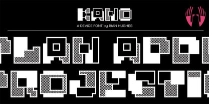
  12. Kano by Device, $39.00
    Kano is inspired by the work of Dutch furniture designer and architect Gerrit Rietveld, one of the principal members of the Dutch artistic movement De Stijl. A modular headline font, constructed from white, black and grey overlapping rectangles, it is seen to best effect in short settings and at larger sizes.
  13. French Bistro JNL by Jeff Levine, $29.00
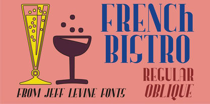
    The 1930s French publication L'Art du Tracé Rationnel de la Lettre was a treasure trove of font revival ideas from the Art Deco era. One example featured a serif typeface with a number of stylized characters. This is now available as French Bistro JNL, in both regular and oblique versions.
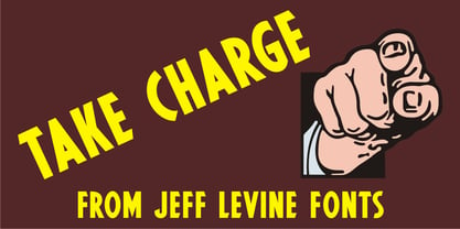
  14. Take Charge JNL by Jeff Levine, $29.00
    Take Charge JNL is based on the opening title card for the 1936 film "The Charge of the Light Brigade" starring Errol Flynn and Olivia de Havilland, Donald Crisp and David Niven. The typeface is a simple, bold titling font with the slight feel of Art Deco influence in its design.
  15. TratexSvart - Unknown license
  16. Grov AB - Unknown license
  17. finitimus iungo - Unknown license
  18. Greer - Unknown license
  19. Bastion Demo - Unknown license
  20. Vergennes Demo - Unknown license
  21. Future Earth - 100% free
  22. Amura YOFF - Personal use only
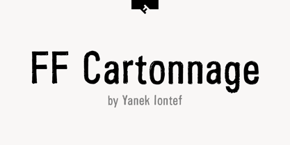
  23. FF Cartonnage by FontFont, $41.99
    Israeli type designer Yanek Iontef created this display FontFont between 2003 and 2011. The family contains 2 weights and is ideally suited for advertising and packaging, film and tv, logo, branding and creative industries, poster and billboards as well as sports. FF Cartonnage provides advanced typographical support with features such as ligatures, alternate characters, case-sensitive forms, fractions, super- and subscript characters, and stylistic alternates. It comes with proportional oldstyle and proportional lining figures.
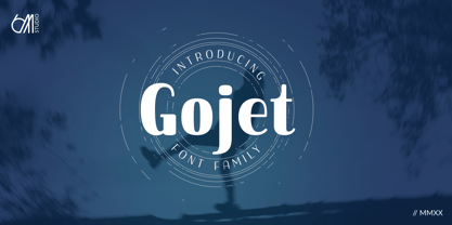
  24. Gojet by 611 Studio, $10.00
    611 Studio proudly presents Gojet, Sans Serif font family with calm, gentle and friendly look. Gojet is available in six different weight, makes it flexible and widely usage possibilities, text, headlines, even logotype. Mix and matching different weight is absolutely the right decision to make your project more attractive, eye catching. The other fact that Gojet is based on ANSI encoding is additional point, multilingual support makes most languages can use this typeface properly.
  25. Terital United by Letterbox, $80.00
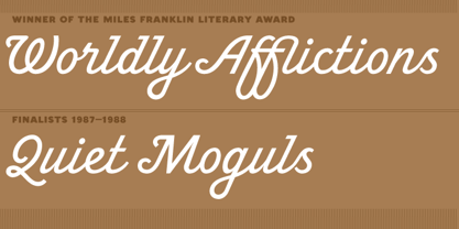
    The long and frustrating search for a dynamic, monoline script drew our attention to the lack of such a typeface. This prompted us to create our very own, Terital, named after the 1960s Italian overcoat advertisement that was the original reference point for its 2003 creation. Fearing the odd all-caps script setting, we cheekily designed Terital as a lowercase set. This limitation was revised in the 2011 version. Beautiful swash capitals were also added.
  26. Retiro Std by Typofonderie, $59.00
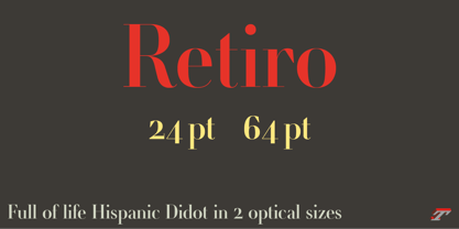
    Full of life Hispanic Didot in 2 optical sizes Retiro is a daring interpretation of Spanish typography. Severe, austere and yet, full of life, Retiro is a vernacular version of Castilian and Andalusian in a typical Didot. Named after a lovely park in Madrid, Retiro started life as a a bespoke typeface designed to give a unique voice to the magazine Madriz. In 2006, the founder of Madriz was looking for a Didot for his new magazine. The Didot is the archetypal typeface used in high-end magazines. Retiro is a synthesis of these high contrast styles mixed with an Hispanic mind. Result is then, after 2-3 years of work, a typeface with countless variations to establish typographic shades adapted to different sections and pages of the Madriz. In 2014, it was necessary to further revise the typeface before its launch at Typofonderie. In order to keep its originality, the unique weight was retained, but complemented with optical size variants to set highly contrasted headlines into various sizes, visually balanced. How to use Retiro optical sizes? Each font provided in Retiro family is named according to the scale of body size: 24 pt and 64 pt. Of course, these names are referring to the body sizes used in typographic design. In the “glorious old days,” the letterpress period, it was customary to cut punches directly to the size at which typefaces would be used. The punchcutter had to visually adapt his design to the engraving size. The aim was to optimize the best contrast and general weight, but also to respect both design’s and reader’s needs. In Retiro’s case, intended for large titling sizes, it’s an adaptation of this ancient practice for our contemporary uses. Although each font is named by a typographic point size, do not feel obliged to use this font at this precise size, but why not, in larger or smaller. It’s rather the concept of gradients that must be preserved in layouts, rather than strictly size numbers. It’s up to the designer to select the right font size for his own designs. Granshan Awards 2012 Creative Review Type Annual 2011 Designpreis 2011 Club des directeurs artistiques, 41e palmarès Type Directors Club 2010 Certificate of Type design Excellence
  27. Kelvinized - 100% free
  28. Yanone Kaffeesatz - Unknown license
  29. Sign Studio by Jeff Levine, $29.00
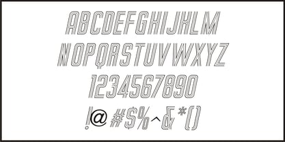
    The French lettering book Album de Lettres Arti (1949) displayed a number of examples of unique, stylized typefaces. One in particular features a multi-line sans serif in a classic Art Deco style with open-ended characters. This design is now available as Sign Studio JNL in both regular and oblique versions.
  30. Artwork Stencil JNL by Jeff Levine, $29.00
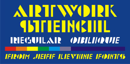
    Many great lettering examples were found in the 1939 French publication by Georges Léculier, "Modèles de Lettres Moderns" ("Models of Modern Letters"). One design in particular is a stencil alphabet so typical of the Art Deco movement of the 1930s. Artwork Stencil JNL is now available digitally in both regular and oblique versions.
  31. Nondescript JNL by Jeff Levine, $29.00
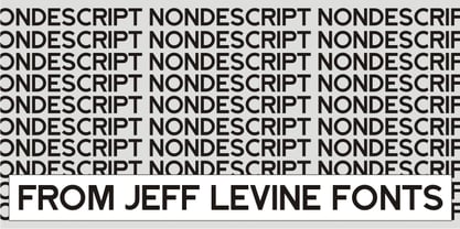
    One good pun is worth a simple description… Nondescript JNL… 'Non' - not. 'de' - of, in Spanish. script - a cursive (handwritten) letter form. So… while nondescript generally means lacking any defining description, in this case it also means "not of a script"… which is precisely what a typeface such as this one is!
  32. NOW YOU SEE ME - Personal use only
  33. Only Fools & Horses - Personal use only
  34. LIGHT EMITTING DIODES - Personal use only
  35. Regal box - Unknown license
  36. North point - Unknown license
  37. West point - Unknown license
  38. Hooper dooper - Unknown license
  39. Royal box - Unknown license
  40. Changstein - Unknown license
Looking for more fonts? Check out our New, Sans, Script, Handwriting fonts or Categories
abstract fontscontact usprivacy policyweb font generator
Processing