10,000 search results (0.04 seconds)
  1. BN FontBoy - Unknown license
  2. Karen Helenes haandskrift - Unknown license
  3. Lady Ice Revisited Upper - Unknown license
  4. Packard Antique - Personal use only
  5. Ruinik - Unknown license
  6. BubbleBoy2 - Unknown license
  7. Klaus Johansens haandskrift - Unknown license
  8. Pole Nord - Unknown license
  9. BN Police - Unknown license
  10. BN Emulator - Unknown license
  11. BN Suck My Balls - Unknown license
  12. Square circle - Unknown license
  13. Planetary Orbiter - Unknown license
  14. Desastra-Bold - Unknown license
  15. Basca - Unknown license
  16. SF New Republic SC - Unknown license
  17. SF Atarian System Extended - Unknown license
  18. Yellow Swamp - Unknown license
  19. pUNKASSBITCH - Unknown license
  20. Smoke-ScreenObl - Unknown license
  21. Quinquefoliolate - Unknown license
  22. Smoke-Rasterized - Unknown license
  23. Cayetano - Unknown license
  24. Summers Notebook - Unknown license
  25. Work Or Spoon - Unknown license
  26. Mira - Unknown license
  27. SF Tattle Tales Condensed - Unknown license
  28. Hearts - Unknown license
  29. Summers Crayons - Unknown license
  30. Erotokritos - Unknown license
  31. Beam - Unknown license
  32. CuxhavenFraktur - Unknown license
  33. Planetary Orbiter - Unknown license
  34. DLTreeCaps - Unknown license
  35. Ordens_VK - Unknown license
  36. Antroposofia - 100% free
  37. Selectric Melt by Indian Summer Studio, $45.00
    A classical 20-th century's (1900s to 1980s) typewriter font for both text and large display usage, titles, signage... A new thicker version of Selectric (2016), as if typed using not a thin carbon ribbon but a coarse fabric one. Both are available on a different models of Selectrics. Made after rare enough samples of the same style used during 1980s in the USSR. Based on the actual letter proportions of the original typewriter Selectric (2016) (Cyrillic ball). This time not monospaced as before, but proportional. The single known so far previous typewriter vector typeface with this 'ink blotting' effect (similarly expanded serifs) as in Dodo (2008) is ITC American Typewriter (1974; by Joel Kaden and Tony Stan) and all its hand drawn analogs from 1980s (and perhaps before). Which, in turn, is resembling ATF Bulletin Typewriter's (1925, 1933; by Morris Fuller Benton) overall proportions, geometry, and even had some natural ink expands in its paper sample (but not by design, as I see it).
  38. screenfox9 - Unknown license
  39. Stone Dense by Putracetol, $20.00
    Stone Dense is a playful display font. Stone Dense has a large number of ligatures, 160 ligatures. So that makes this display font more playful and unique. And Stone Dense has a bold body, with unequal widths for the characters. Stone Dense can suitable for your projects that require fonts with bold and strong characteristics. Such as branding, logos, titles, headlines, printing, magazines, quotes, posters, fashion, t-shirts, apparel and others. Stone Dense is also support multi language.
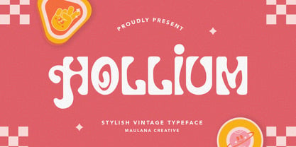
  40. Hollium by Maulana Creative, $14.00
    Hollium Stylish Vintage Typeface. With regular clean stroke, fun character with a bit of ligatures and alternates. To give you an extra creative work. Hollium font support multilingual more than 100+ language. This font is good for logo design, Social media, Movie Titles, Books Titles, a short text even a long text letter and good for your secondary text font with sans or serif. Make a stunning work with Hollium Stylish Vintage Typeface. Cheers, Maulana Creative
Looking for more fonts? Check out our New, Sans, Script, Handwriting fonts or Categories
abstract fontscontact usprivacy policyweb font generator
Processing