10,000 search results
(0.033 seconds)
- Terzo by Wilton Foundry,
$29.00 Terzo uses three lines in the main stem of the capitals resulting in an interesting display of script capitals. Flourishes are uniquely positioned and are deliberately minimalist in order to feature the three part stem capitals. Lowercase characters are also strong enough not to be dominated by the capitals. The overall result is a well balanced and refreshing script that will serve many purposes!
 - Le Havre Hand by insigne,
$- Le Havre. It's a family with no lack of characters diverse, yet none are as deep or tested in their appearance as the weathered, hand-drawn texture of Le Havre Hand. Tall and lean, the well-aged face carries with it the stories of a thousand miles. Starting with a sans as its origin, this handwritten font's layered structure has been shaped through time and trial, ultimately capturing the simple beauty of a wise, experienced character. This layer-based font family includes style variations and new layering solutions. Le Havre Hand includes 21 font files. It also includes an outline, crosshatched versions and five inline variations, several extruded variants including a unique wireframe options. There are two extruded fonts and two drop shadow fonts. For users that have Opentype programs, such as Adobe Illustrator, Photoshop, InDesign, Microsoft Publisher and Quark, each font also comes with an established set of art deco alternatives. Le Havre Hand's alternate characters come together to exhibit a clear sensitivity to the art deco style. Use them on their own or increase your options by using them with any of the other members of the Le Havre family. Take time to look deep into the soul of Le Havre Hand. It's often the tested, weathered hand that is most reliable to guide you to success.
 - Ni Serif by DSType,
$40.00 Ni is a kind of typographic love letter, revealed in three distinct, yet close, type formulas. Ni Serif is a contemporary serif typeface with slight diagonal modulation, amazingly legible, and with a very steady rhythm that allows a wonderful performance, especially in long passages of text. Ni Sans closely match the design characteristics and proportions of the serif counterpart. Ni Sans undeniably shows the strong calligraphic influence that comes from Ni Serif, resulting in a very comfortable humanistic typeface, suited both for print and digital environments. Ni Slab is not a simple Sans with serifs attached. Despite the thick and strong serifs, Ni Slab is a gentle mixture of the DNA of the Serif and Sans counterpart and does not intend to reflect any mechanic approach.
 - Ni Slab by DSType,
$40.00 Ni is a kind of typographic love letter, revealed in three distinct, yet close, type formulas. Ni Serif is a contemporary serif typeface with slight diagonal modulation, amazingly legible, and with a very steady rhythm that allows a wonderful performance, especially in long passages of text. Ni Sans closely match the design characteristics and proportions of the serif counterpart. Ni Sans undeniably shows the strong calligraphic influence that comes from Ni Serif, resulting in a very comfortable humanistic typeface, suited both for print and digital environments. Ni Slab is not a simple Sans with serifs attached. Despite the thick and strong serifs, Ni Slab is a gentle mixture of the DNA of the Serif and Sans counterpart and does not intend to reflect any mechanic approach.
 - Praktika by Fenotype,
$25.00 Praktika Modern grotesk super family Praktika is a multifunctional super family of 40 fonts. It consists of three distinct widths and weights from extra light to extra bold. Conceptually, it is a rendition of the familiar early 20th century European grotesque styles, used in road signage – reimagined to meet the needs of contemporary world. Its design language, however, has been kept decidedly rough and bulky, to achieve a unique-yet-familiar look and feel. Praktika comes with more than a few features, accessible in any open type savvy program. • Built-in small capitals • Both lining and old style numerals, in tabular or proportional form • Superscript and subscript numerals • Many alternate characters For the best experience, purchase the whole family which is available for a good bargain price.
 - WTF Bokytime by Wasabib Type Foundry,
$17.00 Bokytime is a display script font is a typeface that exudes elegance and sophistication with its flowing, timeless, minimalistic yet impactful sweeping letterforms. It captures attention and adds a touch of artistic flair to any design project. The ornate and decorative nature of display script fonts makes them ideal for creating a memorable impact in logos, headlines, invitations, and other creative applications. Bokytime is also bold and commanding, with thick, substantial letterforms. It conveys a strong presence and demands attention. Thick fonts are commonly used in headlines, posters, and other design projects where the goal is to make a bold statement. The weightiness of the strokes adds a sense of strength and solidity to the typography, creating visual impact and enhancing readability.
 - Ni Sans by DSType,
$40.00 Ni is a kind of typographic love letter, revealed in three distinct, yet close, type formulas. Ni Serif is a contemporary serif typeface with slight diagonal modulation, amazingly legible, and with a very steady rhythm that allows a wonderful performance, especially in long passages of text. Ni Sans closely match the design characteristics and proportions of the serif counterpart. Ni Sans undeniably shows the strong calligraphic influence that comes from Ni Serif, resulting in a very comfortable humanistic typeface, suited both for print and digital environments. Ni Slab is not a simple Sans with serifs attached. Despite the thick and strong serifs, Ni Slab is a gentle mixture of the DNA of the Serif and Sans counterpart and does not intend to reflect any mechanic approach.
 - Sports World - Unknown license

- Designosaur - 100% free

- Web Serveroff - 100% free

- Offense by Reserves,
$49.00 Offense is an unyielding rectangular slab-serif face designed with consistently balanced letterforms and a refined finish. It’s extremely angular geometric form commands attention in display settings, yet is also legible in short text blocks. Numerous alternate character sets allow room for customization, while the expanded ligatures push letter combinations to the limit. Stylistically, Offense’s almost crude, sharp-cornered construction is balanced by it’s sophisticated finish and attention to detail, often unrealized in similar faces of this genre. The upright weights are complimented by pairings of true italics, completely rebuilt, slightly narrower in width with modified letterforms, increasing their contrast and flow. Features include: Precision kerning Standard Ligatures set including 'f' ligatures (fi, fl, ff, fh, fj, ffl, ffi, ffj) Discretionary Ligatures set including (ft, rt, ae, oe, st, ft, ct, oc, oo, ry, AE, OE, AL, TH, HE, AK, AN, TT, HD, AM, AP, AR, NF, NE, NH, NL, NB, FL, ND, FE, AB, OB, OD, OF, OG, OH, OK, OL, OM, ON, OO, OP, OQ, OR, OU, AH, UE, UF, UB, UD, UH, UK, UL, UM, UN, UP, UR, UU, MP, XY, YX, KY, WY, VY, AF, FF, FI) Alternate characters (O, o, S, s, a, h circumflex, @, ®, ¶, $, &, _, and various ligature alternates) Case forms (shifts various punctuation marks up to a position that works better with all-capital sequences) Capital Spacing (globally adjusts inter-glyph spacing for all-capital text) Slashed zero Full set of numerators/denominators Automatic fraction feature (supports any fraction combination) Extended language support (Latin-1 and Latin Extended-A) *Requires an application with OpenType and/or Unicode support.
 - Geographica by Three Islands Press,
$29.00 Thomas Jefferys (ca. 1710–1771) was the best-known map maker in 18th-century England, chiefly because he won (and hyped) the title “Geographer to King George III.” Jefferys was really more an engraver/publisher than a geographer, since he mostly relied on the cartographic materials of others. Still, his maps of the North American colonies were well known. Geographica is a legible, four-style serif family modeled after the neat hand-lettered place names and peripheral text on Jefferys’s maps. With its long serifs, tall x-height, and robust curves, Geographica somehow combines classic elegance with a whiff of coastline and sea. The italic styles have the slant and warmth of the hand-drawn source materials. And the typeface comes with a slew of distinctive map-based ornaments—including compass wheels and sailing ships. This evocative serif works well in both display situations and long blocks of text, whether on paper or screen. OpenType features include small capitals, numerous ligatures, and two stylistic sets of titling caps. Geographica offers full support for Central and Eastern European languages—more than 1,200 glyphs in all.
 - Rex Stephane by Mans Greback,
$79.00 Rex Stephane, designed by Mans Greback, is a striking blackletter font that artfully blends medieval influences with modern geometric shapes. Inspired by the tall stature of Gothic architecture, merged with sharpened edges, this font captures the essence of strict ruling while having an elegance of the Middle Ages. First imagined while exploring an abandoned castle, the typeface is based on ancient manuscripts adorned with calligraphic lettering. These texts became the foundation for Rex Stephane, as Mans Greback aimed to recreate the rich history and grandeur of the medieval era while adding his own contemporary twist. The font is built with advanced OpenType functionality and has a guaranteed top-notch quality, containing stylistic and contextual alternates, ligatures, and more features; all to give you full control and customizability. It has extensive lingual support, covering all Latin-based languages, from Northern Europe to South Africa, from America to South-East Asia. It contains all characters and symbols you'll ever need, including all punctuation and numbers. Mans Greback is a Swedish typeface designer with a passion for creating unique and versatile fonts. With an extensive background in design and typography, Mans has built a reputation for his meticulous attention to detail and prolific craftsmanship. His many fonts are widely used by designers around the world, making his work synonymous with creativity and innovation.
 - FG Nadja by YOFF,
$13.95FG Nadja is bold and beautiful - with a real artistic flair around her. - Mehdi by Arabetics,
$39.00 The Mehdi type family follows the guidelines of the Mutamathil Taqlidi type style. It has one glyph for every basic Arabic Unicode character or letter and one additional, final-position, glyph for each Arabic letter that is normally connected with other letters from both sides in traditional cursive Arabic strings. Mehdi employs variable x-height values. Its design uses full curves with variable distributed weights. Mehdi family includes all required Lam-Alif ligatures and uses ligature substitutions and selected marks positioning but it does not use any other glyph substitutions or forming. Text strings composed using types of this family are non-cursive with stand-alone isolated glyphs. The family employs our "natural Arabic input" method where first glyph is displayed in its non-isolated form. Tatweel (or Kashida) glyph is a zero width space. Keying it before any glyph will display that glyph isolated form. Keying it before Alif Lam Lam Ha will display the Allah ligature. Mehdi family includes both Arabic and Arabic-Indic numerals, all required diacritic marks, Allah ligature, in addition to all standard English keyboard punctuations and major currency symbols. The fonts in this family support the following scripts: Arabic, Persian, Urdu, Pashtu, Kurdish, Baluchi, Kashmiri, Kazakh, Sindhi, Uyghur, Turkic, and all extended Arabic scripts.
 - Zapf Essentials by Linotype,
$29.99Linotype Zapf Essentials is the modernized version of Zapf Dingbats and was also designed by Hermann Zapf himself. Over 372 characters and symbols are included within six fonts and make life a little more communicative, a little more informative, and a lot more interesting. The fonts contain symbols for both professional and everyday uses. With their markers, ornaments and arrows they are informative as well as versatile, timeless and lively. An interesting note to the story of Zapf Essentials: in 1977, Hermann Zapf created about 1000 sketches of signs and symbols. ITC chose those which became known around the world as Zapf Dingbats. For a typesetter, dingbats are the characters in the corner of the type box which can be used for just about anything. The last decade has seen the appearance of new symbols for e-mail, fax, mobile phones and other developments. These are now part of Linotype Zapf Essentials, just as they are now a part of everyday life. For a quick overview of the different Linotype Essentials variations, see the keyboard layout PDF in the Gallery section. It shows the keyboard layout of each font. A helpful hint from Hermann Zapf: Linotype Zapf Essentials should be used sparingly so that the characters retain their emphasis. - Mojacalo AH - Unknown license

- Burstwick by Fettle Foundry,
$10.00 Burstwick is a sans-serif typeface inspired by modern workhorse typefaces and designed for everyday use. It has unique personality but doesn’t suffer in more practical situations, and is very flexible: there are six weights, ranging from thin to bold, and matching oblique italicis. Lifting elements from grotesque, geometric, and humanist styles, and putting legibility at the forefront, each weight is drawn with higher contrast and subtle asymmetrical features to enhance individuality and aid in readability, particularly at body sizes on websites. These features are intended as an alternative to rigid geometric lines, bringing a natural feeling to glyphs, resulting is a friendly, but professional choice for any organisation or designer. The foundation of the design is a large X-height, which further aids in differentiating lowercase characters from one another. This allows Burstwuck to feel open, airy, and really shine when used in single-family type hierachies, particulalry in headlines and larger text. Through its 630 glyphs, Burstwick supports many Latin languages, with thorough kerning for accented character combinations, making it an ideal choice for organisations considering multilingual users, and the perfect addition to any designer’s toolbox. In addition to accented characters, a large number of special characters and alternatives have been included to increase choice and flexibility. Among these are expand currency symbols, oldstyle figures, math operators, and symbols. Language support includes: Bosnian, Catalan, Czech, Danish, German, English, Spanish, Estonian, Finnish, French, Irish, Croatian, Hungarian, Icelandic, Italian, Lithuanian, Latvian, Maltese, Dutch, Norwegian, Polish, Portuguese, Romanian, Slovak, Slovenian, Albanian, Swedish, Turkish.
 - Spiderwort by Nathatype,
$29.00 Spiderwort is a lovely script font designed in a natural handwriting look. Like the other cursive fonts, the letters are interconnected to each other. This font type is perfectly applicable for texts that combine uppercases and lower cases in order for the writing to look flawlessly connected. Furthermore, it expresses soft and relaxing nuances to use in informal texts. The character of this font is the low contrasts in thin, unfirm lines. Nevertheless, it shows you unique, artistic displays on your designs particularly when you use it well and based on the desired theme. You can apply this font for any text sizes because it is greatly legible and also enjoy the available features here. Features: Ligatures Stylistic Sets Multilingual Supports PUA Encoded Numerals and Punctuations Spiderwort fits best for various design projects, such as brandings, invitations, greeting cards, name cards, quotes, printed products, merchandise, social media, etc. Find out more ways to use this font by taking a look at the font preview. Thanks for purchasing our fonts. Hopefully, you have a great time using our font. Feel free to contact us anytime for further information or when you have trouble with the font. Thanks a lot and happy designing.
 - Hazel Script by Eclectotype,
$40.00 The design process of this font was rudely interrupted on August 11th, 2015, when my first child, Hazel, was born. Thinking up names for fonts can be tricky, as can thinking up names for babies, so when the font was finally finished, it seemed like a good idea to kill two birds with one stone, and here it is: Hazel Script. Hazel Script is a finely crafted, elegant, connecting script. I wanted to make something unique, and to this end, the contrast in the face is not based on any ductal logic, or the writing of some imagined tool. The thick parts of glyphs are purely aesthetic devices, placed to give the otherwise monoline font an interesting rhythm. The over-sized upper case letters follow a mid-century lettering skeleton, and swash forms can be used judiciously to add spice to the text. Hazel Script works "out of the box" but to really get the best out of it, use OpenType-savvy programs to unlock a world of swashes, alternates, ligatures and the like. In detail, the features are as follows: Swash - alternate forms for many glyphs Stylistic Sets - 1: script r, 2: alternate s, 3: script z, 4 and 5: more swash options, 4,5,6 and 7: access to alternate ampersands (the font boasts six to choose from!), 8: connecting forms for K, L, R, X and Z. Localised forms - ij digraphs for Dutch, and a script lslash for Polish. Standard ligatures - a mixture of ligatures, including the 'percent off' (just type "% off") and a heart that connects to the ends of words (type "<3") Automatic fractions Ordinals - a and o for Spanish etc. but also s,t,r,d,h and n for English 1st 2nd and 3rd etc. Contextual alternates - automatically places special start and end glyphs where necessary. Hazel Script would look great in glossy magazines set large, or would make a slightly unorthodox choice for wedding stationery, birth announcements, letterheads...
 - ITC Needlescript by ITC,
$29.99It's been said that creativity requires ten parts to perspiration to one part inspiration. But not always. According to its creator, Mira Vucko, ITC Needlescript was designed in one breath." An accomplished lettering artist, Vucko was sketching letters one afternoon. "I was using a calligraphy nib and was drawing the alphabet without much thought," she recalls. "When I allowed the down strokes of a couple of letters to fall below the baseline, I realized that I had created the impression of movement. I kept drawing letters in this fashion and did the same with horizontal lines. I added a firm ending to the descenders. Instead of dots above the 'i' and 'j,' I placed strokes in the opposite direction." In this way, the first characters that were to become ITC Needlescript emerged. The finished design is a lively, distinctive alphabet that produces a striking texture on the page. Letters intertwine and overlap to create a sense of movement and graphic intensity, especially when reversed out of a dark background. Vucko lives, works and was educated in Zagreb, Croatia. She lived in France and Sweden while in her twenties, but then returned to Croatia to work as a graphic designer for the country's largest newspaper. It was here that her passion for type and typography was born. Vucko has since gone on to become one of Croatia's leading graphic designers, and has won many awards for her advertising and packaging design. Vucko recommends that ITC Needlescript be used for "titling, lively but 'thorny' content, and anywhere that a little typographic drama is called for."" - Hexonu by Ingrimayne Type,
$6.95 Hexonu is a weird, awkward, monospaced font family. In place of true lower-case letters, it has a second set of capitals that, through the magic of the OpenType contextual alternatives (calt) feature, automatically alternates with the set on the upper-case keys. If one wants to use only one set of letters, the contextual alternatives must be turned off and character spacing adjusted. Hexonu is another effort to create a font with alternating sets of letters (see PoultySign, Lentzers, and Caltic for others). The base shape for forming the letters is a lopsided hexagon that resembles an old coffin. In four of the six family members, the alternating shape is a distorted hour-glass. In the other two, coffin shapes heads-up alternate with coffin shapes heads-down. The family was created as an experiment with the calt feature and not for any particular use. It does not work as text but its bizarreness makes it appropriate for some poster and signage applications.
 - Clockmaker by Sudtipos,
$49.00 Sudtipos is proud to announce the release of Clockmaker, an 8-weight family that takes initial inspiration from typography around the turn of the twentieth century. Clockmaker takes aesthetic references from Victorian, Art Nouveau and Art Deco advertising and typography, taking special influence from John F. Cummings’ all-caps – and never digitized – type design Elandkay. Clockmaker is a robust multi-weight family that includes an array of ligatures as well as alternate characters and support for all latin languages. The design process began with developing and modernizing the uppercase letterforms, followed by designing the lowercase and additional weights. Creating a diverse and playful set of uppercase ligatures was an almost endlessly enjoyable task; they are one of Clockmaker’s most charming features. Clockmaker is an impeccable choice for designs requiring a vintage flair such as a luxury liquor labels, restaurant identities, lavish hotels and many other applications where elegance and grace are needed. In addition to its historical references, Clockmaker is an homage to my grandfather who was a master craftsman, repairing antique clocks and fine watches with great skill and mathematical precision. Watching him work was fascinating and it has been a joy to remember those quiet and curious moments from my childhood while designing this font.
 - Baka Expert by Positype,
$25.00 Why Baka Expert? There’s actually a simple answer. The original Baka was done as an experiment of sorts. I wanted to quickly capture a rough, frenetic handwriting style that broke normal conventions. Commercially, it was successful, received some accolades ... but I wasn’t completely satisfied, so I went back to the master art and the lettering explorations and produced Baka Too. This addressed some of the line items I wanted to refine in Baka. I liked it. Each font has been out for a few years now, and I have seen them in use. I’m very critical of my work, and I could still see things—modulations of strokes, angle of the nib, ink swell, and so on—that I wanted to change, refine, and reorder. For me, it is typographic indulgence, but I wanted to take this handwriting ‘font’ and turn it into a robust ‘typeface.’ So I did just that and a bit more by adding back more of my initial flourish concepts; attaining tighter, consistent control of the modulation; optimizing points; adding titling options; and expanding the character language set. Baka and Baka Too had to exist to produce this entirely new re-envisioning of an old friend ... and they all play well together :)
 - Okezone Chamoon by Alit Design,
$22.00 Get ready to groove with the Okezone Chamoon Groovy Display Serif Font! This font is the perfect blend of retro 80s style, funky cartoon vibes, and a dash of modern flair. With its wavy lines, extensive ligature options, and a whopping 758 characters, Okezone Chamoon is the ultimate choice for designers looking to infuse a playful and nostalgic touch into their projects. Key Features: Groovy 80s Aesthetics: Okezone Chamoon takes you on a trip back to the 1980s with its groovy and wavy design. It's like stepping into a time machine and bringing the funky, vibrant spirit of the 80s into your designs.Funky Cartoon Vibe: This font exudes a playful and fun-loving attitude that's perfect for creating eye-catching headlines, posters, and logos with a whimsical twist. Versatile Ligatures: Okezone Chamoon offers an extensive range of ligatures that seamlessly connect characters, enhancing the flow and style of your text. Experiment with ligatures to create custom and captivating typography. 758 Characters: With a whopping 758 characters at your disposal, you have a wide variety of options to make your text truly unique. Add special characters, symbols, and emojis to express your creativity. Multilingual Support: Don't let language barriers hold you back. Okezone Chamoon supports multiple languages, making it a font that can connect with audiences worldwide. Digital and Print-Ready: Whether you're designing for the web or print, Okezone Chamoon is optimized for both mediums. Your designs will look stunning on screens and in physical publications. Unique Branding: If you want your brand to stand out and be remembered, Okezone Chamoon is the font to make it happen. Its distinct style is sure to leave a lasting impression. Endless Possibilities: Whether you're working on advertising campaigns, retro-themed projects, or simply want to add a touch of nostalgia to your designs, Okezone Chamoon empowers you with endless creative possibilities. With Okezone Chamoon Groovy Display Serif Font, your designs will turn heads, evoke nostalgia, and radiate a playful spirit. Embrace the funky 80s vibe and let your creativity run wild!
 - Tim Sale by Comicraft,
$39.00 If you're familiar with the work of Eisner Award winning artist Tim Sale, you'll also be familiar with the soft curves and hard edges of the characters he brings so vividly to life in the pages of GRENDEL, BATMAN and SUPERMAN. Now you can get to know a selection of the characters Tim has been working on his whole life, and Comicraft has been kind enough to arrange them in alphabetical order for you! Based on Tim's own hand lettering work in the lost Dark Horse classic, BILLI 99, the Tim Sale font brings together the class and finesse of Hunter Rose, the elegance and charm of Bruce Wayne and the honesty and trustworthiness of Clark Kent. Don't go into the big city alone at night without it. See the families related to Tim Sale: Tim Sale Lower & Tim Sale Brush.
 - Hello Cartel Story Script Duo by Attract Studio,
$13.00 Hello Cartel Story Script FONT DUO is a new modern script font with irregular base lines. Trendy and feminine style. Hello Cartel Story Script looks beautiful in wedding invitations, thank-you cards, quotes, greeting cards, logos, business cards, and more. Perfect for use in ink or watercolors. Includes initial letters and terminals, alternatives and support for many languages. Include file: Hello Cartel Story Script.OTF Hello Cartel Story Sans.OTF To activate the OpenType Stylistic alternative, you need a program that supports OpenType features such as Adobe Illustrator CS, Adobe Design & CorelDraw X6-X7, Microsoft Word 2010 or newer versions. There are additional ways to access alternatives / swash, using Character Map (Windows), Nexus Fonts (Windows), Font Books (Mac) or software programs such as PopChar (for Windows and Mac). How to access all alternative characters, using Windows Character Map with Photoshop: https://www.youtube.com/watch?v=Go9vacoYmBw How to access all alternative characters using Adobe Illustrator: http://youtu.be/iptSFA7feQ0 How to use a stylish font set in Microsoft Word 2010 or later versions: https://youtu.be/x1A_ilsBsGs Need help or have questions, let me know. I am happy to help :) Thank you & Congratulations on the Design!
 - Tirade by Fontosaurus,
$19.95I'm not sure where the inspiration for Tirade originally came from, but it looks like a good rant, hence the name. - Abulonia by Forberas Club,
$16.00 Abulonia is unique script font with handwritten style. Very nice if you use it for cute or beauty themes and memories.
 - Wine Stoney by Forberas Club,
$16.00 Wine Stoney font is inspiration from simple cloud. This font can use for comic style , cartoon, and serious like horror themes.
 - Fontazia Christmas Baubles by Deniart Systems,
$20.00 DECORATE THE SEASON with 62 retro-style Christmas decorations. These decorative accents are a great addition to your holiday font collection.
 - Mimbie by Cultivated Mind,
$20.00 A quirky handwritten headline font with doodley artwork by Cultivated Mind. This font collection includes three weights (Regular, SemiBold, and Bold).
 - LD Daffy by Illustration Ink,
$3.00This downloadable font has fun written all over it. Its versatile style makes it useful for all sorts of whimsical themes. - Cayenne by Luxus,
$25.00 Cayenne is an all-caps hand-lettered font in three weights, two dotted versions and an outline and an inline font.
 - Paper - Personal use only

- Cleopatra by Solotype,
$19.95Here's a great old face from the H. W. Caslon foundry in London; a real workhorse. The lowercase is eminently readable, so you can set entire paragraphs to good effect. We don't recommend it for setting all caps, but we did take time to kern it well; so you won't get a jumble of ovelapping letters if you do. - Avalaqus by Amera Type,
$10.00 Avalaqus is a font inspired by certificate, labels, posters, F&B packaging and has ligatures with alternate style that can make your display better than before. You will get a decorative font, sans, serif with bold and outline styles. And you will also get a set of badges with the open type feature format that match this typeface
 - Betterlove by Good Java Studio,
$21.00 Betterlove is a beautiful script font with many swashes at the beginning and end strokes, which let you make beautiful swash characters. This font includes full set of swash heart lowercase letters, numerals, and punctuation. Also it includes OpenType ligatures and stylistic set. This is so perfect for invitations, monograms, weddings, fashion, branding, labels, or logotype.
 - Handlettery by Scratch Design,
$10.00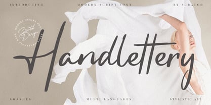 Handlettery is a modern script and handwritten font, which is suit for casual and feminine design stuff. This font is suitable for signature, wedding invitation, branding, promotion, product packaging, poster, and others. You will get a full set of lowercase and uppercase letters, numerals and punctuation, multilingual language, multilingual symbols, swashes, and ligatures. What You Get : Swashes Stylistic Alternates
 - Axelby JNL by Jeff Levine,
$29.00 Axelby JNL was modeled from a set of die-cut, self-adhesive cardboard letters from the 1960s. The design is reminiscent of some early wood type in the way it has letters of varying widths that do not conform to any set standard. The font is perfect for plain, easy-to-read and attention-getting headlines.


