10,000 search results (0.028 seconds)
  1. Lastman - Unknown license
  2. Gears - Unknown license
  3. Shoplifter - Unknown license
  4. Alpha Sentry - Unknown license
  5. Gumtuckey - Unknown license
  6. Walkway UltraBold - Unknown license
  7. UNITED BRK - Unknown license
  8. Touchdown - Unknown license
  9. Fat Legs - Unknown license
  10. U.S.A. Condensed - Personal use only
  11. Rogue Hero Expanded Italic - Unknown license
  12. Chow Fun - Unknown license
  13. Juan Miro - Unknown license
  14. Only Fools and Horses - Unknown license
  15. Tork - Unknown license
  16. Headache - Unknown license
  17. Geared Up - Unknown license
  18. Twin Marker - Unknown license
  19. Electrik Hollow - Unknown license
  20. GALLAECIA - Unknown license
  21. HOUSEPIPES - Unknown license
  22. Binary X BRK - Unknown license
  23. 26WOMAN - Unknown license
  24. Danube - Unknown license
  25. STAR+STAR (sRB) - Unknown license
  26. Superfly - Personal use only
  27. immoral - Unknown license
  28. Morphine Jack - Unknown license
  29. Swiss 924 by Bitstream, $29.99
    An old narrow Grotesque from Stempel’s early days (possibly Information Bold Condensed) revived and revised for photocomposition.
  30. Neue Haas Grotesk Text by Linotype, $33.99
    The original metal Neue Haas Grotesk™ would, in the late 1950s become Helvetica®. But, over the years, Helvetica would move away from its roots. Some of the features that made Neue Haas Grotesk so good were expunged or altered owing to comprimises dictated by technological changes. Christian Schwartz says Neue Haas Grotesk was originally produced for typesetting by hand in a range of sizes from 5 to 72 points, but digital Helvetica has always been one-size-fits-all, which leads to unfortunate compromises."""" Schwartz's digital revival sets the record straight, so to speak. What was lost in Neue Haas Grotesk's transition to the digital Helvetica of today, has been resurrected in this faithful digital revival. The Regular and Bold weights of Helvetica were redesigned for the Linotype machine; those alterations remained when Helvetica was adapted for phototypesetting. During the 1980s, the family was redrawn and released as Neue Helvetica. Schwartz's revival of the original Helvetica, his new Neue Haas Grotesk, comes complete with a number of Max Miedinger's alternates, including a flat-legged R. Eight display weights, from Thin to Black, plus a further three weights drawn specifically for text make this much more than a revival - it's a versatile, well-drawn grot with all the right ingredients. The Thin weight (originally requested by Bloomberg Businessweek) is very fine, very thin indeed, and reveals the true skeleton of these iconic letterforms. Available as a family of OpenType fonts with a very large Pro character set, Neue Haas Grotesk supports most Central European and many Eastern European languages.
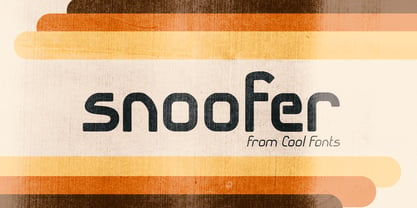
  31. Snoofer by Cool Fonts, $19.95
    Snoofer is a modern font that works for both display and text. It comes in 4 weights(Regular, Italic, Bold, Bold Italic). Snoofer was inspired by a character in stories my dad told me as a kid. Somehow they always ended with "... and they never left home again." Enjoy!
  32. Blocksta by AVP, $30.00
    Based on the character shapes of Atria Bold, Blocksta is a bullish rough cut sans with extensive language support. Hopefully it won’t start another cold war.
  33. LT Festive Medium - 100% free
  34. Goth Stencil Premium - Personal use only
  35. Tombstone - Unknown license
  36. Neue Haas Grotesk Display by Linotype, $33.99
    The first weights of Neue Haas Grotesk were designed in 1957-1958 by Max Miedinger for the Haas’sche Schriftgiesserei in Switzerland, with art direction by the company’s principal, Eduard Hoffmann. Neue Haas Grotesk was to be the answer to the British and German grotesques that had become hugely popular thanks to the success of functionalist Swiss typography. The typeface was soon revised and released as Helvetica by Linotype AG. As Neue Haas Grotesk had to be adapted to work on Linotype’s hot metal linecasters, Linotype Helvetica was in some ways a radically transformed version of the original. For instance, the matrices for Regular and Bold had to be of equal widths, and therefore the Bold was redrawn at a considerably narrower proportion. During the transition from metal to phototypesetting, Helvetica underwent additional modifications. In the 1980s Neue Helvetica was produced as a rationalized, standardized version. For Christian Schwartz, the assignment to design a digital revival of Neue Haas Grotesk was an occasion to set history straight. “Much of the warm personality of Miedinger’s shapes was lost along the way. So rather than trying to rethink Helvetica or improve on current digital versions, this was more of a restoration project: bringing Miedinger’s original Neue Haas Grotesk back to life with as much fidelity to his original shapes and spacing as possible (albeit with the addition of kerning, an expensive luxury in handset type).” Schwartz’s revival was originally commissioned in 2004 by Mark Porter for the redesign of The Guardian, but not used. Schwartz completed the family in 2010 for Richard Turley at Bloomberg Businessweek. Its thinnest weight was designed by Berton Hasebe.
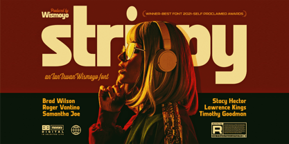
  37. Strippy by Just Font You, $18.00
    Inspired from the bold and loud visual statements from the 90s poster and graphic design trend, makes Strippy can’t hold itself to be born in this universe. A clean, square, and bold form of body, makes Strippy is the simple way to go to shot your statement louder and wider.
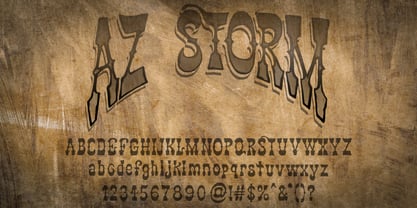
  38. AZ Storm by Artist of Design, $20.00
    AZ Storm was inspired from old '70's skateboard logo. This font was designed for use as a fun bold headline.
  39. Bad Coma - Personal use only
  40. tekken 6 2 - Unknown license
Looking for more fonts? Check out our New, Sans, Script, Handwriting fonts or Categories
abstract fontscontact usprivacy policyweb font generator
Processing