8,220 search results
(0.043 seconds)
- Awry by Gholib Tammami,
$15.00 Awry is a cute and quirky handwritten font that elegantly dances on the edges of organized precision and captivating disorder. With its unique design, ‘Awry’ breaks free from the confines of traditional typography, inviting you to explore a world where imperfection becomes an art form.
 - Resotho by Glukfonts,
$10.00 Resotho is a geometric sans serif (uppercase) family. It comes in 18 weights, 9 uprights and 9 italics. Perfect for graphic design, branding, packaging design but very versatile. Language support covering Western, South, and Central Europe. The Extralight & Extralight Italic weights are free of charge.
 - After Dark BB by Blambot,
$20.00All good things happen After Dark! This handwritten font has delicate, long lowercase characters and huge, care-free caps. Both dangerous and feminine, perfect for signing your signature, After Dark has a large assortment of European characters to assist in your late-night adventures. - Hubba by Green Type,
$19.00 Hubba is a modular geometric typeface. Its heavy weight is excellent for headlines and display. There is a plain, oblique, and opposite oblique styles. The variable version will give you the opportunity to be more free in design and not limited to standard styles.
 - Valentine Street by Hatftype,
$15.00 Valentine Street - Graffiti Font is a free style font that has the characteristics of street art that shows freedom and is filled with unique characters. Features : • Character Set A-Z • Numerals & Punctuations (OpenType Standard) • Accents (Multilingual characters) • Ligature • Alternate. I really hope you enjoy it.
 - Designors by Sarid Ezra,
$15.00 Designors is a freestyle font that will make your project more stylish and free! You can use this font for any project. Suitable for quotes and your tees design. This font also support multilingual. With different lowercase and uppercase will make your design more natural!
 - Mysthiqa by Essentials Studio,
$16.00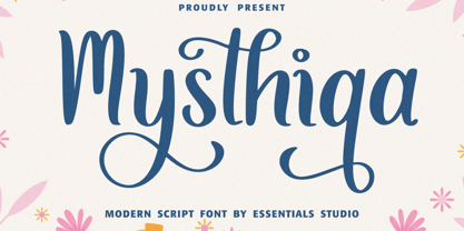 Introducing by Essentials Studio Mysthiqa Is a Modern Script Font Mysthiqa is perfect for product packaging, branding project, megazine, social media, wedding, or just used to express words above the background. Enjoy the font, feel free to comment or feedback, send me PM or email
 - Beautifull Weakness by Sarid Ezra,
$15.00 Beautiful Weakness is a free-styled handwritten font that will make all your project more unique. With brush touch, this font will make your artwork feels more natural. Comes with ligatures and underline that you can access it from opentype feature. Also support multi language!
 - Aminetta by HandletterYean,
$14.00 Aminetta is a beautiful hand-written display font which shows happiness and joy in your heart. This font is most suitable to celebrating your holiday season but also to any occasion you have. Feel free to use it on any creative design you want.
 - Moodystone by Adante Creative,
$23.00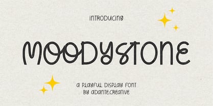 Moodystone A Playful Display Font Moodystone is perfect for product packaging, branding project, magazine, social media, wedding, or just used to express words above the background. Moodystone also multilingual support. Enjoy the font, feel free to comment or feedback, send me PM or email.
 - Horas by Yukita Creative,
$14.00 Horas Sans Serif Geometric is a stunning and modern font, designed with a touch of minimalism and attractive geometrics. This font combines the beauty of serif-free design with the boldness of geometric shapes, creating a fresh, clean look for a variety of design projects.
 - Tripoca by Panatype Studio,
$9.00 TRIPOCA is a Handcraft Vintage inspired typeface with tropical summer vibes, come with 2 family style ( Regular, Slant ) Plus FREE Illustrations & Borders which is perfect for your designs that want a rough style, modern vintage, tropical, summer and carefully crafted for all graphic design needs.
 - Batistar by Allouse Studio,
$16.00 Batistar is perfect for any tittles, logo, product packaging, branding project, magazine, social media, wedding, or just used to express words above the background. Batistar also come with Multi-Lingual Support. Enjoy the font, feel free to comment or feedback, send me PM or email.
 - Signaday by Allouse Studio,
$16.00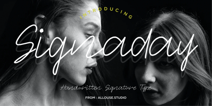 Proudly Present, Signaday a Modern Monoline Handwritten Font. Signaday is perfect for product packaging, branding project, megazine, social media, wedding, or just used to express words above the background. Enjoy the font, feel free to comment or feedback, send me PM or email. Thank You!
 - Sallyna Cattalya by Essentials Studio,
$16.00 Sallyna Cattalya Is a A Monoline Signature Font Sallyna Cattalya is perfect for product packaging, branding project, megazine, social media, wedding, or just used to express words above the background. Enjoy the font, feel free to comment or feedback, send me PM or email.
 - Rexlia Free, designed by the talented Ray Larabie, is a font that manages to balance a robust, industrial aesthetic with an undercurrent of playful quirkiness. This typeface is not your average font;...
- gAbAcHiTA FFP - Personal use only

- MidnightKernboy - Unknown license

- Kristen Curly - Personal use only

- Departura by Nasir Udin,
$20.00 Departura is a sans-serif family inspired by art deco travel posters in early 20th century, fused with modern & geometric touch. It comes in 18 styles, 9 weights and its matching italics. With those style variatons, Departura offers many possibilities to be applied in many graphic or editorial projects.The modernized retro-look makes this family great to presents any contents related to travel, history & culture in the present/modern way. Also thanks to the extended latin character set so that Departura supports 200+ latin-based languages plus Cyrillic (including the Bulgarian and Serbian characters). P.s.: The Bold Italic & ExtraLight styles are free to download, so you can use them for any projects free of charge.
 - R21 hSq by 103cia,
$10.00 R21-h sq is stand for "Ratio 2:1 in horizontal square"; a comparison in making a glyph typography, horizontally in the form of a square. R21-h sq font consists of bold-retro typeface with its own unique funky style. Suitable for app design, games, toys character face, storybook covers, logos, advertisements, branding, poster, or anything that needs a daring and fresh typography. Font include: R21-hSq-Latin (+extended) font R21-hSq-Cyrillic font R21-hSq-Greek font* * Additional Light font for Greek only. All styles include Latin standards (except for free/demo version). The glyph 6, 8, 9, x, O, Q and X on display are for commercial version (the free/demo version are different).
 - Mak Variable by Tkachenko design,
$211.00 Mak is a display font with a Ukrainian feeling inspired by Ukrainian music. Customize weight and contrast to the smallest value to your needs with a variable version of Mak. This is a big update of the first free two styles of Mak (SemiBold High & Black High) that were created in 2019 and become widespread among free display fonts. The big update wasn't been only adding more weights and contrasts but also changing a lot of glyphs and adding new ones. Now Mak supports all Latin-based languages and European Cyrillic. Experiments with historical forms, contrasts, and daring shapes to create a new image of Ukrainian Cyrillic and Latin based on it.
 - Sassoon Joined ENGLISH by Sassoon-Williams,
$66.00 These fonts will join-as-you-type in your OpenType application as shown in the posters above. Choose Use Contextual Alternates option in your app to get basic recommended baseline joins for teaching. Additionally, use can choose from 7 Stylistic Sets of alternative letterforms that are so important for Teachers. Create ‘pen lifts’ anytime too! Fonts display unjoined by default on this website and are delivered that way - joining is controlled by your application. Free to download resources Stylistic Sets and how to access the alternative letters feature in these OpenType fonts Purchasers of this font package may use their Order Number to receive a free Copybook PDF by Rosemary Sassoon recommended for effective teaching
 - Super Active Matrix by Folding Type,
$9.00 S.A.M (Super Active Matrix) combines the big, bright and bold with the microscopic and mathematically precise. Inspired by old science fiction films and new technologies, S.A.M merges the rigid constraints of display mechanics with the free-flowing curves of neon signs. This font is great for a classic sci-fi look – perfect for headlines/logotype. S.A.M also works for blocks of text, unlike some other display fonts. The matrix exists to bring order to an idea – it tames the free-flowing curves of neon signage into a repeatable structure while maintaining a retro aesthetic. Each character, glyph or symbol is drawn on a bitmap grid, merged with a dot matrix to round off the edges.
 - Spiderpies by Lucky Type,
$14.00 Introducing Spiderpies, a brush script that is modern, free-style, free-flowing, friendly and organic.Can be used for various purposes - Branding, Happy New Year, Logos, Greeting Cards, Wedding Stationery and Quotes. Files included : Spiderpies OTF Spiderpies features : Basic Latin A-Z and a-z Numbers Symbols To enable the OpenType Stylistic alternates, you need a program that supports OpenType features such as Adobe Illustrator CS, Adobe Indesign & CorelDraw X6-X7, Microsoft Word 2010 or later versions And this Font has given PUA unicode. There are additional ways to access alternates/swashes, using Character Map (Windows), Nexus Font (Windows), Font Book (Mac) or a software program such as PopChar (for Windows and Mac).
 - Kari Display by Positype,
$49.00 Kari Display is the product of a long standing idea I had to give the well-received Positype typeface, Kari, plastic surgery. Just referring to giving a typeface plastic surgery, or letter lipo, stuck in the back of my head until I was able to pick the project up. The ultimate objective was to refine Kari Display to a point where each glyph was expressed as simple as possible... and in that simplicity a sexiness would appear. Kari is a beautiful script, but it is very 'controlled' and orderly and I wanted Kari Display to break that mold with much more movement, curviness, greater modulation and a more elegant feel on the page. I did not want to take it too far, limiting the use of the typeface, but rather opted for a delicate balance of thick and thin against the added movement of the glyphs. The wealth of sketches and proposed variants during the concepting phase was encouraging and I really pushed to add as many alternate characters, ligatures, swashes (and more) as I possibly could. Just about every character has at least one or more alternates AND the complete offering of alternates completely covers a wide range of Latin-based language groups including Central European diacritics. If you are using any type of OpenType enabled application, then the Kari Display Pro typefaces are the way to go. They include everything found in the 3 separate variants for each style as well as entirely expanding offering of additional swash and ligature sets.
 - Burford by Kimmy Design,
$10.00 Burford is a font family that I sketched while traveling through Europe. I was mesmerized by all the unique typography that was showcased throughout the five countries I visited. Inspired by all that I had seen, I found myself spending 4-5 hours per day in Amsterdam’s Vondel Park drawing characters. Once back in the states I digitalized Burford, deciding it would make for a beautiful layer-based font. Burford Pro package comes with all 18 layering fonts including 5 base layers, 3 top layers, 5 bottom layers and 2 sets of graphic elements. They are strategically made to build on top of each other, creating a cohesive and easy to use layer-based family. Each font also comes with a set of Stylistic Alternatives for letters A C E F G H P Q R. Burford Basic package is created for users who don’t have access to premiere design programs (such as Illustrator, InDesign, Photoshop, etc) and are unable to use the layering effect. Burford can still be a powerful tool as each font can also be used on its own. It includes every font file not needed for the layering effect. (Include 13 fonts - Burford Basic, Dots, DropShadow, Extras Set A, Extras Set B, Extrude B, Extrude C, Inline, Line, Marquee, Outline, Stripes A and Stripes B). The Burford Extras set uses all basic keyboard characters - around 100 total elements per set. They are designed to go specifically with Burford and complement its varying styles perfectly. The set includes: banners, borders, corners, arrows, line breaks, catchwords, anchors and many more!
 - Alrighty, imagine you're diving into a world where comic books aren't just stories; they're experiences that leap off the page. That's where ShockTherapy BB by Blambot Fonts punches its way in, decki...
- Resist Sans by Groteskly Yours,
$25.00 Resist Sans is a free-spirited neo-grotesque that embodies both the innate desire for revolt and a tendency towards uniformity. While Resist Sans preserves the neat, minimalist look which is associated with neo-grotesques, it also accentuates the tentativeness of each letter form. The name, too, hints at the rebellious character of the typeface. Resist Sans comes in 28 styles (14 uprights and matching obliques). Text vs Display Resist Sans comes in two versions: Display and Text, which serve different purposes but remain interchangeable and even complementary in some cases. Resist Text is equipped with deep ink traps and optical compensators, which really come into play at smaller sizes. The Display version is smoother and more consistent, so better for use in larger sizes and headlines. Styles/Weights Each of the two versions of Resist Sans comes in 7 weights (Thin to Black) and is equipped with matching Obliques, which brings the total number of styles to 28. Two trial styles (Text Light and Display Medium Oblique) can be downloaded free of charge. Each style contains 900+ glyphs, awesome OpenType features, and around 1500 kerning pairs. Language Support Resist Sans is truly multilingual. It supports most European and Latin-languages and features Extended Cyrillic, which gives access to such languages as Ukrainian, Bulgarian, Serbian, Russian, Macedonian and many more. Free Styles Two styles of Resist Sans can be downloaded for free on MyFonts. Type Specimen Resist Sans PDF Type Specimen can be downloaded here: Resist Sans PDF Type Specimen
 - Body by Zetafonts,
$39.00 Body graphic project at Behance Body is a type family designed for Zetafonts by Cosimo Lorenzo Pancini with Andrea Tartarelli. Conceived as a contemporary alternative to modernist superfamilies like Univers or Helvetica, Body tries to maximize text readability while providing a wide range of options for the designer. It comes in two variants (Body Text and Body Grotesque), each in four widths and four weights: regular and bold for basic typesetting, light and extrabold for display use. Body Grotesque applies to the sans serif modernist skeleton little imperfections and quirks inspired by our research in early 20th century type specimens. Curves are slightly more calligraphic and a light inverse contrast is applied to bold weights, giving the typeface a slight vintage appearance in display use. Body Text, on the contrary, challenges the modernist aesthetics maximizing horizontal lines and using open terminals for letters like “s” and “a” that appear normally dark in modernist grotesques. For both variants, the normal width family is slightly condensed in an effort to maximize space usage; the Slim width is provided for extremely dense texts or side notes while the Fit width is optimized for display usage as in logos, headings or titles. The Large width manages to look elegant in its light weight while becoming a valid heading or subtitle font in its extrabold weights. All the 64 fonts in the Body superfamily include a complete latin extended character set with small caps for over 70 languages, Russian cyrillic, open type positional numbers, stylist sets and alternate forms.
 - Neuzeit Office by Linotype,
$50.99 The Neuzeit Office family is designed after the model of the original sans serif family Neuzeit S™ , which was produced by D. Stempel AG and the Linotype Design Studio in 1966. Neuzeit S itself was a redesign of D. Stempel AG’s DIN Neuzeit, created by Wilhelm Pischner between 1928 and 1939. Intended to represent its own time, DIN Neuzeit must have struck a harmonious chord. DIN Neuzeit is a constructed, geometric sans serif. It was born during the 1920s, a time of design experimentation and standardization, whose ethos has been made famous by the Bauhaus and De Stijl movements in art, architecture, and design. Upon its redesign as Neuzeit S in the 1960s, other developments in sans serif letter design were taken into account. Neuzeit S looks less geometric, and more gothic, or industrial. Separating it from typefaces like Futura, it has a double-storey a, instead of a less legible, single-storey variant. Unlike more popular grotesque sans serifs like Helvetica, Neuzeit S and especially the redesigned Neuzeit Office contain more open, legible letterforms. Neuzeit Office preserves the characteristic number forms that have been associated with its design for years. After four decades, Neuzeit has been retooled once again, and it is more a child of its age than ever before. Akira Kobayashi, Linotype’s Type Director, created the revised and updated Neuzeit Office in 2006. His greatest change was to retool the design to make its performance in text far more optimal. Additionally, he created companion oblique to help emphasize text.
 - Familiar Pro by CheapProFonts,
$- This family was inspired by a Type Battle over at Typophile: How would you design a font metrically compatible with Helvetica, but better than Arial? Working with preset letter widths was an interesting constraint, both a relief and a limitation at the same time. I have done all the 4 basic weights, and the skewed obliques (done to a slightly less steep 10 degrees angle as opposed to the originals 12) has been optically adjusted. The letters have been designed quite close to the german/swiss grotesk tradition, but by using super-elliptical rounds, rounded dots and slightly curved outer diagonals the end result is a friendly looking font family that still looks... familiar. ALL fonts from CheapProFonts have very extensive language support: They contain some unusual diacritic letters (some of which are contained in the Latin Extended-B Unicode block) supporting: Cornish, Filipino (Tagalog), Guarani, Luxembourgian, Malagasy, Romanian, Ulithian and Welsh. They also contain all glyphs in the Latin Extended-A Unicode block (which among others cover the Central European and Baltic areas) supporting: Afrikaans, Belarusian (Lacinka), Bosnian, Catalan, Chichewa, Croatian, Czech, Dutch, Esperanto, Greenlandic, Hungarian, Kashubian, Kurdish (Kurmanji), Latvian, Lithuanian, Maltese, Maori, Polish, Saami (Inari), Saami (North), Serbian (latin), Slovak(ian), Slovene, Sorbian (Lower), Sorbian (Upper), Turkish and Turkmen. And they of course contain all the usual "western" glyphs supporting: Albanian, Basque, Breton, Chamorro, Danish, Estonian, Faroese, Finnish, French, Frisian, Galican, German, Icelandic, Indonesian, Irish (Gaelic), Italian, Northern Sotho, Norwegian, Occitan, Portuguese, Rhaeto-Romance, Sami (Lule), Sami (South), Scots (Gaelic), Spanish, Swedish, Tswana, Walloon and Yapese.
 - Nasalization Free is an intriguing typeface designed by the prolific Canadian type designer Ray Larabie. It belongs to a category of fonts inspired by the mid-20th-century fascination with space expl...
- Devil Inside by Ditatype,
$29.00 Devil Inside is a spine-chilling display font that will send shivers down your spine. Designed in a large, bold font, this typeface demands attention and exudes an aura of darkness. Each letter is meticulously crafted with a square shape, high contrast, and haunting brush details, adding an eerie and sinister touch to the font. The large size of the letters enhances the font's ominous presence, making it impossible to ignore. The square shape of each letter adds a sense of rigidity and sharpness, while the high contrast brings an element of drama and intensity. These design choices contribute to the font's unsettling and sinister look, immersing the viewer into a world of darkness and fear. The brush details in Devil Inside give the font an organic and handcrafted appearance, as if it were inscribed with ancient symbols by a malevolent force. These haunting details add a sense of craftsmanship and enigma, creating an atmosphere of mystery and foreboding. For the best legibility you can use this font in the bigger text sizes. Enjoy the available features here. Features: Alternates Multilingual Supports PUA Encoded Numerals and Punctuations Devil Inside fits in headlines, logos, movie posters, flyers, invitations, branding materials, print media, editorial layouts, headers, and any horror-themed project. Find out more ways to use this font by taking a look at the font preview. Thanks for purchasing our fonts. Hopefully, you have a great time using our font. Feel free to contact us anytime for further information or when you have trouble with the font. Thanks a lot and happy designing.
 - Remachine Script Personal Use - Personal use only

- BILLY ARGEL FONT - Personal use only

- Uptown Elegance - Personal use only

- Janda Spring Doodles - Personal use only

- Zuben - Personal use only

- Comistain - Personal use only


