8,609 search results
(0.02 seconds)
- Come Alive by Epiclinez,
$18.00 Introducing Come Alive, a hand-drawn, organic feel brush typeface. With its carefree and playful vibe, this typeface is suitable for logos, apparel, headlines, and more. Add a warm touch to your design projects with this fun and energetic brush typeface.
 - Coop Blackletter by Alex Jacque,
$30.00 Coop Blackletter's core concept was to create a more friendly blackletter typeface by pulling together two very different sources of inspiration. The design is a synthesis of the rounded, affable features and heavier weight of Cooper Black with the underlying composition and calligraphic contrast of a Fraktur. It's kinda chunky, soft around the edges, and not entirely unreadable.
 - Moon Corps by Vic Fieger,
$13.99Moon Corps was designed as a simplistic approach to the Japanese katakana script. Though the look of the font is supposed to evoke futurism, the primary intent was always to put legibility first. - Coming Sans by Typefactory,
$14.00 Coming Sans is playful font which puts a smile on your projects and will inspire you to create something fun and memorable like comic or children storybook. It is perfect for comic book, cartoon theme, headings, flyer, greeting cards, product packaging, book cover, printed quotes, logotype, apparel design, album covers, etc
 - Bloody Camp by Typefactory,
$14.00 Bloody Camp is a horror blood font. Bloody Camp has a scary look and feel which makes it a great Halloween or thriller themed font. Suitable for Horror Game, Spooky T-shirts or crafts, Halloween Invitation, and many more.
 - Marine Corps by Mevstory Studio,
$25.00 Get ready to explore cutting-edge typography with Marine Corps, an incredible Industrial Sans Serif Font designed to bring a strong mechanical vibe to your projects. Marine Corps is a font that reflects the strength and rigor of the industrial world. This font was inspired by a warship I saw in person. This font is designed with three styles: Marine Corps Regular Marine Corps in line Marine Corps stamp
 - Walking Corps by Maulana Creative,
$22.00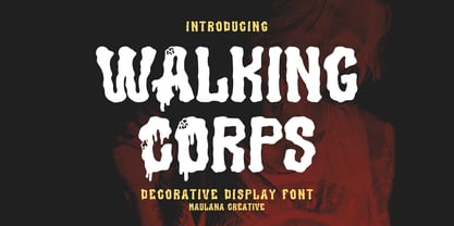 Walking Corps decorative display font, fun character with a bit of ligatures and alternates. To give you an extra creative work. Walking Corps font support multilingual more than 100+ language. This font is good for logo design, Social media, Movie Titles, Books Titles, a short text even a long text letter and good for your secondary text font with script or serif. Make a stunning work with Walking Corps font. Cheers, Maulana Creative
 - Camp Wendigo by Dear Sue,
$12.00 Camp Wendigo is a textured, hand-painted brush display font inspired by national parks, and camping in the great outdoors. Explore your logo designs, school displays, posters, signs, inspirational quotes, merch and packaging with these fun, woodsy letters! Caps Only Fonts.
 - EB Corp by Eko Bimantara,
$21.00 EB Corp designed to be fit for corporate nuances. its letterforms shaped in tune with technological feels. Its shown simplicity, minimal stroke contrast, moderate spacing. Its consist of 18 styles from Thin to Black, contain 470+ glyphs that support broad latin language, contain variation of linning figures, and some alternates glyphs.
 - Camping Holiday by Hanoded,
$15.00 My family and I are off to England for a camping holiday this summer. I have booked some small, basic campsites which are close to nature. The kids love to camp, especially since we can have a campfire at night! I was thinking about this when I worked on Camping Holiday font. It is a cute sans serif ‘book cover’ font. That doesn’t mean that you cannot use it for something else; fancy a poster? No problem. Need a font for your website? Go ahead! It’s yours for the taking!
 - The Camping by Fox7,
$12.00 The Camping is an elegant and stylish vintage slab serif font. This typeface is perfect for elegant and vintage logos, book or movie title designs, fashion brands, magazines, clothes, lettering, quotes, etc. Add this font to your favorite creative ideas and notice how it makes them come alive!
 - Remora Corp by G-Type,
$39.00 Remora is an extensive new humanist sans serif which comes in 2 style variations, the effervescent Remora Sans and its corporate business partner Remora Corp. Both styles include 5 individual width sets ranging from the condensed W1 to the extra-wide W5. Furthermore, with an impressive 7 weights (Thin to Ultra) and true matching italics in each pack Remora is an ultra versatile super family comprising 140 individual fonts, perfect for any typographic assignment or design brief. Remora was designed by G-Type founder Nick Cooke. Both the Sans and Corp families share the same proportions, with the exception of certain key characters that change the overall appearance. Remora Sans is an exuberant and characterful typeface while Remora Corp, as its name suggests, is a businesslike typeface more suited to corporate typography. Quite early on in the design process Nick decided to give Remora Corp equal billing instead of incorporating these glyphs as alternates or a stylistic set that may get overlooked. “I created two separate families after learning a valuable lesson with one of my earlier typefaces, Houschka”, says Nick. “Houschka contained distinctive rounded A’s W’s and w’s, with ‘straight’ styles as character alternates. Even though style sets and alternates are easy to activate they are rarely used, so after many requests for customised versions of the fonts with the straight characters as defaults it was decided to create the separate ‘Alt’ family. So I cut straight to the chase with the two Remora variants and created two complementary families.” Both sets contain many shared letterforms, but it is the alternate characters that significantly alter the appearance of each font. Remora has been carefully designed for optimum legibility at large and very small sizes. Although fairly monolinear in appearance, especially in the lighter weights, particular attention has been paid to optical correction like the overshoots of the curved characters. Open counters and painstaking attention to detail (e.g. weight contrast between horizontal and vertical strokes, junctions of shoulders and stems etc) all boost readability and make Remora a great choice across all media. Remora Sans and Corp are ‘humanist’ rather than ‘geometric’ in style, meaning they’re not strictly based on rectangles and circles, resulting in a warm and friendlier feel. The slightly ’super-elliptical’ rounded forms create generously attractive curves. Remora has very distinctive italics in that they are only inclined by 8 degrees, but are not just based on slanted uprights. The italic styles are very alluring when used for display at large sizes and the good news is they come bundled free with their respective uprights. Each family also contains many OpenType features including proportional and tabular numbers, small caps, discretionary ligatures, plus five stylistic sets for ultra versatile typography.
 - Horror Corps by Allouse Studio,
$16.00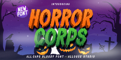 Proudly Presenting, Horror Corps a Handdrawn All Caps Bloody Font. Horror Corps is perfect for any titles, logo, product packaging, branding project, megazine, social media, or just used to express words above the background. Horror Corps also come with Multi-Lingual Support. Enjoy the font, feel free to comment or feedback, send me PM or email. Thank You!
 - Coming Together by Font Aid,
$20.00 Coming Together contains over 400 glyphs and is supplied as a single, cross-platform OpenType font. All glyphs are accessible using OpenType-savvy applications, Unicode-savvy utilities, the Character Map utility on Windows, and FontBook on Mac OS X. Nearly 400 designers contributed to “Coming Together”: Adam Humphries, Aditi Dilip, Adrien Midzic, Afraa Gutub, Al Insan Lashley, Alan Lima Coutinho, Alaric Garnier, Alejandro Cabrera Avila, Alejandro Lo Celso, Alejandro Paul, Alessandro Segalini, Alex Cameron, Alex Coblentz, Alexander Trubin, Alexandre Freitas, Alexey Murashko, Alicia Jabin, Aline Horta, Allison Dominguez, Amanda Postle, Amy Brown, Amy Papaelias, Anderson Maschio, Andrea Emery, Andres Perez, Andrew Boardman, Andrew Jesernig, Andrey Furlan, Andrij Shevchenko, Ann Tripepi, Antonio Gutierrez, Antony Kitson, Anushree Kapoor, Anya Cam, AP303 Estudio Design, Becky Krohe, Beejay, Ben Mitchell, Benjamin K. Shown, Benjamin Varin, Brad McNally, Brad Nelson, Bradley Trinnaman, Brady Baltezore, Brandon Horne, Breck Campbell, Brian J. Bonislawsky, Brian Jaramillo, Brian Jongseong Park, Brian Mueller, Brock French, Bruce Rodgers, Bruno Pugens, Bryan Angelo Lim, Buro Reng, Caitlin Martin-Frost, Calou, Carlos Fabián Camargo Guerrero, Carlos Vidal, Cayo Navarro, Cesar Puertas, Chank Diesel, Charles Williams, Chris Lozos, Chris Trude, Christophe Badani, Christy Lai, Claes Källarsson, Claire Coullon, Claudio Piccinini, Colby Cook, Craig Eliason, Cristina Pegnataro, Curve Doctor, Dan DiSorbo, Dan Liggins, Dan Rubin, Daniel Justi, Daniele Capo, Dav(id Hubner), Dave Bailey, Dave Cohen, David Jonathan Ross, David Sudweeks, David Thometz, Dawn Mercurio, Delve Withrington, Diana van de Blaak, Didier Mazellier, Diederik Corvers, Dino Santos, Dmytro Pobiedash, Donald Beekman, Dries Wiewauters, Duncan Bancroft, Ed Hoskin, Eddy Ymeri, Edineide Oliveira, Eduardo Manso, Eduardo Rodríguez Tunni, Eero Antturi, Eli Castellanos, Elias Bitencourt, Elias Stenalt Werner, Elman Padilla, Emery Miller, Emily Leong, Emily Maher, Enrico Limcaco, Eric Frisino, Eric Stine, Erik Brandt, Espen, Evan Moss, Evangeline Rupert, Fabiane Lima, Fabio Foncati, Fabrizio Schiavi, Farbod Kokabi, Felipe Lekich, Francisco Martin, Frank Riccio, Frans van Bellen, Gary Holmes, Gautam Rao, Gayle Hendricks, Gene Buban, Georg Herold-Wildfellner, George Aytoun, Gerd Wiescher, Giles Edwards, Gist Studio, Glen Barry, Glenn Parsons, Goro Mihok, Grace Engels, Grant Alexander, Grant Hutchinson, Greg Smith, Gunnar Swanson, Gustavo Machado, Hans Nieuwstraten, Harold Lohner, Hilary Salmon, Hillary Fayle, Hrant H Papazian, Hugo Gallipoli, Ian Drolet, Ian Lynam, Ilona Kincses, Isac Corrêa Rodrigues, Ivette Chacon, Ivo Federspiel, Jacques Le Bailly, Jae-hyoung Choi, Jaime Vasquez, James Edmondson, James Grieshaber, James L. Stirling, James Lukens-Gable, James Martin, James Ockelford, James Puckett, Jarbas Gomes, Jarett Knuth, Jason Adam, Jason Robinson, Javier Suzuki, Jay Chu, Jayson Zaleski, Jean Francois Porchez, Jeff Fisher, Jeff Jarvis, Jeffrey Vanlerberghe, Jelmar Geertsma, Jennifer Clarke, Jennifer Rutherford, Jens Kutilek, Jerry Allen Rose, Jess Latham, Jesse Ragan, Jessica Page, Jesvin Yeo Puay Hwa, Jim Ford, Jim Lyles, Jim Rimmer, Jin Ping, Jo De Baerdemaeker, Joachim Muller-Lance, Joanna Abbott Moss, Joe Francis, Joe VanDerBos, Joel Vilas Boas (J85), John Downer, John Flanagan, John Foley, John Langdon, John Lopez, John Lyttle, John Skelton, Johnny Dib, Jonathan Hughes, Jonathan Pierini, Jos Buivenga, Jose Luis Coyotl Mixcoatl, Juan Acosta, Judd Crush, Judith Lee, Julie Johnson, Julie Oakley, Julie Thomas, Juliet Shen, Jumin Lee, Jurgen Weltin, Justin Callahan, Justin Chodzko, Karel Piska, Karen MacKay, Karin Eberhardt, Karin van Soest, Karla Perez, Katie Parry, Katie Snape, Katri Haycock, Katy Brooks, Kelley Garrard, Kelly Redling, Kent Lew, Kevin D’Souza, Kevin J. Boynton, Kevin McDermott, Kim Arispe, Kokin, Kristen Caston, Kristen Hartman, Kristian Möller, Kristians Šics, Kyle Jones, L Bollinger, Lan Huang, Larry Van Dyke, Laura Ricker, Laura Worthington, Laurel Wilson, LeAndrea James, Lijklema Design, Linda McNeil, Lise Barreto, Louie Crumbley, Louis Duchesne, Luke Dorny, Luke Stouffer, Madison Cramer, Måns Björkman, Marc Salinas Claret, Marcus Leis Allion, Marcus Parker, Marcus Sterz, Marie-Anne Verougstraete, Mark Simonson, Martin Majoor, Matheus Barbosa, Mathias Forslund, Matt Desmond, Matt McInerney, Matt Millette, Matthew Jerauld, Max Kisman, Michael Browers, Michael Bundscherer, Michael Cina, Michael Doret, Michael G. Adkins, Michael Hernan, Michael Paul Young, Michael Wallner, Miguel Catopodis, Mikael Engblom, Mike Jarboe, Mike Petschek, Miriam Martincic, Moira Sheehan, Monica Pedrique, Nacho Gallego, Naomi Atkinson, Natanael Gama, Nathanael Ng, Neil Fox, Neil Patel, Neil Summerour, Neil Woodyatt, Ngoc Ngo, Nguyen Pham, Nicholas Curtis, Nicole Hudson, Nicole Sowinski, Nicolien van der Keur, Nina Stössinger, Noah Scalin, Ojasvi Mohanty, Oleg Macujev, Olivia Choi, Ong Fang Zheng, Pata Macedo, Patrick Gallagher, Patrycja Zywert, Paul Hunt, Paul Langman, Pedro Moura, Pedro Paz, Per Ohlsson, PJ Onori, Premm Design Ltd, Rae Kaiser, Rafael Carozzi, Rafael Cordeiro, Rafael Neder, Randy Jones, Ray Larabie, Raymond Forbes, Ressa McCray, Ricardo Esteves, Ricardo Martins, Riccardo Sartori, Richard Kegler, Richard Miller, Rob Keller, Roballo, Rose Coplon, Roy Rub, Rudo van der Velden, Russell McGorman, Ryan Rushing, Ryan Thorpe, Sander Neijnens, Sara Cross, Scott Boms, Scott Fisk, Sergio Jimenez, Shi-Min Chin, Sílvio Gabriel Spannenberg, Soohyen Park, Sorin Bechira, Stanley Friesesk, Stefan Hattenbach, Stefan Kjartansson, Stephen Lay, Steve Harrison, Steve Marsh, Steve Matteson, Steve Mehallo, Steve Zelle, Steven Bonner, Steven Wulf, Stuart Brown, Stuart Ford, Stuart Sandler, Sue Zafarana, Sulekha Rajkumar, Susan Surface, Tanya T Stroh, Taylor Loman, Ted Ullrich, Teja Ideja, Tena Letica, Terrance Weinzierl, Theo França, Thiago Martins, Tiffany Wardle, Tim Whalen, Titus Nemeth, Tom Plate, Tom Rickner, Tomato Košir, Tomi Haaparanta, Travis Kochel, Troy Leinster, Tyler Heron, Type Mafia, Vanessa Robertson, Veronika Burian, Victor Esteves, Victor Zuniga, Viktor Nübel, Viviana G, Wellinton Reis, Wilson Thomas, Wolfgang Homola, Xavier Dupre, Xerxes Irani, Zvika Rosenberg These designers represented the following countries: Argentina, Australia, Austria, Belgium, Brazil, Canada, Columbia, Croatia, Czech Republic, El Salvador, England, Finland, France, Germany, India, Ireland, Italy, Japan, Latvia, Lebanon, Mexico, New Zealand, Peru, Poland, Portugal, Scotland, Siberia, Singapore, Slovenia, Spain, Sweden, Switzerland, The Netherlands, Ukraine, United States, Venezuela, Vietnam
 - COM (sRB) - Unknown license

- PF Hellenica Pro by Parachute,
$69.00 The Golden Age of the Greek Civilization. The world’s history carved on stone. Hellenica Pro was created based on numerous photos from archaeological sites and several other historical references dating back to 1100 B.C. In order to capture the essence of this writing, there are a few alternate forms used at lowercase, uppercase and/or accented positions. These alternates come from different regions in Greece. For instance, uppercase Theta was used by the Cretans and the Korinthians, whereas uppercase Delta by the Ionians. PF Hellenica Pro comes in 3 versions: Light, regular and bold. The new ‘Pro’ version has been expanded to include 3 major scripts: Latin, Greek and Cyrillic.
 - Corps-Script-Shadow - Unknown license

- Flotsam Coming Up - Unknown license

- KR Come Monday - Unknown license

- Coming Soon Pro by Open Window,
$19.95 Coming Soon by Open Window is based on the handwriting from mom when she was in 6th grade. Solid balance, masterful strokes, and just a touch of lemonade stand for good measure!
 - The Corps 86 by Almarkha Type,
$25.00 The Corps 86 is a Sans military style font, first conceptualize was inspired by the classic vintage military stencil design. I wanted a typeface that could be a solid base for any military inspired project The Corps 86 Fonts can be used for wallpaper, pattern fills, web page background, surface textures. Perfect for making army posters , scrapbooking,invitation cards, label stickers, stationary, gift wrap, packaging, clothes, buttons, pendants, holiday gifts, print on fabrics and so much more
 - Air Corps JNL by Jeff Levine,
$29.00 What started as a small project for Mike Humphrey of Chiltern Image Service in the UK ended up as Air Corps JNL, a typeface featuring retro letters and numbers from military aircraft. Expanded to a full character set with punctuation, foreign accents, monetary figures and the like, Air Corps JNL is also available in an oblique version.
 - Night Still Comes by Ana's Fonts,
$16.00 Night Still Comes is a serif font in 4 weights, including italics, and includes over 550 glyphs for each font, including: - A-Z | a-z | 0-9 | Punctuation marks | Accents - Small caps - Ligatures - Old style & lining numbers - Superscript & subscript numbers and letters - Fractions - Swashes With classic and elegant lines, Night Still Comes is perfect for branding, magazines, resumes, and social media posts.
 - Boot Camp JNL by Jeff Levine,
$29.00 Boot Camp JNL has the same roots as Jeff Levine's Condensed Stencil JNL, as they were both modeled from a set of vintage brass interlocking stencils made by the Stafford Manufacturing Company. The previous font was drawn from limited examples of the stencils seen in an online photograph, so a number of the basic characters had to be improvised. Since then, a nearly complete set was obtained and the alphabet and numerals are truer to the original design. Additionally, both Regular and Oblique versions of Boot Camp JNL are available.
 - Coins Coupes NF by Nick's Fonts,
$10.00 Chamfer, released by Barhart Brothers & Spindler in the late nineteenth century, provided the pattern for this simple, elegant headline face. Both flavors of this font feature the 1252 Latin, 1250 Central European, 1254 Turkish and 1257 Baltic character sets.
 - Bill Corp M3 by OGJ Type Design,
$35.00 Bill Corporate M3 supports Central, Eastern European and Western European languages.
 - Camp Granada NF by Nick's Fonts,
$10.00Lettering on a 1928 poster for the Delftsh Studenten Corp provided the inspiration for this campy—and camp-like—typeface. Use it anytime you want to capture a nostalgic, outdoorsy vibe. Both versions include the complete Unicode Latin 1252, Central European 1250 and Turkish 1254 character sets, as well as localization for Lithuanian, Moldovan and Romanian. - MC Mecha Corps by Maulana Creative,
$18.00 Mecha Corps futuristic sans serif font. Heavy stroke, fun character with a bit of ligatures. To give you an extra creative work. Mecha Corps futuristic sans serif font support multilingual more than 100+ language. This font is good for logo design, Social media, Movie Titles, Books Titles, a short text even a long text letter and good for your secondary text font with script or serif. Make a stunning work with Mecha Corps futuristic sans serif font. Cheers, Maulana Creative
 - Zombies Coming Graffiti by Sipanji21,
$15.00 Zombie Coming is a display font with a monoline Dripping graffiti style, there is some swash for your awesome design. It will elevate a wide range of design projects to the highest level, be it branding, headings, wedding designs, invitations, signatures, logos, labels, and much more! Featured : Uppercase Number and Punctuation Stylistic Alternate (Swash)
 - Spring Has Come by Stefani Letter,
$12.00 Spring has come is a stylish modern handwritten script. It has an unique, striking look which can be used to make any design stand out. Incredibly versatile, this font fits a wide pool of designs, elevating them to the highest levels. Add this font to your favorite creative ideas and notice how it makes them come alive! This font is PUA encoded which means you can access all of the glyphs.
 - F2F Tyrell Corp by Linotype,
$29.99The Techno sound of the 1990s, a personal computer, a font creation software and some inspiration had been the sources to the F2F (Face2Face) font series. Thomas Nagel and his friends had the demand to create new unusual faces that should be used in the leading german techno magazine Frontpage"." - Timesquare by Campotype,
$25.00 The initial idea of timesquare typeface inspired by Helvetica when presenting the board information on a subway escalator in Time Square, Manhattan, New York. This confirms strength the legend of Helvetica is not lost amid rampant nice fonts in the site. Therefore it should not appropriate that this timesquare fonts come to rival the greatness of Helvetica. Fonts timesquare thrive (since 2008 for self used) of the basic forms of Helvetica to timesquare born in different shapes and sizes. The greatest challenge during development timesquare is both shape similarity to Helvetica directly, as well as to other fonts inspired by Helvetica. Timesquare's main characteristics are the wide character, modern touch and individually, can work well on a wide variety of applications in books, brochures and magazines as well as applications in advertising. This typeface has been developed on the Latin character sets. Hopefully useful.
 - Miedinger by Canada Type,
$24.95 Helvetica’s 50-year anniversary celebrations in 2007 were overwhelming and contagious. We saw the movie. Twice. We bought the shirts and the buttons. We dug out the homage books and re-read the hate articles. We mourned the fading non-color of an old black shirt proudly exclaiming that “HELVETICA IS NOT AN ADOBE FONT”. We took part in long conversations discussing the merits of the Swiss classic, that most sacred of typographic dreamboats, outlasting its builder and tenants to go on alone and saturate the world with the fundamental truth of its perfect logarithm. We swooned again over its subtleties (“Ah, that mermaid of an R!”). We rehashed decades-old debates about “Hakzidenz,” “improvement in mind” and “less is more.” We dutifully cursed every single one of Helvetica’s knockoffs. We breathed deeply and closed our eyes on perfect Shakti Gawain-style visualizations of David Carson hack'n'slashing Arial — using a Swiss Army knife, no less — with all the infernal post-brutality of his creative disturbance and disturbed creativity. We then sailed without hesitation into the absurdities of analyzing Helvetica’s role in globalization and upcoming world blandness (China beware! Helvetica will invade you as silently and transparently as a sheet of rice paper!). And at the end of a perfect celebratory day, we positively affirmed à la Shakti, and solemnly whispered the energy of our affirmation unto the universal mind: “We appreciate Helvetica for getting us this far. We are now ready for release and await the arrival of the next head snatcher.” The great hype of Swisspalooza '07 prompted a look at Max Miedinger, the designer of Neue Haas Grotesk (later renamed to Helvetica). Surprisingly, what little biographical information available about Miedinger indicates that he was a typography consultant and type sales rep for the Haas foundry until 1956, after which time he was a freelance graphic designer — rather than the full-time type designer most Helvetica enthusiasts presume him to have been. It was under that freelance capacity that he was commissioned to design the regular and bold weights of Neue Haas Grotesk typeface. His role in designing Helvetica was never really trumpeted until long after the typeface attained global popularity. And, again surprisingly, Miedinger designed two more typefaces that seem to have been lost to the dust of film type history. One is called Pro Arte (1954), a very condensed Playbill-like slab serif that is similar to many of its genre. The other, made in 1964, is much more interesting. Its original name was Horizontal. Here it is, lest it becomes a Haas-been, presented to you in digital form by Canada Type under the name of its original designer, Miedinger, the Helvetica King. The original film face was a simple set of bold, panoramically wide caps and figures that give off a first impression of being an ultra wide Gothic incarnation of Microgramma. Upon a second look, they are clearly more than that. This face is a quirky, very non-Akzidental take on the vernacular, mostly an exercise in geometric modularity, but also includes some unconventional solutions to typical problems (like thinning the midline strokes across the board to minimize clogging in three-storey forms). This digital version introduces four new weights, ranging from Thin to Medium, alongside the bold original. The Miedinger package comes in all popular font formats, and supports Western, Central and Eastern European languages, as well as Esperanto, Maltese, Turkish and Celtic/Welsh. A few counter-less alternates are included in the fonts.
 - Neue Haas Grotesk Text by Linotype,
$33.99The original metal Neue Haas Grotesk™ would, in the late 1950s become Helvetica®. But, over the years, Helvetica would move away from its roots. Some of the features that made Neue Haas Grotesk so good were expunged or altered owing to comprimises dictated by technological changes. Christian Schwartz says Neue Haas Grotesk was originally produced for typesetting by hand in a range of sizes from 5 to 72 points, but digital Helvetica has always been one-size-fits-all, which leads to unfortunate compromises."""" Schwartz's digital revival sets the record straight, so to speak. What was lost in Neue Haas Grotesk's transition to the digital Helvetica of today, has been resurrected in this faithful digital revival. The Regular and Bold weights of Helvetica were redesigned for the Linotype machine; those alterations remained when Helvetica was adapted for phototypesetting. During the 1980s, the family was redrawn and released as Neue Helvetica. Schwartz's revival of the original Helvetica, his new Neue Haas Grotesk, comes complete with a number of Max Miedinger's alternates, including a flat-legged R. Eight display weights, from Thin to Black, plus a further three weights drawn specifically for text make this much more than a revival - it's a versatile, well-drawn grot with all the right ingredients. The Thin weight (originally requested by Bloomberg Businessweek) is very fine, very thin indeed, and reveals the true skeleton of these iconic letterforms. Available as a family of OpenType fonts with a very large Pro character set, Neue Haas Grotesk supports most Central European and many Eastern European languages. - "Helveticrap" is a unique and distinctive font created by Michael Tension, an artist and designer known for his creative endeavors and contributions to the world of typography and graphic design. The...
- Folio by Linotype,
$29.99Folio was designed by Konrad F. Bauer and Walter Baum and appeared with the Bauer font foundry (Bauersche Gießerei) in 1957. The designers based their ideas on Helvetica but Folio did not turn out to pose the competition they had hoped. The font has the same applications as Helvetica and is an extremely legible font. Folio is particularly good for text and has an objective, neutral character. - Jam Grotesque by JAM Type Design,
$25.00 Inspired by the beautiful typefaces like Helvetica and Neue Haas Unica, this beautiful typeface looks fantastic in print as well as online.
 - Cardboard by deFUNKT,
$35.00This font was actually designed by trying to teach my helper-monkey, Philip, to cut Helvetica out of a piece of cardboard. - Benjamin by Wilton Foundry,
$29.00Wilton's "Benjamin-Regular" is a delightful twist on a classic - reminiscent of Franklin Gothic, Helvetica and Frutiger with it's own contemporary twist. - Strike Swiss - Unknown license


