10,000 search results
(0.196 seconds)
- Secretsoul by Balpirick,
$15.00 Secretsoul is a Monoline Handwritten Font. Secretsoul Monoline is a thin lettered, refined script font that emanates sophistication and elegance. Its stylish alternates and ligatures make this font the perfect match for any project. Secretsoul also multilingual support. Enjoy the font, feel free to comment or feedback, send me PM or email. Thank you!
 - Rimshot NF by Nick's Fonts,
$10.00A rather droll unicase typeface, discovered in a 1970s chapbook of suggested lettering for Soviet propaganda posters, inspired this bouncy beauty. Way more fun than a barrel of Volga Boatmen. The PC Postscript, Truetype and Opentype versions contain the complete Latin language character set (Unicode 1252) plus Central European (Unicode 1250) languages as well. - Megaphone by Red Rooster Collection,
$60.00 It was our initial intention to develop a suitable lowercase for Les Usherwood's Elston typeface, based on a few characters from an old German typeface called Hermes Grotesque (Woellmer, Berlin). The new design became Creighton. Then, for good measure we decided to experiment with a 'crisper version' of this design; the result is 'Megaphone'.
 - Travel Plans JNL by Jeff Levine,
$29.00 A 1930s travel poster from American Airlines had the airline’s name in a classic thick-and-thin Art Deco design of hand lettering. With the addition of angular spurs, some of the characters become semi-serif in nature. This type style is now available as Travel Plans JNL, in both regular and oblique versions.
 - ITC Jaft by ITC,
$29.99ITC Jaft is the work of New York designer Frank Marciuliano, an adventurous, energetic display typeface. It began with a series of posters designed by Marciuliano for the New York Times. The lettering was drawn with a bamboo pen and then filled in to create the unusual angles that give ITC Jaft its unique look. - Benoa by Creativemedialab,
$20.00 Benoa is a versatile font family for your design, consist of 6 weights from thin to black with dozens of alternates. Benoa works well with any style of design concept, from branding to a nice bold modern look! Benoa also available in Variable format, multilingual support, numbers, and currency symbols, and dozens of alternates.
 - Calhoun by Josh Grzybowski,
$19.99 Built with both thick and thin lines this display font uses heavy round terminals giving this almost didone-style font a more playful and slightly stylish look. Perfect for magazines and publications as well as for identity and branding. The character set contains typical OpenType features in addition to small caps, and old style numbers.
 - Joanna Nova by Monotype,
$50.99 The Joanna® Nova design, by Monotype Studio designer Ben Jones, is an extensive update to Eric Gill’s original Joanna typefaces and brings this much admired – but underused – slab serif typeface into the 21st century. Joanna Nova features 18 fonts – more than twice as many as the original Joanna – with a wide range of weights including thin and ultra black, which were not available in the original design. Every glyph has been redrawn using a variety of reference sources, including Gill’s original sketches and the copper patterns used in Joanna’s initial production. When Jones set out to design Joanna Nova, he saw that the ‘real Joanna’ was not immediately evident. “Some of Gill’s original drawings have a sloped ‘M’; there is also a ‘K’ and ‘R’ with a curled leg and a letter ‘d’ without the flat bottom,” he explained. “Is this Joanna? Or is it the version used to print Gill’s Essay on Typography? Or is it the digital version with which most people are surely more familiar than any other version? Ultimately, I think, none of these and all of these were ‘Joanna’ because, as with any typeface, it is more the idea or concept behind the typeface that makes it what it is. My approach was to create a version of Joanna that appears in your mind when you think of Joanna.” Jones noted that one of the most distinguishing aspects of Joanna is the italics; and that, for reasons unknown, many of the characters in the current versions are much more condensed than those in the hand-set fonts of metal type., The newer designs being almost unusable at small sizes. The italics in Joanna Nova have been reworked to be more legible and closer to their original widths. Joanna Nova expands the original Joanna in several ways that open up new typographic possibilities, These additions include several new weights, support for Greek and Cyrillic scripts, small caps for all scripts in both upright and italic styles, several numeral options and a host of context-sensitive ligatures. The Joanna Nova typeface family is part of the new Eric Gill Series, drawing on Monotype's heritage to remaster and expand and revitalize Eric Gill’s body of work, with more weights, more characters and more languages to meet a wide range of design requirements. The series also brings to life new elements inspired by some of Gill’s unreleased work, discovered in Monotype’s archive of original typeface drawings and materials of the last century.
 - Paneuropa 1931 by ROHH,
$19.00 Paneuropa 1931™ is a faithful recreation of XX-century Polish classic, made by Idzikowski foundry in Warsaw, 1931. Original Paneuropa was a renowned and highly popular typeface in XX-century Poland, and was widely used in all kinds of design, editorial use and printed materials for decades. Paneuropa is a geometric, clean and versatile font family inspired by Paul Renner's famous Futura - it is a bit narrower, with different proportions and details in drawing, completely different figures and punctuation shapes than Futura. It is an interesting and refreshing alternative to Futura with its own distinct personality and a subtle authentic vintage flavour. Paneuropa 1931 contains separate styles for display and large sizes as well as styles for small text sizes - differing in spacing and the softness of letterforms. The family features an original Paneuropa Double font - a beautiful inline style for headlines and display use. The whole family is completed with added missing inbetween styles as well as italics. The original subfamily set is available for purchase and it contains solely the original Paneuropa styles (Thin, Regular, Bold, Text Regular, Text Italic, Double). Paneuropa 1931 characteristics: letter shapes and proportions are very faithful to the original, keeping its idiosycrasies and inconsistencies spacing and kerning are carefully adjusted in order to achieve the colour of the original fonts, keeping maximum possible consistency - a compromise between authentic vintage feel and legible consistent text colour (for hardcore users: just turn off the kerning) weights precisely matching the original (Thin, Regular, Bold, Text Regular, Text Italic, Double), inbetween weights were added (Light, Demi Bold, as well as missing italic styles) italic angle faithful to the original (8 degrees) softened corners help achieving the character of old imprecise printed display styles for big sizes are sharper and have tight spacing, text styles have softer shapes (recreating small print imperfect print) and broader spacing for use in paragraph text (spacing in both display and text styles matches the original as well) original style names in Polish for devices with Polish set as their primary language The family is very versatile. The Inline style as well as bold and thin weights are perfect for headlines and display use, other styles works wonderfully as paragraph text. Paneuropa 1931 consists of 18 fonts - 5 display weights with corresponding italics + 3 text weights with corresponding italics + 2 inline styles (for big and small print sizes). It has extended support for latin languages, as well as broad number of OpenType features, such as case sensitive forms, fractions, superscript and subscript, ordinals, currencies and symbols.
 - Swissa Piccola by Jeremia Adatte,
$30.00 The Swiss typewriters were famous for their unique precision. As complex digitalizations and macro shots were a start for the inspiration and studies, each character has been carefully re-crafted from the ultra high def scans of the printouts made on a special bleed-proof paper. Today’s characters such as @, euro sign and most of accents have been crafted according the original alphabet design. The idea was to digitize and keep a saving of the original typewriter including all its functions (e.g. underlining key) . It’s surprisingly very legible at small sizes. Thanks to an x-height tighter and more spaced, a glyph design less detailed and more neutral/simple than other fonts found on american or italian typewriters. The final artwork can be set at very large sizes due to the highly detailed glyph design. Swissa Piccola Regular is loaded with more than 150 glyphs created with the typewriter to avoid letter repetition in a word. This OpenType feature can be accessed through the 'discretionary ligatures' option. Plus it comes with two stylistic sets : one with an original underlining feature, another with a slashed-x feature. In which all characters are unique and also have been originally typed with the typewriter. It contains more 600 glyphs in total. The two features are separated in another two fonts (Swissa Piccola Slashed x and Underlined) in case a non OT-savvy app is used. If you wish to obtain exactly the same prints as the original Swissa Piccola typewriter, you should set your font at 11.3 pt and 19.5 pt of line spacing. The Swissa Piccola font was originally offered in a dedicated limited edition packaging.
 - VLNL Agitka by VetteLetters,
$30.00 As a font designer for films Henning Brehm delivers fonts with a whip-sharp eye for precision. His latest Vette Letters release, VLNL Agitka is a Cyrillic-inspired (and including) alphabet with both feet rooted in Soviet Union-era propaganda posters. Its design is constructivist (look Mom, no curves!) geometric and strong. Like Russian vodka. Aside from the Regular, Light, Bold and Black weights, Agitka comes in four Neon styles as well. For a dazzling design effect, layer those neons over a regular weight for a star struck embossed-letter effect. We would also like to point out the usage of VLNL Agitka in the Bourne Ultimatum movie, for which Brehm designed neon signage for a scene at a Russian supermarket. За здоровье – Za Zdarovje!
 - Touch Me by Latinotype,
$69.00 Touch Me is a Script hand-drawn style typeface—designed by Coto Mendoza—resulting from polyrhythmic exploration, sign deconstruction and altered calligraphic contrast plays with watercolour brush. Coto has been using these experimental calligraphy techniques when creating the catchwords for Macarons, the Boho Family, Bikini Season Script and Matcha Script and so forth. Touch Me was inspired by a character in a story written by Coto while attending a literary workshop with Ina Groovie in Santiago de Chile. The character is a tribal girl who lives on an island in the Caribbean. She is heir of ancestral knowledge and possesses wild beauty, very passionate and sensual: intense, strong and free. These features are reflected in the polyrhythm of the typeface's curves: an irregular baseline, variable x-height, different lengths of initial and terminal strokes (that sometimes expand and sometimes shrink) and amount of brush pressure that generates changes in contrast within the characters. This way, when composing, signs with stroke contrast randomly alternate with monolinear ones and with signs of altered contrast, thanks to the typeface's OpenType programming. The family, with more than 3,000 glyphs, provides a number of alternative characters, swashes, ligatures, initial and terminal forms, in short, a vast ocean of choices! Touch Me is a spontaneous typeface with a fresh and unique personality. It is the perfect choice for short text in both print and digital formats. The family comes with a Script Regular version and a seductive Script Drop that you will enjoy a lot! The Extras set includes some catchwords, dingbats and ornaments that allows for endless composition options. The family also comes with a Caps version —designed by Luciano Vergara—in 2 styles: a funny and big-headed condensed Sans Grotesk display of inverted vertical proportion plus a Grotesk, neutral and slightly expressive Petite. Both versions, available in 6 weights, have been especially designed to create hierarchies when composing. This allows for balance between strokes of different weight when it comes to the Sans and Script fonts. Come and dare yourself! Touch Me! Thanks Alisa for sharing your amazing and beautiful picture with us.
 - Type Ultimate by VP Creative Shop,
$39.00 Type Ultimate is an exquisite serif font that combines elegance and sophistication. It comes in regular and italic versions, each containing a stunning collection of 383 ligature glyphs and alternate glyphs, as well as 26 swashes for both regular and italic versions. With its extensive character set, Type Ultimate supports a wide range of languages, making it a versatile choice for various projects. This font is perfect for creating a memorable logo, establishing a strong brand identity, and making headlines that stand out. Its timeless and refined design also makes it an excellent choice for elegant wedding invitations and other formal occasions. Overall, Type Ultimate is a font that exudes beauty and refinement, adding a touch of sophistication to any project it's used in. Language Support : Afrikaans, Albanian, Asu, Basque, Bemba, Bena, Breton, Chiga, Colognian, Cornish, Czech, Danish, Dutch, Embu, English, Estonian, Faroese, Filipino, Finnish, French, Friulian, Galician, Ganda, German, Gusi,i Hungarian, Indonesian, Irish, Italian, Jola-Fonyi, Kabuverdianu, Kalenjin, Kamba, Kikuyu, Kinyarwanda, Latvian, Lithuanian, Lower Sorbian, Luo, Luxembourgish, Luyia, Machame, Makhuwa-Meetto, Makonde, Malagasy, Maltese, Manx, Meru, Morisyen, North Ndebele, Norwegian, Bokmål, Norwegian, Nynorsk, Nyankole, Oromo, Polish, Portuguese, Quechua, Romanian, Romansh, Rombo, Rundi, Rwa, Samburu, Sango, Sangu, Scottish, Gaelic, Sena, Shambala, Shona, Slovak, Soga, Somali, Spanish, Swahili, Swedish, Swiss, German, Taita, Teso, Turkish, Upper, Sorbian, Uzbek (Latin), Volapük, Vunjo, Walser, Welsh, Western Frisian, Zulu Ligatures Uppercase - AB,AC,AD,AG,AK,AL,AM,AN,AP,AR,AS,AT,AV,AY,BE,BL,BO,BU,CE,CH,CK,CO,CT,DE,DI,DO,EA,ED, EE,EF,EI,EL,EM,EN,EP,ER,ES,ET,EV,EX,EY,FA,FE,FF,FI,FO,FR,FT,FU,GA,GE,GH,GO,GR,HA,HE,HI, HO,HT,KE,KI,KN,LA,LD,LE,LF,LI,LL,LO,MA,ME,MI,MM,MO,MP,MU,NA,NC,ND,NE,NG,NK,NO,NS,NT, NY,OA,OD,OK,OL,OM,ON,OO,OP,OR,OS,OT,OU,OW,PA,PE,PL,PO,PP,PR,RA,RD,RE,RI,RO,RR,RS,RT, RY,SA,SE,SH,SO,ST,SU,TA,TE,TH,TI,TL,TO,TR,TS,TT,TU,UG,UL,UN,UR,US,UT,VE,VI,WE,WH,WI,WO,YO, YS,MEN,WER,FRO,RON,ROM,THE,AND,ING,HER,HAT,HIS,THA,ERE,FOR,ENT,ION,TER,WAS,YOU,ITH, VER,ALL,THI,TIO,OUL,ULD,IGH,GHT,AVE,HAV,ICH,HIC,HIN,HEY,ATI,EVE,HING,WERE,FROM,THAT,THER, TION,OULD,IGHT,HAVE,THIS,THIN,THEY, ATIO,EVER,MENT Lowercase - ab,ad,ag,ai,ak,al,am,an,ap,as,at,av,ay,ba,be,bl,bo,bu,ca,ce,ch,ck,co,ct,de,di,do,ea,ec,ed,ee,ef,eg,ei,ej,el,en,ep,es,et,ev,ew,ey,fa,fe,fi,fo,fr,fu,ga,ge,gh,gi,gr,ha,he,hi,ho,ht,ic,id,ie,ik,il,im,in,io,ir,is,it,iv,ke,ki,kn,la,ld,le,lf,li,lo,ly,ma,me,mi,na,nc,nd,ne,ng,ni,nk,nl,no,nt,ny,oa,oc,od,of,oi,ok,ol,om,on,oo,op,ot,ou,ov, ow,pa,pe,pi,pl,po,pp,qu,ra,rd,re,ri,rm,rn,ro,rr,rs,rt,ru,ry,sa,se,sh,si,so,sp,ss,st,su,ta,te,th,ti,tl,to,ts,tt, tu,uc,ug,um,un,up,ur,us,ut,va,ve,wa,we,wo,xp,ye,yo,ys,men,wer,fro,rom,ron,the,and,ing,her,hat,tha, ere,for,ent,ion,ter,you,ver,thi,ght,ave,hey How to access alternate glyphs? To access alternate glyphs in Adobe InDesign or Illustrator, choose Window Type & Tables Glyphs In Photoshop, choose Window Glyphs. In the panel that opens, click the Show menu and choose Alternates for Selection. Double-click an alternate's thumbnail to swap them out. Mock ups and backgrounds used are not included. Thank you! Enjoy!
 - VVDS Pacifica by Vintage Voyage Design Supply,
$18.00 Pacifica – hand lettered elegant bold script for decorative typography inspired by American branding typography from end of XX century. Comes with different variates – filled, highlighted or pressed. Perfectly for headers, signs, logos, prints, etc. Comes with ending and some middle alternates and some standard ligatures.
 - Raimoo by Tama Putra,
$12.00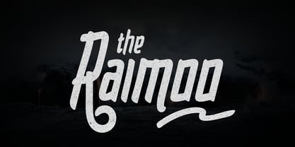 Raimoo is a handwritten typeface. It is suitable for any design needs, branding, cover title, t-shirts, posters and more. The Raimoo typeface includes multi-lingual and currency support, numerals, and punctuations. It comes comes with standard ligatures, stylistic alternates and 3 stylistic sets.
 - Aeris by Linotype,
$29.99 Aeris™ typeface is a contemporary book face created by the American designer Tom Grace. It combines the proportions and rhythm of a sans serif font with the high contrasts and flexed strokes of script faces, while the open counters also ensure optimal legibility. Tom Grace focuses on providing subtle differentiations in his cuts and, as a consequence, this font family has its own individual structure: there are A and B variants of the basic forms regular, italic, bold and bold italic, and a display version for use in titles that also comes in A and B variants. It is advisable to use the A variant for larger font sizes, while the slightly more emphasized B variant can be recommended for smaller font sizes. Where the basic forms are to be mixed together in a work, it is important to use the corresponding A/B variants throughout as their designs have been carefully coordinated. Aeris is available in the OpenType Pro format and thus includes a wide range of different glyphs. The font family can be used in various environments, such as books, magazines, advertisements and promotional materials, but it is also the perfect choice for printed corporate documentation.
 - Kalpa by Octotypo,
$15.00 The early inspiration designs for Kalpa comes from some old wrist watches dials from an iconic diving watch company. The result is a sharp and sleek design that gives an extremely strong look to the font. Kalpa comes in 4 weights and italics to make it versatile and easy to use on all kinds of media. It is a wise choice for headlines, logos, branding, packaging, publications and websites. The design comes with some alternatives glyphs which enhanced the use of the font and let you customise your letter works. The name comes from a Sanskrit word meaning a relatively long period of time to connect with its early inspirations of wrist watches dials.
 - Toonish - Personal use only

- Athoor Style by Suamzu Art,
$10.00 Athoor Style fonts are serif fonts that combine signature styles and retro textures, Athoor style fonts are very easy to use in a variety of your design work such as posters, company logos, company brochures, marketing on websites, magazines, book covers, business cards, clothes, resume and all design work, come up with your best ideas for coming up with the best style of this font. Athoor Style fonts comes with 3 kinds of fonts ligature swash alternate fonts. enjoy the best design work.
 - Hadesz PRO by JOEBOB graphics,
$28.00 Hadesz is a lusty and playful font with a rough, brushy texture. It comes with an abundance of opentype features, which make for the handwritten authenticity one looks for in a handwriting font. Hadesz comes in two versions: Basic (without ligatures) and PRO (the complete set).
 - Fragilly by Sarid Ezra,
$15.00 Fragilly is a modern calligraphic font that will make your project more stunning. It comes with cute and quirky vibes. There's also essential ligatures that will you often use! Also comes with multilingual support and PUA encoded! Sent me an email to saridezra@gmail.com for more information!
 - Hadesz BASIC by JOEBOB graphics,
$17.00 Hadesz is a lusty and playful font with a rough, brushy texture. It comes with an abundance of opentype features, which make for the handwritten authenticity one looks for in a handwriting font. Hadesz comes in two versions: Basic (without ligatures) and PRO (the complete set)
 - Squealer - 100% free

- Senella Script by Aktab Studio,
$16.00 Senella is a script font with more than 350 characters and covers several languages based on the Latin alphabet; the whole font design has also been completed with extensive alternates, ligatures and swashes sets. Senella is suitable for any design project, vintage, fashion, branding, print design and whatever design you want Thank you for visits and happy branding !
 - Baraquiel by Scriptorium,
$18.00Baraquiel is based on an interesting style of calligraphic script we found in a turn-of-the-century magazine ad. It is much more acutely slanted than most scripts, and has pretty dramatic variations in weight. Nonetheless it has high readability and works well in combination with many of our text fonts, particularly Evadare and Albemarle. - Railway Station by Jeff Levine,
$29.00 The hand lettered title on the 1911 sheet music for “That Railroad Rag” was designed in a block style letter with spurred serifs. This simple typographic layout evokes the imagery of early rail transportation although the song itself is was a ‘modern’ composition of then-popular ragtime music. Railway Station JNL is available in both regular and oblique versions.
 - Rhapsody by profonts,
$39.99Rhapsody is clearly showing Unger's love with Blackletters and Gothics. Other than many of the existing Blackletters, Rhapsody is really easy to read. The calligraphic forms of the upper case in connexion with its lower case appear very special, very unique. Rhapsody, having its origins in the 50ies, was redesigned, completed and expanded by Unger for the URW++ FontForum. - Art Exhibit JNL by Jeff Levine,
$29.00 In the 1930s the WPA (Works Progress Administration) was involved with getting a number of Americans back to work during the Great Depression. One faction of the WPA's efforts was the Federal Art Project. Thin, condensed hand lettering on a poster for an Art Exhibition at the New Bedford Free Public Library is the inspiration for Art Exhibit JNL.
 - Xenois Serif by Linotype,
$29.99“Drawing letters is my passion,” says Erik Faulhaber, the designer of the Xenois typeface family. Pronounced “zeeno-is,” the design distills character shapes into what Faulhaber believes are their purest forms. “I studied many typefaces, carefully examining their structure, before I began drawing Xenois. Then I actually wrote out a detailed design brief establishing the goals for my design.” - Sassoon Montessori by Sassoon-Williams,
$48.00 Typefaces following Montessori Institute guidelines for reading and handwriting. With these fonts, the crucial stages of letter formation are made easier for parents and teachers to produce consistent worksheets. Children should then progress towards an efficient and mature joined-up handwriting. Free to download resources: How to access Stylistic Sets of alternative letters in these fonts
 - Suomi Script by Suomi,
$80.00Suomi Script is a typeface with a twist (pun intended): it has more than 1600 ligatures with two or more glyphs connected to make it look like an odd hand-written script polished by ITC. With Open Type savvy programs this font automatically replaces single characters with the ligatures. Some hand kerning is needed here and there. - Rotisserie Menu JNL by Jeff Levine,
$29.00 A 1928 menu for the restaurant “Rotisserie Du Cardinal” had the word “Cardinal” hand lettered in quite an unusual Art Nouveau type design consisting of thick and thin lines using angles to form the letter shapes. This eccentric (yet charming) style of lettering is now available as Rotisserie Menu JNL in both regular and oblique versions.
 - MSung Gold PRC by Monotype HK,
$523.99 M Sung Gold PRC is a modulated style Simplified Chinese typeface. Modulated font designs have apparent thick-thin contrast at the strokes, and often include special design characteristics at entry, finial and transitional points of the strokes. Modulated Simplified Chinese font design category includes traditional Song, Ming or Fang Song style typefaces which are popular for continuous reading.
 - Davina by Nirmalagraphics,
$14.00 I made Davina for display purposes and it can be used for logos with a vintage style, for flyers, brochures, leaflets and more. If you like a logo with a semi-vintage style, thick, unique and clean, it means you have to buy and use Davina! This font also has Multi-Lingual support and more than 15 Ligatures.
 - Creative Thinking by Java Pep,
$17.00 Proudly present a new font that fresh from the oven Creative Thinking font, an elegant font family that has 4 weight styles regular, italic, bold, and bold-italic. It's so perfect to combining and mixing the weight styles to make outstanding and beautiful design project. Don't worry this font already with multilingual support more than 30 languages.
 - ITC Humana Serif by ITC,
$29.99ITC Humana font is the work of British designer Timothy Donaldson, an extended and versatile font family with a large array of variations. Donaldson first created ITC Humana Script with a broad-tipped pen and then went on to design the corresponding roman. ITC Humana is the perfect font for anything requiring both clarity and a touch of personality. - Krays by Pesotsky Victor,
$10.00 «KRAYS» is an ultra-thin font display. Simple structure and fine uniform strokes contrast with bold squares in the structural units. The combination of gravity and lightness. Krays supports Basic Latin and Extended Latin, Cyrillic — in total about 90 languages are supported. The font has one Regular weight. All uppercase. Krays font was designed by Viktor Pesotsky.
 - SubiktoTwo by Subtitude,
$25.00 The first flower that was created was for a the cover of a cultural magazine in Montréal (Québec). Then we couldn't stop and we've created a whole font with interesting forms of flowers. Please note that this font is unusually detailed and its complexity may exceed the memory limitations of drawing programs such as Adobe Illustrator or Corel Draw.
 - Martian B by Deltatype,
$49.00 Martian B is a sans-serif based typeface, inspired from industrial signs with semi-modular structure, suitable for using in wide ranged. Available in nine weights from Thin to ExtraBlack. Use well with sign into small print or web which support many languages with extended latin glyphs with standard of Adobe Latin 4 and world ready supported.
 - MVB Magnesium by MVB,
$39.00Mark van Bronkhorst's MVB Magnesium is based on his impressions of a style of lettering often seen on early 20th century hand-painted signage. With its thick-thin strokes and angled terminals, MVB Magnesium is a warmer, less common alternative whenever one might use a sans serif in all-caps. It is available in two widths.

