3,497 search results
(0.023 seconds)
- HardTimes Roman by Wiescher Design,
$39.50 HardTimes has been hard work, designing a handmade typeface must always have the right balance between rough and smooth, specially with this Times-like face. It has the big European glyph-set, so that it can be used all over the continent I come from. I gave this font extensive kerning. Times are too hard for boring typefaces, so try this one for a change. -Your hardworking type designer, Gert Wiescher
 - Bookvarium Roman by Letterhead Studio-VV,
$19.99 A unique display font based on the research in vintage and old fonts from the beginning of the 20th century. Perfectly work for headlines in print or can be a spice to any other design.
 - Oxonia Roman by Greater Albion Typefounders,
$10.00 Oxonia Roman is a text family, offered in two weights and two widths, deriving it’s inspiration from classic Roman typefaces. It is intended for the setting of text legibly in quantity, and compliments our Anavio and Vectis faces particularly well.
 - Trooper Roman by DTrooper Foundry,
$30.00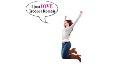
- Roman MF by Masterfont,
$59.00 - Ames' Roman by Greater Albion Typefounders,
$16.00 Ames’ Roman is a stylish ‘New-Style’ Didone Roman family offered in divers weights and widths. It is designed to embody clarity combined with dramatic contrast between horizontal and vertical strokes. All typefaces include small capital forms, new and old style numerals (and indeed ‘small capital’ numerals for consistency). Ames’ is a Roman with the charm of the past and the spirit of the future! It’s ideal for headings and titles and anywhere else you need text of distinction. Watch out for the forthcoming Ames’ Text…
 - Elongated Roman by Aboutype,
$24.99An ultra light thins all caps Victorian design with a slight stroke contrast. Elongated Roman requires subjective display kerning and compensation. - Old Roman by Mad Irishman Productions,
$6.00Intrigued by typefaces of the late 18th and early 19th centuries, the designer was surprised to find no digital renderings of the popular Old Roman typeface. This font is the designer's interpretation of this c. 1895 typeface designed by T.W. Smith. - Marble Roman by MADType,
$21.00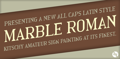
- SoftTimes Roman by Wiescher Design,
$39.50 Designing SoftTimes has been easy on my nerves after the strain of HardTimes. The harder the Times are the more do we need some soft typefaces, this one is the soft counterpart for HardTimes. -Your softspoken typedesigner, Gert Wiescher
 - Roman Wells by Wooden Type Fonts,
$15.00 A revival of one of the popular wooden type fonts of the 19th century, suitable for display, heavy stems, very thin serifs, short descenders. Heavily revised, very much improved, extensive kerning. Now in otf and ttf formats.
 - Elongated Roman by Red Rooster Collection,
$45.00 Elongated Roman is a Didone-style serif typeface. It was originally designed in 1950 by typographers at Stephenson Blake. After International TypeFounders, Inc. acquired exclusive licensing rights to the Stephenson Blake Collection, Steve Jackaman (ITF) digitally revived the typeface in 1997 for the Red Rooster Collection. Much like other Didone typefaces, Elongated Roman’s strong contrast between thick and thin strokes and hairline serif design strengthen its elegance as a “modern face.” Unlike other Didone typefaces in the Red Rooster Collection, Elongated Roman was designed with display size in mind thanks to its strong variance in stroke weight.
 - Monolith Roman by ABC Types,
$45.00 - Informal Roman by ITC,
$29.00Informal is the work of lettering designer Martin Wait and is reminiscent of the late 1940s and early 1950s. Informal is worthy of its name and perfect for anything with a look of the mid-20th century or simply a casual, spontaneous appearance. - Mixtra Roman by T4 Foundry,
$21.00Mixtra is a versatile and complete type family designed by Bo Berndal. The three Mixtra family branches are Roman, Sansserif and Slabserif, each with a full set of weights. The Roman also has a Small Caps font. Combining the three family members is a good starting point for creating a coherent typographical design. Mixtra works well in magazines and all sorts of print in need of a strong visual identity. "Mixtra is a multiface", says Bo Berndal. "With or without serifs, or with powerful slabserifs, you can pick the version that best suits the design and printing technique you have chosen." - Tresillian Roman by ITC,
$29.99 - Romans Lovers by Alit Design,
$12.00 Introducing Roman Lover Elegant typeface + Bonus Boho Illustrations The Roman Lover Serif typeface is an elegantly themed font that has a dynamic serif style. The details of the shape of the "Roman Lover Serif Elegant typeface" are very smooth and flow to create unique and beautiful curves. Elegant Serif typefaces such as “Roman Lover Serif Elegant typeface” are very easy to apply to any design, especially those with an elegant and smooth concept, besides that this font is very easy to use both in design and non-design programs because everything changes and glyphs are supported by Unicode (PUA). The Roman Lover Serif Elegant typeface contains 573 glyphs with many unique and interesting alternative options. Plus, there's a cool serif font family for header and description text from Thin to Heavy. In the poster preview all the letters are in the Roman Lover Serif Elegant typeface.
 - Medium Roman by Monotype,
$29.99Medium Roman is an engravers, all-capitals font for invitations and stationery. Particular characteristics of the Medium Roman font are the tail on Q and the spurs on J and U. - Kingston Roman by Letterena Studios,
$17.00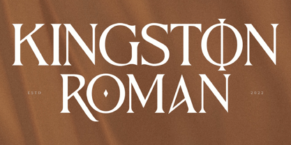 Kingston Roman is a modern and classic serif typeface with a unique style and fancy look. This typeface is perfect for an elegant & luxury logo, book or movie title design, fashion brand, magazine, clothes, lettering, quotes, and so much more. **Uppercase
 - Spry Roman by Stephen Rapp,
$49.00 Handmade, expressive, lively, organic— …words typically used to describe a script font or a casual sans. Spry Roman opens up new possibilities. It’s origin is handwritten letters created using a pointed nib on slightly toothy paper. While based on a Roman form, the letters are designed to break out of the mold and dance along the baseline. Spry Roman Pro is a fully featured opentype font. Among the 964 glyphs are loads of alternate characters and swash letters; a full set of small caps; simple fractions; case sensitive punctuation; and a variety of ornaments, border elements, and flourishes. It also includes a full dose of language support for not only main characters, but also for alternates and small caps. Ligatures have been kept to a minimum to allow users the option of tracking text. **Please note that the Pro version has all the glyphs of the others combined. The smaller versions are for those who don't have opentype savvy apps like Adobe Illustrator.
 - Bechamel Roman by Andinistas,
$39.00 BECHAMEL ROMAN was born interpreting unicase letterings of the movie "Willy Wonka and the chocolate factory". Later these ideas matured with flexible tip nib and paper mixing their naive proportions with some classic ingredients of Baskerville, Bodoni, Didot, Round Hand Script, Graffiti and labels found in Venezuela and Colombia. BECHAMEL ROMAN designed to be combined with Bechamel. BECHAMEL Script, Vein, Words & Ornaments were hand drawn to design words and phrases in logos, packaging, posters, envelopes and greeting cards. BECHAMEL ROMAN 1,2,3 & 4 is an experimental font family designed by #carlosfabiancg. It includes an irregular look to communicate craftsmanship. Its multiple upper cases with condensed width and naive lines are notable for their expressive drawing with a high amount of contrast between thick and thin strokes.
 - Classic Roman by Monotype,
$40.99. - Roman Shaded by URW Type Foundry,
$35.00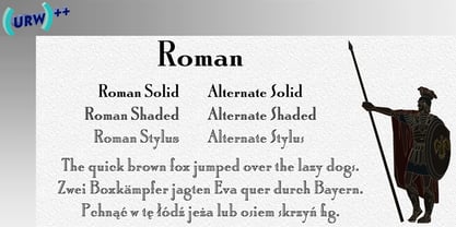
- Neuf by Velvele,
$9.99 Neuf family is an experimental search for new Art Deco letterforms, which are still easy to read and generate some unexpected attention.The distinguishes Neuf favoured by Art Deco and its predecessor Art Nouveau with a modern design touch. The style of Neuf is characterized by geometric shapes and craft motifs with Machine Age imagery and materials.
 - Roma by Canada Type,
$29.95 Tom Lincoln's award-winning type design work since the 1960s has been one way or another of expressing his fascination for the Roman majuscules inscribed at the base of the Trajan Column in Rome. This time he has really outdone himself by bringing us Roma, a definitive, contemporary, mature sans serif expression of those majuscules. With Roma, Lincoln is not satisfied with simply creating a proper "Trajan Sans". He goes on to make it a family of four weights, with built-in small caps and oldstyle figures, then he really goes to town with the options he makes available for shading and multi-color settings. Precise renderings of the Roma capitals are provided in different fonts that can function individually or be layered atop each other for two- or three-color treatments. The Roma family comes with extended language support that spans the majority of Latin-based languages. For more information on the design, complete character sets, technological features, and print tests, consult the accompanying PDF.
 - Oman by Par Défaut,
$35.00 With five weights and four contrasts, all grouped in three version : sans-serif, slab, serif and all this doubled by a true italic, Oman regroup 120 different styles declined in four variables. Perfect from headlines to text, Oman will meet your needs with a many languages to support (Latin pro, Cyrillic), 14 OpenType features (Fraction, Numerator, Denominator, Tabular figure, Oldstyle figure, Small capital, Small capital from capital, Ordinal, Stylistic set, Case sensitive, Discretionary ligature, Contextual alternate and All access alternate). • Numerator and Denominator includes numerals and currency • Tabular Figure includes : numerals, currency, OldStyle numerals, small capital numerals, small capital currency. • Small Capital features includes the Latin & Cyrillic alphabet with the accents. • Ordinal feature includes the Latin & Cyrillic alphabet. • Two Stylistic set for “a” & “g” includes accents. • Discretionary Ligature includes “AE”, “AÉ”, “IJ”,“OE”, available in lowercase, small capital and ordinal. • Contextual Alternate includes ligatures for arrows : <-->^|v|<->v^|. Add n, d or +, for numerator, denominator or case arrows. All Case sensitive characters become after the uppercase and number.
 - PF Hellenica Pro by Parachute,
$69.00 The Golden Age of the Greek Civilization. The world’s history carved on stone. Hellenica Pro was created based on numerous photos from archaeological sites and several other historical references dating back to 1100 B.C. In order to capture the essence of this writing, there are a few alternate forms used at lowercase, uppercase and/or accented positions. These alternates come from different regions in Greece. For instance, uppercase Theta was used by the Cretans and the Korinthians, whereas uppercase Delta by the Ionians. PF Hellenica Pro comes in 3 versions: Light, regular and bold. The new ‘Pro’ version has been expanded to include 3 major scripts: Latin, Greek and Cyrillic.
 - Nue - Personal use only

- LT Aspirer Neue - 100% free

- LT Afficher Neue - 100% free

- Obti Sans Neue - 100% free

- Grandesign Neue Serif - Unknown license

- Flower Sketch Neue by Okaycat,
$29.95 Okaycat presents "Flower Sketch Neue". Flower Sketch Neue contains beautiful illustrations of sunflowers, roses, tulips, olives, and leaves. You may also like our other fonts Flower Sketch and Orchids.
 - Neue Haas Unica by Linotype,
$53.99 The Neue Haas Unica™ family is an extended, reimagined version of the Haas Unica® design, a Helvetica® alternative that achieved near mythical status in the type community before it virtually disappeared. Originally released in 1980 by the Haas Type Foundry and designed by Team ’77 — André Gürtler, Erich Gschwind and Christian Mengelt— for phototypesetting technology of the day, the design was never successfully updated for today’s digital environments – until now. Toshi Omagari of Monotype Studio has given this classic a fresh, digital facelift with more weights, more languages and more letters to meet today’s digital and print needs. Available in 18 styles, the Neue Haas Unica family is remarkably appropriate for a wide range of applications, possessing a delicate gradation of weights and clear character shapes. The family's lighter weights are perfect for headlines and other large settings, as well as small blocks of copy at typical text sizes. The regular, medium and bold weights know no boundaries and the heavy and black designs are ideal for when typography needs to be powerful and commanding. Like the Neue Helvetica and Univers Next typefaces, the Neue Haas Unica family can be used just about anywhere – or for any project. In addition to its 9 tailored weights and complementary italics, the Neue Haas Unica family also possesses additional characters for Eastern and Central European, Greek and Cyrillic language support, which did not exist in the original design. A cosmopolitan typeface for today's modern, discerning design needs, the Neue Haas Unica collection is a new classic in the making—one that every designer should surely have at their disposal.
 - Neue Frutiger Paneuropean by Linotype,
$79.00During planning for the new Roissy Charles de Gaulle airport in Paris at the beginning of the 1970s, it was determined that the airport's signage system had to include the clearest and most legible lettering possible. The development of all signage was put into the hands of Adrian Frutiger and his studio. The team carried out their task so effectively that a huge demand for their typeface soon arose from customers who wanted to employ it in other signage systems, and in printed materials as well. The Frutiger® typeface not only established new standards for signage, but also for a range of other areas in which a clear and legible design would be required, especially for small point sizes and bread-and-butter type. The typeface family that which emerged as a result of this demand was added into the Linotype library as "Frutiger" in 1977. Frutiger Next, created in 1999, is a further development of Frutiger, not necessarily a rethinking of the design itself. It was based on a new concept, the most obvious visual characteristics of which is the larger x-height, as well as a more pronounced ascender height and descender depth for lower case letters in relation to capitals. This new design created a balanced image and included considerably narrower letterspacing. Frutiger Next meets the demand for a space-saving, modern humanist sans. 2009's Neue Frutiger is a rethink of the 1977 Frutiger family, now revised and improved by Akira Kobayashi in close collaboration with Adrian Frutiger. Despite the various changes, this "New Frutiger" still fits perfectly with the original Frutiger family, and serves to harmoniously enhance the weights and styles already in existence. The perfect mix, guaranteed Neue Frutiger has the same character height as Frutiger. As a result of this, already existing Frutiger styles can be mixed with Neue Frutiger where necessary. Likewise, Neue Frutiger is perfect for use alongside Frutiger Serif. Newly added are the "Neue Frutiger 1450" weights. Especially for the requirements of the newly released German DIN 1450 norm we have built together with Adrian Frutiger specific weights of the Neue Frutiger. The lowercase l" is curved at the baseline to better differentiate between the cap "I", additionally the number "0" has a dot inside to better differentiate between the cap "O", and the number "1" is now a serifed 1. The font contains additionally the origin letterforms from the regular Neue Frutiger font which can be accessed through an Opentype feature." - Armature Neue Sans by fontBoy,
$15.00 Armature Neue Sans is an extension of the original Armature Neue family released in 2010. Like Armature Neue, Armature Neue Sans consists of six weights with accompanying italics. Armature is one result of my interest in typefaces that are constructed, rather than drawn. Although it is basically a monoline design, there are subtle details throughout that compensate for a monoline’s evenness. As with all fontBoy fonts, there are dingbats hidden away in the dark recesses of the keyboard. When I first started designing this face in 1992, I called it Dino - I thought I would name all my fonts after famous pets, so the dingbats for Armature are dinosaurs. To access the alternate characters (closed counter B and R, and others) use Stylistic Set 1 or the glyphs palette in your OpenType-enabled application. Designed by Bob Aufuldish with editing and production by Psy/Ops.
 - TT Firs Neue by TypeType,
$39.00 TT Firs Neue useful links: Specimen | Graphic presentation | Customization options TT Firs Neue is reborn! We have rethought the font to introduce the next-generation typeface. After analyzing each contour and graphic element, we rebuilt the font, preserving its best features while making any necessary adjustments. We have created a flawless and modern sans serif using the new technical capabilities of the studio. TT Firs Neue is a Scandinavian sans serif that combines expressive graphic elements with the versatility of use. In the latest 2023 edition, the font's display elements have become even more attractive, while the overall font balance has also been improved. This is the result of the visual research we did before working on the update. Here is what has changed. The visual elements of the font are now logically coherent. We got rid of the ones that did not suit the font's concept and kept the most attractive ones. The changes affected letters with diagonal strokes "M, N, И", and figures "2, 3, 6, 9". All round characters' shapes have been standardized for all font styles. In the previous version, all glyphs looked different: more square or oval, depending on the font's weight. We made the shapes consistent for the font to feel more integral. Glyphs containing bowls have also changed. We have worked on the balance, altering the height and shape of the bowls. Like rounded ones, we aspired to make the glyphs more balanced for all font styles. The shapes of the letters "J, M, N, S, W, З, И" and Black font style characters have changed. The individuality of these glyphs was slightly different from the whole set, which became apparent in larger sizes. We have improved the shapes and made them more suitable for the font's style. Letters with diagonal strokes and triangular glyphs, such as "A, V, Y, D". We have brought the characters to a consistent logic in their shapes by refining the angles and weight of diagonals in different font styles. The glyphs' terminals follow the same logic in the new version. We have preserved and perfected the old shapes. Ligatures and stylistic sets have been updated entirely and expanded. We have researched Scandinavian languages and designed ligatures and diacritical sets that would definitely be useful for designers. We have redesigned diacritical marks, figures, and punctuation marks. Now all characters follow the same logic and contribute to a well-balanced impression of the font. The character set in each font style has been increased from 934 to 1719, and the number of OpenType features—from 24 to 40. The new font includes 23 font styles: 11 roman, 11 italic, and 1 variable font. The variable font has also become a significant technological advancement for TT Firs Neue. We retained a warm sentiment towards TT Firs Neue's previous success while redesigning the font and implementing substantial alterations. The 2023 font has been developed according to new technical standards that have become significantly higher in the past 5 years. TT Firs Neue is a font well-suited for a wide range of contexts. It can be used for headings, text fragments, visual merchandising and building decoration, and the web. The font is visually aesthetic on podcast and video covers and is an ideal choice for packaging design and brand identity. TT Firs Neue OpenType features: aalt, ccmp, locl, subs, sinf, sups, numr, dnom, frac, ordn, tnum, onum, lnum, pnum, case, dlig, liga, c2sc, smcp, ss01, ss02, ss03, ss04, ss05, ss06, ss07, ss08, ss09, ss10, ss11, ss12, ss13, ss14, ss15, ss16, ss17, ss18, ss19, ss20, calt. TT Firs Neue language support: English, Albanian, Basque, Catalan, Croatian, Czech, Danish, Dutch, Estonian, Finnish, French, German, Hungarian, Icelandic, Irish, Italian, Latvian, Lithuanian, Luxembourgish, Maltese, Moldavian (lat), Montenegrin (lat), Norwegian, Polish, Portuguese, Romanian, Serbian (lat), Slovak, Slovenian, Spanish, Swedish, Swiss German, Valencian, Azerbaijani, Kazakh (lat), Turkish, Uzbek (lat), Acehnese, Banjar, Betawi, Bislama, Boholano, Cebuano, Chamorro, Fijian, Filipino, Hiri Motu, Ilocano, Indonesian, Javanese, Khasi, Malay, Marshallese, Minangkabau, Nauruan, Nias, Palauan, Rohingya, Salar, Samoan, Sasak, Sundanese, Tagalog, Tahitian, Tetum, Tok Pisin, Tongan, Uyghur, Afar, Asu, Aymara, Bemba, Bena, Chichewa, Chiga, Embu, Gikuyu, Gusii, Jola-Fonyi, Kabuverdianu, Kalenjin, Kamba, Kikuyu, Kinyarwanda, Kirundi, Kongo, Luba-Kasai, Luganda, Luo, Luyia, Machame, Makhuwa-Meetto, Makonde, Malagasy, Mauritian Creole, Meru, Morisyen, Ndebele, Nyankole, Oromo, Rombo, Rundi, Rwa, Samburu, Sango, Sangu, Sena, Seychellois Creole, Shambala, Shona, Soga, Somali, Sotho, Swahili, Swazi, Taita, Teso, Tsonga, Tswana, Vunjo, Wolof, Xhosa, Zulu, Ganda, Maori, Alsatian, Aragonese, Arumanian, Asturian, Belarusian (lat), Bosnian (lat), Breton, Bulgarian (lat), Colognian, Cornish, Corsican, Esperanto, Faroese, Frisian, Friulian, Gaelic, Gagauz (lat), Galician, Interlingua, Judaeo-Spanish, Karaim (lat), Kashubian, Ladin, Leonese, Manx, Occitan, Rheto-Romance, Romansh, Scots, Silesian, Sorbian, Vastese, Volapük, Võro, Walloon, Walser, Welsh, Karakalpak (lat), Kurdish (lat), Talysh (lat), Tsakhur (Azerbaijan), Turkmen (lat), Zaza, Aleut (lat), Cree, Haitian Creole, Hawaiian, Innu-aimun, Lakota, Karachay-Balkar (lat), Karelian, Livvi-Karelian, Ludic, Tatar, Vepsian, Guarani, Nahuatl, Quechua, Russian, Belarusian (cyr), Bosnian (cyr), Bulgarian (cyr), Macedonian, Serbian (cyr), Ukrainian, Kazakh (cyr), Kirghiz, Tadzhik, Turkmen (cyr), Uzbek (cyr), Lezgian, Abazin, Agul, Archi, Avar, Dargwa, Ingush, Kabardian, Kabardino-Cherkess, Karachay-Balkar (cyr), Khvarshi, Kumyk, Lak, Nogai, Rutul, Tabasaran, Tsakhur, Buryat, Komi-Permyak, Komi-Zyrian, Siberian Tatar, Tofalar, Touva, Bashkir, Chechen (cyr), Chuvash, Erzya, Kryashen Tatar, Mordvin-moksha, Tatar Volgaic, Udmurt, Uighur, Rusyn, Montenegrin (cyr), Romani (cyr), Dungan, Karakalpak (cyr), Shughni, Mongolian, Adyghe, Kalmyk.
 - VLNL Neue Sardines by VetteLetters,
$35.00 Sardines is a project by Jacques Le Bailly aka Baron von Fonthausen. It first saw the light as a student project for a monospaced font and eventually grew into Vette Letters’ largest font family. We saw its potential and expect it to be a million seller, just like our other typefaces. VLNL Sardines comes in 42 different variations, like rough and clean cuts, regular and condensed widths (condensed is the exactly half of the regular width). Sardines is an eclectic mash of classic curves and mathematical measurements, leaving a very distinct typographic flavor. While most of our type is market-fresh, this one comes out of the can, but it’s delicious nonetheless. And it’s great for adventurous BBQ-ing!
 - Torah Neue MF by Masterfont,
$59.00 - ST Remona Neue by Skinny Type,
$18.00 ST Remona Neue is a confident serif. Designed to reflect nature, it creates a sense of softness and natural expression. We pushed the concept in a usability-focused direction, to work as a bold tool and a beautiful communicator. ST Remona Neue allows for fluid designs in 3 styles. Regular, Italic, Outline and Latin based main language. The right slant advances aesthetics, brings energy and makes it suitable for modern design. The type family blends organic curves and soft repetition into strong and harmonious types. At large dot sizes you can appreciate the shape of the letters, while the same control and focus creates an even texture for small dot sizes and long reads. Fonts extend their use by providing a variety of unique language and style supports. The ST Remona Neue character set combines additional symbols, style alternatives, unique binding, and case sensitive punctuation - resulting in a stable, hardworking family ready to tackle projects of any size. Happy Designing


