9,144 search results
(0.107 seconds)
- Square Line Icons Medical 4 by Howcolour,
$17.00 The square icons focus on maximizing the meaning by minimizing the symbols. Let your viewers understand your data without disorientation. Use a metaphorical icon library, designed for fast, intuitive human recognition.
 - Square Line Icons Medical 2 by Howcolour,
$17.00 The square icons focus on maximizing the meaning by minimizing the symbols. Let your viewers understand your data without disorientation. Use a metaphorical icon library, designed for fast, intuitive human recognition.
 - Brave New Era (narrow) G98 - Personal use only

- Digital dream Fat Skew Narrow - Unknown license

- Di Barros by Di Barros,
$5.00 I'm Roberto Teixeira, a Brazilian graphic designer. After looking for a form quite different from the existing types, created in 2019, Di Barros Fonts Family is composed by Di Barros Regular...for while. This,form covers the following, according to the Windows character map: Basic Latin, Latin Supplement 1, Extended Latin A, Extended Latin B, Additional Latin, Cyrillic, Greek, Greek Extended, Armenian and several other special types, such as currency symbols, numbers, fractions, Roman numerals, arrows, symbol of electricity, hearts and vector images, of own authorship and more. Di Barros, with a good length, serves several languages. I think Di Barros applies to fine environments, such as jewelry stores, fashion stores, cultural events and others, where a beautiful and non-aggressive look is required. But there is no better application than the one chosen for its inspiration and creativity. Di Barros Fonts Family was made for you. Thank you for using it.
 - Carrot and Strawberry by HIRO.std,
$17.00 Carrot and Strawberry is a Playful Serif Font. This font describes about fun, cute, easy going, and easy to use. FEATURES - Support Opentype Features - Support Ligatures - Numbering and Punctuations - PUA Encoded Characters - Multilingual Support - Works on PC or Mac USE Carrot and Strawberry works great in craft, any product packaging, book, logotype, magazine, editorial, quotes and any projects that need all about cute and fun taste. Enjoy using! Thanks. HIRO.std
 - Blue Parrot JNL by Jeff Levine,
$29.00The original inspiration for Blue Parrot came from a short scene in the classic film Casablanca. For just a few seconds, the exterior of Ferrari's Blue Parrot night club is shown, complete with a wonderful hand-lettered sign... all in capital letters. Blue Parrot JNL was originally released in 2006, and it wasn't long before a few people noted that the font would also look good with a lower case alphabet. The idea of adding in lower case kicked around for a couple of years until Jeff Levine finally completed a revision of the font. In this version there's also an expanded character set thanks to the creative input of Michael Hagemann of Font Mesa. - Stereofidelic - 100% free

- Narrative BF by Bomparte's Fonts,
$39.00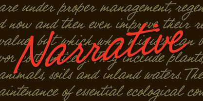 A cool handwritten script with a warm and friendly voice.
 - Code 128 - 100% free

- glow-carro-danish-spiik - Unknown license

- Boneribbon Tall - Unknown license

- ThamesCondensed - Unknown license

- U.S.A. Condensed - Personal use only

- DS CenturyCapitals - Unknown license

- Ransom - Unknown license

- KG Like A Skyscraper - Personal use only

- Garota Sans - Personal use only

- Walkway Condensed SemiBold - Unknown license

- Garota Sans SC - Personal use only

- Globet - Personal use only

- WinterthurCondensed - 100% free

- Miedinger by Canada Type,
$24.95 Helvetica’s 50-year anniversary celebrations in 2007 were overwhelming and contagious. We saw the movie. Twice. We bought the shirts and the buttons. We dug out the homage books and re-read the hate articles. We mourned the fading non-color of an old black shirt proudly exclaiming that “HELVETICA IS NOT AN ADOBE FONT”. We took part in long conversations discussing the merits of the Swiss classic, that most sacred of typographic dreamboats, outlasting its builder and tenants to go on alone and saturate the world with the fundamental truth of its perfect logarithm. We swooned again over its subtleties (“Ah, that mermaid of an R!”). We rehashed decades-old debates about “Hakzidenz,” “improvement in mind” and “less is more.” We dutifully cursed every single one of Helvetica’s knockoffs. We breathed deeply and closed our eyes on perfect Shakti Gawain-style visualizations of David Carson hack'n'slashing Arial — using a Swiss Army knife, no less — with all the infernal post-brutality of his creative disturbance and disturbed creativity. We then sailed without hesitation into the absurdities of analyzing Helvetica’s role in globalization and upcoming world blandness (China beware! Helvetica will invade you as silently and transparently as a sheet of rice paper!). And at the end of a perfect celebratory day, we positively affirmed à la Shakti, and solemnly whispered the energy of our affirmation unto the universal mind: “We appreciate Helvetica for getting us this far. We are now ready for release and await the arrival of the next head snatcher.” The great hype of Swisspalooza '07 prompted a look at Max Miedinger, the designer of Neue Haas Grotesk (later renamed to Helvetica). Surprisingly, what little biographical information available about Miedinger indicates that he was a typography consultant and type sales rep for the Haas foundry until 1956, after which time he was a freelance graphic designer — rather than the full-time type designer most Helvetica enthusiasts presume him to have been. It was under that freelance capacity that he was commissioned to design the regular and bold weights of Neue Haas Grotesk typeface. His role in designing Helvetica was never really trumpeted until long after the typeface attained global popularity. And, again surprisingly, Miedinger designed two more typefaces that seem to have been lost to the dust of film type history. One is called Pro Arte (1954), a very condensed Playbill-like slab serif that is similar to many of its genre. The other, made in 1964, is much more interesting. Its original name was Horizontal. Here it is, lest it becomes a Haas-been, presented to you in digital form by Canada Type under the name of its original designer, Miedinger, the Helvetica King. The original film face was a simple set of bold, panoramically wide caps and figures that give off a first impression of being an ultra wide Gothic incarnation of Microgramma. Upon a second look, they are clearly more than that. This face is a quirky, very non-Akzidental take on the vernacular, mostly an exercise in geometric modularity, but also includes some unconventional solutions to typical problems (like thinning the midline strokes across the board to minimize clogging in three-storey forms). This digital version introduces four new weights, ranging from Thin to Medium, alongside the bold original. The Miedinger package comes in all popular font formats, and supports Western, Central and Eastern European languages, as well as Esperanto, Maltese, Turkish and Celtic/Welsh. A few counter-less alternates are included in the fonts.
 - View Roman Black - Personal use only

- MicroExtendFLF - Unknown license

- Timesquare by Campotype,
$25.00 The initial idea of timesquare typeface inspired by Helvetica when presenting the board information on a subway escalator in Time Square, Manhattan, New York. This confirms strength the legend of Helvetica is not lost amid rampant nice fonts in the site. Therefore it should not appropriate that this timesquare fonts come to rival the greatness of Helvetica. Fonts timesquare thrive (since 2008 for self used) of the basic forms of Helvetica to timesquare born in different shapes and sizes. The greatest challenge during development timesquare is both shape similarity to Helvetica directly, as well as to other fonts inspired by Helvetica. Timesquare's main characteristics are the wide character, modern touch and individually, can work well on a wide variety of applications in books, brochures and magazines as well as applications in advertising. This typeface has been developed on the Latin character sets. Hopefully useful.
 - Neue Haas Grotesk Display by Linotype,
$33.99 The first weights of Neue Haas Grotesk were designed in 1957-1958 by Max Miedinger for the Haas’sche Schriftgiesserei in Switzerland, with art direction by the company’s principal, Eduard Hoffmann. Neue Haas Grotesk was to be the answer to the British and German grotesques that had become hugely popular thanks to the success of functionalist Swiss typography. The typeface was soon revised and released as Helvetica by Linotype AG. As Neue Haas Grotesk had to be adapted to work on Linotype’s hot metal linecasters, Linotype Helvetica was in some ways a radically transformed version of the original. For instance, the matrices for Regular and Bold had to be of equal widths, and therefore the Bold was redrawn at a considerably narrower proportion. During the transition from metal to phototypesetting, Helvetica underwent additional modifications. In the 1980s Neue Helvetica was produced as a rationalized, standardized version. For Christian Schwartz, the assignment to design a digital revival of Neue Haas Grotesk was an occasion to set history straight. “Much of the warm personality of Miedinger’s shapes was lost along the way. So rather than trying to rethink Helvetica or improve on current digital versions, this was more of a restoration project: bringing Miedinger’s original Neue Haas Grotesk back to life with as much fidelity to his original shapes and spacing as possible (albeit with the addition of kerning, an expensive luxury in handset type).” Schwartz’s revival was originally commissioned in 2004 by Mark Porter for the redesign of The Guardian, but not used. Schwartz completed the family in 2010 for Richard Turley at Bloomberg Businessweek. Its thinnest weight was designed by Berton Hasebe.
 - Neue Haas Grotesk Text by Linotype,
$33.99The original metal Neue Haas Grotesk™ would, in the late 1950s become Helvetica®. But, over the years, Helvetica would move away from its roots. Some of the features that made Neue Haas Grotesk so good were expunged or altered owing to comprimises dictated by technological changes. Christian Schwartz says Neue Haas Grotesk was originally produced for typesetting by hand in a range of sizes from 5 to 72 points, but digital Helvetica has always been one-size-fits-all, which leads to unfortunate compromises."""" Schwartz's digital revival sets the record straight, so to speak. What was lost in Neue Haas Grotesk's transition to the digital Helvetica of today, has been resurrected in this faithful digital revival. The Regular and Bold weights of Helvetica were redesigned for the Linotype machine; those alterations remained when Helvetica was adapted for phototypesetting. During the 1980s, the family was redrawn and released as Neue Helvetica. Schwartz's revival of the original Helvetica, his new Neue Haas Grotesk, comes complete with a number of Max Miedinger's alternates, including a flat-legged R. Eight display weights, from Thin to Black, plus a further three weights drawn specifically for text make this much more than a revival - it's a versatile, well-drawn grot with all the right ingredients. The Thin weight (originally requested by Bloomberg Businessweek) is very fine, very thin indeed, and reveals the true skeleton of these iconic letterforms. Available as a family of OpenType fonts with a very large Pro character set, Neue Haas Grotesk supports most Central European and many Eastern European languages. - "Helveticrap" is a unique and distinctive font created by Michael Tension, an artist and designer known for his creative endeavors and contributions to the world of typography and graphic design. The...
- Satiga by Sensatype Studio,
$15.00 Helovatica is a sans serif font with modern, corporate, elegant, unique and classy-look. This font crafted specials for logo design projects, ready to use on Logo, Branding, Magazine, Social Media, and Many more that needs modern touches. Helovatica is also included full set of: uppercase and lowercase letters multilingual characters numerals punctuation Wish you enjoy our font. :)
 - CF Arche Grotesk by Contrafonts,
$22.00 Without serifs and without exaggeration. A project that seeks simplicity, with focus on reading and coverage in many languages. Arche has 5 weights and its italics. 10 fonts ranging from Light to Black. It also has a set of styles, old and modern numbers, arrows and ornaments. Excellent alternative to standards such as Akzidenz Grotesk or Helvetica, with a contemporary look, focus on legibility and with Latin American freshness. For more information visit our website Contrafonts.cl
 - SmallTypeWriting - 100% free

- Oaxaqueña Tall - Personal use only

- Vesta by Linotype,
$29.99 In the late 1990s Gerard Unger won the assignment to design the signage system for the Holy Year celebrations to be held in Rome in 2000. The system he developed in cooperation with the design agency n|p|k used a classically inspired serif typeface, but the earlier proposals included a sans-serif, which became Vesta (2001). Vesta is a versatile family that can be used as a display face alongside Unger's serif faces Gulliver, Capitolium or Coranto; it can also be used on its own, even in longer texts. Vesta is narrower and therefore more economical than some commonly used sans serifs such as Arial and Helvetica; there is also a noticeable contrast between thick and thin parts, which makes it more lively. Vesta is to be extended with narrow versions, small capitals and old style numerals, along with some special versions for headlines.
 - Folio by Linotype,
$29.99Folio was designed by Konrad F. Bauer and Walter Baum and appeared with the Bauer font foundry (Bauersche Gießerei) in 1957. The designers based their ideas on Helvetica but Folio did not turn out to pose the competition they had hoped. The font has the same applications as Helvetica and is an extremely legible font. Folio is particularly good for text and has an objective, neutral character. - Jam Grotesque by JAM Type Design,
$25.00 Inspired by the beautiful typefaces like Helvetica and Neue Haas Unica, this beautiful typeface looks fantastic in print as well as online.
 - Cardboard by deFUNKT,
$35.00This font was actually designed by trying to teach my helper-monkey, Philip, to cut Helvetica out of a piece of cardboard. - Benjamin by Wilton Foundry,
$29.00Wilton's "Benjamin-Regular" is a delightful twist on a classic - reminiscent of Franklin Gothic, Helvetica and Frutiger with it's own contemporary twist. - Strike Swiss - Unknown license

- Squarish by The Type Fetish,
$10.00Squarish could have been the Universe or Helvetica of the 1980's, if only it was designed then. Now it is just a little quirky gridded typeface.


