8,419 search results
(0.091 seconds)
- Driven Unicase Extended by Typekirk,
$12.00 Driven Unicase Extended is sleek and modern, yet hearkens back to the first advertising to catch my eye as a kid in the glorious 1970s – automobile ads that captured the thrill of speed, for sports cars I dreamed of experiencing. Driven is available in 6 individual weights or as a family of 6 fonts, plus ornaments. Includes accented characters supporting for many European languages.
 - Silver Streak by Swell Type,
$20.00 Inspired by the streamlined lettering of trains, cars and advertisements from the 1930s and 1940s, Silver Streak is a font family that combines Art Deco elegance with refined craftsmanship and modern features. Silver Streak's contrasting strokes and tastefully rounded corners conjure an era of refined, vintage elegance. An extravagant palette of 25 weights — from gracefully tall and thin to commandingly wide and heavy, along with a variable font for unlimited options between — provide unforgettable branding possibilities for luxury items ranging from jewelry, clothing and perfume to the sleek badges of high performance sports cars. Features: Five widths from Compressed to Extended Each with five weights from Light to Heavy Complete family includes a Variable font for precise control of weight and width Support for 223 languages, including Western & Central Europe, Russian Cyrillic, Serbian/Macedonian, Ukranian and Vietnamese Alternate hook-cornered capitals (accessible as Opentype Discretionary Ligatures) Alternate round-topped A in two versions, each with international accents (accessible as Stylistic Alternates)
 - Upton by Halbfett,
$30.00Upton is a modern and condensed sans serif. The initial inspiration for its design came from lettering Wim Crouwel created for a poster design. It also takes some cues from neutral grotesks like Helvetica and Akzidenz. Because of its narrow letterforms, Upton is best applied to headlines and poster-sized typography. Upton’s italics were designed with high-quality compensation for all circles and strokes. Upton ships in two different formats. Depending on your preference, you can install the typeface as two Variable Fonts or use the family’s 14 static OpenType font files instead. Those weights run from Extralight to Extrabold. While the static-format fonts offer a good intermediary-step selection, users who install the Variable Font have vastly greater control over their text’s stroke width. The weight axes in Upton’s Variable Fonts allow users to differentiate between almost 1,000 possible font weights. That enables you to fine-tune your text’s exact appearance on-screen or in print. In its fonts, Upton has several ligatures. That includes optional “discretionary ligatures,” which bring a unique tone to display usage. For instance, the fonts include optional ligatures for the letter combinations “E-T”, “F-l”, “L-E-T-T-E”, “L-E-T-T”, “L-E-T”, “L-E-L-O”, “L-U”, “i-j”. and “m-m”. There are also many alternate glyphs. Stylistic Set 1 substitutes in new forms for “G”, “R”, “a”, “f”, “g”, “i”, “r”, “t”, and “y”. Six more Stylistic Sets have alternates for the “æ”, “g”, “k”, “o”, “K”, “O”, and “Q”. Additional OpenType features activate other useful features, such as fractions, numbers in circles, or symbols. - Certainly! Let's dive into the whimsically titled "Arrobatherapy" - a font that might just be what the doctor ordered for those craving a dose of typographic relief. Created by the prolific Harold Lo...
- Soprano by TypeThis!Studio,
$54.00 A well-polished typeface is like the sweet sound of a melodious voice. Soprano is designed for elegant and luxury design elements. Whether it's brands for watches, jewelry, cars or fine wines, Soprano adds the undeniable and outstanding beauty of a professional designed elegant typeface. Soprano offers 5 weights and a full set of upper & lowercase letters, ligatures, old-style & lining figures as well as broad Latin language support. www.typethis.studio
 - Phenotype by URW Type Foundry,
$39.99 The idea about Phenotype was to achieve a unique visual effect by touching serifs. Characters form ligatures, but every combination looks different. Touching serifs form connecting character images, e.g. like logotypes on old refrigerators or oldtimer cars, something like the fonts of Leslie Carbarga. The design idea is based on monospaced and heavy serif fonts like Courier, Isonorm Memphis or Rockwell. However, obviously, Phenotype is not a monospaced typeface.
 - Vivala Unicase by Johannes Hoffmann,
$15.00 Vivala Unicase is a modern, rounded linear grotesque that is easy to read even in small font sizes. The composition of uppercase and lowercase letters results in a unique typeface. The new version contains five weights, including a boldface, which greatly expands the design possibilities. With an extensive set of characters and symbols, it is ideal for posters, t-shirt design, promotional products, car design, labeling, trademarks and headlines.
 - Akrux by Harvester Type,
$20.00 Akrux is a futuristic variable wide font. It is inspired by forms that are close to futurism, stars and space. Everything related to space, movies, cartoons, art, books, spaceships. Ideas came from everywhere. The font is suitable for headlines, posters, logos, large typography, magazines, everything related to cars and anything that can be futuristic and meaningful. It has great language support, and Cyrillic is planned in the future.
 - P22 Ainabee by IHOF,
$24.95 Ainabee is an Art Deco inspired type design. The designer states: "The Art deco period has always fascinated me. The Architecture, The Furniture, The Car Industry, Letters etc, much of what I associate with 20s and 30s. This design is my answer to this fascination. The name is a tribute to my girlfriend Aina." The design is simple and precise in its form and is intended mainly for decorative use.
 - Triangularity - Unknown license

- Naughty Brush by Good Java Studio,
$18.00 Naughty Brush is a set of two fonts, featuring an upright an upright caps and regular slant style, and also includes extra swashes.
 - Paralucent Slab by Device,
$39.00 Paralucent Slab is an addition to the ever-popular Paralucent family. Paralucent is versatile all-purpose modern sans and slab serif design. Available in seven weights, from Thin to Heavy, with corresponding italics, it avoids some of the more eccentric calligraphic quirks of Akzidenz or Helvetica or the cool precision of Univers for an elegant, functional, yet warm design. Several core ideas inform Paralucent’s design. Prime attention has given to the negative space between characters, giving a more even “colour”, especially in text. For example, the J, L and T have shorter arms than comparable sans typefaces, while the M and W are wider. The A has a lower bar, opening up the interior counter. An unusually high lower-case x-height again helps to give a more even colour and improve legibility. Care has been taken to rationalise repeated elements like the tails on lower-case letters, or the Q and the “ear” of the g. Typographic design solutions that are consistent across all these features add more stylistic cohesion. ‘Ink traps’ are exaggerated incisions used to open up a letter's narrower internal angles, which can become clogged with ink, especially in small point sizes. Now largely redundant due to the high quality of modern print, they are still sometimes used as a stylistic quirk or design feature. Now that digital fonts are often reversed or outlined, or enlarged to enormous sizes, these can also lead to unexpected or obtrusive results. Paralucent takes these inevitable digital manipulations into account, and adds optical corrections without resort to ink traps. The family has been picked up by many UK and US publishers, featuring heavily in magazines like Loaded, Heat and TV Quick, as well as high-end coffee-table photography books and gallery websites. The addition of the Slab family adds even more options for running text and headline.
 - ÉconoSans Pro by Ingo,
$41.00 The most space-saving sans serif This font saves more space than any of its kind! Slim proportions, but not “condensed” Characters which nearly touch Sparse ascenders and descenders Distinct forms How close to each other can the characters of a font get? Theoretically, as close as you want. But obviously, the words should still be legible. And as any designer knows, body clearance of characters also depends on other parameters such as point size and line spacing. In practice, there are always situations in which as much information as possible has to be positioned in as little space as possible. The ingoFont ÉconoSans is made for exactly this purpose. Even the name of the font implies its function: French for the infinitive “to save” is “économiser.” Now if that doesn’t sound good… The shapes of the upper and lower case letters are completely matter-of-fact, the way a modern font has got to be. The letters c e, and s are wide open to their neighbors. An especially distinguished trait of this font is the design of the “triangular” characters v w y x k z and A V W Y Z K X M N. And the open form of B R and P is also not typical in a sans serif. The distance between letters is kept tight and often the characters nearly touch, but only nearly. With ÉconoSans you gain approximately 20% more text in a line than with »Tahoma«, and even still more than 10% compared to »Helvetica«. ÉconoSans also includes tabular figures as well as ligatures. Among the ligatures, the double mm is especially unusual and is hardly familiar, but can contribute greatly to saving space without catching the reader’s eye.
 - Benton Sans RE by Font Bureau,
$40.00 A redesign of drawings of News Gothic from the Smithsonian, Cyrus Highsmith and the Font Bureau studio created Benton Sans, one the most popular and versatile families in this genre. This version of the family is part of the Reading Edge series of fonts specifically designed for small text onscreen, having been adjusted to provide more generous proportions and roomier spacing, and having been hinted in TrueType for optimal rendering in low resolution environments.
 - Marttabuck by Letterhend,
$10.00 Marttabuck Script - The bold and straight-forward look script. This script comes with two types, the regular and special. The special type has its unique tiny slices which gives more personal touch and makes the font looks being customized. This font is suitable to use as a logotype, apparel, wedding invitation, signboard, sport club, motor / car, etc. This font has many opentype features like ligature, stylistic alternate, contextual alternate, swash, etc and support multi language.
 - Technical Standard VP by VP Type,
$29.00 The initial inspiration for Technical Standard VP came from examining precisely machined labels on tools from cameras to cars, which need to be legible at all sizes. The streamlined look such processes achieve was reinterpreted and refined - the resulting font at the same time being robust and stylish, universal and unique, with its ten distinct styles offering great versatility. With 1120 glyphs in each style, it guarantees full support for all Latin languages.
 - The Hooge 05_55 Cyr2 font, designed by Nikolay Dubina, is a distinctive and impactful typeface that commands attention through its bold, minimalist aesthetic. Crafted with precision and sharp geometr...
- Parisine Std by Typofonderie,
$59.00 Ultra legible forceful sanserif in 32 fonts Parisine was born as official parisian métro signage typeface. This family of typefaces has become over years one of the symbols of Paris the Johnston for the London Underground or the Helvetica for the New York Subway. The Parisine was created to accompany travelers in their daily use: ultra-readable, friendly, human while the context is a priori hostile. Meanwhile, Parisine is now a workhorse and economical sanserif font family, highly legible, who can be considered as a more human alternative to the industrial-mechanical Din typeface family. More human, but not fancy: No strange “swashy” f, or cursive v, w etc. on the italics, to keep certain expected regularity, important for information design, signages, and any subjects where legibility, sobriety came first. Born as signage typeface family, the various widths and weights permit a wider range of applications. In editorial projects, the Compress version will enhances your headlines, banners, allowing ultra large settings on pages. The Narrow version will be useful as direct compagnon mixed to standard width version when the space is limited. The various Parisine typeface subfamilies Parisine is organised in various widths and subsets, from the original family Parisine, Parisine Gris featuring lighter versions of the usual weights and italics, Parisine Clair featuring extra light styles, to Parisine Sombre with his darker and extremly black weights as we can seen in Frutiger Black or Antique Olive Nord. Many years of adjustments were necessary to refine this complex family. Initially, Parisine was designed by Jean François Porchez in 1996 for Ratp to solely fulfil the unique needs of signage legibility. Parisine remain the official corporate typeface of the public transport in Paris, the worldwide capital for tourism, and now integral part of the French touch. Directly related, Parisine Office was initially created for Ratp’s internal and external communication, Parisine Office is available at Typofonderie too. Not connected with Ratp and public transports, Parisine Plus was created as an informal version of Parisine. Parisine: Introducing narrow and compressed families About Parisine Parisine helps Parisians catch the right bus Observateur du design star of 2007
 - Ah, the elusive font EMILKOZAK.COM | fartdeco, a typographical enigma that caters to the refined taste of those who appreciate a good giggle alongside their graphic design. Picture this: the roaring ...
- Benton Sans Std by Font Bureau,
$40.00 In 1903, faced with the welter of sanserif typefaces offered by ATF, Morris Fuller Benton designed News Gothic, which became a 20th-century standard. In 1995 Tobias Frere-Jones studied drawings in the Smithsonian and started a redesign. Cyrus Highsmith reviewed News Gothic, and with the Font Bureau studio expanded it into Benton Sans, a far-reaching new series, with matched weights and widths, offering performance well beyond the limits of the original; FB 1995-2012
 - Berlewi FA by Fontarte,
$39.00 FA Berlewi is inspired by stencil lettering of a vanguard creator, Henryk Berlewi, who was a precursor of contemporary typography, a painter and a creator of the mechano-facture (Mechano-Faktura) theory. In 1924 he designed a poster for his mechano-facture one-man show in Warsaw Austro-Daimler car salon. An attention-grabbing composition with stencil lettering was doubtless a real innovation and according to Berlewi - the first typographic poster to be made in Poland.
 - Busy Day by PizzaDude.dk,
$16.00 Today has been a busy day. I managed to take the dog for a walk, go for a run, empty the dishwasher, clean the car, vacuum the entire apartment AND make this font! :) The Busy Day font is all about fun and games: it’s playful, whimsical and legible at the same time. I’ve added an Outline version, Inside and the Regular version. They all work well together or as individual fonts - and they all have multilingual support!
 - Rackem PB by Pink Broccoli,
$14.00 Rackem PB started as a digitization of a film typeface known as "Eightball" by LetterGraphics, not to be confused with Eightball that was released by other film type companies of a totally different look. This crazy typestyle had all the flavor it needed to make regular appearances in 70's sticker body modification ads for Chevrolet cars and trucks side panels. Loaded with hooptie appeal, it's something you really need to take for a ride to appreciate its novelty.
 - Vinice by Illuminaut Designs,
$15.00 This typeface was created as a personal project. Inspired by places like Chattanooga and Berkley, I wanted to create a bespoke typeface family for the US Virgin Islands. I noticed that the typeface Berlin Sans was in use all over the islands, in signs, logos, even on the side of police cars. So I built this typeface from the ground up with the goal of updating an old tried-and-true font into a family with versatile potential.
 - Anne Bonny by Melli Diete,
$50.00 Anne Bonny is a modern face with a candy touch. She is noble and confident, bloomy and playful. If you want to give your texts a warm and fabulous note, Anne Bonny is the right one. You can choose between a range of Open Type Features, for example the Swashes Feature for decorating the Upright styles letters as well as the Italics. Share your vision!
 - Andras by Alive Fonts,
$40.00 Inspired from fragments peeled from the helmet of retired stunt-man Andras Balaset, font designer Allen Mercer of Alive fonts has created an alphabet ready to give you the best performance in a variety of conditions. Andras Bold has a more noticeable casual flare with uniquely angled strokes while Andras Slim is a more polished and rigid contender. Whether hand painted on rockets, race cars or pleather jackets, Andras has been highly refined to maintain readability even while traveling at high speeds.
 - Escrow RE by Font Bureau,
$40.00 The Wall Street Journal commissioned the original version of Escrow. Cyrus Highsmith designed forty-four styles in this new Scotch series, which sets the tone of the front page of the Journal, envy of the newspaper industry. This version of the family is part of the Reading Edge series of fonts specifically designed for small text onscreen, having been adjusted to provide more generous proportions and roomier spacing, and having been hinted in TrueType for optimal rendering in low resolution environments.
 - Rail Bum JNL by Jeff Levine,
$29.00 Morris Fuller Benton's Hobo [designed in 1910] is one of a number of fonts which have been so over-used that many designers shy away from it altogether. However, Jeff Levine had often wondered what the design might look like it given a serif treatment. The result is Rail Bum JNL, named for the hobos and transients who hitched along on freight cars to ride the rails across the country during the years when trains were the mainstay of American transportation.
 - Cringe by Aiyari,
$25.00 Introducing "Cringe": a captivating typeface that draws inspiration from the mesmerizing world of psychedelic pop culture and combining it with a uncial letter form and calligraphy approach. Each character exudes a sense of whimsy and free-spiritedness. Cringe Font Family contains 5 style regular, medium, semi bold, bold, & Expanded. It comes with Stylistic set & ligatures. Ayr Cringe Font Family is best used for headings, logotype, quotes, apparel design, invitation, poster, flyers, greeting cards, packaging, book cover, printed quotes, cover album, movie, & etc
 - Rockblast by Violatype,
$10.00 Rockblast is a display font with Extruded, this font is made for those of you who like exciting styles and this unique font is perfect for you This font is perfect for various types of products, such as being printed on a skateboard, car, or product cover, headlines, quotes, adventure designs, and more. This font contains a lot of alternates and ligatures, to make your design more masculine, and bolder If you have any questions, don’t hesitate to contact us.
 - KG Manhattan Script by Kimberly Geswein,
$5.00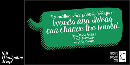 A connected, upright script font.
 - Dont Walk Run - Unknown license

- Ah, the Digital Readout Upright by ShyFoundry - it's the font that looks like it escaped from the dashboard of a 1980s sci-fi spaceship, only to find a loving home in the hearts of modern designers. ...
- Air Superfamily by Positype,
$29.00 In B-movie awesomeness, Air began as Grotesk vs. Grotesque. I was trying to unify the prevailing traits of German and English Grotes(que/k)s in order to make something different but familiar. I am NOT trying to reinvent Helvetica (snore), so get that out of your system. From the onset, I intended this typeface to be a true workhorse that offers infinite options and flexibility for the user. At its core, it is the maturation of the Aaux Next skeleton I developed years ago. I worked out Aaux Next to settle my issues and love for Akzidenz. With Aaux Next, I strove to be mechanical, cold and unforgiving with it. I was single, young, cocky and it fit. Now I'm married, kids, dog and have found that I've turned into a big softy. When I look at Aaux Next (and have for the past few years) I see another typeface trying to eek out. I wanted it to avoid the trappings of robotic sans, quick tricks and compromises. The typeface’s DNA needed to be drawn and not just generated on a screen — so I set aside a year. I love type. I love working with type. I hate when my options for a slanted complement is only oblique or italic. I set out to produce both to balance usage — there are more than enough reasons to prepare both and I want the user to feel free to consciously choose (and have the option to choose) the appropriate typeface for print, web, etc. That flexibility was central to my decision-making process. The Oblique is immediate and aggressive. The Italic was redrawn at a less severe angle with far more movement and, as a result, is far more congenial when paired with the Uprights. Condensed and Compressed. Yep, why not? I know I would use them. There are nine weights currently available. The logical progression of weights and the intended flexibility demanded I explore a number of light weights and their potential uses — this has produced a number of ‘light without being too light’ options that really work based on the size. The result is a robust 81-font superfamily that is functional, professional, and highly legible without compromising its personality. Pair that with over 900 characters per font that includes ligatures, discretionary ligatures, stylistic alternates, fractions, proportional/tabular lining and proportional/tabular oldstyle figures, numerators, denominators, ordinals, superiors, inferiors, small caps, case-sensitive functionality and extensive language support and you have a versatile superfamily well-suited for any project.
 - KG Love Somebody by Kimberly Geswein,
$5.00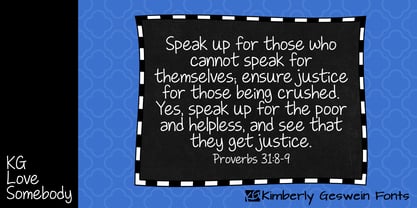 Upright, neat, and legible teen handwriting.
 - KG Piece By Piece by Kimberly Geswein,
$5.00 A neat, upright printed handwritting font.
 - Shentox by Emtype Foundry,
$69.00 During a visit to London in 2008 I fell in love with the square font used on the British car number plates. I was immediately inspired to start working on this font and have been developing it intermittently ever since. Several more trips to London and the project evolved before it finally took off and became Shentox. Despite the starting point being inspired by simple, everyday car plates, the font soon evolved into something fine and very rich in detail. Even though the square genre is very restrictive, Shentox is a highly legible contemporary font with a full range of weights, useable not only as a display family for headlines and posters, but as a distinct, clean font family for branding and general editorial use (Especially magazines). It has been carefully drawn paying extra attention to the details, high end finishes that makes Shentox a safe font for use in large scale work. For example, the curves of every individual corner have been adjusted character by character to avoid the common problems encountered with square fonts (Eg. darker corners between weights or a visually inconsistent radius between the Upper and Lowercases as a result of copy/paste). Shentox italic, which has a 12 degree slant, has been corrected to avoid distortion when slanted. The radius of the upper-right and lower-left corners are more pronounced, giving it a more fluid Italic feel. Shentox is available in Open Type format and includes ligatures, tabular figures, fractions, numerators, denominators, superiors and inferiors. It supports Central and Eastern European languages. This type family consists of 14 styles, 7 weights (Thin, UltraLight, Light, Regular, Medium, SemiBold and Bold) plus italics. Shentox PDF
 - Ah, Louvaine by Paul Lloyd Fonts – the typographic equivalent of that one friend who insists on wearing a monocle and top hat to every casual brunch. In the grand garden party of fonts, where Helveti...
- Once upon a time, in a world bursting with the solemnity of serif and the sternness of sans-serif, there emerged a font so whimsically charming and cheekily vivacious, it could only be known as Comic...
- Styling by Los Andes,
$25.00 Styling is a simple, light, sans-serif typeface inspired on old cars and planes with an aerodynamic shape. The font comes in 5 weights plus italics. Styling and Styling Alt families offer professionals a wide range of creative options. Styling was created in 2014, while its designer was 30,000 feet in the air and the plane was flying over some Latin America cities. A flight full of flavours and shapes. This typeface is the result of anxiety and speed. Keep on rollin’ and fly high with Styling!

