10,000 search results
(0.059 seconds)
- Amico by Hackberry Font Foundry,
$24.95 This is a new barely modulated, slightly narrow, sans serif font family. It has eight styles: thin, thin italic, regular, italic, bold, bold italic, black, & black italic grouped into two 4-font families: Amico Thin with the Bold; and Amico with the Black. Amico has the standard feature set developed at the end of 2007. It has many OpenType features and 654 character/glyphs: Caps, lower case, small caps, ligatures, discretionary ligatures, swashes, small cap figures, old style figures, numerators, denominators, accent characters, ordinal numbers (1st-infinity): lining and oldstyle), and so on. It is designed for text use in body copy. However, Amico really shines as the choice for heads & subheads when using Amitale or Brinar for the text family.
 - Cervo Neue Condensed by Typoforge Studio,
$29.00 Cervo Neue Condensed is the new perfected and Condensed version of Cervo Neue, containing 18 variants. It differs from the previous version of Cervo with the higher accents over glyphs, enlarged punctuation, old-style numerals and the newly added varieties Semi Bold, Bold, Extra Bold and Black. Additionally, there is the variety of grotesque. Font Cervo is inspired by a “You And Me Monthly” published by National Magazines Publisher RSW „Prasa” that appeared from Mai 1960 till December 1973 in Poland. Recently, Cervo Neue Condensed has started being used as a display text in „Przekrój Magazine” which was published in years 1945–2013 in Krakow (2002–2009 in Warsaw) as a weekly and again from 2016 as a quarterly journal in Warsaw.
 - Bodebeck by Linotype,
$29.99 The Swedish designer/typographer Anders Bodebeck designed the Bodebeck type family in 2002. The family, which includes five different styles, is primarily intended for use as a titling, or display face, and belongs to the neo-transitional style of typefaces. Transitional style type first appeared in England during the late 1750s, when John Baskerville released his first sets of type. Bodeck bears similarities to another, later transitional style typeface as well - Eric Gill's Perpetua (originally released by the British Monotype Corporation in 1928). Like these two previous English stonecutters turned masters of typography, Anders Bodebeck has given us a modern re-interpretation of classic letterforms. Bodebeck, which is fitted with old style figures, is available in the following styles: Regular, Italic, Bold, Bold Italic, and Extra Bold."
 - Qi by Cory Maylett Design,
$14.98 Qi is a display sans-serif inspired, in part, by the art deco typefaces sometimes seen on old signs along rural American backroads. Unlike these signs, Qi is new, fresh, a little bit quirky, and not at all in need of repair or a fresh coat of paint. The family is comprised of six distinct fonts with more on the way. With an entire set of Central and Western European (and, of course, American) glyphs, plus a bunch of alternates and ligatures, Qi could be the perfect display face for your next sign, poster, newsletter, headline or, well, most anything else. Hey, the lowercase alone makes these fonts well worth the price.
 - Vershen by Page Studio Graphics,
$25.00A calligraphic roman sans-serif, with large x-height, the Vershen font is available in four weights, plus a series with small capitals and old-style figures, also in four weights, and finally, a four-weight set of universal fraction generators. The fonts are thoroughly pair-kerned, including all accented characters and letter pairs not commonly found in English, but frequent in other western European languages. Each font package includes both TrueType and PostScript versions, and is avialable in either PC/Win or Macintosh format. Numerals and currency symbols in the standard font set are monospaced for orderly columns; but a narrower numeral '1' is also provided, along with an alternate lowercase 'g' and ampersand. - Oksana Sans Compressed by AndrijType,
$33.00 Oksana Sans Compressed is the most skinny part of Oksana Sans font family, but still it retains most features of this humanist sans serif. The Compressed version is designed to get most of your page and fill a minimum space with maximum information. It can be useful in multiple columns typesetting — like magazines, newspapers or business documentation. Oksana Sans Compressed could be a good minor companion for other Oksana fonts as well. It has six weights from Thin to Heavy plus free and funny Fat Compressed Italic face, supports Western, Central European, Baltic Latin and Slavic Cyrillic codepages. Old-style digits, some ligatures, alternative characters and modern currency signs are also included.
 - WC_AquaBlues_Bta - Unknown license

- Covington - Unknown license

- Plasmatica - Unknown license

- Rodista Brush by Stripes Studio,
$20.00 Rodista Brush is a super casual hand brushed script with detailed brush stroke texture, and a quirky, Can be used for various purposes. such as the title, signature, letterhead, signage, labels, newsletters, posters, logos, correspondence, wedding invitations, badges, etc. Rodista Brush Font international Support for a review of most Western languages included.
 - Aries Streaks by Rachel McBride Creative,
$9.00 Aries Streaks is the perfect typeface for any project in need of spunk, edge, or youth. It's extremely eccentric while remaining legible, and has both an air of nostalgia and modern style. Great for use on titles, labels, handwritten projects, and large text projects. Glyph count: 440 and supports most western languages.
 - Cowboy Doodles by Outside the Line,
$19.00 A childhood of Westerns, a cap gun, chaps, spurs, cowboy hat and boots plus a trip to Texas was the inspiration for Cowboy Doodles. If you need a doodle font for your next roundup, rodeo or cattle drive themed invitation check out Cowboy Doodles. 29 cowboy themed illustrations plus wild, wild west lettering.
 - Choose Time by Stripes Studio,
$20.00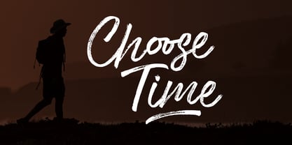 Choose Time is a super casual hand brushed script with detailed brush stroke texture, and a quirky, Can be used for various purposes. such as the title, signature, letterhead, signage, labels, newsletters, posters, logos, correspondence, wedding invitations, badges, etc. Choose Time Font international Support for a review of most Western languages included.
 - Amigueta Script by Solidtype,
$14.00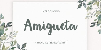 Amigueta Script is a handlettered script font, dynamic and pretty with swashes. Can used for various purposes. such as the title, signature, logo, wedding invitations, letterhead, signage, labels, newsletters, posters, badges, etc. Amigueta Script features Open type feature, including initial and terminal letters,ligatures and International support for most Western Languages is included.
 - Klone by Linecreative,
$12.00 Klone is a slab-serif font that gives the impression of being clean and very elegant. This font supports Latin and Western European languages. It is also equipped with ligatures, so you can design without limits. The Regular style has traditional square edges and corners, the Stamp style features rounded edges and corners.
 - Setter by Cão Fila,
$10.00 Setter is a type family that stands between geometric and humanist styles. Its unique features and large x-height gives it a modern look. Good for small text blocks, headlines and logos. Vast latin character set: Central, Southeastern and Western Europe. Vietnamese, Pinyin and Pan African Latin. Math and Currency. Enjoy it!
 - Atenta by Glen Jan,
$25.00 Atenta is a neutral sans-serif family based on techno-geometric forms in 8 styles. It supports Western, CE, Baltic, Turkish and Cyrillic encoding languages. All styles of Atenta contain small capital forms, case sensitive punctuations, lining, Oldstyle and smallcaps figures (including currency and math operators), superscripts and subscripts, numerators and denominators.
 - Neue Haas Unica Paneuropean by Linotype,
$65.00Neue Haas Unica by Toshi Omagari: The original purpose behind the creation of the typeface Haas Unica was to provide a sympathetic update of Helvetica. But now the font designer Toshi Omagari has decided to make this typeface his own and has thus significantly supplemented and extended it. In the late 1970s, at the same time at which hot metal typesetting was being replaced by phototypesetting, the Haas Type Foundry commissioned a group of specialists known as "Team '77" consists of Andre Gurtler, Christian Mengelt and Erich Gschwind to adapt Max Miedinger's font The characters of Haas Unica are somewhat narrower than those of Helvetica so that the larger bowls, such as those of the "b" and "d", appear more delicate and have a slightly more pleasing effect. In general, the spacing of Haas Unica was increased to provide for improved kerning and thus enhance the legibility of the typeface in smaller point sizes. Major changes were made to the lowercase "a", in that the curve of the upper bowl became rounder and its spur was eliminated. The form of the "k" was additionally modified to remove the offset leg so that both diagonals originate from the main stem. The outstroke of the uppercase "J" was also significantly curtailed. In addition to many minor alterations, such as to the length of the horizontal bars of the "E", "F" and "G" and to the angle of the tail of the "Q", the leg of the "R" was extended and made more diagonal. In the case of the numerals, the upper curve of the "2" was reduced and the lower loops of the "5" and "6" were correspondingly adapted. The sweep of the diagonal of the "7" was also reduced. Several decades later, Toshi Omagari returned to the original sketches with the objective of reinvigorating this almost totally forgotten typeface. First, however, he needed to revise the drafts prepared by Team '77 to adapt them for digital typesetting. So Omagari carefully adjusted the proportions of the glyphs, achieving a more uniform overall effect across all line weights and removed details that had become redundant for contemporary typefaces. It was also apparent from the old drafts that it had been the case that the original plan was to create more than the four weights that were published. Omagari has added five additional styles, giving his Neue Haas Unica? a total of nine weights, from Ultra Light to Extra Black. He has also greatly extended the range of glyphs. Providing as it does typographic support for Central and European languages, Greek and Cyrillic texts, Neue Haas Unica is now ready to be used for major international projects. In addition, it has been supplied with small caps and various sets of numerals. With its resolute clarity and excellent typographic support, Neue Haas Unica is suitable for use in a wide range of new contexts. The light and elegant characters can be employed in the large point sizes to create, for example, titling and logos while the very bold styles come into their own where the typography needs to be powerful and expressive. The medium weights can be used anywhere, for setting block text and headlines. - SF Junk Culture - Unknown license

- Pardner by Stiggy & Sands,
$29.00 Our Pardner font finds its inspiration from the title screens of the 1965 film “West and Soda”, an animated Italian film that was a parody on American Westerns. Director Bruno Bozetto claimed in an interview that he was in fact the originator of the Spaghetti Western, not Sergio Leone. This offbeat and animated serif typeface has characters of varying width and weighting incorporated into opentype scripting as well as numerous alternates to give a lot of fun and frolicking play in typesetting. You can type with just as much diversity as the titling themselves. Opentype features include: - 6 Stylistic Alternate Sets. - A collection of ligatures as well as programming to automatically alternates between Caps and Lowercase. - Full set of Inferiors and Superiors for limitless fractions. - 731 characters of pure joy.
 - Pushkin by ParaType,
$25.00 Designed for ParaType in 1999-2004 by Gennady Fridman. The Pushkin type family is based on the autographs of Alexander Pushkin, the eminent Russian poet (1799-1837). Alternative letters typical for Pushkin's hand are included. There are several variants of Pushkin's hand. Pushkin Script in 2 styles was based on the manuscripts of 1815 and covers Western and Russian character sets. Pushkin One was developed on the basis of thoroughly written documents. Pushkin Two imitates small but nevertheless rather legible hand. Pushkin Three in 2 weights was created on the basis of the autographs distinguished by sprawling hand. Pushkin One, Two and Three series covers just the Russian character set. This set of Russian fonts was amended by Pushkin French font that is based on French writings and covers Western character set.
 - DT Augustina Slab by Deveze Type,
$29.00 DT Augustina Slab is an original Clarendon's style slab serif font family of 98 styles including 7 weights, 7 widths plus Italics. There is no such a big choice of Clarendons with a wide range of styles on a market. Super wide range family will satisfy almost any request. Ultra Lights and Light styles will add elegance and lightness to your headlines, especially with using Italic swashes. Regulars, Mediums and Semi Bold will make your text blocks readable and stylish. Combine with Italics and Small Caps for sub-headers and highlights to get an incredible result. And finally Bold and Extra Bold for massive and heavy text headers. Strong, stable and reliable. The whole family has been working well in almost any type of a project: Websites, Apps, E-Books, Books, Magazines, TV broadcasting, Packaging. The family has an Open Type Features like a Ligatures, Italic Swashes, Small Capitals, Case Sensitive Forms, Tabular Figures, Old Style Figures, Tabular Old Style Figures, Circled Figures, Black Circled Figures, Fractions, Superscripts, Subscripts, Stylistic Sets, Localisation forms for Moldavian / Romanian, Catalonian and Turkish.
 - Haenel Fraktur by RMU,
$25.00 A bold but nevertheless pleasant black-letter font which was released for the first time about 1840 by the Haenel'sche Printshop and Letterfoundery in Berlin. Haenel Fraktur contains a bunch of useful ligatures, and by typing 'N', 'o' and period you get an old style number sign by activating the Ordinals feature.
 - Contenu EBook by Hackberry Font Foundry,
$19.95 Because ebooks will not normally accept .otf fonts, and they don't support Opentype features, this font family was designed to be used for the ebook conversions of print books. It uses old style figures. The italics are slanted a bit more. And Heavy is a little bolder than the bold in Contenu Book.
 - Bishops Stinger by Folding Type,
$9.00 Ouch! Bishops Stinger is a unique isometric display typeface, perfect for bold headlines and logotypes. The blunt serifs and terminals that appear on select letters help ground the faced-paced look. When used for a block of text at smaller sizes the style resembles old script writing but with a retro futuristic twist.
 - Natural Born Designer by Fonts of Chaos,
$10.00 True bold font, only available in uppercase but with different styles. This font of 106 characters is really easy to use in your design and takes his inspiration from the old school post graffiti. The name comes from the movie "Natural Born Killers" by Oliver Stone. UPPERCASE lowercase Numerals Punctuation 106 characters
 - Studio Five by Lafonts,
$29.00 Designed after the sixties neon sign of an arthouse cinema in downtown Zurich, Studio 5 is now a typeface for many applications. The three different styles include old style numbers and alternate characters for titling. All styles have the same metrics. Bold and open styles can be layered for neon sign effects.
 - Feisty by Fauzistudio,
$20.00 Feisty (2020) is a straight script bold using magic OpenType automatically at mimic real hand lettering. Use it for magazine, fashion, invitations, greeting cards, bussines card, logo, t-shirt, web banner, book cover, campaign and watermark photography. Feature Presents an advanced OpenType to automatically choose the appropriate letter shape as you type based on whether the letter appears at the beginning, middle or end of a word. The width of the bar in the lowercase "t" can be changed as desired. Has two different styles of caps: Normal caps, which are the same style as the lowercase; and a type of Comic font, plain caps for setting acronyms, roman numerals or any other case that calls for all caps. With extended language support for most Latin-based Western and Central European languages. Automatic all fractions. *Requires an application with support for OpenType advanced typography, such as Adobe Creative Suite and QuarkXPress.
 - Juxta by NaumType,
$19.00 Juxta is a unique experimental and futuristic script. It was born from the idea to combine two antipodes: programming fonts aesthetics and handwritten script. Juxta has witty and jagged character combined with a perfect grid structure and certain decorative elements, such as cross out letters, that gives it the spirit of Nordic minimalistic design. Juxta script is a part of Juxta superfamily, united by the same aesthetics, which currently also includes Juxta sans. Juxta script is available in 7 weights, including Thin, Light, Regular, Medium, SemiBold, Bold, and Black. It is a potential leitmotif of graphic design projects that need a creative breakthrough, including logos, labels, branding, identity, website design, album art, posters, advertising. Juxta offers standard ligatures, contextual and stylistic alternates. It extends multilingual support to Basic Latin, Western European, Euro, Catalan, Baltic, Turkish, Central European, Pan African Latin, Afrikaans, and Basic Cyrillic for exceptionally far-reaching global accessibility.
 - Runholdy by Alit Design,
$18.00 “RUNHOLDY” is a unique font designed with a concept of dark beauty and modern style. The font combines elements of both modern sans serif and blackletter styles, creating a striking and distinctive appearance. With a total of 762 glyph characters, including rare ligatures and swashes, this font is perfect for creating bold and impactful designs. The font also supports PUA unicode and multilingual characters, making it suitable for use in a variety of languages and settings. Whether you’re designing logos, posters, or other graphics, “RUNHOLDY” is sure to make a lasting impression. Language Support : Latin, Basic, Western European, Central European, South European,Vietnamese. In order to use the beautiful swashes, you need a program that supports OpenType features such as Adobe Illustrator CS, Adobe Photoshop CC, Adobe Indesign and Corel Draw. but if your software doesn’t have Glyphs panel, you can install additional swashes font files.
 - Rainmoney by Alit Design,
$18.00 “Rain Money” is a unique font designed with a concept of dark beauty and modern style. The font combines elements of both modern serif and blackletter styles, creating a striking and distinctive appearance. With a total of 717 glyph characters, including rare ligatures and swashes, this font is perfect for creating bold and impactful designs. The font also supports PUA unicode and multilingual characters, making it suitable for use in a variety of languages and settings. Whether you’re designing logos, posters, or other graphics, “Rain Money” is sure to make a lasting impression. Language Support : Latin, Basic, Western European, Central European, South European,Vietnamese. In order to use the beautiful swashes, you need a program that supports OpenType features such as Adobe Illustrator CS, Adobe Photoshop CC, Adobe Indesign and Corel Draw. but if your software doesn’t have Glyphs panel, you can install additional swashes font files.
 - Blood Beast by Comicraft,
$19.00 Darkness Falls… beware the Moon and stick to the road. Keep clear of the moors, for there you will only find a bloody, UNNATURAL death. Tonight, as every night there is a Full Moon, the Blood Beast stalks the village. It is ready to catch the unwary one, the show-off, the FOOL! It walks the Earth in limbo from one month to the next and only one who is loving in spirit can bring an end to its Carnivorous Lunar Activities! Blood Beast arrives in three weights, Regular, Bold and Heavy, but we recommend you don’t tackle any of them unless you are brave of heart and prepared to save the soul of the poor victim who was left with the Mark of the Blood Beast! Features: Three weights with alternate upper and lowercase characters Languages: Western & Central Europe Automatic alternates & Crossbar I Technology™
 - Play Day Stencil JNL by Jeff Levine,
$29.00 The typography on a 1964 children’s activity book published by Whitman entitled “Build with Stencils” was in a bold, condensed design. The only problem was that the ‘rails’ [the parts that divide a letter into stencil pieces] were too narrow and would disappear at smaller point sizes. Widening the ‘rails’ just a bit greatly improved the appearance of the stencil characters. Play Day Stencil JNL is now available in both regular and oblique versions. In its day, the Whitman Publishing Company of Racine, Wisconsin published dozens of activity books for children, including a number of them with stencils. The company was a division of Western Publishers from the early 1900s through the 1970s, but went through a number of sales and name changes. Currently [as Whitman once again] it is owned by Anderson Press, and is known for its line of coin folders and books on coin collecting.
 - ArmWrestler - 100% free

- Impact by URW Type Foundry,
$35.99 Impact As its name suggests, Impact, a bold sans serif, is designed to make an impression on the reader. Obviously a display font, Impact makes use of its thick strokes and blocked style, to catch and hold the eye. Because Impact is so striking, it is best placed in plenty of white space so that it does not overwhelm any accompanying text.
 - Covington Exp - Unknown license

- Covington Cond - Unknown license

- HVD Comic Serif - Unknown license

- Covington SC - Unknown license

- Fraktura - Personal use only


