10,000 search results
(0.035 seconds)
- Chalfont by Alan Meeks,
$45.00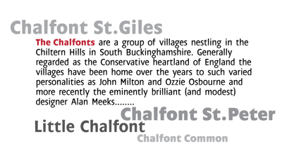 The typeface was designed after seeing a photocopy of some News Gothic text where the ink had faded on the bottom of each character. As character recognition is generally based on the top half of a character, readability was never compromised. Rather like Antique Olive the characters have a top heavy look when viewed straight on, however, as most type is read at an angle with the top further away than the bottom this top heavy look is diminished.
 - Worriment by The Ampersand Forest,
$20.00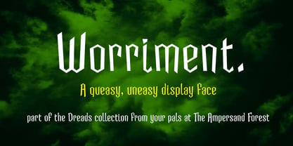 Worriment is a simple, one-off typeface; part of the Dreads collection from the Ampersand Forest. He was born of a whimsical sense of queasiness and unease — he's not just scary, he's Scary Fun! A little kitsch, a little horror. Great for use on Halloween-themed designs, and reminiscent of a "wizarding" look. In terms of letterforms, Worriment is a quirky blackletter-latin hybrid with a sharp, slightly bouncy baseline, and jangly angles, suitable for display use.
 - Mosse Thai by Deltatype,
$59.00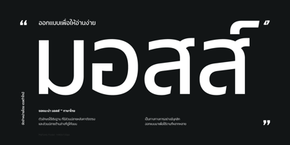 Mosse Thai is an extraordinary sans-serif typeface that designed for improve readability, formal but casual, with straight cut at terminal and reverse angled at spur and finial give a little bit sweet. Mosse is simple and identical, come with nine weights allowed you to use the right weight to the right proportions. Mosse Thai also support many languages, thanks to extended latin glyphs. Mosse Thai come with standard Adobe Latin 4 glyphs, world-ready and mark2mark support.
 - Gunar by The Northern Block,
$39.00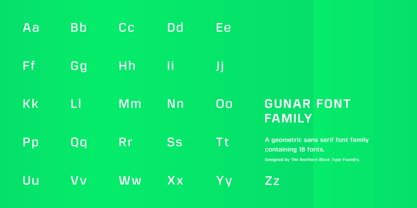 A geometric sans serif with a square chiseled appearance. Precise curves are met with straight lines and tapered angles to produce a fresh, technical typeface. It’s large x-height and neutral width give it good legibility at small point sizes. These refined rectangular features make it ideally suited to a wide range of modern applications. Details include 550 characters with alternative lowercase a, e, g and y. 5 variations of numerals, manually edited kerning and Opentype features.
 - Hochland by Zealab Fonts Division,
$18.00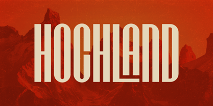 Hochland is a modern, condensed font, inspired by street urban style posters. It works well for headlines, logotypes, signs, posters, greeting card, letterhead, t-shirts, watermarks and more.
 - Peppercorn by Elemeno,
$25.00Peppercorn seems to have been thickly painted on a rough surface. Comes in regular and a spattered Black version. Based on the font Hubbub, which compliments it well. - Beijing by Solotype,
$19.95One of the many Solotype experiments in developing fonts with an ethnic flavor, this one is a bit less obvious than most. The lowercase seems to work well. - Aquitania Script by Alan Meeks,
$45.00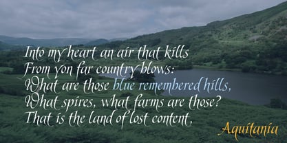 Aquitania Script is a natural but stylish handwritten font with a textured finish. Clearly legible in all sizes, Aquitania is ideal for headlines as well as small text.
 - PIXymbols Chess by Page Studio Graphics,
$29.00Attractive chess and checkerpieces, as well as board components, in a font. Generate boards with light, bold or no border, or a border with rank and file identifiers. - Cordelia by PintassilgoPrints,
$20.00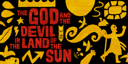 Impacting and vibrant, Cordelia family draws inspiration from covers of 'cordel literature’, small booklets of popular story-poems that played an essential role on the folk-popular cultural life of Brazil. Printed in coarse paper, usually with an woodcut illustration and lettering in the front, these booklets were sold on the streets, in marketplaces and town squares, hung in a cord - therefore the name ‘cordel’. The work of these humble printers and poet-singers of northeastern Brazil strongly served as source for acclaimed romances and movies and still inspires writers of all genres, movie makers, painters, musicians. And type designers too :) Cordelia doesn’t bring a picture font yet, but it goes pretty well with Chronic and Manicuore illustrations. It goes well with and without them. It definitely goes well. You bet!
 - Celestina by Piñata,
$-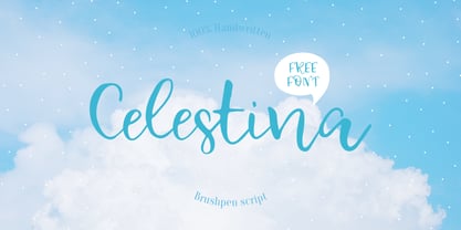 Celestina is the lively spirit, just like drops of ink on a piece of paper or clouds in the sky. The same spirit is maintained by the rounded letters of the script and by the characters' small whorls. Celestina has come to life as a result of a peculiar game in which I tried to bring together the letters with different tempers with help of calligraphic instruments. I wanted to create a very light and playful font which would look like a quick inscription on a piece of paper, but would also be easy to read in a text array. As I was working on the font, my cat Celestina has been very interested in the brush painting process, and I had no other option but to name the font after her! Celestina works perfect for both Moomins stories and personal blogs, as well as for the design of hand-made things, and even just then when you want to put yourself into a good mood!
 - Marvin by Canada Type,
$29.95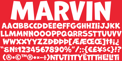 The objective of this font was to try and find out how far back in the designer's life this obsession with letters began. The challenge was to draw, from memory only, two sets of caps that recall older Looney Tunes and Merrie Melodies lettering. The experiment was a success, which means that the designer's got it bad since he was, like, four! The Marvin set includes three stylistic variations (Regular, Round and Shadow), with extensive multi-script language support covering Western, Central and Eastern European languages, as well as Cyrillic, Greek and Vietnamese. A few extra alternates and interlocking ligatures are also included, all adding up to over 650 characters in each font. And here we are. Marvin is a great cartoon font that can help you build your very own Illudium Q-36 Space Modulator, so you can trigger that earth-shattering kaboom. Then you're on your way to claim this planet in the name of Mars. Isn't it lovely, mm?
 - Scandiebox by My Creative Land,
$25.00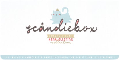 It’s time to have some fun! The Scandiebox Hadlettering Collection was inspired by simplicity of the modern Scandinavian style and also have some influence of Japanese kawaii. All handwritten fonts in this collection perfectly compliment each other as well as the set of more than 100 illustrations created in the same happy style. You can find Scandiebox Extras Manual here. The collection’s childish look-and-feel makes it perfect for all sorts of designs for children - books, cards, invitations, packaging, apparel, children shop ads, etc. If you are an Adobe Suite user, you’ll find that working with illustrations is extremely easy - just select a stylistic alternate you want in either drop down list or using the glyphs panel. If you are using an application that doesn’t support opentype features, you can use all the fonts additional features with a help of either your default font management software or using the pdf reference guide mentioned above. Enjoy!"
 - Hurringtown Script by OldStudioo,
$16.00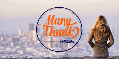 Hurringtown is a collective modern hand lettering. Come with uppercase and lowercase, stylistic set, alternates, multilingual, etc to mix and match your design. This font is perfect for your design, logo, label, badges, apparel design, etc. I also made a design to mix and match pairs of letters to fit your design. Files included: Hurringtown (OTF) Features you get: - Latin A -Z and a – z - Numbers - International Symbols - Multilingual Supports - Alternatives - Ligatures All characters are available through Glyph panel as well, even more each of the alternate letter has it’s own unicode (PUA) so you can copy/paste from Apple Font Book or Windows Character Map. Need to test out a word in this font? Just type it into the box below, and see what it looks like :) That's it! I really hope you enjoy it - please do let me know what you think, comments & likes are always hugely welcomed and appreciated. If you need help or advice, please contact me by e-mail " old.studio87@gmail.com "
 - Majora Pro by Latinotype,
$29.00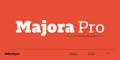 Majora Pro is a slab serif typeface which derives its name from a Portuguese historical toy manufacturer. The font comes in 8 styles, ranging from a delicate Thin to a robust Black, with matching italics and an upright version of stencil fonts, resulting in a total of 24 weights. Majora Pro is well-suited to a wide range of design projects which include packaging, editorial design, screen use, etc. Its humanistic features and moderate contrast between thick and thin strokes make it also suitable for long block of texts while having a high degree of legibility. The font includes a set of alternate glyphs which help give your compositions a different and unique look. The Stencil version was specially designed for use in signage, packaging, titles and headings. Majora Pro contains an extensive set of 750 characters (including small caps, different figure styles, etc.) that support over 200 Latin-based languages. Majora is the previous version of Majora Pro.
 - Wanderly Sans by BeckMcCormick,
$16.00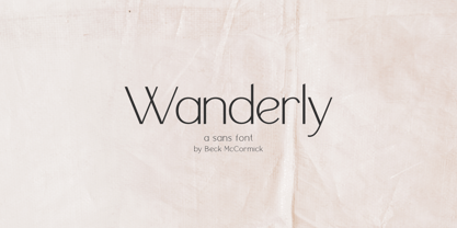 Introducing Wanderly Sans - Wanderly Sans is a sleek, modern font. Its contemporary aesthetic makes it a perfect fit for effortlessly designing logos & branding, elegant paper products like wedding invitation suites, or for displaying content on your website. Wanderly Sans can also be used for other print design like magazines and flyers or printed marketing materials. This font can also be used for digital marketing materials and social media items! Wanderly Sans includes: - full upper + lowercase characters - numbers + punctuation - 10 alternate characters - A, E, K, M, N, P, R, f, j, t - PUA-encoding Extensive Language Support: Western European, Central European, South Eastern European, South American, Oceanian, Vietnamese, Esperanto Wanderly Sans can be used with graphic design programs such as Illustrator or Photoshop, word processing programs like Pages or Word, Design Space, Silhouette, Procreate, Canva Pro, Glowforge, GoodNotes, & more. This font is an installable for desktop & laptop machines, as well as iPads or iPhones. See below for links to help with installation.
 - Gidglet by Nathatype,
$29.00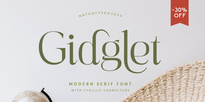 Gidglet is a serif font highlighting the height differences of the letters’ thick and thin parts, and has elegant, clear letters. Little hooks and lines on the letter edges show classical, traditional nuances to your designs. Moreover, the thick and thin letter parts are clearly seen in a high contrast serif font. The thin letter lines show elegant characteristics, while the thick ones express firm, clear nuances. Such high contrasts between the thick and thin parts add dimensions and prominence to the designs. As a result, such a font is perfectly applicable for designs with formal, elegant, professional impressions in big text sizes in order for the beauty and the contrasts of such thick and thin parts to be clearly seen. In addition, you may enjoy the available features here as well. Features: Ligatures Stylistic Sets Multilingual Supports PUA Encoded Numerals and Punctuations Gidglet fits best for various design projects, such as brandings, quotes, invitations, name cards, greeting cards, printed products, merchandise, social media, etc. Find out more ways to use this font by taking a look at the font preview. Thanks for purchasing our fonts. Hopefully, you have a great time using our font. Feel free to contact us anytime for further information or when you have trouble with the font. Thanks a lot and happy designing
 - Englebert Pro by Stiggy & Sands,
$29.00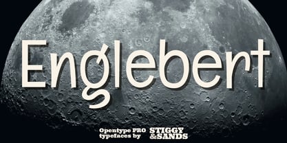 Our Englebert Pro draws inspiration from the title screen of the 1930's film entitled, "Der Blaue Engel", starring Marlene Dietrich. Playful but subdued, yet striking enough to catch the eye, this casual sans has a distinct signature look to it. The offbeat letterforms engage the reader, while the SmallCaps and extensive figure sets lend a wider versatility to the typeface. Opentype features include: - SmallCaps. - Full set of Inferiors and Superiors for limitless fractions. - Tabular, Proportional, and Oldstyle figure sets (along with SmallCaps versions of the figures). - Stylistic Alternates for Caps to SmallCaps conversion.
 - Narnfont - Personal use only

- Goth Stencil - Personal use only

- Pennybridge 1563 - Personal use only

- Radio 187.5 - Personal use only

- Scarious by Rillatype,
$15.00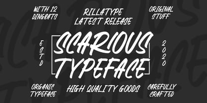 Scarious is perfectly made to be applied for logos, logotype, magazines, book, branding, packaging, fashion, stationary, novel, display use and more. if you have any other question feel free to hit us on rillatype@gmail.com
 - Subzoete by Subtitude,
$25.00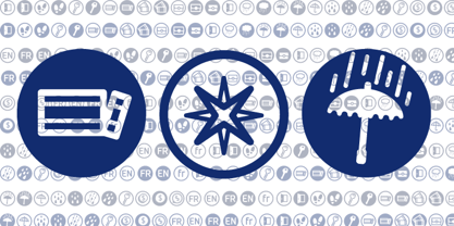 Subzoete is a gathering of icons used in a cultural agenda for the city of Montreal in Quebec. They are unique and original. Great for simple indications such as tickets, free admission, outdoor events, etc.
 - Sightseeing Boat JNL by Jeff Levine,
$29.00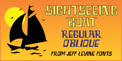 The free form hand lettering comprising the titles and credits for the 1966 romantic comedy “The Glass Bottom Boat” were the model for Sightseeing Boat JNL, which is available in both regular and oblique versions.
 - Homebound by Crumphand,
$19.00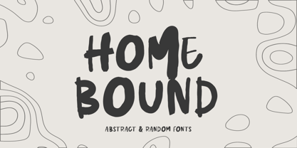 Hello, introducing the new abstract & random fonts. It's called Homebound. Homebound is abstract font. comes with different shape. Good for your graphic, easy to read. What's Included Fonts ? Uppercase Lowercase Numerals Symbols European Multilingual Stylistic Set PUA Encoded Thank You, Regards!
 - Gold Rush by FontMesa,
$25.00This old classic font has an interesting history, it was originally cut with lowercase by the Bruce Type Foundry in 1865 and listed as Ornamented No. 1514. Around 1903 the Bruce foundry was bought by ATF, in 1933 this font was revived by ATF as Caps only and was given the Gold Rush name but was sometimes called Klondike. A similar version of this font with lowercase and radiused serifs was produced by the James Conner's Sons Type Foundry around 1888. In the past other foundries such as the Carroll foundry, Type Founders of Phoenix and the Los Angeles Type Foundry have produced an all caps version of this font. After examining several printed sources of this font from more recent books I found that the original from Bruce's 1882 book was by far the best in design quality, it was also the only printed source that included the lowercase. New open faced, ornamented and distressed versions have been added to this old classic font, there are also many extended characters for Western, Central and Eastern European countries. The Gold Rush Trail OpenType version has alternate double letter pairs included in the font and will automatically be substituted when used in Adobe CS products or other software that takes advantage of OpenType features. Also available is a spurred version of this font listed under the name Gold Spur. - Melody and Memory by Epiclinez,
$19.00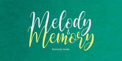 Melody and Memory is a delicate and elegant handwritten font. Its distinct and well rounded letters make this font a masterpiece. Fall in love with its incredibly versatile style and use it to create spectacular designs!
 - Luciana by Liartgraphic,
$14.00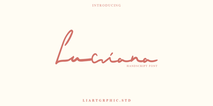 Our newest script font, Luciana, is funny but straightforward, both used as a letter logo, branding, packaging design, landing pages, tag lines and more. Our fonts also include multilingual support as well as alternates and ligatures.
 - Campland by Magpie Paper Works,
$20.00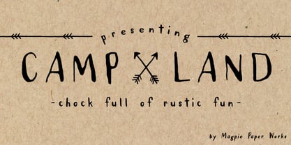 Campland from Magpie Paper Works is a rustic, hand-lettered, sans-serif font chock full of summer-camp fun. This Opentype font features decorative glyphs and interlocking borders, as well as a complete uppercase & lowercase alphabet.
 - Spidertoes PB by Pink Broccoli,
$19.00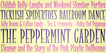 Are you ticklish? Spidertoes is a petite and whimsical tapering latin serif font that is full of life, capable of looking playfully spooky as well as cute & dainty. Its a font that inspires smiles and laughter.
 - Fortnight by ErlosDesign,
$12.00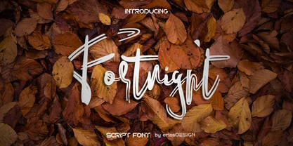 Fortnight is an incredibly stylish script font which will look stunning in a wide variety of contexts. Created with the help of an outstanding brush pen, this font will elevate your projects to the highest level.
 - Smallstep Pro by Evolutionfonts,
$-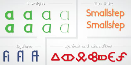 Smallstep - One geometric sans serif with a free spirit. If we presume that geometric typefaces play with the idea of what typography would look like in the future when all unnecessary elements would disappear, than most of their designers seem to envision the future in a rather metropolisque kind of way. We love geometric faces, but the cold and heartless feelings that most of them leave is just not our cup of tea. That is why we are happy to bring some optimism in that genre with our new typeface. We called it Smallstep. Smallstep is a typeface that follows the traditions of classic geometric sans serifs like “Futura”, but is at the same time friendly and whimsical. We took the liberty to deviate from the standard sans serif glyphs while drawing some characters (such as ”a” and ”r” ), others (“w” “k”) are completely redesigned. Probably the biggest trademark of this typeface is the way vertical lines in most lower case characters are “cut” so they end in a 60 degree angle. Smallstep is over all a expressive face, which means it brings some emotions to your design and feelings in itself, and should be used accordingly. Other than that, it is suitable for both headline and body text, print and web. So what kind of name is “Smallstep”? We view the type design process as a form of evolution: There can be no typeface that differs drastically from the current standards, since its characters would be unrecognizable and thus unreadable. But at the same time there are hundreds of faces that differ a little, and still manage to make a difference by moving with small steps towards better and more refined looks. Smallstep consist of 4 weights, that cover all the features, that are expected of a modern Opentype face: kerning pairs, ligatures, true italics and alternative characters, plus a set of symbols, that will help you start off your designs more easily.
 - Text by Alias Collection,
$60.00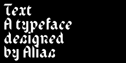 Whereas blackletter types were hand written, Text letterforms are drawn using a series of graphic shapes that slot together in a series of permutations, one set for lower case and another for the upper case. As the link between the method of construction of the letterforms has been removed from the appearance (the quill pen with which they were written resulting in the angle and sharp stresses) there is no logic for these stylistic elements to work in any set way. As this fundamental rule of the blackletter style has been removed the typeface has become something other than a typical or derivative blackletter font.
 - Modum by The Northern Block,
$-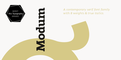 A contemporary serif font family. The design takes influence from traditional serif forms to develop a precise, highly functional text face with a low contrast. Smooth radius details are blended with carefully drawn angles that give a crisp, distinctive aesthetic when used across body copy. Modum is a stylish modern day serif with great charm, harmony and practicality that is best suited for complex hierarchical projects, such as editorials, newspapers and text based books. Details include 8 weights and true italics, over 800 characters with alternative lowercase a, e, g and y. 7 variations of numerals, true small caps with accents, ligatures, manually edited kerning and Opentype features.
 - Reservation Wide by TypeTrust,
$30.00Reservation Wide is intended for headlines with its relatively snug letterspacing and extended forms. Its simplicity will accommodate smaller sizes and lower resolution displays. OpenType Stylistic Alternates for characters 'a', 'g' and 't' lend an even simpler finish. The hand-drawn curves and angled stroke endings temper the otherwise rigid proportions of the family. This painterly tendency becomes more apparent in the heavier weights keeping them from looking too imposing. The design first took shape as a custom font named Majestos for the cable channel The Food Network . It can be found in their growing online and printed presence in addition to their broadcast identity for which it was developed. - Competition by sportsfonts,
$15.00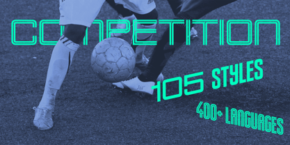 Competition is a state of the art sports typeface. A large width range, slant angles from –12 to 12, and an adjustable inline make it extremely versatile. It’s devided into 5 subfamilies, from the sizes S, M, L & XL with decreasing inline weights to Solid without an inline at all. (By the way: S doesn’t mean it doesn’t look good in large sizes!) Choose from 105 predefined styles, or 1 variable font with axes for width, slant and inline weight (which is included in the family package). Competition embraces the Latin S character set and therefore supports 400+ Latin-based languages. Go for Gold!
 - Lisboa by Vanarchiv,
$35.00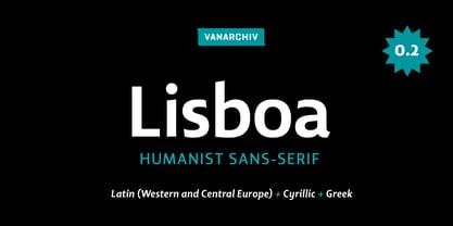 This humanist sans-serif typeface was exhaustively designed, full-featured typeface family that reveals its character and distinctiveness in complex text. It features a large complement of ligatures, lining and old-style figures, expert characters, dingbats (arrows, brackets, and symbols for both Regular weights). In the original Lisboa Pro the forms of the letters are humanist, with hooked headterminals, the characters contains medium contrast with a left-angled stress on the strokes. After ten years from the first version publication, this new version (0.2) is available with Latin (Western, Central Europe) and Cyrillic alphabets. It was selected by Our Favorite Fonts of 2005 (Typographica).
 - Codiga by Andinistas,
$19.95Codiga is perfect for titles and badges that need to show a futurist and space sensation. Its angles formed by straight lines and its san serif monolineal design allows its solid and rigid shapes stress its industrial and technology Look. Codiga consisting of 8 styles: Blanca, Gris, Negra, Super Negra, X1, X2, Stencil and Dingbats (Codiga Dingbats includes 26 illustrations characters). Codiga Blanca, Gris, Negra, Super Negra, X1, X2, Stencil include the complete character set with lower and upper case letters, numbers, accents, diacritics, puntuation and monetary symbols. All of the fonts included in this familily are available in the Open Type format and they are Mac and PC compatible. - Bari Sans by JCFonts,
$30.00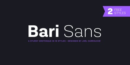 Bari Sans is a solid grotesque typeface with tense curves and compact proportions, but also more subtle details like the angled terminals, the double storey g and the distinctive shape of the lowercase a. Designed to look robust and masculine, this family is also quite versatile with its 9 weights, ranging from thin to black, plus matching italics. Each font include over 500 glyphs with several OpenType features and 8 stylistic sets: alternate lowercase a, g, l, and y, alternate uppercase I and J, alternate quotation marks... Tabular figures, localized forms, ligatures and automatic fractions are also present, among others. Check the pdf specimen for more details.


