10,000 search results
(0.04 seconds)
- Prolexia by Dyslexica,
$10.00 Prolexia is designed to make the font friendly towards those with dyslexia. All the characters are unique with no rotation or mirroring, this makes it harder for the mind to mix up similar glyphs. The characters are made with the illusion of perspective: this helps orient characters in the correct direction to make mental reorientation harder. Finally the o shape is somewhat flattened, this also helps to counteract mental rotation of characters.
 - DF Dudok by Dutchfonts,
$33.00 The DF Dudok is a minimal bitmap typeface which works very well in small sizes both on your screen and on paper. I am connected in a culinary way with the architects’ name W.M. Dudok. It was the first restaurant where I cooked under the critical eye of my chef Gerhard Braun. (Now La Stanza in Rotterdam) Well, it is incidently getting into my typeface work, the cook, the architect, his wife and...who knows
 - Susan by ParaType,
$30.00 An original text and display type family was designed for ParaType in 2007 by Manvel Shmavonyan. The face was named after the designer’s wife. This is an open sans serif font with soft letterforms distinguished by rounded details resembling rudimentary serifs. The family contains true italics developed like in humanist sans serif fonts. Susan is well suited for short and middle range text composing as well as for use in advertising and display typography.
 - International by Yes Please,
$45.00 International is an homage to mid-century modernist trilines. Offering contemporary, well-balanced proportions and a lack of heavily dated styling affectations, International brings a uniquely modern sensibility to the triline style. International features OpenType standard ligatures, discretionary ligatures and stylistic alternates as well as a standard set of accents and symbols to provide a versatile end-user experience. International has played hard for Nike Women's Training, Nike Running, Nike Sportswear, Target, Showtime and more.
 - Tassista by MAC Rhino Fonts,
$59.00 Tassista means taxi in Italian. It suits this typeface well as the source of inspiration is the closing credits from the film Taxi driver, directed by Martin Scorsese in 1976. The typeface is designed to perform especially well in smaller sizes and makes it suitable for various credit copy, footnotes etcetera, nearly always presented in minor sizes. During the designs process it seemed more logical to make small caps instead of traditional lowercases.
 - Hawkins by Fenotype,
$25.00 Hawkins is a rounded serif combined with small hints of Art Nouveau influence and remarkably high x-height. Hawkins takes a lot of space and is a well suited display typeface for any use from print to online and from advertising to book cover or from product design to digital posters. Hawkins is packed with a few OpenType features -Standard Ligatures and plenty of Swash Alternates, as well as few Titling and Stylistic Alternates.
 - Defect Scam by PizzaDude.dk,
$12.00 Defect Scam could easily have been a name for a punk band. But it's not - it's the name of my stencil wannabe font. But, it was inspired by a combination of some punkband's LP cover and the vibes of that genre of music - but not overdoing it by making an obvious punk font! Well, you get 4 different versions of each letter in the Regular, Black and Fill versions, as well as multilingual support!
 - Middle Ages by Mans Greback,
$49.00 Middle Ages is a hand-drawn medieval type, designed by Måns Grebäck during 2019. With its blackletter style it works great in many historical context typesettings, as well as for traditional Christmas projects. It has a Gothic style that also works well for rock music genres, or for tattoos and other rough graphics. The font is multilingual and supports all Latin-based European languages, contains numbers and all symbols you'll ever need.
 - Hybi17 Legend by Hybi-Types,
$12.00 The name says it: This font is made for usage in story-telling, movies, legends, fairy tales, sagas. It will tell about strength and bravery, forgotten tales and ancient kingdoms. You may use it for headlines, slogans and advertising. The style with real capitals will enlarge your potential of design. The fonts are offering a huge character set for usage in many languages. Also thousands of kerning pairs within both styles are obligatory.
 - Monton by Larin Type Co,
$12.00 Monton is a wonderful font family that includes from thin to black style as well as in oblique style, a total of 18 fonts. This is a condensed block sans-serif font that is perfect for titles, logos, branding, posters, flyers, website design, advertising, labels, packaging, web titles, text descriptions and much more. It is well readable and irreplaceable in modern design and can be used as a main or additional one.
 - DIN 2014 by ParaType,
$47.00 A contemporary interpretation of the famous DIN typeface. Regular style suits for long texts, while Light and Bold variations work well in large sizes. The typeface includes 24 styles: 6 upright and 6 normal-width italics, as well as 6 Narrow and 6 Condensed styles. The typeface was designed by Vasily Biryukov and released by Paratype in 2015. The set of Condensed styles was added by Alexander Lubovenko and Isabella Chaeva in 2022.
 - Fragile Script by Dhan Studio,
$19.00 Fragile Script is textured brush font, featuring a contemporary approach to design, and a handmade, natural irregular baseline. It is also equipped with alternatives and ligatures. Suitable for use in title design as well as apparel, invitations, books tittle, stationery design, quotes, branding, logos, greeting card, t-shirt, packaging design, poster and more. Fragile Script includes a complete set of uppercase and lowercase letters, as well as multi-language support, numbers, punctuation.
 - Susan Classic by ParaType,
$30.00 An original text and display type family was designed for ParaType in 2008 by Manvel Shmavonyan to be used together with Susan, earlier released sans by the same author. This is a low-contrast slabserif font with open letterforms. Its shape is distinguished by one- and two-sided rounded serifs. Susan Classic is well suited for short and middle range text composing as well as for use in advertising and display typography.
 - Rosetary by Dhan Studio,
$20.00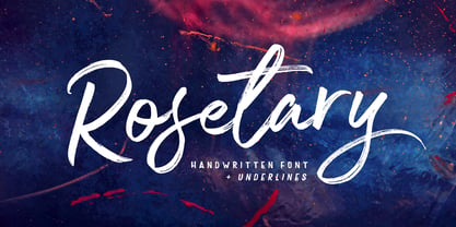 Rosetary is textured brush font, featuring a contemporary approach to design, naturally handmade and with underscores. It also has alternatives and ligatures that make your design more attractive. Rosetary includes a complete set of uppercase and lowercase letters, as well as multi-language support, numbers, punctuation. Suitable for use in title design as well as apparel, invitations, books tittle, stationery design, quotes, branding, logos, greeting card, t-shirt, packaging design, poster and more.
 - Luxus Brut by phospho,
$25.00 Luxus Brut breathes the spirit of hand lettered signage of the Fifties. It’s a formal script, inspired from a well concealed shop portal in Vienna/Austria. Large and distinctive capital letters, wide spacing as well as a low x-height make it an excellent choice for posters, magazine headlines, logotypes, branding and any design that requires a touch of luxury and sensuality. You might also have a look at the stylistically related Luxus Brut Sparkling.
 - Headlines by TypeThis!Studio,
$54.00 Perfect headlines — now and forever! Headlines is designed for clear and straight headlines and also allow longer words and headlines to find the space they need for a well-composed headline. Unicase styles let your headlines shine uniquely in every respect. It contains a number of special ligatures for certain combinations to fill common visual gaps such as tty, rv. Newsletter: www.typethis.studio *Variable fonts work well in software that supports variable font technology.
 - Povetarac Sans by Tour De Force,
$25.00 Povetarac Sans font family is part of Povetarac Superfamily together with Povetarac Didone and Povetarac Didone. Available in 6 weights with matching italics, Povetarac Sans relays on lively uppercase proportions that took inspiration from vintage typefaces. It is well balanced, elegant and fully recognizable sans serif family. With sharp overhang, Povetarac Sans works pretty well in all situations – from editorial use to branding, websites or just titles. Comes with Fractions and extended Latin character map.
 - Swag Urbano by Kaligra.co,
$19.00 Swag Urban is a young and cool playful bold sans serif font family made to be a perfect choice for titles and headlines. It works very well for posters especially for magazine or print but it's versatile enough to be a good fit for a multitude of projects as well as for logos or other graphics that require strong and impactful typography. Have fun and create more.. Your Imagination only your limit!!
 - Fabuleuse Slab by Nuno Dias,
$18.00 Fabuleuse Slab is a one-style font that features a thin, condensed and high cap height and x-height. This gives the font a distinct retro look & bohemian feeling that is great for logos & branding, packaging, titles, magazines, posters, signs, shirts, scrap-booking, … This display font comes in Capital letters as well as Lowercase. It also comes equipped with Ligatures, Numbers, Punctuation Marks, Diacritic Marks and a well stocked supply of special characters.
 - Extatica by Mint Type,
$30.00 Extatica is an eclectic geometric display sans-serif typeface with narrow capitals. It comes in 8 weights with corresponding italics, enriched with several stylistic alternates and OpenType features. The glyph set includes all European Latin-based languages, as well as major languages that use Cyrillic script. Despite being created as a display font family, Extatica also works well in small text sizes, which makes it perfect for stylized captions and subhead paragraphs.
 - Albion's Americana by Greater Albion Typefounders,
$18.00 Albion's Americana is a fun display family and a tribute to our transatlantic friends. The stars and stripes motif is applied to an American inspired all capitals Roman display face, producing something that is bold and boisterous and well...American. The regular face is intended for conventional use, while the 'Black', 'Red', 'White' and 'Blue' faces are designed to facilitate patriotic multi-coloured lettering (of course, you can use other colours as well). It's worth trying out different combinations here- Black and White alone work well, as does read, white and blue minus black. Albion's Americana Companion is also offered, intended as a small or all capitals face for subsidiary lettering. Next time you need some graphic typesetting with that American feel, this is your answer!
 - Bagilan by Queenop Studio,
$14.00 Bagilan - Modern Calligraphy Script Font Bagilan is an elegant, beautiful and flowing handwritten font perfectly for your favorite projects. This font is neatly crafted and very detailed. Whatever the topic, this font will be a great asset to your font library, as it has the potential to enhance any creation. Fall in love with her completely different and timeless style, and use it to create stunning designs. Many alternatives will help you create whatever design you need such as cute and girly handwritten letters and other designs that require a beautiful handwritten touch! Enjoy :) Contains full set: -Uppercase -Lowercase -Alternative -Ligatures -Punctuation -Number -Multilingual support. Need help or have questions let me know. I'm happy to help. Thanks & Congratulations on the Design.
 - Ruskin by Fine Fonts,
$29.00 The origin of Ruskin was a commission for Michael Harvey to design a signage font for the Dean Gallery in Edinburgh. The style of the letterforms was to complement the period of the building which was originally an orphanage built in 1839. Only uppercase letters were created at first with the lowercase letters—and other characters necessary for a font—added later. With elegant and slightly extended letterforms, Ruskin fulfilled its rôle well as a signage font. It also functioned extremely well as a general display font. It is particularly suited to item descriptions and placards in galleries and museums which are frequently read from an angle, as well as head-on. The fonts have both proportionally and monospaced numerals.
 - Wood Nouveau JNL by Jeff Levine,
$29.00 The hand cut wood type which was the inspiration for Wood Nouveau JNL conjures up images of the artistic period between the Victorian Era and 1920s Moderne, as well as the hippie counterculture active in the later part of the 20th Century. During the late 1960s and early 1970s, rock posters, fliers, store signs and other printed ephemera of "the love generation" borrowed heavily from the Art Noveau style in both art and typography. An Alphonse Mucha-inspired flower girl could adorn a concert poster that also combined both vintage wood type and hand-lettered elements. Although this particular type design might well have preceded the actual start of the Nouveau period, the softer, rounder lines of each character lent themselves well to this emerging style.
 - Mangerica by Ndiscover,
$25.00This design incorporates different styles into a consistent look. A pinch of script, a little of geometric and some humanistic shapes as well create a very distinguishable sans-serif. It has an overall good feeling specially on the heavier weights that have intended contrast irregularities to create a 'cartoonish' look. On the intermediate weights the design will preform well on small font sizes because of its large counters, low contrast and large x-height, but as you go to the extremes you will see shapes full of personality that will pop out in large font sizes. The font is loaded with opentype features such as small caps, ligatures, alternates, old style figures, and much more. The italic version is deeply rooted in the calligraphic heritage of the Italics. This way the brush inspired strokes are emphasized as well as an overall calligraphic look. Far from being a mere slant, Mangerica Italic had every lowercase glyph redesigned as well as some uppercase, besides that, every glyph was optically adjusted to ensure not only aesthetics but functionality too. - Mr Quicke - Unknown license

- John 315 - Unknown license

- Missale Incana by astype,
$38.00 Missale Incana is a redesigned, new interpretation of a typeface from Herbert Thannhaeuser. Its a strong calligraphic roman typeface, well suited for headlines. OpenType features:
 - Plz Print Bold Cond by Outside the Line,
$19.00 A bold, energetic, friendly font with a little bounce to it. A good, casual headline font. Works back well with Plz Print or Plz Script.
 - Mid Mid Sun Sun by Daylight Fonts,
$50.00 Mid Mid Sun Sun will help you refine your typography to the extreme. It has a number of alternates, which can change into different expressions.
 - PR Snowflakes 01 by PR Fonts,
$12.00 These are curly designs arranged into fanciful snowflakes, evoking 1960’s psychedelia as well as Victorian romanticism. An excellent choice for any winter holiday material.
 - That by Suomi,
$30.00 This is That: a family of four weights with roman and true italics, and also with chiselled medium weight, and Irregular variant for, well, variety.
 - Van Dingbats by Vanarchiv,
$30.00 This Dingbat font is designed to work well with the Van Condensed family. The dingbats in it have the same round treatment like the typeface.
 - Allrounder Antiqua by Identity Letters,
$40.00 Timeless Renaissance looks, gently updated. For novels and billboards alike. Allrounder Antiqua is an old-style serif member of the Allrounder superfamily. A timeless typeface based on classical proportions, Allrounder Antiqua is perfectly suitable for advanced book and editorial design well as packaging and branding. True: its main purpose is to set flawless body copy and to generate an evenly textured page—but its refined shapes work fantastically in display applications, too. Some details, such as the small and sharp bowl of the lowercase a, are fully appreciated in large sizes only. If you need a sophisticated serif typeface for packaging, food, fashion, consumer goods, or lifestyle branding, Allrounder Antiqua is up for it. It's also apt as an outstanding corporate typeface, be it for a more conservative venture or the latest hipster start-up. This classy serif typeface comes in four weights with corresponding true italics. Just like its sans-serif counterpart, Allrounder Grotesk, Allrounder Antiqua is equipped with plenty of Opentype Features like small caps, six sets of figures, case-sensitive forms, superiors, fractions and many ligatures. You will find alternate letters with swashes within this extended character set, as well as all the accented glyphs necessary to support more than 200 Latin-based languages. Historical Background The (French) Renaissance-influenced typeface started as Moritz Kleinsorge's graduation project within the "Expert Class Type design" course of the Plantin Institute for Typography, located in the famous Museum Plantin-Moretus in Antwerp, Belgium. There, Moritz Kleinsorge decided to create a revival of Robert Granjon's "Ascendonica Romain", described as "a beautiful face; typical of Granjon's mature style" in the inventory list of available material. "To touch punches and matrices cut by Robert Granjon back in 1567 was an invaluable inspiration", Moritz explains. Over time, the typeface moved away from being a true revival. Rather, it evolved into a Granjon-inspired typeface. That typeface is now available as Allrounder Antiqua. Perfect Pairing: Allrounder Antiqua + Allrounder Grotesk Allrounder Grotesk is the ideal complement to Allrounder Antiqua. They both share common vertical metrics and a common color. This allows you to pair both typefaces within the same layout—even within the same paragraph—without creating visual disruption. Head over to the Family Page of Allrounder Grotesk to get more information about this typeface. Design Trick: Bilingual Design With the Allrounder Superfamily Combining Allrounder Grotesk with Allrounder Antiqua is an ideal approach for bilingual designs, wherein both languages get the same emphasis yet are distinguished with two different typefaces. It's also best practice to set headlines in a different typeface than the body text if they harmonize with each other. Allrounder Grotesk and Allrounder Antiqua provide you with the perfect pair for this purpose.
 - Robeaugo by Stephan Kamperman,
$18.00 Robeaugo is pronounced as “ro-bo-go”. The name is originated out of the 3 words: robo, beau (French) and go. It’s a mix of Art Deco with round shapes and is best used in headings and logos.
 - La Babaca - Personal use only

- Panama Road - Personal use only

- Angelique Rose - Personal use only

- DS Goose - Unknown license

- Gaitera Ball - Personal use only


