10,000 search results
(0.024 seconds)
- Billa Brush by Lafitte 58,
$16.00 Billa Brush is a thin and clean handwritten font. It can easily be matched to an incredibly large set of projects, so add it to your creative ideas and notice how it makes them stand out!
 - Dolphinero by Murisa Studio,
$10.00 Dolphinero is a modern and adaptable sans serif font. It can easily be matched to an incredibly large set of projects, so add it to your creative ideas and notice how it makes them stand out!
 - BIG is, as its name suggests, enormous, because with just three letters, it says more than others on a full line. It's an ultra-wide, ultra-black, and ultra-expressive typeface, designed to occupy ...
- Mosafin by Yukita Creative,
$12.00 The Mosafin font is a sans-serif typeface that has a modern and elegant design. This font has a very consistent and proportional letterform, and has clean and firm lines, making it easy to read and very suitable for various graphic design purposes. Made with the latest technology and excellent design, the Mosafin font has distinctive characteristics, such as very geometric letter shapes, with sharp angles and clear, thin lines. This font can be used in various media, such as poster designs, logos, business cards, banners, and various other design purposes. This font also has a proportional font size ratio, so it's easy to read at any size
 - Steamtown by Melvastype,
$16.00 Steamtown is a sans serif type family of three weights and four styles. It is based on geometric forms, so it is a clear and straightforward typeface. It has an industrial feel and also resembles street signage. It has four styles; Clean, Rough, Print and Press. The Rough style has rough edges, Print has a subtle texture and Press has a heavy letter-press texture. Rough, Print and Press styles have two sets of upper- and lowercases. You can manually alternate the two sets of upper- and lowercases or you can enable the Contextual Alternates OpenType feature to automatically cycle these two sets of letters.
 - Wolfgang by Aronetiv,
$9.99 The typeface is influenced by early Italian-French serifs such as Garamond, Jenson, Griffo. The font has clear serifs and slightly sharp shapes. It has a modern character. The font has a uniform texture typical for this type of serif. This font family is well suited for the decoration of solemn and graceful materials. The font has a nice and appropriate italics. Wolfgang is legible and easy to read at small sizes. The font family contains 6 styles The font is equipped with a Variable file. Supports languages ??of central Europe Contains old style figures There are several alternates in the font The font has more than 1000 kerning pairs
 - Plumage by Wilton Foundry,
$29.00Plumage is somewhat unusual in that it has elements of calligraphy as well as script in a semi-loose form that gives it a pleasing appearance for both large and small sizes, and interesting flare finish strokes add to its unique character. As I read a dictionary description of "plumage", I realized that in many ways there is a parallel between a bird's plumage and how it is utilized in the context of writing: Plumage varies in pattern and arrangement for different purposes; what it expresses can of course be even more interesting. Plumage is disposable after a season, as new ones become available... imagine, a self-sustaining quill! - I guess that's equivalent to a refill or disposable pen. Historically, quill pens were made from feathers of a variety of birds, each chosen for its special characteristics. The sturdiest and most reliable feathers, however, come from turkeys, swans and geese. Feathers used to make pens are the stiff-spined flight feathers on the leading edge of the bird's wing. Pens for right-handed writers come from the left wing, and pens for left-handers, from the right! Each bird yields 10-12 good quills, and sometimes only 2 or 3 - so small a yield that the geese reared in England could not furnish nearly enough for local demand, and quills were imported from the Continent in large quantities. At one point St Petersburg in Russia was sending 27 million quills a year to the UK. It is said that geese were specially bred by US President Thomas Jefferson (1743-1826) to supply his own vast need for quills - in his lifetime he wrote almost 20,000 letters. The name "Plumage" was selected to pay homage to the noble birds that supplied countless quills for centuries of literary works. Plumage is recommended for any formal or informal invitation, decorations, awards, poetry, plaques, etc. We hope you will have the pleasure of using Plumage. - Copperplate New by Caron twice,
$39.00 Imagine America in the 1930s. A gangster flick with Al Capone, a crime novel featuring Philip Marlowe. Our hero in a fedora sits in a classy bar, orders a double bourbon, lights a cigar and eyes the evening paper. He turns the pages, reading about a bank heist over on Third Avenue, a scandal involving a baseball player, a small ad for a general practitioner and a large spread about a famous law firm. What do the bottle of booze and the majestic facade of the bank have in common? The elegant baseball uniform and trustworthy attorneys? - Copperplate Gothic - When Frederick William Goudy created his legendary typeface in 1901, it went on to literally become the symbol of early 20th century America. Tiny serifs, characteristically broad letterforms, and particularly bold titles decorated calling cards at 6-point size, enormous bronze-cast logos, newspaper headlines, restaurant menus and more. This was the golden age of Copperplate, lasting up until the arrival of die neue Typografie and monospaced grotesques in the 1960s. Then the typeface almost completely disappeared. It made a partial comeback with the advent of the personal computer; digitizations of varying quality appeared, and one version even became a standard font in Adobe programs. This may have played a role in Copperplate later being used in DIY projects and amateur designs, which harmed its reputation. Copperplate New has been created to revive the faded glory of the original design. Formally, the new typeface expands the existing weight and proportional extremes. The slight serifs are reduced even further, making the typeface sans-like at smaller point sizes and improving readability. In contrast, at large point sizes it retains all of its original character. Decorative inline & shadow styles have been added and both have been created in all five proportions, making it easy to adapt the typesetting to the format you need. Despite these changes and innovations, Copperplate New remains true to Goudy’s original design and represents a snazzy way to evoke a golden era in American culture. Specimen: http://carontwice.com/files/specimen_Copperplate_New.pdf
 - FS Shepton by Fontsmith,
$80.00 Handy Andy Andy Lethbridge had only just completed his graphic design BA at the University of Portsmouth when he was spotted by Jason, who’d seen Andy’s exquisite hand lettering at his degree show and on Instagram. Keen to push the handwritten theme further, having recently launched a digitally-created, chalky script font (FS Sammy), Jason offered Andy a job and the chance to develop a suite of more stylised, truly hand-drawn fonts. Andy duly got out his pads, pencils and pens, and started experimenting with styles and textures. Magic followed. Imperfection perfected Most ‘handwritten’ typefaces are created entirely digitally. Not FS Shepton. From the start, the intention was to create a collection of alphabets of similar character but different texture and style – 100% hand-drawn and purposely imperfect, with the kind of inconsistent, organic shapes and textures of market stall signs, dashed off in chalk or paint. FS Shepton Regular, drawn with a wet brush pen, is solid with a rough outer edge and a casual but controlled feel. The dry brush used to create FS Shepton Light gives it more inner texture and a more formal, slanted, calligraphic style. FS Shepton Bold, drawn using a wider, looser dry brush pen, has a woody grain in the middle of its broad strokes and greater solidity where the brush moves more slowly. Fresh as a daisy Think of FS Shepton not as a family of three weights of the same font so much as a collection of three fonts penned by the same author. All of them – the light, regular and bold – were created independently as display fonts that offer something different to labelling, packaging, point-of-sale and advertising. Lovingly crafted by hand, they’re a good match for products and settings that share the same artisinal qualities: organic foods, drinks and healthcare products, as well as premium chocolate, coffee and condiments.
 - FS Emeric by Fontsmith,
$60.00 Right now! FS Emeric reconciles a pair of seemingly opposing approaches: the systematic but chilly functionalism of early modernist typography, trapped in time, and a warmer, more emotional, more optimistic spirit. What Fontsmith created was something that marries precision with expression, geometry with movement, functionality with humanity. FS Emeric has a sharp, kinetic edge that cuts across design disciplines – graphic, fashion, product, automotive. It’s about what’s happening right now. Contemporary, optimistic, distinctive – a classic working sans serif. Appetite Discussions with some of Fontsmith’s design studio clients had revealed an appetite for a new kind of typeface that could express mid-century modernist principles in a fresh, contemporary voice. As he crafted the letterforms that would form FS Emeric, Phil Garnham was guided by two central ideas. First, there was Jan Tschichold’s contention that a good letter is “one that expresses itself, speaking with the utmost distinctiveness and clarity”. Second was a belief that a font can be personally expressive without compromising its functionality. These provided the fuel that drove the project to its conclusion. Posters To mark the launch of FS Emeric, Fontsmith asked 11 eminent design studios from around the world – the likes of Pentagram, Studio Dumbar, Bibliotheque, Non-Format and Build – to create a limited edition A1 poster. Each poster celebrated a different weight of FS Emeric, and just 50 of each were screen-printed by Dan Mather onto 175gsm Colorplan stock. “We gave away a randomly selected poster every time two or more weights of the FS Emeric were purchased,” says Phil Garnham. “They’ve now become somewhat of a collector’s item in their own right.” Superfamily In the spirit of Univers, the original font superfamily, FS Emeric now comprises 22 Roman and italic typefaces overall, making it one of the most versatile and functional modern fonts across all kinds of media, as well as one of the most distinctive.
 - Garamond Premier by Adobe,
$35.00Claude Garamond (ca. 1480-1561) cut types for the Parisian scholar-printer Robert Estienne in the first part of the sixteenth century, basing his romans on the types cut by Francesco Griffo for Venetian printer Aldus Manutius in 1495. Garamond refined his romans in later versions, adding his own concepts as he developed his skills as a punchcutter. After his death in 1561, the Garamond punches made their way to the printing office of Christoph Plantin in Antwerp, where they were used by Plantin for many decades, and still exist in the Plantin-Moretus museum. Other Garamond punches went to the Frankfurt foundry of Egenolff-Berner, who issued a specimen in 1592 that became an important source of information about the Garamond types for later scholars and designers. In 1621, sixty years after Garamond's death, the French printer Jean Jannon (1580-1635) issued a specimen of typefaces that had some characteristics similar to the Garamond designs, though his letters were more asymmetrical and irregular in slope and axis. Jannon's types disappeared from use for about two hundred years, but were re-discovered in the French national printing office in 1825, when they were wrongly attributed to Claude Garamond. Their true origin was not to be revealed until the 1927 research of Beatrice Warde. In the early 1900s, Jannon's types were used to print a history of printing in France, which brought new attention to French typography and the Garamond" types. This sparked the beginning of modern revivals; some based on the mistaken model from Jannon's types, and others on the original Garamond types. Italics for Garamond fonts have sometimes been based on those cut by Robert Granjon (1513-1589), who worked for Plantin and whose types are also on the Egenolff-Berner specimen. Linotype has several versions of the Garamond typefaces. Though they vary in design and model of origin, they are all considered to be distinctive representations of French Renaissance style; easily recognizable by their elegance and readability. Garamond Pemiere Pro was designed by Robert Slimbach, and released in 2005." - Bonedigger by Hanoded,
$15.00 For some reason I had Paul Simon’s song ‘You Can Call Me All’ in my head when I was busy working on this font, so I just had to call it Bonedigger. Bonedigger does not dig bones, but it does have ‘heavy bones’, as it is quite big. Bonedigger is seriously eroded and would look great on book covers and product packaging. It comes in a lovely regular and italic style and a seriously twisted inline style (with, of course, its own italic). As the song goes: With a knick-knack paddywhack, give the dog a bone, this old font came rolling home.
 - Bad Cake Recipe by Bogstav,
$15.00 I've had a lot of lovely cakes through the years (My wife is a great cook!) But I've also tried some really...ehem...not so good cakes. Actually, the worst cake I ever had, was at work - if you didn't know, I work as a kindergarten teacher - and the cake was made by one of the kids! Anyway, this font was made as a sort of tribute to that cake - the font may not represent something that is smooth and lovely, but it was made with lots of personality and love - just like that cake from that kindergarten kid!
 - Better Valentina by madjack.font,
$10.00 Better Valentina Font Duo is a hand brush font created with brush and ink. Better Valentina Font Duo This typeface is ideal for use in bold watercolor designs or handwritten styles, such as blog titles, posters, wedding elements, t-shirts, clothing, book covers, business cards, greeting cards, branding, cafe / restaurant signs. merchandise, etc. Contains the complete set: - Uppercase - Lowercase - alternative - fasteners - Punctuation - number - Multilingual support. How to access all alternative characters, using the Windows Character Map with Photoshop: - https://www.youtube.com/watch?v=Go9vacoYmBw How to access all alternative characters using Adobe Illustrator: - https://www.youtube.com/watch?v=XzwjMkbB-wQ Thank you!
 - Like A Cat by PizzaDude.dk,
$20.00 As a kid I used to write my favourite football teams name with 3D letters over and over again. I spent hours doing this - often to find out I had the colors wrong, or I had made a spelling error or two - but now, several years after, I have created the "Like a cat" font - so that you can make "handmade" headlines or funny quotes or even your favourite football teams name in a swoosh! If you get the colors wrong, or you make a spelling error, it's fast and easy to correct! :) Like a cat comes with substitution characters for double letters!
 - Gloding Sophia Script by madjack.font,
$17.00 Gloding Sophia Script is a hand brushed font created with brush and ink. Gloding Sophia Script This typeface is ideal for use in bold watercolor designs or handwritten styles, such as blog titles, posters, wedding elements, t-shirts, clothing, covers books, business cards, greeting cards, brands, cafe/restaurant signs. merchandising, etc. Contains full set: - Uppercase - Lowercase - alternative - fasteners - Punctuation - number - Multilingual support. How to access all alternative characters, using the Windows Character Map with Photoshop: - https://www.youtube.com/watch?v=Go9vacoYmBw How to access all alternative characters using Adobe Illustrator: - https://www.youtube.com/watch?v=XzwjMkbB-wQ Thank you!
 - I am not a robot by PizzaDude.dk,
$15.00 The other day I had to login to a page several times, and as security I had to check the "I am not a robot" box. Actually, I think I did a login at that particular page like 30 times that day...and in the end I was thinking "Come on, you should know by now that I am not a robot" And even though I thought it was a repetitious hassle I figured that I needed to name a font "I am not a robot" - and not a robotic-like one, but a sweet and funny cartoonish one! :)
 - Blitanos by Youngtype,
$18.00 Blitanos-Handwritten is a hand brushed font created with a brush and ink, bold and irregular baseline. Contains a complete set of lowercase, uppercase, Alternates, ligatures, punctuation, numbers, and multilingual support. This font ideal for use in watercolor design or lettering style bold hand, such as blog header, posters, wedding elements, t-shirt, apparel, cover books, business cards, greeting cards, branding, merchandise, invitations and handmade quotes and more. How to access all alternative characters, using Windows Character Map with Photoshop: - https://www.youtube.com/watch?v=Go9vacoYmBw How to access all alternative characters using Adobe Illustrator: - https://www.youtube.com/watch?v=XzwjMkbB-wQ Thank you!
 - Seven Seas by Hanoded,
$15.00 Some time ago, my son asked me to name all Seven Seas. I had to think for a bit, because I can think of more than 7 seas (the North Sea, the Caspian Sea, the South China Sea, the Sea Of Okhotsk, etc.), but apparently these are not part of the BIG Seven. It turns out that even oceans count as ‘seas’. Long story short, I created a font, had to think of my son’s question and named the font Seven Seas. Seven Seas is a hand made serif that comes with swashed alternatives for a lot of glyphs.
 - Endgame by Hanoded,
$15.00 Endgame font was made using a very, VERY bad brush and Chinese ink. I had bought a bunch of brushes some time ago and I discovered that the hairs had been treated with some goo to keep them from sticking out. The goo didn’t really come off, so when I started to draw the glyphs for this font, the brush strokes were kind of wild. In the end, I really liked it (even though I will never again buy that particular brand of brushes). Endgame is a wild brush font. Comes with the works: diacritics, ligatures and alternates.
 - The Yoshi by Vim ddd,
$15.00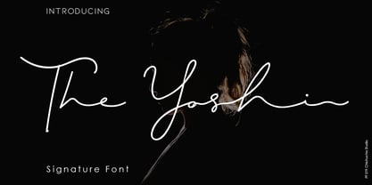 The Yoshi is a beautiful signature font and can make your design project look elegant, classy and modern. This font is perfect for branding, invitations, stationery, wedding designs, social media posts, product packaging, product designs, label, photography, watermarks, special events and more. It comes with full set of uppercase and lowercase letters, ligatures and alternates. How to Enable OpenType Features in Word, Photoshop and Illustrator: https://medialoot.com/blog/how-to-enable-opentype-features-in-Microsoft word-photoshop-and-illustrator/ Hope you enjoy with this font. If you have any questions please don't hesitate to drop me a message :) Thank You, Chichucha Studio
 - Daphne by Ahmet Altun,
$20.00 In the beginning, this font had been designed for an affiche work as wood pattern which includes one font and medium weight. The stylish design of this font had been inclined us to create more weights and more styles. Daphne Font Family comes in three weights; normal and italic. Plus two additional styles which are wood pattern and shadow. You can get great wood pattern results with Daphne Font Family; also with colored shadows, you can get gorgeous results in poster works and t-shirt prints. Even in very small type sizes, it can be legible.
 - Angelica Angelina by Shape Studio,
$10.00 Angelica Angelina is a hand brush font created with brush and ink. Angelica Angelina This typeface is ideal for use in bold watercolor designs or handwritten styles, such as blog titles, posters, wedding elements, t-shirts, clothing, book covers, business cards, greeting cards, branding, cafe / restaurant signs. merchandise, etc. Contains the complete set: - Uppercase - Lowercase - alternative - fasteners - Punctuation - number - Multilingual support. How to access all alternative characters, using the Windows Character Map with Photoshop: - https://www.youtube.com/watch?v=Go9vacoYmBw How to access all alternative characters using Adobe Illustrator: - https://www.youtube.com/watch?v=XzwjMkbB-wQ Thank you!
 - Pinch Remix by sugargliderz,
$15.00 Pinch Remix is a recreated version of a typeface I made in 2007. The form hasn’t changed at all, but I composed the family by increasing the number of weights and revising the spacing and kerning. At first it was created from randomly drawing an alphabet offhand on paper with a drawing pen. Then I figured that perhaps it had the framework for a typeface. Originally because it was just a memo, I had already thrown in the trash once. Yet something about it caught me, and when I turned to look down at it, I couldn’t throw it away.
 - P22 Morris by P22 Type Foundry,
$24.95 William Morris (1834-1896) was probably the most influential figure in the decorative arts and private press movements of the late 19th and early 20th century. In reaction to the increasing lack of quality that the industrial revolution brought on, Morris sought a return to the ideals of the medieval craftsman. Dissatisfied with the commercially available typefaces of the day, he undertook the design of the fonts for his books himself. The P22 Morris font set features new versions of Morris's famous type designs for his Kelmscott Press. The two main fonts include full international character sets for Western European languages. P22 created MORRIS GOLDEN with a rough edge to simulate the look of printing on handmade paper. There is a more "refined" recent version of Golden, but its sterile digitization does not approach the effect that Morris achieved in his Kelmscott books. You'll notice the handmade effect less in the smaller sizes but will find it quite decorative in the larger sizes. (Morris cut his Golden type in only one size for the Kelmscott Press, approximately equal to 14 points.) P22's version of MORRIS TROY is more smooth than Morris Golden and is true to the original Morris design. It is based on the Kelmscott Troy type (an 18 point font) and its smaller counterpart, the Chaucer type (a 12 point font). American Type Founders made an unauthorized version of Troy, "Satanick," 189?, contrary to Morris's wish that it not be made available commercially.(Legend has it that the naming of Satanick comes from William Morris telling the agent inquiring about making copies of his fonts available to go to hell) Several digital versions of Troy (and Satanick) have appeared over the years. The P22 version offers a much more accurate rendering than any previous version. Morris designed the original Troy font to be spaced very tightly; our version reflects and honors his intention. The MORRIS ORNAMENTS are based on those Morris designed and used in his Kelmscott Press books. Characters in the positions of the letters A to Z are decorative drop cap initials. Characters in the number key positions reproduce other Morris embellishments. (See the accompanying key chart.) As with all headline fonts and complex dingbats characters, this font is best used at larger point sizes (e.g., 48, 72, 120). Use in body text or at small point sizes on-screen may not achieve desired results. P22 is grateful to William S. Peterson, Steven O. Saxe and the Lightsey-Offutt Library who gave invaluable research assistance to this project.
 - Pompeian Cursive by Wordshape,
$30.00 Pompeian Cursive is a calligraphically-inspired display typeface featuring a limited number of alternate characters and a handful of graceful ligatures. A lively set of non-lining numerals accompanies, as well as a few calligraphically-inspired flourishes for ornament. The history of this typeface: Oswald Cooper’s relationship with the Barnhart Brothers & Spindler foundry was one instigated under the auspices of creating new styles of type in lieu of following stylistic trends. In 1927, BB&S requested that Cooper create a script-like cursive typeface design in step with Lucien Bernhard’s Schoenschrift and ATF’s similarly-styled Liberty typeface. In response to BB&S’s desire to emulate instead of innovate, Cooper wrote to Mcarthur, “I am desolated to see Barnhart’s hoist the black flag. Your own efforts through the years to boost the foundry into a place in the sun as an originator seem wasted.” Still, Cooper took up the task at hand, creating a delicate, sophisticated type design which he named Pompeian Cursive. The typeface featured a limited number of alternate characters and a handful of graceful ligatures. A lively set of non-lining numerals accompanied, as well as a few calligraphically-inspired flourishes for ornamenting the end of lines of type accompanied the typeface, as well. By reviewing the few remaining original drawings for the type, as well as copious samples of Pompeian Cursive from both Cooper & BB&S' proofing process and period-specific type specimens, Wordshape presents the first digital version of this classic hybrid script/sans typeface, complete with all original alternate characters and ornaments. Pompeian Cursive has been intensively spaced and kerned for the finest setting for weddings, announcements, and general display work. - What was the inspiration for designing the font? While researching a biographic essay for Japan’s IDEA Magazine, I came across the original proofs and drawings for Pompeian Cursive. While a number of foundries have released interpretations of Cooper’s assorted typefaces, they stray from the original rather dramatically in parts. Cooper is without a doubt my favorite type and lettering designer, and to bring a refined return to his original intentions is an immense gift. - What are its main characteristics and features? Pompeian Cursive is a typeface which functions as both a display face and a limited text face. It features classy, thoughtful, and delicate swash capitals and rugged lowercase characters with a low x-height and gracefully long ascenders and descenders. - Usage recommendations: Display type or text-setting. Perfect for newspaper work, editorial design, materials intended to invoke an "old-timey" flavor, or just about anything in need of personality.
 - SWEM is a genuinely captivating typeface that embodies the essence of modern simplicity while retaining a sense of warmth and approachability often sought in contemporary design. At its heart, SWEM i...
- The "MATILDAS GRADE SCHOOL HAND_DEMO_script" font, designed by Fontsandfashion, encapsulates the charm and whimsy of youthful handwriting. This font meticulously reflects the idiosyncratic nature of ...
- COS Elfish by Cosmope Type,
$17.00 COS Elfish is a typeface with stroke contrast and has a unique shape. It has a structure that is well suited for display purposes. It has small serifs throughout and features curvilinear elements in some letters. It is suitable for use in various media such as unique and individual graphic design or web design.
 - Ganora by Eotype,
$12.00 Ganora is a semi serif decorative font. This font has a beautiful and aesthetic look. This font has classic serif legibility as well as beautiful modern curves. This combination makes type interesting in its own way. This font has alternate and ligature features that can help you complete projects like logos, magazines, brands and more.
 - Kontras by Hurufatfont,
$29.00 Kontras has high contrast at vertical and horizontal emphasis. When analyzing characters as a whole, it has contrast at style and practice too. Although has not much alternative characters, it provides decorative and grift effects because of this characteristic. Kontras is ideal for brand building, packet designs, decorative titles and so on. However it contains standard ligatures, contextual alternates (R, a, &), discretionary ligatures and case-sensitive forms. “Kontras” has been derived from “kontrast” which means contrast and opposition in Turkish.
 - Fortune Vintage by Gleb Guralnyk,
$15.00 Introducing Fortune Vintage Font set. This typeface has an old school look with classic western shapes. Fortune Vintage Font has three "layers" for more convenient recoloring. All of the small letters has one or two alternates with bottom expanded shape*. Fortune Vintage Font supports most of the European languages and also has Ukrainian Cyrillic characters. *Make sure that "Contextual & Stylistic Alternates" features are supported & enabled in your software. Also please consider that this feature is available only for English alphabet.
 - MB Empire by Ben Burford Fonts,
$30.00 MB Empire is a font that like MB vintage has its roots in early 20th century design, It has a distinctly english feel with its style references to the classic Gill Sans. It has a very traditional look whilst still maintaining its own modernist individuality. It comes in six weights with italics and has extended language support. With many opentype features including oldstlye & lining figures, automatic fractions and more its a font family that will work for almost any application.
 - Pocket Swash Px by Letradora,
$18.00 Check out other members of the Pocket family: Pocket and Pocket Serif This hand drawn font has a subtle rough texture, and lots of alternate swash characters to start and end words. It is perfect to give an extravagant but whimsical look to your projects. It has support for most western and central European languages, and has alternates for most letterforms accessible through Opentype features, allowing for variations that make it look authentically hand-drawn. It also has extra ligatures, swashes, and catchwords.
 - Broking by Alit Design,
$19.00 Presenting the ✨The Broking Typeface✨ by alitdesign. The Broking Typeface is inspired by stylish designs from the 80s to 90s. At that time the font style like "The Broking Typeface" had a firm and trendy impression. The Broking Typeface has a wide selection of alternative characters and swashes that make it easy to create bold retro-style designs. The Broking Typeface is very suitable for making designs with retro concepts, simple and playful designs, for example making magazine cover designs, music covers, YouTube thumbs, text headers, logotypes and so on with an elegant retort theme. Besides that this font is very easy to use both in design and non-design programs because everything changes and glyphs are supported by Unicode (PUA). The Broking Typeface has a total of 806 glyphs including symbol, multilingual and alternative glyphs. We really enjoyed the process of making The Broking Typeface, we hope you are also happy when using The Broking Typeface. Language Support : Latin, Basic, Western European, Central European, South European,Vietnamese. In order to use the beautiful swashes, you need a program that supports OpenType features such as Adobe Illustrator CS, Adobe Photoshop CC, Adobe Indesign and Corel Draw. but if your software doesn't have Glyphs panel, you can install additional swashes font files.
 - Bulland by Alit Design,
$19.00 Presenting the ✨The Bulland Typeface✨ by alitdesign. The Bulland Typeface is inspired by stylish designs from the 80s to 90s. At that time the font style like "The Bulland Typeface" had a firm and trendy impression. The Bulland Typeface has a wide selection of alternative characters and swashes that make it easy to create bold retro-style designs. The Bulland Typeface is very suitable for making designs with retro concepts, simple and playful designs, for example making magazine cover designs, music covers, YouTube thumbs, text headers, logotypes and so on with an elegant retort theme. Besides that this font is very easy to use both in design and non-design programs because everything changes and glyphs are supported by Unicode (PUA). The Bulland Typeface has a total of 1065 glyphs including symbol, multilingual and alternative glyphs. We really enjoyed the process of making The Bulland Typeface, we hope you are also happy when using The Bulland Typeface. Language Support : Latin, Basic, Western European, Central European, South European,Vietnamese. In order to use the beautiful swashes, you need a program that supports OpenType features such as Adobe Illustrator CS, Adobe Photoshop CC, Adobe Indesign and Corel Draw. but if your software doesn't have Glyphs panel, you can install additional swashes font files.
 - Matolha by Alit Design,
$17.00 Presenting the ✨The Matolha Typeface✨ by alitdesign. The Matolha Typeface is inspired by stylish designs from the 80s to 90s. At that time the font style like "The Matolha Typeface" had a firm and trendy impression. The Matolha Typeface has a wide selection of alternative characters and swashes that make it easy to create bold retro-style designs. The Matolha Typeface is very suitable for making designs with retro concepts, simple and playful designs, for example making magazine cover designs, music covers, YouTube thumbs, text headers, logotypes and so on with an elegant retort theme. Besides that this font is very easy to use both in design and non-design programs because everything changes and glyphs are supported by Unicode (PUA). The Matolha Typeface has a total of 843 glyphs including symbol, multilingual and alternative glyphs. We really enjoyed the process of making The Matolha Typeface, we hope you are also happy when using The Matolha Typeface. Language Support : Latin, Basic, Western European, Central European, South European,Vietnamese. In order to use the beautiful swashes, you need a program that supports OpenType features such as Adobe Illustrator CS, Adobe Photoshop CC, Adobe Indesign and Corel Draw. but if your software doesn't have Glyphs panel, you can install additional swashes font files.
 - Aukim by AukimVisuel,
$20.00 Aukim is an exceptional, unique and ligature-rich font that gives a new look to your texts. It is a more text-oriented font and thanks to its OpenType features, it becomes versatile. It is available in 3 sub-families (condensed, normal and extended) for a total of 54 fonts. There are 9 weights with their real italics. It has 886 glyphs, 107 uppercase and 65 lowercase ligatures per font. It also offers a wide range of languages, from Latin to Cyrillic, as well as powerful OpenType features such as meticulously and professionally maintained kerning, stylistic variations, swashes, highly distinctive ligatures, old-fashioned tabular figures, fractions, denominators, superscripts, unlimited subscripts, arrows and much more to satisfy the most demanding professionals. On the one hand, it has rounded curves with very open endings that make this font family noble, friendly and contemporary and on the other hand very useful for writing titles on any medium. Perfectly suitable for graphic design and any display use. It could easily work for web, signage, corporate design as well as editorial design. Aukim is a cool, wonderful, elegant, bold and fun display font. It can easily be paired with an incredibly wide range of projects, so add it to your creative ideas and notice how it makes them stand out!
 - Brodille by Alit Design,
$18.00 Presenting the ✨The Brodille Typeface✨ by alitdesign. The Brodille Typeface is inspired by stylish designs from the 80s to 90s. At that time the font style like "The Brodille Typeface" had a firm and trendy impression. The Brodille Typeface has a wide selection of alternative characters and swashes that make it easy to create bold retro-style designs. The Brodille Typeface is very suitable for making designs with retro concepts, simple and playful designs, for example making magazine cover designs, music covers, YouTube thumbs, text headers, logotypes and so on with an elegant retort theme. Besides that this font is very easy to use both in design and non-design programs because everything changes and glyphs are supported by Unicode (PUA). The Brodille Typeface has a total of 705 glyphs including symbol, multilingual and alternative glyphs. We really enjoyed the process of making The Brodille Typeface, we hope you are also happy when using The Brodille Typeface. Language Support : Latin, Basic, Western European, Central European, South European,Vietnamese. In order to use the beautiful swashes, you need a program that supports OpenType features such as Adobe Illustrator CS, Adobe Photoshop CC, Adobe Indesign and Corel Draw. but if your software doesn't have Glyphs panel, you can install additional swashes font files.
 - Minatur by Alit Design,
$19.00 Presenting the ✨The Minatur Typeface✨ by alitdesign. The Minatur Typeface is inspired by stylish designs from the 80s to 90s. At that time the font style like “The Minatur Typeface” had a firm and trendy impression. The Minatur Typeface has a wide selection of alternative characters and swashes that make it easy to create bold retro-style designs. The Minatur Typeface is very suitable for making designs with retro concepts, simple and playful designs, for example making magazine cover designs, music covers, YouTube thumbs, text headers, logotypes and so on with an elegant retort theme. Besides that this font is very easy to use both in design and non-design programs because everything changes and glyphs are supported by Unicode (PUA). The Minatur Typeface has a total of 702 glyphs including symbol, multilingual. We really enjoyed the process of making The Minatur Typeface, we hope you are also happy when using The Minatur Typeface. Language Support : Latin, Basic, Western European, Central European, South European,Vietnamese. In order to use the beautiful swashes, you need a program that supports OpenType features such as Adobe Illustrator CS, Adobe Photoshop CC, Adobe Indesign and Corel Draw. but if your software doesn’t have Glyphs panel, you can install additional swashes font files.