10,000 search results
(0.014 seconds)
- Panforte Serif by Zetafonts,
$39.00 Panforte Serif is the basic ingredient for any tasty visual feast: a prime-cut font family, deliciously readable online and offline, space-saving and organic, appealing to hipster consumers and seasoned gluttons. Hand drawn in easy big strokes, its a very condensed typeface that allows you to typeset easily long texts. Lovers of world cuisine will be delighted to discover that it supports over 190 languages using the latin alphabet.
 - Aux Mono by ATK Studio,
$15.00 Aux Mono is a display monospaced font designed with tech industrial taste and solid font style by Radinal Riki. Inspired by airline tickets and airport sign, and created for electronic displays found in our modern techie world such as postal packing slips, airline tickets, informational video displays, coding, ads, logos and more. It comes in single weight with uppercase and lowercase and with a character set that covers over 100 languages.
 - Ballpen by Aga Silva,
$15.00 This font is packed with over 1,100 glyphs and gives you vast possibilites to give handwritten feel to your text - be it in English, Íslenska, Russian, Cymraeg or Čeština. Apart from featuring great number of letters there are also dingbats, roman numerals and mathematical operators included. Recommended to use in projects where personalized, legible, cheerful and straightforward look is required. The design is inspired by mature handwriting, unisex in expression.
 - Ongunkan Byzantine Empires by Runic World Tamgacı,
$100.00 For this Byzantine Empire calligraphy font, I had to work for 2 weeks and 3-4 hours a day and search the internet. It made me very tired, but I finally finished it, and it was good. This font can use both latin keyboard and greek keyboard. I also added Greek unicode characters. I will adapt this font to the latin alphabet, I will make the full character set font, this will take less time. I wish you good work.
 - Gotcha by Nicky Laatz,
$15.00 Say hello to GOTCHA! A versatile new marker font with bounce and vigor and a a super-sexy-casual vibe! The Gotcha fonts are incredibly versatile , from street urban, to styled fashionista, to hearty food branding - whatever the weather, Gotcha! has you covered :) Gotcha! comes with a set of alternate upper and lower case letters, and a second set of lowercase letters - this way you can write one word in a million different ways - and keep things ultra natural looking. A comprehensive set of double letter ligatures are also included. Gotcha! also comes with an “Extras Font” which include textured swashes and splatters/grit to add some pizazz to your design.
 - Poblano by Niche,
$26.99 Poblano is a masterfully designed flared typeface, inspired by Gothic Tuscan that incorporates an aura of modern fun and classic southwest whimsy. With serifs that embody the beautiful, natural curve of the Poblano Pepper, it captures the pepper’s essence and attitude of having the perfect amount of piquant heat. Perfectly suited for menus, headlines, and logos, Poblano will be the ideal garnish to complete and elevate your food, rustic, grunge and hipster themed designs. The Poblano menu includes: • A range of styles from elegantly thin to boastful black • Over 400 glyphs per weight • More than 50 stylistic alternatives • Upper and lowercase characters • Uniquely stylized to elevate your design and add that finishing touch This is the ultimate niche solution to both display and functional Tuscan serif fonts.
 - Grader by RagamKata,
$16.00 Grader is Modern Display Font. This typeface is perfect for an headlines, classy editorial design, magazine, fashion brand , cosmetic brand, fashion promotion , modern advertising design, invitation card, art quote, home decoration , book/cover titles, special events, and much more. Grader Features: • Uppercase & Lowercase • Alternates • Numerals & Punctuation • Accented characters • Multilingual Support • Unicode PUA Encoded While using this product, if you encounter any problem or spot something we may have missed, please don't hesitate to drop us a message. We'd love to hear your feedbacks in order to further fine-tune our products. Thanks and have a wonderful day .
 - Jitter by RagamKata,
$16.00 Jitter is a Beautiful modern serif typeface Unique alternate and ligature, multilingual support . This typeface is perfect for an Display typeface, elegant & luxury logo, Magazine, fashion brand , cosmetic brand, fashion promotion, modern advertising design, invitation card, art quote, home decoration , book/cover titles, special events, and much more. Jitter Features: · Uppercase & Lowercase · Alternates & Ligatures · Numerals & Punctuation · Accented characters · Multilingual Support · Unicode PUA Encoded While using this product, if you encounter any problem or spot something we may have missed, please don't hesitate to drop us a message. We'd love to hear your feedbacks in order to further fine-tune our products.
 - Aerle by Hackberry Font Foundry,
$24.95 My first font for 2009 was Aerle. It is a new dark sans serif font in my continuing objective of designing book fonts that I can really use. It made a little ripple in the industry, but more than that I found that I loved it with Aramus and Artimas — my latest book font family with the same proportions. In many ways, Aerle is a very different direction for me built on what I have learned on Aramus and other recent developments in my style. The concept came to me while using Bitstream's Mister Earl on a site online—though there is no direct reference. I wanted a more playful heavy sans with a much smaller x-height than I have been using lately, plus taller ascenders. As I was using Aerle, I constantly needed a light and bold version. The new direction I am taking is a result of a decision that my fonts, though I loved the character shapes, produced an even type color that is too dark or a little dense. Aerle was an attempt to get away from that look even though the letterspacing is quite tight. For Aerle Thin I pushed a little further in that direction and increased the letterspacing. The hand-drawn shapes vary a lot, many pushing the boundaries of the normal character. This gives a little looseness and helps the lightness in feel I am looking for. It will be interesting to see where this all goes. Most new type around the world is far too perfect for my taste. While the shapes are exquisite, the feel is not human but digital mechanical. I find myself wanting to draw fonts that feel human — as if a person crafted them. In most ways this is a normal font for me in that it has caps, lowercase, small caps with the appropriate figures for each case. These small caps were very small (x-height as is proper). So Aerle's small caps are a little oversize because they plugged up too bad at x-height size. The bold is halfway between. These size variations seem important and work well in the text. This font has all the OpenType features in the set for 2009. There are several ligatures for your fun and enjoyment: bb gg sh sp st ch ck ff fi fl ffi ffl ffy fj ft tt ty Wh Th and more. Like all of my fonts, there are: caps, lowercase, & small caps; proportional lining figures, proportional oldstyle figures, & small cap figures; plus numerators, denominators, superiors, inferiors, and a complete set of ordinals 1st through infinity. Enjoy!
 - Space Rocks by Wing's Art Studio,
$10.00 Space Rocks! A Retro Sci-Fi Font Inspired by 1950s Television Serials “Oh boy, oh boy, oh boy! The next episode of Space Rocks is on tonight! What’s it about? Well, it’s all to do with this family of astronauts who crash land on Mars and how they survive all sorts of alien creatures and killer storms! The science is really real too! Who needs school!!!” And so goes the story of one young fan whose imagination is captured by the latest offering in a golden-age of TV science-fiction. A brand of 1950s programming that offered a light-hearted and optimistic view of the future full of exploration, discovery and hazardous adventure! Sometimes even a cautionary tale to live on in your nightmares! With Space Rocks I want to capture this vibe with an all-caps design inspired the opening titles of these shows, fully hand-drawn with a range of discretionary ligatures that add a comic (not atomic!) touch. The package includes Regular and Outlined (all hand-drawn) versions with a complete set of alternatives to help maintain the analogue look. This font also includes unique uppercase and lowercase characters, along with numerals, punctuation, language support, underlines and symbols. It’s perfect for movie and television titles, album covers, posters or any design that needs a dramatic, spacey and fun look. Check out the visuals to see it in action.
 - 112 Hours by Device,
$9.00 Rian Hughes’ 15th collection of fonts, “112 Hours”, is entirely dedicated to numbers. Culled from a myriad of sources – clock faces, tickets, watches house numbers – it is an eclectic and wide-ranging set. Each font contains only numerals and related punctuation – no letters. A new book has been designed by Hughes to show the collection, and includes sample settings, complete character sets, source material and an introduction. This is available print-to-order on Blurb in paperback and hardback: http://www.blurb.com/b/5539073-112-hours-hardback http://www.blurb.com/b/5539045-112-hours-paperback From the introduction: The idea for this, the fifteenth Device Fonts collection, began when I came across an online auction site dedicated to antique clocks. I was mesmerized by the inventive and bizarre numerals on their faces. Shorn of the need to extend the internal logic of a typeface through the entire alphabet, the designers of these treasures were free to explore interesting forms and shapes that would otherwise be denied them. Given this horological starting point, I decided to produce 12 fonts, each featuring just the numbers from 1 to 12 and, where appropriate, a small set of supporting characters — in most cases, the international currency symbols, a colon, full stop, hyphen, slash and the number sign. 10, 11 and 12 I opted to place in the capital A, B and C slots. Each font is shown in its entirety here. I soon passed 12, so the next logical finish line was 24. Like a typographic Jack Bauer, I soon passed that too -— the more I researched, the more I came across interesting and unique examples that insisted on digitization, or that inspired me to explore some new design direction. The sources broadened to include tickets, numbering machines, ecclesiastical brass plates and more. Though not derived from clock faces, I opted to keep the 1-12 conceit for consistency, which allowed me to design what are effectively numerical ligatures. I finally concluded one hundred fonts over my original estimate at 112. Even though it’s not strictly divisible by 12, the number has a certain symmetry, I reasoned, and was as good a place as any to round off the project. An overview reveals a broad range that nonetheless fall into several loose categories. There are fairly faithful revivals, only diverging from their source material to even out inconsistencies and regularize weighting or shape to make them more functional in a modern context; designs taken directly from the source material, preserving all the inky grit and character of the original; designs that are loosely based on a couple of numbers from the source material but diverge dramatically for reasons of improved aesthetics or mere whim; and entirely new designs with no historical precedent. As projects like this evolve (and, to be frank, get out of hand), they can take you in directions and to places you didn’t envisage when you first set out. Along the way, I corresponded with experts in railway livery, and now know about the history of cab side and smokebox plates; I travelled to the Musée de l’imprimerie in Nantes, France, to examine their numbering machines; I photographed house numbers in Paris, Florence, Venice, Amsterdam and here in the UK; I delved into my collection of tickets, passes and printed ephemera; I visited the Science Museum in London, the Royal Signals Museum in Dorset, and the Museum of London to source early adding machines, war-time telegraphs and post-war ration books. I photographed watches at Worthing Museum, weighing scales large enough to stand on in a Brick Lane pub, and digital station clocks at Baker Street tube station. I went to the London Under-ground archive at Acton Depot, where you can see all manner of vintage enamel signs and woodblock type; I photographed grocer’s stalls in East End street markets; I dug out old clocks I recalled from childhood at my parents’ place, examined old manual typewriters and cash tills, and crouched down with a torch to look at my electricity meter. I found out that Jane Fonda kicked a policeman, and unusually for someone with a lifelong aversion to sport, picked up some horse-racing jargon. I share some of that research here. In many cases I have not been slavish about staying close to the source material if I didn’t think it warranted it, so a close comparison will reveal differences. These changes could be made for aesthetic reasons, functional reasons (the originals didn’t need to be set in any combination, for example), or just reasons of personal taste. Where reference for the additional characters were not available — which was always the case with fonts derived from clock faces — I have endeavored to design them in a sympathetic style. I may even extend some of these to the full alphabet in the future. If I do, these number-only fonts could be considered as experimental design exercises: forays into form to probe interesting new graphic possibilities.
 - Scissor Madness by Hanoded,
$15.00 Back in 2017, I was working on a cutout font that I originally wanted to call Scissor Madness. In the end, I named it Cut Along and it was quite a popular font for a while. This week I decided to clean up my fonts folder a bit (as I usually have tons of unfinished fonts lurking in there) and I found a file named Scissor Madness. It was the original try-out for Cut Along. It contained a couple of nice glyphs that I never used, so I started playing around with them and after a day, I had a whole new font! So, in short, Scissor Madness was partly cut out by hand, partly computer made, but it is 100% fun to use! Scissor Madness comes with a bunch of very cute discretionary ligatures.
 - Alpha Charlie by Wiescher Design,
$39.50 AlphaCharlie started as an experiment. But once I had a couple of letters, I thought it looked very interesting. So I just designed the whole set. Yours experimentally, Gert Wiescher
 - Brigade by Alan Meeks,
$45.00 In searching for a Roman to use, I found there were bits of Bembo, Times, Garamond, etc., that I liked and bits that I did not. So I set out to take the best bits of all my favorite Romans and tried to create the ultimate Roman Typeface.
 - Noise Maker by Bogstav,
$15.00 Can noise be a beautiful sound? Well, I guess...because the other day when I was playing the good old Bleach album by Nirvana (which I consider lovely grunge music!) my wife yelled "Could you stop that noise?!" - and I answered "What noise?!" - ha-ha-ha! Anyway, I finished this font while listening to that particular lovely noise, and I knew that this crunchy, grungy, handmade and full of contextual alternates and multilingual font had to be named something with the word "noise" in it!
 - Puchiflit by sugargliderz,
$44.00 Puchiflit is a typeface disguised as a pen script. I didn't create this typeface by importing the letters on paper and tracing them into a computer with a draw application. So I think it's a pseudo-pen script typeface. By the way, I used a famous Japanese maker's felt-tip pen as a reference for line widths. I thought, "Isn't this what it would look like if I wrote with this pen? I drew a line in the draw application while fantasizing about this.
 - Brush Type Michiko by Brush Art Design Office,
$45.00I have created the brush font named “ BrushType Michiko” in my unique brush style. This is wider than “BrushType Standard ”. I made it for ad designers. I believe this is the only one brush font in the world, so using it will enable them to get easily satisfied on their work. Brush handwriting in Japan has a long and proud Tradition and History. I tried to interject this feeling of Tradition into my font designs for you to comprehend its true meaning. I trust I have succeeded to convey my feelings to you. In addition, I can say each letter of the “ BrushType Michiko” is truly art. I am a pioneer of Brush Art. You are the first person to see and use it in the world. - Nono by Wiescher Design,
$39.50 Nono is the nickname of my oldest son, Konstantin. His little brother could not really speak yet, but he was always looking for him and said something to the tune of, "wea is a nono". From that time on I call Konstantin Nono. I designed a handwritten script with his real name, that i named Konstantin. Now I made this slick version of that script – hence – Nono! I made three basic sets of characters plus a smallcaps version. To top things off, I designed a set of endletters that I throw in for free. Everything can be mixed! I sell single cuts but the best deal would be the entire packet, it goes for a very fair price. Your generous typedesigner, Gert Wiescher
 - Respondent by Mans Greback,
$49.00 Respondent is a flowing and handwritten font. Drawn, created and published by Mans Greback in 2021, this script family has a genuine and empathic personality, while being wild and vivid. Respondent can be used in a product or company logo, or in any digital design where you want the appearance of true, released handwriting. Originally inspired by the lettering on the cover of GTA Vice City, over the design process is has evolved to a very diverse typeface that can be used in a wide variety of contexts, much more than a Grand Theft Auto font. The Respondent Family is provided in five weights: Thin, Light, Medium, Bold and Black The different styles supplies a flexibility in both character and size. The font is built with advanced OpenType functionality and has a guaranteed top-notch quality, containing stylistic and contextual alternates, ligatures and more features; all to give you full control and customizability. It has extensive lingual support, covering all Latin-based languages, from North Europe to South Africa, from America to South-East Asia. It contains all characters and symbols you'll ever need, including all punctuation and numbers.
 - Bodiam by Hanoded,
$15.00 Two years ago I went on a camping holiday in England with my wife and (then two) small children. The first stop was a nature campsite near the village of Bodiam in East Sussex. My son wanted to see a real castle, so I figured Bodiam Castle was the 'realest' of them all! He loved it, as the castle had a moat, crenellated walls, a bunch of towers and a guy dressed up as a knight. Bodiam font is a rough didone-ish affair. It is all caps, but you can freely mix upper and lower case. It would be ideal for book covers, posters and maybe even for castles. Comes with a treasure chest of diacritics.
 - Trivia Humanist by Storm Type Foundry,
$53.00 I decided to draw the Regular style of Trivia Humanist not too light and the Bold not too dark. Delicate anatomy and moderate contrasts of serifed humanist typefaces aren’t usually born by interpolating between extremes, but rather by meticulous care for each individual letter. A delicious blend of a trace of punchcutter’s tool and calligrapher’s hand with as few historical reminiscences as possible. It stays away from any strong aesthetic colorations as well, which is a common feature of the Trivia family system. I wanted a clear and majestic typeface for book jackets, LP cover designs, posters, exhibition catalogues and shorter texts. But at the end it turned out excellent for largest books as well.
 - Royal Tropic by Tom Chalky,
$18.00 Proudly Introducing ‘Royal Tropic‘ – An expressive, quick dry stroke, signature style brush script font. With multilingual support, ligatures, and an extra slanted style. Royal Tropic is great for when you want to grab attention, especially within print design; Packaging, branding, posters, book cover design, etc. The goal was to create a fast-flowing, legible script font with enough personality to take center stage and shine, and I think the end result has delivered exactly that! TIP: Through trial and error, I feel Royal Tropic works best with clean serif/sans-serif fonts. Any other 'handwritten' fonts can disturb the rough/clean contrast, taking with it some of the impact of your design.
 - Colporteur by Hanoded,
$12.00 A Colporteur is a peddler of books, newspapers, and similar literature. When I was young, we often got visits from colporteurs - mostly they wanted to sell us a very expensive encyclopedia. I haven’t seen them for a while - the internet probably killed their trade, as there are numerous free encyclopedias out there. Colporteur font won’t try to sell you stuff - it basically sells itself. It is a jolly serif family of 6 styles plus a very useful doodle style full of arrows. Use it to sell your encyclopedia online, write a book and use if for the cover or create a ‘hunt the colporteur’ game. Comes with an encyclopedic knowledge of diacritics too!
 - Neuer Weltschmerz by Hanoded,
$15.00 About 7 years ago, I released a beautiful (imho) Art Deco inspired font called Weltschmerz. Weltschmerz was an all-caps font and I always wanted to do a lower case version as well. But as things so often go in life, I never found the time and forgot about it. Some time ago, I ‘rediscovered’ my good old Weltschmerz font and remembered that I wanted to create a lower case version. Without further ado: here is Neuer Weltschmerz (‘New Weltschmerz’). I redid the whole font, better kerning, better spacing, better looks… and with a proper lower case! I did keep the original handwritten look intact - because, well, it IS hand made!
 - Caerphilly by Hanoded,
$15.00 I really like Wales; I like the culture, the people and the language. I also like the Welsh legends, especially the ones about King Arthur and Merlin. I am reading a book about Arthur right now, so when I was working on this font, I wanted to give it a Welsh name. Caerphilly is a town in Southern Wales and is home to an immense 13th century castle (Castell Caerffili). Caerphilly font is based on a 16th century manuscript. I kept the glyphs rough, to give it ‘ye olde’ look. Comes with a hoard of diacritics, a bunch of double letter ligatures and some alternate glyphs as well.
 - Cabrito Sans by insigne,
$24.99 It's time to kick off your shoes and feel the "sans" between your toes. Like Cabrito Inverto , its stress-reversing cousin, the new Cabrito Sans serves up something nice and cool in the heat of the project. A quick recap: the original Cabrito is an insigne Design slab serif produced for the kid's book The Clothes Letters Wear. It's been pretty well-received--even more than I expected. I promised to grow the family with a free-standing inverted style that could pair well with Cabrito. (See Cabrito Inverto.) Now, I'm rounding out the family with this well-crafted sans. And so now, Sans is where it's at. Strip away the serifs of Cabrito, and you have a laid back, rounded sans serif alternative served up over easy. This handwriting-inspired creation--like its relatives--is definitely not uptight about its forms (though not afraid to show them off a little). Cabrito Sans' whole pack of alternates is accessible in any OpenType-enabled program. This kiddo consists of a workforce of alternates, swashes, and alternate titling caps to give the font a little extra sweetener to its flavor. Also bundled are swash alternates, old style figures, and compact caps. Check out the interactive PDF brochure to test out each these options. This font family members also consists of the glyphs for 72 various languages. Cabrito Inverto and Cabrito do pair nicely with Cabrito Sans (in case you doubted). Use Sans--or all three of these amigos--to express friendliness on just about anything: food, candy, toys, cars (if you're feeling bold). Don't wait, though. Purchase Cabrito Sans today, and bring a one-of-a-kind look to whatever your computer's next design party is.
 - Lowbridge Hand by Blake Cotterill,
$- I designed Lowbridge Hand for product designers, fashion designers, architects, garden designers and anyone who wants to annotate their sketches and drawings. This is something I wish I had when I was a design student. It has different weights allow you to better match your pen size used on your drawings or to emphasise text. It is an all caps font. I hope you enjoy using Lowbridge Hand for your drawings.
 - Hipsterism by Arendxstudio,
$18.00 Hipsterism is a bold script with its distinctive character that can be easily implemented in your various design projects. Hipsterism comes with OpenType features such stylistic alternates, stylistic sets & ligatures which make it a great choice for logotype, posters, badges, book covers, t-shirt design, packaging and more. Features : • Character Set A-Z • Numerals & Punctuation (OpenType Standard) • Accents (Multilingual characters) • Ligatures • Alternates There it is! I really hope you enjoy it
 - Starless Shutters by PizzaDude.dk,
$16.00 Starless Shutters is my slightly rough handmade all-caps headline font. With its crunchy outline, the font is suitable for most things that needs an organic look. That could be organic products, children's books or toys, book covers or poster. I have added 4 slightly different versions of each letter, and they automatically cycles as you type - or you can manually choose the ones that suits you the best.
 - Beautiful Blossoms by Arendxstudio,
$15.00 Introducing a Beautiful Blossoms - Handwritten Script Font with sharp and beautiful letters that create fonts that are modern, trendy and elegant. Wayfaring came with opentype features such stylistic alternates, stylistic sets & amp; amp; ligatures good for logotype, poster, badge, book cover, tshirt design, packaging and any more. Features : • Character Set A-Z • Numerals & Punctuations (OpenType Standard) • Accents (Multilingual characters) • Ligature • Alternate There it is! I really hope you enjoy it
 - Recollect by Arendxstudio,
$15.00 Introducing a Recollect - Handwritten Script Font with sharp and beautiful letters that create fonts that are modern, trendy and elegant. Matsuyama came with opentype features such stylistic alternates, stylistic sets & amp; amp; ligatures good for logotype, poster, badge, book cover, tshirt design, packaging and any more. Features : • Character Set A-Z • Numerals & Punctuations (OpenType Standard) • Accents (Multilingual characters) • Ligature • Alternate There it is! I really hope you enjoy it
 - Ovation by Arendxstudio,
$15.00 Introducing a Matsuyama - Modern Script Font with sharp and beautiful letters that create fonts that are modern, trendy and elegant. Matsuyama came with opentype features such stylistic alternates, stylistic sets & amp; amp; ligatures good for logotype, poster, badge, book cover, tshirt design, packaging and any more. Features : • Character Set A-Z • Numerals & Punctuations (OpenType Standard) • Accents (Multilingual characters) • Ligature • Alternate There it is! I really hope you enjoy it
 - Workfares by Arendxstudio,
$15.00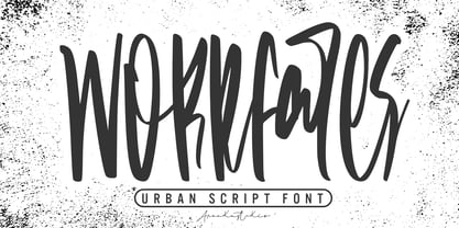 Introducing a Workfares - Urban Script Font with sharp and beautiful letters that create fonts that are modern, trendy and elegant. Workfares came with opentype features such stylistic alternates, stylistic sets & amp; amp; ligatures good for logotype, poster, badge, book cover, tshirt design, packaging and any more. Features : • Character Set A-Z • Numerals & Punctuations (OpenType Standard) • Accents (Multilingual characters) • Ligature • Alternate There it is! I really hope you enjoy it !
 - Sign Work JNL by Jeff Levine,
$29.00 The 1951 sheet music of "I Like the Wide Open Spaces" has the cover title set in a casual type design that emulates the "one stroke" or "speed letter" style so popular with sign painters in that decade. Taking the lettering on the sheet music and expanding the character set with a new interpretation, the result is Sign Work JNL which is available in both regular and oblique versions.
 - Avangard by Larin Type Co,
$12.00 Avangard - a new hand drawn script font in 2 styles. These fonts are ideal for branding and will decorate any of your projects. You can also use them to create a logo or use for small businesses, t-shirts, book covers, stationery, marketing, blogs, magazines, and more. Also I made alternates, ligatures and swash, with their help you can make your project more beautiful and unique. Enjoy using!
 - Spring Market Serif by BeckMcCormick,
$16.00Spring Market is a farmhouse-style serif font. One of my first-ever releases, it was lovingly hand-drawn and inspired by the countryside of Upstate South Carolina. Spring Market Rustic Farmhouse Serif Font has the perfect amount of rusticity and refinement for your next project. I recommend this font for logos, invitations, and your next home decor project that needs that shabby chic touch! Spring Market features European language support! - Matsuyama by Arendxstudio,
$15.00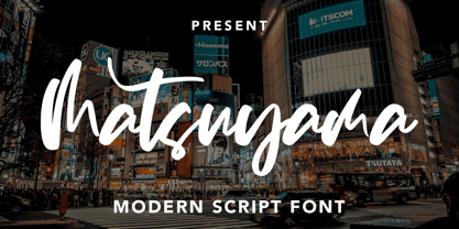 Introducing a Matsuyama - Modern Script Font with sharp and beautiful letters that create fonts that are modern, trendy and elegant. Matsuyama came with opentype features such stylistic alternates, stylistic sets & amp; amp; ligatures good for logotype, poster, badge, book cover, tshirt design, packaging and any more. Features : • Character Set A-Z • Numerals & Punctuations (OpenType Standard) • Accents (Multilingual characters) • Ligature • Alternate There it is! I really hope you enjoy it
 - Falsetto Signature by Putracetol,
$28.00 Falsetto Signature is a modern handwritten signature with unreadable letter. I call it "unreadable" because you will see it twice when you read text in this font. The space is very close and the font is flat are the characteristics of this font. Falsetto Signature best uses for signature, heading, cover, branding, invitation, label, poster, logos, quotes, product packaging, header, merchandise, social media & greeting cards and many more.
 - Donnager by Harvester Type,
$15.00 Donnager is a rough, hard and futuristic typeface. It is inspired by square shapes, dystopia and futurism. The name is inspired, like the font itself, by the Dead Space universe. I can just see this font on the cover of some dystopian comic book! The font has alternate glyphs. The uses are unlimited, as there are different styles, weights, and even a variant version. Logos, posters, headers, branding, prints and more!
 - Summer Romance by Hanoded,
$15.00 I am not a very romantic type (pun intended…), but a slightly slanted connected script always looks as if it was made for romance! Summer Romance is a beautiful connected script, made entirely by hand using a Japanse calligraphy brush-pen. It looks good on just anything: romantic book covers, beauty products, travel websites advertising romantic get-aways… Comes with double letter ligatures and a whole bunch of diacritics.