10,000 search results
(0.016 seconds)
- Maulidine by Subectype,
$15.00 Maulidine is a beautiful modern calligraphy font. It includes elegant ending swashes which makes it perfect to give a luxurious feel to your designs. It’s perfect for logos, product packaging, wedding invitations, branding, headlines, signage, labels, signature, book covers, posters, quotes and more. What's Included: Mauldine Script - TTF I hope you enjoy this font. If you have any questions please don't hesitate to drop me a message :)
 - Conspirator by Arendxstudio,
$22.00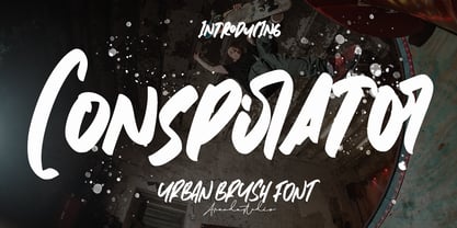 Conspirator - Urban Brush Font with its distinctive character that can be easily implemented in your various design projects . Conspirator came with opentype features such stylistic alternates, stylistic sets & ligatures good for logotype, poster, badge, book cover, tshirt design, packaging and any more. Features : • Character Set A-Z • Numerals & Punctuations (OpenType Standard) • Accents (Multilingual characters) • Ligature There it is! I really hope you enjoy it .
 - Maidstone by Arendxstudio,
$15.00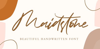 Maidstone - Beautiful Handwritten Font with sharp and beautiful letters that create fonts that are modern, trendy and elegant. Came with opentype features such stylistic alternates, stylistic sets & ligatures good for logotype, poster, badge, book cover, tshirt design, packaging and any more. Features : • Character Set A-Z • Numerals & Punctuations (OpenType Standard) • Accents (Multilingual characters) • Ligature • Alternate There it is! I really hope you enjoy it
 - Persian Ruby by Si47ash Fonts,
$10.00 It's not fragile, it's delicate! :D A Arabic font (Persian typeface), as a gift for you type lovers! This font does not support any Latin characters. Just Persian and Arabic. You can get this font for free by buying another Si47ash Font: https://www.myfonts.com/foundry/si47ash-fonts/ Let me know when you did it and I will send you a promo-code: shahabsiavash [at] gmail [dot] com
 - Conspiracy by Arendxstudio,
$18.00 Conspiracy - Urban Brush Font with its distinctive character that can be easily implemented in your various design projects . Conspiracy came with opentype features such stylistic alternates, stylistic sets & ligatures good for logotype, poster, badge, book cover, tshirt design, packaging and any more. Features : • Character Set A-Z • Numerals & Punctuations (OpenType Standard) • Accents (Multilingual characters) • Ligature There it is! I really hope you enjoy it
 - Mallikha Brush by Gatype,
$18.00 Mallikha Brush is a luxurious, handbrushed typeface with an authentic and casual feel. It would be perfect to use for Branding, Logo Design, Lettering, Logo Type, Clothing, Posters, magazines, packaging, posters, shopping bags, t-shirts, book covers, photography, special events and other design projects. Feature : Uppercase & Lowercase Number I hope you enjoy this font. If you have any questions feel free to message me :) Best, Gatype
 - Sensory Overload by Hanoded,
$15.00 Whenever I create a font using a Chinese brush and ink, it almost always comes out scary-looking. Sensory Overload is not like that: it is quite a neat and tidy font, even if it is a little rough around the edges. Sensory Overload is an all caps typeface and would be ideally suited for book covers, headlines, packaging and posters. Comes with an overload of diacritics.
 - Heroism Theory by Arendxstudio,
$15.00 Heroism Theory - Cute Handwritten Font with sharp and beautiful letters that create fonts that are modern, trendy and elegant. Came with opentype features such stylistic alternates, stylistic sets & ligatures good for logotype, poster, badge, book cover, tshirt design, packaging and any more. Features : • Character Set A-Z • Numerals & Punctuations (OpenType Standard) • Accents (Multilingual characters) • Ligature • Alternate There it is! I really hope you enjoy it
 - Aldo Pro by Sacha Rein,
$21.17 Aldo Pro is a contemporary sans serif OpenType font family designed by Sacha Rein. With 8 weights from hairline to black and an extended latin character set of 690 glyphs it is suitable for all typesetting needs, from advertising and branding to web and screen. Aldo Pro is the evolution of the free Aldo semi-bold font published on dafont.com in 2007, and which has been downloaded over 700.000 times. « I have gotten quite a lot of feedback on the original Aldo over the years and tried to integrate most of it into Aldo Pro. The x-height has been reduced to make for a less condensed, more legible font, which makes it more useful for body text than before. By popular demand the X glyphs have been changed to a more ‘classic’ shape. The font also contains some useful ligatures now. »
 - Syke Mono by The Northern Block,
$39.00 A monospaced companion of the Syke type family. Using the proportional typeface as the reference details are carefully drawn into specially chosen characters to help improve centre alignment, function, and readability. Syke mono has a modern aesthetic style that is distinctive and stands out from the typewriter crowd without being too overpowering making it ideal for computer coding, database applications, ebooks and other screen-based interfaces. Details include five weights and true italics, over 590 characters with an alternative lowercase a, i, l and r. Five variations of numerals, manually edited kerning and Opentype features.
 - Cooper Black by URW Type Foundry,
$89.99Cooper Black The Cooper Black font should be used in display sizes only. Cooper Blacks serifs are rounded and the counters are small. Cooper Black was designed by Oswald B. Cooper for Barnhart Brothers & Spindler in 1921 for advertising and posters. The capital O and Q of the Cooper Black font are tilted back; in the lowercase, the dot on the I and j become elliptical. The extra bold Cooper Black font has a remarkable personality and reproduces well in sizes over 18 point in titles, subheadings and generally short sentences. - Ampmosphere by Joey Maul,
$22.00 Ampmosphere, a picture font, contains instruments and components from a 60's rock and roll band. After a friend's request to create a guitar graphic, I decided to start a set. Over time, more instruments were added along with amps, tubes, lights, etc. The glyphs are great to use individually or combined. 65 detailed glyphs in all... A - Z upper and lower case; 0 - 9; comma, period and forward slash. Upper case A, B, C and D are the separate strings for the stringed instruments a, b, c and d.
 - Swingers by AdultHumanMale,
$20.00 Swingers is a curly, fun, cartoonish display font. I wanted it to look light, but loud, so it can yodel from Posters and Headlines. It has over 300 glyphs, several variations on the standard alphabet and all those extra pesky foreign features. OpenType coded, It has various letter pairings that interlock automatically to create a more randomized, bespoke feel to your copy. It also has tons of extra characters and other combinations available directly through your glyphs palette. Play around with it, break it, like it, buy it.
 - Wee Todd by Typadelic,
$19.95 Wee Todd is a well-connected script font in the rough style of a lefty. Several of my closest friends are lefties and I, over the years, have carefully observed their writing style. For the most part they have unique, interesting handwriting and Wee Todd is a reflection of that style. Notice how Wee Todd’s characters connect. I’ve designed additional ligatures and characters into the typeface so that characters are substituted as you type (in OpenType savvy applications), giving the appearance of natural, spontaneous handwriting. Try it and see!
 - Milescut by Tipos Pereira,
$14.00 Milescut is a display typeface inspired by some seminal covers the graphic designer and photographer Reid Miles created for the Blue Note Records between the 1950s and 1960s. Miles made almost 500 covers for Blue Note in this period, including some using the hand-cut technique that consists basically in doing vertical cuts in capital letters and numerals to create a unique style within the universe he created for Blue Note. Milescut is a tribute to this small “cut” 😬 in his trajectory within the greatest record label of all time. This idea came about while I was working on what will become soon a revival of a wood type that I fell in love with when flipping through a Specimen of the MACHINE CUT WOOD TYPE manufactured by The WM. H. Page Wood Type Co. Milescut has two extra sets of alternates that work cyclically when activated in your OpenType menu and lots of ligatures, pretty cool :)
 - AM False Etruscan by Alberto Milli,
$30.00I created this font following my love for Etruscans, their culture and their myths. Many times I looked for a false, but similar, Etruscan TrueType font on the Internet, but I didn't find it, so one day I decided to make it myself. - Dear Dolores by Samuelstype,
$24.00 Dear Dolores has had its name from the latin word dolorem, meaning sorrow or grief. When I started working on this display font I found myself trying it out using the latin requiem texts. The capitals somehow sat well with the monumental and solemn words of mourning. The broken hairlines suggested stone cuttings where the fine details had been worn down and obliterated over time and it felt at home in a churchyard or in a monument park. Adding lowercase gave the font a more personal and friendly appearance and opened up new possibilities for use. The name itself is a fictional message to someone long missed or perhaps lost too soon. Dear Dolores comes in a cut and an uncut version where the fine details are left intact. Both are excellent for headlines or memorable quotes.
 - Brinar by Hackberry Font Foundry,
$24.95 I've been working on a usable sans serif for body copy since the mid-1990s (though I certainly did not know it at the time). This one works well. It started life back in the mists of time as a scan of an old German font by Carl Fahrenwaldt. It was developed fully as a synergized serif with strong traditional roots and released as Bergsland Pro. Now it finally makes it to where I was headed all along as a sans text font. This is a well modulated humanist, sans serif font family with many OpenType features and over 600 characters: Caps, lower case, small caps, ligatures, swashes, small cap figures, old style figures, numerators, denominators, accents characters, ordinal numbers, and so on. It is designed for text use in body copy. But it also works very well for elegantly stylized display.
 - Green Fairy by Maria Montes,
$39.00 Green Fairy is a chromatic font family highly ornamented for display purposes. Green Fairy’s characters have been specifically designed to accommodate its loops and ornaments following a modern typeface structure. Green Fairy has four chromatic weights: 1. Green Fairy Outline 2. Green Fairy Dots 3. Green Fairy Stencil 4. Green Fairy Full The outline weight has been created as the base or structure for the other weights. You can combine these weights as well as add colours to obtain multiple effects and type styles. Green Fairy has also three combined weights (combos) to simplify your work flow, for these occasions when you only want to use one single colour in your font: 5. Green Fairy Dots Combo 6. Green Fairy Stencil Combo 7. Green Fairy Full Combo GREEN FAIRY ORIGINS The origin of this typeface is the lettering I designed in October 2015 as part of my illustrated cocktail artwork called “Absinthe. La Fée Verte (The Green Fairy)”. Originally, this lettering only featured eight letters “AB·SINTHE” vector drawn in Illustrator. Right after creating the full-colour artwork, I designed a fountain-letterpress print version of it, in collaboration with Ladies of Letters, A.K.A. Carla Hackett and Amy Constable from Saint Gertrude Fine Printing. At the beginning of 2016 –and thanks to the project @36daysoftype– I found the motivation, and most importantly the deadline, to draw the rest of the twenty-six letters of the uppercase alphabet using Illustrator. I started 2017 having my first two calligraphy courses sold out, so I took this amazing opportunity to devote myself to Green Fairy for a few months. In February 2017, I purchased the font software Glyphs and I started to re-draw all twenty-six letters of the uppercase alphabet again. PRODUCTION PROCESS Green Fairy started being one weight, but quickly turned into a layered/chromatic font. Things were going more or less fine till I arrived to the Dots weight: 1) I started drawing squares following a grid; 2) Then, the squares turned into diamonds following the same grid; 3) Then, the grid wasn’t working so well on the round letters so I tried randomising the position of the diamonds but it didn’t work; 4) So I went back to the grid, and this time scaled down the size of the diamonds creating a visual half-tone effect. I spent over four weeks working on the Dots weight and I felt like I was in the middle of a very long tunnel and I couldn’t see the light at the end. I encountered many other problems along the way but by June 2017, I felt I was back on track again. I kept working, tweaking, re-drawing and re-adjusting, and then the diacritics came on board… And then more re-drawing, re-tweaking, re-adjusting and then numbers… And then spacing, symbols, and currencies… And then more spacing, kerning, contextual kerning for triplets… In September 2017 I told myself “that’s it, I’m going to finish it now!” But guess what? More re-tweaking, testing, hinting, testing, rendering, testing… For those of you not familiarized with typeface design, it is extremely time consuming and it requires a lot of hard work, focus and determination. This project could not have been possible without the help of these generous professionals: Jose Manuel Urós, typeface designer based in Barcelona and my teacher twice in the past; Jamie Clarke, freelance letterer and typeface designer who has released a couple of chromatic fonts recently; Troy Leinster, Australian full-time typeface designer living and working in New York City; Noe Blanco, full-time typeface designer and hinting specialist based in Catalonia; And Nicole Phillips, typographer currently relocating from Australia to New Zealand. To all of you: THANK YOU VERY MUCH!
 - Monkeytails by Wiescher Design,
$39.50 I don't know what other typedesigners call those long swirling embellishment, but I call them "Monkeytails". So when I decided on this version of my good old Royal Bavarian, I decided to call the new font "Monkeytails". I just fell in love with this name. Monkeytails and Royal Bavarian should be used together, in order not to have too many embellishments. That's why I offer the two together for a good price. Your swinging typedesigner Gert Wiescher
 - Camy by Scholtz Fonts,
$9.50 I wanted to create a "handwriting" font which could be used professionally. I have often needed such a font with a variety of weights and styles for a particular project and have had to resort to mixing fonts, creating a rather messy, amateur job. Camy is named for a little village in South West France where I did much of the initial work on this font. Camy is ideal for contemporary display work, comes in ten styles, and has a contemporary appeal with its casual, easy to read letters. Camy was designed as a total professional package for designers looking for a handwritten font suitable for all kinds of contemporary display work: the idea being that once you have the Camy Professional Pack you don't have to waste time searching for other handwritten fonts. The Family: LIGHT -- NARROW - light weight, condensed width, delicate line -- MEDIUM - light weight, delicate line -- WIDE - light weight, expanded width, delicate line NORMAL WEIGHT -- NARROW - of medium weight and condensed width - perfect for limited space -- MEDIUM - of medium weight -- WIDE - of medium weight and expanded width BLACK - for best readability -- NARROW - condensed width for bolder statements in small areas without losing legibility -- MEDIUM - for bolder statements -- WIDE - expanded width for bolder statements FAT -- WIDE - for maximum impact Use a combination of styles for product branding, book covers, invitations, greeting cards. The Camy combination works well for both headings and body text. Camy contains over 250 characters - (upper and lower case characters, punctuation, numerals, symbols and accented characters are present). It has all the accented characters used in the major European languages.
 - Whimsical Musical by Harald Geisler,
$34.56 Whimsical Musical is a vivid, hand drawn font with 405 alternate letters, all caps. Developed from a lighthearted drawing in my sketchbook saying the German word “MUSIK” cheerfully over and over in twenty vivid variations. Next to it was the date “6th April 2007”. This initial idea has burst into a font that is full of surprises and whimsical turns. It is dynamically suggestive, like music, and humorously chaotic, as in Dada. Each uppercase letter is enriched with ten stylistic alternates (OpenType stylistic sets) to create a heap of playful variations amounting to a mountain of possibilities. Recommended for display usage: gonzo headlines, fantastical picturesque covers, extravagant quirky flyers, chichi posters, individual labels and fun logos.
 - MeM by 26+,
$40.00 MeM is an eccentric experimental type system created by Elena Schädel and Jakob Runge in 2012. It produces many personalities, each individual and emotive. You will never know which of the alternating letters is going to occur next. Basically, at the heart of it all is MeM: four different weights and letter shapes melded together into one powerful font and shuffled with the sleek usability of OpenType.
 - Karika Hypnotica by Deniart Systems,
$20.00 Karika Hypnotica is the 4th volume in the Karika series of swirly circular symbols. The 52 original designs feature hypnotic motifs in circular symmatrical forms. A splendid addition to any illustration or design project such as backgrounds, greeting cards, posters, etc. Karika Hypnotica's characters are symmetrically sized in height and width so they'll work charmingly together with our Karika Hearts , Karika Swirls and Karika Encore symbol fonts.
 - Murisa Valeria by Murisa Studio,
$10.00 To start this year, we present a beautiful and attractive font. Font inspired by calligraphy strokes in the Middle East. Murisa Valeria is a beautiful font. With care and patience, we created and processed the font with a deep artistic effect. We believe that the fonts we create have high appeal. We make it with all our heart. Murisa Valeria is a font that you really deserve.
 - Tradizional by PizzaDude.dk,
$15.00 Say hi to my happy shadowed font. It's handmade from the heart and is very playful in a very authentic way. The good feeling Tradizional gives the viewer, definitely comes from the 5 different versions of each letter. It makes the text look so realistic, that people forget that they are actually looking at a font! Full of international characters, in order for some international fun!
 - Karika Encore by Deniart Systems,
$20.00 Karika Encore is the 3rd volume in the Karika series of swirly circular symbols. The 52 original designs feature floral and musical motifs in circular symmatrical forms. A splendid addition to any illustration or design project such as backgrounds, greeting cards, posters, etc. Karika Encore's characters are symmetrically sized in height and width so they'll work charmingly together with our Karika Hearts and Karika Swirls symbol fonts.
 - Toyster by Sharkshock,
$115.00 Toyster is an all caps display font designed with playfulness in mind. The childlike characters are defined by their rounded corners, low contrast, and pudgy weight. Smooth contours ensure this will look great for large print projects. Use it for a children's' book, toy packaging, cartoon, or store signage. With 3 different versions Toyster is sure to resonate with kids and the young at heart.
 - Happy Go Lucky Display Font by Goldfish Girl Creative,
$9.00 A Feel Good Kinda Font This playful and light-hearted, sans serif, display font includes uppercase letters, numbers, and punctuation. Great for carefree, boho, and fun designs like stationery, logos, wall art, stickers, patterns, and products. Use the font styles separately or try layering them! Built for easy use in Canva too. Includes: Happy Go Lucky font in 3 styles: Regular, Outlined, and Rounded
 - Captura Now by TypeThis!Studio,
$54.00 Carefully refined shapes and sensitively balanced spacing and kerning create the gentle rythm that grants Captura Now its warm-hearted face, perfect in form and shape. Expanded with an enormous character set, Captura Now offers the freedom to transform your design into the Cyrillic-language world, as well as into any Latin based language — including Vietnamese. *Variable fonts work well in software that supports variable font technology.
 - Rainbowie by Stephan Kamperman,
$18.00 Rainbowie is a font that's ideally used for festivals, artists and logos. It has 3 different widths to make it ideal to use in small and wide spaces. The font has a stencil style that can be used in suprising ways for an unique touch in your design. It also provides several special characters with a star, sun, cloud, trees, guitar, lightning bold and heart.
 - Stolen Times by Mans Greback,
$59.00 Stolen Times, designed by Mans Greback, is a cute and quirky handwriting font that exudes a light-hearted and naive charm. With its hand-crafted appearance and calligraphic touch, this font brings a sense of warmth and personal connection to your design projects. Perfect for craft, homemade items, or simply adding a playful touch to your work, Stolen Times is a delightful and unique typeface.
 - Goth Chic by Comicraft,
$19.00 This pale face -- a Byronic offering from the disaffected youth section of our library -- will provide that slightly sad, sunken eyed feeling most closely associated with Doc Martins, heavy crosses and clothes as black as the blaquest heart... so if you're looking for tragic tramp stamp typography, we think our tattoo parlor maid to wear font will provide just the right amount of Goth Chic.
 - Overnight Oats by Hanoded,
$11.00 I recently walked part of the South West Coast Path in the UK. A couple of days in the hike, I came across a small cafe and I decided to have an oat latte (I am lactose intolerant). Since it was early in the morning, the breakfast menu was out and one of the items I noticed was ‘Overnight Oats’. I normally cook my oats with some lactose free milk and water, but apparently you can soak them overnight, add fruit and nuts and eat it like that. I tried it, it’s ok, but I think I prefer the cooked version. Overnight Oats is a bit of an odd font: it is very higgledy piggledy, yet legible and unique. If you want something out of the ordinary, then this may be your font!
 - Alpha Bravo by Wiescher Design,
$39.50 AlphaBravo was born on a napkin. I was just doodling, playing around with letterforms when the ballpoint glided a little bit too far and suddenly I had my first letter with the dash sticking out on the left of the e’s horizontal line. I quickly checked on how many letters I could let a line stick out! Then I wrote a couple of words that way and letters joined in the most unusual places, creating new closed forms. I gave the font a try and quickly discovered, that I had stumbled onto an interesting new typeface. I didn't know how to call it, so I simply used the first two letters of the alphabet, Alpha and Bravo. Looking forward to Charlie and Delta, your very curious, Gert Wiescher.
 - Maracatu by Bruno de Aviz,
$5.00 The family of Tipografia Maracatu was born in 2020 when we could not leave the house because of the coronavirus epidemic. I had no idea how it would turn out. I just wanted to draw letters. When I finished the regular version, I thought it looked a lot like the art and music from the Northeast of Brazil, and that is why I came up with the name Maracatu. Maracatu is a musical-style original from the Northeast of Brazil. After I had the font style and the Regular version, I thought it would be nice to have Bold and Light.
 - Quincy by Wiescher Design,
$12.00 »QUINCY« started as an art project. I was stitching roughly cutout letters together on a piece of wooden board, but I didn’t like the result! So I ended up with a font in three cutout styles. I thought it was so unusual and really beautifully ugly, that I finished it, adding flashes here and there. Now I am offering this absolutely unusual font as a packet of three for you to enjoy. Have at least as much fun working with it as I had designing the packet. The font is great for packaging or posters, or whatever comes to your imaginations.
 - ZF Gently by ZooFont,
$22.00 Gently, newly released by ZooFont, is a sans serif typeface that harmoniously combines straight lines and curves in a clean form. The stable form, which has its origins in handwriting, and the look of analog sensibility are enough to inspire confidence. Gently has a total of 9 weights, so it can be used freely anywhere, from body text to headlines. In addition, the height of the letters is economically calculated to achieve a reasonable line spacing, ensuring comfortable readability in various digital media. A cool breeze blows, a soft smile spreads across your lips, When I'm with you, the love in my heart seems to awaken. Your sweet whispering voice makes my heart flutter. Gently has the following features: 9 weights (from Ultra light to Ultra Black) extended latin 450+ glyphs fixed width numbers The Latin extension offers more than 130 languages with extensive multilingual Latin support for Western, Central, and Southeastern Europe.
 - Prague Metronome by 38-lineart,
$16.00 We are happy to introduce Prague Metronome, inspired by the city of Prague and the metronome in the heart of this city. Prague Metronome, a font made manually by hand that we set in such a way that everything is connected in a neat rhythm, just like metronome used by musicians to set the tempo. This font has alternate stylistic for Uppercase and Lowercase, we also complement lowercase with alternate swash and titling. No half-hearted, we added 142 ligature to get the impression of natural handwriting. Comes with two thicknesses namely hairline and monoline as well as a unique shape appearance that will attract interest when used as your brand identity. This font can be used for brands, quotes, headers, websites, and other broader graphic designs. Prague with its metronome is a symbol for everything, beauty, history and personal impression that cannot be described. If European cities were a necklace, Prague would be a diamond among the pearls. Enjoy our font. thanks.
 - Kidnapped At Old Times by Intellecta Design,
$11.90 Kidnapped at Old Times, by Intellecta Design, is a collection of 35 fonts (and growing) of some of the most decorative caps we have ever carried. Decorative caps can capture the attention of anyone when used well. These caps are remarkably interesting and very detailed. So many to choose from - the entire family has over 2000 exotic, intrincate and historical letters. Easier to just order the whole family!