10,000 search results
(0.192 seconds)
- Calligraphy - Unknown license

- Cyceon Pro by DBSV,
$90.00 Fluted pillars… As for the name of "Cyceon", it is a "juice-drink" that they made in ancient Greece...! In this font the straight lines are not vertical but inclined like something from the Doric columns!!! There are two versions of letters. In the first version, it is of a normal character, while in the second version I have mixed some capitals with lower case letters. I have given them the acronym Msc "miscellaneous". I tried in this way to give another version of the small capitals and I think they show a different view from the purely small capitals… And in this family, the “Strap”/“Strap Msc”/“StrapIt”/ and “Strap MscIt” with “Solid”/“Solid Msc”/“SolidIt”/ and “Solid MscIt” engage in the same way like… “Layered font families” as the previous series. This series is composed and includes twenty-four fonts with 642-658 glyphs each, with true italics and supports Latin, Greek and Cyrillic.
 - DragonFyre by Scholtz Fonts,
$21.00 Beware: Here be Dragons! It Be Dangeroues to Venture Yonder! This warning, inscribed on a rock at the entrance of a cave in an inaccessible mountain in the far north of Scotland, provided the inspiration for the font DragonFyre. While I have not seen the actual rock myself, I have based the font on an accurate drawing of the original inscription. DragonFyre speaks of lands beyond our ken, of wistful faerie kingdoms, of dark happenings and white magic. Use it at your peril, for its very use will conjure up worlds long forgotten, places of faeries, elves and hobgoblins, of ogres and giants. Those who read texts written in this font may well have their lives strangely changed. I have included a complete character set of 242 characters; upper and lower case; as well as all accented and special characters. All characters have been carefully letterspaced and kerned. For maximum dramatic impact I suggest you use combinations of both upper- and lower-case characters.
 - Imperial Tea by Hanoded,
$15.00 I am a coffee person, but two years ago, just before the whole Covid-thing happened, I came down with what I assumed to be the flu. It was a really nasty flu as well: I was down for 10 days or so and when I sort of recovered, nothing tasted the same. Coffee tasted like cardboard and I couldn't stand the taste of it, so I decided to drink tea instead. The 'supermarket tea' we have in Holland is quite bad and tasteless, so I ordered some proper strong English tea online and I have been drinking it ever since. Of course I was thinking of this when I created Imperial Tea font. Imperial Tea font was made with... yes, you've guessed it: Chinese ink and a brush. Imperial Tea is a nice, 'oriental-ish' looking font that comes with a set of alternate glyphs and an impressive language support, including Vietnamese and Greek.
 - Royal Bavarian by Wiescher Design,
$39.50 RoyalBavarian was comissioned by King Ludwig the First of Bavaria about 1834. He was probably the greatest king Bavaria ever had, but he fell in disgrace for a short affair with the infamous Lola Montez and subsequently had to resign. He died in 1868, peaceful and happy in Nice on the French Riviera. I happened on an original etching of his type-guidelines for official writers of those days about 20 years ago. I always thought it was a very nice Fraktur (Blackletter), not a sturdy militaristic one as most of them are. Being me, I started with first tests immediately and then just forgot the font on my computer. When I was sorting out old stuff a couple of months ago I happened on the etchings once again and kept on working intermittently on the letters. The Plain cut is pretty much like the king wanted it. The Fancy cut is more to my liking and very decorative. Yours in a royal mood, Gert Wiescher.
 - Doretypo by Rosario Nocera,
$10.00 Doretypo was born accidentally, during the design of a poster for a jazz festival in Rome. I was going to realize a typesetting, but I could not find the right character and decided to draw the letters I needed, starting from the first letter of the headline, capital M. I was looking for a lettering able to evoke musical notes, where each letter could be linked to the following one, to the previous one, to the largest at the top and the smallest at the bottom. From this idea doretypo came to life gradually. In the beginning there were a few medium capital letters with very few glyphs, but given the good results I decided to decline in light and bold, integrating minuscule letters, for a whole of 374 glyphs. Today doretypo OpenType is a family of fonts with three weights, 374 glyphs, supporting about 57 languages, ligatures standard, plus a new “NY”. Moreover, each glyph can be used individually to create textures and graphic symbols.
 - Fun Write by FunFont,
$19.00 Fun Write is a font characterized by a playful and enjoyable nature, much like letters inscribed with full-hearted merriment, as implied by its name. With its simple and naive font structure, rounded edges, and an absence of sharp angles, it eschews the pointed facets typical of expressive marker strokes. This font is exceptionally well-suited for your design projects requiring a whimsical and delightful character reminiscent of a child's world
 - Mano Danielli by Kate Brankin,
$32.00 Mama, are you doing letters? I want to do letters too! Mano Danielli is based on the writing of a 6 year old child. Great for anything that has to do with children - even the inner ones.
 - Blue Sheep by Hanoded,
$15.00 It's been a while since I named a font after a sheep, so I figured it was about time. The Blue Sheep, or Naur (Pseudois nayaur), is actually an existing species of sheep. It is found in the Himalayas and is a major food for the very rare snow leopard. Peter Matthiessen wrote a book about it called The Snow Leopard. My Blue Sheep font is not rare, nor threatened. It is an uplifting text font. It is very legible and fun to use and will keep you bleating for more. Comes with a flock of diacritics.
 - Breadcrumbs by Hanoded,
$15.00 Every morning, after the kids have gone to school, I vacuum the floor and remove about half a kilo of breadcrumbs… No, not really have a kilo, but any given bird could probably survive on the leftovers. When it was time to name this font, Breadcrumbs was all I could think of! Breadcrumbs and children seem to go together well, as they are featured in Hansel & Gretel and Hop-o'-My-Thumb. Breadcrumbs font is a happy, sloppy fairytale font, which you can use for your book covers, your party posters and maybe crumbly bread packaging. But that is entirely up to you.
 - Wildstyler by Tomatstudio,
$10.00 Today everyone can create wildstyle graffitii easily! With all my experience in graffiti and my street art life, i proudly present "Wildstyler fonts". Wildstyler style is combined my original graffiti style and several best graffiti styles around the world. Combine Wildstyler Line and Wildstyler Fill for best result, add it with drop shadow or extrude to make it more realistic, also add highlight shine is also make it stand out! Best for your Graffiti assets, Street art design concept, Hip-Hop events and many more! Although i already set the kerning and spacing, i reccomend you guys to adjust the kerning manually for the best results, it's because yea you know.. this is real graffiti styles! not an ordinary fonts.
 - Bombelli Light Hand by Wiescher Design,
$39.50 Bombelli is a font that looks like it has been handwritten by a meticulous architect in one of those hand-drawn blueprints of the old days. I chose the name to honor one of my ex-bosses -- a graphic designer-architect who taught me a lot of things when I was young and needed the money. One of the things he taught me – and probably the most important one – was to always be on time in the morning. He never said a word about me being late, but it worked. He taught me about being meticulous in detail and many other things I only appreciated much later. This clear and straightforward font deserves bearing his name. Your grateful type designer Gert Wiescher
 - Briosh by Larin Type Co,
$12.00 Briosh - a hand drawn script font. Beautiful and elegant but at the same time unique thanks to its ending letters. It is stretched and not in a hurry , attracts attention and is perfect for creating logos, greeting cards, branding, book covers and many others. Alternative characters will help you create a project that is not repeatable. I decided to reflect this font in two styles, clean and rough, as you can see in the preview image. Enjoy using!
 - Thik by Zang-O-Fonts,
$25.00I've heard it described as "Copperplate Gothic" on LSD. It's broad, funky and dangerously pointy. - Tenacious Brush by PintassilgoPrints,
$26.00 Tenacious Brush is an expressive font, provocative, free spirited and wild hearted. It's an all-caps face, with 4 alternates for each letter and 2 for each numeral — some letters also have stylistic choices. For that spontaneous hand-painted feel, you know. Turn on the contextual alternates feature to automatically cycle all these variety of glyphs. Or... pick your choices manually, which is quite a playful task now in some applications like Adobe Illustrator and Photoshop — just select a glyph and you see its alternates. The font brings yet some useful ornaments to give an extra buzz here and there. And let's not forget to mention the extended language coverage. And there are even fractions available! And ordinals! Definitely not just a rad face. This is a cool brush font with a contemporary tone, offering endless design possibilities: logos, poster art, branding, bold imagery, packaging, t-shirts, apparel and much more... With loads of attitude included. Step into it!
 - Robert Moore by Harvester Type,
$15.00 Robert Moore is a font that was specially designed for comics. A lot of work has been done. At first, glyphs were drawn manually using different markers, then they were transferred to the font. The font was tested on real printing and digital comics. The world of fonts for comics is big and I wanted to create even more variability for authors with one family, which is why a variable version was created containing two axes: weight and italics. This gives you more options. A large number of glyphs, multilingualism, ligatures, and a capital give even more scope for work and creativity. The name was created from the names of the authors of the comics Robert Kirkman and Alana Moore, so the Robert Moore font turned out. Although the font was made for comics, it is not limited to them. Posters, logos, covers, text, headings, prints, product design, web, interfaces are not all options for using the font.
 - Paltime by Typodermic,
$11.95 Step right up, ladies and gentlemen, and feast your eyes on the most dazzling typeface in the land! Paltime is the star of the show, with its all-caps display font and dotted “marquee lights” style that will light up any design like a three-ring circus. But that’s not all, folks! Paltime is a font that knows how to have fun, with layers of dots, hearts, and stars that can be stacked on top of the solid layer to create a multicolored effect that will leave your audience in awe! It’s like a carnival in your design, and everyone is invited. And even if you prefer to keep it simple, Paltime has got you covered. The Marquee, Love, and Glam styles are all standouts on their own, perfect for when you need a monochrome setting or just can’t get enough layer stacking in your life. So come on down to the Paltime font party and join the fun! With its circus barker style, this typeface will be the talk of the town and the star of your design! Most Latin-based European writing systems are supported, including the following languages. Afaan Oromo, Afar, Afrikaans, Albanian, Alsatian, Aromanian, Aymara, Bashkir (Latin), Basque, Belarusian (Latin), Bemba, Bikol, Bosnian, Breton, Cape Verdean, Creole, Catalan, Cebuano, Chamorro, Chavacano, Chichewa, Crimean Tatar (Latin), Croatian, Czech, Danish, Dawan, Dholuo, Dutch, English, Estonian, Faroese, Fijian, Filipino, Finnish, French, Frisian, Friulian, Gagauz (Latin), Galician, Ganda, Genoese, German, Greenlandic, Guadeloupean Creole, Haitian Creole, Hawaiian, Hiligaynon, Hungarian, Icelandic, Ilocano, Indonesian, Irish, Italian, Jamaican, Kaqchikel, Karakalpak (Latin), Kashubian, Kikongo, Kinyarwanda, Kirundi, Kurdish (Latin), Latvian, Lithuanian, Lombard, Low Saxon, Luxembourgish, Maasai, Makhuwa, Malay, Maltese, Māori, Moldovan, Montenegrin, Ndebele, Neapolitan, Norwegian, Novial, Occitan, Ossetian (Latin), Papiamento, Piedmontese, Polish, Portuguese, Quechua, Rarotongan, Romanian, Romansh, Sami, Sango, Saramaccan, Sardinian, Scottish Gaelic, Serbian (Latin), Shona, Sicilian, Silesian, Slovak, Slovenian, Somali, Sorbian, Sotho, Spanish, Swahili, Swazi, Swedish, Tagalog, Tahitian, Tetum, Tongan, Tshiluba, Tsonga, Tswana, Tumbuka, Turkish, Turkmen (Latin), Tuvaluan, Uzbek (Latin), Venetian, Vepsian, Võro, Walloon, Waray-Waray, Wayuu, Welsh, Wolof, Xhosa, Yapese, Zapotec Zulu and Zuni.
 - Cori by HiH,
$8.00 You wrote on your school notebooks, didn't you. Of course, just about everyone did. And those that didn't are probably in therapy trying to overcome the repression and guilt. Balloon letters are fun, easy to draw and have a light-hearted presence. With little autonomy, what young person can resist the opportunity to make a public, personal statement on their notebook. Guess what! Adults do it too - with our cars, our houses, our toys, our accessories and so on. And how "grown-up" are we really? Anyway, my niece, Cori, made this nice, colorful, hand-drawn birthday card. It was so vibrant and fun - in warm circus colors - that I could not resist making it into a font. Use it for positive, fun stuff, stuff with a light touch - an invitation for an informal party perhaps, but probably not a formal dinner at the White House. This font is not comfortable in a bowtie. But don't be fooled. Casual as Cori is, you can set at least twelve major European languages with it, in addition to English: Albanian, Danish, Dutch, Finnish, French, German, Hungarian, Italian, Norwegian, Portuguese, Spanish and Swedish. Cori Valentine adds a decorative Valentine border to the upper case of Cori. By leaving out the bow in the upper center of the border we were able to fit the border around the accented caps. Similarly, we omitted the butterfly for the Ccedilla glyph. Blank versions of the regular border & the bowless border are provided at positions 135 & 137 in case you want to put a border around your signature or something like that. Just for reference, the letterforms for Cori Valentine are 75% the size as the regular Cori font. We would like to assure you that it is permissible to use Cori Valentine to create a romantic card, flyer or note during any month with less the 32 days.
 - BikyBold - 100% free

- Excelsius by Comicraft,
$19.00 Once upon a midnight dreary, this Comicraftsman pondered, weak and weary, For a name synonymous with Mighty and Marvelous comics lore. Solid, Outline, Inline was the nameless font I'd crafted, I nodded, nearly napping o'er the work I'd grafted When suddenly came a tapping, As of someone gently rapping, rapping at my cubicle door. "'Tis some visitor," I muttered, "tapping at my cubicle door-- Calling out "EXCELSIOR!" Then an Amazing Vision beguiled my sad fancy into smilin', By the Spectacular decorum of the countenance it wore, "Though thy crest be shorn and shaven," he said, "thou art sure no craven, And thy font should not remain nameless here forevermore!" Eagerly I wished the morrow; vainly I had sought to borrow From comic books surcease of sorrow, letters that called out "EXCELSIOR!" Then, upon the velvet sinking, I betook myself to linking Fancy unto fancy, thinking of the nominative neuter singular thing Like Some Silvered Surfer wandering from the Nightly shore-- The Vision shrieked, upstarting--"Tell me what thy lordly name is thus!" Quoth the Craftsman: "EXCELSIUS!"
 - Stage Show JNL by Jeff Levine,
$29.00 “9 Garcons...Un Cœur” (“9 Boys...One Heart”) is a 1948 French musical starring Edith Piaf. The hand lettered credits for the film are done in a condensed Art Deco sans alphabet, now available digitally as Stage Show JNL in both regular and oblique versions.
 - Litter Funk by PizzaDude.dk,
$15.00 You may already have guessed it...Litter Funk is experimental typography. Some letters are fat blocks, others have stars, stripes or dots, some are funny and funky while others are plain weird - but all in all, they leave a really nice confusing effect when used. Due to the contextual alternates, each letter comes in 5 different versions, and automatically cycle as you type. Well, the font was fun to make - I hope you have fun using it! :)
 - Reaper BT by Bitstream,
$50.99Thomas Oldfield’s typeface, Reaper, is reminiscent of inscribed Greek letterforms but he claims that its origin is much simpler than that. “I recall”, Tom says, “that I just began the design by making the uppercase ‘I’ and continued using it to make up the other characters.” The cap only typeface has alternate cap forms in the lowercase positions, including a vastly scaled downed O and Q that make for some unusual text settings. Contrary to what the name might have you believe, there’s a lot of life in this quirky typeface. - Richfont by Enrich Design,
$24.95Richfont Bold is the bold version of my handwriting. I always felt that I had unique handwriting. When I was learning how to design fonts, the first font I made was Richfont Medium, which Bitstream is selling. The Bold version is the perfect companion to the medium version, which is offered at Bitstream. - Chillerz by Hanoded,
$15.00 I was doodling away on a piece of paper, when I noticed that the weird letters I was producing were in fact a nice font. So, I decided to build it! Chillerz is a lovely, messy handmade script font. It comes with double letter ligatures, a healthy attitude and a relaxed fit.
 - Dubbel Zout by Hanoded,
$15.00 Dubbel Zout in Dutch means ‘Double Salt’. I admit, it sounds better in Dutch… Dubbel Zout is a kind of licorice which we (in Holland) love! Not many people actually like it, but I know of one addict in Denmark, who eats it by the bagful. Dubbel Zout is a ‘crayon-ish’ font - all caps, different upper and lower glyphs that you can mix and a royal assortment of diacritics. It may be an acquired taste, but once you get used to it, you’re hooked!
 - Tritura by estudioCrop,
$19.90 Tritura is my personal take on textura fonts. Several methods of drawing were used, both analog and digital, to bring its overall rough feel. Each and every character was designed not from historical references, but from my view on this very peculiar typographic style. Instead of following established rules of character construction, I preferred to just keep in mind the mechanics of the pens used in textura drawings, as well as the little I already knew from the style, to create my own characters from there.
 - Bankal by Hugo Kuder,
$10.00 After a few months my new typeface "Bankal" is here! To create it, I always tried to keep a 90 degree angle. In French when you say that something is "bancal" it means that it's not right. This is why I choose this as a name because despite the name she is right. And for the K it's just for the style here. Bankal is a sans-serif font with 3 variations (bold, regular, light) Check more on my website : https://www.hugokuder.com/ or my instagram : hugokuderdesign
 - Taco by FontMesa,
$25.00 Taco is a new Mexican style font family based on our Tavern and Algerian Mesa type designs. When I finished the extra heavier weights for Tavern I decided to play around with a decorated version, the extra bold letters allowed for much more room to work with an inlay pattern. After experimenting with several designs I decided on a Mexican pattern because the original base font is very popular in Mexican restaurant logos and menus plus it's frequently used on Tequila bottle labels. I originally planned three weights for the Taco font family, however, after completing the bold weight I've decided to release it now so you may put it to use while the regular and extra bold are being produced, sorry I can't estimate a release date for the two other weights. To use the fill font layers you'll need an application that allows you to work in layers such as Adobe Creative Suite products. The Taco Fill Uno font may be used as a stand alone font, however, we recommend searching for our Tavern font family where you'll find three different bold weights of this same design. Opentype features aware applications are also needed for accessing the many alternate glyphs in Taco, all the alternates that you love in our Tavern fonts are also available in Taco. While the fill font layers are in registration with one another some applications may throw them out of alignment by changing the spacing. Custom inter letter spacing in Adobe Creative Suite may also throw the fill fonts out of alignment. We recommend doing your custom spacing first then duplicate the type layer and change to the next fill font and color. The inspiration for the Taco name of this font family was from a homemade Taco dinner I made for a guest at my house, after dinner I searched to see if there was a commercial font named Taco. There was no such font named Taco and the rest is history. The old Stephenson Blake Algerian font has come a long way since 1908, and we're not done with it yet. We hope you enjoy our Taco font family, we're looking forward to see it in use.
 - Andrew Typewriter by Andrew Tomson,
$10.00 Greetings, friend. I created this font for personal use on a YouTube themed channel about old things. The comments often ask what font I use, so I decided to share it with the community. You can use it in your commercial projects and for personal use. The font is great for creating a vintage text feel. The font is perfectly readable and scalable because I chose the most comfortable DPI for scaling when creating it. I wish you good luck and enjoy using this font!
 - Ongunkan Iberian Script by Runic World Tamgacı,
$50.00 The Iberian scripts are the Paleohispanic scripts that were used to represent the extinct Iberian language. Most of them are typologically unusual in that they are semi-syllabic rather than purely alphabetic.[1] The oldest Iberian inscriptions date to the 4th or possibly the 5th century BCE, and the latest from end of the 1st century BCE or possibly the beginning of the 1st century CE. The characters in this font do not contain all the characters of the Iberian script. If there are friends who need all the characters, contact me so that I can install the font on the system.
 - Shine of Love by Namara Creative Studio,
$9.00 Cute and Playful display fonts crafted with heart, especially for you. It is perfect for children-themed designs, Such as t-shirt designs, story books, packaging, children’s activity or school projects, posters, greeting cards, valentine’s crafts, and more! Come in 03 variants : Regular, Shadow and Fun. So add it to your creative ideas and notice how it makes them stand out!
 - Fox Realistic by Fox7,
$12.00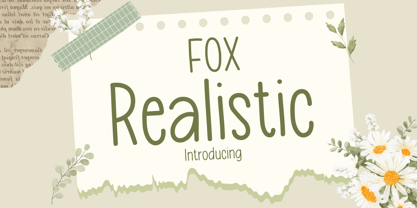 Fox Realistic is your versatile companion, ready to enhance a wide range of projects. Whether you're working on blog posts, branding materials, advertisements, invitations, greeting cards, planners, photo albums, decorations, or anything else your creative heart desires, this font has you covered. Infuse your projects with personality and charm. Try Fox Realistic today and experience the magic of handwritten simplicity, sans serif style.
 - African Jazz by Scholtz Fonts,
$19.00African Jazz is an informal and vigorous font that moves to the rhythms of Africa. Its angular shapes are reminiscent of the syncopated jazz beat that grew out of the heart of Africa. African Jazz has carefully crafted spacing and kerning, making it easy to use in any display setting. It also includes all punctuation, symbols, special characters and diacritical marks. - Maroon Vibes by ErlosDesign,
$19.00 Rafflesia - Modern Calligraphy by erlosDESIGN Rafflesia is a delicate, elegant and flowing modern calligraphy font. It has beautiful and well balanced characters and as a result, it matches a wide pool of designs. Rafflesia features a varying baseline, smooth lines, gorgeous glyphs and connecting heart swashes. Add it to your most creative ideas and notice how it makes them come alive!
 - Vengeance Is Mine by Comicraft,
$29.00 VENGEANCE IS MINE, I WILL REPAY, sayeth the Lord. "BUT IF YOUR ENEMY IS HUNGRY, FEED HIM, AND IF HE IS THIRSTY, GIVE HIM A DRINK -- FOR IN SO DOING YOU WILL HEAP BURNING COALS ON HIS HEAD.""AND FURTHERMORE" sayeth the Lord, "WHEN I FINALLY GET AROUND TO EXPRESSING MY VENGEANCE, LO. MY WORD SHALL BE RENDERED IN A FONT WITH THREE RAGGED LAYERS -- VENGEANCE IS MINE!"
 - Egg Farm JNL by Jeff Levine,
$29.00 The opening titles and credits of the 1947 film comedy “The Egg and I” were done in a hand lettered casual sans serif typeface which inspired the digital font Egg Farm JNL; available in both regular and oblique versions. “The Egg and I” introduced audiences to Ma and Pa Kettle as portrayed by Marjorie Main and Percy Kilbride, who went on to do a number of additional films as those characters.
 - Indie by Lián Types,
$37.00 A FEW THOUGHTS Indie is a trendy script, result of the wide range of possibilities that can be achieved using a pointed brush. (1) “You Only Live Once” say The Strokes, (to me, symbols of indie music) so, what would represent that sensation of volatility better than a brush? As you may already know, this time inspiration came from hipsters and indies around us: We may sometimes criticise them, we may sometimes want to be like them, but the truth is that the universo gráfico they generated these past years is gigantic, full of colour and variations. (2) Brush lettering and Sign painting are fields I've been fond of since I started as a designer. Nowadays, these styles are getting a lot of attention and maybe it’s due to the undeniable mark of life that is materialised when using a brush. This tool is so expressive that shows the passions and fears of the artist, and materialises that idea of “living the present”, so popular in this era. When you see Indie, you think of skaters, rollers, surfers, hiphop dancers, street artists, summer, and why not? California beaches. So if you feel life is only one, it’s high time you got Indie into your fonts' collection! STYLES Indie comes in 4 styles plus another one which consists only in capitals. Indie; Indie Shade; Indie Shade Solo; Indie Inline are all open-type programmed and have exactly the same glyphs and metrics, so you can combine them without probem. (I.E. You may use Indie Inline, then write the same word using Indie Shade Solo, and finally put them together). In applications such as Adobe Illustrator, the font has nice results when fi ligatures is activated. However, if you want a more casual look, activate the contextual and the decorative ligatures. NOTES 1. After several years of practicing calligraphy I can say that to me, there’s nothing more satisfying than being able to create fonts out of your own handlettering. I owe a lot of this brush-style to Carl Rohrs. He was the very first calligrapher who taught it to me. His style is unique and what he can do with a brush is truly marvelous. I'm serious. 2. In spite of some particular cases, I can say I'm happy to live in a present in which Typography is living a kind of Renaissance along with Lettering. Like it happened with W. Morris a hundred years ago, handcrafts are being revalued/reborn, and some of this may be happening thanks to these indie designers that, trying to be unique, gave new/fresh air to different areas of graphic design.
 - GretaDS by FontAle,
$9.00 One day, when I was walking with my daughter Greta, I stopped in front of the windowshop of a bookshop, that caught my attention, but Greta was pretty irritated, as always when it comes to books: she is dyslexic. All things written are basically a nightmare for her!So one thing came to my mind: if the great Louis Braille, with visual impairment, invented an instrument that allowed blind people to read, write and play,there had to be a tool that made it easier for dyslexics to do the same things. So, I proposed to Greta to create together a font to help her and other dyslexics. We worked on it, becoming a bit of graphic designers, inventors and guinea pigs at the same time.We brought some initial changes to the mirror letters "pq bd", based on some examples already available on the market, that improved reading times, strenghtening our willing to go ahead. That's how "GretaDS" is born, a completely new font, from the "handwritten" family, which marks a difference on the mirror letters, making them easily recognizable, as well as the lowercase couple rn (RN) which can be confused with the letter "m", not to mention the capital "I" (vowel i) indistinguishable from the lowercase "l" (L)We hope, that other graphic designers will follow its flow, modify and improve the path, and make the most of its energy, to offer dyslexics a tool that make reading as easy as drinking a glass of water.
 - Brush Type Michiko by Brush Art Design Office,
$45.00I have created the brush font named “ BrushType Michiko” in my unique brush style. This is wider than “BrushType Standard ”. I made it for ad designers. I believe this is the only one brush font in the world, so using it will enable them to get easily satisfied on their work. Brush handwriting in Japan has a long and proud Tradition and History. I tried to interject this feeling of Tradition into my font designs for you to comprehend its true meaning. I trust I have succeeded to convey my feelings to you. In addition, I can say each letter of the “ BrushType Michiko” is truly art. I am a pioneer of Brush Art. You are the first person to see and use it in the world.

