9,245 search results
(0.02 seconds)
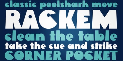
- Rackem PB by Pink Broccoli,
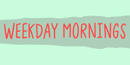
$14.00 - Weekday Mornings by Bogstav,
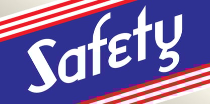
$17.00 - Safety by Pelavin Fonts,
$25.00 - Cowboy Lament JNL by Jeff Levine,
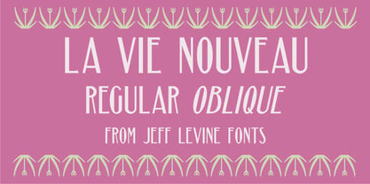
$29.00 - La Vie Nouveau JNL by Jeff Levine,
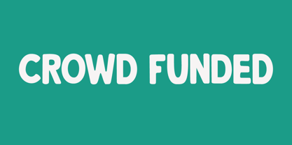
$29.00 - Crowd Funded by Hanoded,
$15.00 - Big George NF by Nick's Fonts,
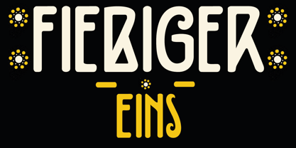
$10.00 - Fiebiger Eins by Hanoded,
$15.00 - The KR Chinese Zodiac font by Kat Rakos is a captivating and expressive display font that captures the essence of the Chinese Zodiac's symbolism through its intricate designs. Each character within t...
- Yanone Kaffeesatz is a distinctive and versatile typeface that carries a unique blend of modernity and nostalgia. It was first created by Yanone, a German type designer, in 2004. The inspiration behi...
- As of my last update in April 2023, "TwoBeers" is not a widely recognized or standard font within graphic design or typography communities. However, with the proliferation of digital fonts and the ea...
- Alright, let's dive into the world of Iconian Fonts and talk about one of their creations, the Postmaster font. Imagine for a moment venturing into a realm where the past and the future collide, brin...
- As of my last update in April 2023, without direct information on a specific typeface designated as "13_Fletcher," I can fabricate a creative description based around the intriguing elements the name...
- Ah, Bou College, the font that decided it was time to put its varsity jacket on and strut through the halls of typographical academia with a sporty swagger. Picture this: the letters, muscular and fi...
- Blocked Off by Kimberly Geswein is a delightful meld of whimsy and structure, capturing attention with its unique charm and playful aura. The font embodies a sense of creativity that's instantly reco...
- Germania, a typeface designed by the talented Dieter Steffmann, is a testament to the rich historical and cultural essence of Germany's typographic tradition. Steffmann, known for his dedication to r...
- Cream Cake, a captivating typeface designed by Ef Studio, stands out as a unique and versatile font that effortlessly captures the essence of modern creativity and elegance. The font is characterized...
- The Slant font by Altsys Metamorphosis is a unique typeface that embodies a dynamic and forward-moving aesthetic, embodying the essence of motion through its distinctive slanted characters. Altsys, a...
- Imagine waking up on a beautiful, sunny morning, feeling refreshed and eager to conquer the world. That sensation, my friend, is what encountering the font "Greatday" by Letteratom is like. It's not ...
- Sturkopf Grotesk, designed by Uwe Borchert, is an intriguing addition to the vast world of typefaces. Its design distinguishes itself by threading the fine line between stoic traditionalism and bold ...
- Yoko Smile, crafted by the talented typeface designer Rémi Godefroid, is a font that exudes happiness, creativity, and flexibility. At its core, Yoko Smile represents more than just a series of lette...
- Web Serveroff, a meticulously crafted typeface designed by Sergiy Tkachenko, stands as a testament to the designer's keen eye for detail and understanding of typography's power. This font finds its r...
- The Kremlin Emperor font designed by Bolt Cutter Design is an evocative and regal typeface that seamlessly bridges the gap between historical richness and contemporary flair. This font is not just a ...
- As of my last update in April 2023, SERIESB is not a widely recognized or standard typeface within the vast library of fonts available to designers and typographers. This suggests that SERIESB might ...
- As of my last update, the "British Outline Majuscules" isn't a universally recognized or widely used font name in the vast world of typography. However, given the descriptive nature of the name, we c...
- As of my last update in April 2023, the font named "Jumbo" by dustBUSt Fonts has not been widely documented in mainstream font directories or collections. Therefore, the following description is a ge...
- As of my last update in April 2023, the font named "Linear Curve Fatty" by Matt Perkins represents a distinctive blend of design principles that make it stand out in the realm of typography. The name...
- "Teen Light," a creation by the prolific Canadian typeface designer Ray Larabie, encapsulates the spirit of youthful exuberance and casual charm. This font, part of Larabie's extensive catalogue, is ...
- Racer, created by the visionary designer onezero, is a font that embodies dynamism, speed, and elegance. Its design is inspired by the high-speed world of racing, capturing the essence of motion and ...
- Sure, imagine for a moment that the Shadowed Serif font by J. Fordyce attended a high school reunion. It would be the character that managed to age remarkably well, maintaining an elegant yet bold ap...
- "Dark11" isn't a recognized standard font at the time of my last update, so I'll take a creative approach to describe what I envision for a font with such a mysterious and intriguing name. Envision...
- Ingleby Regular is part of the Ingleby typeface family, designed by David Engelby, a typeface designer who brings a detail-oriented and thoughtful approach to his creations. This particular font, Ing...
- Ah, Monster Paparazzi! Imagine for a moment, deep in the wild underbrush of creativity, lurks a font so captivating that it could only be dubbed Monster Paparazzi. Crafted by the illustrious duo, Kev...
- The Smargana typeface is a distinctive font characterized by its unique blend of tradition and modernity. With its origin steeped in a rich typographic tradition, Smargana offers a contemporary twist...
- The Embossing Tape 2 (BRK) font, created by AEnigma, stands as a quirky and distinctive typeface that captures the essence and nostalgic feel of labeling used in handheld embossing label makers. This...
- Allow me to introduce you to the enchanting world of Dreamspeak, a font that could charm the socks off a centipede - not that they wear any, but let's not get bogged down by the details. Dreamspeak i...
- Bubbleboy is a charming, lively font that seems to burst with cheerful energy and playful charm, evoking the whimsy of childhood bubble letters yet refined enough for both personal and professional p...
- "Action Is" is a font designed to inspire movement and dynamism. Its design embodies the essence of action and motion, suggesting a forward-thinking attitude and an urgent push towards execution. Unl...
- The JustOldFashion font by Manfred Klein is a distinctive typographic style that captures the essence and charm of bygone eras, encapsulating a nostalgic feel in its design. Embodying characteristics...
- Gadolinium Rounded, designed by Matthew Gadd, represents a distinct blend of aesthetic fluidity and modern sensibility. This typeface exhibits rounded terminals, lending it a soft, approachable feel ...
