10,000 search results (0.086 seconds)
  1. Giraffe - Unknown license
  2. VTKS clean - 100% free
  3. extravaganzza - Unknown license
  4. Lexia - Unknown license
  5. Eight Track program two - Personal use only
  6. Y2K Analog Legacy - Unknown license
  7. Tork - Unknown license
  8. Coolvetica - Unknown license
  9. Teen Light - Unknown license
  10. Albino - Unknown license
  11. Teen - Unknown license
  12. Tintoretto - Personal use only
  13. Lexia - Unknown license
  14. GradoGradooNF - Unknown license
  15. PopularCafeAA - 100% free
  16. Cicle Gordita - Unknown license
  17. Walkway UltraExpand - Unknown license
  18. UKNumberPlate - Unknown license
  19. Weltron - Personal use only
  20. Ashby - Unknown license
  21. Fortyfive - Unknown license
  22. TonleSab - Unknown license
  23. Kandide Unicase - Unknown license
  24. Roslyn Contour - Unknown license
  25. Fugue - Unknown license
  26. Epitough - Unknown license
  27. Whitehall 1212 - Unknown license
  28. Phrixus - Unknown license
  29. Walkway Bold - Unknown license
  30. Elliot_Swonger - Unknown license
  31. SF Iron Gothic - Unknown license
  32. Redhead Goddess - Unknown license
  33. Bandy - Unknown license
  34. Spinach - Unknown license
  35. Oh Crud BB - Personal use only
  36. Uptown - Unknown license
  37. Sassoon Primary Cond by Sassoon-Williams, $48.00
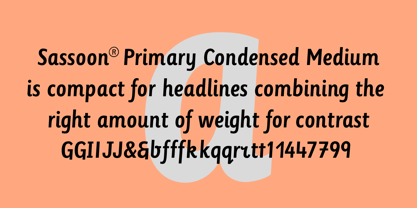
    Those who design books for young children should consider the different needs of their readers. When laying out pages for young readers, particular care should be taken over word spacing. Don't forget that justifying short lines disrupts spacing. Justification should be used only when absolutely necessary. In the research undertaken with young readers the importance of consistent spacing was clear. It also appeared that the poorer readers profited from wider word spacing, while spacing that suited the poorest readers, positively annoyed the better readers. These typefaces have built-in letter spacing because of their exit strokes, as well as extra clarity designed into them. Sassoon Primary Medium Condensed is a compact style for headlines combining the right amount of weight, yet in a friendly style. When used at large sizes the friendliness of Sassoon types really shines. Why not use it for headings throughout a book. You can find many other new ways to use this typeface. Ideal perhaps for the masthead or a magazine? Free to download resources: How to access Stylistic Sets of alternative letters in these fonts
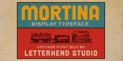
  38. Mortina by Letterhend, $17.00
    Introducing, Mortina - a vintage sans serif font duo. Inspired by 50s 60s signages, this font made to bring back the good ol' days. This type of font perfectly made to be applied especially in logo, headline, signage and the other various formal forms such as invitations, labels, logos, magazines, books, greeting / wedding cards, packaging, fashion, make up, stationery, novels, labels or any type of advertising purpose. Features : Two fonts (Thin and bold style) numbers and punctuation multilingual PUA encoded We highly recommend using a program that supports OpenType features and Glyphs panels like many of Adobe apps and Corel Draw, so you can see and access all Glyph variations.
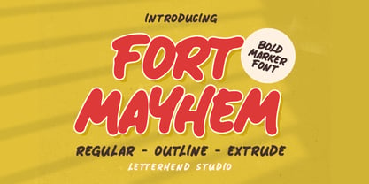
  39. Fort Mayhem by Letterhend, $17.00
    Fort Mayhem is a display marker font with hand drawn feel. The strokes make this font outstanding and looks great for title. This type of font perfectly made to be applied especially in logo, headline, signage and the other various formal forms such as invitations, labels, logos, magazines, books, greeting / wedding cards, packaging, fashion, make up, stationery, novels, labels or any type of advertising purpose. Features : 3 Styles-Regular, Extrude, & Online numbers and punctuation multilingual alternates / swashes and ligatures PUA encoded We highly recommend using a program that supports OpenType features and Glyphs panels like many of Adobe apps and Corel Draw, so you can see and access all Glyph variations.
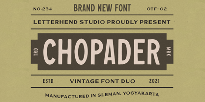
  40. Chopader by Letterhend, $17.00
    Introducing, Chopader - a vintage sans serif font duo. Inspired by 50s 60s signages, this font made to bring back the good ol' days. This type of font perfectly made to be applied especially in logo, headline, signage and the other various formal forms such as invitations, labels, logos, magazines, books, greeting / wedding cards, packaging, fashion, make up, stationery, novels, labels or any type of advertising purpose. Features : Two fonts (Thin and bold style) numbers and punctuation multilingual PUA encoded Only caps We highly recommend using a program that supports OpenType features and Glyphs panels like many of Adobe apps and Corel Draw, so you can see and access all Glyph variations.
Looking for more fonts? Check out our New, Sans, Script, Handwriting fonts or Categories
abstract fontscontact usprivacy policyweb font generator
Processing