10,000 search results
(0.042 seconds)
- Alio Text by R9 Type+Design,
$35.00 Alio™ Text is the workhorse of the Alio family . It works beautifully as display type, body copy and anything in between. We redesigned Alio Text with taller x-height, more pronounced accents, and wider letter spacing than its siblings, Alio Pro. We also cut down from 6 weights/12 styles to 4 weights/8 styles. All of these is to ensure the legibility and readability and to maximize the weight contrast at small sizes. Whether your designs call for all caps, title case, sentence case or all lowercase, Alio Text has got you covered with the case-sensitive punctuations. No more baseline shift all your punctuations. Alio Text supports most Latin-based languages and even the Chinese Pin-Yin. This typeface also packs with Open-Type features similar to Alio Pro. For examples, both recognize fractions vs. dates; Both features several alternate positions for the legal symbols (3 in Alio Text; 5 in Alio Pro). If you’re looking for a go-to, versatile typeface for most occasions, Alio Text is for you. (4 weights/8 font styles, 500+ glyphs each).
 - Garagin Rock by Rodrigo de Carvalho,
$14.50 Garagin Rock was developed from the studies for the title of a publication called Garagin in 1999. Its use is indicated for the titles on posters and stuff like that, but feel free to dare. Anyway, it really was not made for small sizes and is not a WebFont obviously, but again, feel free to dare. May you notice something odd in the baseline position, this is to keep leading with a defined size. But of course you can change it in any editing program. Being a heavy typeface, use in moderation... or not! Garagin Rock Lite is a version with a limited set of characters.
 - Pop Cubism by K-Type,
$20.00 The Pop Cubism fonts are inspired by Roy Lichtenstein who combined the strong outlines and benday dots of Pop Art with the fragmented viewpoints and facet line divisions of Cubism. The bold letterforms are derived from a variety of styles, both serif and sans, angular and rounded. Pop Cubism is available in two packages: Pop Cubism Shaded is a single font which contains the lines and dot tones for use in a single color. The Pop Cubism Color Kit contains three matching fonts (Pop Cubism Outline, Pop Cubism Halftone Underlay and Pop Cubism Color Underlay) for overlaying different colors of lines, dot tones, and background color.
 - Neonlife by Popskraft,
$19.00 This font comes from the romance of 20th century tube signs that will likely disappear forever. But let's not be upset — the Neonlife font embodies not only the warmth and comfort of neon signs, but also the energy of a modern style. And welcome to New Neon Life! The font family contains 6 sizes to help you choose the best size for different occasions. Neonlife is a unique solution for cool typography, branding, headings, in short, everything that makes our world unique and special. Although this font is not designed for large amounts of text, all characters are perfectly balanced and can be used like any regular font.
 - Boomerank by Scratch Design,
$10.00 Introducing Boomerank! It's a cool Dry Marker handwriting with 23 ligatures and some swashes to make your notes type look authentic! This font is perfect for some projects like logotypes, comics, headlines, invitations, quotes, menu design, branding, clothing, prints ads and some designs that need natural handwriting with dry marker effects. Please Note: To access all the features of this font you will need software with a glyphs panel - such as Adobe Photoshop CC, Adobe Illustrator, and Adobe Indesign. We hope you will get so much fun and get inspired when you play with this font. Hope will get some amazing experiences with Boomerank! Just download it now!
 - Imagine if fonts could dance. Well, if any font were to throw on a pair of dancing shoes and hit the dance floor, Unity Dances by S. John Ross would be busting moves that would make even the most res...
- Klothilde by Fontroll,
$20.00 Klothilde is a handwriting font which came to life in one of my doodling sessions (I must admit I still doodle with pen and paper). The idea was to create a font which resembles writing with a quill on paper with exaggerated ball terminals. Sometimes there is too much ink which makes the letters fat and the strokes uneven. The paper soaks the ink resulting in blurred line crossings. The form gets blurry. On the other hand, when the quill runs out of ink the stroke gets thinner looking like the light version of Klothilde. In order to emulate the different looks, I created six fonts with a common skeleton but different appearance which can be altered seamlessly by using the Variable Fonts technology (e.g. in latest Adobe apps or CorelDRAW Graphics Suite) along the Weight and Blurred sliders. But even without, Klothilde can be used even in longer copy. Use it from 18 pt upwards, flush left with tight leading and intersecting ascenders and descenders. Due to extensive manual kerning, it gives your text an even colour. To my knowledge, Klothilde is one of the first script Variable fonts in different weights. No, Klothilde’s letters are not connecting. But I added a whole bunch of connecting ligatures which are simply activated by the ligature feature of your app. Even Microsoft Word can do that. Thus Klothilde comes to life, as it should be expected from a handwriting font. In order to add to variety there are additional glyphs for some critical initial and standalone letters. Repeating letter combinations like nn, mm or rr are avoided by replacing the second letter by an alternative form. All features are activated by the standard ligature feature. Ligatures are available for most European languages, some even in Cyrillic (some special Serbo-Croat letters included and accessible through localization or Style Set 08 features). Romanian comma-accent characters and ligatures are accessible through the OpenType locl feature. For the topping on the cake, I added an alternate ampersand (stylistic set 1) and asterisk (ss04), an alternate Cyrillic b (ss02) and t (ss03), a few fleurons, arrows and a skull (OpenType feature ornm), fractions (frac feature), circled numbers (ss06) and an interrobang (ss07) which result in exactly 900 glyphs in each of the six fonts. There should be enough to play with. Should you be missing a special character, do give me a hint.
 - LOVE-BOX - Personal use only

- Indulta SemiSerif - Personal use only

- Monserga FFP - Personal use only

- Disoluta - Personal use only

- Supreme by BW90,
$19.00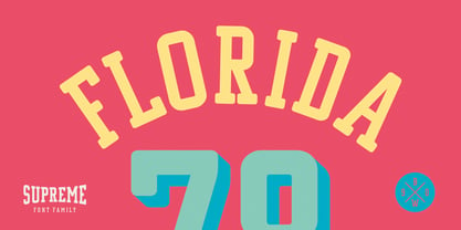 *GO TEAM GO*
 - Haboro Slab Soft by insigne,
$32.99 Haboro Slab Soft is a scion of the Haboro hyperfamily. This concept powers through with its well built, accommodating nature. Haboro Slab Soft’s serifs are rounded, giving it a softer look. The Haboro hyperfamily is a comprehensive design suite that provides solutions for many projects. The iconic angled wedge makes this family ideal for apparel, packaging, apps, corporate identities and advertising campaigns. Subfamilies in the hyperfamily include the original Haboro, a Didone face, Haboro Sans, Serif, Soft, and Slab. The Haboro hyperfamily is known for its ability to make your copy appear clear and simple. The Haboro typeface is built on a common underlying model. It has the same cap height, the same x-height, and the same basic character shape. This unification of shape and proportion results in a complementary set of typefaces. Haboro Slab Soft’s wide variety of ligatures and OpenType alternatives give your message the clarity it deserves. The Haboro Slab Soft family includes seven weights, from Thin to ExBold, three widths, and matching italics. There are over 550 glyphs per style and support for over 70 Latin-based languages. Haboro Slab Soft includes features such as small caps, ligatures, fractions, and alternatives. Haboro Slab Soft is there when you need to present information in a clear and friendly fashion.
 - Good Foot - Unknown license

- Star Time Too JL - Unknown license

- Be Aggressive - Unknown license

- BubbleMan - Unknown license

- Poilet Taper - Unknown license

- You are what you eat - Unknown license

- Klytus - Unknown license

- Foot Fight - Unknown license

- Late Frost by Gleb Guralnyk,
$13.00 This calligraphic script font is called Late Frost. It's an elegant decorative font with lots of ligatures and multilingual support.
 - DotLinDot by Pankabre,
$9.00 Accurate handwritten font with dots and lines. In small sizes it looks especially good in the texts of history books.
 - Yule Love It by Just My Type,
$25.00 YuleLoveIt or Yule not. What else can be said about holiday toys that are also letters? We just said it.
 - Starlette by Jonahfonts,
$49.00 Usage recommendations: Captions, fliers, packaging, cards, posters, ads, book jackets, manuals, menus, bulletins, magazines, greetings, announcements. Not suitable for MSWord.
 - Frivolous by Typadelic,
$19.00The informal style of Frivolous feature lots of flourishes and swirls that give it a charming and spontaneous handwritten quality. - Chesta by RahagitaType,
$14.00 Chesta is playful monoline font for a lot of purposes. Such as branding, packaging, logo, craft, fashion, poster, brochure, etc.
 - Bakemono by Zetafonts,
$39.00 Francesco Canovaro created Bakemono as a way to explore the design space around the duality of fixed/proportional width. He was also interested in the concept of monowidth design, inherent in monospaced typefaces, that can bring flexibility and ease of use also to proportional type - allowing you to change the weight of a word without losing the text alignment. In his research on fixed width type design he mixed the lessons of mechanical typewriter technology with the intuitions of eastern brush calligraphy, which has been dealing with for centuries with fixed space grids. The name of the typeface comes from the Japanese shape-shifter yokais that could change their form freely between human and animal, and aptly describes the metamorphic nature of this wide superfamily coming in proportional, monospace and intermediate subfamilies. With a design mixing the expansion principles of the brush with the sharp technicality of typewriter and system fonts, Bakemono can both excel at text size in its regular widths optimized for legibility as well as owning the page at display size with its uncommon design details. Bakemono reflects its multicultural nature with its extended latin + cyrillic charset, soon to be expanded with Bakemono Arabic (exploring the fascinating world of monospaced arabic script) and Bakemono Kana (our first experiment in cjk scripts). • Suggested uses: born to allow you to change the weight of a word without losing the text alignment, Bakemono can both excel at text size in its regular widths optimised for legibility as well as owning the page at display size with its uncommon design details. Perfect for contemporary branding, web design, packaging and countless other projects; • 21 styles: 7 weights x 3 different styles + 1 variable font; • 839 glyphs in each weight; • Useful OpenType features: Access All Alternates, Contextual Alternates, Case-Sensitive Forms, Glyph Composition / Decomposition, Denominators, Fractions, Localized Forms, Mark Positioning, Mark to Mark Positioning, Alternate Annotation Forms, Numerators, Ordinals, Scientific Inferiors, 7 Stylistic Sets, Subscript, Superscript, Slashed Zero • 217 languages supported (extended Latin and Cyrillic alphabets): English, Spanish, Portuguese, French, Russian, German, Javanese (Latin), Vietnamese, Turkish, Italian, Polish, Afaan Oromo, Azeri, Tagalog, Sundanese (Latin), Filipino, Moldovan, Romanian, Indonesian, Dutch, Cebuano, Igbo, Malay, Uzbek (Latin), Kurdish (Latin), Swahili, Hungarian, Czech, Haitian Creole, Hiligaynon, Afrikaans, Somali, Zulu, Serbian, Swedish, Bulgarian, Shona, Quechua, Albanian, Catalan, Chichewa, Ilocano, Kikongo, Kinyarwanda, Neapolitan, Xhosa, Tshiluba, Slovak, Danish, Gikuyu, Finnish, Norwegian, Sicilian, Sotho (Southern), Kirundi, Tswana, Sotho (Northern), Belarusian (Latin), Turkmen (Latin), Bemba, Lombard, Lithuanian, Tsonga, Wolof, Jamaican, Dholuo, Galician, Ganda, Low Saxon, Waray-Waray, Makhuwa, Bikol, Kapampangan (Latin), Aymara, Ndebele, Slovenian, Tumbuka, Venetian, Genoese, Piedmontese, Swazi, Zazaki, Latvian, Nahuatl, Silesian, Bashkir (Latin), Sardinian, Estonian, Afar, Cape Verdean Creole, Maasai, Occitan, Tetum, Oshiwambo, Basque, Welsh, Chavacano, Dawan, Montenegrin, Walloon, Asturian, Kaqchikel, Ossetian (Latin), Zapotec, Frisian, Guadeloupean Creole, Q’eqchi’, Karakalpak (Latin), Crimean Tatar (Latin), Sango, Luxembourgish, Samoan, Maltese, Tzotzil, Fijian, Friulian, Icelandic, Sranan, Wayuu, Papiamento, Aromanian, Corsican, Breton, Amis, Gagauz (Latin), Māori, Tok Pisin, Tongan, Alsatian, Atayal, Kiribati, Seychellois Creole, Võro, Tahitian, Scottish Gaelic, Chamorro, Greenlandic (Kalaallisut), Kashubian, Faroese, Rarotongan, Sorbian (Upper Sorbian), Karelian (Latin), Romansh, Chickasaw, Arvanitic (Latin), Nagamese Creole, Saramaccan, Ladin, Kaingang, Palauan, Sami (Northern Sami), Sorbian (Lower Sorbian), Drehu, Wallisian, Aragonese, Mirandese, Tuvaluan, Xavante, Zuni, Montagnais, Hawaiian, Marquesan, Niuean, Yapese, Vepsian, Bislama, Hopi, Megleno-Romanian, Creek, Aranese, Rotokas, Tokelauan, Mohawk, Onĕipŏt, Warlpiri, Cimbrian, Sami (Lule Sami), Jèrriais, Arrernte, Murrinh-Patha, Kala Lagaw Ya, Cofán, Gwich’in, Seri, Sami (Southern Sami), Istro-Romanian, Wik-Mungkan, Anuta, Cornish, Sami (Inari Sami), Yindjibarndi, Noongar, Hotcąk (Latin), Meriam Mir, Manx, Shawnee, Gooniyandi, Ido, Wiradjuri, Hän, Ngiyambaa, Delaware, Potawatomi, Abenaki, Esperanto, Folkspraak, Interglossa, Interlingua, Latin, Latino sine Flexione, Lojban, Novial, Occidental, Old Icelandic, Old Norse, Slovio (Latin), Volapük
 - Tipsy Waitress by Saja TypeWorks,
$12.00 The clock struck 2am. In the Wixendorf Café, a dingy diner off Route 75, the waitress behind the bar took another swig of whiskey—it was one of those nights. Ask to get a cup of coffee and you’re never sure how much will end up in your cup and how much will end up on the bar top. But it is hot, and paired with a plate of cherry pie? Why, that place is a slice of heaven. Tipsy Waitress, with a few too many swigs of liquor, is full of character and ready for any task—if you don’t mind a bit of sloppiness! The font includes: - A complete set of uppercase and lowercase letters, basic punctuation, numerals and currency figures, and diacritics - Western Europe language support - A whole heck of a lot of fun Need an extended license? Simply email us at hello@sajatypeworks.com and we’ll be happy to help! A collaboration between Dave Savage of Savage Monsters and Aaron Bell of Saja Typeworks. Get in touch: We’re here to help! If you have any questions or need assistance, please DM or contact us via hello@sajatypeworks.com Languages supported: Abneki, Afaan Oromo, Afar, Albanian, Alsatian, Amis, Anuta, Aragonese, Aranese, Arrernte, Arvanitic (Latin), Asturian, Aymara, Basque, Bikol, Bislama, Breton, Cape Verdean Creole, Cebuano, Chamorro, Chavacano, Chickasaw, Cofán, Corsican, Dawan, Delaware, Dholuo, Drehu, English, Faroese, Fijian, Filipino, Folkspraak, French, Frisian, Friulian, Galician, Genoese, German, Gooniyandi, Guadeloupean Creole, Haitian Creole, Hän, Hiligaynon, Hopi, Ido, Ilocano, Indonesian, Interglossa, Interlingua, Irish, Italian, Jamaican, Javanese (Latin), Jèrriais, Kala Kagaw Ya, Kapampangan (Latin), Kaqchikel, Kikongo, Kinyarwanda, Kiribati, Kirundi, Klingon, Latin, Lojban, Lombard, Makhuwa, Malay, Manx, Marquesan, Meriam Mir, Mohawk, Montagnais, Murrinh-Patha, Nagamese Creole, Ndebele, Neapolitan, Ngiyambaa, Norweigan, Novial, Occidental, Occitan, Oshiwambo, Palauan, Papiamento, Piedmontese, Portuguese, Potawatomi, Q’eqchi’, Quechua, Rarotongan, Romansh, Rotokas, Sami (Southern Sami), Samoan, Sango, Saramaccan, Sardinian, Scottish Gaelic, Seri, Seychellois Creole, Shawnee, Shona, Sicilian, Slovio (Latin), Somali, Sotho, Spanish, Sranan, Sundanese (Latin), Swahili, Swazi, Swedish, Tagalog, Tetum, Tok Pisin, Tokelauan, Tshiluba, Tsonga, Tswana, Tumbuka, Tzotzil, Uzbek (Latin), Volapük, Walloon, Waray-Waray, Warlpiri, Wayuu, Welsh, Wik-Mungkan, Wiradjuri, Xhosa, Yapese, Yindjibarndi, Zapotec, Zulu.
 - Romely by Din Studio,
$25.00 If you’re looking for a gorgeous font to attract your audiences or customers then we’ve got the font for you! Introducing Romely- A Sans Serif Font This handmade font typeface with modern style looks very interesting for loads of different projects and promotions. It is perfect to be used on your website, for your social media branding, Pinterest banners, printed products, and more! Features: Multilingual Support PUA Encoded Numerals and Punctuation Thank you for downloading premium fonts from Din Studio
 - Pelagic Bird by Yahya Type,
$17.00 Pelagic Bird is a unique ligature font. Clean, delicate, classic. Available in upper and lower cases with numeric, symbol, punctuation, and multilingual support. Pelagic Bird will be perfect for many projects: logo, wedding designs, social media posts, advertisements, product packaging, product designs, label, photography, watermark, invitation, or whatever project you’re working on. WHAT’S INCLUDED? Uppercase & lowercase letters Numbers, punctuation Ligature & Huge Stylistic alternate Multilingual support. Still got a question? Send me a message and I’ll be happy to answer! qura.yahya@gmail.com
 - Chicago Makers by Din Studio,
$25.00 Hi, Everyone! If you’re looking for a gorgeous font to attract your audiences or customers then we’ve got the font for you! Chicago Makers- A Serif Font This handmade font typeface with modern style looks very interesting for loads of different projects and promotions. It is perfect to be used on your website, for your social media branding, Pinterest banners, printed products, and more! Features: Multilingual Support PUA Encoded Numerals and Punctuation Thank you for downloading premium fonts from Din Studio
 - Deroma by Yahya Type,
$20.00 Deroma - is an editorial serif font (regular and italic) It beautifully combines a vintage look with a modern flair. Deroma will be perfect for many projects: logo, wedding designs, social media posts, advertisements, product packaging, product designs, label, photography, watermark, invitation, or whatever project you’re working on. WHAT’S INCLUDED? Deroma Regular (uppercase & lowercase) Deroma Italic (uppercase & lowercase) Numbers & punctuation Ligature & Huge Stylistic alternate Multilingual support. Still got a question? Send me a message and I’ll be happy to answer! qura.yahya@gmail.com
 - Easytype by Vitalik B. Old,
$5.00 Easytype is the first font family released by Vitalik B. Old. Yet simple, handwritten type feels in title as good as in a middle size paragraph. Both italic and italic bold styles got 999 characters in a set, including Latin, Cyrillic and Greek symbols. Full set of Basic, Additional, Extended and Advanced Latin symbols [452]; Full set of Basic and Extended characters in Cyrillic script [256]; Basic Greek character set [73] Font family was designed by y/y behance.net/youryourich
 - Magelo by Din Studio,
$25.00 Hi, Everyone! If you’re looking for a gorgeous font to attract your audiences or customers then we’ve got the font for you! Introducing Magelo - A Serif Font This handmade font typeface with modern style looks very interesting for loads of different projects and promotions. It is perfect to be used on your website, for your social media branding, Pinterest banners, printed products, and more! Features: Multilingual Support PUA Encoded Numerals and Punctuation Thank you for downloading premium fonts from Din Studio
 - Heroliga by Yahya Type,
$18.00 Heroliga is an elegant & modern sans serif font with special alternative letters and with multilingual support. Heroliga is perfect for logo design, magazine headers, product packaging, branding projects, clothing or simply as a stylish text overlay to any images or websites. WHAT’S INCLUDED? • Comes with regular, italic, bold and bold italic font styles. • Uppercase & lowercase letters. • Numbers, punctuation. • Ligature & Huge Stylistic alternate. • Multilingual support. Still got a question? Send me a message and I’ll be happy to answer! qura.yahya@gmail.com
 - Miguel by Din Studio,
$25.00 Hi, Everyone! If you’re looking for a gorgeous font to attract your audiences or customers then we’ve got the font for you! Introducing Miguel- A Serif Font This handmade font typeface with modern style looks very interesting for loads of different projects and promotions. It is perfect to be used on your website, for your social media branding, Pinterest banners, printed products, and more! Features: Multilingual Support PUA Encoded Numerals and Punctuation Thank you for downloading premium fonts from Din Studio
 - Madison Street by Studioways,
$40.00 Madison Street is a font family with 8 fabulously fun typefaces! Eliza Gwendalyn & Jim Lyles of Studioways have teamed up with Spencerian calligrapher Elaina DeBoard to create a classic pointed pen calligraphy font. From its ornamental monograms, to its variety of complimentary text styles, and to its Madison Street Pro, with its elegant stylistic swashes and OpenType goodies, there is a font for every designer. Enjoy the sleek Madison Street Sans, Serif or Script, paired with the Ornaments font, complete with ornate monograms, or use each typeface on its own! Madison Street Pro has all the OpenType bells and whistles. The Ligature feature automatically substitutes beginning and ending letterforms, as well as 100 ligatures. Turn on the Swash feature for elegantly sweeping swash lowercase forms. Enable Stylistic Alternates for even more variations. There are also 10 Style Sets to chose from. And many more OT features! Madison Street is a basic version of the Pro font, intended for users who do not have OpenType savvy applications. Madison Street Stylistic is also a basic version of the Pro font, intended for users who do not have OpenType savvy applications. It has stylistically different ascenders and descenders. Madison Street Swash is intended to be used with the basic fonts, Madison Street and Madison Street Stylistic. It has lowercase beginning and ending swash glyphs and cannot be used to set text by itself. Madison Street Sans, Serif, and Script are text fonts modeled after the handwriting of Elaina. They are intended to be complimentary to any of the script fonts. However, you'll need to set them at a smaller point size (about 1/3 the size) in order to get the preferred scale and weight. Finally, the hairline weight of the Madison Street script fonts is very thin, and at small sizes up to 40 pt, you may notice some breaking up when printing to desktop printers. To remedy this, we recommend outline stroking the text a small amount (.1 -.3 value). this should improve the output without adding to much weight overall.
 - Buffet Script by Sudtipos,
$99.00 Buffet Script is based on fantastic calligraphy by Alf Becker, arguably the greatest American sign lettering artist of all time. The Alf Becker series of nameless alphabets published by Sign of the Times magazine in 1941 has attracted letter digitizers for a few years now, so it’s really a wonder that a few of those alphabets are still in the non-digital realm. It is understandable, though, that the basis for Buffet Script was not digitally attempted until now. The page presenting this alphabet shows a jungle of letters running into each others and swashes intertwining. The massive amount of work involved in digitizing such lettering, where scanning is nowhere near being an option, is quite obvious at a mere glance. If anyone was going to commit this particular alphabet to a digital form, it would have to be redrawn stroke by stroke and curve by curve on the computer. And don't we love a challenge! But seriously, the challenge was not the main attraction. In a way, the Becker approach to lettering is so far from digital that the imagination is almost forced to work out possibilities and letter combinations to solve problems presented by the scant showings in that magazine. After a few imaginative visualizations, the digital potential becomes clear in the mind, and the eye and hand follow. The result with Whomp (another Alf Becker-inspired work) was an enormous font with a lot of alternates and ligatures. With Buffet Script the imaginative process was no different, but the result particularly shines here, because this is some of the most fascinating flowing calligraphy ever seen. Calligraphy is where the accountability of all the little extra touches, such as alternates and swashes and ligatures, is raised to a higher level than in most other type categories. Buffet Script’s OpenType programming contains discretionary ligatures, stylistic and contextual alternates, interacting with each other to allow the composition of just the right word or sentence. This font is best used where lush elegance is one of the design’s requirements.
 - Amica Pro by Eclectotype,
$40.00 Welcome Amica Pro, a workhorse sans designed to give your branding a friendly, approachable look. What is it that makes a typeface friendly? Eclectotype undertook extensive research* in this and the results are in! To cut a long story short, friendliness in sans serif fonts can be summed up in two words – short and fat. Basically, think Danny DeVito in letter form. The shortness in Amica Pro is achieved (somewhat counterintuitively) by pushing up the x-height. This, coupled with short ascenders and descenders, gives the text a squat appearance. For the fatness, that's easy in the bolder weights, but how to carry this through to the lights? Here, the fatness equates to roundness, so the letterforms, even if the stroke weight is light, have a rotund appearance from the wideness and roundness of the circular glyphs. When thinking about friendliness, we think about inclusiveness. To this end, Amica Pro supports a super wide range of latin-based languages, as it uses Underware's Latin Plus character set, as well as extra support for Vietnamese. Amica Pro is best used for branding, logos, infographics etc. It will give your UI a friendlier feel, but that doesn't mean it's not serious. There are many useful typographic features, including alternates, numerous figure styles, automatic fractions and case-sensitive forms. The italics are carefully optically corrected "sloped romans" and as such they are the same width as their upright equivalent, so changing your copy to italics will not mess around with the spacing. *I looked at a few fonts and drew some lazy conclusions.


