10,000 search results
(0.074 seconds)
- AmpleSoft by Soneri Type,
$50.00 AmpleSoft is a softer version derived from Ample type family. AmpleSoft is a display type family, optical mono linear and a bit squarish in nature. It has smooth curve instead of sharp angle formed by the junction of two strokes, which is a prominent feature of its design. It is designed to be a little eye-catching yet legible. It has clear and distinguishable letterforms, which helps to elaborate and emphasis the message. It is graphically strong and command viewerís attention. The overall appearance of type is suitable in setting it as heading, title, headline, etc. The type family consists of six weights viz. Thin, ExLight, Light, Regular, Medium and Bold. Considering the nature of this type family, italics have been excluded. AmpleSoft is designed by Aakash Soneri in the year 2014.
 - Monotype Engravers Old English by Monotype,
$29.99 The rather wide, caps-only Monotype Engravers family imitates scripts that evolved from copperplate and steel plate engravers hands of the nineteenth century, which were a quite expressive medium! Monotype Engravers' letters show a strong contrast between thick and thin strokes and have sharply cut serifs. In 1899, Robert Wiebking (who worked for a number of foundries in his time) designed an all-caps typeface named Engravers Roman."" Shortly thereafter, American Type Founders, Inc. (ATF) released another successful ancestor of this design in 1902, ""Engravers Bold,"" designed by Morris Fuller Benton. Engravers Bold was also released by the Barnhart Brothes & Spinder foundry. Also made available by Lanston Monotype at the beginning of the twentieth century, the Engravers faces soon became a popular choice for letter heads, advertising and stationery.
 - Monotype Engravers by Monotype,
$40.99 The rather wide, caps-only Monotype Engravers family imitates scripts that evolved from copperplate and steel plate engravers hands of the nineteenth century, which were a quite expressive medium! Monotype Engravers' letters show a strong contrast between thick and thin strokes and have sharply cut serifs. In 1899, Robert Wiebking (who worked for a number of foundries in his time) designed an all-caps typeface named Engravers Roman."" Shortly thereafter, American Type Founders, Inc. (ATF) released another successful ancestor of this design in 1902, ""Engravers Bold,"" designed by Morris Fuller Benton. Engravers Bold was also released by the Barnhart Brothes & Spinder foundry. Also made available by Lanston Monotype at the beginning of the twentieth century, the Engravers faces soon became a popular choice for letter heads, advertising and stationery.
 - Fortezza by Eurotypo,
$22.00 Fortezza is a family of fonts inspired by the great masters who have created the Modern Roman style: Firmin Didot (1764 -1836) and Giambattista Bodoni (1740 -1813) Both typefaces can be similar, but a trained and close vision, show clear differences in the final result, like its weight and the degree of transition of the strokes. The type of Didot suggests greater warmth and elegance, they are characterized by extreme contrast in thick strokes and thin strokes, by the use of serifs very thin and by the vertical stress of the letters. while the Bodoni type conveys a greater robustness and hardness. Fortezza brings together the elegance and spirit of both types, but proposes a contemporary vision, establishing a distance with certain features typical of the baroque that was manifested at that time.
 - AZ Varsity Brush by Artist of Design,
$20.00 AZ Varsity Brushed font was inspired from a combination of typical collegiate t-shirts designs and also the current wave of Hollister t-shirt designs (rough painted look). This font utilizes an "old look" to the line work which is designed to have a "worn feel" to it. It is designed to compliment it's sister font; AZ Vintage. This font is designed for use as a worn and antiqued headline or subheadline.
 - TG Cthu by Weishan Gao,
$39.00 This is an industrial-style font with a strong and powerful presence, suitable for use in headings and slogans. It can be applied to industries such as factories and construction.
 - Leaner by Kulturrrno,
$9.00 "Leaner" is uppercase sans-serif typeface. It’s clean and universal. Best for logos and heading. Extended latin glyphs Uppercase letters Thin / Regular / Bold weights + Same italics Numbers & punctuation That's it!
 - Reluxed by Typotheticals,
$4.00Originally completed in 2002, this font was lost in a hard disk failure. A later perusal of old disks unearthed an early version and this set was created from that. - Cambridge Round by AVP,
$29.00 Cambridge Round provides a rounded version of Cambridge, useful for headings and more informal texts. The family contains four weights in three widths with matching italic forms for all variants.
 - Brass by HiH,
$8.00 The Brass Family has a lineage that extends into English history. About five hundred years ago a devout, but anonymous Englishman gave glory to the God he worshipped by designing the capital letters and decorations of these two fonts. Originally recorded in The History Of Mediaeval Alphabets And Devices by Henry Shaw (London 1853), they are described by Alexander Nesbitt in his Decorative Alphabets And Initials (Mineola, NY 1959) as “Initials and stop ornaments from brasses in Westminster Abbey.” I wish I could say I remember seeing them when I was there, but that was forty-two years ago and all I remember was seeing the tomb of Edward the Confessor. One definition of “stop” as a noun is a point of punctuation. I have heard people from the British Isles speak of a “full stop” when referring to a period. Some may remember a 19th century form of communication called a telegram being read aloud in an old movie, with the use of the word “stop” to indicate the end of a sentence or fragment. A full dozen of these stop ornaments are provided. They occupy positions 060, 062, 094, 123, 125, 126, 135, 137, 167, 172, 177 & 190. The Brass Family consists of two fonts: Brass and Brass Too. Both fonts have an identical upper case and ornaments, but paired with different lower cases. Although the typefaces from which the lower cases were drawn are both of modern design, both are interpretations of the textura style of blackletter in use in England when the upper case and ornaments were fashioned for the Abbey. Brass is paired with Morris Gothic, which matches the color of the upper case quite well. Brass Too is paired with Wedding Regular, which is distinctly lighter than the upper case. I find it very interesting how each connects differently. The resulting fonts are unusual and most useful for evoking an historic atmosphere.
 - CA Saygon Text by Cape Arcona Type Foundry,
$40.00 CA Saygon Text is the logic consequence of CA Saygon. It is much calmer and therefore also suitable for reading texts and everyday’s editorial tasks. Basic shapes and proportions were adopted from Saygon and continued in such a way that a font family from Thin to Extrabold resulted. A fundamental inspiration were early static grotesque typefaces such as Akzidenz Grotesk. Nevertheless, the typeface was by no means intended to have a historical look. Thus, a relatively high x-height was chosen, which makes the typeface quite economical in type-setting, since the letters appear visually larger. A relatively small line spacing with good legibility can be achieved due to the small ascenders and the low cap height. Letters like f and t, which otherwise tend to end in curves, were given right angles, which on the one hand meets certain design elements of the original Saygon, but on the other hand also refers to contemporary trends in typeface design. A special feature are the five styles in which CA Saygon Text can be used. The default setting is the Helvetica style, with two-storey a and g. The Futura style has a single-storey a and a two-storey g accordingly. The third style with two-storey a and three-storey g is called the Franklin style. But the real highlight is the Cape style with single-storey a and three-storey g – a real rarity up to now. Let yourself be inspired by this unusual typeface. If you like it even more progressive, you should try the flat style, which continues the right angles in a, g, and y as well. Thanks to the Cyrillic and Latin Extended character sets, a huge linguistic area is covered that even extends to Vietnam! Even the exotic German capital-double-s is available and appears automatically when typed between other capital letters. Numerous OpenType features make life easier for the professional typographer: there are fractions, superscript and subscript numbers, as well as proportional and tabular capitals.
 - Retro Thunders by Lettersiro,
$25.00 This is our newest product, inspired by retro style. We call this font "Retro Thunders". Retro Thunders is perfect for any retro project, poster, logo, label, clothing, music album cover, and many others. Comes with solid and extrude style, you can use this font easily, and make save a lot of your time in creating. Retro Thunders also contains: - Opentype Features : swash, ligatures, stylistic alternate, ss01, ss02 , ss03 - 8 end swashes - Basic Latin Language Support (AÀÁÂÃÄÅCÇDÐEÈÉÊËIÌÍÎÏNÑOØÒÓÔÕÖUÙÜÚÛWYÝŸÆßÞþ )
 - Litore by Enfeeltype,
$22.00 This font represents the wonders of the sea, with an engraved design that brings waves to mind when reading. Litore is a clean and elegant font with clear strokes and a modern style. Life is just one big journey, and the path you choose has a great impact on your future and overall happiness. So if you're looking for inspiration on what represents beauty in life and love, Litore is the perfect font to spend some time with.
 - Dinghy by Atlantic Fonts,
$32.00 Dinghy is a shore thing. Like three fonts in one, Dinghy sports a friendly, bold lower-case, a salty, strong upper-case, and in all-caps with discretionary ligatures turned on, Dinghy is tightly interlocking. Turn some ligatures on, others off, to craft the look you want - whatever floats your boat. Dinghybats contains 26 original Amy Dietrich seaside illustrations from curious ocean animals to dune grasses to, well, dinghies.... So enjoy making waves with Dinghy family!
 - Kitsch by Zetafonts,
$39.00 Designed by Francesco Canovaro with help from Andrea Tartarelli and Maria Chiara Fantini, Kitsch is a typeface happily living at the crossroads between classical latin and medieval gothic letterforms. But, rather than referencing historical models like the italian Rotunda or the french Bastarda scripts, Kitsch tries to renew both its inspirations, finding a contemporary vibe in the dynamic texture of the calligraphic broad-nib pen applied to the proportions of the classical roman skeleton. The resulting high contrast and spiky details make Kitsch excel in display uses, while a fine-tuned text version manages to keep at small sizes the dynamic expressivity of the design without sacrificing legibility. Both variants are designed in a wide range of weights (from the almost monolinear thin to the dense black), and are fully equipped with a extended character sets covering over two hundred languages that use latin, cyrillic and greek alphabets. Special care has been put in designing Kitsch italic letterforms, with the broad-nib movements referencing classical italian letterforms to add even more shades to your typographic palette. The resulting alternate letter shapes have also been included in the roman weights as Stylistic Alternates - part to the wide range of Open Type features (Standard and Discretionary Ligatures, Positional Numerals, Small Caps and Case Sensitive Forms) provided with all the 32 weights of Kitsch. Born for editorial and branding use, Kitsch is fashionable but solid, self-confident enough to look classic while ironic enough to be contemporary.
 - Ah, diving into the fun world of fonts, aren't we? Alright, let me introduce you to the whimsical world of the "Poke" font, crafted by the talented Ray Larabie. This particular font is like the bubbl...
- Brasika Display by Nurrontype,
$14.00 Hello my name is Brasika Display, a fun, funk and swirly font. I was designed with versatility, easy to adapt to your needs. I'm playful enough to make you happy. Just look my styistic and anatomy, it's cool, isn't it ? You can put me in your logo project. Or your magazine title. In your Christmas greetings card, wedding invitation, perhaps use me in your Instagram feeds, Youtube title, and many more, you name it. All my friends called me Polyglat, because I'm speaking and understand many languages. I'm Brasika, buy me now, and I will help you to ignite your next project.
 - Nori by Positype,
$49.00 First, the important information…Nori is a hand-lettered typeface that contains over 1100 glyphs, 250 ligatures, 487 alternate characters, 125+ swash and titling alternates, lining and old style numerals. To make sure it is perfectly clear—Nori is the result of brush and ink on paper. The textures produced in each glyph are real and the imperfections are intentional and add to the sincerity of the letters. I say this to be as blunt as possible in order to avoid confusion and to frame what this typeface represents—calligraphic, handwritten letters captured digitally for their warmth and poetic variation for print and screen. Like my handwritten, calligraphic or brush-driven faces before it (the Baka series and the TDC2 2010 winning typeface, Fugu), Nori is a product of my analog and digital hand. To view the words and sentences formed by this typeface is to look at how my hands, yes hands, make letters. The fluidity, as well as the irregularity, is human, honest and intentional—to do so lets the brush I am holding breathe life into each letter. Once digital, any number of points and repetitive processes can’t mask its influences—and I like that. The brush, a simple instrument, my tool, my friend designed to emulate traditional Japanese sumi-e brushes... the Pilot Japan Kanji Fude brush pen. Each letter, each variation was written over and over again until I found the right combination. From there, each was scanned, digitized and optimized. Points were removed in order to ‘clean’ the glyphs up some but I did not want to compromise the integrity of the actual brush stroke. Once this base set of characters (about 350) were completed, the thoughtful manipulation of the glyphs, their gestures and forms were further expanded to solidify the embellishments used within the ligatures, alternates, swashes and additional features. This process was admittedly self-indulgent to an extent. I wanted the words created with this typeface to have the flexibility of variation and cohesiveness of movement that someone fluidly producing these letters by hand might have. I hope you enjoy this typeface as much as I did during the six months working on it. A specimen and style guide is included with the purchased of Nori.
 - Ah, LaPerutaFLF, the font that decided it was too cool for the mainstream yet not quite ready for the underground indie scene. Picture this: if fonts had personalities, LaPerutaFLF would be that quie...
- Goneon by Ditatype,
$29.00 Goneon is a vibrant and eye-catching display font designed to bring the electrifying energy of neon lights to your designs. With its big, bold uppercase letterforms and mesmerizing neon style, this typeface captures the essence of a lively and dynamic atmosphere.. Each letter is meticulously crafted to emanate a radiant and electrifying glow, just like the vibrant neon signs that illuminate city streets at night. This neon style adds a touch of excitement and energy, instantly drawing the viewer's attention. Inspired by the pulsating rhythm of city nightlife, Goneon exudes a sense of modernity and vibrancy. The font captures the essence of an urban atmosphere, casting a dazzling neon glow that creates a lively and captivating visual impact. Each letter radiates with an unmistakable charm, bringing your designs to life with its electrifying vibes. Features: Alternates Multilingual Supports PUA Encoded Numerals and Punctuations Goneon perfect for headlines, banners, posters, and any design that requires a bold statement. The neon style adds an extra layer of excitement, making your text shine with a dynamic and eye-catching appeal. Whether you're working on advertising campaigns, event promotions, digital artwork, or any creative project that calls for a lively aesthetic, this font will instantly infuse your designs with an electrifying energy. It particularly shines in applications related to nightlife, entertainment, music, and urban-themed designs. Find out more ways to use this font by taking a look at the font preview. Thanks for purchasing our fonts. Hopefully, you have a great time using our font. Feel free to contact us anytime for further information or when you have trouble with the font. Thanks a lot and happy designing.
 - Bottle Depot - 100% free

- Leander - 100% free

- Syarlina by Stripes Studio,
$14.00 Introducing the latest font Syarlina Script with a kind of modern hand scratches, I hope you are interested in this font. It can easily and simply be used because there are a lot of features in it: Syarlina Script contains a complete set of lower and uppercase letters, assorted punctuation, numbers, multilingual support and also several ligatures and alternate style Stylistic. To enable the OpenType Stylistic alternates, you need a program that supports OpenType features such as Adobe Illustrator CS, Adobe Indesign & CorelDraw X6-X7, Microsoft Word 2010 or later versions. And there are additional ways to access alternates/swashes, using Character Map (Windows), Nexus Font (Windows), Font Book (Mac) or a software program such as PopChar (for Windows and Mac). How to access all alternative characters using Adobe Illustrator: https://www.youtube.com/watch?v=XzwjMkbB-wQ How to access all alternative characters, using Windows Character Map with Photoshop: https://www.youtube.com/watch?v=Go9vacoYmBw This Font has given PUA unicode. Thank you for your purchase!
 - Melisenda Script by Stripes Studio,
$13.00 Melisenda Script with the kind of modern hand writing, I hope you are interested in this font. This font can be used easily and simply because there are a lot of features in it and therefore contain a complete set of letters lower and uppercase letters, assorted punctuation, numbers, and multilingual support. It also contains several ligatures and alternate style stylistic characters. To enable the OpenType Stylistic alternates, you need a program that supports OpenType features such as Adobe Illustrator CS, Adobe Indesign & CorelDraw X6-X7, Microsoft Word 2010 or later versions. And there are additional ways to access alternates/swashes, using Character Map (Windows), Nexus Font (Windows), Font Book (Mac) or a software program such as PopChar (for Windows and Mac). How to access all alternative characters using Adobe Illustrator: https://www.youtube.com/watch?v=XzwjMkbB-wQ How to access all alternative characters, using Windows Character Map with Photoshop: https://www.youtube.com/watch?v=Go9vacoYmBw This Font has given PUA unicode Thank you for your purchase!
 - Beardstown by Swell Type,
$15.00 Beardstown is solid, hardworking & no-nonsense. It may be a little gritty & rough around the edges, but it can also be open, warm and welcoming. Beardstown is a little Midwestern town on a river with a town square where you can buy comic books from a spinner rack at the front of the drugstore and read 'em with a root beer float from the soda counter in the back. The Beardstown font is perfect for t-shirts, sports graphics, beer cans, trading cards, carnival posters and record albums. But that’s it. I mean, you could use it on foofy hipster stuff like organic produce, vegan meat substitutes, electric car accessories or mountain bike parts, but you risk Beardstown coming over there to kick your butt. Features: three versions of each letter and two versions of each number automatically rotate for authentic print texture thirteen catchwords (like "and" "of" "for" & "the") accessible in Discretionary Ligatures support for 223 languages including Western & Central Europe, Vietnamese & Cyrillic
 - CA El Amor by Cape Arcona Type Foundry,
$19.00 This typeface has the most important ingredient of all: love. So it’s not surprising that the font is called El Amor. It is a reversed oblique all-caps headline font that consists of two styles, “Regular” and “Fill”. Feel free to experiment with them, together or alone. Write something with “Regular”, copy paste it to another layer and switch to “Fill”. Give it a little offset if you like or place it straight on top, both works fine. You can also use the “Fill”. style for body text, but do so at your own risk, spacing and kerning is optimized for the use with the “Regular” style, so be generous if the result looks not as even as text-font. Maybe you’ll discover the charm of a more dynamic spacing that fit perfectly with the vivid and crispy outlines. Unlike other display fonts CA El Amor features a huge character set covering most languages that you can write with a Latin alphabet.
 - Angola Script by Stripes Studio,
$20.00 Our latest font Angola Script has a kind of modern hand-written feel, I hope you like it. It can easily and simply be used because there are a lot of features in it: Angola Script contains a complete set of lower and uppercase letters, assorted punctuation, numbers, multi-lingual support and also several ligatures and Stylistic Alternates. To enable the OpenType Stylistic alternates, you need a program that supports OpenType features such as Adobe Illustrator CS, Adobe Indesign & CorelDraw X6-X7, Microsoft Word 2010 or later versions. And there are additional ways to access alternates/swashes, using Character Map (Windows), Nexus Font (Windows), Font Book (Mac) or a software program such as PopChar (for Windows and Mac). How to access all alternative characters using Adobe Illustrator: https://www.youtube.com/watch?v=XzwjMkbB-wQ How to access all alternative characters, using Windows Character Map with Photoshop: https://www.youtube.com/watch?v=Go9vacoYmBw This Font has given PUA unicode. Thank you for your purchase!
 - Melya by Stripes Studio,
$12.00 Melya Script, a modern hand writing, I hope you are interested in this font. It can be used easily and simply because there are a lot of features in it and contains a complete set of letters in lower and uppercase, assorted punctuation, numbers, and multilingual support. It also contains several ligatures and alternate style stylistic characters. To enable the OpenType Stylistic alternates, you need a program that supports OpenType features such as Adobe Illustrator CS, Adobe Indesign & CorelDraw X6-X7, Microsoft Word 2010 or later versions. And there are additional ways to access alternates/swashes, using Character Map (Windows), Nexus Font (Windows), Font Book (Mac) or a software program such as PopChar (for Windows and Mac). How to access all alternative characters using Adobe Illustrator: https://www.youtube.com/watch?v=XzwjMkbB-wQ How to access all alternative characters, using Windows Character Map with Photoshop: https://www.youtube.com/watch?v=Go9vacoYmBw Melya Script has given PUA unicode. Thank you for your purchase!
 - Mercurial by Grype,
$16.00 Geometric/Technical style logotypes have been developed for car chrome labels since the early 1980’s, but automobile companies don't monopolize the style by any means. During the 80’s and 90’s, a lot of these logos leaned towards the geometric sans styles and the swiss styling of fonts like Handel Gothic, while playing with varying degrees of squared rounds and varying expanded widths per logotype. Mercurial has this flavor, but it wasn’t derived from logotypes. Instead, it began as a digitization of a film typeface from LetterGraphics in the early 70's known as "Sam". It visual ties to this genre of automotive logotypes and fonts like Handel Gothic lend a familiarity to it, yet it has an identity all its own. As with so many automotive logotypes, this singular style film typeface, lacked an expansive family which shows off all potential the logotypes have and what they "could" be and do. And that's where we come in. What originally began as this family’s Regular Width - Bold Style has been expanded into a collection of 3 Width Families, each containing 5 Weights. Here’s what’s included with the Mercurial Complete bundle: 396 glyphs per style - including Capitals, Lowercase, Numerals, Punctuation and an extensive character set that covers multilingual support of latin based languages. (see the final poster graphics for a preview of the characters included) 3 widths in the collection: Narrow, Regular, & Wide 5 weights in each width family: Light, Book, Regular, Medium & Bold. Here’s why the Mercurial Family is for you: - You’re in need of stylish sans font family with a range of widths and weights. - You’re love those 80’s automotive logos, but want more range of use. - You’re looking for an alternative to Handel Gothic. - You’re looking for a clean techno typeface for your rave poster designs. - You just like to collect quality fonts to add to your design arsenal.
 - Bright Aurora by Mega Type,
$12.00 INTRODUCING Bright Aurora is a fun handwritten font, Mix uppercase and lowercase for a fun and unique look! Bright Aurora is perfect for quotes, t-shirt designs, websites, branding, store brand, kids designs, svg designs, blogs, poster, logos, invitations and more! Have fun using Bright Aurora!!! Feel free to follow, like and share. Thank you very much for checking my store!
 - Black Gold VP by VP Creative Shop,
$15.00 Black Gold is sophisticated typeface with tons of alternate glyphs, ornaments and multilingual support. It's a very versatile font that works great in large and small sizes. Black Gold is perfect for branding projects, home-ware designs, product packaging, magazine headers - or simply as a stylish text overlay to any background image. Feel free to contact me if you have any questions!
 - Kwash Brush by me55enjah,
$14.00 Introducing Kwash Brush! A handmade brush typeface. Inspired by brush ink stroke character, Kwash Brush makes the messages you write have a more personal touch. This handwritten brush font containing upper & lowercase characters, numerals, and punctuation. Also, support multi-language (Latin simple). This brush font can be applied to any kind of purpose, from handwritten quotes, packaging merchandise, branding projects, etc.
 - September Twilight by Sronstudio,
$15.00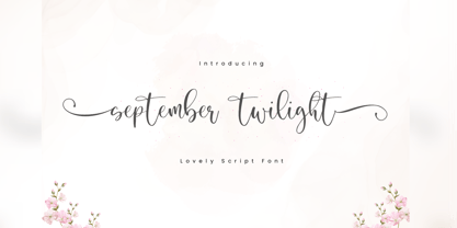 September Twilight is a beautiful calligraphy font perfect for crafting, branding, invitation, stationery, wedding designs, social media posts, advertisements, product packaging, product designs, label, photography, watermark, special events or anything. September Twilight comes with full set of uppercase and lowercase letters, swash alternates, ligatures,multilingual symbols, numerals and punctuation. If you have any questions don't hesitate to drop me a message ;) Happy Creation !!
 - Giftbox by Gleb Guralnyk,
$12.00 Introducing a vintage font Giftbox. It's a classic style font with thin lines decoration. Giftbox font set includes a main font file with lots of ligatures and a simple one which will be more usefull in a small size. Giftbox font has a west european multilingual support (please check out a screenshot with all characters). Thank you and have a lovely day!
 - Madeleine by insigne,
$11.95Madeleine is an open script face with influence from early 50s scripts. The stroke doesn't have much variation, and the characters are wide and flowing. The script also features OpenType end swashes and discretionary ligatures to extend the twirling and fluid nature of the script. This mischievous script is useful for informal invitations, scrap booking or whenever you need a retro look. - Chenica by Scratch Design,
$9.00 Chenica is an elegant, clean & simple sans serif. It has a sophisticated, minimalist and elegant typeface design. This beautiful font has been designed for projects which are suitable for modern & elegant design, such as branding, magazines, logos, headers, and many more. Shepia includes: Letters Numbers Symbols & Punctuation Multilingual Support Beautiful Ligatures If you have any questions, please feel free to contact us Thanks!
 - Ungaraca by pentagonistudio,
$19.00 Ungaraca Is a modern duo inspired by Serif and Script style. SOFTWARE REQUIREMENTS : Fonts and alternates: No special software is required they may be used in any basic program/website app that allows standard fonts, that's it folks! You can go ahead and get cracking :) Follow my shop for upcoming updates including additional glyphs and language support. Have a Good Day!
 - Cristal Ttris by Johannes Krenner,
$7.00 This Font is inspired by the Nintendo game: Tetris® It has 2 styles: BOLD and THIN. They both have simulated greyscale and can be used out of the box like you see them on the pictures. It comes with more than 450 glyphs per style. More than capable of supporting all european languages, small caps and different numeral figures.
 - Vanrott by Ergibi Studio,
$15.00 Vanrott is an old font with two styles: Regular and Destroyed. Both styles have a bold, prominent, old-fashioned but modern look! Vanrott is perfect for those of you who need fonts for titles, logos, clothing, invitations, branding, packaging, advertisements, and more. Vanrott includes uppercase and lowercase letters, punctuation, symbols, numbers, stylistic sets, alternate, ligatures as well as multi-lingual support.
 - Athletic Pro by Mandarin,
$29.00 Athletic Pro is an updated and revised version of Athletic Condensed. Added weight styles and a brand new designed Cyrillic alphabet. Practical and timeless, this display font does an excellent job on laying headlines and bold messages. With the variable font file you will have further personalisation and broader range of styles, it also contains the standard weights and styles.

