1,823 search results (0.108 seconds)
  1. Pilsen Plakat - Unknown license
  2. Maybrook JNL by Jeff Levine, $29.00
    One of the type examples found within the pages of “Lettering” by Harry B. Wright (1950) is a bold hand lettered serif typeface with a unique twist – the slab serifs had rounded corners, looking very much like show card lettering of the early 1900s. This design is now available digitally as Maybrook JNL, in both regular and oblique versions.
  3. Positive Vibe JNL by Jeff Levine, $29.00
    Positive Vibe JNL is a meeting of two eras... The model for this font was Jeff Levine's Two Reeler JNL, modeled after title cards in a Charlie Chaplin movie from the beginning of the 1900s. With a few stroke weight shifts, this versatile font takes on the image of the "Peace and Love" generation of the mid-60s and early 70s.
  4. Farquharson by Quadrat, $25.00
    Farquharson is an all-caps display face, adapted from an early American woodtype, and designed especially for use in the book Charlie Farquharson’s Unyverse. The complete family consists of two fonts: a regular version and a stencil version. Alternate versions with slightly elongated feet are provided for A, H, K, M, N and R. Very eccentric, it is best used in small doses.
  5. The "Turok" font, created by Neale Davidson, is a fascinating and distinctive typeface that captures the essence and spirit of adventure often associated with its namesake. Neale Davidson, known for ...
  6. Along Slab Work by Brenners Template, $19.00
    Along Slab WORK is a elegant Slab Serif font family, which designed by Ryuld Davidson of the Brenners Template. It retains the skeleton of the Along Sans S2(https://www.myfonts.com/fonts/brenners-template/along-sans) Especially, all italic styles were rhythmically redesigned for inspiration of glyphs. This font family has a unique personality for each style and will help a designer's choice.
  7. Variety Store JNL by Jeff Levine, $29.00
    Ben Harris' illustrated cover for the sheet music of "I Found A Million Dollar Baby (in a Five and Ten Cent Store)" from 1931's "Billy Rose's Crazy Quilt" lists the show's stars and other credits in a pen lettered monoline design with rounded terminals. This early Art Deco type style has now become the digital font Variety Store JNL (a reference to the Five and Ten Cent stores alluded to in the song title from the sheet music).
  8. The Jedi font by Neale Davidson is a captivating and stylized typeface that draws heavy inspiration from the iconic and beloved Star Wars universe. This font embodies the futuristic and otherworldly ...
  9. Plinc Beaux Arts Didot by House Industries, $33.00
    Firmin Didot is credited with establishing the Modern genre of serif typefaces, of which Beaux Arts Didots stands as an exemplary model. Like the French neoclassical architecture of its namesake, Beaux Arts has all the hallmarks of the early nineteenth-century style: a clear and confident construction consisting of simple yet strong lines. Use it for elegant and formal settings, or when a direct typographic tone is desired. Mix it with styles of similar sensibilities such as Plinc Hanover and Davison Spencerian. Digitized from the original Photo-Lettering film matrix in 2014 by Jean-Baptiste Levée. BEAUX ARTS DIDOT CREDITS: Typeface Design: Photo-Lettering Staff Typeface Digitization: Jean-Baptiste Levée Typeface Production: Ben Kiel Typeface Direction: Ken Barber Like all good subversives, House Industries hides in plain sight while amplifying the look, feel and style of the world’s most interesting brands, products and people. Based in Delaware, visually influencing the world.
  10. ITC Bottleneck by ITC, $39.00
    Tony Wenman designed the display typeface Bottleneck in the early 1970s and its figures reflect the spirit of the times. Its distinguishing characteristic is the extreme heaviness of the serifs in the lower third of the characters, a trait which the viewer could associate with the plateau shoes of the 1970s. Bottleneck is a carefree, playful typeface which can be found even today on entertainment fliers and retro advertisements. When used sparingly in headlines and slogans, it is a real eye-catcher. Similar typefaces are Julia Script, by David Harris, and Candice, by Alan Meeks.
  11. Hollywood Revue JNL by Jeff Levine, $29.00
    Hollywood Revue JNL gets its design inspiration and name from a vintage movie poster for "The Hollywood Revue of 1929". The letter style shows early Art Deco influences, yet the hand lettering was done in the late 1920s toward the end of the Art Nouveau period. MGM produced this early "talkie" all-star musical with a cast that included Jack Benny, John Gilbert, Conrad Nagel, Laurel and Hardy, Buster Keaton, Joan Crawford, Norma Shearer, Polly Moran and many others. This is the motion picture where Cliff ("Ukelele Ike") Edwards introduced "Singin' in the Rain" (composed by Arthur Freed and Nacio Herb Brown). Years later, Freed was a producer at MGM and gathered up many of the songs he and Brown wrote during the 1920s to form the musical core of the 1952 Gene Kelly-Debbie Reynolds-Donald O'Conner musical "Singin' in the Rain".
  12. The Equestria_Cyrillic font, crafted by Neale Davidson, is a distinctive and playful font inspired by the magical realm of Equestria from the popular My Little Pony franchise. This typeface captures ...
  13. DHF Quinta's Diary - Personal use only
  14. Future Bugler Upright by Breauhare, $35.00
    Future Bugler Upright is a non-slanted version of Future Bugler, a font based on the second logo created by Harry Warren in early 1975 for his sixth grade class newsletter, The Broadwater Bugler, at Broadwater Academy in Exmore, Virginia, on Virginia’s Eastern Shore. This font can convey several perspectives or moods. It can suggest a space-age vision of the future, or an art-deco perspective of the future as in the movie Sky Captain and the World of Tomorrow. It also communicates the idea of high performance, or extreme sports, without the grunge. Digitized by John Bomparte.
  15. Along Serif BSC by Brenners Template, $19.00
    Along Serif BSC is a elegant font family, which designed by Ryul Davidson of the Brenners Template. It is designed to blend classic delicacy with modern rhythm of glyphs to suit elegant design works. And the waves of the rhythmic stems make funny designers with sharp swords in light-weight styles. These Italic lowercase glyphs are redesigned to get this rhythm and they are shining through the contrast of each style. Enclosed glyphs are often used by professional designers like you. Please Check it out through the glyphs Window of Adobe apps.
  16. Birdman - Unknown license
  17. DHF Happy Birthday Ryan - Personal use only
  18. DHF Dipanegara - Personal use only
  19. Spencer by The Northern Block, $30.99
    Spencer is a calligraphic semi-serif type family that has been carefully designed to provide easily distinguishable letterforms that are practical in use, as well as aesthetically appealing. It's natural and organic forms comes from a deep consideration of the efficiency of the visible word and provides the typeface with a distinct and unique voice.

 Named after Herbert Spencer, an educator and researcher of legibility at the Royal College of Art in the sixties and seventies, and influenced by other early typographers and legibility researchers, such as Walter Tracy and John Harris. Spencer was designed as part of a legibility study by Sofie Beier and Kevin Larson.
  20. Future Bugler Soft by Breauhare, $35.00
    Future Bugler Soft is a soft version of Future Bugler, a font based on the second logo created by Harry Warren in early 1975 for his sixth grade class newsletter, The Broadwater Bugler, at Broadwater Academy in Exmore, Virginia, on Virginia’s Eastern Shore. This font can convey several perspectives or moods. It can suggest a space-age vision of the future, or an art-deco perspective of the future as in the movie “Sky Captain and the World of Tomorrow”. It also communicates the idea of high performance, or extreme sports, without the grunge. Also check out its siblings, the original Future Bugler, and Future Bugler Upright. Digitized by John Bomparte.
  21. Bocfer by Brenners Template, $19.00
    Designed by Ryul Davidson, this typeface is a special style for designers who prefer a sense of space and differentiation in the layout system. It applies a design concept that continues the modern and contemporary grotesque lineage. And, It adopts a somewhat low x-height system and has a classic and sophisticated balance. As the height of lowercase letters is lowered, more differentiated and rhythmic typography can be realized, and it showcases a wide range of coverage from offline publishing to display areas. The elaborately optimized kerning system is a good choice for designers who prefer more professional logos and editorial designs.
  22. Future Bugler by Breauhare, $35.00
    Future Bugler is a font based on the second logo created by Harry Warren in early 1975 for his sixth grade class newsletter, The Broadwater Bugler, at Broadwater Academy in Exmore, Virginia, on Virginia’s Eastern Shore. This font can convey several perspectives or moods. It can suggest a space-age vision of the future, or an art-deco perspective of the future as in the movie “Sky Captain and the World of Tomorrow”. It also communicates the idea of high performance, or extreme sports, without the grunge. Also be sure to check out the upright version of this font, Future Bugler Upright, available separately. Digitized by John Bomparte. Additional tags: NFL, NFL Network, NFLN
  23. Pall Mall by Red Rooster Collection, $45.00
    Based on the early ‘Pall Mall’ typefaces.
  24. Vienna by Solotype, $19.95
    This early 1900s type is from the German foundry of Schelter & Gieseke, and is typical of early twentieth century design. As usual, we have added all the modern necessities, such as monetary signs for the major commercial countries.
  25. Avebury by Parkinson, $25.00
    An ultra black blackletter, Avebury Black and Avebury Inline were inspired by an early blackletter from the Caslon Foundry. Early blackletters from the Bruce Type Foundry are also reflected in this slightly modernized and more readable typeface. Caution. For display only.
  26. Gothic Nesbitt by Wooden Type Fonts, $20.00
    An early gothic heavy sans serif font, largely for display.
  27. Titanic by Red Rooster Collection, $45.00
    Based on an early wood type design. An original creation.
  28. Triple Condensed Gothic by Red Rooster Collection, $45.00
    Based on an early wood type design. An original creation.
  29. Yeoman Gothic by Red Rooster Collection, $45.00
    Based on an early wood type design. An original creation.
  30. Bitmap Sketch by The Tree is Green, $20.00
    Inspired by early bitmap fonts, hand drawn for a contemporary twist.
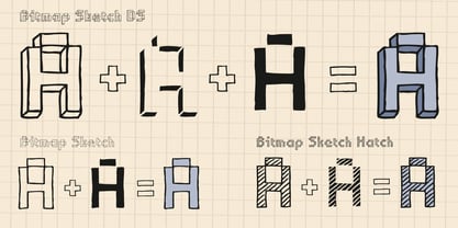
  31. Grand Canyon by Red Rooster Collection, $45.00
    Based on an early wood type design. An original creation, that kept growing...!
  32. Yarker by Corien’s Handwritingfonts, $19.00
    Yarker is the Business Hand of the late 1800's early 1900's.
  33. Altemus Arabesques by Altemus Creative, $11.00
    A collection of 174 calligraphic designs derived from early 20th Century European arabesques.
  34. Cobalt 27 by Lee Iley, $29.00
    A typeface based on early Constructivism Design and Early 20th Century Type form the Modernist Movement. Cap Height for the font has been extended to represent early 20th century typography more closely, while rounded shoulders add a contemporary, modern feel, allowing the design to bridge both centuries. Cobalt Bold works best for headers and titles, while Cobalt Medium and Regular lend themselves to body text. Cobalt Text has smaller Cap Heights, Ascenders, and Descenders, and has been designed where smaller leadings in a body of copy is needed.
  35. Stone Age by Indian Summer Studio, $15.00
    Stone Age Cave Art primeval prehistoric Neolithic primitive cavish petroglyphic genuine rough original early font.
  36. CMSquish - 100% free
  37. Secret Service Typewriter by Red Rooster Collection, $45.00
    Based on proofs of an early Remington typewriter font from the Keystone Type Foundry, circa 1905.
  38. Welcome by Solotype, $19.95
    This is another of those early 20th century, post art nouveau types from Europe. Probably German.
  39. Karolla by ParaType, $30.00
    Designed at ParaType in 1994 by Tatiana Lyskova. Based on Carola Grotesk of H.Berthold and Bauer type foundries (early 20th century) and Boutique of Haas type foundry (Munchenstein, Switzerland). Bold style based on Herkules of H.Berthold foundry (early 20th century) was added for ParaType by Manvel Shmavonyan in 2002. For use in advertising and display typography.
  40. Artist Colony JNL by Jeff Levine, $29.00
    Artist Colony JNL is the third type design inspired by some online examples from an early 20th Century French book of decorative hand lettering. While Arte Critique JNL and French Art Initials JNL embrace the Art Noveau style, Artist Colony JNL leans more toward the emerging Art Deco Movement of the late 1920s and early 1930s.
Looking for more fonts? Check out our New, Sans, Script, Handwriting fonts or Categories
abstract fontscontact usprivacy policyweb font generator
Processing