1,203 search results
(0.014 seconds)
- Cartoon Panel JNL by Jeff Levine,
$29.00 Charles W. "Plot" Plotner was a cartoonist who had developed a template-based cartooning set for kids circa 1952 called "Plot-O". A companion set was called "Plot-O the Clown". "Plot-O" consisted of two plastic templates with pre-cut and numbered cartoon shapes. By following the simple directions and tracing the corresponding parts, any youngster could create basic cartoons of people and finish them off with their own details. The hand-lettered instruction booklet provided the design inspiration for Cartoon Panel JNL.
 - Skicack by upirTYPO,
$17.00Skicack is scribbled form of classic bold font. Creates nice texture when used in small sizes (especially printed), and hard heavy look in big sizes. Comes with complete Central European character set, and few additional symbols (see gallery images). Ideal for headlines, CD covers, T-shirts, clothes designs, webpages, banners, and everywhere where you need something special! As you can see on gallery image, it´s really easy to create nice background-patterns, and as it is a font, you can scale it to any size! - Horse Drawn Carriage JNL by Jeff Levine,
$29.00 Picture if you will, a balmy autumn evening in Manhattan during the 1930s and a well-dressed couple out on the town. They hail one of the hansom cabs located near Central Park and climb in for an old-fashioned romantic ride around the green. Such are the type of images the stylized Art Deco hand-lettering comprising Horse Drawn Carriage JNL evokes. The inspiration for this font was the title card for a 1935 Bette Davis feature entitled "The Girl from 10th Avenue".
 - Remontoire by MAC Rhino Fonts,
$36.00 The original sketches who formed the base for Remontoire is known as one of the first typefaces drawn by Karl-Erik Forsberg . It was a result of a competition set up by various typographic organizations in the early 1930. The typeface was never completed and sketches are only to be found on paper. Made only as a single font but some the character can later on be found in other of examples of his work; Carolus and Ericus. MRF developed and expanded the family into 5 weights.
 - dT Delicatta by dooType,
$40.00 Easy to use, but hard to miss. That’s dT Delicatta. An elegant script face that adds a special touch to any message. Script typefaces usually come packed with endless features and, more often then not, all those possibilities take their toll on the designer or art director. With usability in mind, we kept dT Delicatta simple and straightforward to use while delivering refined shapes that enhance your or your client’s communication. dT Delicatta is a revised, improved and virtually new font of our old classic Delicatta
 - First Love by Senekaligrafika,
$12.00 “First love” has hard strokes and signature style that speak to instant romance sensation. Take your creative projects to the highest level with this font. “First love” will help you to create special and touching typographical design for your loving and romantic projects, for every day or the happiest day in life, wedding party, wedding card,valentine day, greeting card, headings, flyer, product packaging, book cover, printed quotes, logos, and many more. It is really universal and modern font. The owner of endless possibilities!
 - TIES - Personal use only

- a sogra Ruth - Personal use only

- Obcecada Serif - Personal use only

- Obcecada Sans - Personal use only

- Escobeta One - Personal use only

- Uchrony Circle - Personal use only

- Posteratus Rex - Personal use only

- Pabellona (B) Dúplex - Personal use only

- Cienfuegos - Personal use only

- Pabellona (A) Símplex - Personal use only

- Pabellona (C) Tríplex - Personal use only

- Oaxaqueña Tall - Personal use only

- Peanut Square Layer by PizzaDude.dk,
$19.00 This is a font that will fit in the "hard to read section" because it may not be super legible at first sight - that is because of the negative space. But when you combine the two layers (Layer and Box) the letter suddenly appears very legible! Play around with your favourite colour palette while adjusting the transparency in order for the colours to blend, giving a really nice handcrafted look! You have 4 different versions of each letter to play around with and of course there is multilingual support!
 - Bargain Shopping by Jeff Levine,
$29.00 F.W. Woolworth was once one of the giants of the variety store chains, along with the likes of Kress, S.S. Kresge, McCrory’s, Neisner Brothers, Ben Franklin and others. In 1960, the company brought out a new corporate logo with a type design harking back to the Art Deco style of the 1930s and 1940s. A photo of one of their old store fronts (despite having only eight letters to work with) inspired the digital interpretation of the signage as Bargain Shopping JNL, which is available in both regular and oblique versions.
 - Delicious Pro by Yes Please,
$45.00 Delicious Pro from Yes Please is a bold, contemporary take on the classic Americana script. Inspired by the vibrant history of early 20th Century American packaging vernaculars, Delicious Pro delivers unique flavor packed with gestural personality perfect for headlines, packaging and more! Delicious Pro features conventional ligatures, a standard set of accents and symbols, and a full set of extended custom styling ligatures to provide a versatile end-user experience. Delicious Pro has played hard for Nike Women's Training, Nike Sportswear, IFC and more. Delicious Pro is designed by Lee Schulz.
 - Radar by Type-Ø-Tones,
$60.00 Radar is a revival of the sans serif typeface “Grotesca Radio”, from the Spanish foundry Richard Gans, which existed from 1888 to 1975. His authorship is attributed to the German type designer and master punchcutter Carl Winkow. Although the new version of this font has always tried to keep accurate similarities with the original typeface, Radar is not intended as a strict revival, but as a contemporary interpretation. In this new version the user can find some alternate characters that give the typeface a more art-déco or neutral flair.
 - Core Bandi by S-Core,
$59.00 Core Bandi is a grunge 3D font supported by equivalent ‘flat’ styles named Core Bandi Face. This typeface is very cute and has rhythmic flow line, but not distracted. And you can easily make various color combination with CoreBandi & CoreBandi Face. Its really hard to find doodled 3D Korean(Hangul) fonts even in Korea because Hangul has as many as 11,172 characters. Supported codepages are MS Windows 1252 Latin1 and MS Windows 949 Korean consisting of 11,172 Korean letters and Symbols except Chinese. We recommend to use for books, magazines and posters.
 - Destructive Decisions by Chank,
$99.00 Destructive Decisions is a font based upon the inherent flaws of human nature—presented under the guise of complete legibility. At first impression this font is very readable, but upon closer examination you'll notice the edges are fuzzy and some of the lines are off-kilter. You can read it, but it is also a bit foggy. No matter how hard it strives for perfection. This font was originally designed for a cable tv show about substance abuse, but is now available for use in your web and print designs, too.
 - Too Much by Comicraft,
$19.00If you've had too much coffee but not enough of Too Much Coffee Man you can now indulge in an excess of characters created by the hand of Too Much Coffee Man's creator, Mister Shannon Wheeler. Don't worry, in our efforts to ensure clean and confident lettering samples, we kept Shannon on decaf until he was done. Dip this font in your system folder and your hard drive will get a caffeine and sugar rush guaranteed to increase its memory partition and bring the images on your monitor into sharper focus. - Diorite by Three Islands Press,
$24.00Diorite is modern face built on classical letterforms -- but left with a bit of residual roughness. Some might call Diorite forthright, others brutal. (It reminded the designer of the dark, hard igneous rock of the same name, treasured by the ancient Egyptians for statuary.) The typeface has a relatively chunky, four-style family; the italics are true cancellaresca corsiva, also writ heavy. "The cancellaresca is of course a Gothic design," notes the designer. "Just use a broader pen, and you'll see!" Has four styles: regular, bold, cursive, and cursive bold. - Manual by TypeUnion,
$39.00 Manual is an 80 font super family formed of 10 weights in 4 different widths. The font is styled with a slight retro feel to give it a unique appearance. Manual is a blue-collar font that works hard for you and your design ideas. The higher x-height enhances the readability for smaller, more informative text sizes whereas the black weights create beautiful, impactful headlines to fit a variety of spaces. The support of the expansive weights and widths will give your design a truly unique feel.
 - Golum by Type Innovations,
$39.00 Deep in the bowels of the earth a tortured creature tries to mimic the writings of mankind. It labors long and hard carving the letter forms on the walls of its cave. Many years later, rubbings where taken of these impressions and fashioned to create this hideous font. All kidding aside, with such a formal training in type design, it was not easy for me to create these ill-shaped letters. I kept wanting to smooth out the outlines. Anyway, it was a good exercise and we now have this antique heavy-weight.
 - Rogelio Script by Joelmaker,
$15.00 Rogelio Script is a stylish modern calligraphy font with casual chic flair. It is perfect for branding, wedding invites and cards, signature and maybe for red wine label. Rogelio Script includes full set of gorgeous uppercase and lowercase letters, numerals, a large range of punctuation and variation ligatures. All lowercase letters include beginning and ending swashes, giving realistic hand-lettered style. What you get, darling? In order to use the beautiful swashes, you need a program that supports OpenType features such as Adobe Illustrator CS, Adobe Photoshop CC, Adobe Indesign and Corel Draw.
 - Freak by HiH,
$10.00 Freak was originally released by The Great Western Type Foundry in 1889. According to Maurice Annenberg, Great Western became Barnhart Brothers & Spindler when the Barnhart brothers bought out the Toepfer family in 1868.The plant superintendent, Charles Spindler, became Secretary of the new firm. Specimen books as late as 1899 show the name Great Western alongside the BB&S name. At some point, prior to 1925, Freak was renamed “Bamboo” by BB&S. It was delisted when BB&S was absorbed by ATF in 1929. Listed in McGrew under “Bamboo”.
 - Fabbabi by astroluxtype,
$20.00 Fabbabi is a vintage bold retro-font suggested uses would be for headlines that catch the eye. The glyphs are hard edged with soft corners that makes for a fun playful look in the uppercase version and an useful display font using the lowercase letterforms for subheads and the like. Slightly condensed, this bold font applied to projects that need an attention grabbing headline but expresses the fun of the info being convened. Best used larger than 42 points in size. Fabbabi is a wonderful, beautiful and fabulous big baby of a font- Ciao!
 - Southland Letter by Hanzel Space,
$25.00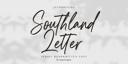 Southland Script Handwritten Font with contemporary, sophisticated accents. It is perfect for branding, wedding invites, tagline, cards, maybe for label and logo. Southland includes full set of gorgeous uppercase and lowercase letters, numerals, a large range of punctuation and ligatures. It expresses beauty of handwriting. What you get, darling? In order to use the beautiful ligatures, you need a program that supports OpenType features such as Adobe Illustrator CS, Adobe Photoshop CC, Adobe Indesign and Corel Draw. Feel free to give me a message if you have a problem or question.
 - Pittsbrook by Fontdation,
$15.00 Pittsbrook Family, a pack of classic typefaces that inspired by the letters used in old advertisement and packagings. Its rigid shape gives you strong, sharp and blocky feelings, no curves were harmed in the making of these typefaces. Comes in three styles; Sans, Serif and Outline, all of them are consistently mouse-crafted characters, we spent a lot of attention to every details. Suits best for any classic/vintage design project, such as E-Sport logo, liquor/food label, packaging, headline, space-filler, logotype, typographic quote writings, etc.
 - Mochaik by Say Studio,
$15.00 Mochaik - Psychedelic Display Font Here's a lettering style that just might be exactly on your wavelength. Add just the right dose of vintage freak-a-delia to your retro graphics with this original psychedelic-style design. Great for music posters, album graphics, book titles, etc. Evoke a warpy, wavy, whimsical vibe that harks back to the carefree 1960s or early 1970s era with Sixties Flashback; it's pure hippie, trippy fun! Whats Includes : - Mochaik Regular, Outline, Italic - Multilingual Support If you want any Question, let me know Have a wonderful Day, Saystudio
 - Encoder by District,
$20.00 This is not a stencil font. At least it isn't intended to be. The foundation for the entire font comes from a progression in experimental rules on stroke intersections (pinching, separating) while maintaining proportions and elements from a more conventional typeface. More latitude was given to the unicase "Fat" face but still retains the overall flavor of the original. The end result is a typeface that's hard to categorize as any one personality. Most likely a good candidate for logo, display, or headline work, the applications for Encoder are yet undeciphered.
 - Luminance by MAC Rhino Fonts,
$36.00 As a result of fascination for East European type design, MRF couldn’t resist to make a unique interpretation of a typeface named Pracht. Originally made by the Czech type designer Carl Pracht in 1941–43. Having a rather calligraphic style both in regular and italic, MRF preferred it to be more straightforward and modern-looking. The italic version was executed with traditional italic letters (a, f, g, k, v, w and y). The numerals were made in a classic manner as old-style figures. Can be treated as both a text and display font.
 - Pleasure Point by Comicraft,
$39.00 Slocals! Check out the action of our radical new font, PLEASURE POINT! It's Bananas, Totally Tubular, Stoked and ready to ride some waves. Back in his grom days, Comicraftsman John JG Roshell could be found down at Pleasure Point, waiting for The Big One, and this is IT! Don't be a criddler, paddle hard and rip this font to your motherboard to keep it real every time you gun, rail or tail. And if you get rag dolled, dude, don't blow out your squeaker. Pleasure Point will hang loose and chillax you to the max.
 - Distill by MADType,
$19.00 Distill draws its inspiration mainly from Theo van Doesburg's De Stijl era lettering. The type he designed for the Aubette Café, De Stijl Magazine, etc was used as a starting point and then expanded upon. While this typeface was inspired by historical references, it also has the ability to invoke a contemporary feel under the right conditions. Distill will work hard whether you are designing a neo-constructivist poster or a futuristic website. Distill is a family of 12 fonts: 4 weights, each containing condensed, regular, and expanded widths. It also features several alternate characters.
 - Shockwave by Type Innovations,
$39.00 I'm always experimenting with new ideas for display fonts. I took the inside counter of a capital 'O', divided it into quarters, and applied an outline stroke to all the elements. By removing two quarters of the inside counter I had the beginnings for an interesting new design. Of course, the hard part was getting all the other letters in the alphabet to work well together using this approach. It's often a labor of love trying to shape an idea into a new typeface. I find the entire process stimulating and rewarding.
 - Benn by Factory738,
$5.00 Benn is a bold and strong font family. Inspired by a car shape, it's sturdy uncompromising style is felt through the controlled letterforms and fluid touches. A balance of hard lines and smooth curves. Benn works great in any branding, poster, logos, magazines, films. The different weights give you full range to explore a whole host of applications, while the alternate glyphs give a fluid and modern feel to any projects. Eight styles Alternate glyphs are available Numbers & Punctuation Extensive Language Support Thanks for having a peek at Benn.


