10,000 search results
(0.158 seconds)
- Gloriesta Playful by DYSA Studio,
$19.00 Gloriesta Playful is a new playful typeface. This another collection of display is perfect for your next branding project, excellent for your business. Gloriesta Playful have a natural edges, so this font gives an authentic handcrafted feel style.
 - Halloween School by Jehansyah,
$9.00 Halloween School is a font family with various types in it, you can choose according to your needs, with several characters to suit the latest design trends experience, make this your choice and have fun with each character.
 - M Ngai PRC by Monotype HK,
$523.99 M Ngai PRC is a graphic style Simplified Chinese typeface. Graphic font designs have strong personalities and visual impact. Graphic style Simplified Chinese fonts feature decorative elements and pronounced graphics characteristics, suitable for catching attention in display applications.
 - Ridinger Pro by RMU,
$30.00 Based upon Riedingerschrift, cut by Franz Riedinger for Benj. Krebs Succ. in Frankfurt am Main in 1906, here come Ridinger Std and its extended version, Ridinger Pro. An elegant cursive font which also includes various adorning swash strokes.
 - Kutai by Eko Bimantara,
$18.00 Kutai is an explorative typeface that created to pursue unique display typeface fuse with ethnic look. It's consist of three styles or instance; Normal, Tall and Taller which have different height between each other, especially the x-height.
 - Alfrere Banner by Greater Albion Typefounders,
$12.00 Alfrere Banner is a 1950s inspired masthead typeface, designed to complement our ‘Alfrere Sans’ typeface family. These two Banner faces, offered in regular and incised forms, emphasise horizontal lines and have a distinct ’streamline-era’ feel to them.
 - ALT Lautus by ALT,
$5.00 Lautus is a 10 weight typeface and can be use in almost every graphic design application. It’s great for minimal design, logos, posters, and magazines Check out the whole presentation here http://www.behance.net/gallery/Alt-Lautus-Typeface/788079
 - M Yoyo HK by Monotype HK,
$523.99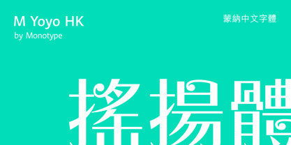 M Yoyo HK is a graphic style Traditional Chinese typeface. Graphic font designs have strong personalities and visual impact. Graphic style Traditional Chinese fonts feature decorative elements and pronounced graphics characteristics, suitable for catching attention in display applications.
 - M Windy PRC by Monotype HK,
$523.99 M Windy PRC is a graphic style Traditional Chinese typeface. Graphic font designs have strong personalities and visual impact. Graphic style Traditional Chinese fonts feature decorative elements and pronounced graphics characteristics, suitable for catching attention in display applications.
 - M Stream HK by Monotype HK,
$523.99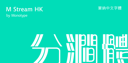 M Stream HK is a graphic style Traditional Chinese typeface. Graphic font designs have strong personalities and visual impact. Graphic style Traditional Chinese fonts feature decorative elements and pronounced graphics characteristics, suitable for catching attention in display applications.
 - Velvet Script by Typadelic,
$19.00A pretty handwriting typeface. Smooth and feminine. You'll find an alternate "r" and "s" (Option 9 and Option 10 on the keyboard) which have a beginning stroke to achieve a finished look. Try it and see for yourself. - Bilhete by Vernacular,
$9.99 Bilhete ('note') is a font for a quick writing. You can write a poem, a shop list or your name in a coffee cup. Any note on your project will have a personal taste with Bilhete by Vernacular. :)
 - HF Monorita by HyFont Studio,
$29.00 HF Monorita is the first monospace we have created. It is perfect for coding, display and design. The subtle curves on the diagonal strokes create a friendly vibe and can create a better reading flow for the users.
 - Nanu by Gustav & Brun,
$20.00 Nanu is a hand drawn font where lower and upper cases have the same cap height. It is multilingual and contains a lot of open type features. When purchasing Nanu you get the Nanu Simple Ornaments for free.
 - Lecory by vuuuds,
$16.00 Introducing Lecory Font! Lecory is modern serif font, every single letters have been carefully crafted. This font including beautiful alternate glyph. You can access the alternate glyph via Font Book (Mac user) or Windows Character Map (Windows user).
 - M Rocky PRC by Monotype HK,
$523.99 M Rocky PRC is a graphic style Simplified Chinese typeface. Graphic font designs have strong personalities and visual impact. Graphic style Simplified Chinese fonts feature decorative elements and pronounced graphics characteristics, suitable for catching attention in display applications.
 - Pekoe JNL by Jeff Levine,
$29.00 Jeff Levine Fonts offers its interpretation of Tea Chest, an Art Deco serif stencil font originally designed in 1939 by Robert Harling for the Stephenson-Blake type foundry. Pekoe JNL is available in both regular and oblique versions.
 - Ridinger by RMU,
$30.00Based upon Riedingerschrift, cut by Franz Riedinger for Benj. Krebs Succ. in Frankfurt am Main in 1906, here come Ridinger Std and its extended version, Ridinger Pro. An elegant cursive font which also includes various adorning swash strokes. - M Circus PRC by Monotype HK,
$523.99 M Circus PRC is a graphic style Simplified Chinese typeface. Graphic font designs have strong personalities and visual impact. Graphic style Simplified Chinese fonts feature decorative elements and pronounced graphics characteristics, suitable for catching attention in display applications.
 - M Rocky HK by Monotype HK,
$523.99 M Rocky HK is a graphic style Traditional Chinese typeface. Graphic font designs have strong personalities and visual impact. Graphic style Traditional Chinese fonts feature decorative elements and pronounced graphics characteristics, suitable for catching attention in display applications.
 - Al Crystasea by Aluyeah Studio,
$119.00 Crystasea, a Dawn Seeker Display Serif Font with Stunning 4 weight Style. Very suitable for magazine, headline, website, ads, product package and all type of design project you have. Features: OpenType support Multilingual support (15 languages) PUA Encoded
 - Bullhead by Gassstype,
$28.00 Here comes a New font, Bullhead is a handwritten brush that is written casually and quickly. these strong Letters are made with brushes on Procreate. Bullhead is perfect for homeware designs, branding projects, Logo design, Quotes product packaging.
 - Fleurons Four by Wiescher Design,
$39.50 Fleurons are embellishments and here is my fourth round. I found some nice old ones and made some new. These go very well with my scripts Nadine and Ellida!!! Yours once more in a beautiful mood, Gert Wiescher
 - Talloween by Ingrimayne Type,
$9.00 Talloween is a bizarre typeface in which the letters have a fraktur form, but look as if they had been made of wax that has partially melted. It comes in four styles, regular, oblique, shadow, and oblique shadow.
 - Spargo by Greater Albion Typefounders,
$8.50 Spargo is inspired by 20s and 30s American typefaces, often seen on share certificates and other securities. Spargo is offered in six all capitals display typefaces. Bring a touch of inter-war America to your next design project!
 - Olifant by Hipopotam Studio,
$25.00 Typeface originally designed as a monospace font (single standard width for all glyphs). We needed that for a project where letters stood directly above each other. Eventually it became proportional, and only the digits have a fixed width.
 - Razzle by Ayca Atalay,
$18.00 Razzle Sans | A Whimsical Sans Serif Razzle Sans is a clean sans serif typeface with a whimsical attitude. Playful yet legible letterforms that have a high x-height makes Razzle Sans an excellent choice as a display typeface.
 - Butterflies by Typadelic,
$-Can one have enough butterflies? I think not, which is why I created these little creatures. Another release of Butterflies, containing more butterflies and perhaps a few other critters thrown in, will be available later in the year. - Poison Ivy by Hanoded,
$15.00 Poison Ivy is a messy, scrawled font. It looks like the glyphs have been etched by an unsteady hand. Poison Ivy is ideal for use in books, albums and posters. Comes with a witches' kettle full of diacritics.
 - M Computer HK by Monotype HK,
$523.99 M Computer HK is a graphic style Traditional Chinese typeface. Graphic font designs have strong personalities and visual impact. Graphic style Traditional Chinese fonts feature decorative elements and pronounced graphics characteristics, suitable for catching attention in display applications.
 - Given my artistic inclination and optimistic outlook, it's delightful to delve into describing a font named "Tangled". The name itself conjures images of whimsy and adventure, perhaps inspired by fai...
- Sonrisa by CastleType,
$59.00 Sonrisa is a design that evolved from my sketches of the skeletal structure of Jakob Erbar’s Koloss, trying to discover its underlying essence without all the contrast and bulkiness of the original design. Sonrisa Thin was the resulting font, from which the other weights of the family were developed. Gentle curves, open counters, generous x-height, and sleekly tapered terminals give Sonrisa a very legible, modern, elegant appearance. When she saw the first draft of this typeface, the smile on my friend Jennifer’s face gave me the idea to call it “Sonrisa” (Spanish for “smile”). Jennifer, a clinical psychologist, described Sonrisa’s personality as: "happy, clean, clear, open, joyful, spacious, playful, calm. I can see it being used for body product lines such as oils and lotions. Can see it being used in home/travel magazines or even Architectural Digest. Yoga magazine, definitely." Sonrisa is what some foundries call a “Pro” typeface family with all the bells and whistles that provide typographic versatility: true small caps, oldstyle numerals, arbitrary fractions, discretionary ligatures, and other powerful OpenType features. All fonts in the family, except Sonrisa Titling, support most European languages, including modern Greek and languages that use the Cyrillic Alphabet. (Cyrillic glyphs designed in consultation with Ukrainian type designer, Sergiy S. Tkachenko.) Sonrisa is available in the original Thin, monoline version as well as six weights (Light, Regular, Medium, Bold, Extra Bold, Black), and a Titling font that is essentially a display font construction kit. If you enjoy using Sonrisa even half as much as I enjoyed creating it, then I know you will have a “sonrisa” (smile) on your face!
 - Campuni by Identity Letters,
$29.00 A charming confidant. Italic, but without the slant. Campuni is a sans-serif typeface that can be described as an “upright italic”: its letters are modeled on the handwritten forms of italics—but without the slant. This gives Campuni a contemporary, charming, and trustworthy character. As with most modern sans-serif typefaces, Campuni’s design is based on low-contrast, almost monolinear strokes with a neat and clear appearance. This is where Campuni’s steep and tapered joints come in: with a bit of contrast, they provide the perfect foundation for a steady rhythm between characters—just like you’d find in meticulous handwriting. Careful spacing ensures that this rhythmic character is preserved on the page and on screen, making for a pleasant reading experience. It’s not just the letterforms that gain from Campuni’s calligraphic heritage, though. This typeface is packed with calligraphy-style swash capitals and end swashes on lowercase letters, as well as discretionary ligatures. These are available via OpenType, allowing you to spice up your logo or headline with a hint of calligraphy in a breeze. Despite its flawless legibility in body text, Campuni is definitely eye-catching in display sizes. (Decrease letterspacing for some additional punch.) Besides logo design, Campuni is a great choice for branding, advertising, packaging, corporate design, or even signage and wayfinding. The range of topics that Campuni excels in varies from food, leisure, retail, e-commerce, music, and travel to games, toys, childcare, and family-themed events. Campuni has got an Extended Latin character set, seven sets of figures, case-sensitive forms, arrows, and a few other advanced typographic features—622 glyphs in total. Its eight weights span from Thin to Black.
 - Envelove by Sudtipos,
$39.00 «Envelove» is the brand new typographic challenge handwritten by Yani Arabena and designed along with Guille Vizzari and Ale Paul, for Sudtipos. It all started as a game for Yani. A carefree and spontaneous calligraphy, making use of the pointed nib with black ink, exploring its expressive possibilities pressing against paper. With time that nib turned into her dearest tool to flow through her writing, breeding this particular style of hers that let her trespass the barrier that kept personal and professional passions apart. All that inspiration is present in «Envelove», a play on words that reflects the love of letters. An expressive free-and-easy typeface that follows no formal calligraphic model and lets itself go with the meaning of words, rhythm and sensations. «Envelove» successfully joins three different fonts, «Envelove Script»—free, spontaneous and unique of its kind—going together with «Envelove Caps»—an uppercase style that builds controlled but dynamic words thanks to its alternates and ligatures, and to its own true Small Caps set as well—and «Envelove Icons», ideal to decorate and bring to life any written message. «Envelove» encourages you to write as if you have a nib, ink and an envelope. It invites you to take part in other worlds like a magic cocktail, a summer night, a long-awaited reunion, a first dance, a dish cooked with your own hands. The fashion world, gourmet, stationery, scrapbooking and everyone where a Handmade or Handcrafted feel is craved for, save a special place for «Envelove». (The illustration series that are shown with «Envelove» were made by the incredible Argentine illustrator Eugenia Mello.)
 - Yorkten by insigne,
$- Clean and welcoming, the distinct look of Yorkten is remarkably satisfying to the eye. Straight to the point, Yorkton features a fashionable, geometric composition with angled main stems. There are no fewer than fifty-four fonts in the family, all of which are characterized by one of three widths – extended, normal or condensed. Each individual subfamily is equipped with eight weights from Thin to Black with respective Italics, giving Yorkten a breathtaking range of fonts to boast. The greater value for you, though, is its members’ ability to work well together. With a deep toolbox of weights and widths to choose from, this family provides you with significant value and a broad number of design solutions, making sure you have the tools you need for each challenge. So where should you use the font? Jeremy Dooley designed Yorkten’s underpinning structure to be compact. Combined with its superior features and terrific legibility, this versatile font can be used effectively for many jobs, whether in print or on screen. Use it freely for e-books and apps. Yorkten is particularly great for headlines, banners, posters, and websites. As with all insigne fonts, fonts that are well received by the market are expanded into future variants such as rounded or slab serif types. Yorkten’s later expansions will increase the versatility and functionality of the family. There’s no need to wait for these future releases, though. This new face already complements a number of other insigne faces, such as Grayfel, Look, or the Cabrito Superfamily. So what are you waiting for? Get Yorkten today and bask in the rich potential it offers! Get Yorkten and luxuriate in its straightforward multifunctionality!
 - FF Kaytek Slab by FontFont,
$50.99 Kaytek™ Slab is a fresh take on the correspondence typefaces of the 90s - which were originally designed for the demands of office environments. Just like its predecessors, this text typeface is robust and hard-working - meaning it works well in challenging design or printing environments - but it’s not without personality. Look closer at the lowercase g and a, especially in the italic, and you can see some unexpected elements of subversiveness within the design. This blend of sturdiness and quirkiness means it’s just as relevant for information-heavy projects, such as annual reports, as it is in more expressive environments. Although first and foremost designed for text, Kaytek Slab’s details shine through in its heavier weights and larger sizes, meaning it also has display potential. Every style of the typeface takes up exactly the same amount of space, thanks to the way Radek Łukasiewicz created the design. He based the entire typeface on a single, master set of proportions. This means designers can switch between styles without the text being reflowed, making it particularly useful in magazines, where space might be limited, and also on the internet, where hover links appear in a different style. As well as its roots in the office, Kaytek Slab draws on a little bit more 90s nostalgia. It’s named for the first and only Polish walkman, and embodies the same solid, no-nonsense shapes that made the analogue technology of the era so charming. Kaytek Slab is robust and solid. Kaytek Slab comes in 12 weights, from Thin to Black Italic, and offers multi-language support. Kaytek Sans, Kaytek Headline and Kaytek Rounded, are also available.
 - Stolen Love by VP Creative Shop,
$30.00 Introducing Stolen Love - Stylish serif typeface + Swashes and Ornaments Stolen Love is stylish and creative typeface loaded with 6 different fonts, alternate and ligature glyphs, 52 swashes in 3 different sizes, 26 ornaments to make you typography truly unique! Language Support : Belarusian, Bosnian, Bulgarian, Chechen, Macedonian, Russian, Serbian, Afrikaans, Albanian, Asu, Basque, Bemba, Bena, Breton, Chiga, Colognian, Cornish, Czech, Danish, Dutch, Embu, English, Estronian, Faroese, Filipino, Finnish, French, Friulian, Galician, Ganda, German, Gusii, Hungarian, Indonesian, Irish, Italian, Jola-Fonyi, Kabuverdianu, Kalenjin, Kamba, Kikuyu, Kinyarwadna, Litvian, Lithuanian, Lower Sorbian, Luo, Luxembourish, Luyia, Machame, Makhuwa-Meetoo, Makonde, Malagasy, Maltese, Manx, Meru, Morisyen, North Ndebele, Norwegian Bokm ål, Norwegian Nynorsk, Nyankole, Ormo, Polish, Portuguese, Quechua, Romanian, Romansh, Rombo, Rundi, Rwa, Samburu, Sango, Sangu, Scottish Gaelic, Sena, Shambala, Shona, Slovak, Soga, Somali, Spanish, Swahili, Swedish, Swiss German, Taita, Teso, Turkish, Ukrainian, Upper Sorbian, Uzbek (Latin), Volap ük, Vunjo, Walser, Welsh, Western Frisian, Zulu FEATURES Uppercase, lowercase, numeral, punctuation & Symbol Light, Regular, Bold, Extra Bold, Black and Rough Versions 52 swashes in three sizes ( small, medium, big ) 26 ornaments Character maps for swashes and ornaments BGR support - special fonts with Bulgarian alphabet ligature glyphs alternates Multilingual support - 95 languages No special software is required to type out the standard characters of the Typeface. How to access alternate glyphs? To access alternate glyphs in Adobe InDesign or Illustrator, choose Window Type & Tables Glyphs In Photoshop, choose Window Glyphs. In the panel that opens, click the Show menu and choose Alternates for Selection. Double-click an alternate's thumbnail to swap them out. Feel free to contact me if you have any questions! Mock ups and backgrounds used are not included. Thank you! Enjoy!
 - TT Tricks by TypeType,
$35.00 TT Tricks useful links: Specimen | Graphic presentation | Customization options TT Tricks is a modern serif font family whose design refers us to the style of transitional serifs. The distinctive features of TT Tricks are the relatively low contrast of strokes, the slightly squarish shapes of round characters and the emphasized businesslike nature. The original idea of TT Tricks is based on the graduation project of student Sofia Yasenkova, who chose to create a daily planner font as her final project. This led to many stylistic decisions, for example, the large and asymmetrical serifs, low contrast strokes, and the presence of interesting details. In the process of working on TT Tricks, we have significantly revised the initial idea and expanded the areas of possible font application, while maintaining the original spirit of the project. Despite the large number of display details, the typeface looks great in a small point size, and also when it is used in large text arrays. TT Tricks features an original stylistic set which, when turned on, adds features of typical pointed-pen serifs to some of the lowercase characters. In addition, TT Tricks has small capitals for Latin and Cyrillic alphabets, as well as several interesting ligatures. The TT Tricks font family consists of two font subfamilies, these are the main version and the version with the original stencil cutting. Each subfamily consists of 12 fonts: Light, Regular, DemiBold, Bold, ExtraBold, Black + True Italics. Following a good tradition, TT Tricks supports a large number of OpenType features: ordn, case, c2sc, smcp, frac, sinf, sups, numr, dnom, onum, tnum, pnum, dlig, liga, calt, salt (ss01).
 - DT Lythmore by Dragon Tongue Foundry,
$9.00 Lythmore This font is called Lythmore and is inspired by Lithos. Lithos was originally designed for Adobe by Carol Twombly in 1990, based it on the lettering from ancient Greek inscriptions. The Capitals are similar in feel and design, but is totally original and built from scratch. It is designed to be similar intentionally, but it is not a clone or rip off. Lithos is an example of a simple blocky san serif font style, with subtly concave sides, angled ends, and off centred curves. Lythmore is also an example of that same style. But is also different in places where I felt it could be improved. And it has a complete lower case set, which Lithos doesn't. I built Lythmore with 8 different weights. Lythmore can be very effective when used in advertising and general display work, but it can also be used for much more. Although it was never designed to be body copy, when used as such, it is still perfectly readable and adds its own version of sans serif style and flavour. I have included two versions of the Lythmore family. Lythmore A and Lythmore B. In the Lythmore A family, the lighter 4 weights all vary in weight in both the horizontal and vertical axis. The heavier 4 weights all vary in the horizontal axis only. In the Lythmore B family, the transition is even in both directions across the entire family. The result of this difference is that the A and B versions difference is most noticeable between the Regular and Medium weights. While the extreme ends of each family version are virtually identical.
 - Schwabacher - Personal use only

