10,000 search results
(0.061 seconds)
- TOMO Fango by TOMO Fonts,
$20.00 A sans serif typeface, designed to speak very happy and friendly.
 - Backstage by AVP,
$19.00Backstage is a bold sans serif stencil with subtly rounded corners. - Etched Fractals by Typotheticals,
$6.00Drawn in Illustrator, this plain sans serif was created in 2004. - Tali MF by Masterfont,
$59.00 Finesse and style in this condensed hand drawn elegant type forms.
 - Fringe by La Boîte Graphique,
$20.00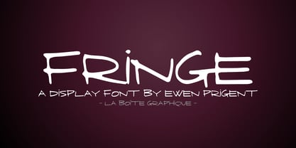 Fringe is a hand made font ideal for your graphic project.
 - Bear by La Boîte Graphique,
$16.00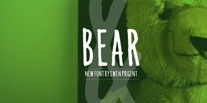 Bear is a hand made font ideal for your graphic project.
 - Bitmap Sketch by The Tree is Green,
$20.00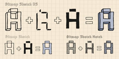 Inspired by early bitmap fonts, hand drawn for a contemporary twist.
 - Alpine Mtn by Wooden Type Fonts,
$15.00 Sans serif, bold, display font, useful for brochures and display advertising.
 - Kikster by La Boîte Graphique,
$29.00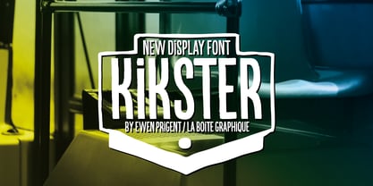 Kikster is a hand made font ideal for your graphic project.
 - ToreTtO by RodrigoTypo,
$25.00 Designed by Rodrigo Salas, ToreTtO is a display sans font family.
 - Altemus Roughcuts by Altemus Creative,
$11.00 A collection of 174 rough, hand-made and rough-looking designs.
 - Cyne by Typotheticals,
$8.00A plain sans serif that would be good for everyday use. - FT Grandpas Script by Fenotype,
$19.95 Grandpas Script is a blotted and hand-drawn joined script font.
 - Agartal MF by Masterfont,
$59.00 Flexible elegance in one font, as creamy as you can imagine...
 - Kontext Dot by Elster Fonts,
$20.00 Imagine a font that is easier to read the smaller it is – or the further away the text is. There are already many rasterised fonts, I wanted to take it to the extreme and use as few dots as possible. The result is a typeface that lives up to its name. Each individual circle makes no sense on its own; individual letters are only recognisable in the context of all associated circles, individual letters are most likely to be recognised in the context of whole words. Attached to a building wall, text would be readable from a great distance and become increasingly difficult to decipher the closer you get to the building. Placed on the ground or on a large flat roof, text would only be readable from a higher building, an aeroplane or - depending on the size - in Google Earth. Kontext has old style figures, superscript numerals, case-sensitive questiondown and exclamdown and an alternative ampersand, 390 glyphs at all. Use the same value for font size and line spacing to keep the lines in the grid, or change the line spacing in 10% steps. Change the spacing in 100-unit increments to keep the grid. The numbers in the family- and style-names refer to the (ca.) grey value of the respective background and the font itself. Kontext Dot 00-33 has e.g. a white background (0%) and 33% grey value. Kontext Dot 66-33 has a 66% background and 33% grey value. »Positive« styles (first number smaller than the second number) have kerning, »negative« styles (first number bigger than the second number) can have none.
 - Preta by Lián Types,
$39.00 Preta, portuguese for a very pure kind of black, has its name very related to its concept: I wanted to make the fattest/darkest script ever. People who follow my work may notice its forms are very related to works of my past (1) but this time the challenge was to be very cautious with the white spaces between letters. Not only I followed some rules and ductus of the copperplate style of calligraphy but also I took a lot of inspiration in posters of the early Art Nouveau (specially in Alfred Roller of the Vienna Secession) where letters forms looked like black squares if not looked from a close distance. With Preta, I wanted to achieve that same idea of “darkness” and thanks to the always welcomed question -what if?- the font grew a lot. The result is a very fat font, that looks delicious. Due to possible customer needs, I designed Preta Small, so it can be used in smaller sizes. Preta Ao Sol (which literally means under the sun!) is a style with those lovely tiny details to give the sensation of bright. Preta Ao Sol Solo was made to be used as a layered font with Preta. Finally, Preta Capitals serves as a company for Preta. Hope you enjoy the font as much as I did when designing it: The fact that it’s full of alternates, swashes, ligatures and swirls makes it really pleasurable at the moment of using it. Give it a try and dance with Preta! TIPS For better results, use Preta with the ‘standard ligatures’ feature activated. NOTES (1) Beatle in 2014. Seventies in 2015.
 - VLNL Bromfiets by VetteLetters,
$30.00 Vette Letters are thrilled to add maverick designer Dirk Uhlenbrock to the family, with the release of VLNL Bromfiets. Bromfiets (the Dutch word for moped) is a ‘holiday child’, the basic idea coming from a stop at a road junction in the Dutch coastal province of Zeeland. The Dutch signage, the black and white rings of traffic light poles, the symbols for brom- and snorfiets have always appealed to Dirk. While on vacation in Zeeland the first scribbles and digital drafts were created, always in mind that the typeface had to be striking, clear and friendly. The end result is more than that, a strong and instantly recognisable font with a matching dingbat weight full of icons and arrows. Stencil fonts have always interested Dirk, the informal character and the possible universal use as a paint- or spray-stencil on a wide variety of surfaces makes this type of font so interesting for me. The technically necessary dissolution of closed font contours always ensures a special aesthetic: What’HAT and HOW MUCH has to be removed or left, in order to make words easy to read and to avoid a fractal impression. Dirk Uhlenbrock has been working as graphic designer and illustrator in his hometown Essen, Germany for over 30 years. Always interested in typedesign he got in contact with Fontographer in 1996 and started to create and distribute loads of free fonts through his online platforms ‘Eyesaw’ and ‘Fontomas’. A bunch of these type experiments have been extented on request to complete fonts. Still located in Essen in 2009 Dirk started his second owner-based business erste liga büro für gestaltung - ersteliga.de
 - Prismatic Spirals by MMC-TypEngine,
$93.00 PRISMATIC SPIRALS FONT! The Prismatic Spirals Font is a decorative type-system and ‘Assembling Game’, itself. Settled in squared pieces modules or tiles, embedded by unprecedented Intertwined Prismatic Structures Design, or intricate interlaced bars that may seem quite “impossible” to shape. Although it originated from the ‘Penrose Square’, it may not look totally as an Impossible Figures Type of Optical Illusions. More an “improbable” Effect in its intertwined Design, that even static can seem like a source of Kinetical Sculptures, or drive eyes into a kind of hypnosis. Prismatic Spirals has two related families, its “bold” braided version Prismatic Interlaces and the Pro version. While the default is simpler or easier to use, as all piece’s spin in same way, PRO provides a more complex intricate Design which requires typing alternating caps. Instructions: Use the Map Font Reference PDF as a guide to learn the 'tiles' position on the keyboard, then easily type and compose puzzle designs with this font! All alphanumeric keys are intuitive or easy to induce, you may easily memorize it all! Plus, often also need to consult it! *Find the Prismatic Spirals Font Map Reference Interactive PDF Here! (!) Is recommended to Print it to have the Reference in handy or just open the PDF while composing a design with this typeface to also copy and paste, when consulting is required or when it may be difficult to access, depending on the keyboard script or language. As a Tiles Type-System, the line gap space value is 0, this means that tiles line gaps are invisibly grouted, so the user can compose designs, row by row, descending to each following row by clicking Enter, same as line break, while advances on assembling characters. Background History: The first sketches of my Prismatic Knots or Spirals Designs dates back then from 2010, while started developing hand-drawn Celtic Knots and Geometric Drawings in grid paper, while engage to Typography, Sacred Geometry and the “Impossible Figures” genre… I started doing modulation tests from 2013, until around 2018, I got to unravel it in square modules or tiles from the grid, then idealized it as fonts, along with other Type projects. This took 13 years to come out since the first sketches and 6 months in edition. During the production process some additional tiles or missing pieces were thought of and added to the basic set, which firstly had only the borders, corners, crossings, nets, Trivets connectors or T parts and ends, then added with nets and borders integrations. Usage Suggestions: This type-system enables the user to ornate and generate endless decorative patterns, borders, labyrinthine designs, Mosaics, motifs, etc. It can seem just like a puzzle, but a much greater tool instead for higher purposes as to compose Enigmas and use seriously. As like also to write Real Text by assembling the key characters or pieces, this way you can literarily reproduce any Pixel Design or font to its Prismatic Spirals correspondent form, as Kufic Arabic script and further languages and compose messages easily… This Typeface was made to be contemplated, applied, and manufactured on Infinite Decorative Designs as Pavements, Tapestry, Frames, Prints, Fabrics, Bookplates, Coloring Books, Cards, covers or architectonic frontispieces, storefronts, and Jewelry, for example. Usage Tips: Notice that the line-height must be fixed to 100% or 1,0. In some cases, as on Microsoft Word for example, the line-height default is set to 1,15. So you’ll need to change to 1,0 plus remove space after paragraph, in the same dropdown menu on Paragraph section. Considering Word files too, since the text used for mapping the Designs, won't make any literal orthographical sense, the user must select to ignore the Spellcheck underlined in red, by clicking over each misspelled error or in revision, so it can be better appreciated. Also unfolding environments as Adobe Software’s, the Designer will use the character menu to set body size and line gap to same value, as a calculator to fit a layout for example of 1,000 pts high with 9 tiles high, both body size and line gap will be 111.1111 pts. Further Tips: Whenever an architect picks this decorative system to design pavements floor or walls, a printed instruction version of the layout using the ‘map’ font may be helpful and required to the masons that will lay the tiles, to place the pieces and its directions in the right way. Regarding to export PNGs images in Software’s for layered Typesetting as Adobe Illustrator a final procedure may be required, once the designs are done and can be backup it, expanding and applying merge filter, will remove a few possible line glitches and be perfected. Technical Specifications: With 8 styles and 4 subfamilies with 2 complementary weights each (Regular and Bold) therefore, Original Contour, Filled, Decor, with reticle’s decorations and 2 Map fonts with key captions. *All fonts match perfectly when central pasted for layered typesetting. All fonts have 106 glyphs, in which 48 are different keys repeated twice in both caps and shift, plus few more that were repeated for facilitating. It was settled this way in order for exchanging with Prismatic Spirals Pro font which has 96 different keys or 2 versions of each. Concerning tiles manufacturing and Printed Products as stickers or Stencils, any of its repeated pieces was measured and just rotated in different directions in each key, so when sided by other pieces in any direction will fit perfectly without mispatching errors. Copyright Disclaimer: The Font Software’s are protected by Copyright and its licenses grant the user the right to design, apply contours, plus print and manufacture in flat 2D planes only. In case of the advent of the same structures and set of pieces built in 3D Solid form, Font licenses will not be valid or authorized for casting it. © 2023 André T. A. Corrêa “Dr. Andréground” & MMC-TypEngine.
 - Prismatic Interlaces by MMC-TypEngine,
$93.00 PRISMATIC INTERLACES TYPEFACE! Prismatic Interlaces is a decorative system and ‘Assembling Game’, itself. Settled in squared pieces modules or tiles, embedded by unprecedented Intertwined Prismatic Structures Design, or intricate interlaced bars that may seem quite “impossible” to shape. Although it originated from the ‘Penrose Square’, it may not look totally as an Impossible Figures Type of Optical Illusions. More an “improbable” Effect in its intertwined Design, that even static can seem like a source of Kinetical Sculptures, or drive eyes into a kind of hypnosis. Prismatic Interlaces has two related families, both as a kind of lighter weight versions Prismatic Spirals Default & Pro. While Default is simpler or easier to use, same way as Prismatic Interlaces, Pro provides a more complex intricate Design that requires typing alternating caps. Instructions: Use the Map Font Reference PDF as a guide to learn the 'tiles' position on the keyboard, then easily type and compose puzzle designs with this font! All alphanumeric keys are intuitive or easy to induce, you may easily memorize it all! Plus, often also need to consult it! *Find the Prismatic Interlaces Font Map Reference Interactive PDF Here! (!) Is recommended to Print it to have the Reference in handy or just open the PDF while composing a design with this typeface to also copy and paste, when consulting is required or when it may be difficult to access, depending on the keyboard script or language. As a Tiles Type-System, the line gap space value is 0, this means that tiles line gaps are invisibly grouted, so the user can compose designs, row by row, descending to each following row by clicking Enter, same as line break, while advances on assembling characters. Background History: The first sketches of my Prismatic Knots or Spirals Designs dates back then from 2010, while started developing hand-drawn Celtic Knots and Geometric Drawings in grid paper, while engage to Typography, Sacred Geometry and the “Impossible Figures” genre… I started doing modulation tests from 2013, until around 2018, I got to unravel it in square modules or tiles from the grid, then idealized it as fonts, along with other Type projects. This took 13 years to come out since the first sketches and 6 months in edition. During the production process some additional tiles or missing pieces were thought of and added to the basic set, which firstly had only the borders, corners, crossings, nets, Trivets connectors or T parts and ends, then added with nets and borders integrations. Usage Suggestions: This type-system enables the user to ornate and generate endless decorative patterns, borders, labyrinthine designs, Mosaics, motifs, etc. It can seem just like a puzzle, but a much greater tool instead for higher purposes as to compose Enigmas and use seriously. As like also to write Real Text by assembling the key characters or pieces, this way you can literarily reproduce any Pixel Design or font to its Prismatic Spirals correspondent form, as Kufic Arabic script and further languages and compose messages easily… This Typeface was made to be contemplated, applied, and manufactured on Infinite Decorative Designs as Pavements, Tapestry, Frames, Prints, Fabrics, Bookplates, Coloring Books, Cards, covers or architectonic frontispieces, storefronts, and Jewelry, for example. Usage Tips: Notice that the line-height must be fixed to 100% or 1,0. In some cases, as on Microsoft Word for example, the line-height default is set to 1,15. So you’ll need to change to 1,0 plus remove space after paragraph, in the same dropdown menu on Paragraph section. Considering Word files too, since the text used for mapping the Designs, won't make any literal orthographical sense, the user must select to ignore the Spellcheck underlined in red, by clicking over each misspelled error or in revision, so it can be better appreciated. Also unfolding environments as Adobe Software’s, the Designer will use the character menu to set body size and line gap to same value, as a calculator to fit a layout for example of 1,000 pts high with 9 tiles high, both body size and line gap will be 111.1111 pts. Further Tips: Whenever an architect picks this decorative system to design pavements floor or walls, a printed instruction version of the layout using the ‘map’ font may be helpful and required to the masons that will lay the tiles, to place the pieces and its directions in the right way. Regarding to export PNGs images in Software’s for layered Typesetting as Adobe Illustrator a final procedure may be required, once the designs are done and can be backup it, expanding and applying merge filter, will remove a few possible line glitches and be perfected. Technical Specifications: With 8 styles and 4 subfamilies with 2 complementary weights each (Regular and Bold) therefore, Original Contour, Filled, Decor, with reticle’s decorations and 2 Map fonts with key captions. *All fonts match perfectly when central pasted for layered typesetting. All fonts have 106 glyphs, in which 49 are different keys repeated twice in both caps and shift, plus few more that were repeated for facilitating. It was settled this way in order for exchanging with Prismatic Spirals Pro font which has 96 different keys or 2 versions of each. Concerning tiles manufacturing and Printed Products as stickers or Stencils, any of its repeated pieces was measured and just rotated in different directions in each key, so when sided by other pieces in any direction will fit perfectly without mispatching errors. Copyright Disclaimer: The Font Software’s are protected by Copyright and its licenses grant the user the right to design, apply contours, plus print and manufacture in flat 2D planes only. In case of the advent of the same structures and set of pieces built in 3D Solid form, Font licenses will not be valid or authorized for casting it. © 2023 André T. A. Corrêa “Dr. Andréground” & MMC-TypEngine.
 - Goddess by Device,
$39.00 Decadent, baroque and refined. Sinuous curves, ornate swashes and alternates that can be customized to suit your burlesque ball, bodice-ripping romance novel or high-fashion label. The “Swash” version includes swash capitals that can be toggled on or off using the ‘swash’ option in Adobe apps. The “Title” version includes drop-caps that connect with an underline that runs under the regular characters. These again can be toggled on and off using the ‘swash’ option. Also includes optional stylistic alternates and ligatures.
 - Alegria by Outras Fontes,
$24.00 Alegria is a font family for joyful communication. The family consists of Alegria Roman (with upper/lowercase and oldstyle figures), Alegria Caps (with uppercase, small caps and lining figures), Alegria Bright (a small caps version with a three-dimensional feel) and Alegria Fill (that can be used as a second layer with Bright or Caps faces to create multiple colors on the text). Alegria family is suitable for short display texts and can be used in many ways you can creatively think of.
 - Diaper Bag by Bellafonts,
$25.00 Diaper Bag is a ding bat font providing images related to baby: bottles, pacifiers, rattles, cribs, bassinets, safety pins, and some random things like umbrellas (for a baby shower), expecting moms, storks, baby feet, teddy bear, rubber duckey, booties, teething ring, etc. You can use these to make baby shower invites, baby announcements, and anything you can customize with your own design. Bellafonts' user license allows for commercial use so you can make products for re-sale, including services offering graphic design.
 - Sweet Cupcake by MlkWsn,
$15.00 Sweet Cupcake fun fonts with 4 styles and can be applied to many of your precious moments, this font is specially designed in layered style, equipped with multi-language and OpenType, don't forget there are also alternative letters and ligature that make this font so fun. There are more additions dashed line that you can enter manually to look different styles and there are dozens of additional doodle & badges completing this font. You can make as posters, titles, games, packaging, invitations and more.
 - Grayson Rough by Gleb Guralnyk,
$14.00 Introducing a modern display font Grayson Rough. It's a textured grunge typeface that has a lot of ligatures and stylistic alternates. The OpenType features can help you to create awesome and unique lettering compositions with unexpected characters combinations. Use capital letters to access all this features. Nevertheless Grayson Rough can be a quite simple font if you type a small letters, which can be useful for short supporting text. This font has west european multilingual support (check out the screenshot with available characters).
 - Campton by René Bieder,
$30.00 Campton is an unconventional typeface based on the first steps of the newly born sans serif genre in the early twentieth century. Its character draws inspiration from Gill Sans and Johnston Sans while combining it with contemporary elements. The result is a modern and unorthodox family that is perfectly suited for graphic design application ranging from editorial and corporate design to web and interaction design. Campton comes in nine weights with matching italics and is equipped with a wide range of opentype features.
 - Ligotra by Prioritype,
$18.00 Ligotra font comes in a victorian style, looks simple and not too complicated, but still has character. What can be used in this font? Of course, there are so many and can be explored as needed because it contains many alternative characters. You can use it on digital or print media such as food and beverage products or labels, music festivals, labels, vinyl records, clothing & accessories, automotive and many more. For reference, see preview. Features: -Uppercase -Lowercase -Numeral -Punctuation -Multilingual -Alternate
 - Syakaila Script by Bejeletter,
$10.00 This is our newest product called Syakaila Script. The alternative characters were divided into several OpenType features such as Title and Swash. Syakaila can be used for wide ranges of application, such as wedding design, logo, invitations, social media posts, clothing, invitation, poster, cafe/resto sign, and many others. Features: Syakaila Script Regular Syakaila Script Italic OpenType features (Titling and Swash) Ligatures Multilingual glyphs - spread your message globally AÀÁÂÃÄÅCÇDÐEÈÉÊËIÌÍÎÏNÑOØÒÓÔÕÖUÙÜÚÛWYÝŸÆßÞþ Fonts: You can use any software that fonts can be used on it
 - Hardipe by Sarid Ezra,
$15.00 Hardipe is logo fonts with unique side that will make your logo and design looks more simple and stylish. With the unique characteristic lowercase, this font can make your logo even more stunning. You can use this font for any purpose, especially to make logotype. You can mix and match the uppercase and lowercase to make your logo more stand out. Hardipe also comes with italic version that have different vibes. This font also comes with number, symbol, and multilingual support!
 - MC Mecha Corps by Maulana Creative,
$18.00 Mecha Corps futuristic sans serif font. Heavy stroke, fun character with a bit of ligatures. To give you an extra creative work. Mecha Corps futuristic sans serif font support multilingual more than 100+ language. This font is good for logo design, Social media, Movie Titles, Books Titles, a short text even a long text letter and good for your secondary text font with script or serif. Make a stunning work with Mecha Corps futuristic sans serif font. Cheers, Maulana Creative
 - MC Phobia Panic by Maulana Creative,
$15.00 Phobia Panic horror sans serif font. Bold stroke, fun character with a bit of ligatures and alternates. To give you an extra creative work. Phobia Panic horror sans serif font support multilingual more than 100+ language. This font is good for logo design, Social media, Movie Titles, Books Titles, a short text even a long text letter and good for your secondary text font with script or serif. Make a stunning work with Phobia Panic horror sans serif font. Cheers, Maulana Creative
 - Promethium by Mysterylab,
$17.00 Promethium is an elegant vintage-style condensed font with lots of ornate detailing. Ideal for western, cowboy and rodeo graphics, as well as circus & carnival themes. Additionally, Promethium can trace some of its design roots to the well established Argentine graphic style known as Fileteado, as well as to Victorian poster and book arts. The stacking & layering of the 4 different versions of the font can yield a great range of eye-catching diverse looks and color schemes that can fit many purposes.
 - Rephone by Majestype,
$15.00 Rephone is a handwriting font that has a force and rush personality but still beautiful. Each letter was made with love so that it can work well with one another. Rephone are designed to work well on the design like invitation, clothing, photography, branding, album covers, signature and the style that can work well with this font. Rephone support Multiple Language & OpenType features, that can allow you to choose a character that you like and suitable for the project you're working on.
 - Platinor by Larin Type Co,
$16.00 Platinor this is a beautiful and elegant Display Serif font. You can use this font in the classical style, with it you can highlight exactly what you need. But Platinor can also be more expressive, playful and looking vintage due to the many alternatives and ligatures that are harmoniously combined in this font. Try changing alternatives, ligatures and you will get many options for your project, which will make it unique. This font is easy to use as it has OpenType features.
 - Ripped Bam Boom by Comicraft,
$19.00 It’s stronger than the Thing AND the Hulk! It can bench press 500 pound gorillas and send them scurrying into the corner. RIPPED BAM BOOM is a font that can tear through the alphabet faster than you can say “A to Z” and will work your chest, shoulders and triceps and help YOUR characters gain upper-body strength and muscle mass! Features alternate uppercase characters, Western & Central Europe, Vietnamese & Cyrillic support, Crossbar I Technology™ and 18 Chinese Sound Effects
 - Kis Antiqua Now TH Pro by Elsner+Flake,
$99.00 In the course of the re-vitalization of its Typoart typeface inventory, Elsner+Flake decided in 2006 to offer the “Kis Antiqua” by Hildegard Korger, in a re-worked form and with an extended sortiment, as an OpenType Pro-version. After consultation with Hildegard Korger, Elsner+Flake tasked the Leipzig type designer Erhard Kaiser with the execution of the re-design and expansion of the sortiment. Detlef Schäfer writes in “Fotosatzschriften Type-Design+Schrifthersteller”, VEB Fachbuchverlag Leipzig, 1989: No other printing type has ever generated as far-reaching a controversy as this typeface which Jan Tschichold called the most beautiful of all the old Antiqua types. For a long time, it was thought to have been designed by Anton Janson. In 1720 a large number of the original types were displayed in the catalog of the „Ehrhardische Gycery“ (Ehrhardt Typefoundry) in Leipzig. Recently, thanks to the research performed by Beatrice Warde and especially György Haimann, it has been proven unambiguously that the originator of this typeface was Miklós (Nicholas) Tótfalusi Kis (pronounced Kisch) who was born in 1650 in the Hungarian town of Tótfal. His calvinistic church had sent him to the Netherlands to oversee the printing of a Hungarian language bible. He studied printing and punch cutting and earned special recognition for his Armenian and Hebrew types. Upon his return to Hungary, an emergency situation forced him to sell several of his matrice sets to the Ehrhardt Typefoundry in Leipzig. In Hungary he printed from his own typefaces, but religious tensions arose between him and one of his church elders. He died at an early age in 1702. The significant characteristics of the “Dutch Antiqua” by Kis are the larger body size, relatively small lower case letters and strong upper case letters, which show clearly defined contrasts in the stroke widths. The “Kis Antiqua” is less elegant than the Garamond, rather somewhat austere in a calvinistic way, but its expression is unique and full of tension. The upper and lower case serifs are only slightly concave, and the upper case O as well as the lower case o have, for the first time, a vertical axis. In the replica, sensitively and respectfully (responsibly) drawn by Hildegard Korger, these characteristics of this pleasantly readable and beautiful face have been well met. For Typoart it was clear that this typeface has to appear under its only true name “Kis Antiqua.” It will be used primarily in book design. Elsner+Flake added these two headline weights, which are available besides a separate font family Kis Antiqua Now TB Pro. Designer: Miklós (Nicholas) Tótfalusi Kis, 1686 Hildegard Korger, 1986-1988 Erhard Kaiser, 2008
 - Annabel Script is a typeface that elegantly bridges the gap between classical calligraphy and contemporary flair. It is crafted with a keen eye on the fluidity and natural flow that hallmark traditio...
- 99 Names of ALLAH Minimal by Islamic Calligraphy75,
$12.00 We have transformed the “99 names of ALLAH” into a font. That means each key on your keyboard represents 1 of the 99 names of ALLAH Aaza Wajal. The fonts work with both the English and Arabic Keyboards. We call this Calligraphy "Minimal" because of the minimal decoration and simplistic design. The first "Alef" has a "hamzit wasel", this indicates that the name can be pronounced both as "AR-RAHMAAN" or "R-RAHMAN" (in the zip file you will find a pdf file explaining the differences in the "harakat", pronunciation and spelling according to the Holy Quran). This calligraphy is not only minimal in its design but easy to read, very few letters overlaps and the decorative symbols are at minimum. Decorative letters used in this calligraphy: "Mim, Aain, Sin, HHe, He & Saad". Purpose & use: - Writers: Highlight the names in your texts in beautiful Islamic calligraphy. - Editors: Use with kinetic typography templates (AE) & editing software. - Designers: The very small details in the names does not affect the quality. Rest assured it is flawless. The MOST IMPORTANT THING about this list is that all the names are 100% ERROR FREE, and you can USE THEM WITH YOUR EYES CLOSED. All the “Tachkilat” are 100% ERROR FREE, all the "Spelling" is 100% ERROR FREE, and they all have been written in accordance with the Holy Quran. No names are missing and no names are duplicated. The list is complete "99 names +1". The +1 is the name “ALLAH” 'Aza wajal. Another important thing is how we use the decorative letters. In every font you will see small decorative letters, these letters are used only in accordance with their respective letters to indicate pronunciation & we don't include them randomly. That means "mim" on top or below the letter "mim", "sin" on top or below the letter "sin", and so on and so forth. Included: Pdf file telling you which key is associated with which name. In that same file we have included the transliteration and explication of all 99 names. Pdf file explaining the differences in the harakat and pronunciation according to the Holy Quran. Here is a link to all the extra files you will need: https://drive.google.com/drive/folders/1Xj2Q8hhmfKD7stY6RILhKPiPfePpI9U4?usp=sharing ---------------------------------------------------------------------------------------------------------------------------
 - 99 Names of ALLAH Subhanahu by Islamic Calligraphy75,
$12.00 We have transformed the “99 names of ALLAH” into a font. That means each key on your keyboard represents 1 of the 99 names of ALLAH Aaza Wajal. The fonts work with both the English and Arabic Keyboards. We call this Calligraphy "Subhanahu Wa Ta'ala" because we have added "Subhanahu Wa Ta'ala" to each and every name. The first "Alef" has a "hamzit wasel", this indicates that the name can be pronounced both as "AR-RAHMAAN" or "R-RAHMAN" (in the zip file you will find a pdf file explaining the differences in the "harakat", pronunciation and spelling according to the Holy Quran). The calligraphy is rectangular shaped, and the "fatha" is big and covers almost the entire name, in most of the names. Decorative letters used in this calligraphy: "Mim, Aain, Sin, HHe, He, Ta, Kaf & Saad". Purpose & use: - Writers: Highlight the names in your texts in beautiful Islamic calligraphy. - Editors: Use with kinetic typography templates (AE) & editing software. - Designers: The very small details in the names does not affect the quality. Rest assured it is flawless. The MOST IMPORTANT THING about this list is that all the names are 100% ERROR FREE, and you can USE THEM WITH YOUR EYES CLOSED. All the “Tachkilat” are 100% ERROR FREE, all the "Spelling" is 100% ERROR FREE, and they all have been written in accordance with the Holy Quran. No names are missing and no names are duplicated. The list is complete "99 names +1". The +1 is the name “ALLAH” 'Aza wajal. Another important thing is how we use the decorative letters. In every font you will see small decorative letters, these letters are used only in accordance with their respective letters to indicate pronunciation & we don't include them randomly. That means "mim" on top or below the letter "mim", "sin" on top or below the letter "sin", and so on and so forth. Included: Pdf file telling you which key is associated with which name. In that same file we have included the transliteration and explication of all 99 names. Pdf file explaining the differences in the harakat and pronunciation according to the Holy Quran.
 - 99 Names of ALLAH Handwriting by Islamic Calligraphy75,
$12.00 We have transformed the “99 names of ALLAH” into a font. That means each key on your keyboard represents 1 of the 99 names of ALLAH Aaza Wajal. The fonts work with both the English and Arabic Keyboards. We call this Calligraphy "Handwriting" for obvious reasons. The first "Alef" has a "fatha", this indicates that the name can be pronounced only one way, "AR-RAHMAAN". (in the zip file you will find a pdf file explaining the differences in the "harakat", pronunciation and spelling according to the Holy Quran). The calligraphy is very easy to read, no letters overlaps and the decorative symbols are at minimum. Decorative letters used in this calligraphy: "Mim, Aain, Sin, HHe, He, Saad & Ta". Purpose & use: - Writers: Highlight the names in your texts in beautiful Islamic calligraphy. - Editors: Use with kinetic typography templates (AE) & editing software. - Designers: The very small details in the names does not affect the quality. Rest assured it is flawless. The MOST IMPORTANT THING about this list is that all the names are 100% ERROR FREE, and you can USE THEM WITH YOUR EYES CLOSED. All the “Tachkilat” are 100% ERROR FREE, all the "Spelling" is 100% ERROR FREE, and they all have been written in accordance with the Holy Quran. No names are missing and no names are duplicated. The list is complete "99 names +1". The +1 is the name “ALLAH” 'Aza wajal. Another important thing is how we use the decorative letters. In every font you will see small decorative letters, these letters are used only in accordance with their respective letters to indicate pronunciation & we don't include them randomly. That means "mim" on top or below the letter "mim", "sin" on top or below the letter "sin", and so on and so forth. Included: Pdf file telling you which key is associated with which name. In that same file we have included the transliteration and explication of all 99 names. Pdf file explaining the differences in the harakat and pronunciation according to the Holy Quran. Here is a link to all the extra files you will need: https://drive.google.com/drive/folders/1Xj2Q8hhmfKD7stY6RILhKPiPfePpI9U4?usp=sharing
 - Bigtyles by Forberas Club,
$16.00 Hi this is Bigstyles our new handwritten font, maybe this playful font theme can suits your upcoming event, party, or your personal project. This font is free for personal use, If you need an extended license or corporate license you can contact me at gasforberas@gmail.com.