2,398 search results
(0.011 seconds)
- Valemon by Balpirick,
$15.00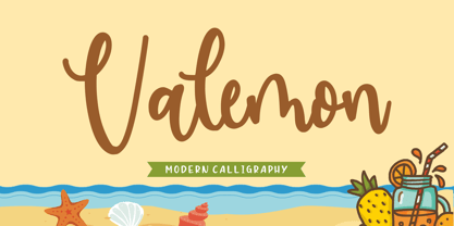 Valemon is a fancy handwritten fonts. It features gorgeous ligatures that make this script incredibly versatile. Whether you’re looking for fonts for Instagram or calligraphy scripts for DIY projects, Valemon will turn any creative idea into a true piece of art!
 - Beach Party by Cititype,
$9.00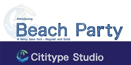 Beach Party is a cute and casual display font with an incredibly friendly feel. Whether you’re looking for fonts for Instagram or calligraphy scripts for DIY projects, this font will turn any creative idea into a true piece of art!
 - Newsletter Stencil by Volcano Type,
$19.00The font "Newsletter Stencil" is based on the font family Newsletter which is to be published by die Typonauten. During the toilsome development of this font family it was a pleasure to destroy the letter forms and to create a bastard. - The Comic Struves by Stringlabs Creative Studio,
$25.00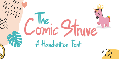 The Comic Struve is a cute and casual display font with an incredibly friendly feel. Whether you’re looking for fonts for Instagram or calligraphy scripts for DIY projects, this font will turn any creative idea into a true piece of art!
 - Hungarian Nouveau JNL by Jeff Levine,
$29.00 A piece of sheet music from Hungary (circa1921) entitled “Praerie Trott” offered up some playfully rounded hand lettering in a cartoon-like style. This was the visual model for Hungarian Nouveau JNL, which is available in both regular and oblique versions.
 - Casting Call JNL by Jeff Levine,
$29.00 Casting Call JNL is a simple condensed sans modeled from the hand-lettered title of a piece of vintage sheet music entitled "Somebody Else is Taking My Place"; a 1940s song co-authored and made famous by bandleader Russ Morgan.
 - Zar Brush by SzarDesign,
$19.95 ZarHand began as my "speedball" showcard lettering font, used when the boss brought in a pile of urgent work at the end of the day. We would get out our "4 o'clock brushes" hoping to finish at a reasonable hour.
 - Woodland Doodles by Outside the Line,
$19.00 An eye-pleasing collection of 31 Woodland Doodles. Illustrations of 11 trees--traditional and contemporary. A branch, animals, cabin, acorn, flower, leaves, mushrooms, bird’s nest, pine cone and birds on a branch. Coordinating nicely with Lake Vacation Doodles or Farm Doodles .
 - Cut Block by Adam Ladd,
$20.00 A hand-drawn typeface that depicts the idea of cutting away pieces of wood. It has a rough, yet modern appearance as it is largely based off the popular Gill Sans (with some modifications). Leaving a graphic and textured look.
 - Liberty Script by Monotype,
$29.99The Liberty font was designed by William T. Sniffin and released in 1927. This script is very fine, with a light color. Liberty can be used on stationery and packaging and is also suitable for short pieces of copy in brochures. - Lemon Rolls by Illushvara,
$12.00 Lemon Rolls is a cute and casual handwritten font with an incredibly friendly feel. Whether you’re looking for fonts for Instagram or calligraphy scripts for DIY projects, this font will turn any creative idea into a true piece of art!
 - Sign Panels JNL by Jeff Levine,
$29.00Alf R. Becker was a noted sign painter, designer and the creator of hundreds of unique alphabets which were published in the trade magazine Signs of the Times during the 1930s through the 1950s. Thanks to Tod Swormstedt of ST Media [and who is also the curator of the American Sign Museum in Cincinnati], Jeff Levine received some reference material on Becker's work. Becker displayed many of his type styles within decorative panels—a popular trend in the days when signs were hand-lettered. Using the reference material as a guide, Jeff has re-drawn twenty-six sign panels for adaptation to digital print work. While the designs in themselves are not thoroughly unique to Alf Becker, he has left behind some tangible examples of how sign painters embellished their lettering work. With the use of complementary colors and tones, these panels—joined with vintage lettering - classically recreate the warm and attractive advertising of years ago. - Tunesmith JNL by Jeff Levine,
$29.00 A "tunesmith" is one so nicknamed because the person or persons craft (compose) a song from scratch. When the area of Broadway known as Tin Pan Alley was in its heyday, every music publisher's office would have sounds emanating from the various cubicles of men and women trying for the next big hit. Sheet music was the main source of songwriter's royalties during those days, and to please the general public with a song destined to be a popular piece was a lofty goal. It's then only fitting that the lettering inspired by a 1920s-era piece of sheet music for a song called "Jerry" would be named Tunesmith JNL.
 - Xpress by Wiescher Design,
$12.00 »XPress« is a very distinct, expressive, typical new Sans. »XPress« is my new Sans-Serif that impresses – especially in small sizes – with its outstanding readability. Seven precisely calibrated weights from »Thin« to »Heavy« and its corresponding italics make this font-family universally usable. »XPress« got its bearings from the fabulous American »Gothic« fonts of the twenties of last century. Modern, present day elements, high lowercase letters and infinitesimal elegant slight curves in start- and end strokes make the font family not only great for body copy, but also very useful in advertising. »XPress« ist eine individuelle, expressive, typische neue Sans. »XPress« ist meine neue Serifenlose die – speziell in kleinen Schriftgraden – durch aussergewöhnliche Lesbarkeit auffällt. Sieben präzise aufeinander abgestimmte Schnitte von »Thin« bis »Heavy« und dazu passende Kursive machen die Schriftfamilie vielseitig einsatzfähig. »XPress« orientiert sich bewusst an den grossen amerikanischen Groteskschriften der zwanziger Jahre des letzten Jahrhunderts. Durch moderne Formelemente, große Mittellängen und unendlich leichte, elegante An- und Abstriche ist die Schrift jedoch nicht nur als Textschrift, sondern auch im gesamten Bereich der Werbung vielseitig einsetzbar.
 - Tequendama by JVB Fonts,
$30.00 A display fontface for titles inspired on Latin America, Ethnic, Native, Tribal, Mysthical, Handmade, Aboriginal, Pre-Hispanic, Pre-Columbian, Textured. By mid-1997 I was developed the early type edition was called «Muisca Sans» as my work for the degree in Graphic Design (Universidad Nacional de Colombia), based on the concept of pre-Columbian figures characteristics within some of the very few visual elements recovered from the Muisca culture, ancient pre-Columbian tribe disappeared before the arrival of the Spaniards in what is now central Colombia. In fact, the name of the capital Bogotá (the capital of Colombia) goes back to Bacatá as primary or village downtown of what was once the imperial capital of tribe Muisca. Although this unfinished early typographic project has not yet been published, Tequendama is the evolution of the first one. Tequendama reminds the myth of Muisca culture and religion of this tribe. The god Bochica, a wise old man with a white beard heard the cries of his tribe suffered against flooding of their land losing harvests before the divine punishment resulted by the offended god Chibchacun. However Bochica appeared wearing a white robe sitting on a huge rainbow and he broken the mountain towards the southwest wise old man with a golden staff broke the mountain to drain the flooded savanna. This emblematic and iconic place would later be called as «Salto de Tequendama». Tequendama name also been adopted to a nearby province to Bogotá.
 - Up Up And Away by Comicraft,
$19.00 Is it a Bird? Is it a Plane? Is it a Rocket? No it’s another Super Font from those awfully nice chaps at Comicraft. Faster than a speeding Option 8, Up, Up and Away can see through 'O’s, jump Capital T in a single bound, and rescue caps dropped from the tallest descenders. There isn't a more heroic or x-heighting font in our catalog and it’s as wholesome as truth, justice and mom’s apple pie. Brought to you in cut out form in association with our friends at Howtoons! Be sure to also check out Up Up And Away's clever sidekick Single Bound! Comicraft fonts are created BY comic book letterers FOR lettering comic books. Accept no substitutes!
 - Snoopy Snails NF by Nick's Fonts,
$10.00Duck! There’s a cream pie headed your way! This wild and wacky face is based on the title card lettering for the original Soupy Sales TV show, a lasting testament to my misspent youth. Both versions of this font contain the complete Unicode Latin A character complement, with support for the Afrikaans, Albanian, Basque, Bosnian, Breton, Catalan, Croatian, Czech, Danish, Dutch, English, Esperanto, Estonian, Faroese, Fijian, Finnish, Flemish, French, Frisian, German, Greenlandic, Hawaiian, Hungarian, Icelandic, Indonesian, Irish, Italian, Latin, Latvian, Lithuanian, Malay, Maltese, Maori, Moldavan, Norwegian, Polish, Portuguese, Provençal, Rhaeto-Romanic, Romanian, Romany, Sámi, Samoan, Scottish Gaelic, Serbian, Slovak, Slovenian, Spanish, Swahili, Swedish, Tagalog, Turkish and Welsh languages, as well as discretionary ligatures and extended fractions. - FF Sanuk Round by FontFont,
$50.99 “The rounded shapes are like Chantilly cream or Italian meringue over a lemon pie,” says designer Xavier Dupré of his FF Sanuk Round typeface. Designed to work alongside the existing members of the FF Sanuk family, this sprightly sans serif offers a more mischievous personality than its counterparts. Angular shapes have been gently softened, to create a playful design that really comes into its own at larger sizes. Set this one on posters and packaging, or anywhere you need to be punchy yet approachable. The FF Sanuk Round family is based on the original FF Sanuk family and offers 5 weights plus from Ultra Light to Black plus italics. It offers OpenType features including stylistic alternates and ligatures.
 - Drogowskaz - 100% free

- Paul6 - Unknown license

- P22 Mexican Relics by IHOF,
$24.95 Mexican Relics is a collection of over 100 dingbats in font format based on images found on a variety of clay stamps primarily from pre-Columbian Mexico. This font brings ancient artwork featuring fantastic animals and geometric shapes into the computer age.
 - Flower Shop JNL by Jeff Levine,
$29.00 A piece of sheet music for “Broken Blossoms” circa the 1920s or early 1930s has its cover title hand lettered in a wide thick-and-thin Art Deco design. This is now available as Flower Shop JNL, in both regular and oblique versions.
 - Classroom JNL by Jeff Levine,
$29.00A set of old die-cut cardboard letters and numbers used by teachers directly on bulletin boards or for tracing was the inspiration for Classroom JNL. In turn, these letters take their cue from typefaces such as Franklin and earlier wood type designs. - Valkids by Letterara,
$12.00 Valkids is a cute and sweet handwritten font with an incredibly friendly feel. This font will turn any creative idea into a true piece of art! This font is PUA encoded which means you can access all of the cute glyphs with ease!
 - Penwrite JNL by Jeff Levine,
$29.00 The same 1935 piece of sheet music ("Along Tobacco Road") that yielded the multi-line lettering design for Deco Triline JNL has also provided lettering examples inspired by the writers' credits for what is now Penwrite JNL, in both regular and oblique versions.
 - Raifin by Hooper Type,
$9.99 Out with the old in with the BOLD. Raifin is a messy, gory and fantastical piece of work which shoves two fingers up at conformity. A title font, a copy font, a bonkers font. An experimentation of the rules, or lack thereof. Enjoy!
 - Heckel by Hanoded,
$15.00 Erich Heckel (1883 - 1970) was a German painter and printmaker. He was a founding member of Die Brücke (The Bridge), a group of German expressionists. Heckel font somewhat resembles the loose (and messy) handwriting Erich Heckel used in some of his drafts.
 - So Nouveau JNL by Jeff Levine,
$29.00 Three of the four letters of the name “Jane” on the cover of a vintage piece of sheet music inspired So Nouveau JNL. The free-form swoops emulating the pen lettering of the early 1900s adds a nostalgic charm to this typeface.
 - Blok by Studio Few,
$10.00 Built on a square grid, Blok's variable axis conforms to your canvas. With pre-defined weights ranging from 2x1, through to 1x16, Blok is as flexible as it is structured. Character Set: A-Z, Period & Exclamation Mark Weights: 6 Normal & 6 Rounded
 - Vallisa by Letterara,
$12.00 Vallisa is a cute and sweet handwritten font with an incredibly friendly feel. This font will turn any creative idea into a true piece of art! This font is PUA encoded which means you can access all of the cute glyphs with ease!
 - Thorowgood Sans by HiH,
$8.00 A three-dimensional all-cap font for title use, Thorowgood Sans Shaded was released by the Fann Street Foundry of W. Thorowgood & Co. in 1839. Interestingly, it more closely resembles Figgins' Four-Line Emerald Sans-Serif Shaded of 1833 than Fann Street’s own Grotesque Shaded of 1834 (with light and shadow reversed). The idea of a shaded font is of an outline font whose letters have each been extruded through a die and then viewed from the lower right to reveal the third dimension. That third dimension has also been referred to as a shadow. Vincent Figgins' 1815-release of a shaded serif typeface was the first known of many shaded faces, as the other foundries rushed to bring out their own versions. Thorowgood Sans Shaded may be gainfully used today as a eye-catching headline font, just as it was so popularly used in the early nineteenth century. To assist with the usual all-cap letter-spacing problem, the following pre-kerned pairs are included: AT, AV, AW and AY. Be sure to download the Type Specimen showing the full character set, as well as a sample text. Live large - use it boldly.
 - Inner Shadow by Ably Creative,
$15.00 inner shadow is a great display font that brings out a street art vibe. the inner shadow appears in capital letters and a unique variety of ligatures. Inner Shadow is a graffiti font that combines the improvised qualities of urban graffiti with the subtlety and regularity of typeface. the inner shadow is spaced letter to letter individually so spacing will work smoothly, regardless of irregular shape expression and also includes a decorative font, which has clouds, underlines, arrows, crowns, halos, and more to add flavor. on your design.
 - Aragon by Canada Type,
$24.95 Re-introducing the classic mid-1500s Garamond forms for the twenty-first century is never an easy task. But Hans van Maanen makes a fine attempt at just that by remodeling the traditional shapes through a modern lens with stunning results. Aragon is a workhorse family that performs very well in a variety of text sizes, from footnotes and legal copy to lengthy body sets. Its combination of wedge serifs with uniquely tapered stems offers a sturdy Dutch touch that improves legibility altogether, while at the same time the slight stress shift to the top half of the characters makes the immersive reading experience very open and comfortable. The Aragon family comes in a standard two-weight set with corresponding italics, a roman small caps font with its own italics, and very attractive initials for display uses. All fonts come in the usual popular formats, and include a glyph repertoire that covers Western, Central and Eastern European languages, as well as Turkish and Welsh/Celtic.
 - Rough Print JNL by Jeff Levine,
$29.00 The Superior Marking Equipment Company was originally located in Chicago, Illinois and over the years produced a line of both commercial and toy rubber stamp printing sets which were used for making signs, posters, tickets and other printed items. Rough Print JNL reproduces the scanned images printed from one of the toy rubber stamp sets. The sample characters were smaller than one half inch in height and were further reduced during scanning. This gives the end result of a typeface which looks like rubber stamp imprints at small sizes, and very angular, distorted, somewhat grunge type when printed at larger sizes. There is a limited character set consisting of alphabet, numerals, some punctuation and currency symbols. No kerning was added to keep the hand-made appeal. Rough Print JNL is an all caps font with the letters and numbers jogged randomly on both the caps and lower case keystrokes. For a similar design with lower case, Amateur Printer JNL is recommended.
 - Structural Glass JNL by Jeff Levine,
$29.00 A page from the 1931 Vitrolite catalog showing illustrations of store fronts and building exteriors utilizing the material provided a classically Art Deco type example. The business name “Sylvin” did not offer many characters to work with, so completion of the digital type design was simply left to imagination. The end result is Structural Glass JNL, which is available in both regular and oblique versions According to Wikipedia: “Pigmented structural glass, also known generically as structural glass and as vitreous marble, and marketed under the names Carrara glass, Sani Onyx, and Vitrolite, among others, is a high-strength, colored glass. Developed in the United States in 1900, it was widely used around the world in the first half of the 20th century in Art Deco and Streamline Moderne buildings. It also found use as a material for signs, tables, and areas requiring a hygienic surface. Over time, the trademarked name “vitrolite” became a generic term for the glass.”
 - Varese Gradient by Tarallo Design,
$18.99 Varese Gradient is a color font for display, headlines, or large body text. Use it for bold graphic statements or a vintage mood. Its geometric style is inspired by Art Deco and early 1900s European travel posters. This typeface will set a friendly and light tone while giving messages a unique and memorable feeling. The gradients transition vertically and come in these sets; color with white, color with black, two colors, chromatic grays, grayscales, and concepts like summer or cappuccino. The font name will indicate its color. The full family includes one regular font. Here is a list of all the fonts in color. The lowercase letterforms are similar to the uppercase, but the lowercase have counterforms. It comes with OpenType features such as alternate glyphs, half-height letters, standard ligatures, and stylistic sets. The fonts are OpenType SVG format and fully scalable. Contact Tarallo Design if you need custom colors. Varese Gradient has siblings, Varese Soft (rounded) and Varese Outlined (color/shadow/outline).
 - Prague Metronome by 38-lineart,
$16.00 We are happy to introduce Prague Metronome, inspired by the city of Prague and the metronome in the heart of this city. Prague Metronome, a font made manually by hand that we set in such a way that everything is connected in a neat rhythm, just like metronome used by musicians to set the tempo. This font has alternate stylistic for Uppercase and Lowercase, we also complement lowercase with alternate swash and titling. No half-hearted, we added 142 ligature to get the impression of natural handwriting. Comes with two thicknesses namely hairline and monoline as well as a unique shape appearance that will attract interest when used as your brand identity. This font can be used for brands, quotes, headers, websites, and other broader graphic designs. Prague with its metronome is a symbol for everything, beauty, history and personal impression that cannot be described. If European cities were a necklace, Prague would be a diamond among the pearls. Enjoy our font. thanks.
 - Silverline by Fenotype,
$18.00 Silverline Script & Sans Silverline Script is a hand drawn signature style script. Silverline is fast and expressive -it’s great for contemporary branding and advertising. Silverline Script is equipped with Contextual Alternates and Standard Ligatures that keep the script eloquent and connections smooth. Contextual Alternates and Standard Ligatures are automatically on. In addition Silverline Script has Swash Alternates for A-Z and a-z that can be used for extra flair. From Discretionary Ligatures you’ll find specially designed ligatures for “and”, “for”, “the”, “at” and “in”. Silverline Script is PUA encoded so you can access extra glyphs in any graphic design software. Another half of the Silverline family is Silverline Sans -a three weight ultra-condensed sans serif that works great with the Script. Silverline Sans is great for making sturdy text word blocks - a great type for any display use from magazine covers to packaging. Try combining Silverline Script with Silver Script -they make a nice contrast together.
 - Aragon ST by Canada Type,
$39.95 Aragon ST is a special version of Hans van Maanen’s Aragon family. It was developed for science writing, and it serves as the very first introduction of SciType, an innovative new way of building fonts specifically for typesetting science text. For more information about SciType, please consult the SciType FAQ PDF in the Gallery section. The Aragon design is a remodelling of the classic mid-1500s Garamond forms through a modern lens. It is a text workhorse that performs very well in a variety of sizes, from footnotes and legal copy to lengthy, immersive-reading body sets. Its efficient and legibility-asserting traits are wedge serifs and uniquely tapered stems that slightly shift the weight stress to the top half of the forms while maintaining the clarity and synergy of the counterspace’s sequence. Aragon ST takes all that a step further for science writers. For details about the functionality of Aragon ST, please consult the Aragon ST Access Chart PDF in the Gallery section.
 - TOMO Joseph by TOMO Fonts,
$12.00 Joseph is a slab-serif face designed by TOMO. With a wood type look - letterpress print, this fatty comes in handy when is time to design an informal —yet strong—looking communication piece. Imagine this typeface on a T-shirt, even a mug! Sweet.

