10,000 search results
(0.028 seconds)
- Meche Pro by RodrigoTypo,
$29.00
- Marshall by Solotype,
$19.95 - Printers Choice JNL by Jeff Levine,
$29.00
- Syndebuk by Bogstav,
$17.00
- Sunday Monday by Hanoded,
$15.00
- Perdido by Scriptorium,
$12.00 - Subway Novella by KC Fonts,
$34.00
- Crispy Yellow by Bogstav,
$14.00
- Pastis by Hanoded,
$15.00
- Shenandoah Clarendon by Megami Studios,
$7.50
- Greeting Script by Ayca Atalay,
$19.00
- Propeller by Gleb Guralnyk,
$15.00
- Bakari by Letteralle,
$18.00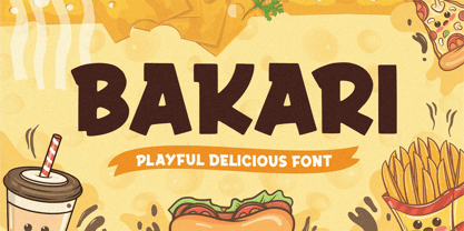
- Brush Swipe by Jonahfonts,
$35.00
- LTC Broadway by Lanston Type Co.,
$24.95
- Blue Point by Solotype,
$19.95 - MPI No. 507 by mpressInteractive,
$5.00
- Compact by ParaType,
$25.00
- Sunbeat by PintassilgoPrints,
$26.00
- Nosy Note by PizzaDude.dk,
$16.00
- Nature Beauty Personal Use - Personal use only

- LT Carpet Text - 100% free

- Plasmatica - Unknown license

- Project Z - Personal use only

- Covington Exp - Unknown license

- Plasmatica Outline - Unknown license

- Avondale SC - Unknown license

- Avondale Shaded - Unknown license

- Covington SC Shadow - Unknown license

- Covington SC Cond - Unknown license

- Avondale Outline - Unknown license

- Covington Cond - Unknown license

- Covington Exp - Unknown license

- Avondale SC Cond - Unknown license

- Covington SC Exp - Unknown license

- Plasmatica Ext - Unknown license

- Avondale Cond - Unknown license

- Plasmatica Open - Unknown license

- Arsenale White - Personal use only

- Covington - Unknown license


