8,332 search results
(0.018 seconds)
- About Loving by Akifatype,
$14.00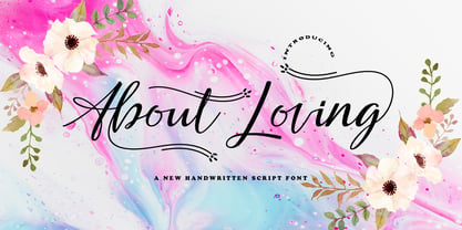 About Loving is highly legible Script typeface, get touch of a bold, classic and fun Vintage Script font, With glyphs and opentype features with stylistic alternates. Can be used for various purposes. such as posters, t-shirt, signage, logos, news, badges etc. To enable the OpenType Stylistic alternates, you need a program that supports OpenType features such as Adobe Illustrator CS, Adobe Indesign & CorelDraw X6-X7, Microsoft Word 2010 or later versions. About Loving is coded with PUA Unicode, which allows full access to all the extra characters without having special designing software. Mac users can use Font Book , and Windows users can use Character Map to view and copy any of the extra characters to paste into your favourite text editor/app.
 - Raw potato by Agnieszka Ewa Olszewska,
$25.00 Introducing "Raw Potato" - a font that beautifully balances the raw and the captivating. Its bold, middle, and very thin weights within each letter create an intriguing, almost unfinished aesthetic that's still undeniably cool and eye-catching. "Raw Potato" is the perfect choice for products aimed at kids, as it brings a sense of playfulness and curiosity to any design. Its unconventional charm adds a touch of whimsy while maintaining a modern and edgy appeal. So, if you're in the market for a font that's raw yet fascinating, "Raw Potato" is your ticket to making designs that resonate with creativity and youthful energy. Let your imagination run wild with "Raw Potato" and watch your projects come alive! it contains Europenian diarcritics.
 - Bulkr by Hackberry Font Foundry,
$24.95 Over the years, I've used Impact a lot. But, not because I liked it—rather because it was the only font I could find with the bulk I needed for a given title or whatever. I finally decided to make my own. It was originally built off Librum Sans Bold, but I quickly made a mask of Impact for the widths, bumped the x-height way up, made the horizontals much heavier, and on and on. You know how it is when you start designing. The result is a black sans with the bulk of Impact and much more interesting character shapes. I suspect I'll use it a lot. My hope is that you like it as much as I do. Have fun!
 - Aabak by Polimateria,
$39.00 Aabak is a sumptuous modern typeface family. The high contrast, super elegant, didone like shapes were infused with a little fluidity from 60’s psychedelic lettering, the results is a contemporary face that screams freshness. It is ideal for branding, advertising, headlines, posters, movie titles, and much more! This design deliberately sabotages a lot of white space to have that compressed punchy look. The tear drop terminals and the melting serifs create a surprisingly superb combo. Sharp joints were smoothen to convey a warm and subtle feeling. Aabak comprises a total of 18 styles, 6 weights in 3 different cuts: Upright, Italic and Swash. The Swash styles have also a terminal forms feature that gives that extra lush feel. Have fun playing with it!
 - Mestika Arabic by Boharat Cairo,
$20.00 Mestika is a resinous spice, in Arabic means gum, the name is Mestika cause the mestika has a mixture of sharp edges and cursive connections, that mixture gives the typeface an edge to stand out, a low contrast sharp design with 9 weights making it works well with text and headlines. The design is a collaboration with the Iranian designer Kamyab Jafari, The typeface is a modern design, and has a wide range of ligatures and features for better justifications. The typeface comes with 9 weights, and works in variable axes, the typeface now supports only Arabic-based languages, but in the near future, it would support Latin-based languages, the Typeface is based on Naskh calligraphy, something in between the Iranian and the Arabic styles.
 - Allegroost by 38-lineart,
$14.00 Allegroost is a handwritten font that uses a large brush in a horizontal position, so that the brush strokes vertically make the size large, opposite the horizontal strokes the size becomes small. To add to the natural impression, we complete many ligatures that adjust handwriting such as: ob, oc, od, og, oh, oi, oj, ok, ol, om, on, oo, op, oq, or, os, ot, ou , ov, ow, ox, oy, oz, bo, bd, bg, bi, br, bu, by, ee, ii, ll, tt, th, tl, lt, it, ti, iti, ld, ts, st , mm, nn This unique handwriting is perfect for logos, quotes, posters, fun letters, for clothing, or any design project. Equipped with 28 language support makes your brand can appear in various parts of the world
 - Twenty One by Akifatype,
$14.00 Twenty One is highly legible Script typeface, get touch of a bold, classic and fun Vintage Script font, With glyphs and opentype features with stylistic alternates. Can be used for various purposes. such as posters, t-shirt, signage, logos, news, badges etc. To enable the OpenType Stylistic alternates, you need a program that supports OpenType features such as Adobe Illustrator CS, Adobe Indesign & CorelDraw X6-X7, Microsoft Word 2010 or later versions. Twenty One is coded with PUA Unicode, which allows full access to all the extra characters without having special designing software. Mac users can use Font Book , and Windows users can use Character Map to view and copy any of the extra characters to paste into your favourite text editor/app.
 - Hello Night by Black Studio,
$15.00 Hello Night is a very easy-to-read Script typeface, getting a touch of the bold, classic, and fun Vintage Script font, featuring glyphs and opentypes in alternative styles. Can be used for various purposes. such as posters, t-shirts, signboards, logos, news, badges etc. To activate the OpenType Stylistic alternative, you need a program that supports OpenType features such as Adobe Illustrator CS, Adobe Indesign & CorelDraw X6-X7, Microsoft Word 2010 or a later version. Hello Night is coded with PUA Unicode, which allows full access to all additional characters without having any special design software. Mac users can use Font Book, and Windows users can use Character Map to view and copy additional characters for pasting into your favorite text editor / application.
 - Racun by Gassstype,
$25.00 Here comes a New font, Introducing RACUN It's Fun Hand Drawn Font is a Natural Style and Authentic classy style, this font is great for your creative projects such as watermark on photography, and perfect for logos & branding, invitation,advertisements,product designs, special events or anything that need handwritting taste. RACUN is a Hand Drawn feel It is perfect for any design project as Invitation,logo, book cover, craft or any design purposes,photos, photography overlays, signs, window art, scrapbooking, tags and so much more! It is perfect for any design project as Invitation,logo, book cover, craft or any design purposes. It also features a wealth of special features including You can activate 15 Ligatures and 16 Alternates OpenType panel.
 - Ramose by Kulokale,
$19.00 Ramose is a experimental display serif font. Ramose is well-suited for advertising, branding, logotypes, packaging, titles, headlines and editorial design. This font comes in two styles, Regular and Oblique Version. This font is encoded with Unicode PUA, which allows full access to all additional characters without having special design software. Mac users can use Font Book, and Windows users can use Character Map to view and copy one of the extra characters to paste into your favorite text editor / application. We highly recommend using a program that supports OpenType features and Glyphs panels such as Adobe Illustrator, Adobe Photoshop CC, Adobe InDesign, or CorelDraw, so you can see and access all Glyph variations. We hope you enjoy the font. Thanks and have fun!
 - Noland by Flavortype,
$14.00 Noland, A new carefully crafted Variable Geometric Typeface. The Ideas of this fonts are from retro poster, music, movie poster, theater, science fiction from the 70s and early 80s. Adding the elements from the reference above to be represented as Noland. It’s Versatile, Fun, Sharp and Retro-ish feel that you get in Noland Typefaces. Noland Available with 3 Weights: Regular, Semibold and Bold. Also Available in Variable, so the weights are more flexible between Regular and Bold. Just Play with slider weight. Our creation on the display to give you a reference what it looks like on your project. such as Branding, Header, Logotype, Poster, Magazine, Packaging, and etc. It shows that Noland clearly can accommodate Retro Vintage style.
 - Covergirl by Trine Rask,
$25.00 Warning: works with contextual alternate-feature, which is not showing here. Covergirl is a script typeface that works all by itself. It has a very high contrast, but works also in smaller sizes. It is a display typeface. Covergirl is based on handwriting. The basic shapes are transformed to a very high contrast strict form and the hairline runs through the words in an amusing lively way that simulates the writing by hand. Its scandinavian designed handwriting, decorated, but also very minimalistic. While writing the letters will be substituted by one of the variations of the letter, that will make sure that the letters connect well. When writing in only UPPERCASE a much more simple letter shape will substitute the default.
 - Joyous by Ana's Fonts,
$15.00 Joyous is a comics-inspired serif font that includes 3 styles: outline, filled and shadow and a set of complimentary extras. Perfect for any design that needs a bold font, such as logotypes, quotes and social media posts, website and magazine layouts, and poster designs. Joyous includes: 3 serif fonts in filled, outline and shadow styles. The three font styles can be combined to create a layered look. In addition, each font includes 3 different options for each letter and number, accessible through contextual alternates (or the glyphs panel). 3 extras fonts with a set of 36 doodles in filled, outline and shadow styles. Joyous is a casual font that is so fun to use in animations and designs with a handmade look.
 - Gofienda by Alit Design,
$22.00 Introducing Gofienda Typeface Gofienda typeface Inspired by ancient manuscripts in the European area. Carefully designed to work together in harmony making it perfect for wedding favors, book covers, greeting cards, logos, branding, business cards and certificates, even for any design work that requires classic, formal or extravagant. Attempt calligraphy Desired, delight in those riches from claiming OpenType features and tell its exquisite fun and fervor make you euphoric What's more support your creativity! you might utilize this font precise undoubtedly. Elegant script “Gofienda Typeface” are very easy to apply to any design, especially those with an elegant and smooth concept, apart from that this font is very easy to use in both design and non-design programs because all alternates and glyphs are supported by Unicode (PUA).
 - Desirable Brust Texture by Alcode,
$20.00 Desirable Brush Texture is a brush version of desirable solid released in 2019. With a classic style and an elegant touch, inspired by Italian women's handwriting and ancient manuscripts. These two fonts are carefully designed to work together in harmony making them perfect for wedding media, book covers, greeting cards, logos, branding, business cards and certificates, even for any design work that requires classic, formal or extravagant. Try Desirable Brush Texture, enjoy the richness of the features and let her fun and elegant excitement make you happy and enhance your creativity! You can use this font very easily. Multilingual Support And Special Ligatures If you are interested in the solid version, visit the link - https://www.myfonts.com/fonts/alcode/desirable-calligraphy/
 - Southern Nights by Breauhare,
$35.00 Based on the hit album by Glen Campbell, Southern Nights is the font with a style that’s “free as a breeze,” as the song says. It’s fun and casual, yet it has a flair for fashion and elegance. It also has an art nouveau look which lends itself to greeting cards as well as the branding of perfume, clothing, retailing, dining, and other luxury/high-end uses. This font includes alternate characters for the upper R, S, and T, the lower g and z, plus ligatures that include a double lower t and double lower l (L). As the song might say, I apologize to anyone who can truly say that they have found a better font! Digitized by John Bomparte.
 - Beachclub by Royalclub,
$12.00 Get some beach holiday vibe so needed during a crazy year in the city! BEACHCLUB fonts are inspired by tropical islands hand-painted signs. Bring the summer beach parties feeling with sunshine, music and strong cocktails. We crafted digital versions of woodcrafted letters as if it was made for a beach bar in Hawaii. Then the time, sea and sand did the rest. Use our fonts to bring this fun and relaxed energy to your graphics! Key Features: BEACHCLUB fonts will be a great help and perfect fit for various posters, banners, typography and illustrations. Fonts can be used for both personal and commercial projects. Credits: BEACHCLUB clean and BEACHCLUB grunge are designed by Royalclub. For purchasing the full kit (brushes/frames) proceed to www.royalclub.sh/royalclub-supplies
 - Kafkey by Kulokale,
$17.00 Kafkey is a display slab serif font. Kafkey is well-suited for advertising, branding, logotypes, packaging, titles, headlines and editorial design. This font comes in 2 styles, Regular and Oblique version. This font is encoded with Unicode PUA, which allows full access to all additional characters without having special design software. Mac users can use Font Book, and Windows users can use Character Map to view and copy one of the extra characters to paste into your favorite text editor / application. We highly recommend using a program that supports OpenType features and Glyphs panels such as Adobe Illustrator, Adobe Photoshop CC, Adobe InDesign, or CorelDraw, so you can see and access all Glyph variations. We hope you enjoy the font. Thanks and have fun!
 - Crewekerne Magna by Greater Albion Typefounders,
$13.95 Crewekerne is a typeface family which speaks of the villages that are at the heart of English life. It is inspired by the arts and crafts movement of the early twentieth century, and is complimented by two other families, Crewekerne Magna and Crewekerne Magister. Three widths - condensed, regular and expanded and three weights - regular bold and heavy are offered. Crewekerne is especially good when combined with its two complimentary families and when used in poster and design work that needs a rustic hand crafted flair but still needs to be easily legible. Crewekene is a fun family and a serious set of faces all in one. Crewekerne, Crewekerne Magna and Crewekerne Magister can also be purchased together in the Crewekerne Value Pack.
 - Reallova by Garisman Studio,
$20.00 The name Reallova comes from the idea of true love. Love your great work! Captivatingly display, Reallova provides a bold touch, lots of fun, and brush effect that will add a natural look to your design. This font is very suitable for book titles, posters, quotes, t-shirt designs, logo types, templates, banners, flyers, headline titles, and more. Reallova supports in 23 languages, including: Afrikaans Albanian Catalan Croatian Czech Danish Dutch English Estonian Finnish French German Hungarian Icelandic Italian Norwegian Polish Portuguese Slovak Slovenian Spanish Swedish & Zulu. The benefits of Reallova: - Simple installation - Support for MAC and PC - Can be used in a variety of graphic software: Adobe Illustrator, Photosop, Corel Draw, and others. - Natural texture - MültÎlÌñgûål Súppõrt (23 languages) - PUA Encoded - Ligatures
 - Route Du Soleil by Hanoded,
$15.00 Probably everyone living in Europe has heard of the (in)famous Route Du Soleil. The Route Du Soleil (Motorway Of The Sun) is a stretch of road from Paris to Lyon (in the south). It is THE route holiday makers take to reach southern France, so they can get there before everyone else does. The result: endless traffic jams, overheated engines and people and more toxic exhaust fumes than your average petroleum distillery. Route Du Soleil is also a very nice hand written font that comes with swashes and ligatures. If you happen to find yourself in a traffic jam on your way to southern France, then I hope you have downloaded this font. Just one look at it and you’ll forget your problems! ;-)
 - Delugional by Roland Hüse Design,
$24.00 Delugional is an Atlantis theme typeface, it's character set is an imaginary alphabet inspired by Greek style scripts mixed with Classic Latin. This font is a display font family of two weights, Regular and Bold. It can be used for various creative/mythological and fantasy theme projects from book covers to games or movie titles. There are some OpenType features such as Stylistic Alternates and Discretionary Ligatures along with some extra symbols like sun, moon, snake and the stylised map of Atlantis in place of stylistic set 02 of uppercase "O". I have also created a font presentation video you can view it on youtube here: https://youtu.be/f7bKdoffWnI I hope you enjoy this one as much as I did while creating, Good luck with your project!
 - Urban Blocker by Din Studio,
$25.00 Have you been looking for a graffiti font? Do you dream of creating headings that stand out and inspire creativity, imagination, modernity, and endless fun? Then we’ve got just the font for you! Introducing Urban Blocker-A Graffiti Font This bubble graffiti font can be used for a host of different content needs and projects. An excellent choice to add the right amount of street vibe and playfulness. Create gorgeous printed quotes, standout packaging, or beautiful t-shirts! You can even use it to create amazing headings, logos, menus, and social media graphics. Chalkboard includes multilingual options to make your branding reach a global audience. Features: Standart Ligatures Multilingual Support PUA Encoded Numerals and Punctuation Thank you for downloading premium fonts from Din Studio
 - Analogia by George Tulloch,
$21.00 Analogia is a digital interpretation of types used in the mid-18th century in books printed at Leuven by Martin van Overbeke. It is intended primarily for use in running text. The roman is businesslike, yet with a distinct personality; it has a generous x-height and is slightly condensed, though without appearing cramped. It is complemented by a more lively italic, which retains some irregularities in the angle of slant that are characteristic of the original. Analogia provides wide support for west, central, and east European languages that use the roman alphabet. Among its OpenType features are ligatures, small caps, several sets of numerals, contextual alternates, intelligent implementation of long ‘s’, and fractions. For more detail, please see the pdf available in the Gallery.
 - Bill Hiffith Handwritten by Colllab Studio,
$19.00 "Hi there, thank you for passing by. Colllab Studio is here. We crafted best collection of typefaces in a variety of styles to keep you covered for any project that comes your way! Bill Hiffith is an Organic Script, a gorgeous font that can be used for making multiple things. it includes smooth brush stroke, simple and soft. Its elegant taste is one of the most gorgeous fonts. This typography is reflected in this exquisite font family. The type is clean and simple yet fun and stylish. It is beautiful, better for headlines style design or logo design. Or you can have it on your website’s body style. Grab it now, Bill Hiffith could elevate your elegance brand design. A Million Thanks Colllab Studio www.colllabstudio.com
 - Wathelmina by IRF Lab Studio,
$15.00 Wathelmina Script is a very readable Script typeface, get a touch of bold, classic and fun Vintage Script fonts, Features glyph and opentype with alternative styles. Can be used for various purposes. such as posters, t-shirts, signboards, logos, news, badges etc. To activate the OpenType Stylistic alternative, you need a program that supports OpenType features such as Adobe Illustrator CS, Adobe Indesign & CorelDraw X6-X7, Microsoft Word 2010 or a later version. Wathelmina Script is coded with PUA Unicode, which allows full access to all additional characters without having to design special software. Mac users can use Font Book, and Windows users can use Character Map to view and copy any additional characters for pasting into your favorite text editor / application.
 - Imperial Granum by Greater Albion Typefounders,
$18.00 Imperial Granum is designed primarily as a Roman Title and lettering face, combining formality and dignity with a delightful touch of 'Arts and Crafts' like hand drawn design. The regular form of Imperial Granum (which is inspired by a beautifully hand-lettered early 20th century food advertisement) offers two sizes of capitals, in order to provide true 'small-capitals' lettering. Similarly, the Ornamental form consists exclusively of capitals and is designed to be able to mix and match with the regular form. The miniscule form can, of course, be used in its own right, but is primarily intended to complement the regular and ornamental forms. All three faces are offered in regular and bold weights. Explore some Edwardian Arts and Crafts typographical fun today!
 - Liquorice Twist by Scrowleyfonts,
$14.00 Liquorice Twist is a light-hearted fun font which developed from some hand drawn text designed to accompany and be integrated with some ‘Zen Doodling’ art that someone had drawn. It is very informal and unconventional, with the glyphs created using unusual and loose ‘rules’. The font has a set of stylistic alternates with equal height lower-case letters. It also has the option of alternate initial capitals and alternate ending lower case letters accessible via contextual alternates. I hope you will enjoy using it and if you have any further requirements please don't hesitate to contact me. Myfonts does not render the starting and ending swashes correctly. If you wish to see how any word will appear with contextual alternates selected please let me know.
 - Chalobah by Natural Ink,
$17.00 Chalobah - a serif look with simple, clean and visual elegance with smooth curves and beautiful ligatures, A very versatile font that works in both large and small sizes. This font is suitable for a wide variety of projects such as: headlines, logos, labels, branding projects, magazines, homeware designs, product packaging, mugs, quotes, posters, and more. It can also be more expressive and fun, thanks to the many alternatives and binders that combine harmoniously in this font and make it more interesting and versatile. Try to change alternatives, binders and you will get many options for your project which will make it Smooth & beautiful. Features: Section • Full set of uppercase, lowercase • Ligatures • Alternative • A wide variety of numbers, symbols & punctuation • Characters with accents • Support Multiple Languages • PUA encoded
 - Cabrito Semi by insigne,
$24.00 Relax. Deep breath. And step away to font nirvana with Cabrito Semi. Like its Cabrito relatives, Semi’s handwriting-inspired feel is mellow and care-free. But don’t misunderstand us. Even with its fun-loving peculiarities, this free spirit will command whatever party you invite it to. It’s a perfect blend of unique and functional. So what’s the secret of this little one’s strength? It’s pure balance. Cabrito Semi’s energy surges from deep within the relaxed, balanced tones of its humanist structure and calligraphic crafting. The 36 fonts of this well-crafted semi serif originate from the popular Cabrito, an insigne design slab serif developed for the kid’s book, The Clothes Letters Wear. Along with its other amigos, Inverto and Sans, Cabrito Semi rounds out this easy-going household of fonts. The four fonts play well together on anything from meals and candy to toys and cars. With the support of the other three, Semi makes a great choice for titles and moderately long text like you would use for websites, flyers, and packaging. Semi’s complete pack of alternates is accessible in any OpenType-enabled system. This kiddo has loads of alternates, swashes, and alternate titling caps to add a bit of sweetener to the balance. Also bundled are swash alternates, old style figures, and compact caps. Preview any and all of these features in the interactive PDF brochure. This font members of the family also consists of your glyphs for 72 languages. So who says you can’t love quirky? Take a look at Cabrito Semi--and any of the other members of the Cabrito family. You’re bound to find yourself loving fun all over again.
 - Sleepy Bear by Missy Meyer,
$12.00 I've been learning to read Cyrillic and Greek letters lately, mainly because I've been playing the game GeoGuessr. (If you haven't played it, I highly recommend! It plops you down somewhere in the world in Google Street View, and you have to figure out where you are.) Cyrillic shows up in so many more places than Russia! You can see it in Bulgaria, Mongolia, Serbia, Montenegro, Kyrgyzstan, and more. Because of that, I made sure to include a fun double-uppercase version of those alphabet sets in Sleepy Bear. They're styled the same way as the Latin characters: all uppercase height, with some lowercase-styled letters thrown in at that same height for a fun look for all ages. I've also made two weights of Sleepy Bear: a plump and smooth regular weight, and a lighter weight that's built to stack on top of the regular (though you can use it on its own). Just type out a word in Sleepy Bear, copy it, and then change the copy to Sleepy Bear Light. You'll get a great outline look in seconds! All characters are extensively cleaned up, with smooth curves and rounded ends. Sleepy Bear is great for all print projects, and also cuts out of all materials like a dream. It's a cute and quirky monoline font family that's great for all of your family's designs. Each font contains over 850 glyphs, and includes: - Latin and extended Latin characters to support over 100 languages; - Cyrillic and Greek double-uppercase alphabet sets; - 18 fractions; - Punctuation galore; - 38 double-letter ligatures for variety (including international pairs like KK and II); - And a half-dozen alternates for even more variety!
 - Super Sabretooth by Set Sail Studios,
$13.00 Take your typography to the next level with Super Sabretooth. A vigorous, rebellious brush font designed to bring the noise, start the fun, and leave any inhibitions at the door. It pushes lettering limits to the extreme and breaks down any boundaries on it's journey there. Super Sabretooth is packed full of great features & added extras, providing everything you need to create highly charged typography designs. Here's what this family consists of: Super Sabretooth • A high energy brush font containing upper & lowercase characters, numerals and a large range of punctuation. Super Sabretooth All Caps • This is a second version of Super Sabretooth, with all lowercase characters replaced with a brand new set of small-caps. Use this font as a larger & louder alternative to the regular version. Quick Tip! If you want more freedom, you can combine the two font sets together to create truly awesome customised typography, they will work in harmony as well as being strong standalone fonts. There are no rules with it - play around, mix it up, have fun, and enjoy the ride! Super Sabretooth Swashes • Still looking for even MORE features? Alrighty, check out this extra font containing 17 swashes and 9 paint splatters, designed to add the perfect finishing touch to underline & exaggerate your Super Sabretooth lettering. Simply type any a-z character in this font to generate the extras. Fonts include multilingual support for the following languages; English, French, Italian, Spanish, Portuguese, German, Swedish, Norweigen, Danish, Dutch, Turkish, Polish, Finnish, Romanian, Hungarian, Estonian, Filipino, Indonesian, Icelandic, Romansh, Welsh Thanks for checking it out, and remember: Push the Limits.
 - Brassens by Typorium,
$53.00 Le Typorium présente une nouvelle famille de caractères calligraphiques basés sur une écriture étudiée à travers les manuscrits et autographes de Georges Brassens, poète et musicien (1921-1981). Son tracé, rigoureux et appliqué, souvent minutieux, est à l’image d’une œuvre unique et singulière, immédiatement reconnaissable. Le script Brassens offre des fonctionnalités OpenType telles que des caractères alternatifs pour les majuscules et les minuscules afin de renforcer la fluidité d’une écriture manuelle, des chiffres alternatifs, des fractions et un jeu de caractères accentués étendu pour prendre en charge de nombreuses langues étrangères. Trois graisses ont été créées afin d’offrir une large palette de possibilités graphiques. 60 images d’un poète qui a cassé sa pipe à l’âge de 60 ans., classées en trois séries de vignettes (pictogrammes, symboles, portraits), elles illustrent l’univers imagé et la richesse symbolique de la poésie de Georges Brassens où les représentations mythologiques et allégoriques y tiennent une part importante. Georges Brassens est un poète, auteur-compositeur-interprète né à Sète le 22 octobre 1921, mort à Saint-Gély-du-Fesc le 29 octobre 1981 et enterré au cimetière Le Py de Sète. Auteur de plus de deux cents chansons populaires, il met en musique et interprète ses poèmes en s’accompagnant à la guitare. Outre ses propres textes, il met également en musique des poèmes de François Villon, Victor Hugo, Paul Verlaine, Paul Fort, Antoine Pol, ou encore Louis Aragon. Il reçoit le Grand Prix de Poésie de l’Académie Française e 1967. Un grand nombre d’écoles, salles de spectacle, voies, parcs et jardins portent également son nom, dont à Paris le parc Georges-Brassens, tout proche de l’impasse Florimont où il vécut ses premières années parisiennes, de sa maison de la rue Santos-Dumont et du café Les Sportifs Réunis – Chez Walczak – rue Brancion qui lui inspira « Le Bistrot ». À Sète, l’Espace Georges Brassens ainsi que de nombreux festivals et associations redonnent vie au poète et à son œuvre. The Typorium presents a new calligraphic typeface family based on a writing studied through the manuscripts and autographs of Georges Brassens, poet and musician (1921-1981). Its layout, rigorous and applied, often meticulous, is in the image of a unique and singular work, immediately recognizable. Brassens script offers OpenType features such as alternate characters for upper and lower case to enhance the fluency of handwriting, alternate numbers, fractions and an extended accented character set to support many foreign languages. Three weights have been created to offer a wide range of graphic possibilities. 60 images of a poet who broke his pipe (French expression for passing away) at the age of 60, classified into three series of vignettes (pictograms, symbols, portraits), they illustrate the imagery world and the symbolic richness of Georges Brassens poetry where mythological and allegorical representations hold an important part. Georges Brassens is a poet, singer-songwriter born in Sète on October 22, 1921, died in Saint-Gély-du-Fesc on October 29, 1981 and buried in Le Py cemetery of Sète. Author of more than two hundred popular songs, he sets to music and performs his poems, accompanying himself on the guitar. In addition to his own texts, he also sets to music poems by François Villon, Victor Hugo, Paul Verlaine, Paul Fort, Antoine Pol, or Louis Aragon. He received the Grand Prix of Poetry from the Académie Française in 1967. A large number of schools, theaters, streets, parks and gardens also bear his name, including in Paris the Georges-Brassens park, very close to the impasse Florimont where he lived his first years in Paris, his house in the rue Santos-Dumont and the café Les Sportifs Réunis - Chez Walczak - rue Brancion which inspired "Le Bistrot". In Sète, the Espace Georges Brassens as well as numerous festivals and associations bring the poet and his work back to life.
 - Pupcat by Typodermic,
$11.95 Introducing Pupcat, the typeface that will take your design game to the next level. This display font is not your ordinary font. Inspired by the iconic movie posters of the 1960s, Pupcat’s unicase design is the perfect blend of whimsy and sophistication. With its unorthodox design, Pupcat will add a playful touch to any message you want to convey. Its flared strokes add an element of drama that will capture the attention of your audience. Plus, with its four weights and italics, you can create a hierarchy of text that is both visually pleasing and easy to read. Whether you’re working on a magazine spread, a movie poster, or a branding project, Pupcat is the perfect typeface for those who want to stand out. Its versatility and unique design make it an excellent choice for any project that requires a touch of creativity and fun. So, what are you waiting for? Get your hands on Pupcat and let your imagination run wild. With this typeface, your designs will never be boring again. Trust us, Pupcat is the missing piece you didn’t know you needed. Most Latin-based European writing systems are supported, including the following languages. Afaan Oromo, Afar, Afrikaans, Albanian, Alsatian, Aromanian, Aymara, Bashkir (Latin), Basque, Belarusian (Latin), Bemba, Bikol, Bosnian, Breton, Cape Verdean, Creole, Catalan, Cebuano, Chamorro, Chavacano, Chichewa, Crimean Tatar (Latin), Croatian, Czech, Danish, Dawan, Dholuo, Dutch, English, Estonian, Faroese, Fijian, Filipino, Finnish, French, Frisian, Friulian, Gagauz (Latin), Galician, Ganda, Genoese, German, Greenlandic, Guadeloupean Creole, Haitian Creole, Hawaiian, Hiligaynon, Hungarian, Icelandic, Ilocano, Indonesian, Irish, Italian, Jamaican, Kaqchikel, Karakalpak (Latin), Kashubian, Kikongo, Kinyarwanda, Kirundi, Kurdish (Latin), Latvian, Lithuanian, Lombard, Low Saxon, Luxembourgish, Maasai, Makhuwa, Malay, Maltese, Māori, Moldovan, Montenegrin, Ndebele, Neapolitan, Norwegian, Novial, Occitan, Ossetian (Latin), Papiamento, Piedmontese, Polish, Portuguese, Quechua, Rarotongan, Romanian, Romansh, Sami, Sango, Saramaccan, Sardinian, Scottish Gaelic, Serbian (Latin), Shona, Sicilian, Silesian, Slovak, Slovenian, Somali, Sorbian, Sotho, Spanish, Swahili, Swazi, Swedish, Tagalog, Tahitian, Tetum, Tongan, Tshiluba, Tsonga, Tswana, Tumbuka, Turkish, Turkmen (Latin), Tuvaluan, Uzbek (Latin), Venetian, Vepsian, Võro, Walloon, Waray-Waray, Wayuu, Welsh, Wolof, Xhosa, Yapese, Zapotec Zulu and Zuni.
 - Anisette Std Petite by Typofonderie,
$59.00 Geometric font inspired by shop signs in 4 styles Anisette has sprouted as a way to test some ideas of designs. It has started with a simple line construction (not outlines as usual) that can be easily expanded and condensed in its width in Illustrator. Subsequently, this principle of multiple widths and extreme weights permitted to Jean François Porchez to have a better understanding with the limitations associated with the use of MultipleMaster to create intermediate font weights. Anisette built around the idea of two widths capitals can be described as a geometric sanserif typeface influenced by the 30s and the Art Deco movement. Its design relies on multiple sources, from Banjo through Cassandre posters, but especially lettering of Paul Iribe. In France, at that time, the Art Deco spirit is mainly capitals. Gérard Blanchard has pointed to Jean Francois that Art Nouveau typefaces designed by Bellery-Desfontaines was featured before the Banjo with this principle of two widths capitals. The complementarity between the two typefaces are these wide capitals mixed with narrow capitals for the Anisette while the Anisette Petite – in its latest version proposes capitals on a square proportions, intermediate between the two others sets. Of course, the Anisette Petite fonts also includes lowercases too. Anisette Petite, a geometric font inspired by shop signs in 4 styles So, when Jean François Porchez has decided to create lowercases the story became more complicated. His stylistic references couldn’t be restricted anymore to the French Art-déco period but to the shop signs present in our cities throughout the twentieth century. These signs, lettering pieces aren’t the typical foundry typefaces. Simply because the influences of these painted letters are different, not directly connected to foundry roots which generally follow typography history. The outcome is a palette of slightly strange shapes, without strictly not following geometrical, mechanical and historical principles such as those that typically appear in typefaces marketed by foundries. As an example, the Anisette Petite r starts with a small and visible sort of apex that no other similar glyphs such as n or m feature, but present at the end of the l and y. The famous g loop is actually inspired by Chancery scripts, which has nothing to do with the lettering. The goal is of course to mix forms without direct reports, in order to properly celebrate this lettering spirit. This is why the e almost finishes horizontally as the Rotis – and the top a which must logically follow this principle and is drawn more round-curly. This weird choice seemed so odd to its designer that he shared his doubts and asked for advise to Jeremy Tankard who immediately was reassuring: “Oddly, your new top a is fine, it brings roundness to the typeface, when the previous pushes towards Anisette Petite to unwanted austerity.” The Anisette Petite, since its early days, is a mixture of non-consistent but charming shapes. Anisette, an Art Déco typeface Anisette Petite Club des directeurs artistiques, 46e palmarès Bukva:raz 2001
 - Ollie by Eclectotype,
$40.00 Meet Ollie, a casual signage script whose friendly, bouncy exterior belies a heart of sophisticated OpenType programming. This font is designed to make the most of OpenType savvy applications, and as such is recommended for professional design use. Or to put it another way: Make sure that contextual alternates and ligatures are always turned on! Ollie includes about 900 glyphs, many of which are automagical substitutions to keep the text flowing smoothly, and to pseudo-randomly pick different glyphs to avoid repetition. With contextual alternates turned on (as they should be by default), most lowercase letters will alternate between at least two different forms. The powerful OpenType programming makes the font itself ‘look back’ (up to eight characters) on previously used letters; typing “banana” will give you three different a’s and two different n’s (the last a is a special ‘end form’ character). The calt feature controls many other ‘special effects’ which all add together to give a smooth-flowing, hand-lettered look. These effects include start and end forms (and indeed, ‘loner’ forms) of many letters, which are automatically substituted in at beginnings or ends of words, or when the previous or next letter doesn't connect. Another special feature tests to see if there is room for the crossbar of t (or tt ligature) to extend further over the previous or next letter, or both, as is often the case. The last main effect of the calt feature is to substitute certain letters typed before any ‘e’ character, to make for a more natural connection (see the pe combination in ‘Eclectotype’ in the first poster). Ligatures should be on by default, for a much nicer looking tt combination, and a few others besides. The swash feature should be used sparingly (one glyph at a time, really) to apply a more extravagant look to g,j and y in the lower case, and quite a few of the upper case too. Oldstyle figures are included, as well as the lining defaults. Now to delve into the stylistic alternates... These are all included in the salt feature, or for uses of applications that support them, separated into stylistic sets thus: ss01 - (with swash feature on) L and G swashes get even swashier. ss02 - standard s changes to a connected script s form. ss03 - r takes on a script form. ss04 - z also gets a scriptier look. [the previous three sets also change any versions of s, r or z with diacritics] ss05 - a useful underline function. When enabled, typing two or more underscores will extend a cool underline under the previous letters. More underscores = longer underline. ss06 - the Polish script lslash changes to its more standard form. ss07 - E, S and B change to a more top-heavy alternate form. ss08 - An alternate form for A characters. ss09 - Alterative rounder forms of M and N. ss10 - An alternate ampersand. That about wraps up the features. Now all that’s left is for you to license the font and get experimenting!
 - Posterama by Monotype,
$40.99 The Posterama™ typeface family contains 63 fonts and is a true journey through space and time. Designed by Jim Ford, each Posterama family contains 7 weights from Thin to Ultra Black, in 9 distinct families. What makes Posterama so unique and versatile are the eight alternative display families. By making use of a collection of alternative glyphs, Posterama sets an evocative flavor to visualize an entire century of futuristic reference points from art, architecture, poster design and science fiction into one family. Posterama Text is the base family. It has the most robust character set including upper and lowercase glyphs and pan-European language support (including Greek and Cyrillic). Note: all the other Posterama variants described below do not have lowercase letters or Greek and Cyrillic support. Posterama 1901 recalls the decoratively geometric style of Art Nouveau from the turn of the 20th century. Letterforms such as the slender, snaking ‘S’, the high-waisted ‘E’ and the underlined ‘O’ revive the spirit of Charles Rennie Mackintosh and the designers of the Viennese Secession. Posterama 1913 pays homage to the Armory Show, or 1913 Exhibition of Modern Art, which brought the revolutionary work of European artists such as Picasso, Duchamp and Kandinsky to the US for the first time to the shock and astonishment of press and public. Near-abstract, angular characters such as the ‘A’, ‘E’ and ‘N’ hint at cubism’s jagged and clashing planes. Posterama 1919 uses a small, but important, variation to set a tone when the Bauhaus was founded, and the surge in radical European typography that followed. The straight-sided, roundheaded ‘A’ adds a flavor of 1919 – this style of ‘A’ can still be seen in the Braun logo, designed in 1934. Posterama 1927 captures the year of Metropolis, The Jazz Singer and Paul Renner’s pioneering, geometric Futura typeface from 1927, which had a profound influence on design in the US and Europe. Posterama 1933 – With its low-waisted, sinuous designs, the Posterama 1933 typeface family echoes lettering of the Art Deco period, which in turn had its roots in Art Nouveau, the key influence on Posterama 1901. The two fonts make a great team and can be used interchangeably. Posterama 1945 features a few Cyrillic characters to conjure up an era when Russian art and political posters made their mark in cold war propaganda, espionage and also giant aliens and monsters. Posterama 1984 takes its typographic influences from George Orwell’s classic novel, publicity for the dystopian action and sci-fi movies (Blade Runner, Videodrome and Terminator) and games like Space Invaders and Pac-Man that made an impact at that time. Posterama 2001 was inspired by Stanley Kubrick’s science fiction masterpiece, which made extensive use of the Futura typeface. Posterama 2001 finds its cosmic orbit with its nosecone-style ‘A’ from NASA’s much-missed ‘worm’ logotype. There’s an echo, too, in Bauhaus designs from as early as 1920, whose minimalist, geometric lettering also featured a crossbar-less ‘A’.
 - Ysans Std by Typofonderie,
$59.00 Fashion style meets typography in 9 styles The Ysans designed by Jean François Porchez is a sanserif influenced by Cassandre lettering pieces and the geometric sanserif style from the inter-war period. Since Chanel logo, the geometric sanserif style is the favorite typographic thing in fashion. Ysans asserts this reference. Not only Haute-Couture houses use these categories of typefaces for their visual identity, but fashion magazines usually strength their layout with these geometric sanserif when a Didot isn’t used. Details of Ysans drawings Nevertheless, Ysans takes its sources in certain details imagined by the graphic designer Adolphe Mouron Cassandre for the monogram then logotype Yves Saint Laurent (1961 …). One thing keeps coming in again and again in Cassandre’s post-war graphic work: the pointed finish and endings, the references to the Roman capitals engraved and unique features such as the open R or other details influenced by Antiqua and calligraphic forms or ductus (you should have in mind that an earlier typeface by Cassandre is the Peignot, a modern uncial based on researches of the palaeographer Jean Mallon.) Certain letters from the Ysans are directly an homage to the Yves Saint Laurent logo, the R, the narrow U, the apex of the N, and all the details of such pointed endings on the f and t lowercases. The Ysans, a typeface between diversity and synthesis There are several ways to approach the design of a new geometric sanserif. The first approach is to follow the Bauhaus philosophy by designing in the most rational way, typographic forms based on simple geometric elements: square, round, triangle. Another approach is to start a revival based on an historical geometric typeface and optimize the original ideas, in order to adapt certain details to the contemporary needs. For Ysans, the approach is somewhat different because this project started in 2011 at ZeCraft as a typeface designed specifically for Yves Saint Laurent Beauty, still in use by the brand under its original name Singulier. The Singulier-Ysans has been conceptualized by ZeCraft, both drawing its sources from Cassandre and various historical geometric typefaces. Some will spot specific traits as in Futura, others in Metro or Kabel. By closely observing the Ysans, the result can also recall the way Eric Gill draw the curves and endings of his typefaces, of which Jean François Porchez is a fervent admirer. In the end, Ysans is like fashion as envisioned by Yves Saint Laurent who constantly revealed multiple references in his new collections, without being recognisable any other than with his unique style. “Fashions pass, style is eternal. Fashion is futile, not style.” Cherry on the cake: Ysans Mondrian Ysans Mondrian, named in reference to the Mondrian dress created by Yves Saint Laurent, is the multi-layer version of the family. Ysans, fashion style meets typography Club des directeurs artistiques, 49e palmarès
 - Jack Stanislav - Personal use only

- Modern Vision - 100% free


