5,706 search results
(0.02 seconds)
- Maximback Regular by Allouse Studio,
$16.00 Proudly Present, Maximback A Bold Graffiti Font With Four Styles. Maximback is perfect for any titles, logo, product packaging, branding project, megazine, social media, wedding, or just used to express words above the background. Maximback come with Multi-Lingual Support. Enjoy the font, feel free to comment or feedback, send me PM or email. Thank You! Uppercase
 - Jackson California by Allouse Studio,
$16.00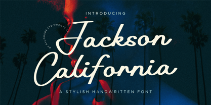 Proudly Presenting, Jackson California A Fancy Script Font. Jackson California is perfect for any titles, logo, product packaging, branding project, megazine, social media, wedding, or just used to express words above the background. Jackson California also come with Multi-Lingual Support. Enjoy the font, feel free to comment or feedback, send me PM or email. Thank You!
 - Calmbelt by Allouse Studio,
$16.00 Proudly Present, Calmbelt A Bold Graffiti Font With Two Styles. Calmbelt is perfect for any titles, logo, product packaging, branding project, megazine, social media, wedding, or just used to express words above the background. Calmbelt come with Multi-Lingual Support. Enjoy the font, feel free to comment or feedback, send me PM or email. Thank You!
 - Plastic Template JNL by Jeff Levine,
$29.00 Prior to the advent of digital type, many architectural layouts, amateur print projects and a myriad of other lettering jobs were created by the use of routed plastic templates and ink pens. Plastic Template JNL was designed from just one strip of a multi-part template set and replicates the clean lines of the original design.
 - Hisyan by Zeenesia Studio,
$15.00 INTRODUCING HISYAM. Hisyam is a Bold style sans serif font with strong character and soft features. modern and classic sans serif font with a clear and bold look. It’s a very versatile font that works great in large. Hisyam was built with open Type features, many stylistic alternate and Ligature makes your project will be awesome
 - Kalimaya Soultice by Allouse Studio,
$16.00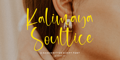 Proudly Presenting, Kalimaya Soultice A Handwritten Script Font. Kalimaya Soultice is perfect for any titles, logo, product packaging, branding project, megazine, social media, wedding, or just used to express words above the background. Kalimaya Soultice also come with Multi-Lingual Support. Enjoy the font, feel free to comment or feedback, send me PM or email. Thank You
 - Trilogi Materialism by Allouse Studio,
$16.00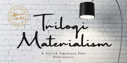 Proudly Presenting, Trilogi Materialism A Stylish Signature Font. Trilogi Materialism is perfect for any titles, logo, product packaging, branding project, megazine, social media, wedding, or just used to express words above the background. Trilogi Materialism also come with Multi-Lingual Support. Enjoy the font, feel free to comment or feedback, send me PM or email. Thank You!
 - Jakarta Brittany by Allouse Studio,
$16.00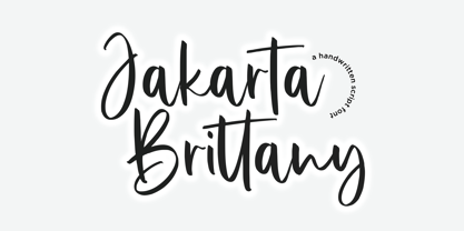 Proudly Presenting, Jakarta Brittany A Handwritten Script Font. Jakarta Brittany is perfect for any titles, logo, product packaging, branding project, megazine, social media, wedding, or just used to express words above the background. Jakarta Brittany also come with Multi-Lingual Support. Enjoy the font, feel free to comment or feedback, send me PM or email. Thank You!
 - Freaky Bouncy by Allouse Studio,
$16.00 Proudly Presenting, Freaky Bouncy A Bold Handwritten Font. Freaky Bouncy is perfect for any titles, logo, product packaging, branding project, megazine, social media, wedding, or just used to express words above the background. Freaky Bouncy also come with Multi-Lingual Support. Enjoy the font, feel free to comment or feedback, send me PM or email. Thank You!
 - Spicy Garlic by Allouse Studio,
$16.00 Proudly Present, Spicy Garlic a Handwritten Brush Font. Spicy Garlic is perfect for any titles, logo, product packaging, branding project, megazine, social media, wedding, or just used to express words above the background. Spicy Garlic also come with Multi-Lingual Support. Enjoy the font, feel free to comment or feedback, send me PM or email. Thank You!
 - Jingle Balle by Allouse Studio,
$16.00 Proudly Presenting, ingle Balle A Christmas Font With Two Styles. Jingle Balle is perfect for any titles, logo, product packaging, branding project, megazine, social media, wedding, or just used to express words above the background. Jingle Balle also come with Multi-Lingual Support. Enjoy the font, feel free to comment or feedback, send me PM or email. Thank You!
 - Gecko Moria by Allouse Studio,
$16.00 Proudly Presenting, Gecko Moria a Horror Handdrawn Font. Gecko Moria is perfect for any titles, logo, product packaging, branding project, megazine, social media, or just used to express words above the background. Gecko Moria also come with Multi-Lingual Support. Enjoy the font, feel free to comment or feedback, send me PM or email. Thank You!
 - Burnfolk by Allouse Studio,
$14.00 Burnfolk a Brush Font that bring an a natural brush impression. Come with separate alternate and Multi-Lingual Support. Burnfolk is perfect for any tittles, logo, product packaging, branding project, megazine, social media, wedding, or just used to express words above the background. Enjoy the font, feel free to comment or feedback, send me PM or email. Thank You!
 - Comickes by Allouse Studio,
$16.00 Proudly Presenting, Comickes A Handwritten Comic Font with 4 Styles. Comickes is perfect for any titles, logo, product packaging, branding project, megazine, social media, wedding, or just used to express words above the background. Comickes also come with Multi-Lingual Support. Enjoy the font, feel free to comment or feedback, send me PM or email. Thank You!
 - Sticky Buttercup by Allouse Studio,
$16.00 Proudly Presenting, Sticky Buttercup a Quirky Handwritten Font. Sticky Buttercup is perfect for any titles, logo, product packaging, branding project, megazine, social media, wedding, or just used to express words above the background. Sticky Buttercup also come with Multi-Lingual Support. Enjoy the font, feel free to comment or feedback, send me PM or email. Thank You!
 - Wakefield by Galapagos,
$39.00A gentle breeze caressed his face as his body took on the easy posture of a dancer on break. Flickering sparklets of light sprinkled the glass-smooth surface of the aqua liquid on which he floated. His mind wandered; he was only days away from his scheduled departure date. This day was no different from a hundred other days he had spent melded to his windsurfer, skittering along the breadth of the modest lake, soaking up the sun's rays and forgetting about the entire rest of the world. Lake Quannapowitt, and the town of Wakefield, Massachusetts, were familiar to Steve, a long-time resident of the picturesque New England town. This is where he grew up; this is where he married and lived for many years; and this is the place he was preparing to leave, not one week hence. Not generally prone to nostalgia, it was in just such a state he nonetheless found himself once Zephyrus retreated, as was his custom, periodically, while patrolling the resplendent lake. Steve was going to miss the lake, and he was going to miss the town. How many hours of how many days had he spent exactly like this, standing on his motionless board, waiting for his sail to fill, and staring at the lake's shores, its tiny beach, the town Common with its carefully maintained greenery, and equally well-tended gazebo, the Center church - its spire shadow piercing the water's edge, like a scissor-cut the better to begin a full-fabric tear? Yes, he was going to miss this place - this town which all of a sudden had become a place out of time, just as he was about to become a person out of place. Once this idea struck him, he couldn't shake it. He was transported back in time four score years, now watching his ancestors walk along the shore. Nothing in view belied this belief - not the church's century old architecture, not the gazebo frozen in time, nor the timeless sands of the beach, nor the unchanging Common. Everything belonged exactly where it was, and where it always would be. This, he decided, was how he would remember his hometown. And this is when it occurred to Steve to design a typeface that would evoke these images and musings - a typeface with an old-fashioned look, reflected in high crossbars, an x-height small in size relative to its uppercase, and an intangible quality reminiscent of small-town quaintness. Wakefield, the typeface, was born on Lake Quannapowitt in the town for which it was named, shortly before Steve moved away. It is at once a tribute to his birthplace and a keepsake. - The Sex Pistols font captures the raw energy and rebellious spirit of the punk rock movement, much like the iconic band it's named after. This typeface is more than just a collection of letters; it e...
- MVB Embarcadero by MVB,
$79.00 MVB Embarcadero lies in a space between grotesque sans serifs and the vernacular signage lettering drawn by engineers. It’s a style that happens to convey credibility and forthrightness without pretense—it’s anti-style, actually. All of this makes for the most versatile of typefaces, capable of delivering any kind of message while staying out of the way. As is often the case with a type design that develops over several years, Embarcadero isn’t the realization of a specific concept. In the ’90s Mark van Bronkhorst began digitizing a blocky slab serif from the Victorian era, which was then set aside for many years. He later revisited the design, paring it down to its bare essentials, and as more time passed, it evolved from a grid-based outline to curves that echoed the rigid skeleton of the original. Eventually it became a complete family with all the readability requirements of a text sans serif, yet maintaining the subtle eccentricities of its inspiration. Functionally, the Embarcadero family is as adaptable as its design. The OpenType Pro set of 20 fonts contains two widths and five weights, each with italics, small caps, a full set of figures, bullets and arrows, and support for most Latin-based languages. In all, Embarcadero is suitable for headlines or text. And—thanks to its simple, square form—it’s ideal for type on screen too.
 - Normandia by Canada Type,
$30.00 Designed over three years after the second World War, and published in 1949 by the Nebiolo foundry, Normandia was Alessandro Butti’s take on the fat face. As it usually was with Butti’s designs, this face effectively injected a catchy yet expertly calculated calligraphic spin into its source of inspiration — which was the essentially geometric/deco, thicker model of Bodoni’s very popular aesthetic. The metal Normandia saw some widespread use for a handful of years after its publication, not least because of the multitude of sizes in which it was available. It stepped out of the limelight by the mid-1950s, due to a combination of the popularity of cold type and Nebiolo’s refusal to retool its faces for new technologies. It was copied by a few small film typesetting outfits on both sides of the Atlantic, but never really found its way back to the mainstream. By the time computer type became the norm, Normandia was pretty much relegated to a type historian’s collection of anecdotes. This digital update of the classic series revives and refines the three original metal designs (Tonda/Regular, Corsiva/Italic, and Contornata/Outline) and expands the character set to more than 600 glyphs per font, including small caps, six types of figures, fractions and nut fractions, a full set of f-ligatures, some stylistic alternates, and other fine typography niceties.
 - ALS SyysScript by Art. Lebedev Studio,
$63.00 Handwriting of a strong Carelian personality revived: It’s autumn time once again, harvesting season, mushroom & berry time – the favourite season of my Karelian aunt Katri. A postcard she sent me more than twenty years ago had inspired me to SyysScript, “Script of Autumn” in Finnish. Katri had a very kind but also energetic personality, and I always thought her handwriting was a mirror of it. By making SyysScript I felt I could revive some of her unforgettable character. My Finnish autumn font has by now become a favourite for many and is branding fine food in both the Eastern and the Western hemisphere – even far beyond the arctic circle. “SyysScript“ is actually a growing family. For enhanced functionality in small sizes I added “SyysScript Eco” a year ago, a style with shortened extensions and simplified letterforms especially suited for packaging. And this autumn, a special one for Finland which is celebrating its 99th birthday, SyysScript grew again: Two long awaited newcomers, “SyysScript FeltTip” and “SyysScript FeltTip Eco” joined the family. They are bolder and softer than the previous styles but keep their positive, lighthearted feel. Use them to make a powerful individual mark on any background. – They are equally well suited for paper, packaging, a screen or even a concrete wall! Language support: Western and Central European, Extended Cyrillic.
 - Maison Luxe by FontMesa,
$25.00 Maison Luxe is a revival of a very old font designed in France in or around the year 1820. You may have seen this font in the past under the names of Circus, Roma, Madame and Gillé Classic. As of November 2016 we have changed the name of this font from Gillé Classic to Maison Luxe which means Luxury House in French. For many years Joseph Gillé was credited as the original designer of this font however we've recently been contacted by a type historian in France reporting that he could not find any evidence supporting Joseph Gillé as the designer and to the best of his knowledge an artist by the name of Sylvestre may be the true designer. If you love this classic font then you're sure to enjoy the alternate version also with a matching lowercase available from FontMesa under the name of Home Style. This version of the classic with its squared off shadow is true to the original design where Home Style has diagonal lines creating a cast shadow. New in 2016 for Maison Luxe is a new matching lowercase, an uppercase German Double S (versal eszett), Greek character set, opentype features including case sensitive forms and old style numerals. We know you'll enjoy the new additions to this timeless classic design.
 - Tichy by NoCommenType,
$20.00 The "Tichy" typeface is intended for use in titles, headlines and in short text blocks, like citates. However, the typeface is legible even in larger text blocks. It's strong appeal allows the typeface's usage mixed with other graphic elements of the layout without compromising it's readability and it's presence. The typeface's simple initial module (double braked at 135 degrees straight line), the strict rules of forming the letters lead to an unique typeface - masculine, strong and still legible. The Cyrillic glyphs are influenced by the work of the great Bulgarian typographers Boris Angelushev, Vassil Yonchev and Alexander Poplilov, who developed Cyrillic further in 60-s and 70-s of the XX century. Western, East European, Cyrillic, Baltic and Turkish codepages are supported. The font file contains all the basic ligatures, alternate glyphs and kern pairs. It can be used both on Windows and MacOS based computers. The history of "Tichy" typeface began many years ago with a project for logotype design for a small company. It was a kind of designer's game to try making some letters just using one single module. Development of the other glyphs of the latin alphabet was for many years a mandatory exercise for the young colleagues in our studio. Suddenly we realized that this project matured and creation of a new typeface started.
 - Touvlo by Monotype,
$49.99 New from the Monotype Studio’s Creative Type Director, Emilios Theofanous, Touvlo – meaning brick in Greek – is an homage to London and the view from his studio window. A zestful, modern interpretation of a classic genre, Touvlo skillfully captures the spirit of early British grotesque typefaces through playful terminals and lively curves. Touvlo offers an array of styles, from clean uprights to characterful Italics, and exuberant Backslants. Its regular upright weights are optimized for long text, with prominent and visible vertical contrast, creating rhythm and texture for comfortable reading. The Italics are designed to be visibly distinct, with narrower proportions and calligraphic shapes, offering brightness and emphasis wherever needed. The Backslants are an unexpected and energetic addition, providing an element of surprise while following similar design choices as the Italics, packing a particular punch. With a total of 24 weights in 3 styles across 3 variable fonts, Touvlo’s variety adds flavor in any use case, and can withstand complex typographic layouts or unexpected and peculiar settings. Touvlo’s weights range from Thin to Black, giving it an expressive edge for headlines. Its lyrical Drop caps are the finishing touch, featuring exquisite birds and creatures inspired from ornaments found in type specimen books. Touvlo’s spirit is radiant; becoming more than a voice; a reimagining of a classic genre and a must have for every designer's typographic palette.
 - Touvlo Variable by Monotype,
$229.99 New from the Monotype Studio’s Creative Type Director, Emilios Theofanous, Touvlo – meaning brick in Greek – is an homage to London and the view from his studio window. A zestful, modern interpretation of a classic genre, Touvlo skillfully captures the spirit of early British grotesque typefaces through playful terminals and lively curves. Touvlo offers an array of styles, from clean uprights to characterful Italics, and exuberant Backslants. Its regular upright weights are optimized for long text, with prominent and visible vertical contrast, creating rhythm and texture for comfortable reading. The Italics are designed to be visibly distinct, with narrower proportions and calligraphic shapes, offering brightness and emphasis wherever needed. The Backslants are an unexpected and energetic addition, providing an element of surprise while following similar design choices as the Italics, packing a particular punch. With a total of 24 weights in 3 styles across 3 variable fonts, Touvlo’s variety adds flavor in any use case, and can withstand complex typographic layouts or unexpected and peculiar settings. Touvlo’s weights range from Thin to Black, giving it an expressive edge for headlines. Its lyrical Drop caps are the finishing touch, featuring exquisite birds and creatures inspired from ornaments found in type specimen books. Touvlo’s spirit is radiant; becoming more than a voice; a reimagining of a classic genre and a must have for every designer's typographic palette.
 - Scary Notes by Ditatype,
$29.00 Scary Notes is a spine-chilling display font designed to evoke fear and horror. With its big letters and bold weight, this font demands attention and is sure to send shivers down your spine. The details of the letters are meticulously crafted to resemble brush strokes, adding an unsettling and handcrafted touch to the font. Each letter in Scary Notes is bold and commanding, creating an impactful presence that cannot be ignored. The big size of the letters adds to the font's intensity. The brush details in this font give the font an organic and chaotic appearance, reminiscent of chilling hand-painted writings. These details add a sense of unpredictability and terror, immersing the viewer into the world of horror and fear. For the best legibility you can use this font in the bigger text sizes. Enjoy the available features here. Features: Multilingual Supports PUA Encoded Numerals and Punctuations Scary Notes fits in headlines, logos, movie posters, flyers, invitations, branding materials, print media, editorial layouts, headers, and any project that requires a terrifying touch. Find out more ways to use this font by taking a look at the font preview. Thanks for purchasing our fonts. Hopefully, you have a great time using our font. Feel free to contact us anytime for further information or when you have trouble with the font. Thanks a lot and happy designing.
 - Lalibela by CyberGraphics,
$43.00My motivation for designing the Lalibela family (which is based on Bodoni) was to pay homage to Ethiopic script. The script has been around for about 3 000 years, but I took artistic licence to deviate from the original model and add personal touches. I chose Bodoni as a historical model because of its display value and not its text size use because the extreme contrast made it difficult to read at small sizes. A Modern typeface characterized by consistently horizontal stress, flat and un-bracketed serifs, and a high contrast between thin and thick strokes, were the final step in typography two-hundred-year journey away from calligraphy. The austerity, simplicity and greater contrast style was perfected.Contrary to all the refinements in Bodoni, I have revisited calligraphy with the font Lalibela that mimics Ethiopic Script. It was drawn with a much larger x height and less geometric than Bodoni for its primary use as a display font. For example, a lot of italic serifs were added to the roman face as well as 16 additional ligatures to obtain more a feel of calligraphy. I made the serifs thicker and bracket one side with straight steps obtaining a reduced contrast to withstand breaking up at smaller sizes.An additional variant, "Lalibela Alternate" was designed to provide an interesting mixing possibilities with the Bold face for more expressive headlines. - K5 - Personal use only

- peach sundress ~ - 100% free

- Particela by Putracetol,
$20.00 Particela - Display Font. Particela is a display style font. The classic, fun and groovy impression is very visible. But in Particela I combine several variations such as the ligature. Particela is inspired by vintage albums and posters from 1960s music bands. It makes this font even more unique and different. Particela is also great for any kind of display purpose from album, cover,poster, label, tshirt, apparel, signage, quote, logo, greeting card,logotype and many more. Particela is also support multi language. The alternative characters were divided into several Open Type features such as Swash, Stylistic Sets, Stylistic Alternates, Contextual Alternates, and Ligature. The Open Type features can be accessed by using Open Type savvy programs such as Adobe Illustrator, Adobe InDesign, Adobe Photoshop Corel Draw X version, And Microsoft Word. This font is also support multi language.
 - The font "Ex Kata Damaged" is a distinctive typeface designed by the talented font designer, Vic Fieger. As the name suggests, this font carries a damaged, distressed aesthetic that conveys a sense o...
- Dokument Pro by Canada Type,
$29.95 Jim Rimmer aptly described his Dokument family as a sans serif in the vein of News Gothic that takes nothing from News Gothic. Building on that internal analysis, Dokument Pro is the thoroughly reworked and expanded of the original main set released in 2005, with different widths still in the pipeline. This new version updates Jim’s work to six Pro weights and their italic counterparts, each of which takes advantage of OpenType stylistic sets to introduce different degrees of graduation from gothic to humanist. Dokument Pro is now a unique text sans family, with an adaptable personality suitable for the kind of edgy, uncompromising corporate and media typography that just tells it like it is, instead of having to resort to the common contemporary luring and baiting tactics. Dokument Pro’s range of weights, styles and features (over 775 glyphs per font, built-in small caps, alternates galore, and support for over 45 Latin languages) allows for multi-application versatility and clear, precise emotional delivery. This is the kind of straight-shooter sans that should be in every designer’s toolbelt. For more details on the fonts' features, text and display specimens and print tests, consult the Dokument Pro PDF availabe in the Gallery section of this page. 20% of Dokument Pro’s revenues will be donated to the Canada Type Scholarship Fund, supporting higher typography education in Canada.
 - Mikadan by Typodermic,
$11.95 Hear ye, hear ye! Adventurers of all realms, allow me to regale you with a tale of Mikadan, a font of great splendor and beauty. Behold, its letterforms are imbued with the grace and character of the medieval age, yet tempered with modern sensibilities. This typeface is a tribute to the great Verona of Stephenson Blake, a typeface of old that harks back to the days of yore, the age of kings and queens, and the rise of chivalry. Mikadan also draws inspiration from William Dana Orcutt’s Illumanistic, a font of great power and mystery from the turn of the century. Moreover, Mikadan possesses some of the accessible qualities of Morris Fuller Benton’s Motto, a font that has stood the test of time since 1915. Truly, Mikadan is a font that combines the best of old and new, of medieval fantasy and modern design. With its easy-to-read letterforms and medieval design, Mikadan is the ideal choice for all modern applications. Whether you’re designing a poster for a tournament, a sign for a market, or a banner for your guild, Mikadan will serve you well. And if your program supports OpenType alternates, you can access unique drop-down capital letters that will truly set your design apart. So come forth, brave adventurers! Embrace the medieval fantasy design of Mikadan and set forth on your journey to create designs that will endure through the ages. Most Latin-based European, and most Cyrillic-based writing systems are supported, including the following languages. Afaan Oromo, Afar, Afrikaans, Albanian, Alsatian, Aromanian, Aymara, Bashkir, Bashkir (Latin), Basque, Belarusian, Belarusian (Latin), Bemba, Bikol, Bosnian, Breton, Bulgarian, Buryat, Cape Verdean, Creole, Catalan, Cebuano, Chamorro, Chavacano, Chichewa, Crimean Tatar (Latin), Croatian, Czech, Danish, Dawan, Dholuo, Dungan, Dutch, English, Estonian, Faroese, Fijian, Filipino, Finnish, French, Frisian, Friulian, Gagauz (Latin), Galician, Ganda, Genoese, German, Greenlandic, Guadeloupean Creole, Haitian Creole, Hawaiian, Hiligaynon, Hungarian, Icelandic, Ilocano, Indonesian, Irish, Italian, Jamaican, Kalmyk, Kaqchikel, Karakalpak (Latin), Kashubian, Kazakh, Khalkha, Kikongo, Kinyarwanda, Kirundi, Komi-Permyak, Kurdish, Kurdish (Latin), Kyrgyz, Latvian, Lithuanian, Lombard, Low Saxon, Luxembourgish, Maasai, Macedonian, Makhuwa, Malay, Maltese, Māori, Moldovan, Montenegrin, Ndebele, Neapolitan, Norwegian, Novial, Occitan, Ossetian, Ossetian (Latin), Papiamento, Piedmontese, Polish, Portuguese, Quechua, Rarotongan, Romanian, Romansh, Russian, Rusyn, Sami, Sango, Saramaccan, Sardinian, Scottish Gaelic, Serbian, Serbian (Latin), Shona, Sicilian, Silesian, Slovak, Slovenian, Somali, Sorbian, Sotho, Spanish, Swahili, Swazi, Swedish, Tagalog, Tahitian, Tajik, Tatar, Tetum, Tongan, Tshiluba, Tsonga, Tswana, Tumbuka, Turkish, Turkmen (Latin), Tuvaluan, Ukrainian, Uzbek, Uzbek (Latin), Venetian, Vepsian, Võro, Walloon, Waray-Waray, Wayuu, Welsh, Wolof, Xhosa, Yapese, Zapotec, Zulu and Zuni.
 - Xkanz by Xuveki,
$10.00 XKANZ is a futuristic, robotic, variable display font geared towards cyberpunk poster text, cover text, and futuristic UI. It can easily shine as both as header and body. Wide glyphs, high weight and corner contrast, and "connectors" that bridge the gap between the stems, it's this mix of elements that give XKANZ its unique look. The purchase includes two static styles, regular and oblique, and a variable font file with a interpolatable 0-12 degree slant axis. Extensive multilingual support covering most latin characters 4 stylistic sets that include alternates for the D, I, R, and E glyphs, along with symbol/punctuation alternates such as the parenthesis, brackets, and more. Possible updates include condensed versions. The updates will be free and available to everyone who has already purchases XKANZ. This one was a wild and weird journey. It took A LOT of iteration to get to this end product. I'm proud to share it. Enjoy All questions, requests, or inquiries can be sent to abe.xuveki@gmail.com or DM'd to Xuveki on Instagram (https://www.instagram.com/xuveki)
 - Xkans SQ by Xuveki,
$10.00 XKANZ SQ is a blockier, more rigid variant of a previous font: XKANZ. It's a futuristic, robotic, variable display font geared towards cyberpunk poster text, cover text, and futuristic UI. It can easily shine as both as header and body. Wide glyphs, high weight and corner contrast, and "connectors" that bridge the gap between the stems, it's this mix of elements that give XKANZ its unique look. The family package (same price as any individual style) includes two static styles, regular and oblique, and a variable font file with a interpolatable 0-12 degree slant axis. Each style includes extensive multilingual support covering most latin characters. 4 stylistic sets that include alternates for the D, I, R, and E glyphs, along with symbol/punctuation alternates such as the parenthesis, brackets, and more. Possible updates include condensed versions. The updates will be free and available to everyone who has already purchases XKANZ SQ. All questions, requests, or inquiries can be sent to abe.xuveki@gmail.com or DM'd to Xuveki on Instagram (https://www.instagram.com/xuveki)
 - Lyra by Canada Type,
$39.95 Lyra is an Italian Renaissance script that might have developed if metal type had not broken the evolution of broad pen calligraphy. It lies in the area between the humanist bookhand and the chancery cursive, combining the fullness and articulation of the Roman letters with a moderate italic slant and condensation. A steep pen-angle allows use of a broader pen relative to the x-height, giving the letters more contrast with light verticals and heavy curves. Lyra embodies the Renaissance spirit of refining technical advances of the late middle ages with reintroduction of ancient classical principles. Based on the moving penstroke with constantly changing pen-angle, it brings the vitality of handwriting to the ordered legibility of type. Lyra is a formal italic, too slow for copying books. By eliminating the element of speed, digital technology opens up a new level of calligraphy, bringing it into the sphere of typography as would naturally have happened if metalworkers had not controlled the process. If classical Western traditions are respected, digital calligraphy has the potential to recapture the work of the past and restart its stalled evolution. There is of course no substitute for the charm of actual writing, with each letter made for its space; but the tradeoff is for the formal harmony of classical calligraphy as every curve resonates in tune with every other. This three-weight font family marks Philip Bouwsma's much-requested return from a three year hiatus. It also reminds us of his solid vision in regards to how calligraphy, typography and technology can interact to produce digital beauty and vesatility. Each of the three Lyra fonts contains almost three character sets in a single file. Aside from the usual wealth of alternates normally built into Bouwsma's work, Lyra offers two unique features for the user who appreciates the availability of handy solutions to subtle design space issues: At least three (and as many as six) length variations on ascending and descending forms, and 65 snap-on swashes which can be attached to either end of the majuscules or minuscules. The series also offers 24 dividers and ornaments built into each weight, and a stand-alone font containing 90 stars/snowflakes/flowers, symmetric contstructs for building frames or separators, masking, watermarking, or just good old psychedelia.
 - Monotype Goudy by Monotype,
$40.99Over the course of 50 years, the charismatic and enterprising Frederic W. Goudy designed more than 100 typefaces; he was the American master of type design in the first half of the twentieth century. Goudy Old Style, designed for American Type Founders in 1915-1916, is the best known of his designs, and forms the basis for a large family of variants. Goudy said he was initially inspired by the cap lettering on a Renaissance painting, but most of the flavor of this design reflects Goudy's own individualistic style. Recognizable Goudy-isms include the upward pointing ear of the g, the diamond-shaped dots over the i and j, and the roundish upward swelling of the horizontal strokes at the base of the E and L. The italic was completed by Goudy in 1918, and is notable for its minimal slope. Goudy Bold (1916-1919) and Goudy Extra Bold (1927) were drawn not by Goudy, but by Morris Fuller Benton, who was ATF's skillful in-house designer. Goudy Catalogue was drawn by Benton in 1919-1921 and was meant to be a medium weight of Goudy Old Style. Goudy Heavyface was designed by Goudy for Monotype in 1925, and was intended to be a rival to the successful Cooper Black. Goudy Modern was designed by Goudy in 1918; its small x-height, tall ascenders and shorter caps impart a spacious and elegant feeling. Benton designed Goudy Handtooled, the shaded version that has just a hairline of white through its bold strokes. The Goudy faces, especially the bolder weights, have long been popular for display and advertising design. They continue to pop up all over the world, and still look reassuring to our modern eyes." - Goudy Ornate MT by Monotype,
$29.99Over the course of 50 years, the charismatic and enterprising Frederic W. Goudy designed more than 100 typefaces; he was the American master of type design in the first half of the twentieth century. Goudy Old Style, designed for American Type Founders in 1915-1916, is the best known of his designs, and forms the basis for a large family of variants. Goudy said he was initially inspired by the cap lettering on a Renaissance painting, but most of the flavor of this design reflects Goudy's own individualistic style. Recognizable Goudy-isms include the upward pointing ear of the g, the diamond-shaped dots over the i and j, and the roundish upward swelling of the horizontal strokes at the base of the E and L. The italic was completed by Goudy in 1918, and is notable for its minimal slope. Goudy Bold (1916-1919) and Goudy Extra Bold (1927) were drawn not by Goudy, but by Morris Fuller Benton, who was ATF's skillful in-house designer. Goudy Catalogue was drawn by Benton in 1919-1921 and was meant to be a medium weight of Goudy Old Style. Goudy Heavyface was designed by Goudy for Monotype in 1925, and was intended to be a rival to the successful Cooper Black. Goudy Modern was designed by Goudy in 1918; its small x-height, tall ascenders and shorter caps impart a spacious and elegant feeling. Benton designed Goudy Handtooled, the shaded version that has just a hairline of white through its bold strokes. The Goudy faces, especially the bolder weights, have long been popular for display and advertising design. They continue to pop up all over the world, and still look reassuring to our modern eyes." - Goudy Handtooled by Monotype,
$40.99Over the course of 50 years, the charismatic and enterprising Frederic W. Goudy designed more than 100 typefaces; he was the American master of type design in the first half of the twentieth century. Goudy Old Style, designed for American Type Founders in 1915-1916, is the best known of his designs, and forms the basis for a large family of variants. Goudy said he was initially inspired by the cap lettering on a Renaissance painting, but most of the flavor of this design reflects Goudy's own individualistic style. Recognizable Goudy-isms include the upward pointing ear of the g, the diamond-shaped dots over the i and j, and the roundish upward swelling of the horizontal strokes at the base of the E and L. The italic was completed by Goudy in 1918, and is notable for its minimal slope. Goudy Bold (1916-1919) and Goudy Extra Bold (1927) were drawn not by Goudy, but by Morris Fuller Benton, who was ATF's skillful in-house designer. Goudy Catalogue was drawn by Benton in 1919-1921 and was meant to be a medium weight of Goudy Old Style. Goudy Heavyface was designed by Goudy for Monotype in 1925, and was intended to be a rival to the successful Cooper Black. Goudy Modern was designed by Goudy in 1918; its small x-height, tall ascenders and shorter caps impart a spacious and elegant feeling. Benton designed Goudy Handtooled, the shaded version that has just a hairline of white through its bold strokes. The Goudy faces, especially the bolder weights, have long been popular for display and advertising design. They continue to pop up all over the world, and still look reassuring to our modern eyes." - Goudy by Linotype,
$39.00Over the course of 50 years, the charismatic and enterprising Frederic W. Goudy designed more than 100 typefaces; he was the American master of type design in the first half of the twentieth century. Goudy Old Style, designed for American Type Founders in 1915-1916, is the best known of his designs, and forms the basis for a large family of variants. Goudy said he was initially inspired by the cap lettering on a Renaissance painting, but most of the flavor of this design reflects Goudy's own individualistic style. Recognizable Goudy-isms include the upward pointing ear of the g, the diamond-shaped dots over the i and j, and the roundish upward swelling of the horizontal strokes at the base of the E and L. The italic was completed by Goudy in 1918, and is notable for its minimal slope. Goudy Bold (1916-1919) and Goudy Extra Bold (1927) were drawn not by Goudy, but by Morris Fuller Benton, who was ATF's skillful in-house designer. Goudy Catalogue was drawn by Benton in 1919-1921 and was meant to be a medium weight of Goudy Old Style. Goudy Heavyface was designed by Goudy for Monotype in 1925, and was intended to be a rival to the successful Cooper Black. Goudy Modern was designed by Goudy in 1918; its small x-height, tall ascenders and shorter caps impart a spacious and elegant feeling. Benton designed Goudy Handtooled, the shaded version that has just a hairline of white through its bold strokes. The Goudy faces, especially the bolder weights, have long been popular for display and advertising design. They continue to pop up all over the world, and still look reassuring to our modern eyes." - The Great Escape - Personal use only


