10,000 search results
(0.025 seconds)
- Ninja Hirosi by Yoga Letter,
$16.00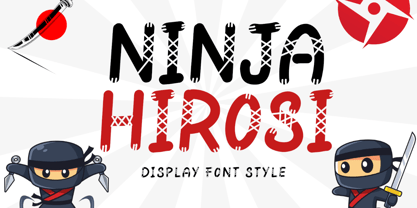 "Ninja Hirosi" is a very unique and cute display font. This font is equipped with uppercase, lowercase, numerals, punctuation, and multilingual support. Very suitable for comics, book titles, promotions, business branding, stickers, banners, branding, logos, film titles, and others.
 - Anabela Christmas by Yoga Letter,
$20.00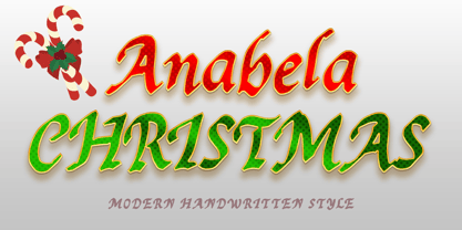 "Anabela Christmas" is an elegant handwritten font. This font is equipped with uppercase, lowercase, numerals, punctuation, and multilingual support. Very suitable for business branding, Christmas, Christmas invitations, weddings, Halloween, logos, film titles, book titles, posters, banners, stickers, and others.
 - Santa Display by Yoga Letter,
$18.00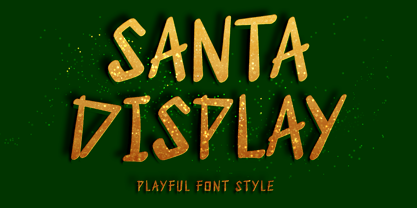 "Santa Display" is a unique and cute display font. This font is equipped with uppercase, lowercase, numerals, punctuation, and multilingual support. Very suitable for Christmas, weddings, birthdays, engagements, posters, branding, stickers, logos, tattoos, book titles, film titles, and others.
 - Sparose by Dhan Studio,
$21.00 Sparose fonts is handwritten specifically designed to get texture, also have ligature and beautiful Swash. Suitable for use in design titles such as invitations, signboards, book titles, stationery designs, quotes, branding, logos, greeting cards, packaging designs, posters, and more.
 - Death Demon by Yoga Letter,
$15.00 "Death Demon" is a horror font that is very scary and full of mystery. This font is perfect for Halloween moments, movie titles, book titles, Halloween party invitations, and more. Equipped with uppercase, lowercase, numerals, punctuation, and multilingual support.
 - BK Bird by Konst.ru,
$10.00 Font for names, logotypes, titles, headers, topics etc.
 - Kermel by La Boîte Graphique,
$25.00 Handwriting font. Usage recommendations: Title, short text, logo.
 - Decima Round by TipografiaRamis,
$39.00 Decima Round – one more addition to the Decima fonts family. It is a new version of recently released Decima Pro fonts with new content and styles. The main difference in the new version is a visual softer impressions of letter shapes made by the rounding of all glyphs’ corners and terminals. Decima Round is released in OpenType format with some OpenType features and support of most Latin languages as well as Cyrillic.
 - Iova Nova by profonts,
$41.99 Iova Nova is based on Jowa Script, designed by J. Wagner in 1967. The typeface has been redesigned, digitized, completed and expanded as OpenType Pro in the profonts studio. The resdesign includes the modification of the numerals which originally had capheight size. Besides, we complete the character set to cover Western and Eastern Europe including Turkey and Romania. The font contains more than 300 characters. Iova Nova is a young, fresh and casual design.
 - Darwin Rounded by Los Andes,
$39.00 Darwin Rounded, the resequel to Darwin, is ready for sea and new adventures! A new fresh design with an updated language support and different sets of figures. Darwin Rounded comprises 3 subfamilies: Darwin Rounded Pro, Darwin Rounded Essential and Darwin Rounded Alt Essential. The font includes alternative characters available as an OpenType feature as well as Oldstyle figures, numerators and denominators. Special thanks to Eli Hernández for her help with digital editing.
 - Catapult by Jonahfonts,
$39.00 Catapult is designed based on my popular condensed versions of Cornerstone / 8 styles, Cornerstone Pro / 10 styles and Cornerstone Flair / 8 styles. Catapult / 8 styles is wider with much detail to kerning and keeping the overall color in paragraphs at a minimum. Catapult also contains extra glyphs and new alternates. https://www.myfonts.com/search/cornerstone/ Applications include Headlines, logos, ads, invitations, captions, packaging, bulletins, posters, and greeting cards as well as short texts.
 - Nafta Brush Font by WildOnes,
$4.95 Nafta Extended Font is the Pro version of the free Nafta Font. It features a huge language support, from all European languages to even Cyrillic and Vietnamese. The Font features handwritten marker shapes with natural edges. Nafta Extended is a brush font which you can use and enjoy again and again, for anything from promotional material and handwritten quotes, to product packaging, merchandise, and branding projects. Made by Krisjanis Mezulis ar Wildones Type Foundry.
 - Sluicebox by Aerotype,
$29.00 Straight from the ‘extras’ drawer, the mismatched Sluicebox character set is comprised mainly of serif type specimens. The OpenType versions of Sluicebox have 52 ligature features that automatically substitute a unique pair of distressed characters when any upper or lower case letter is keyed twice in a row, as well as features for Old Style Numerals and Small Caps. Sluicebox Pro extends the character set to support Eastern European Latin, Baltic, Greek and Turkish.
 - Manas World by Fontuma,
$40.00 Manas is the name of the epic of the Kyrgyz Turks. The font family is also designed with serifs to reflect the characteristics of the epic from which it is named. This typeface, which is a serif, consists of three families: ▪ Manas: Font family containing Latin letters ▪ Manas Pro: Font family including Latin, Arabic and Hebrew alphabets ▪ Manas World: A family of typefaces including Latin, Cyrillic, Greek, Arabic and Hebrew alphabets
 - Manas by Fontuma,
$20.00 Manas is the name of the epic of the Kyrgyz Turks. The font family is also designed with serifs to reflect the characteristics of the epic from which it is named. This typeface, which is a serif, consists of three families: ▪ Manas: Font family containing Latin letters ▪ Manas Pro: Font family including Latin, Arabic and Hebrew alphabets ▪ Manas World: A family of typefaces including Latin, Cyrillic, Greek, Arabic and Hebrew alphabets
 - Bertham by Ascender,
$29.99 Bertham Pro Family (4 fonts) is a revival of Frederic W. Goudy’s Bertham typeface. Steve Matteson produced this unique typeface and added bold, italic and openface styles. The fonts include a variety of OpenType features including swash capitals, small capitals and old style figures. It is unmistakably American in appearance recalling a day of quality craftsmanship and hard work. Publishing, branding and packaging materials will draw inspired attention due to its grace and distinctive appearance.
 - Wolves Gothic by Chank,
$39.00 Make a little extra impact with this strong athletic font with big geometric muscles, clean lines and sharp teeth, too. Originally created for a local pro basketball team in Minnesota, this sporty and big-shoulder poster font is now available directly to you for the first time ever to add some punch to your printed or web designs. Crisp and clear and ready for action a concise variety of weights and styles!
 - Dexa Round by Artegra,
$29.00 Dexa Round is the round cornered version of the Dexa Pro superfamily. It has 18 fonts with thin to black weights, along with their true italic counterparts. With more than 770 glyphs per font, It supports all the Latin languages as well as the Cyrillic ones. OpenType features: small caps, caps to small caps, alternates, old style figures, tabular lining, old style tabular lining, language localizations, ligatures, superscript, subscript, numerators, denominators, fractions, historical forms.
 - Lust Hedonist by Positype,
$50.00 Check out the new Lust Pro & Lust Pro Didone to see how the series has grown and evolved. Confident, voluminous and versatile, Lust is an exercise in indulgence—an attempt to create something over the top and vastly useful. Lust Hedonist pushes contrast almost to the limit. The letterforms, especially the Script style are very self-indulgent for me, dare I say Hedonistic, and how I like to see letter masses taken to extreme contrast. The series unapologetically channels Herb Lubalin, but produced with a deliberate, contemporary twist. There is an intentional slyness infused in the letterforms—the extreme thick and thin lines flow effortlessly without becoming gratuitous. It’s always just enough, not too much. What makes the type series so appealing? The curves. When asked to describe the letterforms, most people unwittingly allude to the human form, using adjectives usually reserved for describing physical traits… creating all-too-familiar comparisons. Summerour has grown to accept this as unavoidable and reasonable given his acknowledgement of its influences and has provided nuances within the letterforms to accentuate that.
 - Akko Paneuropean by Linotype,
$79.00The Akko typeface family is the first new design from Akira Kobayashi in a very long time - and it is well worth the wait. Picture an industrial strength typeface like the Isonorm™ design. Now blend this with an organic design like the Cooper Black™ typeface. It was the idea of the fusion of these two design concepts that inspired Kobayashi to draw Akko. „My initial idea was to create a sanserif type with a ‚soft-focus‘ effect,“ says Kobayashi. „From here, the design evolved into two families, the robust and structured sanserif Akko and soft and friendly Akko Rounded.“ Akko has a wide range of weights, with options including complementary italics and a new Condensed range. The Akko typeface family is available as a suite of OpenType™ Pro fonts, allowing for the automatic insertion of small caps, ligatures and alternate characters. Pro fonts also offer an extended character set supporting most Central European and many Eastern European languages. And new Paneuropean versions introduce support for Cyrillic and Greek. - Mela by Resistenza,
$39.00 Mela was created with a pointed brush and walnut ink using thick brushstrokes. The original idea was to make a kind of urban graffitti with a fat brush, but the final result is more refined and elegant. Something new - light and bold together. The letters are a little bit slanted using sharp strokes, the brush gives the illusion of a fat-tipped marker. This handmade typeface has a lot of contrast, it brings together the beauty of the calligraphic shapes and strokes with the esthetics of a modern urban style. It creates a carefree feeling, contemporary, adding a perfect modern touch to your work. The possibilities for customized layouts are limitless, using the opentype ligatures and alternates to you make Mela your own. Mela Pro contains 473 glyphs: alternates, ligatures, icons, ornaments, and much more. Mela regular is limited to letters, figures and punctuation. Mela & Mela Pro are perfect for headlines and short texts. Use it for magazines, packaging, advertising, branding, posters, editorials, TV, movies and websites to give to your projects the unmistakable human touch of beautiful handwritten letters.
 - Interval Next by Mostardesign,
$25.00 Interval Next is a modern sans serif font family that is the successor of the successful Interval Sans Pro. Designed by Olivier Gourvat, Interval Next typeface consists of 16 fonts in 8 weights — Ultra Light, Light, Book, Regular, Medium, Semi Bold, Bold, Black— and has 4 styles. This super family combines a humanist mind with its contrasted shapes and a modern look with its open counters. With its four versatile styles (Condensed, Narrow, Roman and Wide) Interval Next has a creative palette able to meet the modern typographic demands. Its OpenType features will provide you almost unlimited multilingual support as well as small caps, case sensitive forms, proportional and tabular figures, slashed zero, numerators, superscripts, denominators, scientific inferiors, circled figures, subscript, ordinals, fractions, arrows and f-ligatures. Also extremely functional for professional editorial design, Interval Next has a pro kerning and would be extremely suitable for mobile applications, e-books, web sites, headlines, posters, signage and many more. Interval Next covers a large spectrum of languages such as West European, East European and the Cyrillic.
 - Akko by Linotype,
$40.99 The Akko typeface family is the first new design from Akira Kobayashi in a very long time - and it is well worth the wait. Picture an industrial strength typeface like the Isonorm™ design. Now blend this with an organic design like the Cooper Black™ typeface. It was the idea of the fusion of these two design concepts that inspired Kobayashi to draw Akko. „My initial idea was to create a sanserif type with a ‚soft-focus‘ effect,“ says Kobayashi. „From here, the design evolved into two families, the robust and structured sanserif Akko and soft and friendly Akko Rounded.“ Akko has a wide range of weights, with options including complementary italics and a new Condensed range. The Akko typeface family is available as a suite of OpenType™ Pro fonts, allowing for the automatic insertion of small caps, ligatures and alternate characters. Pro fonts also offer an extended character set supporting most Central European and many Eastern European languages. And new Paneuropean versions introduce support for Cyrillic and Greek.
 - Cute Dog by Yoga Letter,
$15.00 "Cute Dog" is a display font with decorative bones, dog heads, and dog paws. This font is equipped with lowercase, uppercase, numerals, punctuation, and multilingual support. Suitable for posters, business branding, logos, banners, stickers, magazine titles, film titles, and more.
 - Kigelio by Ivan Rosenberg,
$15.00 KIGELIA is a stylish display serif font inspired by fashion magazines and romance. It is great for short headlines and titles, but it looks great in advertising, vintage mood board, branding, logotypes, packaging, titles, editorial design and modern and vintage design.
 - Morque by Craft Supply Co,
$20.00 Morque – Sans Serif Font: Bold and Expressive Boldness in Every Letter: Morque – Sans Serif Font stands out with its all caps design. It’s perfect for impactful titles and displays. This font commands attention in any visual space. Ideal for Titles and Displays: Morque’s bold structure makes it ideal for titles and visual displays. It enhances the readability of headlines. This font is a go-to for designers aiming for a strong statement.
 - Solantra by Stephen Rapp,
$44.00 Solantra is a solidly crafted handwritten script. I’ve long felt that beautiful writing is more pleasing to the eye than the more attention grabbing swashes and flourishes. That being said, both have their role in design and Solantra has a large slice of each. Solantra combines vintage style handwriting with all its quirks and English Roundhand of that same era. The result is a solid setting script filled with charm and personality. With default Adobe Illustrator settings for Ligatures and Contextual Alternates active, the vintage charm is in full display. Want to add more flair? There are loads of more embellished letters inside the full version. Solantro takes into account how scripts are actually written so that connections from letter to letter are more fluid and rhythmic than the average script font. In natural script/handwriting most letters end at the bottom right and move up to connect with the next. Some letters like o, v, and w, however; end at the top right. Rather than force these letters to dip down and go back up they should ideally connect from that upper right point. This is accomplished through a series of alternate letters and ligatures with extensive contextual feature programming. So, for example, you might get one version of a ligature in the middle of a word and a different one at the beginning or end of that word. Solantra also takes into account another often overlooked feature of natural handwriting. When you write you inevitably pick your pen up from the paper at times. This is often just to reposition the hand, but in the days of writing with dip pens this was also needed to attain a fresh supply of ink. Having these occasional breaks in connections makes the writing less static and more rhythmic. While the Basic versions are limited to a standard character set and several ligatures and alternates for better settings of text, the full pro versions contains 1292 glyphs and an abundance of features. Even with numbers there are options like Oldstyle numbers, fractions, and ordinals. Central European language support is included as well as some select ligatures that use accents. To see more on the technical aspects and instructions on using Solantra, please check out the user’s guide in the Gallery section. **Note: The Pro versions of Solantra which do not have the word “Basic” attached to the title, have everything in them. So if you license a Pro version there is no need to get the Basic versions.
 - Jubel by Sine,
$15.00 Jubel font is named after the German word for "celebration". Crafted with a natural, blocky style, Jubel is designed for various creative uses, including magazine titles, captivating headlines, book titles, distinctive logos, vibrant shop banners, attention-grabbing flyers, and impactful advertising headlines.
 - Pimpaw Cat by Yoga Letter,
$15.00 "Pimpaw Cat" is a unique and cute display font. This font is decorated with different types of cat shapes. Equipped with uppercase, lowercase, ligatures, punctuations, numerals, and multilingual support Suitable for posters, banners, prints, branding, stickers, magazine titles, film titles, and more.
 - Birthmont by Typeskets,
$18.00 Birthmont is a vintage display style font, capital letters with interesting combinations, very suitable for use on label designs, titles, or other vintage themed designs. a font inspired by the 80's label designs that used it for the title and headline sections
 - Asrafel by Scriptorium,
$18.00Asrafel is an original font by Dave Nalle. It is a strong, stylish titling font based on hand lettering influenced by Celtic uncial styles and Art Nouveau titling fonts. It includes a variety of alternate character forms to create interesting visual relationships. - Ink Line by Atom,
$13.00 Ink Line is a modern font script that gives a unique impression. With ligature, titling, swash, and multi language features, Ink Line is very easy to use in the application of posters, flyers, titles, bloggers, Instagram stories, web banners, etc. Happy Design :)
 - Mia Love by Dhan Studio,
$20.00 Mia Love is a special brush font designed to look bold, with a perfect texture, suitable for today's designs. Perfect for use in design titles such as invitations, signboards, book titles, stationery designs, quotes, branding, logos, greeting cards, packaging designs, posters, and more.
 - Fette Trump-Deutsch - Unknown license

- Petroglifos by John Moore Type Foundry,
$19.00 Petroglifos is a dingbats font as a collection of pre-Hispanic petroglyphs of indigenous ethnic Venezuela, most of them are found in signs carved in stone or painted in caves of the pre-Hispanic period, each icon is an accurate representation of these ancestral signs. Forms are very interesting from a visual, anthropological, historical and semiotic point of view.
 - Cora by TypeTogether,
$49.00 Cora is a sans serif with an experimental bent, offering a large x-height, some contrast of stroke weight, and capitals inspired by classical lettering. The large x-height gives it a voice with a little more volume so that those in the back of the room have no trouble hearing. Because the letters seem slightly large, Cora remains clear at smaller point sizes. It is a typeface intended to perform well on screen without losing its attraction in print and the nature of its shapes allows for condensation or expansion without becoming severely distorted. The uppercase exhibits classical proportions found in ancient Roman inscriptions, which provides opportunities for setting titles in all caps. Cora Opentype Pro has a full range of numerals for every use, small caps, the most common open type features and supports many languages that use the latin extended alphabet. It is available in a range of three weights plus Italics. CoraBasic is a reduced version of Cora. It is still an OT-font but without any particular features except of a set of ligatures, class-kerning and language support including CE and Baltic.
 - Aeris by Linotype,
$29.99 Aeris™ typeface is a contemporary book face created by the American designer Tom Grace. It combines the proportions and rhythm of a sans serif font with the high contrasts and flexed strokes of script faces, while the open counters also ensure optimal legibility. Tom Grace focuses on providing subtle differentiations in his cuts and, as a consequence, this font family has its own individual structure: there are A and B variants of the basic forms regular, italic, bold and bold italic, and a display version for use in titles that also comes in A and B variants. It is advisable to use the A variant for larger font sizes, while the slightly more emphasized B variant can be recommended for smaller font sizes. Where the basic forms are to be mixed together in a work, it is important to use the corresponding A/B variants throughout as their designs have been carefully coordinated. Aeris is available in the OpenType Pro format and thus includes a wide range of different glyphs. The font family can be used in various environments, such as books, magazines, advertisements and promotional materials, but it is also the perfect choice for printed corporate documentation.
 - Quijote Sauvage by Lián Types,
$45.00 It was in the beginning of 2008 when I designed a font named Quijote, its predecessor. In the middle of 2009, I looked at it again and thought it could be a good idea to make an update of it. Variables and Features: Quijote Sauvage Pro is the most complete variable. It includes all the ligatures, alternates and swashes. It has the OpenType function in order to alternate glyphs easily when running applications which support this. The font is also offered separately. Quijote Sauvage Standard has the right glyphs to get an equilibrium between wildness and softness. It includes standard and discretionary ligatures. Quijote Sauvage Stylistic has the sharpest glyphs. Its decorative traces are discreet in order not to have problems as regards legibility. Its upper case are less wild than the other variables. Quijote Sauvage Text is the most discreet of its partners. This one was thought in order to improve legibility. Its ascenders and descenders are shorter, so the words are easier to read in small sizes. Quijote Sauvage Contextual, Swash and Titling, are the ones with wonderful terminals. They decorate words, adding a wonderful look of wildness or passion.
 - Rosart and Fleisch Hi Res by California Type Foundry,
$129.00 This font is not just historic, but classy, timeless, and in its current form, a modern classic. The original Titling Caps and icons Jacque François Rosart painstakingly carved, now meticulously digitized to be a true, accurate, and complete representation of the original designs. You can get the fully matching family with "ALL", or choose the set that meets your immediate needs: Zodiac and Constellations - The Stars Have Aligned into a Great Font So what's your sign? Whatever it is, R&F has it, and in so many ways! Pictograph, symbol, constellation and picto-constellation are all included. Constellations are useable even in scientific and education settings: based on current star charts and matched to Bayer designations, these stars shine both in design and accuracy! Includes Rosart's original moon and sun faces. Faces for the planets to match those for the sun and moon. Rosart's symbols for the planets. Astrology symbols including, Rosart’s pictographs for the twelve signs. Constellations of the Zodiac from precise star charts. Precise small star shapes, so you can design other constellations. Pinwheel, saltires, asterisks, solid stars, and even the Christmas star. Dave Lawrence, "Each symbol was carefully designed to match the main font." Alchemy Symbols - Turns A Design into Gold From labeling your cupboard of magical ingredients to getting one step closer to the golden goose, these rare alchemical symbols are a treasure trove of possibilities. Including: classic symbols for elements combinations medicinals chemistry mathematical symbols Includes music symbols for titling, as well as Verse and Response symbols. Seasons - Symbols to Keep Things Organized Throughout the Year Classic weather stylings, including old fashioned lightning and an eclipsing moon with the four-o'clock shadow. Map Markers Religious Symbols Phases of the moon. Pointing symbols: fingers, arrows, triangles, with circles Matching Italics CAL's Dimension Slant™ Instead of sloping all the pictures and drawings to an even slant, a multidimensional approach was used. And each symbol was evaluated and crafted individually. Pro World1 Font The pro world font contains all of these: Latin Standard set Rosart's original backwards X alternate. Alternate U shape. In the italic: swash variants for the J, Q, and Y. Proportional Lining (default), proportional old style, small caps figures. CAL Dimension Slant, for dynamic italics Includes Rosart's original moon and sun faces, along with additional faces for each planet. Rosart’s symbols for the planets and pictographs for the twelve signs of the zodiac. Constellations of the Zodiac along with small star shapes. Large stars, pinwheel, saltires, asterisks Symbols for chemistry Medicine Music symbols Mathematical symbols Pointing symbols like the finger, acorn, arrow and triangle. Geometrical shapes. Plus these more: Latin Pro character set for central European languages and Turkish. Rare kerns for Polish, Czech, Slovakian and others. Ligatures needed for some central European orthographies. Lowered German Umlauts for better line spacing. Cyrillic uppercase and small caps for eastern Europe, southern Europe, and Russia, with kerning. Rosart’s original Greek uppercase and small caps, but also tonos for monotonic Greek. Vietnamese, which has been kerned. Pinyin, including a special form of the Ü so that titles can be set closer. Numbers: A set of stacking (nut) fractions, along with very elegant automatic fractions A large set of currency symbols in lining, old style, small caps, denominator and numerator sizes. Our first Retail Pricing Feature: (ss03 + ss04) Just turn on the feature and type $1.99 and Rosart will do the rest. Ampersand alternates. Numerator sized musical sharp and flat symbols. Dave Lawrence, “From the moment I saw these letters I knew I had to make this typeface. What I didn’t know was that I would end up drawing most of Rosart’s special symbols... But it was too hard to resist."
 - Air Castles JNL by Jeff Levine,
$29.00 The cover of the 1919 sheet music for "While Others are Building Castles in the Air I'll Build A Cottage for Two" had its title hand lettered in a wonderfully eccentric Art Nouveau serif design that typified the era. Also typical of the time was the habit of various songwriters to come up with wordy titles. This particular one checks in at fourteen words. Nonetheless, the sheet music's title inspired Air Castles JNL and its oblique counterpart.
