10,000 search results
(0.081 seconds)
- Present Anthem by Heinzel Std,
$20.00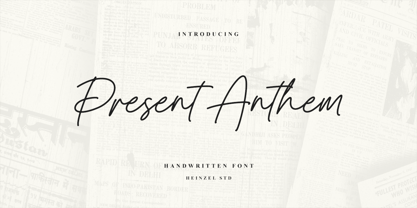 Present Anthem is a modern handwritten script font, described by an elegant touch, perfect for your favorite projects. It looks stunning on wedding invitations, thank you cards, quotes, greeting cards, logos, branding, business cards, social media posts, magazines, marketing materials, and every other design that needs a handwritten touch. Fall in love with its incredibly distinct and timeless style and use it to create spectacular designs! Present Anthem Features: Regular Version Uppercase and Lowercase Numerical and Punctuation Ligatures PUA Encoded Multilingual Language Easy To Use
 - Riva by ITC,
$29.00ITC Riva is the work of English designer Martin Wait and appeared with ITC in 1994. Its letters form gently flowing words and sentences and the light stroke contrast makes the font stable yet lively. The contemporary typefaces of the 18th century influenced the forms of ITC Riva and its overall image brings to mind flowing white sundresses, fields of flowers and tea parties. Perfect for invitations and greeting cards, the capitals of ITC Riva can also be used as initials and combined with other alphabets. - Richford by Heinzel Std,
$19.00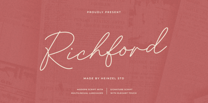 Richford is a signature script font, described by an elegant and modern touch, perfect for your favorite projects. It looks stunning on wedding invitations, thank you cards, quotes, greeting cards, logos, business cards, social media, magazines, branding, marketing materials, and every other design which needs a handwritten touch. Fall in love with its incredibly distinct and timeless style and use it to create spectacular designs! Richford Features: Regular Version Uppercase and Lowercase Numerical and Punctuation Alternates and Ligatures PUA Encoded Multilingual Language Easy To Use
 - Just Married by Gatype,
$12.00 Just Married Script is a feminine font and handwritten with fun characters. Good for greeting cards, wedding invitations, quotes, posters and many other projects. ♥ You just need to enable Contextual Alternates. Usually Adobe Photoshop and other programs enable it by default. It's your signature - unique and original. Ligatures Stylistics alternates PUA (personal use area) Compatible with Silhouette & Circut Languages currently supported: Albania, Netherlands, France, Indonesia, Hungary, Ireland, Romania, and Spain. Hope you like it! Any feedback is always welcome and very much appreciated :)
 - Sure! Penmanship Print is a typeface that exudes a casual warmth and personal touch, embodying the essence of handwritten notes and personal correspondence. Drawing inspiration from traditional handw...
- Black Mark by Hanoded,
$15.00 Black Mark is a fat, heavy, grunge-to-the-max marker font. It comes with alternates (calt & salt).
 - Utopian by Sudtipos,
$39.00 UTOPIAN is a color font family based on primary colors and pure geometric shapes, influenced by Bauhaus, DeStijl and Art Deco. Its pure shapes and basic colors are inspired by the beauty of simplicity of modular order and grid, creating a perfect environment where all these elements live in a perfect color harmony. In the other hand, DYSTOPIAN, the black and white family, represents a close sibling in appearance and structure, that carries an opposite meaning, with a darker look and feel. Both typefaces are, somehow, a reflection of the divided views and posible outcomes that the future times ahead yield before us. Package: Utopian/Dystopian comes in file with a pre-defined color palette. You can always change the colors converting the text to outlines. Technical info to use: The package contains a normal TTF/OTF set of fonts in Black and White and a colorfont in SVG-TTF format. To be able to use the color file you need to have installed Adobe Photoshop CC2017 or Adobe Illustrator CC2018. Not all the browsers support color fonts so please be sure to use them as graphics.
 - Atlantica by Jonahfonts,
$35.00 My pet peeve for many years has been with the 'rn' in small texts, especially with my smart phone. I felt that perhaps others may have the same peeve. I decided to try and fix that with Atlantica. As you can see in poster No. 4. "With the combination of 'rn' in small text it tends to appear as 'm'. Therefore it may be read as 's t e m' instead of 's t e r n'. Altalntica has an alternate 'rn'. By invoking the < Contextual-Alternate > feature. Atlantica will replace each 'rn' - or you may individually change them if you desire". Also note the deep cuts to help legibility for smaller texts. This combination apparently does not appear in many words, but when it does it can suggest a different word as in; eastern, stern, tarnish, Tornado, Turn and in some names as well.
 - Widget - Unknown license

- Deadly Breakfast - Unknown license

- Puppies Play by TypeSETit,
$24.95 Puppies Play is a fun, bouncy script with connectors that give a playful flow. Perfect for baby shower invitations, nursery rhymes, and other items that require a fun, children's look.
 - Steamboat by Atlantic Fonts,
$26.00 Steamboat is ready to embark on the next great adventure. Steamboat’s ribbony script has a vintage vibe, but is eager to put a playful twist on whatever comes its way.
 - Party Noid by PizzaDude.dk,
$20.00Party Noids goes all the way - from cartoonish to romantic, from funny to serious. Write in all caps, all lowercase or mix upper and lowercase to create ounces of fun! - Unsprit by PizzaDude.dk,
$20.00Unsprit jumps up and down, use the ligatures and the letters combine in all sorts of funky ways! You will need to use OpenType supporting applications to use the ligatures. - Deco Style JNL by Jeff Levine,
$29.00 The hand lettered title on the 1943 sheet music for "This Love of Mine" formed the basis for Deco Style JNL, which is available in both regular and oblique versions.
 - LD Jacob by Illustration Ink,
$3.00Jacob, you love him or you hate him... either way, his handwriting rocks! LD Jacob is great for journaling, adorning scrapbook pages, or adding that final touch to your project. - Cleveland Neon JNL by Jeff Levine,
$29.00 The channel letters in the neon sign for the iconic Clevelander Hotel located in the Art Deco district of Miami Beach was the inspiration and basis for Cleveland Neon JNL.
 - Merry Baubles by Greater Albion Typefounders,
$6.00 Merry Baubles is a set of fleurons in the form of traditional painted glass Christmas Tree ornaments. That's really all there is to say about this piece of typographic fun.
 - DF Tapa by Dutchfonts,
$39.00 DF Tapa is a typeface based on the vernacular, popular graphics used in Spain. They proudly announce the daily fresh snacks which are homemade and served in every proper bar.
 - Human Silhouettes by Intellecta Design,
$14.90 Human Silhouettes are inspired by people and daily situations. It includes a wide variety of topics and may be used individually or in combination with wide range of design possibilities.
 - Allonges by Nathatype,
$29.00 Looking for a font that will make your branding stand out? Do you sometimes have an appetite for a bit more wholesome typography? Looking for a fabulous, stylish, and adventure font? We've got what you want. Allonges -A Script Font Alllonges script is suitable for today's growing market design, this font has a model trendy, natural and soft, with this font you can take advantage of an occasion in every moment. Allonges is a new modern script font with an irregular base line. Style trendy and feminine. Allonges looks beautiful for branding, logos, wedding goods, greeting cards, fashion, lookbook, marketing promotions. Our font always includes Multilingual Support to make your branding reach a global audience. Features: Ligatures Stylistic Set Swahes PUA Encoded Numerals and Punctuation Thank you for downloading premium fonts from Natha Studio
 - Calgary Script by Sudtipos,
$99.00 Calgary Script was mostly inspired by a brush script on a Welcome To Calgary sign in, you guessed it, Calgary. Though now, after it's finished, I can easily tell the influence is evident of all the books on American sign painting I have absorbed over the years. The overall effect of the font is similar to something that Fonzied itself, big hair and leather jackets and all, out of the early 1980s, but the feeling really dates back to a few decades earlier. Heady caps and free-flowing lowercase make for a speedy, determined, and instinctively organized buffalo herd of a typeface. This is a packaging font with a true supermarket sign spin, with OpenType features including ligatures, alternates, and ordinals specifically made to follow numbers.
 - Fontwax by Kustomtype,
$25.00 The Fontwax font is inspired by sign painters in sixties advertisings with a touch of Arts & Crafts. This style of type is instantly associated with advertising and design for high-end products. Fontwax is meticulously drawn for quality and readability. Fontwax is great for display, logos, branding, packaging, advertising, food, sports, titles, film, tv, and much more. Fontwax comes in 4 styles which perfectly match together. Fontwax is a great display family with roots in the advertising and sign painting industry of the 20th century. It is smoothly polished with all the features a good designer needs. For the best price, I recommend you grab the whole pack! Fontwax is designed by Coert De Decker in 2018 and published by Kustomtype Font Foundry.
 - As of my last update in April 2023, "Winob" does not appear to be a widely recognized font within the traditional or digital typography communities, so my depiction will lean into imaginative interpr...
- Dirchave by Rillatype,
$15.00 Introducing, Dirchave, dirchave is a vintage inspired display font that perfect for packaging, branding, headline, quotes, etc. Features: - Uppercase Font - Number - Punctuatuon - Stylistic Alternate - PUA encoded
 - Tourist by Solotype,
$19.95MacKeller, Smiths and Jordan had a font called Giraffe Wide which we liked, but like many Victorian display fonts it had no lowercase. We fixed that! - KG Summer Storm by Kimberly Geswein,
$5.00 An all-caps title font in a whimsical style. This font comes in 2 styles- a rough edged marker version and a smooth-edged clean version.
 - Silver Pearl by Aestherica Studio,
$12.00 Introducing the new fun handwritten dont by Aestherica Studio. Proudly presenting Silver Pearl. Silver Pearl is perfect for product packaging, branding project, magazines, social media, wedding, and more. Silver Pearl has also multilingual support. Enjoy the font, feel free to comment or feedback.
 - Malache Crunch - Unknown license

- Gastank by Maulana Creative,
$14.00 Gastank is a modern handwritten script font, With a rough marker brush stroke and fun characters. It has Opentype features of ligatures, makes it a perfect choice for branding and digital designs. Use this font for logos, social media, websites, blogs, instagram, social media, business cards, branding, and more! Gastank font support multilingual more than 100+ language. and good pair for your secondary text font with sans or serif. Make a stunning work with Gastank marker handwritten script font. Cheers, MaulanaCreative
 - FF Pastoral by FontFont,
$50.99 A sturdy workhorse with the grace of a gazelle, the FF Pastoral typeface family marries pure craftsmanship with rapturous excesses of form. With his fifteenth release under the FontFont brand, prolific French designer Xavier Dupré has filled a typographic toolbox with plentiful options ranging from a tender, feathery Thin to a robust, healthy Black. At a glance, FF Pastoral appears deceptively simple, particularly in the middle weights. That surface serenity is intentional and allows for easy reading and quick comprehension of short blocks of copy. Upon closer inspection, FF Pastoral is complex and nuanced, carrying a balanced tension in its forms. This plays particularly well in magazine spreads and corporate logos, where uniqueness is a virtue. In creating his latest design, Dupré drew inspiration from a tasteful mix of references, combining diverse elements with a deft hand. While its letter shapes were informed by humanist-geometric hybrid Gill Sans, FF Pastoral’s proportions have been optimized for contemporary typography. Slightly condensed but generously spaced, FF Pastoral features a tall x-height, open counters, and subtle, sprightly italics slanted at just 5°. Proportional oldstyle figures are the default in the family, with tabular and lining numbers and fractions accessible through OpenType features. Elegant details evocative of calligraphy judiciously pepper the FF Pastoral glyph set. The ‘e’ bears an oblique crossbar, while the right leg of the ‘K’ and the ‘R’ are insouciantly curved in both the upright and italic variants. Further flourishes appear throughout the italics, notably in the ‘T’ and the ‘Z’, the gloriously looped tail of the ‘G’, and an extraordinary ampersand. Sharp-eyed fans of Dupré’s work may feel like they’re in familiar territory, and they would be right. An early version of FF Pastoral sprang to life in 2017 as Malis, a family in four weights on the heavier side of the spectrum. Over time, Dupré refined his original design, expanding it with four lighter styles and including true italics for all. The lightest weights are ethereal, with exquisitely delicate strokes drawing the eye in and across a line of type. The most substantial styles are tremendous in their power, allowing text to make a deep impression in print or on screen. Fully fleshed out, FF Pastoral works sublimely in a vast array of text and display settings. Dupré sees his latest FontFont offering as a ‘cultural’ typeface, perfect for the pages of an oversized coffee-table book or business communications where warmth and informality will win the day. Born in Aubenas, France (1977), Xavier Dupré is a gifted user of type as well as an award-winning type designer and lettering artist. After training in graphic design in Paris, Dupré studied calligraphy and typography at the Scriptorium de Toulouse. Since releasing FF Parango in 2001, Dupré has published such FontFont classics as the FF Absara and FF Sanuk superfamilies, FF Megano, FF Tartine, and FF Yoga. A designer of Khmer fonts as well as Latin typefaces, Dupré splits his time between Europe and Asia.
 - Prillwitz Pro by preussTYPE,
$49.00 Johann Carl Ludwig Prillwitz, the German punch cutter and type founder, cut the first classic Didot letters even earlier than Walbaum. The earliest proof of so-called Prillwitz letters is dated 12 April 1790. Inspired by the big discoveries of archaeology and through the translations of classical authors, the bourgeoisie was enthused about the Greek and Roman ideal of aesthetics. The enthusiasm for the Greek and Roman experienced a revival and was also shared by Goethe and contemporaries. »Seeking the country of Greece with one’s soul«. All Literates who are considered nowadays as German Classics of that time kept coming back to the Greek topics, thinking of Schiller and Wieland. The works of Wieland were published in Leipzig by Göschen. Göschen used typefaces which had been produced by until then unknown punch cutter. This punch cutter from Jena created with these typefaces master works of classicist German typography. They can stand without any exaggeration on the same level as that of Didot and Bodoni. This unknown gentleman was known as Johann Carl Ludwig Prillwitz. Prillwitz published his typefaces on 12th April 1790 for the first time. This date is significant because this happened ten years before Walbaum. Prillwitz was an owner of a very successful foundry. When the last of his 7 children died shortly before reaching adulthood his hope of his works was destroyed, Prillwitz lost his will to live. He died six months later. His wife followed him shortly after. The typeface Prillwitz as a digital font was created in three optical styles (Normal, Book and Display). The typeface Prillwitz Press was created especially for a printing in small sizes for newspapers. »Prillwitz Press« combines aesthetic and functional attributes which make written text highly readable. It was originally designed for a newspaper with medium contrast to withstand harsh printing conditions. Its structure is quite narrow which makes this typeface ideal for body text and headlines where space is at premium. For the Normal – even more for the Book – a soft and reader-friendly outline was created through a so-called »Schmitz« and optimized in numerous test prints. The arris character and the common maximal stroke width contrast of the known classicist typefaces (Didot/Bodoni) were edited by the study of the original prints. This was also done in order to reach a very good readability in small type sizes. This typeface is perfectly suited to scientific and belletristic works. Accordingly it has three styles: Regular, Bold and Italic as Highlighting (1). The typeface Prillwitz is a complete new interpretation and continuing development of the conservated originals from 1790. They have been kept in the German Library in Leipzig. It was always given the priority to keep the strong roughness and at the same time optimizing the readability of this striking font. The type family has all important characters for an efficient and typographic high quality work. ----------- (1) Accentuation of particular words or word orders (e.g. proper names, terms etc.). Typographic means for Highlighting could be Italic, SmallCaps or semi-bold.
 - BC Away by Egg Fonts,
$28.00 BC Away is a display typeface. It has emerged from the idea of drawing letterforms with a single-line path. Thanks to this idea, the characters are designed out of standard and conventional forms. Character designs are a combination of sharp corners and smooth curves, at the same time keeping readability. Some parts have been left blank in accordance with the letter forms. The name 'Away' represents these blanks. Also, the word 'a way' refers to the design of letterforms using a single-way.
 - Beachfront Hotel JNL by Jeff Levine,
$29.00 The Raleigh Hotel at 18th Street and Collins Avenue on Miami Beach is an Art Deco landmark and part of the city's popular tourist district. A vintage matchbook from the hotel had its name hand lettered in what is now Beachfront Hotel JNL; available in both regular and oblique versions. The lower case letters have been made more traditional, eliminating the Deco-influenced "overhangs" present on the capital letters, and an alternate "E" from the original matchbook design is available on the bar and broken bar keys.
 - Tacky Shoes by PizzaDude.dk,
$18.00 May I present to you: Tacky Shoes. Actually there's nothing tacky here - just liked the sound of that :) Just like the letters may look quite straight-forward, but here and there the lines are a bit off, which enhances the handmade look - which makes it great for work like posters, invitations, flyers, stickers or something that has to do with creativity. Each letter has 6 variants (in all 6 versions!) which makes the text look more natural and random - because these variants cycle as you type!
 - Nursery Rhyme Initials by Celebrity Fontz,
$24.99High-quality ornamental initials superimposed on nursery rhyme backgrounds such as Humpty Dumpty, Ride a Cock Horse, Baa Baa Black Sheep, Tom Tom the Piper's Son, Rub-A-Dub-Dub, the Queen of Hearts, Old King Cole, and many others. Includes one set of A-Z ornamental initials conveniently assigned to both the upper and lower case alphabet characters. Ornate and accurate renderings that can be used for the beginning of paragraphs in any children's publication or texts relating to nursery rhymes and fairy tales. - Kernig Braille by Echopraxium,
$5.00 This font is the younger sister of HexBraille with which it may be combined to create new patterns. This also explains why their introductory text are similar. Introduction The purpose of this monospace font is to display braille in an original and "steganographic" way. The Kernig prefix means "Robust" in German, this is because of the crank shapes . The core of the glyph design is a flat hexagon which can be read as 3 rows of 2 dots (i.e. regular braille glyph grid). Even if within a glyph, braille dots ("square dots" indeed) are placed on the vertices of a flat hexagon, the difference with HexBraille is that edges connecting vertices are not straight lines but "crank shapes" instead. This can be summarized by saying that the whole glyph is a Hexcrank (a flat hexagon where vertice pairs are connected by a crank shape) NB: The initial design is illustrated by glyphs 'ç' (no dot) and 'û' (6 dots) as shown by poster 6. A. "Kernig Lattice" In KernigBraille, glyphs are connected to each other, thus for each Hexcrank glyph there are 6 connections: 2 on left/right and 4 on top/bottom. In the final design some cranks were removed for esthetical reason (i.e. leave empty space for allowing patterns diversity). In summary, a text using this font won't display a honeycomb but a lattice instead. NB: Please notice that in order to obtain the lattice without vertical gaps, you must set the interline to 0. The lattice is made from 3 kind of shapes: a.1. Hexcrank a.2. Square a.3. Irregular cross (mostly unclosed) The design favored squares over crosses. The whole slightly resembling a PCB. B. Text Frames It's possible to frame the text with 4 sets of frame glyphs (as illustrated by poster 2) b.1. Kernig { € ° £ µ § ¥ ~ ¢ } b.2. Rectangular-High { è é ê ï î à â ä } b.3. Rectangular-Low { Â ù Ä Ê Ë Ô õ ö } b.4. Mixed Kernig+High: a mix of Kernig and Rectangular-High frame glyphs When using frame glyphs, it is advised to show Pilcrow (¶) and Non Breaking Space, which are replaced by empty shapes in this font (e.g. in Microsoft Word, use CTRL+8 or use [¶] button in the ribbon).
 - MOO! - Personal use only

- Nabana by Alifinart Studio,
$15.00 Nabana is a quotable sans serif font that offers a relaxed, comfortable and informal feel. This font is inspired by the packaging of environmentally friendly products, as well as from book covers for children. The first impression when you see this font is a sense of joy and fun. Moreover, this font package also includes a variety of floral element designs that are very harmonious when used together. Instructions: For complete details, please visit my Behance profil.
 - Bunday Sans by Buntype,
$22.50 Buntype’s new Bunday™ Sans Font Family consists of four main states with different moods: the crisp and distinctive sans, the cute script styled upright and the matching italics (these upright styles are currently not available). All states of Bunday™ Sans share the same contemporary, clear and open base forms and create a space-saving and homogeneous text colour. Despite the fact that the overall width is space-saving or narrow, Bunday™ Sans offers good legibility. The font was manually hinted and contains extensive handcrafted kerning tables to ensure perfect appearance in all media. Bunday™ Sans ships with 9 standard, 9 upright italic, 16 italic styles from a considerable thin “Hair” to a pretty fat “Heavy” weight. It supports at least 99 languages and provides OpenType® features for ligatures, alternative glyphs, localised forms and more. Please take a look at the other members of the Bunday superfamily: Bunday™ Clean Bunday™ Slab Further information: Bunday Sans Specimen PDF Bunday Sans OpenType® Quickguide Feature Summary: 9 weights: Hair, Light, Thin, SemiLight, Regular, SemiBold, Bold, ExtraBold and Heavy 4 Moods: Sans, Upright, Sans Italic and Upright Italic Overall width: Narrow or Space-Saving Advanced “f” ligature set* “s” and “c” ligatures* Alternates Characters: a, ç, e, f, g, l, t, y and more* Capital German Esszett* Supports at least 99 Languages * Available only in applications with advanced OpenType® support


