10,000 search results
(0.201 seconds)
- Red Sun by Inumocca,
$20.00 Red Sun – A futuristic font with simple and strong characters. Inspired by the visuals and colour scheme of neon signs and synthwaves. A really great font for many projects, like game design, websites, magazines, branding, posters, logos, and more. - Unique glyphs - Multilingual support - UPPERCASE - Lowercase - Numeric - Symbol - Punctuation - PUA encoded - Stylistic alternates
 - SLICKY BOHEM by Jolicia Type,
$25.00 SLICKY BOHEM is a bold condensed typeface that is strong geometric. with a variety of discretionary ligatures to give you all you need for great typography. make your creative work stand out with lots of unique ligatures. highly recommended and those who are planning a poster design, logo, headline, t-shirt, etc.
 - Clarinta by Putracetol,
$19.00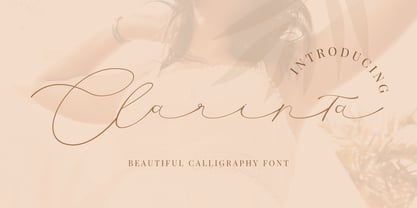 Clarinta, a beautiful script font. a lovely, elegant and sweet script font. Clarinta is perfect for styling logos, stationery, wedding event, invitation, quote, social media, websites and so much more! Come with Opentype feature with a lot of alternates, its help you to make great lettering.This font is also support multi language.
 - Chennai Slab by insigne,
$29.00 Chennai Slab is an extension of the original Chennai. Chennai Slab is a simplified slab serif with over sixty OpenType alternates for the ball terminals, unique simplified alternates and more traditional capital forms. Use Chennai Slab when you need a fun and versatile slab serif. The sans-serif Chennai makes a great complement.
 - Raks by PeachCreme,
$14.00 Meet our new font "Raks"! These eye-catchy letters work great for headings and logos. If you would like to add some vanguard touches to your design, then this font is for you! Bold and curvy lines of "Raks" will give dramatic look for nearly any text from magazine headers to product emblems.
 - Boldies by Illushvara,
$14.00 Boldies is a serif font, mixed the modern with the classic concept line serif. The Alternate shape will make your design look like Modern. But don't worry if you need the Design like Classic and Bold Serif, you just put the normal Uppercase and Lowercase. With many ligatures will make your design projects stand out! Add this font to your most creative ideas for Application, Art Gallery Poster or postcard, Architectural Logo Project, Classic Magazine, Product Skincare or Logotype you want to used! Support the Multilingual Language! If you have any question, don’t hesitate to contact me. Happy Designing !!! Thank You, Illushvara Design
 - Disposition by PizzaDude.dk,
$15.00 You may not know it, but you've been looking for a font like DISPOSITION! Yeah, it's a font...but it doesn't act or look like one! Why?! Because there are 6 different versions of each letter! Yes, SIX different versions! Enough to make your design look soooo cool and handmade! The font uses "contextual alternates" which makes the font cycle the different versions as you type! What can you use DISPOSITION for? There are almost no limits, but I would suggest designs such as invitations, headlines, posters, signs and other cases where a dry brush look is required.
 - Mayes by Sabrcreative,
$15.00 Mayes is a soft, geometric sans serif font family. It consists of 6 weights ranging from Thin to Black, combining elements of Bauhaus and modern styles with its distinctive softness. Its design is minimalist, elegant, and warm, offering a unique yet versatile and easily readable impression. Mayes was created with the purpose of providing text displays that are easy to read, strong, and make a standout impression. It is compatible with both text and display purposes, making it perfect for headers, titles, posters, websites, branding, apps, and various other creative designs or projects. Mayes features several OpenType functionalities, including standard ligatures and number variations such as old-style figures, fractions, numerators, and denominators. It also offers extensive support for the Latin language. With Mayes, you can effortlessly create text displays that stand out with a touch of specialty. Its soft yet strong design makes it an ideal choice for creating remarkable and captivating designs.
 - Marjac by Jeremia Adatte,
$29.00 Marjac is an angular and upright script typeface that is directly inspired by handwriting. It is created after "Jacno", a typeface designed in 1948 by French type and graphic designer Marcel Jacno. This unique bold design later inspired other typeface designers to create brush script typefaces like Roger Excoffon’s "Choc". You will also notice it has a "unicase" feel, sharing some lowercase letters in the capital letters. It is recommended to use it for any packaging designs related to quality hand-made products, advertising, web, film title sequence design, posters, magazines and book jackets. Marjac is loaded with an extended character set, supporting Central, Western and Eastern European languages. It has plenty of cool OpenType features like a fun automatic brush underline feature or newly-designed secret alternate letters (like capital A). Kerning and spacing (+ than 25,000 kerning pairs) have been meticulously made-to-measure to this specific brush typeface. Beautiful hand-made arrows and other symbols were created to accompany letters.
 - Verao by insigne,
$24.99 Remember clear summer days as a kid? Remember open fields that you explored? Sun shining? Simple breezes sweeping past your face as you ran far and free? The feeling was uncomplicated and enjoyable. It was natural. That’s Verao, the simple spirit of summer. Alive and vibrant, Verao takes a turn away from the cold structure of today’s rigid creations and embraces the movement back to the value of things handmade. This artisan creation represents the rare, soul-invested fusion of the craftsman’s tools, materials, and hand movements, which shapes the solid--but beautifully defined--parts, pieces that, when put together, breathe a measure of life into everyday paragraphs and other bodies of text. Verao’s hand-written brush script, with its characters’ imperfect elegance and handmade quality, keeps your work looking organic. Write a word in more than a hundred different ways thanks to the large number of extra letters it offers. Two sets of lowercase alternative letters without connectors are included as is a set of swashed endings. Verao contains stylistic substitutions and ligatures, too, that you can combine however you like. Whichever way you design, the elements continue to appear balanced and separate and will undoubtedly add more personality to your design. So stop switching out cogs in your rigid set of fonts. Take time again to play with a natural face that’s both easy and energetic. Verao’s great temperament makes it a joy to design with. Let this spirit of summer take you away from the mundane. There’s a good chance Verao will lead you where you need to go. Production assistance from Lucas Azevedo.
 - Termit by Ditatype,
$29.00 Termit is a striking display font designed with a game theme, featuring large letters with a fairly thick weight and a rectangular shape with sharp corners. This font shows large letters that demand attention and create a bold statement. The rectangular shape with sharp corners in Termit adds a sense of structure and stability to the font. The clean lines and defined angles create a visually bold and impactful appearance. This unique feature evokes a sense of strength and resilience, reflecting the competitive and strategic nature of the gaming world. Each character shares the same height and width, creating a cohesive and pleasing visual experience. With its low-contrast design, it offers a subtle and understated look. The minimal variation in stroke width adds a sense of uniformity and simplicity to the font, allowing the overall design to take center stage. This feature ensures that the focus remains on the content while still maintaining a strong visual impact. Enjoy the available features here. Features: Stylistic Sets Multilingual Supports PUA Encoded Numerals and Punctuations Termit fits in headlines, logos, posters, titles, branding materials, print media, editorial layouts, website headers, and any other game-themed projects. Find out more ways to use this font by taking a look at the font preview. Thanks for purchasing our fonts. Hopefully, you have a great time using our font. Feel free to contact us anytime for further information or when you have trouble with the font. Thanks a lot and happy designing.
 - Salma Arabic by Zaza type,
$29.00 Salma is a modern typeface inspired by the Naskh Mastry style. It stands out from traditional fonts with its high contrast and new connections between letters, creating an eye-catching aesthetic that will make any text stand out. Its bold lines and timeless appeal make Salma perfect for headlines and display typography, as well as other design projects. It comes in 5 weights ranging from light to black, allowing users to customize their designs with OpenType features. The unique look of Salma makes it ideal for logos or branding materials that require a distinctive touch. With its strong presence across different media platforms such as print publications or digital displays, this versatile typeface can be used to create impactful visuals.
 - Agatized Formal by ULGA Type,
$25.00 Agatized Formal is a chunky stencil typeface with slightly condensed letterforms and tight spacing. Designed primarily for display use, it’s ideal for posters, logos, advertising, book cover designs or small chunks of text such as pull-out quotes. It exudes authority without taking itself seriously, like a plump jolly uncle in charge of a brass band. Agatized Formal is a big, bold typeface with a charismatic presence that commands attention – in a friendly way, of course. But what really makes this typeface come alive is its arsenal of alternative characters and ligatures. There is a saying: Use sparingly. Whoa! Not here, no, no, no. Make your Glyphs palette earn its money. Flex your OpenType muscles: get stylized, contextualized, indulge in some ligaddiction. This typeface is a peacock that likes to put on a show, spread its plumage and strut around in all its blazing glory. Agatized, according to Wiktionary, means: A living thing converted into the form of agate; fossilized. I felt the name suited the solid, almost rock-like letterforms, but most of all I just wanted a typeface name that began with the letter A. Although Agatized Formal is a single-weight typeface it has a sibling, Agatized Informal, an older, more casual brother, rougher round the edges with craggy good looks and an altogether more jaunty style.
 - Basilio by Canada Type,
$29.95 In the late 1930s, old Egyptiennes (or Italiennes) returned to the collective consciousness of European printers and type houses — perhaps because political news were front a centre, especially in France where Le Figaro newspaper was seeing record circulation numbers. In 1939 both Monotype and Lettergieterij Amsterdam thought of the same idea: Make a new typeface similar to the reverse stress slab shapes that make up the titles of newspapers like Le Figaro and Le Frondeur. Both foundries intended to call their new type Figaro. Monotype finished theirs first, so they ended up with the name, and their type was already published when Stefan Schlesinger finished his take for the Amsterdam foundry. Schlesinger’s type was renamed Hidalgo (Spanish for a lower nobleman, ‘son of something’) and published in 1940 as ‘a very happy variation on an old motif’. Although it wasn’t a commercial success at the time, it was well received and considered subtler and more refined than the similar types available, Figaro and Playbill. In the Second World War, the Germans banned the use of the type, and Hidalgo never really recovered. Upon closer inspection, Schlesinger’s work on Hidalgo was much more Euro-sophisticated and ahead of its time than the too-wooden cut of Figaro and the thick tightness of Playbill. It has a modern high contrast, a squarer skeleton, contour cuts that work similarly outside and inside, and airy and minimal solutions to the more complicated shapes like G, K, M, N, Q and W. It is also much more aware of, and more accommodating to, the picket-fence effect the thick top slabs create in setting. Basilio (named after the signing teacher in Mozart’s Figaro) is the digital revival and major expansion of Hidalgo. With nearly 600 glyphs, it boasts Pan-European language support (most Latin languages, as well as Cyrillic and Greek), and a few OpenType tricks that gel it all together to make a very useful design tool. Stefan Schlesigner was born in Vienna in 1896. He moved to the Netherlands in 1925, where he worked for Van Houten’s chocolate, Metz department store, printing firm Trio and many other clients. He died in the gas chambers of Auschwitz in 1944. Digital revivals and expansions of two of his other designs, Minuet and Serena, have also been published by Canada Type.
 - Kate Slab by Monday Type,
$15.00 Kate Slab Pro is a sophisticated and robust modern Slab Serif Typeface that works in a variety of design scenarios. It is designed to work in big attention grabbing headlines as well as in smaller text and even body text. The recognition value of Kate Slab Pro is its biggest asset in world of uniformity. Ranging from "100 Thin" all the way to "900 Black" makes Kate Slab Pro such an amazing and versatile font family that stands out. Kate Slab Pro doesn’t only work great in lifestyle and fashion related contexts but will also look amazing for restaurants, coffee shops or and other use cases that ask for character and identity. To fill all the gaps of a designer's needs, Kate Slab Pro comes with an italic style with every weight. Those italics are equipped with unique and real italic characters and will make you love it. Being a Slab Serif Kate Slab Pro manages to remind you of a classic Font Family with a modern and timeless approach that will make you happy for decades. Monday Type can’t wait to see the beautiful designs you are going to create with our Kate Slab Pro.
 - Sketch Block by artill,
$25.00 Sketch Block is a hand-sketched headline font. The family contains a light and bold weight; both complement each other perfectly. The mundane, constructed basic forms of the egyptienne typeface get their charming touch by the handmade hatching. Impressions of dominance and warmth are equally created. Created solely by me from sketch by hand and then digitized, Sketch Block makes a perfect font to create the hand-made character look, or to supplement illustrations with typography.
 - Sketch Gothic by artill,
$17.00 Sketch Gothic is a hand-sketched headline font. The family contains a light and bold weight; both complement each other perfectly. The mundane, constructed basic forms of the Franklin Gothic, get their charming touch by the handmade hatching. Impressions of dominance and warmth are equally created. Created solely by me from sketch by hand and then digitized, Sketch Gothic makes a perfect font to create the hand-made character look, or to supplement illustrations with typography.
 - Ethnocentric - Unknown license

- Good Times - Unknown license

- Street Cred - Unknown license

- Vademecum - Unknown license

- Baltar - Unknown license

- Astron Boy - Unknown license

- Mexcellent 3D - Unknown license

- Libel Suit - 100% free

- Zorque - Unknown license

- Wild Sewerage - Unknown license

- Walshes - Unknown license

- Metal Lord - Unknown license

- Misirlou Day - Unknown license

- Interplanetary Crap - Unknown license

- ParaAminobenzoic - Unknown license

- Let's Eat - Unknown license

- Motorcade - Unknown license

- Zeroes Three - Unknown license

- Saved By Zero - Unknown license

- Still Time - Unknown license

- Almonte - 100% free

- Highway to Heck - Unknown license

- Should've Known - Unknown license


