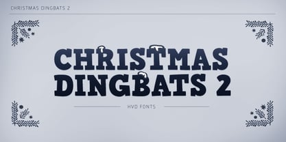
Christmas Dingbats 1 and Christmas Dingbats 2 are two Christmas fonts with different styles. Each font contains more than 90 Christmas icons, borders and ornaments.
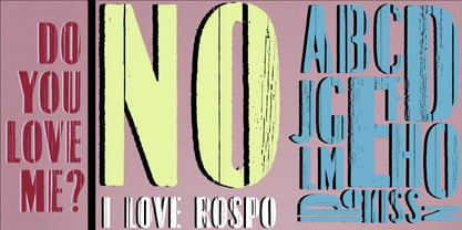
Font Rospo-Wood is two-element font inspired by the weekly "Tygodnik Ilustrowany” from the 1933. Font has three alternative glyphs that are automatically replaced.
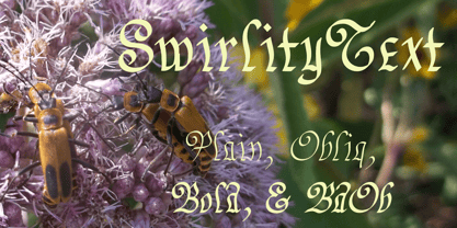
SwirlityText is a fussy, over-the-top calligraphic typeface with lots of curves and wiggles. It comes in two weights, each with an oblique style.
Sure! Qurve Hollow Wide, crafted by the talented Dan Redding, is a distinctive font that immediately catches the eye due to its unique design and broad appeal. This typeface belongs to the larger fam...
Superfly, a creation of Fontalicious, embodies the essence of a design era that is simultaneously nostalgic and forward-looking. With its playful yet structured appearance, Superfly is not just a fon...
The Halcion font, brought to life by the innovative designers at Apostrophic Labs, is a distinctive typeface that seamlessly blends modern flair with a touch of nostalgia. Its creation reflects a car...
Imagine a font that decides to escape the mundane life of letters trapped on a dusty chalkboard, embarking on a dazzling journey into the neon-filled nights of a sci-fi metropolis. That font would be...
The font !CRASS ROOTS OFL by !Exclamachine is an intriguing and captivating typeface that stands out for its raw energy and unapologetic boldness. It's a creation that embodies a fusion of graffiti-i...
The "ROBO" font, designed by George Edward Purdy, is a significant contribution to the typographic world, blending the boundaries between technology and art. At its core, "ROBO" encapsulates the esse...
As of my last update in April 2023, the font "Menace" by Ace Fonts is not a widely recognized or standard font in the vast landscape of typography. However, let me give you a general description of w...
Oh, okay, picture this: BattleLines by Blambot Fonts, it's like the ultimate secret weapon for your design arsenal, especially if you're about to embark on a project that's screaming for that punchy,...
Gamegirl Classic is a charming and nostalgia-infused font that seems to teletransport its audience back to the bygone era of handheld gaming, reminiscent of the iconic Nintendo Game Boy that dominate...
In much the same way that the leading character in Scott McCloud's first full-length graphic novel has given his life to art, Comicraft's John 'JG' Roshell has given HIS life to sculpt a unique font to suit it. Well, not his LIFE, but at least a couple of days. However, unlike the eponymous hero of THE SCULPTOR, you don't have to make a deal with Death to get your own copy of The Sculptor font! You too can letter anything with your bare hands! And a keyboard. And a computer. And some operating programs and software, obvs. Because creating anything is always going to be harder than you think, especially when you have only 200 days to live. Not you, The Sculptor. In all good bookstores now!
Ah, Harrington, the font that dresses for dinner! Imagine if the 19th century decided to take up typography, and right before it put on its top hat, it scribbled down the essence of its spirit. That,...
Colchester by Dieter Steffmann is a font that seems to capture the essence of historical depth and artistic elegance, marrying them into a cohesive typeface that's both visually intriguing and laden ...
The SF Collegiate Solid font, crafted by ShyFoundry, evokes the spirit of academic excellence and sportsmanship that is often associated with college and university life. Its design pays homage to th...
Idolwild by PizzaDude is an intriguing and distinct font that immediately catches your eye due to its unique characteristics and playful energy. Created by Jakob Fischer, the Denmark-based designer b...
Jellyka Castle's Queen, crafted by Jellyka Nerevan, is a font that truly stands out in the realm of typography due to its whimsical and unique design. It belongs to a category of fonts often describe...
The font named Mottek is a distinctive typeface designed by Thomas E. Harvey, which showcases a strong character and a unique aesthetic, making it suitable for various design projects that require a ...
Imagine if your high school chemistry teacher decided to become a typographer, and their first project was to somehow capture the essence of every "Eureka!" moment they ever had in a font. The result...
Billo is an enchanting and playful display font created by the unique font foundry, Fontalicious. It captures the essence of whimsy and fun, perfectly suited for projects that aim to stand out with a...
RomanticFont2, as its name suggests, is a font that breathes life into the essence of romance, elegance, and an exquisite touch of delicateness. Crafted with a keen eye for harmonizing the traditiona...
As of my last update in April 2023, there's no widely recognized or standard font specifically named "Signboard" that's known across major font repositories or among typographic tools; however, the i...
The font "Pea Bethany's Doodles" by Fonts For Peas is an embodiment of whimsy and casual artistry, captivating users with its playful and hand-drawn aesthetic. Created with a light-hearted touch, thi...
Absolutely! Imagine delving into the creative world of typography and stumbling upon a font that's as distinctive and expressive as its name suggests: Johnyokonysm. This isn't just any font; it's a j...
Major Snafu, conceived by the imaginative mind of Vic Fieger, is a typeface that doesn't merely exist within the realm of digital design but actively jumps off the page, daring the viewer to sit up a...
Sailor '87 is a captivating typeface that beckons with the romance and adventure of the open sea, invoking the nostalgic spirit of the 1980s. Its design elegantly merges the robustness of traditional...
The Sex Pistols font captures the raw energy and rebellious spirit of the punk rock movement, much like the iconic band it's named after. This typeface is more than just a collection of letters; it e...
My motivation for designing the Lalibela family (which is based on Bodoni) was to pay homage to Ethiopic script. The script has been around for about 3 000 years, but I took artistic licence to deviate from the original model and add personal touches. I chose Bodoni as a historical model because of its display value and not its text size use because the extreme contrast made it difficult to read at small sizes. A Modern typeface characterized by consistently horizontal stress, flat and un-bracketed serifs, and a high contrast between thin and thick strokes, were the final step in typography two-hundred-year journey away from calligraphy. The austerity, simplicity and greater contrast style was perfected.Contrary to all the refinements in Bodoni, I have revisited calligraphy with the font Lalibela that mimics Ethiopic Script. It was drawn with a much larger x height and less geometric than Bodoni for its primary use as a display font. For example, a lot of italic serifs were added to the roman face as well as 16 additional ligatures to obtain more a feel of calligraphy. I made the serifs thicker and bracket one side with straight steps obtaining a reduced contrast to withstand breaking up at smaller sizes.An additional variant, "Lalibela Alternate" was designed to provide an interesting mixing possibilities with the Bold face for more expressive headlines.
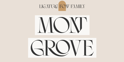
Montgrove is a beautiful serif font that includes an extensive set of ligatures that's too long to list! Montgrove features large extended serifs that help make it a memorable display font. This font works really well for branding projects, editorial layouts, stationery & so many other projects.

Cities often have their own voice, a voice that can be read... in each location and each business, voice portraying a cultural fabric with an array of manifestations. Balneario Script is a small tribute to a coastal port and tourist city. Through the Sign Painters, in its golden age, a clear, friendly, practical, and functional way of making itself heard evolved. Far from wanting to be perfect, a typeface seeks to be close, warm, and casual. Inspired by the gestures of the brush, Balneario Script reverts to the use of “Casual Letters” so used by Sign Painters. In this adaptation, we sought to adjust its morphology to optimize its performance in small formats and extend the system to include lower case letters as part of the set. The set of fonts has two script weights in addition to an all caps version. The design emphasizes creating a harmonious morphological criterion. Friendly, rhythmic, and with a firm stroke Balneario Script is unique, ideal for headlines and short texts that need to be gestural but simple and highly functional. This typeface was designed to be used in promotional posters or for relaxed and fun Packagings. Balneario Script goes beyond constructive or functional aspects. It seeks to capture the smell of the sea, the warm summer breeze and the nostalgic feeling of a city that from its daily life, knew how to forge a unique personality. This atmosphere allows it to host millions of tourists year after year, and with them reinforce their spirit each summer.

«Quotes» is the second typeface calligraphed by Yani Arabena, designed along with Guille Vizzari and Ale Paul, for Sudtipos. Being thrilled by the use of the pointed brush, spontaneous messages, gesture and freshness to represent inspirational phrases and quotes written by hand, «Quotes» comes in two handwriting styles: Script and Caps. «Quotes Script» and «Quotes Caps» are thought together and complement each other filling with rhythm and infinite sensations to the spoken words. A more free and spontaneous version –Script–, joined by an uppercase system –Caps–, that offers a huge amount of alternate glyphs, ligatures and connectors, to enrich different messages brought to life with this type family. «Quotes Script» counts on a great variety of alternate signs in its lowercase as well as its uppercase letters. It hands a combination of ligatures and capital alternates that allows to shape the beginnings and endings of words and phrases intended to be inspiring and to inspire others that read them. «Quotes» also stands for the fashion universe, Gourmet, Natural, the D.I.Y. passionates, and for all those who seek for the Handcrafted spirit and agrees that it adds an added value to its products and in their communication possibilities. Nowadays, new trends in the calligraphic and drawn letters fields, have lead to the use of the brush pen as a daily practice, bringing to life phrases that motivates people to share their thoughts. «Quotes» is a typeface that invites to write, share and influence others to make their own. Sometimes a feeling can’t be explained, but «Quotes» is a font that can.

It is a cute font that imaged a circle that was popular among young Japanese girls in the 1970s and 1980s, plus elements of the current round character as well. The momentum of the circle fads of the 70s and 80s back then seemed to have been great, and it seems that there were schools that prohibited the use of the round letters as students were all writing, too. In addition, a circular letter contest was held, and it seems that the work selected from many entries was released as a phototype. I tried to round up to the limit while incorporating the elements of that circle and the elements of the round letters that the current Japanese girls would write. It corresponds to Hiragana · Katakana · Alphabet · Numerals · Symbols · Kanji(chinese characters). You can also write vertically. You can use it easily, because it contains JIS first · second level, and IBM extended Kanji(about 6700chinese characters). I think that it is an eye-catching design although it lacks a little on readability, so it is also recommended to use it point-wise. The name "Hachimaru" is a thing that touched "80" in the 1980s. The 80s is one of my favorite times. I think that the power to young girls 'Kawaii' such as circle letters, fancy goods and idols was a very strong era. I hope I can express even a little "Kawaii" culture of that unique and unique 80's Japan. <「はちまるポップ」紹介文> 1970年〜80年代に、日本の若い女の子の間で流行した丸文字をイメージし、現在の丸文字の要素もプラスしたかわいいフォントです。 70〜80年代当時の丸文字の流行の勢いは凄かったらしく、学生さんもみな書いていたそうで、丸文字の使用を禁止する学校もあったそうです。 また、丸文字のコンテストが行われ、多数の応募から選ばれた作品が写植書体としてリリースされたこともあるそうです。 その丸文字の要素と、現在の日本の女の子が書くような丸文字の要素も取り込みながら、極限まで丸っこくしてみました。 ひらがな・カタカナ・アルファベット・数字・記号類・漢字に対応しており、縦書きもできます。 漢字はJIS第一水準・第二水準・IBM拡張漢字に対応(約6700文字)しているので、使い勝手も良いかと思います。 可読性には少々欠けますが目を引くデザインだと思うので、ポイント的に使うのもオススメです。 名称の「はちまる」は80年代の「80」をもじったものです。 80年代は私の好きな時代の1つです。丸文字をはじめ、ファンシーグッズやアイドルなど、若い女の子の「かわいい」へのパワーがとても強い時代だったんだなぁと思います。 その個性的で独特な80年代日本の「かわいい」カルチャーを少しでも表現できてればいいなぁと思います。 <スタイルカテゴリー> 手書き風、丸ゴシック

Please note! If you need OTF versions of the fonts, just email us at commercial@typetype.org TT Rationalist useful links: Specimen | Graphic presentation | Customization options We thought, "What if we provide the user with a collection of matching fonts, each of which would still be unique?"—and so we started developing TT Rationalist. For those familiar with the bestsellers TT Norms® Pro and TT Commons Pro, the new font will be intuitive to use. It has similar proportions, characteristics and functionality, but yet it is an independent and original font family. Unlike the geometric sans serifs TT Norms® Pro and TT Commons Pro, TT Rationalist is a slab serif typeface. It is functional and original. Slabs are characterized by massive rectangular serifs, but in TT Rationalist they are trapezoidal and refined, which makes them look modern. Speaking of modernity, when creating the typeface, we wanted to avoid the excessive historicism that can be seen in many slab serif fonts. We have been particularly careful working on the Black style, which in the first sketches had something in common with the Wild West posters. When we balanced out the excessive contrast caused by visual compensation, the font stopped evoking retro associations. Now TT Rationalist Black is perfect for headlines, especially on posters and posters, and works great with Light styles in TT Norms® Pro and TT Commons Pro. The new typeface works well for both headings and text arrays. It looks especially aesthetically pleasing in printed production (books, magazines, brochures). The TT Rationalist typeface consists of 22 two styles: 10 upright, 10 real Italics and two variable fonts, each with over 950 glyphs. It supports over 200 languages and contains 27 OpenType features. In addition to the standard ones, there are Small Capitals for Latin and Cyrillic languages, alternative versions of the ampersand and the letter g. The italics have two stylistic sets allowing to switch the design of style-forming characters (k, v, w, y, z) between italic and classical forms. TT Rationalist font field guide including best practices, font pairings and alternatives. FOLLOW US: Instagram | Facebook | Website
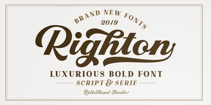
Introducing, Righton - a luxurious font duo that brings a classy and luxury look. It contains two fonts, script and serif, which perfectly pair. They work great if you need a typeface for headlines, logotypes, apparel, invitations, branding, packaging, advertising etc. This typeface is comes in uppercase, lowercase, punctuation, symbols, numerals, stylistic set alternate, ligatures, and also has Multi-Lingual support. We hope you enjoy the font, please feel free to comment if you have any thoughts or feedback. Or simply send me a PM or email me at letterhend@gmail.com
Mak by Tkachenko design, $21.00 Mak is a display font with a Ukrainian feeling inspired by Ukrainian music. This is a big update of the first free two styles of Mak (SemiBold High & Black High) that were created in 2019 and become widespread among free display fonts. The big update wasn't been only adding more weights and contrasts but also changing a lot of glyphs and adding new ones. Now Mak supports all Latin-based languages and European Cyrillic. Experiments with historical forms, contrasts, and daring shapes to create a new image of Ukrainian Cyrillic and Latin based on it.
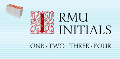
Four fonts entirely of decorative initials of which the uppercase basic letters of RMU Initials One are occupied by Walthari initials, the lowercase ones by Eckmann initials, both released first by Rudhard’sche Gießerei, Offenbach, Germany, about 1900. RMU Initials Two consists of Jubilaeumsinitialen in the uppercases and Augsburger Initialen in the lowercases. RMU Initials Three comes with floral ornaments, whereby the lowercase initials can be colorized by yourself due to non-joining elements. RMU Initials Four consists of hand drawn initials by Rudolf Koch and letters of a former Klingspor font called Queen.
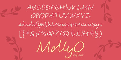
MollyO by Atlantic Fonts, $28.00 MollyO font family is based on the original, reliably cool handwriting of illustrator (and dear friend), MollyO of mollyOcards. Like MollyO herself, this font is unique, unpretentious, and beautiful. Part printed and part script, it has the authentic connections and stops of a contemporary, casual font. For the truest handwritten feel, keep discretionary ligatures on, or turn them off where you want more evenness. MollyO is expressive in all-caps, available in two weights, and with effortless warmth and inky flow, will bring a wide range of creative projects to life.
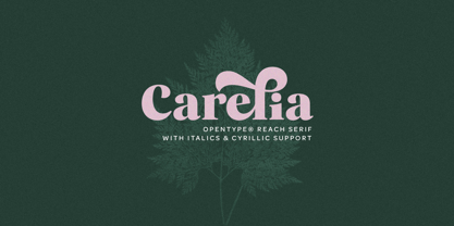
Carelia by My Creative Land, $29.00 Carelia is a modern multilingual (including cyrillic) serif family with classic forms, enhanced by extended OpenType features. It is well suited for all sorts of design - starting from web, to editorial and branding. Its stylistic alternates, swashes and ligatures (more 1200 glyphs in each font) will make your design even more stylized and unique. Carelia comes in two styles Upright and Italic - each has it's own character but both share the same curves and style. Both fonts are fully unicode mapped - can be used in any application of your choice.
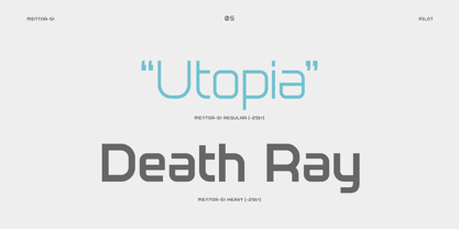
While developing one of their own IP's, Pilot needed a typeface which reflected a developing story with a science fiction theme. Mentor-51 is proudly the first release born out of this IP. It was created by designer and Pilot co-founder Bill Concannon and Brendan Keohane, a graphic designer at the studio. Pilot, located at Boston Design Center, is home to graphic designers and illustrators who enjoy the mix of the two disciplines. Pilot's primary goal is effective brand development through telling brand stories using strategy and art.
