4,471 search results
(0.02 seconds)
- Arum Sans by Australian Type Foundry,
$40.00 A humanist sans-serif family which displays subtle influences of the edged writing tool. Inspired by modern faces such as Chaparral and Enigma, Arum Sans is versatile enough to be used for high-end text setting as well as display purposes. A full international glyph set, extended for European use, allows Arum Sans to play on the field with the big boys.
 - Goberz Tigre by Sipanji21,
$16.00 "Goberz Tigre" is a monoline font with a graffiti theme. It is perfect for a wide range of urban or street-themed design projects, such as streetwear design, logo design, car/motosport decals, skateboard decals, and other similar designs. With its edgy appearance, "Goberz Tigre" brings a sense of energy and attitude to your designs. The font's monoline style that adds visual interest and makes your designs stand out. Whether you're looking to create a strong and impactful design or add a touch of urban style to your projects, "Goberz Tigre" is the font for you.
 - Plain Stupid by PizzaDude.dk,
$17.00 Really, there is nothing stupid about this font. In some strange and weird way, I just thought that the name sounded like something eye-catching - in the same way that the font is eye-catching! It may look like your average comic font, but it's not! I carefully put a lot of funk, twist, comic and a spoonful of pizzadude into each and every letter. The result is a bouncy crazy looking comic font. Oh, I almost forgot - I topped the letters with a spoonful of grafitti mixed with the sounds of a party...that's the recipe for this lovely multilingual font! :)
 - Skate Story by Epiclinez,
$18.00 Skate Story is a stunning hand brush font with a graffiti-style feel. Get inspired by its unique charm, and turn any design project into a true stand-out. This brush typeface is supporting multi-Languages, which include: Afrikaans Albanian Catalan Danish Dutch English Estonian Finnish French German Italian Norwegian Portuguese Spanish Swedish Zulu. Skate Story will look outstanding in any context, whether it’s being used on busy backgrounds or as a standalone headline! You will get : Skate Story Basic Latin A-Z & a-z. Numbers, symbols, and punctuations Swashes Multilingual Support. Accented Characters : ÀÁÂÃÄÅÆÇÈÉÊËÌÍÎÏÑÒÓÔÕÖØŒŠÙÚÛÜŸÝŽàáâãäåæçèéêëìíîïñòóôõöøœšùúûüýÿžß Thank you
 - Calle 26 by Christian Gamba Pardo,
$9.90 This group of icons has graffiti as central theme, based on the most representative images and styles of the artists; Guache, Toxicomano and DjLu. In addition, the 26th Street corridor (also known as El Dorado Avenue) was taken as the main reference because it brings together the work of many important exponents in this type of art; at least locally and nationally. Some icons are characterized by have a similar appearance with the Stencil technique or by have a loose stroke with high contrast. This font can be used in projects and works related to street art.
 - StreetArtist by Graffiti Fonts,
$19.99 This tag font includes full alphabets of uppercase & lowercase letters giving 2 distinct looks as well as interesting substitutions. Street Artist is clean and consistent without sacrificing style. With the StreetArtist font family anyone can easily create their own custom graffiti lettering. This tag style typeface includes 4 styles that can be used alone or in groups to create complex effects that are difficult to render manually. The style is inspired by modern handstyles as written with a chisel-tip marker. The rendering of each glyph is clean and smooth. Well over 200 letters, numbers and symbols are included in each style.
 - Artes by Greentrik6789,
$19.00 Proudly present, Artes groovy layered display font. Inspired by bubble letters in graffiti art and retro style design, it produces a display font with a fun style that is perfect for the design needs of posters, flyers, covers, titles, logos, packaging, t-shirts, branding and various needs that require a unique display font. Activate the Contextual Alternates feature so that the shape of the character changes according to the shape of the character in front of it, and Activate the Stylistic Alternates feature to change the number characters into bubbles that you can use as additional elements in your design.
 - Line Art Eclectrice Aligned by DJ THINK,
$95.00 Thanks for checking out LineArt ECLECTRICE (pronounced EHCK-LEHCK-TREES) Light Aligned font by Rene Toussaint (otherwise known as DJ THINK) of LineArt Foundry and Brand. This font is designed in the vein of graffiti art with stylings of hip-hop and hieroglyphic appearance. Try it in a preview window and check out if it will meet your needs for something cool and hip for your next flyer design or other type of graphic art image. Keep in mind that this is a light design and may require extra thickening in your vector program of choice with outline thickness options.
 - Bomb Da Gone by Prioritype,
$69.00 Start creating new moves. Make cool designs in urban graffiti style. You can apply them to your designs such as t-shirt designs, skateboards, album covers, merchandise, tote bags, landing pages, social media posts, posters, stickers, events etc. See some of the previews above for reference. Features: -Uppercase -Numeral -Punctuation -Multilingual -PUA Encoded -Opentype Features Note: To access the Opentype feature, it would be better if you use a program that supports it and is available with a glyph panel so you can see various alternative characters. Examples of programs such as Adobe Illustrator, Corel Draw or Inkscape. Thanks.
 - StoneWash by Scholtz Fonts,
$15.00 StoneWash is a funky, grunge font, with a monumental marble finish. The font combines an “old as the hills grunge” look with IN YOUR FACE, modern lines. It has a look of very old, washed out denim, about to disintegrate. StoneWash has all of the grunge characteristics: -- it’s dirty and corroded -- it’s coarse & broken -- it’s rough & pitted It also has the characteristics of an African style font: -- it’s ethnic -- it’s irregular -- it’s primitive -- it’s rustic -- it’s vibrant Use StoneWash for a great variety of applications: -- think advertisements - think flyers - think graffiti art - think posters - think magazine pages. You have to have StoneWash.
 - Down The Wall by Hanoded,
$15.00 I have no great love for walls, especially when they are built to keep people out. When I started working on this font, I realized it looked a bit like protest graffiti, found on… yes, walls. Down The Wall is a great little font: it is handwritten, messy and in your face. It has no real baseline and glyphs jump all over the place. Use it for book covers, posters, album covers - anything really. It certainly would look good on a wall too! Comes with a whole bunch of diacritics, so whatever you have to say, the world will understand.
 - Off The Wall JNL by Jeff Levine,
$29.00Off the Wall JNL is a unique typeface that combines graffiti-style lettering with a brick wall background. special keystroke features give you a complete "wall of text": { (left bracket) places a smaller closed end cap on the left side of the text. } (right bracket) places a medium closed end cap on the right side of the text. [ (left brace) places a regular closed end cap on the left side of the text. ] (right brace places a regular closed end cap on the right side of the text. | (vertical bar key) adds a space between words. \ (backslash) adds a larger space between words. - Larisch by HiH,
$8.00 Larisch is a hand-lettered design by the Austrian calligrapher and teacher, Rudolf von Larisch. The original was used for the title page of the 1903 edition of Beispiele Kunstlerischer Schrift (Examples of Artistic Writing). Larisch is an attractive, casual set of caps of even strokes with rounded terminals. Except for the terminals, it is similar in style to Kunstler Grotesk. The numerals are lining or ranging figures, meaning they line up with the baseline, unlike old-style text figures. All are of equal width for setting up columns of numbers. The letters are well formed and easy to read, as you would expect from a writing master. Ligatures includes CH (123), CK (125), FT (135), LA (137), LO (167), OO (172), CO (177) and TT (181. An alternative O with underscore is provided at position 111. Friendly, but not fancy -- a very useful all-cap font.
 - TE Thuluth Golden 2 by Tharwat Emara,
$85.00 Amazing Font of THARWAT which is similar to calligraphy of THULUTH of a real calligrapher. I added many glyphs to get this feature and it becomes easier to a graphic designer to write with Arabic THULUTH font without real calligrapher. Golden2 is beautiful in Headlines of Arabic books and photos. Thuluth font (THARWAT EMARA THULUTH GOLDEN 2) distinguished by its beautiful artistic structures and ready-made sentences to help you design the designer designs and paintings easily. It also retains the beauty of its original Arabic calligraphy. This font can be used in titles of books, magazines and Quranic verses. Also for printing on clothes, Najaf and antiques. It is the first font that you can write complete sentences and Ayat of Quran with beautiful artistic structure like those written by the calligrapher. It also simulates the handwriting and no need to calligraphy it when you have this font.
 - Filistique by URW Type Foundry,
$39.99 Filistique is gracious, flexible, and stylish. In the first sketches of this typeface, the one-line drawing principle was the rule. This principal had to perish soon when more complex characters came up. But still the one-line rule was kept in tradition to maintain the behavior of the natural course of the drawing line. Once writing, the characters joined fluidly into words and slipped easily into sentences like they had always belonged there. They have these natural features maybe somewhat familiar on the first sight. Filistique approaches handwriting but likes to be straight up as well. Please, no Christmas card writing with this character! She is best in shape for finger licking good menus of classy restaurants, lyrics on an album cover of a renowned and utterly cool artist, for a letter to your precious loved one and of course for making a hell of an impression anyway!
 - PF Kids Pro by Parachute,
$79.00 This is not just a typeface inspired by a kid’s first attempts to write. This is in fact how exactly a kid writes. Alexandros Papalexis was born again kid when he became a father. This series came about while designing his daughter’s birthday invitations. Since its first release, it has been constantly on our most wanted list. You step into a supermarket, a bookstore or a clothing store and you see tens of products using this typeface. Anything from baby products, food, clothing, children’s books and magazines, print and TV campaigns, you name it. But don't just stick to the name. Every single weight serves the right purpose. This is why this typeface has also been used extensively for grown-up market. Recently, it was upgraded to include Latin, Greek and Cyrillic. Furthermore, the accompanied series of pictograms was completed and loaded with 125 western and eastern European pieces.
 - Villosophie by Pinakiaa Studios,
$15.00 Hey, I'm glad you're here to check out my font! Villosophi is a fun, and adorable handwritten brush script for your beautiful writing. Villosophie is made with love with a brush and It is suitable for logos, titles, product packaging, merchandise, quotes or writing for t-shirt designs. Come try it yourself in the preview section to see this font, what you see is what I made for you! To achieve that adorable handlettered feel, Villosophie comes with a full set of alternative lowercase letters as well as 21 ligatures to play with, giving you a variety to choose from before using. If you use software that supports OpenType, everything is included in the main font that will come to life as you type. Otherwise, I've also included Alternative and Ligature as a cute font pair for you to use. Any question? Contact me and I'll be happy to answer!
 - Ongunkan South Arabian Script by Runic World Tamgacı,
$49.99 The Ancient South Arabian script (Old South Arabian 𐩣𐩯𐩬𐩵 ms3nd; modern Arabic: الْمُسْنَد musnad) branched from the Proto-Sinaitic script in about the 9th century BCE. It was used for writing the Old South Arabian languages Sabaic, Qatabanic, Hadramautic, Minaean, and Hasaitic, and the Ethiopic language Ge'ez in Dʿmt. The earliest inscriptions in the script date to the 9th century BCE in Yemen. There are no letters for vowels, which are marked by matres lectionis. Its mature form was reached around 800 BCE, and its use continued until the 6th century CE, including Ancient North Arabian inscriptions in variants of the alphabet, when it was displaced by the Arabic alphabet In Ethiopia and Eritrea, it evolved later into the Ge'ez script, which, with added symbols throughout the centuries, has been used to write Amharic, Tigrinya and Tigre, as well as other languages (including various Semitic, Cushitic, and Nilo-Saharan languages).
 - RAYOH by Product Type,
$13.00 Rayoh is a stylish and freedom-loving graffiti display font. With two variations available, regular and shadow, this font gives a unique touch to projects that require rich and beautiful handwriting. With Rayoh, you can bring freedom and creativity to your designs. This font combines bold graffiti and beautiful handwriting elements to create an amazing combination. Expressive designs and bold characters make Rayoh the perfect solution for projects that want to stand out. With this font, you can create a striking poster, a cool merchandise design, or unforgettable promotional material. Their different variations provide flexibility in customizing the desired style and effect. Use regularly for a plain look and bring out the beauty of handwriting, or choose shadow for a dramatic shadow effect that adds depth and dimension to your design. Rayoh is the right choice for those who want to add a touch of freedom and uniqueness to their creative projects. Immediately choose Rayoh as your flagship font and see how your design steals attention and attracts potential customers in no time. What’s Included : - File font - All glyphs Iso Latin 1 - Ligature, Alternate - We highly recommend using a program that supports OpenType features and Glyphs panels like many Adobe apps and Corel Draw, so you can see and access all Glyph variations. - PUA Encoded Characters – Fully accessible without additional design software. - Fonts include Multilingual support
 - Korpen Tag by Mans Greback,
$69.00 Korpen Tag is a cool and edgy graffiti font that captures the essence of street art and urban culture. With its tag-inspired handwriting and paintbrush strokes, this font brings an authentic and vibrant touch to your creative projects, making them feel dynamic and alive. Ideal for streetwear branding, album covers, posters, and other projects that require a cool, contemporary vibe, Korpen Tag is an uppercase font that adds a raw, energetic touch to your designs. Its distinctive style makes it a great choice for projects that need to stand out and make an impact. The Korpen Tag font family includes four high-quality styles to suit various design needs: Regular: A free-flowing, paintbrush-inspired graffiti style Upright: A more controlled, vertical version of the regular style Bold: A heavier, bolder version for more impactful designs Bold Upright: Combines the boldness of the bold style with the structure of the upright style Built with advanced OpenType functionality, Korpen Tag ensures top-notch quality and provides you with full control and customizability. It includes stylistic alternates, ligatures, and other features to make your designs truly unique. It has extensive lingual support, covering all Latin-based languages, from Northern Europe to South Africa, from America to South-East Asia. It contains all characters and symbols you'll ever need, including all punctuation and numbers.
 - Linkpen Primary by Linkpen Handwriting Fonts,
$10.00 Linkpen Primary is a font family for teaching handwriting. It is designed to be used by teachers and parents to help children or adult learners practice their handwriting, at home or at school. Linkpen Primary gives you endless possibilities for creating your own educational resources - worksheets, signs, labels, etc. - to appeal to your learners and get them interested and passionate about learning to write. This versatile font family contains 24 styles, each with special features that support learning to write. For ultimate flexibility, styles are available with and without guide lines, and in regular and italic versions. The styles can each be purchased separately or as a complete family value pack. The letter shapes have been designed to be clear, simple and easy to read. There are 12 print styles designed for beginners or younger children, to allow them to practice writing the letter shapes. The print fonts all come in Regular, Guide, Dotted, Dotted Guide, Outline, and Arrow styles, to give learners different ways to build their confidence creating the letter shapes. There are 12 Join fonts, for when your learners are ready to progress onto joined up handwriting. The Join fonts automatically join up as you type on your computer, tablet, or interactive whiteboard, producing beautiful, neat, clear joined up text for your classroom or home resources. The Join fonts come in Regular and Dotted styles, as well as a special Connect style which highlights the join between letters, to help your learners make the transition from printed writing to joined up. The Join fonts are created with OpenType Contextual Alternate rules, which ensure that the joins are always formed correctly, depending on the context of each letter within a word. Compatible with Microsoft Word and Publisher 2010 onwards (desktop version), SMART Notebook 18 onwards, Pages and Keynote for iOS, TextEdit for macOS, LibreOffice 6, Notepad for Windows, and Promethean ActivInspire Version 2.21 onwards.
 - Lansbury - 100% free

- Frames 1 by Intellecta Design,
$34.90Frames 1 consists of a series of frames scanned at a low resolution. The result when magnified is a bitmapped image that looks like a black and white mosaic. - Chisel by Linotype,
$29.99An inline version of the Latin bold condensed, and designed on the suggestion of Robert Harling. There is a double white line, which was originally engraved in Latin type. - Vianova Serif Pro by Elsner+Flake,
$59.00 The font superfamily Vianova contains each 12 weights of Sans and Slab and 8 weights of the Serif style. The design from Jürgen Adolph dates back into the 1990s, when he studied Communication Design with Werner Schneider as a professor at the Fachhochschule Stuttgart. Adolph started his carrier 1995 at Michael Conrad & Leo Burnett. He was responsible for trade marks as Adidas, BMW, Germanwings and Merz. He has been honored as a member of the Art Directors Club (ADC) with more than 100 awards. On February 26, 2014, Jürgen Adolph wrote the following: “I was already interested in typography, even when I could not yet read. Letterforms, for instance, above storefronts downtown, had an irresistible appeal for me. Therefore, it is probably not a coincidence that, after finishing high school, I began an apprenticeship with a provider of signage and neon-advertising in Saarbrücken, and – in the late 1980s – I placed highest in my field in my state. When I continued my studies in communications design in Wiesbaden, I was introduced to the highest standards in calligraphy and type design. “Typography begins with writing” my revered teacher, Professor Werner Schneider, taught me. Indefatigably, he supported me during the development of my typeface “Vianova” – which began as part of a studies program – and accompanied me on my journey even when its more austere letterforms did not necessarily conform to his own aesthetic ideals. The completely analogue development of the types – designed entirely with ink and opaque white on cardboard – covered several academic semesters. In order to find its appropriate form, writing with a flat nib was used. Once, when I showed some intermediate designs to Günter Gerhard Lange, who occasionally honored our school with a visit, he commented in his own inimitable manner: “Not bad what you are doing there. But if you want to make a living with this, you might as well order your coffin now.” At that time, I was concentrating mainly on the serif version. But things reached a different level of complexity when, during a meeting with Günther Flake which had been arranged by Professor Schneider, he suggested that I enlarge the offering with a sans and slab version of the typeface. So – a few more months went by, but at the same time, Elsner+Flake already began with the digitilization process. In order to avoid the fate predicted by Günter Gerhard Lange, I went into “servitude” in the advertising industry (Michael Conrad & Leo Burnett) and design field (Rempen& Partner, SchömanCorporate, Claus Koch) and worked for several years as the Creative Director at KW43 in Düsseldorf concerned with corporate design development and expansion (among others for A. Lange & Söhne, Deichmann, Germanwings, Langenscheidt, Montblanc.”
 - Vianova Slab Pro by Elsner+Flake,
$59.00 The font superfamily Vianova contains each 12 weights of Sans and Slab and 8 weights of the Serif style. The design from Jürgen Adolph dates back into the 1990s, when he studied Communication Design with Werner Schneider as a professor at the Fachhochschule Stuttgart. Adolph started his carrier 1995 at Michael Conrad & Leo Burnett. He was responsible for trade marks as Adidas, BMW, Germanwings and Merz. He has been honored as a member of the Art Directors Club (ADC) with more than 100 awards. On February 26, 2014, Jürgen Adolph wrote the following: “I was already interested in typography, even when I could not yet read. Letterforms, for instance, above storefronts downtown, had an irresistible appeal for me. Therefore, it is probably not a coincidence that, after finishing high school, I began an apprenticeship with a provider of signage and neon-advertising in Saarbrücken, and – in the late 1980s – I placed highest in my field in my state. When I continued my studies in communications design in Wiesbaden, I was introduced to the highest standards in calligraphy and type design. “Typography begins with writing” my revered teacher, Professor Werner Schneider, taught me. Indefatigably, he supported me during the development of my typeface “Vianova” – which began as part of a studies program – and accompanied me on my journey even when its more austere letterforms did not necessarily conform to his own aesthetic ideals. The completely analogue development of the types – designed entirely with ink and opaque white on cardboard – covered several academic semesters. In order to find its appropriate form, writing with a flat nib was used. Once, when I showed some intermediate designs to Günter Gerhard Lange, who occasionally honored our school with a visit, he commented in his own inimitable manner: “Not bad what you are doing there. But if you want to make a living with this, you might as well order your coffin now.” At that time, I was concentrating mainly on the serif version. But things reached a different level of complexity when, during a meeting with Günther Flake which had been arranged by Professor Schneider, he suggested that I enlarge the offering with a sans and slab version of the typeface. So – a few more months went by, but at the same time, Elsner+Flake already began with the digitilization process. In order to avoid the fate predicted by Günter Gerhard Lange, I went into “servitude” in the advertising industry (Michael Conrad & Leo Burnett) and design field (Rempen& Partner, SchömanCorporate, Claus Koch) and worked for several years as the Creative Director at KW43 in Düsseldorf concerned with corporate design development and expansion (among others for A. Lange & Söhne, Deichmann, Germanwings, Langenscheidt, Montblanc.”
 - Vianova Sans Pro by Elsner+Flake,
$59.00 The font superfamily Vianova contains each 12 weights of Sans and Slab and 8 weights of the Serif style. The design from Jürgen Adolph dates back into the 90th, when he studied Communication Design with Werner Schneider as a professor at the Fachhochschule Stuttgart. Adolph started his carrier 1995 at Michael Conrad & Leo Burnett. He was responsible for trade marks as Adidas, BMW, Germanwings and Merz. He has been honoured as a member of the Art Director Club (ADC) with more than 100 awards. On February 26, 2014, Jürgen Adolph wrote the following: “I was already interested in typography, even when I could not yet read. Letterforms, for instance, above storefronts downtown, had an irresistible appeal for me. Therefore, it is probably not a coincidence that, after finishing high school, I began an apprenticeship with a provider of signage and neon-advertising in Saarbrücken, and – in the late 1980s – I placed highest in my field in my state. When I continued my studies in communications design in Wiesbaden, I was introduced to the highest standards in calligraphy and type design. “Typography begins with writing” my revered teacher, Professor Werner Schneider, taught me. Indefatigably, he supported me during the development of my typeface “Vianova” – which began as part of a studies program – and accompanied me on my journey even when its more austere letterforms did not necessarily conform to his own aesthetic ideals. The completely analogue development of the types – designed entirely with ink and opaque white on cardboard – covered several academic semesters. In order to find its appropriate form, writing with a flat nib was used. Once, when I showed some intermediate designs to Günter Gerhard Lange, who occasionally honored our school with a visit, he commented in his own inimitable manner: “Not bad what you are doing there. But if you want to make a living with this, you might as well order your coffin now.” At that time, I was concentrating mainly on the serif version. But things reached a different level of complexity when, during a meeting with Günther Flake which had been arranged by Professor Schneider, he suggested that I enlarge the offering with a sans and slab version of the typeface. So – a few more months went by, but at the same time, Elsner+Flake already began with the digitilization process. In order to avoid the fate predicted by Günter Gerhard Lange, I went into “servitude” in the advertising industry (Michael Conrad & Leo Burnett) and design field (Rempen& Partner, SchömanCorporate, Claus Koch) and worked for several years as the Creative Director at KW43 in Düsseldorf concerned with corporate design development and expansion (among others for A. Lange & Söhne, Deichmann, Germanwings, Langenscheidt, Montblanc.”
 - Nouveau Thin JNL by Jeff Levine,
$29.00 A condensed, light face spurred serif alphabet was shown on an antique catalog page from Spon & Chamberlain Publishers as “French”. The catalog likely sold tools and dies to stonecutters for making inscriptions in marble, granite and so forth. This elegant design is available digitally as Nouveau Thin JNL in both regular and oblique versions.
 - Caesar Dressing Pro by Open Window,
$19.95 Caesar Dressing is a 'Markers' take on a Greek alphabet. Open Window fonts gravitate towards more experimental or spontaneous renderings and this one doesn't look out of place next to the most experimental of those. It also maintains the geometric balance of a classic Greek-font quite effectively. Designed by Dathan Boardman of Open Window.
 - Makika Sun by Andinistas,
$39.00 Makika Sun enhances the handwritten expressive possibilities of an architect mom and a graphic designer dad in Bogotá, Colombia. In other words, it is a versatile handwritten font family designed for writing short messages in children's contexts. Makika Sun shines for its conceptualization and logic, combining ideas from the American calligrapher Austin Norman Palmer and the Italian calligrapher Ludovico degli Arrighi. Makika Sun, a creative font family specializing in titles and paragraphs for children's books, emerged in 2009 and has developed over the years. Its essence lies in the simplicity of handwriting. In 2023, Makika Sun was applied in the book "Secret Files Tardigrades 1" for children ages 5-6 on Amazon from MyMicroSchool. The main goal of Makika Sun is to emulate handwriting that is legible and accessible to everyone. Makika Sun stands out for its readability and uncomplicated, artisanal style. It offers four typographic styles that simulate different calibers of markers: thick tip (Makika Sun Black), medium tip (Makika Sun Bold), normal tip (Makika Sun Regular) and Makika Sun Dingbats, a set of arrows and figures perfect to enrich your writing. . In short, Makika Sun's versatility and stylistic uniformity make it easy to create writing in various typographic settings. Its typographic heart communicates harmony in messages meticulously designed for spontaneous contexts that require high readability. Makika Sun offers a dynamic range of styles in 4 fonts notable for their outstanding performance in the field of children's book design and the creation of playful brand identities.
 - Karlo by The Northern Block,
$28.95 Karlo is a super family of several branches, originating in the same lightweight skeleton. The lightweights are based on a pen of an even stroke-width. Inspired by the writings of calligrapher Edward Johnston, the family moves on in two directions in the heavier weights. Johnston demonstrated that the broad nib pen can produce different writing styles. Following this, one heavy weight has a humanistic low stroke contrast (KarloSerifBold and KarloSansBold), and another has a high stroke contrast of vertical axis with references to the 19th century jobbing typefaces (KarloOpen). The latter is inspired by Johnston’s demonstration of the broad nib pen, where he suggested fastening two pencils together. With each pencil representing an edge of the pen, it becomes more evident how the pen works in writing. The friendly informal look makes KarloSans and KarloSerif usable for both running text and for display sizes. KarloOpen, on the other hand, is solely designed for display purpose showing few words at a time. In Denmark, a guy named Karlo would typically be an old fellow with a slick hairstyle that makes an effort with his appearance. He is a handyman who can do a bit of this and that when needed. He is a happy go lucky kind of guy that takes one day at a time. To me, the typeface family has some of the same qualities. Check out Pyke which is a great pair for Karlo.
 - Sigmund Freud Typeface by Harald Geisler,
$29.00 “For those who regret what keyboards and touch screens have done to their penmanship, typographer Harald Geisler has an answer: Sigmund Freud.” — The Wall Street Journal Sigmund Freud was a neurologist who lived from 1856 to 1939. His research and studies led to the foundation of ‘Psychoanalysis’. When I first saw Freud’s century old letters, I was fascinated by the beauty of these historic manuscripts. It made me smile to imagine a person writing his or her shrink a letter set in Freud’s handwriting. I started to plan creating a font based on his manuscripts. I contacted the Sigmund Freud Museum Vienna and Freud Museum London. To start the creation I selected eight handwritten documents from the archive in Vienna – This selection of specimen was my orientation during the design process. The Samples were created between 1883 to 1938 and are of various character such as handwritten scientific papers, personal letters, notes and a telegram. A successful Kickstarter Campaign "The Sigmund Freud Typeface - A Letter to your Shrink" with over 1400 Backers enabled me to visit the archive in Vienna and study the original manuscripts of Sigmund Freud. After a year of preparation and design work, I finished four alphabets based on Freud’s handwriting. What are the different Versions PRO, Kurrent, #1, #2, #3 and #4 about? “This project gives people the convenience afforded by the computer while maintaining the romantic nostalgia, beauty, and character of letter writing with real handwriting.” — Daniel Vahab, The Huffington Post When you write with your hand, every letter looks a little different. When you write a text on your computer every letter looks exactly the same. In order to make type look like handwriting, I chose four different variations of each letter from Freud’s manuscripts, drew and stored them in the font. The font is then programmed to exchange letters while you are typing. This makes the rendered result on your screen or print look like unique handwriting. PRO While you are typing… the PRO Version actively combines all four alphabets and exchanges them automatically. Through this mechanism never the same two o’s will stand next to each other. With every touch a unique look is generated. This works in certain applications i.e. Word 2010(or newer), Pages, TextEdit, Editor(Pre-installed on Windows 7 or newer), InDesign, Illustrator… →Here you can see an animation of what this effect looks like in action. (Please Note: some applications like LibreOffice, OpenOffice do currently not support this feature. Date: December 2013) #1 #2 #3 and #4 The Sigmund Freud Typeface #1, #2, #3 and #4 each hold one individual lowercase alphabet based on Freud’s handwriting. Kurrent Most of Freud’s correspondence was written in German. Until the 1950′s a different handwriting was taught throughout German speaking countries (Switzerland, Austria, Germany). This style is called Kurrent. The name Kurrent and Cursive derive from the Latin word currere - to run, hurry - both styles were designed to write fast. As you can see in the samples above, Freud practiced both Kurrent and when writing english Cursive (Latin script or Joined-up). Kurrent has three significantly different letters (s,h,e). Use Kurrent to render the authentic look of an historic Sigmund Freud letter in German. Bundle On the Top of this page you can get all six fonts of the Sigmund Freud Typeface Family in a bundle. International Typeface All styles of the Sigmund Freud Typeface feature a wide range of accented letters so you can write to all your friends in Sweden (Bjørn) France (Chloé & Zoë), Ireland (Dáirine), Poland (Łucja), Germany (Jörg) and almost everywhere around the globe (Find a complete list in the tech specs). Usage recommendations I hope that this design will be valuable to you and most of all that you have fun with this typeface! 1. Point Size — To reproduce the size of Sigmund Freud’s handwriting adjust the type size between 18-24 point in your word processor. If you are using an imaging software like Photoshop set the resolution to 300dpi and adjust the point size between 18-24. 2. Line Spacing — Narrow the line hight until swashes of capital letters touch the baseline above. This also happens when you write a letter and gives the document a unique handwritten look. 3. Right Aligned — Freud had the habit to write towards the right edge of the page and start loosely on the left. Set your text alignment to ‘right’ to incorporate this dramatic expression also to your documents. What do other People say about the Sigmund Freud Typeface? “Wouldn’t you love to write a letter to your shrink using the Sigmund Freud typeface?” — Dorothy Tan, Design TAXI ''“JUST DON’T WRITE A LETTER TO YOUR MOTHER WITH IT… …until the reader looks a bit closer, and they see 70+ years of modern science weighing in on turn-of-the-century pop psychology."'' — Mark Willson, Fast Company “Doctor, what does it mean if you dream of creating a font of Freud’s handwriting?” — Ayun Halliday, Open Culture “…geekily romantic, at once artistic and scientific” — Edie Jarolim, Freud’s Butcher “…sympathisch” — Jürgen Siebert, Fontblog !WOW! Thank you for reading the complete font description! You are awesome! If you still have a question please contact me through MyFonts or my website haraldgeisler.com. Credits This project was made possible by the help of 1481 Backers on Kickstarter and the kind support of the Sigmund Freud Museum Vienna and the Freud Museum London. Thank you. All of Freud’s Manuscripts shown are © Sigmund Freud Museum Vienna. Poster Image: IN17 - Sigmund Freud, Germany 1932. © Freud Museum London. Flag Image: IN19 - Sigmund Freud 1930’s. © Freud Museum London.
 - Compacta by ITC,
$39.00 Compacta is the work of Fred Lambert and is reminiscent of the extremely narrow, sans serif stencilled fonts of the 1920s, then intended as titles or headlines for magazines and posters. The characters of all cuts are narrow and the space between letters is very small. The white spaces between strokes are perceived almost as only small white stripes and dots which stand out from the black bands of the lines of text. Compacta is not meant for longer texts but is impressive in titles and headlines.
 - Compacta MT by Monotype,
$29.00 Compacta is the work of Fred Lambert and is reminiscent of the extremely narrow, sans serif stencilled fonts of the 1920s, then intended as titles or headlines for magazines and posters. The characters of all cuts are narrow and the space between letters is very small. The white spaces between strokes are perceived almost as only small white stripes and dots which stand out from the black bands of the lines of text. Compacta is not meant for longer texts but is impressive in titles and headlines.
 - Written By Hand by Trim Studio,
$14.00 Written By Hand, a handmade font that is taken from the real hand style of writting, its so realistic to used for many branding and personal identity style, especially for its messy stlye of writting Its perfectly suited for crafter and graphic artist to complete their design such as invitation, advertisement, poster, logo, birthday, product sign, and many more! Buttier also Lightweight, even so contains All Standard glyphs and punctuations
 - Swank by ITC,
$29.99Jill Bell's typefaces are energetic, highly decorative, and refreshingly unpredictable. Some are friendly and childlike, while others are rough and nervous. Her latest creation is ITC Swank, a connected script whose shabby-chic" sophistication communicates a worn elegance. Bell begins the design process "with black stuff on white paper," she explains, preferring to draw letters before she digitizes them. Often the inspiration for her typefaces comes from a piece of hand-lettering. "Bruno began as a reminder to buy cat food," she says, "and ITC Swank started out as a small bit of lettering for Wurlitzer Pianos." Bell finds that working with blocks of lettering is a good start for script typefaces. "If I'm drawing a script typeface, I have to write out sentences in the letters first," she explains. "Drawing each letter separately doesn't establish the flow and spontaneity that scripts deserve." Bell's newest design is ITC Swank. It's a somewhat tattered formal script with definite links to early copperplate scripts. Though probably not for wedding invitations, Swank's elegant underpinnings are evident, with its slightly narrow proportions and a baseline that can best be called "bouncy." Graphic designers will appreciate the abundance of swash letters, making it easy to create distinctive headlines and short blocks of copy. Bell has a fondness for the "open, genuine" quality of Chinese and Japanese calligraphy. "Eastern styles incorporate the natural flow of the hand," she says. "Natural, human qualities shine through. Mistakes are accepted, not scorned as in the 'white-out' Western culture." This philosophy is evident in Bell's own designs. Whether it's ITC Clover 's carefree spirit, the slightly spooky Hollyweird, Caribbean 's< rustic charm or the weathered elegance of ITC Swank, there is a natural honesty in her work." - Halloween Rules by AEN Creative Studio,
$15.00 Halloween Rules is a cool-lettered and spooky decorative font. It is perfectly suitable for any Halloween-related project or crafty idea! Add it confidently to your favorite creations and let yourself be amazed by the outcome generated. Halloween Rules is PUA encoded, which means you can access all of the glyphs and swashes with ease!
 - Jossie by Olivetype,
$18.00 Jossie is a cool brush font. The style is a little bit rough, suitable for all of your logos, branding, social media, and crafty DIY projects. Features : Basic Latin A-Z & a-z Numbers Symbols, and punctuations Ligatures and swashes Multilingual support: from Afrikaans Albanian Catalan Danish to Dutch English Spanish Swedish Zulu. Accented Characters : ÀÁÂÃÄÅÆÇÈÉÊËÌÍÎÏÑÒÓÔÕÖØŒŠÙÚÛÜŸÝŽàáâãäåæçèéêëìíîïñòóôõöøœšùúûüýÿžß Thank you
 - Violetail by Balpirick,
$15.00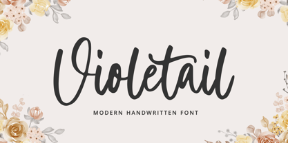 Violetail is a Modern Handwritten Font. Violetail Modern is an elegant and dainty handwritten font that features sweet and delicate swashes. This original look will appeal to a wide range of crafty ideas, from letterheads and titles, to stationery. Violetail also multilingual support. Enjoy the font, feel free to comment or feedback, send me PM or email. Thank you!
 - J.M. Nexus Grotesque - Personal use only


