10,000 search results
(0.034 seconds)
- Barlouth by Pixesia Studio,
$10.00 Introducing Barlouth - A Modern Handwritten Font Barlouth is a delicate, elegant and flowing handwritten typeface with lovely and well-balanced characteristics. Its soft curves and natural writing make it distinct and beautiful. Barlouth gives lovely typographic harmony for a wide range of design needs, including quotes, poster design, personal branding, promotional materials, logotype, product packaging, etc. Add it to your most creative ideas and see how they come to life! FEATURES - Stylistic Alternates - Ligatures - Uppercase and Lowercase letters - Numbering and Punctuations - Multilingual Support - Works on PC or Mac - Simple Installation - Support Adobe Illustrator, Adobe Photoshop, Adobe InDesign, also works on Microsoft Word Hope you Like it. Thanks.
 - Averie Brenton by Grezline Studio,
$18.00 Averie Brenton is an elegant serif font family. Perfectly to be applied to various forms such as invitations, labels, logos, magazines, books, greeting / wedding cards, packaging, fashion, make up, stationery, novels, labels or any type of advertising purpose. Feature : Alternates and Ligatures Multilingual Language Works on PC & Mac Simple installations Accessible in the Adobe Illustrator, Adobe Photoshop, Adobe InDesign, even works on Microsoft Word. We highly recommend using a program that supports OpenType features and Glyphs panels like many of Adobe apps and Corel Draw, so you can see and access all Glyph variations. Thank You! Grezline Studio – Akhmad Reza Fauzi Contact : grezline.studio@gmail.com
 - Chilango by Ed Garland,
$28.00 Chilango is a beautiful new typeface based on the gorgeous hand-painted street signs of Mexico City.., It come with 7 weights and a unique Italic family. Throughout Mexico City, from the Centro Historic (Zocalo) through La Condessa, Polanco and Guerrero - from La Roma to San Rafael to Atlampa to Lomas, you can be sure to see the iconic hand painted blue with white lettered street signs wherever you go. It is an exuberant and flourishing font that represents this fabulous flourishing city to its core. It is a historical one, classy and stylish and deeply routed in the curvature and designs of the Spanish heritage.
 - Klapt by SevenType,
$24.99 Klapt is a geometric sans serif family that is soft on the outside and sharp on the inside. This family of four weights, includes an extended character set supporting most Latin languages even Vietnamese! Klapt, which can be bold or very elegant, is well suited for designs ranging from branding and corporate identity to editorial design and also web design. It is great for display purposes especially for headlines, posters, magazines, book covers, logos... you name it! Feel free to share your designs using Klapt or just get in touch via email to hi@seventype.com. Need extended Cyrillic support? We've got you covered https://www.myfonts.com/fonts/seventype/klapt-cyrillic/
 - Nantua Flava by Characters Font Foundry,
$25.00 Nantua Flava XL is a display font by heart. It's preferably seen on posters or flyers. It's inspired by the Op Art style of lettering in the USA from the 1960s and 70s. But it holds also very futuristic elements so it work very well on futuristic techno party flyers and posters. Nantua Flava XLi speeds up your design. It's powerful as a Ferrari engine, strong as a steam locomotive. The very close innerforms and low contract make it perfectly suited for background patterns as well as big headline texts. The stiff little brother of this is simply called Nantua. They are a happy family.
 - Perola by IKIIKOWRK,
$17.00 Introducing Perola - Fancy Type, created by ikiiko. Perola means "pearl" and comes from spanish language. This letter has a distinctive feature on its hook, which is in the form of a unique and dynamic curve. This letter is suitable if you want to show a cheerful impression or playful design with solid color. This typeface is perfect for an cute branding, pop art design, packaging product, food & beverages, quotes, or simply as a stylish text overlay to any background image. What's included? Uppercase & Lowercase Number & Punctuation Multilingual Support Works on PC & Mac Enjoy our font and if you have any questions, you can contact us by email : ikiikowrk@gmail.com
 - Cooper Black by Linotype,
$40.99 Oswald Bruce Cooper designed Cooper Black, an extra bold roman face, based on the forms of his earlier typeface Cooper Old Style, which appeared with Barnhart Brothers & Spindler Type Founders in Chicago. Copper Black was produced by Barnhart in 1922 and acquired in 1924 by the Schriftguß AG in Dresden, where it was later completed with a matching italic. Although Cooper Black appeared in the first third of the 20th century, it still looks contemporary and it can be found on storefronts in almost any city scene. The flowing outer contours create forms that are both strong and soft, making Cooper Black an extremely flexible font.
 - Monod by Resident,
$40.00 Created in 2009 by V.H. Fleisher, Monod is a geometric sans-serif typeface. The font has OpenType features that can be accessed in programs like the Adobe Creative Suite. These features include titling caps which are heavier & more tightly spaced than the regular caps, alternative punctuation marks, and arbitrary nut fractions (for single digit numerators & denominators). By clicking on the "gallery" tab above, you can see an illustration of the OpenType features. The "ff" tab on the "Sample Text" bar below allows you to test the OpenType features with your own text. Supported languages include: Albanian, Czech, Danish, Dutch, English, Faroese, Finnish, French, German, Icelandic, Italian, Norwegian, Portuguese, Spanish & Swedish.
 - Cruller by Wordshape,
$20.00 Cruller is a display typeface that is based on a rare bit of lettering from a 1910 German lettering book. What was the inspiration for designing the font? I found the base lettering years ago in a specimen and scanned it. I've used it perennially for assorted metal bands' logos, and finally decided to digitize it. What are its main characteristics and features? It is a spidery bit of lettering that would work well in Harry Potter movies or on album covers. Usage recommendations: Display type for use in materials that are meant to have a hand-wrought look circa the turn of the century.
 - Agatha by TipoType,
$25.00 2015 First Prize TipoType award. Agatha is a new typeface for titles and short texts in big sizes. It can be use both in editorial publishing and brand design. From gothic geometric bases, the letters resemble the Nordic style in order to be more feminine, rhythmical and vertical. The two versions, Regular & Outline, let the designer choose between two contrasts: one heavy version that emphasize the rhythm and a lighter one that intensifies the subtlety. The third version, Blossom, combines light and color with ornaments that highlight the style. The three fonts have in addition a ligature set and some decorative glyphs that increase the possibilities of use.
 - Blue Venom by Linecreative,
$16.00 Blue Venom is a unique typography with a modern style, Each letter is cut into two parts, the first consists of three labyrinthine combined lines and the other is a diagonal cut line, so that the combination of these two parts into one letter that looks stunning , and each letter consists of four character choices, two character choices for numbers, and equipped with Ligatures (Opentype feature) All character options are included in one font. You can use alternatives in most major image editors, just find the Glyps (Alternate) menu item there. For example, in Adobe Illustrator you need to select the Window / Type / Glyphs menu item.
 - Psychedelic Xylophones by Mysterylab,
$22.00 Perfect in its imperfection, Psychedelic Xylophones is a retro trippy hippie font that brings a hand-lettered groove to your text graphics. It features a large complement of two-character alternate glyphs that adds a subtle sway and an ebb-and-flow that results in some customized surprises and other more subtle variations to your text. It's great for that bendy, melty, warped headline psychedelic poster thing. Try it on retro t-shirt messages and surf/skate graphics, or a daring branding choice for drink or snack packaging. The alternate glyphs are turned on by default but can be over-ridden easily in the Glyphs panel of many popular software packages.
 - Mittelhorn by High Peak,
$23.00 Mittelhorn is a clean, readable, distinctive neo-grotesque. Use it for logotypes, web, signage, or editiorial design. Make a statement and choose one of the alternate sick glyphs… Main features: The family comes in three weights and matching italics Reinterpreted numbers and punctuation Comprehensive character sets for Western and Central European language Selected alternate uppercase sick glyphs for extra character Each glyph in this family was crafted with intention and care. It is a creative yet versatile and very readable font that you can easily use on a range of applications - headlines, billboards, signage, web copy, editorial, publishing… Most of all, have fun with it!
 - Geller Sans by Ludka Biniek,
$29.00 Geller Sans typeface have been developed based on his serif predecessor’s proportions. He’s quite handsome, quite organised. Looking at thin–extraheavy styles he has enough of charm to stand out in advertisement. In text styles you can relay on him. He’s able to meet demand of complex design tasks. Geller Sans has been fitted with wide range of OpenType features. As Geller Serif, he has bullets & dingbats, for easier entry-point making. Entire font family comes in 4 width (Regular, Narrow, Condensed, Compressed). Each width finds its best application in different typographic fractions what makes Geller Sans easy to apply in editorial graphic design. Who’d like to challenge him?
 - Scriptek by ITC,
$29.99 Scriptek was created by British designer David Quai in 1992, based on the constructivist forms which became popular after the First World War with the progressing industrialization in Moskow. Typefaces such as Scriptek were often used in the propaganda of totalitarian political systems and can still be seen on monuments like the central train station in Milan or political posters of the 1930s and 40s. The robust Scriptek has strong serifs in the upper left and lower right of characters and this, together with the diagonal strokes of many lower case letters, gives the font a dynamic feel. Scriptek is best used for headlines and display.
 - AM Floriana by URW Type Foundry,
$39.99 The origin of AM Floriana is already several decades ago. At a time when there was no photo set and the choice of metal type fonts was still very manageable, Alois Menacher received an order to design a custom business logo from a flower shop. He then created a hand-drawn lettering based on the form of leaves and plants. Now Alois Menacher professionally designed and developed AM Floriana on the basis of this lettering. AM Floriana is ideally suited for packaging design, as well as for display design and logo design. AM Floriana is available as a Bold version and will soon be complemented by further cuts.
 - Scene by Monotype,
$29.99 Work on Scene began some time after designer Sebastian Lester joined Monotype Imaging in 2000. Clean, calm, and highly legible — thus the design brief Lester set for himself. With Scene, he wanted to provide graphic designers and creative directors with a suite of fonts that would serve as a strong foundation for identity projects, incorporating what he had learned about on-screen and print legibility. Scene was developed during two years of after-hours and weekend work. The family comes in six weights with matching italics, there is a set of “semi-sans” characters to introduce more expressive word rhythms into headlines and blocks of copy.
 - Monolina by Petra Docekalova,
$29.99 Monolina is a contemporary monolinear script that is based on the contrast between classical (beautiful) calligraphy and quickly jotted manuscript (sketches). As all styles are based on the single stroke of a round nib pen, the letter is rounded. The typeface features two sets of capital and curly uppercase letters, swash characters and alternative lowercase letters, which combine well in three styles. The font also features swash figures and decimal figures for writing years and summer sales. Accent marks for all languages using Latin letters, currency symbols and punctuation marks are included. The typeface comes across as fresh as is particularly effective at headline point sizes.
 - Bayamo by Monotype,
$29.99 Emil Bertell's Bayamo is a contemporary, digital take on the brush script tradition. It echoes the loose forms and energetic personality of sign painted letters, tapping into the current nostalgia for hand-drawn type. “I think most script fonts nowadays are either some kind of modern calligraphy, or synthetic/mechanical scripts,” says Bertell. “This one leans more towards a classic American sign painting tradition.” Contextual alternates ensure that lowercase characters change depending what's next to them, mimicking the more varied word shapes created by sign writers. Well suited for branding projects, packaging and headlines, Bayamo also pairs well with strong sans serif, and other typefaces with angular forms.
 - Curely Pro by Konstantine Studio,
$15.00 Start from the idea of our free font, Curely, which has hit the milestone - a 70K project views on Behance and a thousand times more download (still going). Now we came up with the Pro version of it. More complex, more features, and absolutely more playful. So, please welcome, Curely Pro. A Versatile casual handmade decorative lettering typeface. Still inspired from the girly things and cuteness overload in every letters. Perfectly fit for your cute, sweet, lovely, and casual branding or logo project. Or any design stuff that need a lovely cute touch on it, let the Curely Pro smooch it all the way baby!
 - Whitenow by Proportional Lime,
$15.99 In the year 1528 Pierre Attaignant led a revolution in music printing. His method of once-press moveable type, greatly simplifying the original 3 impression process developed by Petrucci, remained in use till near the end of the 17th century. The method could only realize one line of music per staff, and the introduction of barlines as a common means of aligning multiple staves brought this method to a close after nearly two centuries of use. This font is meant to allow the printing of music using that method with the notation of that era. It is largely based on an exemplar printed by Snodham of London.
 - Streeters by Fontsphere,
$16.00 Streeters is a hand brush typeface, created for a specific project, where one of the assumptions in creating it was to combine the appearance of a manual brush, liquid paint but also a spatial effect. Uppercase and lowercase letters create a slightly different effect with the same character height. They are created in such a way that, in addition to writing with one letter case, it is also possible to mix and create many different combinations of uppercase and lowercase characters, for example, a unique look for the same repetitive words. The font is best for works where a non-standard, strong and distinctive form of communication is needed.
 - Rantika by Arterfak Project,
$15.00 Rantika is a cute brush font, created with additional bold on the strokes and mostly curved edges of the letterforms. This font comes from the manual brush stroke which has an informal stroke thickness that makes the font looks more natural. Bring the happiness with Rantika, make your design more cheerful because you can use this font for cards, apparel, merchandise, invitation, food or menu design, poster, cute quote, holiday design, and many more! Fonts featured : Uppercase Lowercase Numbers Punctuation Accented characters Stylistic set Ligatures Thank you for watching
 - Madame Karoline by Raditya Type,
$25.00 This time, I would like to introduce a bold typeface called "Madame Karoline", which has an attractive retro atmosphere. This font looks interesting too, as I've added some alternatives that you can use. Don't forget to add an extruded style to make your design look more appealing. This font is suitable for those who want a design that shows an old-school side but still relates to a modern look that is attractive . No problem if you have experience using this font in your designs. Make this font one of your computer's font collection.
 - Phoenica Std Mono by preussTYPE,
$29.00 Phoenica Std Mono expands the already large family of my very successful Phoenica. The motivation to develop a new mono-Phoenica family was that I was not satisfied with monospaced fonts in programming code, or simply in e-mail correspondence. The Mono Phoenica solves the problem of a typical monospaced font, a rigid, fixed width. The design gradations from Condensed monospaced to monospaced from 390em to 600em-square incurred a total of 21 fonts. Packages contain the fonts in CFF-OpenType and TrueType format, so you can use these beautiful fonts on all operating systems.
 - Devil Scream by Yoga Letter,
$15.00 "Devil Scream" is a very unique horror font, as it is equipped with ghost decorations and a witch's hat on each letter. This font is very easy to use because the letters and decorations will automatically appear when typing letters. "Devil Scream" is a display font with a horror theme that will add a horror atmosphere to your Halloween party celebration. In addition, this font can also help your work. This font can be used as logos, branding, banners, posters, prints, stickers, horror movie titles, book titles, comics, or others.
 - Engrave by BaronWNM,
$14.00 Engrave is a vintage-style scrips font. This font is an elegant font, and has a luxurious impression with sweet curves on the alternate letters. "Engrave" is perfect for branding luxury fashion products, jewelry, and is also great for use as a lettering in logos and mockups. The use of this font is also not limited to that, but can also be used for writing book covers, movies, posters, taglines, etc. "Engrave" also has ligatures and alternatives that give each lowercase style a choice of styles and add a luxurious feel to this font.
 - Naquia by Nantia.co,
$16.00 The Naquia Multilingual Brush font is a 100% handcrafted font with which you can achieve a handwritten-type lettering feeling. This typeface is a multilingual lettering font with Greek (of course), Latin characters and diacritics. The style of the font is perfect for your modern graphic design needs. This font has a really nice flow so you use it in a large text if you want to give them a touch of personality. In addition, this typeface can be used on social media content, for branding or packaging.
 - Rough Riders Redux by FontMesa,
$35.00Rough Riders Redux along with our Rough Riders font, got its start from a small sample of letters used in the logo for the Beach Creek Railroad Co. dating back to the early 1860’s. I studied the design for one year before drawing the letters. Rough Riders and the Redux version are simply the most Wildest Western looking fonts you'll find. The Rough Riders fill font is not meant to be used as a stand alone black typeface, the fill font is designed to be layered behind the regular Rough Riders font. - Random Notes by Gassstype,
$23.00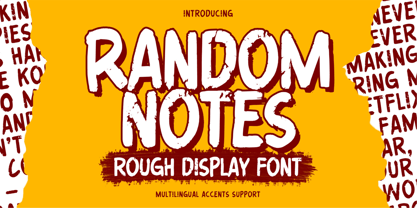 Hello Everyone,introduce our new product Random Notes is a Rough Display Font Handmade Font is a Strong Style and classy style, This font is great for your next creative project such as logos, printed quotes, invitations, cards, product packaging, headers, Logotype, Letterhead, Poster, Label, cartoon, and comic etc. This font is great for your creative projects such as watermark on photography, and perfect for logos & branding, photography, invitation. Random Notes a natural handwritten feel. This handmade font will make your design has a beautiful natural touch for each details.
 - Flossy by Gassstype,
$23.00 Here comes our new font Flossy is a Handwritten Brush font with a Rough style and dramatic movement. This font is great for your next creative project such as logos, printed quotes, invitations, cards, product packaging, headers, Logotype, Letterhead, Poster, Label, and etc. This font are handmade with brushes on Procreate. Then crafted carefully drawn into vector format. Flossy a natural handwritten feel. This handmade font will make your design has a beautiful natural touch for each details. It is perfect for any design project as Invitation,logo, book cover, craft or any design purposes.
 - Rafferty by Gassstype,
$23.00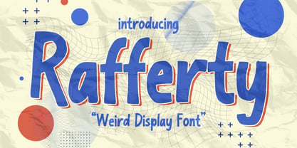 Here comes a New font, Introducing Rafferty It's Weird Display Font is a Natural Style and Authentic classy style, this font is great for your creative projects such as watermark on photography, and perfect for logos & branding, invitation,advertisements,product designs, stationery, wedding designs,label ,product packaging, special events or anything that need handwritting taste. Rafferty a natural Hand Drawn feel. This handmade font will make your design has a beautiful natural touch for each details. This font is PUA encoded which means you can access all of Alternates glyphs.
 - TE HAFS2 Tharwat Emara2 by Tharwat Emara,
$49.00 It is known as the Hafs Quraan2 Font for its extensive use in the copying and transmission of books because it helps the writer to write more quickly than any other font since the Islamic times and then Alnaskh Quraan font wrote the "Quran"And the advantages of Alnaskh Quraan font are clarifying the letters and show their beauty and splendor. Naskh Font for writing the Holy Qur’an by Raweya Hafs, for the first time, the possibility of coloring all its letters to learn Tajweed - The possibility of coloring letters, various forms of one letter
 - Emencut by Twinletter,
$15.00 Emencut sans serif, and everything in between. San Serif is a hot trend, and we have the hottest ones. Our newest font family is waiting for you to get it: The San Serif family offers 18 different styles, each with a unique look. Use this typeface in your design or business projects, of course, your various design projects will be perfect and extraordinary if you use this font because this font is equipped with a font family, both for titles and subtitles and sentence text, start using our fonts for your extraordinary projects.
 - PAG Revolucion by Prop-a-ganda,
$19.99Prop-a-ganda offers retro-flavored fonts inspired by lettering on retro propaganda posters, retro advertising posters, retro packages all the world over. This is perfect font for your retrospective project. PAG Revolucion has a boyish mood compared to other fonts of Prop-a-ganda series. It has short legs and large head, but because of its simplicity, it is legible font. Perfect for all of display. In 2012, Extended and optimized for multipurpose font family named Revolution Gothic which has lowercase, multi-language accents, five weights and italics can be available from Dharma Type. - Lakony by Khoir,
$9.00 Lakony Regular, italic and display serif lacony are combined into one into a modern serif, lacony pays attention to high readability and a soft font model so that readers feel comfortable. lakony font also has unique alternates, making it easier for you to design as unique a text as possible. However, this does not leave behind the function of the font itself, namely readability, so this font is suitable for titles, posters, branding, invitation cards and much more. Lakony Regular Lakony Italic Lakony Display Uppercase Lowercase 75+ Language Alternates Font
 - Andeeta by Tlatous Type,
$19.00 Andeeta! A sweet handwritten font that will add fun to your creativity. the font consist of a charming all-caps font and a sweet handwritten script font for the perfect and fun blend of your content. Andeeta has also added 26 doodles to add interest to your content in separate files. Each font file includes uppercase, lowercase, numbers, punctuation, and multilingual support. That's it! I hope you enjoy it. Feel free to comment if there are issues or queries. You can also say hi to me on Instagram: https://www.instagram.com/tlatoustype/ Thank You!
 - Milk Water by Yumna Type,
$12.00 Be a the ultimate you with gorgeous style font. The awesome Milk Water. It is a beautiful font duo that reflects youth, power, yet cuteness. The weight of the display font brings strength to any title or header you apply to it. On the other hand, the curve of the script font also convey a sense of cuteness. Features: Stylistic Sets Ligatures Multilingual Supports Numerals and Punctuations Thank you for purchasing premium fonts from our studio. If you have any further questions, don't hesitate to contact us. Happy Designing.
 - Crusthy by Scratch Design,
$10.00 Introducing, Crusthy modern handwriting with signature style and brush texture. This font comes with textured handwriting font so natural and this font looks authentic but still readable and incredibly versatile. This font will look outstanding in any occasion design concept, whether it’s being used on colorful backgrounds or as a stand as a headline in a minimalist background! Crushty has multi-language support, swashes, alternate and ligature dan you can apply it in OpenType mode in adobe photoshop or adobe illustrator. Please enjoy the Crushty Font which makes some stunning designs.
 - Simarigo by Asenbayu,
$15.00 Simarigo is a serif-stencil display font with a unique shape. Simarigo has an interesting combination of typography, crafted from serif shapes that make it elegant and luxurious, yet one of those stencils that are abstract and strong. You can use this font in modern, vintage and retro design. This font is perfect for a variety of projects, such as branding, poster displays, logo designs, magazine, headline, sticker and more. Simarigo font feature open type, kerning, ligatures, and alternative styles. Simarigo font include uppercase, lowercase, numbers, punctuation and multilingual support.