10,000 search results
(0.3 seconds)
- FF Irregular by FontFont,
$41.99
- CC Angular by Okaycat,
$24.50
- Angular Alchemy by Hipfonts,
$17.00
- HaManga Irregular by Linotype,
$29.99 - Ano Angular by Alias,
$60.00
- Mono Hexular by PizzaDude.dk,
$20.00
- Cyrillic Old Face - Unknown license

- Old Standard TT - 100% free

- Old Rubber Stamp - 100% free

- Ye Old Shire - Unknown license

- SF Old Republic - Unknown license

- SF Old Republic - Unknown license

- BN-Old Fashion - Unknown license

- Olde European ES - Unknown license

- old time radio - Unknown license

- OMEGA Old Face - Unknown license

- SF Old Republic - Unknown license

- SF Old Republic - Unknown license

- Old School Tattoo by m u r,
$15.00
- Old French School by JBFoundry,
$20.00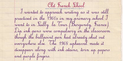
- WL Rasteroids Old by Writ Large,
$5.00
- Caslon Old Face by Bitstream,
$29.99 - Old Paris Nouveau by Baseline Fonts,
$24.00 - Old Persian Cuneiform by Deniart Systems,
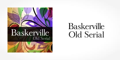
$10.00 - Baskerville Old Serial by SoftMaker,
$-
- Old Favorites JNL by Jeff Levine,
$29.00 - Old Softy NF by Nick's Fonts,
$10.00 - Old Claude LP by LetterPerfect,
$39.00
- Same Old Joke by Bogstav,
$15.00
- Old Labels JNL by Jeff Levine,
$29.00
- Old Fashion Script by Monotype,
$29.99 - The Old Navy by Larin Type Co,
$12.00
- Old Chisholm JNL by Jeff Levine,
$29.00
- Olde Nouveau JNL by Jeff Levine,
$29.00
- Fty OLD SPORT by The Fontry,
$15.00
- Old Trail JNL by Jeff Levine,
$29.00
- Ongunkan Old Turkic by Runic World Tamgacı,
$50.00
- TS Old Baskerville by TypeShop Collection,
$24.80 - Albion's Old Masthead by Greater Albion Typefounders,
$15.00
- Collins Old English by Scriptorium,
$12.00


