10,000 search results
(0.038 seconds)
- Anno by Linotype,
$29.99The impulse behind André Maaßen’s design of the Anno typeface was the design of a New Year’s card for the year 2000 (Anno 2000). His desire to create the perfect printed image developed into a family with four styles: Anno 1, Anno 1 Italic, Anno 2, and Anno 2 Italic. Anno 1 and its Italic are semi-classicist typefaces, with a high degree of stroke contrast, while Anno 2 and its Italic are semi-grotesks, with less stroke contrast. Both Anno 1 and Anno 2 are sans serifs typefaces, but they each offer a new interpretation of the genre. The Anno typeface may be used in a number of applications and sizes. And it is naturally suitable for New Year’s greetings and other cards, of course! - Neo Brushly by IbraCreative,
$17.00 Neo Brushly is an enchanting handlettered brush font that encapsulates the artistry of free-flowing strokes and the warmth of handcrafted expression. With each character meticulously crafted, the font exudes a genuine, human touch, reminiscent of brush strokes on canvas. The letters dance dynamically, creating a harmonious rhythm that lends a unique, personalized flair to any project. Neo Brushly captures the essence of spontaneity, making it an ideal choice for designs that seek a balance between casual elegance and a hint of playful sophistication. The organic, brush-inspired design imparts a sense of authenticity, making Neo Brushly an inviting and versatile choice for a wide range of creative endeavors, from branding to invitations, infusing a touch of handmade charm into every typographic creation.
 - banister by One Fonty Day,
$15.00 Banister looks both contemporary and vintage. It contains a total of 12 styles including two main styles (Normal and Loaded), and for each style it comes with two widths (Semi-condensed and Semi-Expanded) and three weights (Light, Regular and Bold). The 40’s inspired style is subtle in banister, so it comes across more contemporary. Also, slightly curved strokes can be found on some letters, which gives a more organic feeling overall. To gain full advantage of banister, you can toggle “Fill” and “Stroke” on any editable applications to experiment the style, also layering normal and loaded styles let you discover something unexpected. Banister is versatile, simple and organic looking typeface, and good for headlines, logos, tiles and any large texts.
 - Renata by Laura Worthington,
$25.00 Both casual and upscale, Renata features inviting. languorous letterforms, stroked by the hand of an experienced calligrapher with a small brush-tipped pen. Renata is quite readable thanks to its high x-height and spacious connecting strokes. It also looks exceptionally natural – every lowercase letter includes an alternate of each letter and a beginning, ending, and an “isolated” form (useful for settings like “mar y sol,” “o sole mio”; lettered lists; and creative uses like wordmarks). Renata features 119 swashes for a custom look and feel. See what’s included! http://bit.ly/2fQYX6B This font has been specially coded for access of all the swashes, alternates and ornaments without the need for professional design software! Info and instructions here: http://lauraworthingtontype.com/faqs/
 - Sanity by Popkern,
$- The design of Sanity typeface is modernized by abandoning any characteristics associated with hand writing, such as curved lines or elaborate corner details. The design is based on a rigid geometric grid and radiates confidence with its daring contrasts and provocative style. In large amounts of text the font “Sanity” can be hard to read due to a «dazzle» effect caused by alternating thick and thin strokes, particularly as the thin strokes are hardly visible at small point si es. Due to this quality, the “Sanity” font-family is best suitable for titles or large print advertisements. There are five key stylistic principles taken as a main framework for the creation of the “Sanity”: symmetry, contrast, geometry, artificiality and monospacing.
 - Wanted by ITC,
$29.99 One look at the font Wanted brings to mind swinging saloon doors, double shots of whiskey and sheriff's badges. It belongs to the so-called Italienne typefaces which began to appear at the beginning of the 19th century. The distinguishing characteristic of such typefaces is the robustness of its serifs, which exceeds that of the base strokes. Wanted looks almost as though it were stamped on paper. Small white flecks appear in some of the strongest black strokes just as they would in a stamp which did not get quite enough ink...or are they perhaps the work of a sharp shooter? Wanted is best for short headlines and perfect for anything which should have the look and feel of the Wild West.
 - Mastro Sans by Ndiscover,
$39.00 Mastro™ Sans is a contemporary humanist sans serif and the sans version of Mastro. The lowercase shapes are simple yet distinct, its organic design (specially the italic) are based on different stroke modulation ideas combined into a coherent whole. The uppercase is inspired in roman capital proportions yet keeping the lowercase stroke modulation. Mastro™ Sans has a total of 16 styles and it covers a large set of languages. It also has many Opentype features, such as small caps, superscript numbers and letters, old style and lining figures, tabular figures, case sensitive forms, fractions and more. It is a design with a lot of personality while being versatile. You can use it in branding, editorial, web and video.
 - Le Bonjour by Vintage Voyage Design Supply,
$14.00 Classic retro sans with some modern looks. Contrast vertical and horizontal lines in Bold style and elegant and airy Light style. This font has no lowercase letters, only the small caps which makes it very suitable for Headers, Logotypes, sub-headers, etc. This family has a French mid-century spirit with the alternate underlined O, inherent in that time, ligatures for L-pairs and T-pairs letters and some decorative alternates for A, C, H, J, O, Q, and U letters. The Le Bonjour has three widths: Bold, Regular and Light. Four styles for Bold and Regular: Clear, Offset Decor Line, Pressed and Stroke. And two styles for Light: Clear and Stroke. (the light style is too narrow for Offset decor and Press styles)
 - M XiangHe Hei SC Std Variable by Monotype,
$1,049.99The M XiangHe Hei Simplified Chinese typeface merges traditional brush strokes with modern letterforms to carefully balance traditional calligraphy with humanist design. Named for the smooth movements of a flying crane, the M XiangHe Hei typeface is designed to glide across the page, and features strokes that are partly derived from the Kaishu calligraphic style – an everyday script which dates back hundreds of years. Seol Sans features Neue Frutiger for its Latin glyphs, and works harmoniously with Neue Frutiger World and Monotype’s CJK typefaces Tazugane Info (Japanese) and Seol Sans (Korean). M XiangHe Hei is a great choice for global brands using sans serif Latin typefaces looking to maintain their visual identity, and communicate with a consistent tone of voice with Simplified Chinese. - Allegroost by 38-lineart,
$14.00 Allegroost is a handwritten font that uses a large brush in a horizontal position, so that the brush strokes vertically make the size large, opposite the horizontal strokes the size becomes small. To add to the natural impression, we complete many ligatures that adjust handwriting such as: ob, oc, od, og, oh, oi, oj, ok, ol, om, on, oo, op, oq, or, os, ot, ou , ov, ow, ox, oy, oz, bo, bd, bg, bi, br, bu, by, ee, ii, ll, tt, th, tl, lt, it, ti, iti, ld, ts, st , mm, nn This unique handwriting is perfect for logos, quotes, posters, fun letters, for clothing, or any design project. Equipped with 28 language support makes your brand can appear in various parts of the world
 - M XiangHe Hei TC Variable by Monotype,
$1,049.99The M XiangHe Hei Traditional Chinese typeface merges traditional brush strokes with modern letterforms to carefully balance traditional calligraphy with humanist design. Named for the smooth movements of a flying crane, the M XiangHe Hei typeface is designed to glide across the page, and features strokes that are partly derived from the Kaishu calligraphic style – an everyday script which dates back hundreds of years. Seol Sans features Neue Frutiger for its Latin glyphs, and works harmoniously with Neue Frutiger World and Monotype’s CJK typefaces Tazugane Info (Japanese) and Seol Sans (Korean). M XiangHe Hei is a great choice for global brands using sans serif Latin typefaces looking to maintain their visual identity, and communicate with a consistent tone of voice with Traditional Chinese.¶ - M XiangHe Hei SC Pro by Monotype,
$187.99The M XiangHe Hei Simplified Chinese typeface merges traditional brush strokes with modern letterforms to carefully balance traditional calligraphy with humanist design. Named for the smooth movements of a flying crane, the M XiangHe Hei typeface is designed to glide across the page, and features strokes that are partly derived from the Kaishu calligraphic style – an everyday script which dates back hundreds of years. Seol Sans features Neue Frutiger for its Latin glyphs, and works harmoniously with Neue Frutiger World and Monotype’s CJK typefaces Tazugane Info (Japanese) and Seol Sans (Korean). M XiangHe Hei is a great choice for global brands using sans serif Latin typefaces looking to maintain their visual identity, and communicate with a consistent tone of voice with Simplified Chinese. - Letraset Romic by ITC,
$40.99Typeface designer and Letraset type director Colin Brignall created the font Romic. The character of the strokes as well as the serif forms give the font its calligraphic look. The placement of the serifs, on the upper left and lower right of a character, also distinguishes this typeface and allows the figures to be set very close to one another. The dots on the i and j do not hang in the air, rather, they are connected to the rest of the letter with a light, serif-like stroke. The elegant and lively Romic font is legible even in smaller point sizes. It is best used in middle length texts and headlines and wherever an individual and sophisticated image is the goal. - Mayfair by Canada Type,
$24.95The long awaited and much requested revival of Robert Hunter Middleton's very popular classic is finally here. Mayfair Cursive was an instant hit for Middleton in 1932, and it went on being used widely until late into the 1970s, in spite of it never having crossed over to film type technology. Like a few of its contemporary designs, most notably the work of Lucien Bernhard, Mayfair is a formal script that is somewhat based on traditional italic forms with swash uppercase, but also employs subsidiary hairline strokes in some of its lowercase as an emphasis to the script's cursive traits. Why these gorgeous letters never made the leap into photo typesetting is a mystery to us. But here they are now in digital form, almost three quarters of a century since they first saw the light in metal. Mayfair was redrawn from original 48 pt specimen. It also underwent a major expansion of character set. Plenty of swash characters and ligatures were added. An alternate set of lowercase was also made, in order to give the user a choice between connected and disconnected variations of the same elegant script. Mayfair ships in all popular font formats. While the Postscript Type 1 and True Type versions come in two fonts (Mayfair and Mayfair Alt), the OpenType version is a single font containing all the extra characters in conveniently programmed features that are easily accessible by OpenType-supporting software applications. We are quite sure today's graphic designers will be appreciative of having access to the face that all but defined menus, romance covers, wine and liquor labels and chocolate boxes for almost two 20th century generations. - Gelion by Halbfett,
$30.00 Gelion is a large family of geometric sans serif fonts. It ships both as two Variable Fonts or as 16 traditional fonts. Those static fonts span eight different weights, ranging from Extralight to Black. Each has an upright and an italic font on offer. The italics are carefully crafted, with an 8° slope. Gelion is inspired by 20th-century geometric sans serifs and classic neo-grotesque designs from the late 19th century and the middle of the 20th century. Its forms remain true to the gracefully geometric look of its classic predecessors, which will surely tick off any client’s long list of branding requirements. Letters in all of Gelion’s weights are drawn with virtually monolinear strokes. Its lowercase letters have a tall x-height. Yet, that still leaves enough room for the fonts’ diacritical marks. Gelion’s default “a” and “g” each have single-storey forms by default. The dots on the ‘i’, ‘j’, and diacritics are round, as are the punctuation marks. Gelion is an excellent choice for both corporate design and editorial design projects, thanks to its range of weights and its legibility in text. The fonts include a lot of ligatures, some monochromatic emoji, a set of arrows, lovely Roman Numerals, and more. Thanks to Gelion’s stylistic alternates, if a project comes up where you do not need a geometric vibe, you can activate Stylistic Set 1. That will replace many of the fonts’ letters with more humanistic-sans alternates, giving your text the feeling of a whole other type design with just one click. Last but not least, the descending “f” available in Gelion’s italics is a nice typographic trait.
 - Maged by Linotype,
$187.99Maged, a traditional-style Arabic text face, enjoyed widespread popularity as a dry-transfer typeface prior to being licensed by Letera Arabica to Linotype-Hell for font production. In consultation with the Linotype Design Studio (U.K.), the artwork was redrawn by Adrian Williams to render the typeface into a complete, unitized Arabic font with a full complement of traditional-style ligatures suitable for digitization. Maged, which has two weights, first appeared as a 202 font in 1987 before its eventual conversion to OpenType in 2005. Thus Linotype’s Maged font can be described as a trend-setting modern Naskh design that retains a sense of the fluidity of Naskh calligraphy: the letters, when composed, appear as freshly-written text characterized by rich, inky horizontals, tapering swash strokes and contrasting delicate ascenders. The Bold exploits these features of the Regular without excess, tempered by the need for clarity at smaller sizes. Maged Regular and Bold are eminently suited to text and titling in broader column work (brochures, magazines, advertising, coffee-table books etc.) and are thus able to extend the range of the Linotype Arabic library in areas of work where the more compact text and titling fonts would create a too concentrated effect. Both of the Maged fonts include Latin glyphs (from Palatino Medium and Palatino Black) inside the font files, allowing a single font to set text in both most Western European and Arabic languages. Maged incorporates the Basic Latin character set and the Arabic character set, which supports Arabic, Persian, and Urdu. They include tabular and proportional Arabic, Persian, and Urdu numerals, as well as a set of tabular European (Latin) numerals. - Macaroni Sans by Type Associates,
$30.00 Macaroni Sans evolved from our search for an extended font family consisting of a range of weights in both uprights and obliques, with a contemporary appeal. The desired character was to be sympathetic with a range of high-tech consumer products so a friendly, soft approach was called for. The resulting mix of geometric shape, rounded terminals, subtle italic angle of just six degrees and a few quirky stroke endings met with an enthusiastic response. As its subject product line exhibits brilliant color and imagery, a style was called for that conveyed contemporary appeal and readability but would not compete with the savvy products. We arrived at a clean, modern, sociable look that would suit a broad subject field in either text, semi display or signage. Its simple lines and monoline strokes fit well with logo usage or screaming posters, enhancing letterheads or websites, for foodstuffs to autos, insurance to swimming pools, lawfirms to babyfood. Macaroni Sans is the perfect typeface for branding, logotypes, may even flatter challenging viewing conditions. Rounded types have been around (pardon the pun) for centuries; numerous examples can be seen on old wood type posters, which in a small way prompted the name: in fashion Macaroni was a term used in mid-eighteenth century Europe to describe a dandy, a chap who displayed flamboyance in dress and hairstyle and spoke outlandishly or in an effeminate manner. Hence the term macaronic verse.
 - Zebramatic by Harald Geisler,
$14.99 Zebramatic - A Lettering Safari Zebramatic is a font for editorial design use, to create headlines and titles in eye-catching stripes. Constructed to offer flexible and a variety of graphical possibilities, Zebramatic type is easy to use. The font is offered in three styles: POW, SLAM and WHAM. These styles work both as ready-made fonts and as patterns to create unique, individualized type. The font design’s full potential is unleashed by layering glyphs from two or all three styles in different colors or shades. Working with the different styles I was reminded of the late Jackson Pollock poured paintings—in particular the documentation of his painting process by Hanz Namuth and Paul Falkernburg in the film Jackson Pollock 51. In Pollock’s pictures the complex allure arises from how he layered the poured and dripped paint onto the canvas. Similar joyful experience and exciting results emerge by layering the different styles of Zebramatic type. Texture In the heart of the Design is Zebramatics unique texture. It is based on an analog distorted stripe pattern. The distortion is applied to a grade that makes the pattern complex but still consistent and legible. You can view some of the initial stripe patterns in the background of examples in the Gallery. Zebramatic POW, SLAM and WHAM each offer a distinct pallet of stripes—a unique zebra hide. POW and WHAM use different distortions of the same line width. SLAM is cut from a wider pattern with thicker stripes. The letter cut and kerning is consistent throughout styles. Design Concept Attention-grabbing textured or weathered fonts are ideal for headlines, ads, magazines and posters. In these situations rugged individuality, letter flow, and outline features are magnified and exposed. Textured fonts also immediately raise the design questions of how to create alignment across a word and deal with repeated letters. Zebramatic was conceived as an especially flexible font, one that could be used conveniently in a single style or by superimposing, interchanging and layering styles to create a unique type. The different styles are completely interchangeable (identical metrics and kerning). This architecture gives the typographer the freedom to decide which form or forms fit best to the specific project. Alignment and repetition were special concerns in the design process. The striped patterns in Zebramatic are carefully conceived to align horizontally but not to match. Matching patterns would create strong letter-pairs that would “stick out” of the word. For example, take the problematic word “stuff”. If Zebramatic aligned alphabetically, the texture of S T and U would align perfectly. The repeated F is also a problem. Imagine a headline that says »LOOK HERE«. If the letters OO and EE have copied »unique« glyphs - the headline suggests mass production, perhaps even that the designer does not care. Some OpenType features can work automatically around such disenchanting situations by accessing different glyphs from the extended glyph-table. However these automations are also repeated; the generated solutions become patterns themselves. Flip and stack To master the situation described above, Zebramatic offers a different programmatic practice. To eliminate alphabetic alignment, the letters in Zebramatic are developed individually. To avoid repetition, the designer can flip between the three styles (POW, SLAM, WHAM) providing three choices per glyph. Stacking layers in different sequences provides theoretical 27 (3*3*3) unique letterforms. A last variable to play with is color (i.e. red, blue, black). Images illustrating the layering potential of Zebramatic are provided in the Gallery. The design is robust and convenient. The font is easily operated through the main font panel (vs. the hidden sub-sub-menu for OpenType related features). The process of accessing different glyphs is also applicable in programs that do not support OpenType extensively (i.e. Word or older Versions of Illustrator). International Specs Zebramatic is ready for your international typographic safari. The font contains an international character set and additional symbols – useful in editorial and graphic design. The font comes in OpenType PostScript flavored and TrueType Format.
 - Retro Signature - Personal use only

- Lekton04 - Personal use only

- Andrew Ward - 100% free

- Chalkene by Aminmario Studio,
$20.00 This is a supercharged font, with natural brush, quick strokes and sharp details. Perfect for challenging jobs, titles, movie,logos, apparel, t-shirts, hoodies, quotes, product packaging, or anything that needs a typographic turbo-boost and a typographic unique style. Thanks for checking out this font. I hope you enjoy it!
 - Dotum by Microsoft Corporation,
$129.00Dotum™ features plain strokes similar to sans serif designs with proportional Latin characters, and works well for on-screen display such as user interfaces. This Dotum font file is 5.2 MB in size. Dotum is a trademark of Microsoft Corporation. Dotum font Character Set: Latin 1, Korean code page 949 - Insecticide by Arkalandara,
$110.00 Insecticide Infused with a laid-back charm, our casual handwriting captures the essence of relaxed authenticity. Effortlessly stylish, each stroke exudes approachable warmth, making it the perfect choice to connect with your audience on a personal level. Embrace a brand identity that feels as comfortable as your favorite pair of jeans
 - Presence by Présence Typo,
$36.00Présence is a modern sans serif with a light stroke contrast. The capitals are a bit narrow for a titling use which makes them space-economical without lack of legibility. The lower cases have a normal width for a fluid reading. Its wide range of weights allows it many uses. - Hollyweird by ITC,
$29.00Hollyweird is another original, funky work of California designer Jill Bell, a bold display script with intentionally shaky strokes and tightly curled flourishes. The capitals are ideal as initials and the lowercase is best used tightly set. Hollyweird is a good choice for any work requiring a casual chic appearance. - Mostaneo by Aminmario Studio,
$20.00 This is a supercharged font, with natural brush, quick strokes and sharp details. Perfect for challenging jobs, titles, movie,logos, apparel, t-shirts, hoodies, quotes, product packaging, or anything that needs a typographic turbo-boost and a typographic unique style. Thanks for checking out this font. I hope you enjoy it!
 - Adorable by DainType,
$15.00 'Adorable' has a happy mood. It also feels lively because you can feel the rhythm in the strokes. This typeface is suitable for any place where a happy atmosphere is needed, such as printouts for children, gift cards, children's clothes, birthday cards, and cheerful advertisements. It contains Latin extended characters.
 - Club Type Script Pro by Club Type,
$65.00 A quill pen-like joined script typeface which echoes the cartoon lettering of 17th Century court papers during the period of the English Civil war. A nifty feature of this font is that if you enter a vertical bar '|' character, it will turn off the exit stroke of a joining character.
 - Merchant Trade JNL by Jeff Levine,
$29.00 A precursor to Art Deco headline/display sans serif typefaces with thick and thin strokes is the Matthews Series (circa 1902). It was manufactured and sold through the Inland Type Foundry of St. Louis, MO. Digitally redrawn as Merchant Trade JNL, it’s now available in both regular and oblique versions.
 - DotumChe by Microsoft Corporation,
$129.00DotumChe™ features plain strokes similar to sans serif designs with half-width Latin characters, and works well for on-screen display such as user interfaces. This DotumChe font file is 5.2 MB in size. DotumChe is a trademark of Microsoft Corporation. DotumChe Character Set: Latin 1, Korean code page 949 - Highway Shredded by Aminmario Studio,
$30.00 This is a supercharged font, with natural brush, quick strokes and sharp details. Perfect for challenging jobs, titles, movie,logos, apparel, t-shirts, hoodies, quotes, product packaging, or anything that needs a typographic turbo-boost and a typographic unique style. Thanks for checking out this font. I hope you enjoy it!
 - GulimChe by Microsoft Corporation,
$129.00GulimChe™ features plain strokes similar to sans serif designs with half-width Latin characters, and works well for on-screen display such as user interfaces. This GulimChe font file is 5.2 MB in size. GulimChe is a trademark of Microsoft Corporation. GulimChe Character Set: Latin 1, Korean code page 949 - Gingato by Aminmario Studio,
$20.00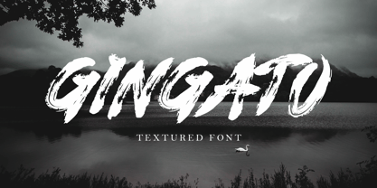 This is a supercharged font, with natural brush, quick strokes and sharp details. Perfect for challenging jobs, titles, movie,logos, apparel, t-shirts, hoodies, quotes, product packaging, or anything that needs a typographic turbo-boost and a typographic unique style. Thanks for checking out this font. I hope you enjoy it!
 - Zinjaro by ITC,
$29.99Zinjaro is the work of English designer Carol Kemp. Its clever design captures elements of both African and Latin American art in its forms. A combination of decorated and solid capital strokes gives it an exciting, unpredictable appearance and an array of devices and border elements further enhance the font. - Timeless Wonderland by Letterhanna Studio,
$19.00 Timeless Wonderland is a captivating calligraphic handwritten script font that weaves a story of timeless beauty and enchantment. Each stroke of this font is a testament to the artistry of calligraphy, making it the perfect choice for creative projects that seek to blend elegance with an enduring sense of wonder.
 - ENEMY by Aminmario Studio,
$30.00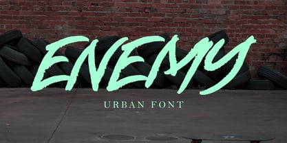 This is a supercharged font, with natural brush, quick strokes and sharp details. Perfect for challenging jobs, titles, movie,logos, apparel, t-shirts, hoodies, quotes, product packaging, or anything that needs a typographic turbo-boost and a typographic unique style. Thanks for checking out this font. I hope you enjoy it!
 - Khatt Algharraf by Mans Greback,
$59.00 Dive into the mesmerizing strokes of Khatt Algharraf, an Arabic typeface that seamlessly blends the age-old beauty of Middle Eastern calligraphy with the dynamism of modern design. With every curve and contour, it tells tales of ancient deserts and bustling souks, yet its sharp, crisp features make it strikingly contemporary.
 - Hard Street by Aminmario Studio,
$30.00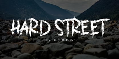 This is a supercharged font, with natural brush, quick strokes and sharp details. Perfect for challenging jobs, titles, movie,logos, apparel, t-shirts, hoodies, quotes, product packaging, or anything that needs a typographic turbo-boost and a typographic unique style. Thanks for checking out this font. I hope you enjoy it!
 - M Hei3 HK by Monotype HK,
$523.99 Monotype Hei3 HK is a modulated and transitional Chinese design with structure, diǎn, piē and nà carry Song style, while horizontal & vertical strokes are relatively simple. This mix of ancient and modern elements with low contrast is something that you can find in wood carving: rigid while balanced with softness.


