10,000 search results
(0.022 seconds)
- Spin Cycle OT, created by Blue Vinyl Fonts, stands as a remarkable and vibrant addition to the typographic world. This font encapsulates a playful yet sophisticated essence, making it a versatile cho...
- Hype vol 2 by Positype,
$20.00 Hype lives up to its name. An energetic attempt to blow past previous sans’ descriptive words of massive, large, extensive, super and others. Hype transcends the everyday marketing terms and rests solely atop them all with a jaw-dropping current offering of 432 fonts that spans 18 widths and 12 weights. Insert a long pause and mic drop here, because nothing compares. Hype Volume 2 includes 6 of the 18 subfamilies that comprise the full Hype Collection. Each of these subfamilies represent 1 of the 18 available widths and each width contains 12 weights and matching italics. Volume 2 contains 144 fonts. Families included in Volume 2: Hype 0200, Hype 0500, Hype 0800, Hype 1100, Hype 1400, and Hype 1700. If you would like to complete your collection be sure to view and purchase Hype vol 1 and Hype vol 3. Hype’s bombastic approach meant supplying everything it could within each typeface: including small caps, yes small caps, a full numeral set that includes inferiors and superiors, super- and subscripts, full fraction support, case-sensitive forms, stylistic alternate letterforms, and more while touting a full Western, Central and South Eastern European character support. Embracing a Univers-esque bravado and a willingness to push the envelope, Hype leaves even more room to grow. No corners were cut, no shortcuts taken with a focus on sensible, efficient letter construction and functional reliability that ignores any one classification and instead looks to form an amalgam of classic sans styles influenced by wood type, movie showcards, and urban industrial letterforms.
 - Hype vol 3 by Positype,
$20.00 Hype lives up to its name. An energetic attempt to blow past previous sans’ descriptive words of massive, large, extensive, super and others. Hype transcends the everyday marketing terms and rests solely atop them all with a jaw-dropping current offering of 432 fonts that spans 18 widths and 12 weights. Insert a long pause and mic drop here, because nothing compares. Hype Volume 3 includes 6 of the 18 subfamilies that comprise the full Hype Collection. Each of these subfamilies represent 1 of the 18 available widths and each width contains 12 weights and matching italics. Volume 3 contains 144 fonts. Families included in Volume 3: Hype 0300, Hype 0600, Hype 0900, Hype 1200, Hype 1500, and Hype 1800. If you would like to complete your collection be sure to view and purchase Hype vol 1 and Hype vol 2. Hype’s bombastic approach meant supplying everything it could within each typeface: including small caps, yes small caps, a full numeral set that includes inferiors and superiors, super- and subscripts, full fraction support, case-sensitive forms, stylistic alternate letterforms, and more while touting a full Western, Central and South Eastern European character support. Embracing a Univers-esque bravado and a willingness to push the envelope, Hype leaves even more room to grow. No corners were cut, no shortcuts taken with a focus on sensible, efficient letter construction and functional reliability that ignores any one classification and instead looks to form an amalgam of classic sans styles influenced by wood type, movie showcards, and urban industrial letterforms.
 - Hype Vol 1 by Positype,
$20.00 Hype lives up to its name. An energetic attempt to blow past previous sans’ descriptive words of massive, large, extensive, super and others. Hype transcends the everyday marketing terms and rests solely atop them all with a jaw-dropping current offering of 432 fonts that spans 18 widths and 12 weights. Insert a long pause and mic drop here, because nothing compares. Hype Volume 1 includes 6 of the 18 subfamilies that comprise the full Hype Collection. Each of these subfamilies represent 1 of the 18 available widths and each width contains 12 weights and matching italics. Volume 1 contains 144 fonts. Families included in Volume 1: Hype 0100, Hype 0400, Hype 0700, Hype 1000, Hype 1300, and Hype 1600. If you would like to complete your collection be sure to view and purchase Hype vol 2 and Hype vol 3. Hype’s bombastic approach meant supplying everything it could within each typeface: including small caps, yes small caps, a full numeral set that includes inferiors and superiors, super- and subscripts, full fraction support, case-sensitive forms, stylistic alternate letterforms, and more while touting a full Western, Central and South Eastern European character support. Embracing a Univers-esque bravado and a willingness to push the envelope, Hype leaves even more room to grow. No corners were cut, no shortcuts taken with a focus on sensible, efficient letter construction and functional reliability that ignores any one classification and instead looks to form an amalgam of classic sans styles influenced by wood type, movie showcards, and urban industrial letterforms.
 - Kandidat by Fontroll,
$30.00 Imagine being printer in the early nineteenth century, your stock isn’t the finest, your lead characters are worn out: Voilá Kandidat Rough. But wait, Kandidat isn’t the usual scan-an-old-book,-put-the-glyphs-in-a-font-and-you’re-done-font. Kandidat Rough has a variety of whopping 14 alternates for most characters. Our algorithm changes the letters automatically. All you have to do is turn on Contextual Alternates in your layout app. The algorithm is the best we’ve seen so far, and it’s so good that even same words appear in different forms. And should by coincidence words have the same glyphs, just assign a different Style Set to the first letter, and all other letters in the word will change as well (well, it depends a bit on your software). The mechanism isn’t perfect and maybe we stretched OpenType capabilities a bit over the top, but we yet haven’t seen any better routine for switching letters on the fly. Is it worth to mention that Kandidat Rough not only speaks English, but also German, French, Spanish, Dutch, Danish, Norwegian, Swedish, Croatian, Turkish and most likely some other languages? Maybe. To be sure whether your language is supported, this is the typeset of all letters: ABCDEFGHIJKLMNOPQRSTUVWXYZÀÁÂÃÄÅÆÇÈÉÊËÌÍÎÏÑÒÓÔÕÖØÙÚÛÜÝĆČĐĞ݌ފŸŽ abcdefghijklmnopqrstuvwxyzàáâãäåæçèéêëìíîïñòóôõöøùúûüýÿćčđğıœşšž Apart from that we also included the following punctuation and currency symbols: !"#$%&'()*+,-./:;?@[\]_{|}¡©«®°±¶·»¿×–—‘’‚“”„†•…‹›⁄≠☞ €¢$£¥ This sums up to nearly 3000 glyphs per font, and we have three of them: Regular, Italic and Bold. All neatly kerned. All in all a great repertoire for even the most demanding book or advert jobs with a look of old times. And now imagine you are sick of the rugged print experience Kandidat Rough delivers: go for Kandidat. This is our Scotch-ish ancestor the Rough version was made from. A sturdy, friendly, round, warm friend from the beginning of the nineteenth century. A bit dark, maybe. You will like it. Kandidat has the aforementioned type set plus complete Baltics, Eastern Europe and Cyrillic. Plus a couple of gimmicks like fleurons, stars, circled numbers, arrows, and, and, and… Kandidat Regular additionally has small caps for Latin based scripts (not Cyrillic). The spick and span Kandidat font set also consists of Regular, Italic and Bold cuts. The bold cut is on the very bold side and can nicely be used for headings, whereas Italic is a great companion for Regular. It took us some time and trouble to finish this project, but after all we are very proud of our little feat and hope you will enjoy Kandidat as much as we do. Enjoy!
 - Happy Serif - Personal use only

- Happy Sans - Personal use only

- PetalGlyph - Unknown license

- MFC Bontebok Monogram by Monogram Fonts Co.,
$69.00 The inspiration source for Bontebok Monogram is a unique and inventive hand-drawn letterset from a vintage embroidery publication combining a stylized geometric oblique all capitals letterset with bracketing marks to make a monogram. First drawn as outlined letterforms with stipple shading, we’ve created multiple variations for you to design with. While this monogram was originally intended to adorn handkerchiefs, it has many other possibilities. Download and view the MFC Bontebok Monogram Guidebook if you would like to learn a little more.
 - Boetia by Scriptorium,
$24.00Boetia is an Art Nouveau period font which is designed to give some of the feel of ancient Greek lettering and design. It also echoes the lettering of the Psychedelic poster era and would be a great addition to any 60s font collection. The overall effect is both modern and classical at the same time, with readable, bold character forms perfect for posters or other titling uses. If you like our Hendrix or Pantagruel fonts you're going to love Boetia. - Fluid by Paulo Goode,
$20.00 This frivolous 6-font typeface was inspired by playing with my food one evening. I began to wonder what it would be like to draw a typeface with a pipette and liquid... the result is Fluid. A key feature are the contextual alternates that substitute an alternate second glyph when typing double letters, this gives a more natural feel to the resulting text. It’s a fun typeface from my back catalogue that was originally released in June 2018. Enjoy playing!
 - Olive Display by FoxType,
$10.00 Olive Display is a Unique Modern Elegant Typeface with Web-fonts. It's a very versatile font that works great in large and small sizes. Olive Font would perfect for branding, logos, headlines, Captions. or simply as a stylish text overlay to any background image. Strong capitals and a smooth, open lowercase are effective in a variety of applications. It's shown a clean, minimalist, warmth, quirky, yet still purposed to be versatile and easy to read. 7 Weights Included. Free updates and feature additions.
 - Super Discount by Mozatype,
$17.00 Hello there, Proudly presenting SUPER DISCOUNT. It is stylish marker font. It’s in two styles: Regular and Bold. SUPER DISCOUNT was designed to make logotype and lettering for your brands. And it’s would perfect for t-shirts/ apparel, promotional materials, sports, music festival, quotes, special events, or anything. What’s Included : Works on PC & Mac Easy to use ( Installations ) Easy Convert to Webfont Compatibility Windows, Apple, Linux, Cricut, Silhouette, and Other cutting machines Thanks for downloading, and I hope you enjoy it!
 - Smilodon by astroluxtype,
$20.00 Smilodon an ancient distressed font made with raptor claws, cat’s teeth, stone and sky? It's a corroded, distressed, punk scrawl with lots of attitude. This is a basic minimal glyph set with uppercase and lowercase forms. This is a headline display font suggested use would be 60 point or larger. Note: The metric and kerning on this font is extremely tight spacing and user should letterspace to desired width within application type controls. This monster cat is pre-historic indeed.
 - Bonwick Typeface by FoxType,
$9.00 Bonwick Display is a Unique Modern Elegant Typeface with Web-fonts. It's a very versatile font that works great in large and small sizes. Bonwick Font would perfect for branding, logos, headlines, Captions. or simply as a stylish text overlay to any background image. Strong capitals and a smooth, open lowercase are effective in a variety of applications. It's shown a clean, minimalist, warmth, quirky, yet still purposed to be versatile and easy to read. 8 Weights Included. Free updates and feature additions.
 - Tropen by Ahmet Altun,
$12.00 Tropen Font Family comes in one weight with six different types of styles but compatible at the same time with each other. All fonts are hand-made. It can be accessed to the extras with the standard keyboard codes which makes the use of font files very practical and easy. Tropen Font Family was designed carefully to create elegant works. It would be a perfect choice to design posters, affiches, logos, t-shirt and magazine prints, eye-pleasing typographic designs and more.
 - Shaky Halloween by Putracetol,
$28.00 Shaky Halloween is a horror display font. This font is inspired by movie titles and some horror logos. The impression of horror is highly emphasized, but the alternate character of this font that curves at the beginning and end of the letter makes this font very suitable to be used as a logo and poster. Shaky Halloween would be perfect for Logo, title, logotype, cover, headline, apparel, comic, cover books, cards, posters, or anything that requires a horrror or halloween!
 - Cortese by Hanoded,
$15.00 As usual, I stumbled upon a great 1971 Italian movie poster when looking for something else. The poster for “La Morte Cammina Con I Tacchi Alti” (directed by Luciano Ercoli), was made by an unknown artist and comes with a great font. Cortese was based on this movie poster font, but as I started working on the glyphs, I figured they would even look better in ligatures. So here it is: Cortese font - complete with 135 ligatures, accents and even Greek and Cyrillic!
 - Jaques Display by FoxType,
$10.00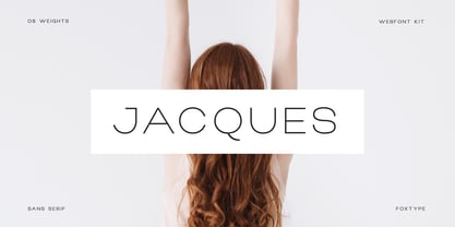 Jacques Display is a Unique Modern Elegant Typeface with Web-fonts. It's a very versatile font that works great in large and small sizes. Jacques Font would perfect for branding, logos, headlines, Captions. or simply as a stylish text overlay to any background image. Strong capitals and a smooth, open lowercase are effective in a variety of applications. It's shown a clean, minimalist, warmth, quirky, yet still purposed to be versatile and easy to read. 8 Weights Included. Free updates and feature additions.
 - Quico Display by FoxType,
$12.00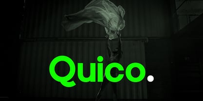 Quico Display is a Unique Modern Elegant Typeface with Web-fonts. It's a very versatile font that works great in large and small sizes. Quico Font would perfect for branding, logos, headlines, Captions. or simply as a stylish text overlay to any background image. Strong capitals and a smooth, open lowercase are effective in a variety of applications. It's shown a clean, minimalist, warmth, quirky, yet still purposed to be versatile and easy to read. 08 Weights Included. Free updates and feature additions.
 - Pax by Linotype,
$29.99Pax is clearly a didone, using Vox classification. The contrast between the thin lines and the thicker ones is noticeable, as you would expect from a didone. The basic form is relatively narrow, therefore I designed another Pax, slightly wider and darker, and called it Pax #2. Otherwise they are more or less identical. Pax is Latin for peace, on everyone's want list in 1995 - as well as every single year before and after that. Pax was released in 1995. - Water Splash by Putracetol,
$21.00 Water Splash is a unique display font. This font is inspired by the water splash shape. There are 3 directions for the splash water (direction to the left, up and down and to the right), and they are alternate from this lowercase font. With these variations, it will make it easier for you to create creativity for your project. Water Splash would be perfect for branding, logo, product, title, quotes, doodle, comic, books, greeting cards, toys, posters, baby clothing, picture books, etc.
 - Jazzy Croquette by Art Grootfontein,
$19.00 Jazzy Croquette is a friendly handwritten all-caps family made for jazzing up your designs! It was initially designed by illustrator Art Grootfontein for lettering his speech bubbles. Some cool Opentype ligatures give its distinctive organic jazzy feel. Jazzy Croquette is a professional tool designed to support Central and Eastern European as well as Western European languages. This font would be honored to be used on comic book, games, press, food products, advertising and all kind of stationery! Caps only Fonts.
 - Luciano Display by FoxType,
$12.00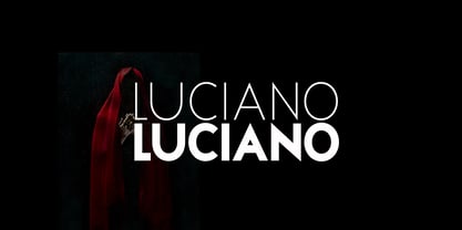 Luciano Display is a Unique Modern Elegant Typeface with Web-fonts. It's a very versatile font that works great in large and small sizes. Luciano Font would perfect for branding, logos, headlines, Captions. or simply as a stylish text overlay to any background image. Strong capitals and a smooth, open lowercase are effective in a variety of applications. It's shown a clean, minimalist, warmth, quirky, yet still purposed to be versatile and easy to read. 6 Weights Included. Free updates and feature additions.
 - Bungehuis by Hanoded,
$15.00 Bungehuis font was modeled on the lettering found on an Amsterdam art deco building from 1931. This building on the Spuistraat, also called "Het Bungehuis", used to house offices, but is now part of the University of Amsterdam. In 2015 it had its brief moment of fame, when students, demanding more democracy at the University, occupied it. Bungehuis is a heavy art deco font and would look great on posters and in headlines. It comes with a rather democratic range of diacritics.
 - Palembang by Hanoded,
$15.00 Palembang is the second largest city on the Indonesian island of Sumatra. It is also one of the oldest cities in Indonesie and used to be the capital of the powerful Buddhist Kingdom of Srivijaya. After finishing Semarang and Semarang Kolonial fonts, I sort of stayed in the Indonesian mood and named this font Palembang. It is a narrow, tall, all caps Art Deco typeface and would be most suited for headlines, cards, headers and luxury packaging. Palembang comes with royal language support.
 - Lectori Salutem Sans by HoboArt,
$10.00Is it royal, or is it dandyish? Either way it's sure to catch the eye. Prepare for titling figures any movie executive would be jealous of using. Do you write sci-fi, fantasy, costume, or cult; or is your announcement for an off-beat wedding? Lectori Salutem Sans offers salutations to the reader, and an edge. Lectori Salutem Sans is the sans serif counterpart of the Lectori Salutem font. A postmodern font with slightly romantic features, cut off at the stem. - Roxane Display by FoxType,
$11.00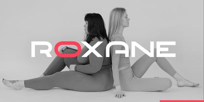 Roxane Display is a Unique Modern Elegant Typeface with Web-fonts. It's a very versatile font that works great in large and small sizes. Roxane Font would perfect for branding, logos, headlines, Captions. or simply as a stylish text overlay to any background image. Strong capitals and a smooth, open lowercase are effective in a variety of applications. It's shown a clean, minimalist, warmth, quirky, yet still purposed to be versatile and easy to read. 4 Weights Included. Free updates and feature additions.
 - Lorsche Display by FoxType,
$10.00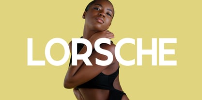 Lorsche Display is a Unique Modern Elegant Typeface with Web-fonts. It's a very versatile font that works great in large and small sizes. Lorsche Font would perfect for branding, logos, headlines, Captions. or simply as a stylish text overlay to any background image. Strong capitals and a smooth, open lowercase are effective in a variety of applications. It's shown a clean, minimalist, warmth, quirky, yet still purposed to be versatile and easy to read. 9 Weights Included. Free updates and feature additions.
 - Rostra by Tail Spin Studio,
$20.00It was during a visit to the Roman Forum that we were inspired by a seemingly unique style of lettering on a tablet among the ruins. The Latin message was chiseled in a condensed, free-style manner, almost as if it were intended as a personal note. While the stone showed only the capital letter forms of the period, we felt the creation of a lowercase would help extend the fonts usability and also add a whimsical feel to the design. - Darker Marker by Hanoded,
$15.00 Darker Marker is just what the name suggests: I found a very big fat marker in a local stationary store, bought it, came home and went to work on this font. Darker Marker is a very clear, very easy to read marker font. It is all caps, but upper and lower case differ and can be interchanged. Darth Vader would have said: “come to the dark side” and I believe you should. Darker Marker comes preloaded with all the diacritics you need.
 - Macallan by FoxType,
$25.00 Macallan Decorative is a Unique Modern Elegant Typeface with Web-fonts. It's a very versatile font that works great in large and small sizes. Macallan Font would perfect for branding, logos, headlines, Captions. or simply as a stylish text overlay to any background image. Strong capitals and a smooth, open lowercase are effective in a variety of applications. It's shown a clean, decoarative, warmth, quirky, yet still purposed to be versatile and easy to read. 02 Styles Included.. Free updates and feature additions.
 - Fingerfood by Hanoded,
$15.00 I made this font using my index finger and Chinese ink. I thought the ink would come off easily, but I can tell you: it doesn’t. I have been walking around with a black stained finger for a week now and I do get strange looks from people every so often… Fingerfood, of course, is hand made. It is a rather playful font - all caps, but lower and upper case differ and like to mingle. Comes with a full diacritics palette.
 - Interstellar by Loshaj Foundry,
$10.00 Interstellar is inspired by science fiction movies and writings. My initial idea for the font was to be used for signage and user interfaces that would appear on spaceships and bases. However, Interstellar is very flexible and can be used in many creative ways. For example, it is perfectly suited for graphic design applications ranging from editorial, corporate, web, interaction, and product design. The font contains 400+ glyphs which includes uppercase letters, numbers, symbols, accented characters, and multiple language support. Check it out.
 - Brocode Display by FoxType,
$12.00 Brocode Display is a Unique Modern Elegant Typeface with Web-fonts. It's a very versatile font that works great in large and small sizes. Brocode Font would perfect for branding, logos, headlines, Captions. or simply as a stylish text overlay to any background image. Strong capitals and a smooth, open lowercase are effective in a variety of applications. It's shown a clean, minimalist, warmth, quirky, yet still purposed to be versatile and easy to read. 08 Weights Included. Free updates and feature additions.
 - Edits And Credits JNL by Jeff Levine,
$29.00Edits and Credits JNL is a cheerful sans serif typeface modeled from ceramic letters in a movie titling set from the late 40s or early 1950s. In the original kit, letters would be lined up accordingly against a contrasting background and photographed for home or professional movie and slide titles. Note: The cap height is slightly smaller than normal for the respective point size. This will give the effect of wider line spacing - similar to that of home movie titles. - Mint Condition by Hanoded,
$15.00 My kids like to read Donald Duck magazine. They have boxes full of old editions that we bought second hand. Most of the comics are well-used, but there are some in near mint condition. I thought it would be nice to create a font that mimics the lettering found in comics. Mint condition is a very nice, very friendly handmade comic book font that comes with extensive language support (including Vietnamese and Cyrillic), plus two sets of alternate glyphs.
 - Magazine Grotesque by Latinotype,
$29.00 Magazine Grotesque is a sans-serif font specially designed for headlines and titles. Its unique features make it different from the traditional Grotesk typefaces. For example, outstroke extending beyond body in 'a' and 'e' letters or closed aperture in 'c', creating an unusual rhythm. Magazine Grotesque is the perfect choice for logos, titles, headlines and short blocks of text. As you would expect from Latinotype, this face comes with a standard set of 487 characters that support over 200 Latin-based languages.
 - F2F Provinciali by Linotype,
$29.99Heavy techno music, a personal computer, a font creation program and some inspiration had been the sources to the Face 2 Face font series. Alessio Leonardi and his friends had the demand to create new unusual faces that should be used in the leading german techno magazine Frontpage". Even typeset in 6 point to nearly unreadability it was a pleasure for the kids to read and decrypt the messages. The Provinciali letters look like they would be reversed in the spotlight." - Spookies Identity by Putracetol,
$32.00 Spookies Identity is a horror display font. This font is inspired by movie titles and some horror logos. The impression of horror is highly emphasized, but the alternate character of this font that curves at the beginning and end of the letter makes this font very suitable to be used as a logo and poster. Spookies Identity would be perfect for Logo, title, logotype, cover, headline, apparel, comic, cover books, cards, posters, or anything that requires a horrror or scarylook!


