10,000 search results
(0.031 seconds)
- etaoin shrdlu - Personal use only

- Ruthless Wreckin TWO - Personal use only

- Let Me Ride - Personal use only

- The X-Files - Personal use only

- Rider Wide - Personal use only

- HEROES - Personal use only

- PENCIL STENCIL - Personal use only

- Ruthless Wreckin ONE - Personal use only

- Generator REX - Personal use only

- GARFIELD the CAT - Personal use only

- First Lyrics - Personal use only

- Barkants - Personal use only

- ELEKTRA ASSASSIN - Personal use only

- Second Lyrics - Personal use only

- manic-depressive - Personal use only

- Paper-Mache - Personal use only

- R-2014 Eroded - Personal use only

- wATCHMEn - Personal use only

- LEGO BRIX - Personal use only

- Witches Magic - Personal use only

- Markera - Personal use only

- 1864 GLC Monogram by GLC,
$20.00 This family of two character monograms and initial letters was inspired from a French portfolio containing about two hundred examples of "Chiffres - deux lettres", destinated to engravers and jewelers, published in Paris in 1864, drawn by French engraver, C. Demengeot. Unfortunately, a large part of the pages were lost, so we have had to redraw about two thirds of the complete monogram family. Each package contains numerals and two complete sets of two-letter monograms, for example the A-B set, containing AA AB AC... corresponding to caps keys alphabet and BA, BB, BC... corresponding to lower case keys alphabet. We have added an Initial set, with two choices of single characters. Warning: I and J have strictly identical monograms.
 - Eutaw Stencil JNL by Jeff Levine,
$29.00 A hand lettered emulation of a Roman stencil type face on the cover of the folio for the Stenso School Set was the basis for Eutaw Stencil JNL, which is available in both regular and oblique versions. The Stenso School Set (circa 1940-41) was comprised of three stencils – two lettering guides and a map of the [then] 48 United States. Developed and patented by Baltimore school teacher Ruth Libauer Hormats, her stencils were the first to offer a system for accurate letter spacing and ease of use. “Eutaw” (as part of the font’s name) is taken from Eutaw Place, the street where Ruth and her husband lived at the time of Stenso’s inception. To the Cherokee, the name means “Creek Indian”.
 - Filthy Creation by Wing's Art Studio,
$9.00 Filthy Creation; An Outrageously Cartoonish Slime Font - Barf Bag Optional! Creeping off my ink-drenched drawing board, these illustrated slime fonts offer designers a unique set of diabolical tools for use in their gruesome creations. The five hand-drawn font styles are reminiscent of the best in vintage horror comics, 80s trading cards, gross-out movies, paperbacks and Saturday morning cartoons. Each style comes with uppercase and lowercase characters, plus numerals, punctuation, language support and symbols. Added to this is a complete set of alternatives (no need to repeat those oo’s, tt’s and ee’s) and an extra collection of grotesque illustrations that’ll leave you reaching for the barf bag! When you need the most gory, disgusting and slimy looking titles, look no further than this Filthy Creation.
 - Contempo Elan by Poole,
$36.00Where's the party? Don't forget Contempo Elan! This stunning new font comes with it's own party ornaments. The right solution for any festive occasion, this super innovative face comes in two flavors. Contempo Elan Grand Script is a surprisingly elegant alternative to a more traditional formal script. Designed by Wesley Poole of Hawaii, this alphabet is definitely a hip script. Early reviews call this font "remarkable" and "a masterwork". Contempo Elan Ornamental is elegant and fun! Just perfect for those last minute Holiday announcements or any use that requires a classy, celebratory typeface, Contempo Elan Ornamental fits the bill. Equally at home on board the Enterprise or beckoning revelers at Mardi Gras, Contempo Elan belongs in every type library, just for fun. Party on. - Stormy Youth by LomoHiber,
$16.00 I'm happy to present my Stormy Youth font. It has been drawn with a marker pen and a swift hand. Stormy Youth has intentionally overlapping letters to remind street style and give an underground look. Initially, I planned to make it as only uppercase, so feel free to use it this way. Stormy Youth is great for aggressive/rebel design style for teenagers. Stormy Youth Features: Can be used as uppercase font Set of alternates and ligatures for most common double letters Carefully tuned kerning (preview above doesn't always show it correctly for some reason) Swashes Wide Latin language support If you have some issues or questions, please let me know: lhfonts@gmail.com Hope you'll enjoy using Stormy Youth! You may also like my new font fracaso
 - Scripps College Old Style by Monotype,
$49.00The story of Scripps College Old Style is a heart-warming and inspiring chronicle about a young librarian, a handful of students, a wealthy grandmother, a dedicated educator -- and two eminent American type designers. The story begins in 1938, when Dorothy Drake, the newly hired librarian at Scripps College, a small women's college in southern California, became an impromptu dinner companion of the American type designer Fred Goudy. By the 1990s, the original fonts that Goudy had created for Scripps College in the 1940s had become prized -- but they were seldom-used antiques. Scripps needed digital versions of the metal fonts. This goal posed two immediate challenges: finding a designer familiar with letterpress printing who was skilled at creating digital fonts, and locating the money to commission the designer's services. The first challenge was the easiest to conquer. Sumner Stone was my first and only choice," recalls Kitty Maryatt, the current curator of the Scripps College Press. "I knew he had letterpress experience, was an accomplished calligrapher, and that his typeface designs were simply exquisite. The choice was easy."The second challenge was more difficult. It took the dedication, hard work and tenacity of Maryatt to bring the beautiful Goudy designs into the twenty-first century. While Stone was eager to begin work on the project, the college had no more money for new typeface designs in the 1990s than it did in the1930s. Years of lobbying, cajoling and letter writing were necessary to obtain the college's approval for the design project. Once she had the necessary funding, the design brief posed yet a third challenge. Goudy had provided two sizes of type to the Press: 14 point and 16 point. Which would serve as the foundation for Stone's work? In addition, the Goudy fonts were quite worn. Should Stone use printed samples as his design master, or base his work on the original Goudy renderings? The 14-point master drawings were the ultimate choice, with the stipulation that the finished fonts would provide both a seamless transition from the worn metal versions and a faithful representation of the original Goudy designs. Once the budget and design brief were established, the process of converting the original Goudy drawings into digital fonts took just a little over two months. Stone delivered finished products to Scripps in the fall of 1997. The first official use of the fonts was to set an announcement for a lecture by Stone at Scripps in February of 1998. But the story is not quite finished. Maryatt was so pleased with the new digital fonts, she wanted to share them with the graphic design community. At Stone's suggestion, she contacted Monotype Imaging with the hope that the company would add the new designs to its library. An easy decision! Now Monotype Imaging is part of the story. We are proud to announce the release of Scripps College Old Style as a Monotype Classic font. The once exclusive font of metal type is now available in digital form for designers around the world. " - Servus Slab by Dada Studio,
$29.00 This family is very special to me. I started working on it right after my first son was born. I decided to name the typeface "Servus" which means "Hello" in my country. The whole idea of the family symbolizes a child’s growth. It starts with Thin and Narrow weights - just like a newborn baby - then it slowly grows to Black and Wide. As You can guess, my son is quite chubby now! And I can assure You that I put all my love into details. Servus consists of 9 weights which gives us 18 fonts with matching italics. Lights and Bolds, due to their strong personality, are perfect for display uses. At the same time, Regulars create a harmonious structure that provides good legibility in long texts. Servus covers all latin languages. It contains a wide set of numerals, small capitals, fractions, ligatures and other OpenType goodies.
 - Tecna Dark Up Triangle BNF by Descarflex,
$30.00 The Tecn@ Dark&Light Triangle Background Nomenclature Font family is differentiated by the direction of the triangle tip in the 4 cardinal points. The family were designed to head, enumerate, indicate or highlight writings or design plans, for this reason, the characters are available only in capital letters and some signs or symbols that can serve such purposes. A triangle or empty character is included so that the user can use it overlaying any character of his choice or to be used alone. What is Lorem Ipsum? Lorem Ipsum is simply dummy text of the printing and typesetting industry. Lorem Ipsum has been the industry's standard dummy text ever since the 1500s, when an unknown printer took a galley of type and scrambled it to make a type specimen book. It has survived not only five centuries, but also the leap into electronic typesetting, remaining essentially unchanged. It was popularised in the 1960s with the release of Letraset sheets containing Lorem Ipsum passages, and more recently with desktop publishing software like Aldus PageMaker including versions of Lorem Ipsum. Why do we use it? It is a long established fact that a reader will be distracted by the readable content of a page when looking at its layout. The point of using Lorem Ipsum is that it has a more-or-less normal distribution of letters, as opposed to using 'Content here, content here', making it look like readable English. Many desktop publishing packages and web page editors now use Lorem Ipsum as their default model text, and a search for 'lorem ipsum' will uncover many web sites still in their infancy. Various versions have evolved over the years, sometimes by accident, sometimes on purpose (injected humour and the like). Where does it come from? Contrary to popular belief, Lorem Ipsum is not simply random text. It has roots in a piece of classical Latin literature from 45 BC, making it over 2000 years old. Richard McClintock, a Latin professor at Hampden-Sydney College in Virginia, looked up one of the more obscure Latin words, consectetur, from a Lorem Ipsum passage, and going through the cites of the word in classical literature, discovered the undoubtable source. Lorem Ipsum comes from sections 1.10.32 and 1.10.33 of "de Finibus Bonorum et Malorum" (The Extremes of Good and Evil) by Cicero, written in 45 BC. This book is a treatise on the theory of ethics, very popular during the Renaissance. The first line of Lorem Ipsum, "Lorem ipsum dolor sit amet..", comes from a line in section 1.10.32. The standard chunk of Lorem Ipsum used since the 1500s is reproduced below for those interested. Sections 1.10.32 and 1.10.33 from "de Finibus Bonorum et Malorum" by Cicero are also reproduced in their exact original form, accompanied by English versions from the 1914 translation by H. Rackham. Where can I get some? There are many variations of passages of Lorem Ipsum available, but the majority have suffered alteration in some form, by injected humour, or randomised words which don't look even slightly believable. If you are going to use a passage of Lorem Ipsum, you need to be sure there isn't anything embarrassing hidden in the middle of text. All the Lorem Ipsum generators on the Internet tend to repeat predefined chunks as necessary, making this the first true generator on the Internet. It uses a dictionary of over 200 Latin words, combined with a handful of model sentence structures, to generate Lorem Ipsum which looks reasonable. The generated Lorem Ipsum is therefore always free from repetition, injected humour, or non-characteristic words etc.
 - Allaina by Creativemedialab,
$22.00 Allaina is a stylish and elegant Serif family consisting of three styles, Regular, Medium and Bold with matching italics. It has many alternates and some unique attractive ligatures. This pretty serif family could be used for fashion, label packaging or elegant vintage style lettering. Combining standard letters with alternative letters wil give you beautiful and unique words.
 - Dingocitta by Erwin Krump,
$32.00 Dingocittà with its 12 fonts, contains a large amount of features like small capitals, different figure sets, automated fractions, ordinals, standard ligatures, contextual alternates (generates letter combinations to avoid form collisions by simultaneous maintaining word fugue) and discretionary ligatures. Dingocittà is suitable for a wide range of applications and can be readily combined with other fonts.
 - History Fabrica by Allouse Studio,
$16.00 Proudly Presenting, History Fabrica A Charming Script Font. History Fabrica is perfect for any titles, logo, product packaging, branding project, megazine, social media, wedding, or just used to express words above the background. History Fabrica also come with Multi-Lingual Support. Enjoy the font, feel free to comment or feedback, send me PM or email. Thank You!
 - Rumini Namamu by Allouse Studio,
$16.00 Proudly Presenting, Rumini Namamu a Handwritten Sans Textured Rumini Namamu is perfect for any titles, logo, product packaging, branding project, megazine, social media, wedding, or just used to express words above the background. Rumini Namamu also come with Multi-Lingual Support. Enjoy the font, feel free to comment or feedback, send me PM or email. Thank You!
 - Sophia Marilyn by Timurtype,
$14.00 Introducing by Timur type Proudly Present, Sophia Marilyn Sophia Marilyn A Handwritten Script Font Sophia Marilyn is perfect for product packaging, branding project, megazine, social media, wedding, or just used to express words above the background. This Sophia Marilyn font includes: Sophia Marilyn multilingual support. Embelish your designs with our original fonts.Enjoy the font,Thank you!
 - Gudeg Theo by Letterayu Studio,
$15.00 Gudeg Theo is a modern Slab serif style display font category. This font is very attractive. Perfect for cute quotes, packaging, branding, invitations, greeting cards, and more. Features : – Uppercase and Lowercase letters – Numbering and Punctuations – Multilingual Support – Works on PC or Mac – Simple Installation – Support Adobe Illustrator, Adobe Photoshop, Adobe InDesign, also works on Microsoft Word
 - Misty Black by Balpirick,
$15.00 Proudly Present, Misty Black Font. Misty Black is a Stylish Bold Script Font. Misty Black is perfect for product packaging, branding project, magazine, social media, wedding, or just used to express words above the background. Misty Black also multilingual support. Enjoy the font, feel free to comment or feedback, send me PM or email. Thank you!
 - Stangith by Mokatype Studio,
$19.00Hello Introducing, stangith - Ligatures modern Serif is an elegant, unique font that uses ligatures to smoothly link letters. Perfect for adding a unique twist to word-mark logos, monograms or pull quotes. stangith has 45 ligatures and 10 Alternates as well as numbers and punctuation making it super fantastic.Ligature can be turned off if required standard writing needs. - Planet Chalky by Allouse Studio,
$16.00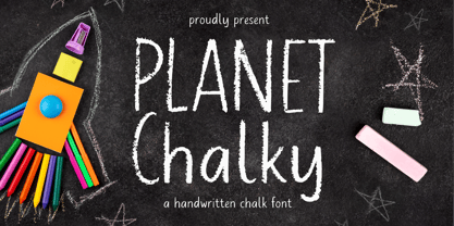 Proudly Presenting, Planet Chalky A Handwritten Chalk Font. Planet Chalky is perfect for any titles, logo, product packaging, branding project, megazine, social media, wedding, or just used to express words above the background. Planet Chalky also come with Multi-Lingual Support. Enjoy the font, feel free to comment or feedback, send me PM or email. Thank You!
 - Rotisserie Menu JNL by Jeff Levine,
$29.00 A 1928 menu for the restaurant “Rotisserie Du Cardinal” had the word “Cardinal” hand lettered in quite an unusual Art Nouveau type design consisting of thick and thin lines using angles to form the letter shapes. This eccentric (yet charming) style of lettering is now available as Rotisserie Menu JNL in both regular and oblique versions.
 - Manito LP by LetterPerfect,
$39.00 Manito was designed by Garrett Boge in 1989. He employed a wide pen and angular, sturdy forms to simulate rough-hewn woodcut letters. The font, consisting of both capitals and small caps, provides an ideal graphic complement to collateral of a natural or environmental character. It is named after a native American word for 'Great Spirit'.


