10,000 search results
(0.033 seconds)
- Santanelli by Pisto Casero,
$19.00 Santanelli is a rounded all caps display typeface. It is intended to be used in posters, editorial headlines and logotypes. It comes in three weights: Thin, Medium and Bold. Each letter has been designed with two different styles or flavors: decorative and clean. You can access each of them by typing uppercase and lowercase respectively. These two styles fit perfectly when combined within the same word or message.
 - Ekuhot by Product Type,
$18.00 EKUHOT Racing Font is a font that is designed with a precise shape and has many alternate variations and various ligature styles that make every word beautiful when written, make this font for various titles and text in your special projects so that your project looks beautiful. dignified character, bold and sporty. This font is perfect for headlines as well as others, what are you waiting for, use this font now.
 - Caress by Rometheme,
$18.00 Caress is a handwritten Sans serif for cartoons, kids stuff, and that feels fun, fancy, and cool. Highlights: Standard glyphs (Uppercase, Lowercase, Numeral and Punctuation) Work on PC or Mac PUA Encoded Support Fonts include multilingual support ä ö ü Ä Ö Ü ß ¿ ¡ No special software is required, The fonts can be opened and used in Adobe Illustrator, Adobe Photoshop, Adobe InDesign, even works on Microsoft Word.
 - Moonrova by Slide Shoot,
$12.00 Moonrova Serif is a handmade serif font. He has a beautiful character. It fits perfectly with invitation card designs, company logos, movie titles, movie names, business cards, book titles, brand names and various other designs. FEATURE : Ligature Uppercase and lowercase Numbering and Punctuation Works on PC or Mac Simple Installation Supports Adobe Illustrator, Adobe Photoshop, Adobe InDesign, also works in Microsoft Word Hope you like it Thank you.
 - Honest Punch by Sarid Ezra,
$15.00 Honest Punch is a bold and strong quotable font that you can use for any purposes. This font is very suitable for tagline and branding. With readability and clear looks, this font is perfect for quote. Honest Punch contains unique lowercase and uppercase that you can use at the same times in a word that will make your design more attractive. This font also contains ligature, underline, and support multilingual.
 - America Line by Kustomtype,
$30.00 Since its foundation in 1901, the iconic building in the Rotterdam neighborhood Kop van Zuid, is shining. Where previously the Holland America Line was housed, you will now find Hotel New York. A building with a tremendous history. We’re glad to take you back in time with captivating memories. In 1991, catering entrepreneurs Daan van der Have, Hans Loos and Dorine de Vos refurbished the at the time vacant property into a hotel/restaurant. To honor its 25 years existence, we celebrate this happening with a brand-new font, ‘America Line’. A tribute to Wim ten Broek, the multi-talented Dutch Graphic Designer. As early as the 1930’s before the Second World War, Wim ten Broek made the famous posters for the Holland-America Line. The influence of A.M. Cassandre here in, is clearly recognizable. Wim ten Broek also worked for HAL with large surfaces and fixed lines in which primary colors dominate, accentuated with shadows acquired by spraying technique. He also made graphic works for, among others, the World Exhibition in New York, the Dutch railway company ‘Werkspoor’ and the royal Dutch steel factory ‘Hoogovens’. His drawings and lettering gave me a love for the trade and naturally gave me a completely different view on fonts. That’s how I slowly but surely made my way to the trade. Based on the letters I had at my disposal from the Holland – America Line poster, I started to complete the alphabet in the same style as the original text. I digitized everything in order to acquire a usable and modern font. The Holland America Line Font comes with uppercase and lowercase with all the needs of modern times to create a good digital font and to be able to use it for all graphic purposes. The font is ideal for headtext, posters, logos, etc... Don't hesitate and use this unique historical font! It will give your work that glamour that you will find in few fonts. Enjoy the Holland America Line. The Holland America Line Font comes with uppercase, lowercase, numerals, punctuations so you can use the Holland America Line font to customize all your designs. The Holland America Line font is designed by Coert De Decker in 2018 and published by Kustomtype Font Foundry. The Holland America Line Font can be used for all graphic purposes. It is ideal for headtext, posters, logos, logos, letterhead, apparel design, package design, label design etc... Don't hesitate any longer and enjoy this unique historical font! It will give your work the glamour that you will only find in a few fonts. Enjoy your journey with the Holland America Line!
 - Carrig by Monotype,
$25.99 IMPORTANT – Please consider the superior Carrig Pro before making a purchase decision. Carrig started its life in 1998. I was working for a design agency in Cork, Ireland and was given a new brand identity project for a lakeside hotel in County Kerry. While visiting the hotel I made various sketches of the surroundings and upon returning to the studio, it was clear that my strongest ideas for the identity would be based on these freehand drawings. I wanted a classic, rough, hand-drawn typeface to complement this style but at that time, the studio didn’t have anything suitable, so I decided to draw my own. I found a Trajan-esque typeface that I really liked the look of in an old calligraphy workbook. I set about drawing my own version and then digitised it. Once the client had seen and approved my design, I began working on creating a complete all caps typeface to use for the hotel’s stationery. With ‘carrig’ being the Gaelic word for ‘rock’, my new typeface was all the more appropriate as it had the appearance of letterforms that had been carved into stone and weathered by time. With the project completed and the client happy, Carrig then sat in my unused fonts folder for several years... but there was always a nagging feeling at the back of my mind that I should do something more with it. So, in the autumn of 2014, I finally set about doing just that and created the font family you now find at MyFonts. Carrig’s form and structure was influenced by a hybrid of Classic Roman and Garalde typeface designs. The original calligraphic elements from the 1998 version of Carrig have been retained to add personality—as can be seen in the serifs, strokes, spurs, terminals and open bowls. Perhaps its most distinctive trait is a high x-height combined with relatively short ascenders. I wanted Carrig to immediately resonate with the reader and have designed it to be familiar and friendly. I imagine designers might choose Carrig as an alternative to such typefaces as Trajan, Garamond and Baskerville. I see Carrig as primarily a display typeface for titles/headlines in printed materials. I would also love to see it being used for branding, packaging and promotional material and am keen to hear from designers who use it in their own work.
 - Aire by Lián Types,
$37.00 Aire is what Sproviero would call a < big display family >. We recommend seeing its user’s guide. After his success with Reina, Sproviero comes out with this big family of 7 members: Each of them loaded with lots of sophisticated ligatures, alternates and the entire cyrillic alphabet. The overall impression that the font gives is lightness and delicateness; that’s the reason the designer chose to call it Aire, or Air, in English. "Aire was somehow having a rest from my fat face Reina [...] It started as a really thin style of Reina, but it rapidly migrated from it and grew up alone. And how it grew..." The inspiration came from his own past creations: “The heavy strokes of Reina were shouting for a more delicate thing. Something more feminine. More fragile. Something which had a lot of elegance and fresh air inside”. Aire responds to this: Sproviero found that many of the typefaces of nowadays which are used for headlines (best known as display fonts) have almost always just one, maybe two weight styles. This was his opportunity to try something new. Aire makes it easier for the user to generate different levels/layers of communication thanks to its variety of styles. With this font you can solve entire decorative pieces of design with just one font, and that was the aim of it. Aire was designed to be playful yet formal: While none of its alternates are activated it can be useful for short to medium length texts; and when the user chooses to make use of its open-type decorative glyphs, it can be useful for headlines with dazzling results. On March of 2012, Aire was chosen to be part of the most important exhibition of typography in Latinoamerica: Tipos Latinos 2012. TECHNICAL Aire is a family with many members. In total, the user can choose between almost 6,000 (!) glyphs (1,000 per style). Each member has variants inside, which are open-type programmed: The user decides which glyph to alternate, equalizing the amount of decoration wanted. Every decorative glyph has its weight adjusted to the style it belongs to. Exclusively for decoration, Aire Fleurons Pro is an open-type programmed set of ornaments. And last but not least, remember Aire is delicate. What’s my point? It is not recommended to activate all the alternates at the same time. It is typo-scientifically proved: A maximum of 3 or 4 alternates per word would be more than enough.
 - Boxajoy by PizzaDude.dk,
$20.00Boxajoy drawn with an inky pen and scanned at high resolution - that's why it looks good, even at large sizes! - LHF Sofia Script by Letterhead Fonts,
$43.00 Hand-lettered script with alternate characters. Looks especially nice when used in conjunction with bolder letter styles for good contrast.
 - DotLinDot by Pankabre,
$9.00 Accurate handwritten font with dots and lines. In small sizes it looks especially good in the texts of history books.
 - Rooky Hand by Siren Fonts,
$10.00 Rooky Hand was made with the simple goal of creating a casual handwriting font which looked good in all sizes.
 - Cambourne by Studio K,
$45.00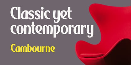 Classic yet contemporary, Cambourne is a crisp, curvaceous and timelessly elegant display font ideal for branding or promoting luxury goods.
 - Bobolha by Intellecta Design,
$24.90Bobolha is a funny font good to use in kids stuff, like birthday decorations and this kind of joy things... - Burger Joint JNL by Jeff Levine,
$29.00Fast food, good times and nostalgic memories are represented by Burger Joint JNL, another retro-design font from Jeff Levine. - Gruyere by Atlantic Fonts,
$26.00 Gruyère is rich with character and always in good taste. Earthy and assertive, Gruyère adds distinctive flavor to every occasion.
 - Tattoo God by Forberas Club,
$16.00 Tattoo God font is good to application for tattoo artist logo, vintage style, and black letter style and many more.
 - LTC Remington Typewriter by Lanston Type Co.,
$39.95 Remington Typewriter, whose original designer is unknown, was one of the earliest Lanston Monotype designs. The italic was designed by Frederic Goudy in 1927. His approach was to make an unconventional typewriter form that looked well-spaced even though all letters shared the same width.
 - Dime Store by Breauhare,
$35.00 Dime Store is a font inspired by childhood memories of dime stores in downtowns and shopping malls in the 1970s. The font was tweaked and digitized by Bob Alonso, who also digitized Breauhare’s Cooper Goodtime font. Dime Store is a cool, hip, nostalgic way of creating a decorative display, and at times it seems to have a slightly futuristic look, too.
 - Hype vol 2 by Positype,
$20.00 Hype lives up to its name. An energetic attempt to blow past previous sans’ descriptive words of massive, large, extensive, super and others. Hype transcends the everyday marketing terms and rests solely atop them all with a jaw-dropping current offering of 432 fonts that spans 18 widths and 12 weights. Insert a long pause and mic drop here, because nothing compares. Hype Volume 2 includes 6 of the 18 subfamilies that comprise the full Hype Collection. Each of these subfamilies represent 1 of the 18 available widths and each width contains 12 weights and matching italics. Volume 2 contains 144 fonts. Families included in Volume 2: Hype 0200, Hype 0500, Hype 0800, Hype 1100, Hype 1400, and Hype 1700. If you would like to complete your collection be sure to view and purchase Hype vol 1 and Hype vol 3. Hype’s bombastic approach meant supplying everything it could within each typeface: including small caps, yes small caps, a full numeral set that includes inferiors and superiors, super- and subscripts, full fraction support, case-sensitive forms, stylistic alternate letterforms, and more while touting a full Western, Central and South Eastern European character support. Embracing a Univers-esque bravado and a willingness to push the envelope, Hype leaves even more room to grow. No corners were cut, no shortcuts taken with a focus on sensible, efficient letter construction and functional reliability that ignores any one classification and instead looks to form an amalgam of classic sans styles influenced by wood type, movie showcards, and urban industrial letterforms.
 - Hype vol 3 by Positype,
$20.00 Hype lives up to its name. An energetic attempt to blow past previous sans’ descriptive words of massive, large, extensive, super and others. Hype transcends the everyday marketing terms and rests solely atop them all with a jaw-dropping current offering of 432 fonts that spans 18 widths and 12 weights. Insert a long pause and mic drop here, because nothing compares. Hype Volume 3 includes 6 of the 18 subfamilies that comprise the full Hype Collection. Each of these subfamilies represent 1 of the 18 available widths and each width contains 12 weights and matching italics. Volume 3 contains 144 fonts. Families included in Volume 3: Hype 0300, Hype 0600, Hype 0900, Hype 1200, Hype 1500, and Hype 1800. If you would like to complete your collection be sure to view and purchase Hype vol 1 and Hype vol 2. Hype’s bombastic approach meant supplying everything it could within each typeface: including small caps, yes small caps, a full numeral set that includes inferiors and superiors, super- and subscripts, full fraction support, case-sensitive forms, stylistic alternate letterforms, and more while touting a full Western, Central and South Eastern European character support. Embracing a Univers-esque bravado and a willingness to push the envelope, Hype leaves even more room to grow. No corners were cut, no shortcuts taken with a focus on sensible, efficient letter construction and functional reliability that ignores any one classification and instead looks to form an amalgam of classic sans styles influenced by wood type, movie showcards, and urban industrial letterforms.
 - Hype Vol 1 by Positype,
$20.00 Hype lives up to its name. An energetic attempt to blow past previous sans’ descriptive words of massive, large, extensive, super and others. Hype transcends the everyday marketing terms and rests solely atop them all with a jaw-dropping current offering of 432 fonts that spans 18 widths and 12 weights. Insert a long pause and mic drop here, because nothing compares. Hype Volume 1 includes 6 of the 18 subfamilies that comprise the full Hype Collection. Each of these subfamilies represent 1 of the 18 available widths and each width contains 12 weights and matching italics. Volume 1 contains 144 fonts. Families included in Volume 1: Hype 0100, Hype 0400, Hype 0700, Hype 1000, Hype 1300, and Hype 1600. If you would like to complete your collection be sure to view and purchase Hype vol 2 and Hype vol 3. Hype’s bombastic approach meant supplying everything it could within each typeface: including small caps, yes small caps, a full numeral set that includes inferiors and superiors, super- and subscripts, full fraction support, case-sensitive forms, stylistic alternate letterforms, and more while touting a full Western, Central and South Eastern European character support. Embracing a Univers-esque bravado and a willingness to push the envelope, Hype leaves even more room to grow. No corners were cut, no shortcuts taken with a focus on sensible, efficient letter construction and functional reliability that ignores any one classification and instead looks to form an amalgam of classic sans styles influenced by wood type, movie showcards, and urban industrial letterforms.
 - Kandidat by Fontroll,
$30.00 Imagine being printer in the early nineteenth century, your stock isn’t the finest, your lead characters are worn out: Voilá Kandidat Rough. But wait, Kandidat isn’t the usual scan-an-old-book,-put-the-glyphs-in-a-font-and-you’re-done-font. Kandidat Rough has a variety of whopping 14 alternates for most characters. Our algorithm changes the letters automatically. All you have to do is turn on Contextual Alternates in your layout app. The algorithm is the best we’ve seen so far, and it’s so good that even same words appear in different forms. And should by coincidence words have the same glyphs, just assign a different Style Set to the first letter, and all other letters in the word will change as well (well, it depends a bit on your software). The mechanism isn’t perfect and maybe we stretched OpenType capabilities a bit over the top, but we yet haven’t seen any better routine for switching letters on the fly. Is it worth to mention that Kandidat Rough not only speaks English, but also German, French, Spanish, Dutch, Danish, Norwegian, Swedish, Croatian, Turkish and most likely some other languages? Maybe. To be sure whether your language is supported, this is the typeset of all letters: ABCDEFGHIJKLMNOPQRSTUVWXYZÀÁÂÃÄÅÆÇÈÉÊËÌÍÎÏÑÒÓÔÕÖØÙÚÛÜÝĆČĐĞ݌ފŸŽ abcdefghijklmnopqrstuvwxyzàáâãäåæçèéêëìíîïñòóôõöøùúûüýÿćčđğıœşšž Apart from that we also included the following punctuation and currency symbols: !"#$%&'()*+,-./:;?@[\]_{|}¡©«®°±¶·»¿×–—‘’‚“”„†•…‹›⁄≠☞ €¢$£¥ This sums up to nearly 3000 glyphs per font, and we have three of them: Regular, Italic and Bold. All neatly kerned. All in all a great repertoire for even the most demanding book or advert jobs with a look of old times. And now imagine you are sick of the rugged print experience Kandidat Rough delivers: go for Kandidat. This is our Scotch-ish ancestor the Rough version was made from. A sturdy, friendly, round, warm friend from the beginning of the nineteenth century. A bit dark, maybe. You will like it. Kandidat has the aforementioned type set plus complete Baltics, Eastern Europe and Cyrillic. Plus a couple of gimmicks like fleurons, stars, circled numbers, arrows, and, and, and… Kandidat Regular additionally has small caps for Latin based scripts (not Cyrillic). The spick and span Kandidat font set also consists of Regular, Italic and Bold cuts. The bold cut is on the very bold side and can nicely be used for headings, whereas Italic is a great companion for Regular. It took us some time and trouble to finish this project, but after all we are very proud of our little feat and hope you will enjoy Kandidat as much as we do. Enjoy!
 - Happy Serif - Personal use only

- Happy Sans - Personal use only

- PetalGlyph - Unknown license

- MFC Bontebok Monogram by Monogram Fonts Co.,
$69.00 The inspiration source for Bontebok Monogram is a unique and inventive hand-drawn letterset from a vintage embroidery publication combining a stylized geometric oblique all capitals letterset with bracketing marks to make a monogram. First drawn as outlined letterforms with stipple shading, we’ve created multiple variations for you to design with. While this monogram was originally intended to adorn handkerchiefs, it has many other possibilities. Download and view the MFC Bontebok Monogram Guidebook if you would like to learn a little more.
 - Boetia by Scriptorium,
$24.00Boetia is an Art Nouveau period font which is designed to give some of the feel of ancient Greek lettering and design. It also echoes the lettering of the Psychedelic poster era and would be a great addition to any 60s font collection. The overall effect is both modern and classical at the same time, with readable, bold character forms perfect for posters or other titling uses. If you like our Hendrix or Pantagruel fonts you're going to love Boetia. - Fluid by Paulo Goode,
$20.00 This frivolous 6-font typeface was inspired by playing with my food one evening. I began to wonder what it would be like to draw a typeface with a pipette and liquid... the result is Fluid. A key feature are the contextual alternates that substitute an alternate second glyph when typing double letters, this gives a more natural feel to the resulting text. It’s a fun typeface from my back catalogue that was originally released in June 2018. Enjoy playing!
 - Olive Display by FoxType,
$10.00 Olive Display is a Unique Modern Elegant Typeface with Web-fonts. It's a very versatile font that works great in large and small sizes. Olive Font would perfect for branding, logos, headlines, Captions. or simply as a stylish text overlay to any background image. Strong capitals and a smooth, open lowercase are effective in a variety of applications. It's shown a clean, minimalist, warmth, quirky, yet still purposed to be versatile and easy to read. 7 Weights Included. Free updates and feature additions.
 - Super Discount by Mozatype,
$17.00 Hello there, Proudly presenting SUPER DISCOUNT. It is stylish marker font. It’s in two styles: Regular and Bold. SUPER DISCOUNT was designed to make logotype and lettering for your brands. And it’s would perfect for t-shirts/ apparel, promotional materials, sports, music festival, quotes, special events, or anything. What’s Included : Works on PC & Mac Easy to use ( Installations ) Easy Convert to Webfont Compatibility Windows, Apple, Linux, Cricut, Silhouette, and Other cutting machines Thanks for downloading, and I hope you enjoy it!
 - Smilodon by astroluxtype,
$20.00 Smilodon an ancient distressed font made with raptor claws, cat’s teeth, stone and sky? It's a corroded, distressed, punk scrawl with lots of attitude. This is a basic minimal glyph set with uppercase and lowercase forms. This is a headline display font suggested use would be 60 point or larger. Note: The metric and kerning on this font is extremely tight spacing and user should letterspace to desired width within application type controls. This monster cat is pre-historic indeed.
 - Bonwick Typeface by FoxType,
$9.00 Bonwick Display is a Unique Modern Elegant Typeface with Web-fonts. It's a very versatile font that works great in large and small sizes. Bonwick Font would perfect for branding, logos, headlines, Captions. or simply as a stylish text overlay to any background image. Strong capitals and a smooth, open lowercase are effective in a variety of applications. It's shown a clean, minimalist, warmth, quirky, yet still purposed to be versatile and easy to read. 8 Weights Included. Free updates and feature additions.
 - Tropen by Ahmet Altun,
$12.00 Tropen Font Family comes in one weight with six different types of styles but compatible at the same time with each other. All fonts are hand-made. It can be accessed to the extras with the standard keyboard codes which makes the use of font files very practical and easy. Tropen Font Family was designed carefully to create elegant works. It would be a perfect choice to design posters, affiches, logos, t-shirt and magazine prints, eye-pleasing typographic designs and more.
 - Shaky Halloween by Putracetol,
$28.00 Shaky Halloween is a horror display font. This font is inspired by movie titles and some horror logos. The impression of horror is highly emphasized, but the alternate character of this font that curves at the beginning and end of the letter makes this font very suitable to be used as a logo and poster. Shaky Halloween would be perfect for Logo, title, logotype, cover, headline, apparel, comic, cover books, cards, posters, or anything that requires a horrror or halloween!
 - Cortese by Hanoded,
$15.00 As usual, I stumbled upon a great 1971 Italian movie poster when looking for something else. The poster for “La Morte Cammina Con I Tacchi Alti” (directed by Luciano Ercoli), was made by an unknown artist and comes with a great font. Cortese was based on this movie poster font, but as I started working on the glyphs, I figured they would even look better in ligatures. So here it is: Cortese font - complete with 135 ligatures, accents and even Greek and Cyrillic!
 - Jaques Display by FoxType,
$10.00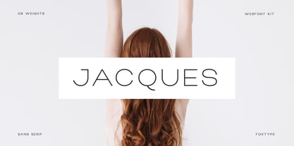 Jacques Display is a Unique Modern Elegant Typeface with Web-fonts. It's a very versatile font that works great in large and small sizes. Jacques Font would perfect for branding, logos, headlines, Captions. or simply as a stylish text overlay to any background image. Strong capitals and a smooth, open lowercase are effective in a variety of applications. It's shown a clean, minimalist, warmth, quirky, yet still purposed to be versatile and easy to read. 8 Weights Included. Free updates and feature additions.
 - Quico Display by FoxType,
$12.00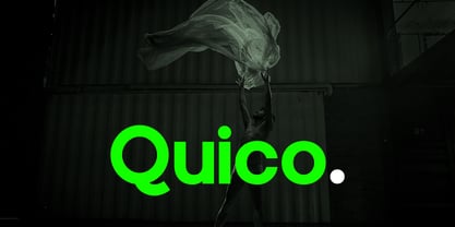 Quico Display is a Unique Modern Elegant Typeface with Web-fonts. It's a very versatile font that works great in large and small sizes. Quico Font would perfect for branding, logos, headlines, Captions. or simply as a stylish text overlay to any background image. Strong capitals and a smooth, open lowercase are effective in a variety of applications. It's shown a clean, minimalist, warmth, quirky, yet still purposed to be versatile and easy to read. 08 Weights Included. Free updates and feature additions.
 - Pax by Linotype,
$29.99Pax is clearly a didone, using Vox classification. The contrast between the thin lines and the thicker ones is noticeable, as you would expect from a didone. The basic form is relatively narrow, therefore I designed another Pax, slightly wider and darker, and called it Pax #2. Otherwise they are more or less identical. Pax is Latin for peace, on everyone's want list in 1995 - as well as every single year before and after that. Pax was released in 1995. - Water Splash by Putracetol,
$21.00 Water Splash is a unique display font. This font is inspired by the water splash shape. There are 3 directions for the splash water (direction to the left, up and down and to the right), and they are alternate from this lowercase font. With these variations, it will make it easier for you to create creativity for your project. Water Splash would be perfect for branding, logo, product, title, quotes, doodle, comic, books, greeting cards, toys, posters, baby clothing, picture books, etc.


