10,000 search results
(0.063 seconds)
- Seashell Paradise by Letterhanna Studio,
$19.00 Introducing "Seashell Paradise," a delightful new handwritten font. This font captures the essence of tranquility and elegance with its flowing lines and graceful curves. "Seashell Paradise" is a versatile typeface that can be used for a wide range of design applications, from invitations and greeting cards to branding and product packaging. Its clean, modern look makes it a perfect choice for projects that require a contemporary and sophisticated feel.
 - Jester Script by Paul O'Connell,
$9.95This comical styled Jester Script font was created to suit various design applications within the typeface market and is aimed at people looking for a clown styled brush script typeface that is very unconventional indeed. Designed and produced by Paul O'Connell of POCT, it is a distinct styled font script, loosely drawn with irregular rounded edges and curves to create a free flowing handwritten font that will appeal to everyone. - Table Shake by PizzaDude.dk,
$16.00 Table Shake is somewhat like sunshine after a cloudy day: It puts a smile on your face and makes your trouble seem easier to overcome. Table Shake handmade, yet digitally re-organized, but leaving the organic handmade details. Maybe it is that particular font that makes your designs blow into space with happiness! I've added 3 different versions of each lowercase letter, and they automatically cycle as you type.
 - Energetica by Balpirick,
$15.00 Energetica is a Modern Handwritten Font. Energetica is a delicate, elegant and flowing handwritten font. It has beautiful and well balanced characters and as a result, it matches a wide pool of designs. Add it to your most creative ideas and notice how it makes them come alive! Energetica also multilingual support. Enjoy the font, feel free to comment or feedback, send me PM or email. Thank you!
 - FF Good Headline by FontFont,
$72.99 FF Good is a straight-sided sans serif in the American Gothic tradition, designed by Warsaw-based Łukasz Dziedzic. Despite having something of an “old-fashioned” heritage, FF Good feels new. Many customers agree: the sturdy, legible forms of FF Good have been put to good use in the Polish-language magazine ‘Komputer Swiat,’ the German and Russian edition of the celebrity tabloid OK!, and the new corporate design for the Associated Press. Although initially released as a family of modest size, the typeface was fully overhauled in 2010, increasing it from nine styles to 30 styles, with an additional 30-style sibling for larger sizes, FF Good Headline. In 2014, the type system underwent additional expansion to become FontFont’s largest family ever with an incredible 196 total styles. This includes seven weights ranging from Light to Ultra, and an astonishing seven widths from Compressed to Extended for both FF Good and FF Good Headline, all with companion italics and small caps in both roman and italic. With its subtle weight and width graduation, it is the perfect companion for interface, editorial, and web designers. This allows the typographer to pick the style best suited to their layout. As a contemporary competitor to classic American Gothic style typefaces—like Franklin Gothic, News Gothic, or Trade Gothic—it was necessary that an expanded FF Good also offers customers both Text and Display versions. The base FF Good fonts are mastered for text use, while FF Good Headline aims for maximum compactness. Its low cap height together with trimmed ascenders and descenders give punch to headlines and larger-sized copy in publications such as newspapers, magazines, and blogs.
 - ITC Johnston by ITC,
$29.00ITC Johnston is the result of the combined talents of Dave Farey and Richard Dawson, based on the work of Edward Johnston. In developing ITC Johnston, says London type designer Dave Farey, he did “lots of research on not only the face but the man.” Edward Johnston was something of an eccentric, “famous for sitting in a deck chair and carrying toast in his pockets.” (The deck chair was his preferred furniture in his own living room; the toast was so that he’d always have sustenance near at hand.) Johnston was also almost single-handedly responsible, early in this century, for the revival in Britain of the Renaissance calligraphic tradition of the chancery italic. His book Writing & Illuminating, & Lettering (with its peculiar extraneous comma in the title) is a classic on its subject, and his influence on his contemporaries was tremendous. He is perhaps best remembered, however, for the alphabet that he designed in 1916 for the London Underground Railway (now London Transport), which was based on his original “block letter” model. Johnston’s letters were constructed very carefully, based on his study of historical writing techniques at the British Museum. His capital letters took their form from the best classical Roman inscriptions. “He had serious rules for his sans serif style,” says Farey, “particularly the height-to-weight ratio of 1:7 for the construction of line weight, and therefore horizontals and verticals were to be the same thickness. Johnston’s O’s and C’s and G’s and even his S’s were constructions of perfect circles. This was a bit of a problem as far as text sizes were concerned, or in reality sizes smaller than half an inch. It also precluded any other weight but medium ‘ any weight lighter or heavier than his 1:7 relationship.” Johnston was famously slow at any project he undertook, says Farey. “He did eventually, under protest, create a bolder weight, in capitals only ‘ which took twenty years to complete.” Farey and his colleague Richard Dawson have based ITC Johnston on Edward Johnston’s original block letters, expanding them into a three-weight type family. Johnston himself never called his Underground lettering a typeface, according to Farey. It was an alphabet meant for signage and other display purposes, designed to be legible at a glance rather than readable in passages of text. Farey and Dawson’s adaptation retains the sparkling starkness of Johnston’s letters while combining comfortably into text. Johnston’s block letter bears an obvious resemblance to Gill Sans, the highly successful type family developed by Monotype in the 1920s. The young Eric Gill had studied under Johnston at the London College of Printing, worked on the Underground project with him, and followed many of the same principles in developing his own sans serif typeface. The Johnston letters gave a characteristic look to London’s transport system after the First World War, but it was Gill Sans that became the emblematic letter form of British graphic design for decades. (Johnston’s sans serif continued in use in the Underground until the early ‘80s, when a revised and modernized version, with a tighter fit and a larger x-height, was designed by the London design firm Banks and Miles.) Farey and Dawson, working from their studio in London’s Clerkenwell, wanted to create a type family that was neither a museum piece nor a bastardization, and that would “provide an alternative of the same school” to the omnipresent Gill Sans. “These alphabets,” says Farey, referring to the Johnston letters, “have never been developed as contemporary styles.” He and Dawson not only devised three weights of ITC Johnston but gave it a full set of small capitals in each weight ‘ something that neither the original Johnston face nor the Gill faces have ‘ as well as old-style figures and several alternate characters. - Wild Spirit by Set Sail Studios,
$13.99 Introducing: Wild Spirit! A carefree and untamed brush font with a natural flow. Handmade with long organic strokes, Wild Spirit isn't held back by any boundaries or expectations. It's the perfect choice for personal branding projects, handwritten quotes, homeware designs, product packaging - or simply as a modern & stylish text overlay to any background image. Wild Spirit includes two sets of each character, and 25 ligatures (double letters) - which combined offers you a huge range of customisability and layout options, and allows you to produce a very organic and natural handwritten flow to your text. It also comes with a bonus set of 14 swashes & arrows to assist your project.
 - Morning Memories by Set Sail Studios,
$22.00 Introducing the Morning Memories Serif & Script. It's a nostalgic nod to those cherished memories of golden years gone by, but also a revived hope in creating new moments to treasure. At the forefront is the Morning Memories Serif - a bold, condensed, striking serif which includes a regular and true italic version, perfect for bold statements, logo designs and header text. Also included in the Morning Memories Script, a fast hand, pencil-textured handwritten font, perfect as a secondary font to the serif, standout words, and logo taglines. Includes 36 ligatures (unique double and triple letter combinations), to help recreate naturally flowing handwritten letterforms. A bonus Morning Memories Doodles font is also included, which contains 26 handrawn ovals, underlines and arrows - perfect for highlighting your serif text and adding a personal touch. Language Support • All fonts the following languages; English, French, Italian, Spanish, Portuguese, German, Swedish, Norwegian, Danish, Dutch, Finnish, Indonesian, Malay, Hungarian, Polish, Croatian, Turkish, Romanian, Czech, Latvian, Lithuanian, Slovak, Slovenian
 - Austy by Cititype,
$14.00 Austy is sophisticated typography that looks authentically handwritten. This typeface comes with 120 ligatures for a natural flow and feel, Use Austy to create stunningly beautiful designs easily. Perfect for logos, Digital signature, branding, business cards, watermarks, and much more!
 - Matteny Angels by Multype Studio,
$16.00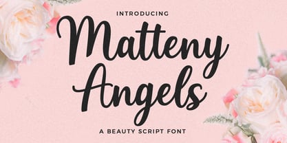 Matteny Angels is a beautiful and flowing script font. It looks stunning on wedding invitations, branding, thank you cards, watermark, fashion, quotes, greeting cards, logos, business cards and every other design which needs a handwritten touch. This font is PUA encoded.
 - Dutch Mediaeval Book by Canada Type,
$29.95This is the elaborately expanded version of what is arguably the most classic and popular of all historic Dutch faces: Sjoerd Hendrik de Roos's Hollandse Mediaeval from 1912. Over the decades, many pressmen and typography connoisseurs have gushed loving prose about this typeface. An extended family of two weights, corresponding italics, small caps, four condensed fonts, four book fonts, a set of initials and some very Dutch ornaments, Dutch Mediaeval is a versatile workhorse that flows comfortably and artistically, with the elegance of the main weights nicely complemented by the sturdiness of the bolds. Very few text faces are this clean and inviting while being crafty as well. The Dutch Mediaeval family comes with quite a few OpenType features and extended Latin language support. - Dutch Mediaeval by Canada Type,
$29.95This is the elaborately expanded version of what is arguably the most classic and popular of all historic Dutch faces: Sjoerd Hendrik de Roos's Hollandse Mediaeval from 1912. Over the decades, many pressmen and typography connoisseurs have gushed loving prose about this typeface. An extended family of two weights, corresponding italics, small caps, four condensed fonts, four book fonts, a set of initials and some very Dutch ornaments, Dutch Mediaeval is a versatile workhorse that flows comfortably and artistically, with the elegance of the main weights nicely complemented by the sturdiness of the bolds. Very few text faces are this clean and inviting while being crafty as well. The Dutch Mediaeval family comes with quite a few OpenType features and extended Latin language support. - Voltury by Angin Studio,
$10.00 Voltury is a vintage script created carefully to create a great flow and great character. It is inspired by American vintage signage and packaging. Voltury comes with 2 styles: clean and rough. It also comes with OpenType features such as ligatures and stylistic alternates, so you have more flexibility to mix and match the letters and make your design stand out from the crowd. It also contains characters for multi-lingual support. Check this link to see all glyph inside this product : https://bit.ly/2Oa3DVo Email : ahmadaswin99@gmail.com Thank you happy creating
 - Romeria Notes by Mans Greback,
$79.00 Romeria Notes is a handwritten font that captures the genuine essence of a signature. This natural script font, with its fluid and seamless strokes, seems as if it's been directly lifted from a personal notebook. Each character is crafted to mirror the effortless elegance found in an artist's autograph, making it a perfect choice for projects that require a touch of personalization. The cute and charming style of Romeria Notes brings a delightful and engaging feel to the text, while maintaining a beautiful and coherent appearance. The font exudes an organic flow, reminiscent of writing done in a state of inspiration and spontaneity. The font is built with advanced OpenType functionality and guaranteed top-notch quality, containing stylistic and contextual alternates, ligatures and more automatic and manual features; all to give you full control and customizability. It has extensive lingual support, covering all Latin-based languages, from North Europa to South Africa, from America to South-East Asia. It contains all characters and symbols you'll ever need, including all punctuation and numbers. Designed by Mans Greback, Romeria Notes stands as a testament to his creative expertise in capturing the essence of handwritten elegance. This font not only communicates messages but also conveys emotions, making it an ideal choice for projects that seek to connect on a more personal level.
 - Blang Cod by Gatype,
$14.00 Blang Cod Brush is a handwritten script font, based on free-flowing, friendly, and organic signature style expressions. hand painted with love. Blang Cod is available with alternative ligatures and characters in the Open Type Feature. Perfect for branding projects, logos, product packaging, posters, invitations, greeting cards, news, blogs, everything including personal charm. Blang Cod Brush is coded with Unicode PUA, which allows full access to all additional characters without special design software. Mac users can use Font Book , and Windows users can use the Character Map to view and copy any of the extra characters to paste into your favorite text editor/app. Thanks a lot for viewing and let me know if you have any questions.
 - Rockabilly Romance by Wing's Art Studio,
$16.00 Rockabilly Romance - A 1950s Rock ’n’ Roll Inspired Retro Script Font Rockabilly Romance is a rebellious script font from Wingsart Studio inspired by 1950s Americana. It’s designed to evoke the feel of bustling retro diners, drive-in movies and a Rock ’n’ Roll attitude. It features fast curves with a hand-made free-flowing style, plus an alternative version with added lipstick gloss. Standard features include unique uppercase and lowercase characters, punctuation, language support and numerals. It also includes underlines and lots of special ligatures and alternative characters to experiment with. The Rockabilly Romance font is particularly suited to bold displays such as menu headers, posters, movie titles and album covers. Check out the visuals for more usage ideas.
 - Ciseaux by Wilton Foundry,
$29.00 Ciseaux was inspired and is dedicated to the art of paper cutting. Early paper cutting artists were often royalty, but it soon became a folk art practiced by commoners whose cutouts decorated their homes. By the seventeenth century it had spread throughout the world. The Japanese called it Mon-kiri, the German's Scherenschnitte and Turkey even boasted a guild devoted to the art form. In Poland the designs were traditionally symmetrical and often used layers of colors to form pictorial collages. When Russian invaders confiscated scissors, villagers were found to cut their intricate designs with sheep shears! The art form later developed into cutting out elaborate designs of nature scenes and people, celebrating special occasions and even decorating legal documents. Ciseaux letterforms mimic paper cutting art in its shapes with a rather loose and almost joyous rhythm. The overall effect is somewhat earthy and natural yet it has an element of sophistication that cannot be ignored. Just like paper cutting, Ciseaux can be used for special occasions like invitations, brochures, identities, restaurant menus, and if you dare, some awesome looking paper graffiti. Available in TT, PS and Opentype for Mac and Windows.
 - Billund by Elster Fonts,
$24.00 Have you ever played with Lego™ and built letters? With Billund Side and Billund Top you can do it again and create colourful headlines on your Mac or PC. Billund is a font-system consisting of the two base-fonts Billund Side Outline and Billund Top Outline, extended by layer-fonts for one or five colours. Use the Outline-fonts alone to get »transparent« letters in one colour, use it with the Fill-fonts to fill the whole letter with one colour, or use the five Colour-fonts to get colourful letters in every colour you want. Billund contains cyrillic and greek glyphs and can be used for nearly a hundred languages. To expand the typographic possibilities, small caps, old style figures, numerals for small caps (c2sc), three stylistic sets, different symbols, forms, standard- and discretionary ligatures have been added, furthermore contextual alternates to avoid colliding letters. Each Billund-font contains 870 glyphs and more than 1600 kerning-pairs. Billund is named after the city of Billund (Denmark), where Lego™ was invented, the Lego™-headquarter still resides and the first Legoland™ theme park was opened in 1968 and still exists today.
 - MVB Solano Gothic by MVB,
$39.00MVB Solano Gothic Bold was originally designed as a display face for the City of Albany, California (located on the San Francisco Bay facing the Golden Gate Bridge and bordering Berkeley). Named for the City’s main street, the typeface needed to work on signage in proximity to early 20th Century buildings, and in contemporary settings. Rather than creating a neutered design to cover all bases, Mark van Bronkhorst chose to develop a simple, strong, condensed face that would offer flexibility of style by providing both retro and more contemporary forms. Solano Gothic has since been expanded to a family offering five weights from Light to Bold. The basic fonts provide upper- and lowercase forms, with figures designed to harmonize within upper- and lowercase settings (the standard figures are not full cap height). The same figures are provided with Small Caps, and align to small cap height. For all-cap settings requiring figures and monetary symbols of full-cap height, there are the “Cap” fonts. An alternate tabular “1” is provided in all fonts so that both fitted and tabular settings of figures are possible (access to alternate characters subject to system or application support). - Malnor Sans by Sikifonts,
$24.00 Malnor Sans is a normal sans serif family of 18 fonts. With modern style or neo-grotesque, Malnor sans has balanced proportions in every letter, and it's clean, minimal and cool. There are several alternative letters that can be used in both upright and oblique styles. Single story 'a' can give a more geometric impression, even though it is not purely geometric. There is also an alternative double story 'a' with a tail, a double story 'g' and an alternative 'l' that can be applied together via the 'salt' or 'stylistic sets' features for a slightly warmer feel. Malnor Sans currently has around 900 glyphs, including diacritical marks, that support a broad Latin-based language.
 - Wetricia by IbraCreative,
$17.00 Wetricia is a captivating monoline script font that effortlessly blends elegance with modern style. Its sleek, single-weight line design exudes a sense of sophistication, making it a perfect choice for projects that demand a refined aesthetic. The fluidity of its curves and the uniformity of its strokes create a harmonious balance, resulting in a graceful and timeless script. Wetricia’s individual characters flow seamlessly into one another, producing a cohesive and smooth appearance. Whether used for invitations, branding, or any design endeavor seeking a touch of class, Wetricia stands out as a chic monoline script font that adds an air of sophistication to any typographic composition.
 - Cristal Bendilar by Gian Studio,
$18.00 About Product Cristal Bendilar, Display Typography with Variable Weight and Width. Cristal Bendilar is an elegant modern variable font. It's basically Sans with a touch of serif to each letter. A Simplicity yet very legible with various widths and weights that you can explore, combine, create and help you design things. Font Styles on OTF files or even more if you use Single File Variables, you can shift weight and width in the sweetest places in Cristal Bendilar. What you get: Language Support: English, French, German, Indonesia, Ireland, Italy, Low German, Norwegian, Portuguese, Swedish, Swiss German. Thank You.
 - 99 Names of ALLAH Handwriting by Islamic Calligraphy75,
$12.00 We have transformed the “99 names of ALLAH” into a font. That means each key on your keyboard represents 1 of the 99 names of ALLAH Aaza Wajal. The fonts work with both the English and Arabic Keyboards. We call this Calligraphy "Handwriting" for obvious reasons. The first "Alef" has a "fatha", this indicates that the name can be pronounced only one way, "AR-RAHMAAN". (in the zip file you will find a pdf file explaining the differences in the "harakat", pronunciation and spelling according to the Holy Quran). The calligraphy is very easy to read, no letters overlaps and the decorative symbols are at minimum. Decorative letters used in this calligraphy: "Mim, Aain, Sin, HHe, He, Saad & Ta". Purpose & use: - Writers: Highlight the names in your texts in beautiful Islamic calligraphy. - Editors: Use with kinetic typography templates (AE) & editing software. - Designers: The very small details in the names does not affect the quality. Rest assured it is flawless. The MOST IMPORTANT THING about this list is that all the names are 100% ERROR FREE, and you can USE THEM WITH YOUR EYES CLOSED. All the “Tachkilat” are 100% ERROR FREE, all the "Spelling" is 100% ERROR FREE, and they all have been written in accordance with the Holy Quran. No names are missing and no names are duplicated. The list is complete "99 names +1". The +1 is the name “ALLAH” 'Aza wajal. Another important thing is how we use the decorative letters. In every font you will see small decorative letters, these letters are used only in accordance with their respective letters to indicate pronunciation & we don't include them randomly. That means "mim" on top or below the letter "mim", "sin" on top or below the letter "sin", and so on and so forth. Included: Pdf file telling you which key is associated with which name. In that same file we have included the transliteration and explication of all 99 names. Pdf file explaining the differences in the harakat and pronunciation according to the Holy Quran. Here is a link to all the extra files you will need: https://drive.google.com/drive/folders/1Xj2Q8hhmfKD7stY6RILhKPiPfePpI9U4?usp=sharing
 - Aphrodite Slim by Typesenses,
$57.00 Aphrodite Slim Pro is not just a lighter version of its sister Aphrodite Pro. Aphrodite Slim Pro has duplicated the quantity of characters of its partner, and that means more than 500 new glyphs, reaching a total of more than 1000. More delicate and meticulous, Aphrodite Slim Pro is once more a new typography with deep calligraphic ideals: We immersed ourselves into the world of each calligraphy ductus and each calligraphy masters by studying from decoration to lettering books. This was the key for the logic of Aphrodite Slim’s behavior. The new concept of Aphrodite Slim Pro was to join diverse styles of calligraphy in one in order to achieve an autonomous expressiveness, in fact, this is what calligraphy aims to, and we agreed to bring those ideals to the world of typography: It is justifiable to be inspired in hundred-year-old calligraphies, but it is even better if the results you obtain have a plus. A personal plus. During the creation process we were wondering whether it was possible to mix certain strokes of such rigid styles as uncial, (Li·n’s favourite style), with strokes of the copperplate, (Sav’s favourite style), and also to take and mix cualities of cancelleresca cursiva, formata and moderna; finally giving our creation a roman-transition italic look. So Aphrodite Slim takes ideals and aspects from those formal styles, following its own logic though, and emphasizing the fact of being a decorative typography. Calligraphy masters of our past are who we are in debt with. They are the cause we have lovely letters now. They have been spontaneous at the moment of creation, what differs from the type-designers of nowadays, whose spontaneity is more limited. Digital faces that we are used to see these days are a result of long hours of optical adjustments, grids, macros and inspirations of other existing typography, but without personal contributions. Aphrodite Slim wants to refute this. Its mission is to rescue de spontaneity of the artesanal lettering in order to obtain unique words; those which only calligraphy masters of our past or lettering artists of our present could give us. We have worked hard to achieve this, making Aphrodite the most universal font we could: It was necessary to study the most common words, focalizing more in the ones referring to “sensitivity”, of four of the most spoken languages in the world. Aphrodite Slim has an enormous quantity of decorative characters and special ligatures for phrases and words in English, French, Spanish and German. (See English, Français, Español, Deutsch PDF in the gallery section). We promise there is no existing type that decorates/ligates glyphs and words like Aphrodite Slim does: It is the first time a font like this really considers its purpose. -The way glyphs are ligated is insane- : Aphrodite Slim rescues some ideals of persons like Jan van den Velde (Italian cancilleresca writing of XVI Century) who understands ascenders and descenders as possibilities to beautify the lines of writing with curved strokes that seem to be dancing above and below of the words. This master also creates ascenders and descenders even where they are not necessary, on letters that do not actually need them: Aphrodite Slim takes this ideal. The font counts with a wide range of glyphs that seem not to be satisfied with its more primitive form and prefer to extreme their parts to be decorative. It also existed masters of calligraphy like José de Casanova of XVII Century, who, with a magnificant skill and a really personal mark, had the particularity of ligating words that were actually separated with spaces. This is another innovative feature in Aphrodite Slim. An investigation of the most common beginnings and endings words of the English language was done. Having that feature activated (discretionary ligatures), common words will start to ligate or to be decorated even when they are separated by spaces. Impossible to forget Francesco Periccioli of XVII Century and our experience us designers to face with works of him: His letters, that today are included in the group of cancellerescas modernas, have been a direct inspiration to the oldstyle figures and historical forms variables in Aphrodite Slim. Giovanni Antonio Tagliente (XVI Century) and his particular way of making tails and diagonals longer than usual, qualities that our creation reflects too. Finally, our adventures in Biblioteca Nacional and Barrio San Telmo, Buenos Aires, were essential for us to make Aphrodite Slim more complete and interesting: Sav did an excellent work when studying how the decorative miscellanea and swirls of early XX century were. She also investigated what particularities made those roman titling characters look antique so she could rescue some ideals for the oldstyle figures and historical forms variables. This also leaded her to create the ornaments variable in Aphrodite Slim. We are really proud of presenting Aphrodite Slim Pro, a typography that was the result of days and nights of working hard, because we do love what we do; and we are glad we are living in a present that gives us the possibility to spread this kind of art, because that is the way we consider our job: Aphrodite Slim Pro is Art. Hope you can appreciate the enormous work this type has. Features. Aphrodite Slim Pro is the most complete variable. It includes more than 1000 glyphs. Thanks to the Open-Type programming, it counts with a easy way to change/alternate glyphs if the application in which the font is used supports this. The variables contained in Aphrodite Slim Pro are also offered separately. Aphrodite Slim Text: It is the variable for lines and paragraphs. Thus it is the least ornamental and the most accurate to achieve a satisfying legibility. It has the Standard Ligatures feature in order to improve the possible conflicts some glyphs could have by others. Aphrodite Slim Contextual: It is the one that makes emphasis in decorating. It has the particularity of ligating/decorating words of common use in English, French, Spanish and German. It also has the quality of ligating common beginnings and endings of the common words in English. Aphrodite Slim Stylistic: With similar features of Slim Contextual. It includes a set of decorative numbers for a display use. Aphrodite Slim Swash: This one has special beginnings and endings to decorate words. Aphrodite Slim Endings: It makes words look as a signature. Aphrodite Slim Historical: It adds an antique look to the written word. It also has the special historical ligature function. Aphrodite Slim Titling: This one is the most decorative. Its copperplate inspired ornaments give words a special color, in order to handle the quantity of decoration, it comes with the standard ligature feature, which has the most common ligatures plus others that make decorative swirls not to be conflictive. Aphrodite Slim Ornaments: A set of 52 ornaments. Aphrodite Slim Pro includes all this features plus the Stylistic Set 1; Stylistic Set 2 and the possibility of Slashed Zero. We recommend you to check out the gallery in order to see all these features in action.
 - Bely by TypeTogether,
$49.00 Bely is the first design by French newcomer Roxane Gataud. Too many typefaces are either governed by fear and never accomplish what they could, or are unrestrained which results in their frenetic dangling like a leaf caught in a spider’s web. Bely’s strength is that it has both restraint and freedom throughout the text weights and into the unique display weight. There is no fear in this type family, but only great respect for both the tradition of reading and the opportunity to make an impression. Bely is a high-class throwback containing four text weights which were built upon classical proportions to capitalise on reading familiarity. Bely Text features balanced capitals and a play between large, triangular serifs at the top and thick, bracketed, rectangular serifs at the bottom. The family is capped by a radical, expressive French-style display weight which pushes the rules of the text weights to their logical extreme. Bely Display, truly daring with its monstrous and angled contrast, exploits the features which make an impression at larger sizes. In the end, Bely Display is adventurous when used in packaging, identities, and headlines with attitude, while Bely Text’s calm baseline and piercing ascenders give paragraphs texture and familiarity. Bely covers the Latin A Extended glyph set and brings its sense of confidence to your projects with its two text weights, matching italics, and unique display style. Bely’s satisfying OpenType features allow for the implementation of typographic niceties such as small caps, both tabular and proportional lining and oldstyle figures, ligatures, alternate characters, case-sensitive variants, and fractions. The complete Bely family, along with our entire catalogue, has been optimised for today’s varied screen uses. Awards – Selected for TypeTogether’s Typeface Publishing Incentive Programme scholarship in 2014. – Selected by French magazine Étapes for the 2014 Diploma Issue. – Selected for the 2014 exhibition “TransFormations” at Centre Pompidou. — Received the SOTA catalyst Award 2016
 - Narony by Alit Design,
$22.00 Introducing "Narony" – where sophistication meets nature in a harmonious dance of elegant typography and organic inspiration. This unique font seamlessly blends the timeless allure of serif with the dynamic fluidity of script, creating a typographic masterpiece that is both refined and enchanting. Serif Elegance: Embrace the classic charm of serif letterforms that exude sophistication and readability. Narony's serif elements add a touch of timelessness to your text, making it perfect for both formal and creative contexts. Dynamic Script: The script elements in Narony bring a sense of movement and fluidity to your words. The dynamic script flows effortlessly, adding a touch of personality and modernity to your designs. Whether used for headings or accents, Narony's script component elevates your text with grace. Natural Harmony: Immerse your designs in the serenity of nature with Narony's natural concept. Adorned with elegant leaf illustrations, each character is delicately intertwined with botanical elements, creating a seamless blend of man-made artistry and the beauty of the natural world. Versatility in Design: Narony is designed for versatility, making it suitable for a wide range of applications. From branding and logo design to wedding invitations and editorial layouts, this font effortlessly adapts to various design needs. Distinctive and Memorable: Set your projects apart with a font that is both distinctive and memorable. Narony leaves a lasting impression on your audience, ensuring that your message is not just read but experienced. Ideal Usage: Branding and Logo Design Editorial Layouts Wedding Invitations Packaging Design Social Media Graphics Nature-themed Projects Elevate your designs with the perfect blend of sophistication and nature – Narony. Let your words flourish in the graceful strokes of this font, where each character is a work of art and each design tells a story of elegance and harmony. Experience the beauty of Narony and redefine your typographic expression.
 - Rachele by Resistenza,
$39.00 Rachele is a mono line based script thin font. Inspired on the cute “Italian Bella Scrittura” handwriting but influenced by Spencerian. Ornaments and ligatures make this hand more expressive offering round stroke endings and a flowing shape. Rachele is a big family, its stroke expand into extra light till medium and passing through a calligraphic/ribbon effect. At the same time the width varies, that’s make this script even more flexible, from Ultra Condensed to Super Extended. Enjoy it. Check out also Check out also ‘Mentha’ based on Rachele’s skeleton. We recommend to combine Rachele with: Turquoise
 - MMC Insignia Pro by MMC-TypEngine,
$42.50 MMC INSIGNIA PRO, is an Iconic & Emblematic Neogothic Geometric Display… Assembled by Trivial Squares and Diagonals Symbols Pattern from a puzzled grid Aftermath!! Includes Small Caps & Stylistic Alternates!! +Extra Monospaced Figures. In 22 styles, with Obliques, both for single display and layer Typesetting, plus OpenType Features & Bonus Blocks Fonts! MMC Insignia Pro, is the cursive version of MMC Insignia and the default or main lowercases in ‘SC’ feature plus cursive stylistic alternates and sets such as Monospaced figures… Its atmosphere stands by on both Corporative to Decorative, Modern & Fashion, Federalist, Bohemian, Romantic, Ludic, Treasured Look, Etc. This Display font-family is the result of the repeated applications of this unique infamous Icon or Symbol, of two counterpointed triangles, implicit as hourglasses, in order to compose an innovative and unprecedented typographic pattern and modulation concept through the letterforms, in an extremely Geometric style. The Graphic Sign used throughout this type, is a remarkable trend used already in Logos of different businesses, whose most famous case refers to a famous International Bank, which doesn’t need to be mentioned, as it is instantly associated! This characteristic innovation was the main motivation while creating this type. Usage Suggestions: Type Fancy Titling texts, Display Remarkable Logos, Branding Projects, Labels, Emblems, Fashion Patterns, or in everything Noble and designed for Excellence as a type of Insignia, or distinguished marks and attributes of Royalty and Power!! That’s also forwardly, the reason why it was named MMC Insignia… TIPS: 1-Combine styles into innumerous possibilities of Chromatic Typesetting, by ‘central pasting’ layers… You may dislocate layers for improvisations! 2-USE BLOCK “FREE-STYLES” 1 & 2 also to add default 3D! Change 3D directions by switching Block 1 to Block 2, that way you can Zig-Zag words and lines. *Also shift the block layer up to bottom limit, it makes the 3D direction turn upside down. Greetings! André, MMC-TypEngine.
 - Blizka by YXType,
$22.00 Blizka is a legible sans-serif with much characteristics! Inspired by calligraphic strokes, it features straight cuts in unexpected details. Great care is taken to make sure all letters flow harmoniously with each other for a superb reading experience for small texts. Blizka is subtle and functional in small sizes but perverse and full of personality when large! • Support over 200 languages with full coverage of western & central European Latin. • Beautiful Italics • SmallCaps • Proportional, tabular, oldstyle figures, fractions, you name it.
 - 99 Names of ALLAH Pilot by Islamic Calligraphy75,
$12.00 We have transformed the “99 names of ALLAH” into a font. That means each key on your keyboard represents 1 of the 99 names of ALLAH Aaza Wajal. The fonts work with both the English and Arabic Keyboards. We call this Calligraphy "Pilot" because it was the very first one we produced. The first "Alef" doesn't have a "hamzit wasel" nor a "fatha", this indicates to skip the pronunciation of that letter. So instead of saying "AR-RAHMAAN" you say "R-RAHMAN". (in the zip file you will find a pdf file explaining the differences in the "harakat", pronunciation and spelling according to the Holy Quran). Decorative letters used in this calligraphy: "Mim, Aain, Sin, HHe, He, Kaf & Alef". Purpose & use: - Writers: Highlight the names in your texts in beautiful Islamic calligraphy. - Editors: Use with kinetic typography templates (AE) & editing software. - Designers: The very small details in the names does not affect the quality. Rest assured it is flawless. The MOST IMPORTANT THING about this list is that all the names are 100% ERROR FREE, and you can USE THEM WITH YOUR EYES CLOSED. All the “Tachkilat” are 100% ERROR FREE, all the "Spelling" is 100% ERROR FREE, and they all have been written in accordance with the Holy Quran. No names are missing and no names are duplicated. The list is complete "99 names +1". The +1 is the name “ALLAH” 'Aza wajal. Another important thing is how we use the decorative letters. In every font you will see small decorative letters, these letters are used only in accordance with their respective letters to indicate pronunciation & we don't include them randomly. That means "mim" on top or below the letter "mim", "sin" on top or below the letter "sin", and so on and so forth. Included: Pdf file telling you which key is associated with which name. In that same file we have included the transliteration and explication of all 99 names. Pdf file explaining the differences in the harakat and pronunciation according to the Holy Quran. Here is a link to all the extra files you will need: https://drive.google.com/drive/folders/1Xj2Q8hhmfKD7stY6RILhKPiPfePpI9U4?usp=sharing
 - Patched by Mans Greback,
$39.00 Patches is a multi-faceted, victorian-era serif typeface for when you need something more than plain text. Get that extra attention while adding a genuine, original appearance to your message. Patches was designed from scratch to give a sense quality and depth. Its designer Mans Greback has created a typeface with a complex structure, yet one that will be easy to master. This work will suit every style, taste and skill level. It is a decorative and completely hand-drawn design in vintage lettering, with the perks and flexibility of present-day technology, which is exactly what you'd expect from a modern typeface. Whether you are making a decorative floral headline, drawing a cowboy logo, or creating a unique design based on this ornamental font, the hopes are that Patches can give you a set of tools and inspiration to bring out the best of your artistry. Standing on the shoulders of giants, it was inspired by a wide range of works, and will hopefully be able to continue to teach and inspire future artists. Or at least help you become a better designer when you're designing an elegant and classic headline. Set the coloring of Patches to light gold and cream tones to apply a luxurious look, or in dark tones for a more rugged impression. Bold, bright colors will make it appear In the mid-1800s, decorative design flourished in the Western major cities. Victorian style thrived and encouraged techniques such as enamelling, embroidery and calligraphy. From the 1880s onwards, there were a series of reactions to higher Victorian tastes, with Art Deco reaching the heights of the 20th century. However, the Victorian art persisted popularity, as it changed to more sophisticated designs which made it more attractive to specific professions and groups. The evolution of the Victorian style in the mid-20th century was a key factor in the succession of the movement. Classic shops and salons, sport designs and traditional festivals, and later Rock'n'Roll and Harley Davidson-themed graphics inspired the continued development of the art. Aspiring to carry on this tradition, this typeface family consists twelve different high-quality variations. The main ones are Patched and Patched In – an outlined variation – and each one provided in five weights: Thin, Light, Medium, Bold and Black. Additionally, the two rough fonts Hangaround and Prospects, that tries to grasp the rough, earthy atmosphere of a shady motorcycle club. The font is built with advanced OpenType functionality and has a guaranteed top-notch quality, containing stylistic and contextual alternates, ligatures and more features; all to give you full control and customizability. It has extensive lingual support, covering all Latin-based languages, from North Europa to South Africa, from America to South-East Asia. It contains all characters and symbols you'll ever need, including all punctuation and numbers.
 - Barista - Personal use only

- LT Oksana - Personal use only

- LT Oksana - Personal use only

- Sculptors Hand - Personal use only

- Hitalica - Personal use only

- Calla Personal Use Only - Personal use only

- Prakrta - Unknown license

- Crimson Petal - Personal use only

- Oriental View - Unknown license


