10,000 search results
(0.013 seconds)
- 1543HumaneJenson - Personal use only

- 1742Frenchcivilite - Unknown license

- Gilgamesh by ITC,
$29.99Gilgamesh is the work of British designer Michael Gills, based largely on his calligraphic experiments and named after a poem from Middle Eastern mythology, The Epic of Gilgamesh". Gilgamesh offers functionality with style and will give emphasis to any typographic design." - Cut Block by Adam Ladd,
$20.00 A hand-drawn typeface that depicts the idea of cutting away pieces of wood. It has a rough, yet modern appearance as it is largely based off the popular Gill Sans (with some modifications). Leaving a graphic and textured look.
 - Parisine Office Std by Typofonderie,
$59.00 Humanistic sanserif in 4 fonts The Parisine Office typeface family can be considered as the text version of the Parisine. When Parisine xheight fit Helvetica large xheight, Parisine Office is more close to Gill Sans in term of proportion, as it was developed for Ratp, the public transport in Paris to allow compatibility with documents set in Gill Sans without changing the length of text. Parisine Office by default is a humanistic sanserif available in 4 fonts perfect for text setting. The design of the italic lowercases is more cursive than in Parisine. About Parisine Parisine helps Parisians catch the right bus Observateur du design star of 2007
 - Scary Night by Trim Studio,
$12.00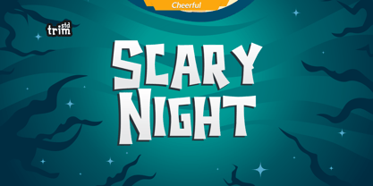 Scary Night is the perfect Halloween font: scary, weird and creepy. It will add a touch of horror to any design project! Its perfectly suited for crafter and graphic artist to complete their design such as invitation, Halloween Event, advertisement, poster, logo, birthday, product sign, and many more! Scary Night Font also Lightweight, even so contains All Standard glyphs and punctuations
 - Arqua by DubbioGusto,
$15.00 I took Arquà’s curvy lines from some details in art nuveau posters from late 1800 / early ‘900, then I added to the mix a little bit of elegance with some weird contrast (look at the S). One hour in the hoven and a modern looking display font came out in 2 weights: Goodboy and the doppelganger Badboy perfect to mix up.
 - Born To Ride by Gassstype,
$25.00 Here comes a New font, Introducing BORN TO RIDE It's Weird Display Typeface is a Natural Brush Style and Authentic classy style, this font is great for your creative projects such as watermark on photography, and perfect for logos & branding, invitation,advertisements,product designs. It also features a wealth of special features including You can activate 22 Ligatures OpenType panel.
 - Parisian Ornamentals by Celebrity Fontz,
$24.99Beautiful, richly ornamented shadowed letters in the Empire fashion, similar to the fonts of the Parisian type founder J. Gille', cut around 1810. Includes one set of A-Z ornamental initials conveniently assigned to both the upper and lower case alphabet characters. - Astoria by Alan Meeks,
$45.00 Based heavily on Gill especially in the mid weights, Astoria has a subtle top left serif which makes it not quite a Roman and not quite a Sans. Designed specifically as a text face it still works very well as a headline font.
 - Glider Girls, crafted by the creative duo Kevin and Amanda, is a font that captures the essence of spontaneous handwriting, infusing your projects with a personal and playful touch. This font stands ...
- KR Heartalicious - Unknown license

- Utroligt by Hanoded,
$15.00 I am (trying to) learn Danish using an app on my phone. The grammar and vocabulary are not that difficult, as the Danish language is very close to the Dutch language. The pronunciation, however, is quite tricky. Words look simple when written down, but when pronounced, they sound very different. Take ‘pige’ (‘girl’) - it reads ‘pee-guh’, right? Well, it is pronounced ‘pee-uh’. Or how about ‘brød’ (meaning bread)? If you keep in mind that the o-slash is pronounced as the ‘i’ in bird - almost like ‘uh’, it should be br-uh-d, right? Wrong again. It is pronounced br-uh-l. Aaargghh! I will succeed, hopefully! Utroligt is a Danish word meaning ‘incredible’. It is a nice, uncomplicated all caps font. I made it with a cheap rollerball pen and some nice French paper. Comes with double letter ligatures and all the diacritics you’d like - including the danish ones.
 - Whatchamacallit by Comicraft,
$19.00 We popped the Doohickey into the Framistat and out popped this Whatchamacallit! Is it fat? is it thin? Is it tall? Is it short? Is it light? Is it heavy? Is it condensed?! is it expanded?! Yes, yes, yes and yes -- It’s all of the above and more! Our resident mad scientist John “Mr. Fontastic” Roshell has developed a single contraption that can handle any design emergency, from crimelords to supervillain team-ups to alien invasions. Whatchamacallit is a friendly and readable sans-serif, inspired by some of our all-time favorites -- Gill Sans, Futura, Venus and Antique Olive. But, like its machinery-contraption namesakes Doohickey and Framistat, Whatchamacallit has a lively personality -- the strokes are a little wavy, the ends a bit bulbous, and the circles are like little loaves of bread, rising in the Whatchamacallit's oven... delicious!
 - Varisse by AVP,
$19.00 Varisse spans over two centuries of type design and draws its inspiration from well-loved classics that are as fresh today as they were when they were created. The range stretches from a quintessential 18th century transitional serif to an uncompromising 20th century sans. Think Baskerville, think Gill. The idea was to create a family that shared similar forms and the same vertical metrics, allowing them to be mixed to provide impact and readability as required. With a generous x-height and a host of options, the Varisse family is ideally suited to branding, packaging, magazines and editorial. It also provides a wealth of opportunity in website presentation. The fonts are divided into five subfamilies by degree of ‘serification’. Varisse Sans Varisse Soft Sans Varisse (normal) Varisse Soft Serif Varisse Serif Each subfamily contains six weights and accompanying italics.
 - Almeida Script by Blankids,
$24.00 Introducing of our new product the name is Almeida Girly Script Font. Almeida inspired by modern calligraphy style this font is a fun theme very good for display, tshirt design, craft, quote sign, logotype and etc FEATURES : Uppercase Lowercase Number Punctuation Multilingual PUA Encode Opentype
 - Kensington by AVP,
$29.00 Kensington started life as a sans serif based loosely on the strokes and weights of Garamond but, inevitably, influences of Gill Sans crept in, creating an interesting mix. The single weight is excellent for titling and works as a body font in reasonably small quantities.
 - Just Shoes And Purses by Outside the Line,
$19.00 Just Shoes & Purses… from silly to sophisticated, a collection of 26 line drawings of shoes and purses and those same 26 with areas filled in. Lots of cute girlie stuff… if you need more check out Hat Doodles , Diva Doodles or Diva Doodles Too .
 - RMU Koralle by RMU,
$25.00 Koralle was an abundant family of grotesque font styles which had been released by Schelter & Giesecke in the first quarter of the previous century. Out of this family four of the most impressive styles were revived, whereby I stuck as close to the original as possible. All styles contain even the weird-looking capitalized German double-s of which I am a strong opponent.
 - Tapir by HVD Fonts,
$26.00 Searching for the Exceptional Designing Tapir was driven by the search for a display typeface which is doing something different than the rounded and bouncy fun faces – the letterforms should stand out with a slight touch of weirdness, creating attention and recognizabilty. A big character set, optimized spacing & kerning and lots of features make Tapir a good choice for professional usage between games, toys and skateboards.
 - After Nightfall by Hanoded,
$10.00 After Nightfall is a handmade fairytale font. It was called Bunting Nook first (after a spooky story of a black dog that haunts a town in Britain), but I figured it was a bit of a weird name, so I settled for After Nightfall. This font comes with some lovely swashes, which should be used sparingly. But that, of course, is entirely up to you.
 - Message from Mars by PizzaDude.dk,
$18.00 This is a live recording from Mars: Your planetary system is about to be invaded by the inhabitants of Mars. We come in peace, we come with party! Heh-heh. Say hello to my interplanetary font, Message from Mars. Handmade, yet super digital. Play around with the weird shaped letters, and make your own galactic text - use upper- and lowercase as well as the alternate version
 - The font "The Girl Next Door" created by Kimberly Geswein has an intriguing mixture of casualness and charm, encapsulating the warmth and approachability its name suggests. Kimberly Geswein, known fo...
- Keep Calm by K-Type,
$20.00 Keep Calm is a family of fonts developed from the now famous World War 2 poster that was designed in 1939 but never issued, then rediscovered in 2000. As well as the original Keep Calm font, the medium weight of the poster, new weights are now available – Keep Calm Book (regular weight), Heavy and Light – and each weight comes with a complimentary italic. Version 2.0 (2017) is a comprehensive update which consists of numerous refinements and improvements across all weights. The family now contains a full complement of Latin Extended-A characters, Welsh diacritics and Irish dotted consonants. The four italics have been optically corrected with revised, ‘true italic’ forms of a and f. The crown motif from the top of the Keep Calm poster is located at the plus minus ± and section § keystrokes (Alt 0177 and Alt 0167 on Windows). The lowercase g follows the Gill/Johnston eyeglass model, but also included is an alternative, single-story g at the Alt G keystroke (Alt 0169 on a Windows keyboard), the normal location of the copyright symbol which has been relocated elsewhere in the fonts. An alternative lowercase t, without the curved wedge cutaway, is provided at the Alt T (dagger) keystroke (Alt 0134 on Windows). When I first saw the Keep Calm and Carry On poster, I wrongly assumed the letters to be Gill Sans. Recent research at the National Archive by Dr. Bex Lewis of Manchester Metropolitan University has revealed that the original poster was hand drawn by the illustrator and painter, Ernest Wallcousins. The Gill Sans influence is apparent, in the R particularly, the M’s perfectly pointed vertex is redolent of Johnston’s Underground, and the most anomalous character, the C, resembles the ‘basic lettering’ of engineers that provided the vernacular sources for the Gotham typeface. Developing the Keep Calm typeface has been an exercise in extrapolation; an intriguing challenge to build a whole, high quality font family based on the twelve available capitals of the Keep Calm poster, and on similar lettering from the other two posters in the original series. This has required the creation of new lowercase letters that are believably 1939; that maintain the influence of Gill and Johnston while also hinting at the functional imperative of a wartime drawing office. Wallcousins’s lettering balanced intuitive human qualities and the pure pleasure of drawing elegant contemporary characters, against an underlying geometry of ruled lines, perfect circles, 45° terminals, and a requirement for no-nonsense clarity.
 - Hand Drawn by ITC,
$29.00Hand Drawn is a faithful adaptation of the original typeface of hte Letraset range by Michael Gills. A set of numerals was added to complete the font. Hand Drawn has all the charisma of the 1950s brush style and should be set closely for the best impact. - Elysium by ITC,
$29.99Elysium is the work of Michael Gills who was in turn influenced by Czechoslovakian designer Oldrich Menhart. The typeface is an old style roman font whose refreshing quality comes from the designer's love of calligraphy. Elysium has a crisp appearance coupled with creative and unique letterforms. - Talie - Unknown license

- Snag Mag - Unknown license

- Cosmic Dude Demo - Unknown license

- Black Eye Nue - Unknown license

- Bouncy Color by Mans Greback,
$59.00 Bouncy Color is a funny cartoon font with pre-set coloring, outline and shine effects! Drawn and created by Mans Greback in 2021, this comic-style lettering has a happy, quirky personality and optimistic humour. It has a colorful graffiti and street art look, while being a childish and cute sans-serif – a typeface for boys and girls alike. Bouncy Color is provided in five styles: White, Blue, Pink, Highlight and Outlined. Use it in Photoshop, Illustrator, InDesign or any other modern software that supports color fonts, and you'll give any project a fun and happy appearance.
 - Macho by Dada Studio,
$29.00 Macho has a complex nature. He’s a true “gentle giant”. He kicks asses as a splendid fighter, but also, being a gentle lover, leaves girls breathless. You can count on him in any situation and it’s always good to have him by your side. The brave Macho supports all Latin languages, as well as Cyrillic. His família consists of nine weights plus matching italics. It is stuffed up with various OpenType features such as small capitals, fractions, local forms, ordinals, alternates, ligatures and a full set of superscript and subscript glyphs. A good buddy of Clavo, Servus and Sharik.
 - Soothsayer by Comicraft,
$39.00 A soft spoken sorceress whispers sweet somethings in your shell-like ear. Her words excite and enthrall, tantalize and tease, they soothe and seduce, stimulate and sustain you, they awaken and arouse you, they entice and engorge you, they -- oh, I'm sorry, what was I supposed to be saying? Oh yeah, from the pages of DC Comics' Vertigo title, THE WITCHING HOUR, and Joe Kelly and Chris Bachalo's STEAMPUNK, Comicraft is happy to make available one of our most requested fonts... Hey, what happened to that cute girl with the white hair? And, Hey, Where's my wallet?!?
 - Quirky Kurlz by Scholtz Fonts,
$22.00 Quirky Kurlz is a cute, curly, vintage font. It's light hearted and funny, rounded and retro. Rounded characters, curly loops and undulating baseline work together to give a lively, look-at-me impression. Use Quirky Kurlz for branding, packaging, girls stuff, kids fashion, greeting cards, party invitations, retro postcards and advertising. Quirky Kurlz has all the features usually included in a fully professional font. Language support includes all European character sets, Greek symbols and all punctuation. Quirky Kurlz makes use of OpenType features to avoid the mechanical look caused by two identical characters side by side.
 - Prague by ITC,
$29.00Prague was designed by Michael Gills, who was strongly influenced by the work of Czech designer Oldrich Menhart. It is a strong, angular roman typeface with classical overtones. The exciting vibrancy of Prague is suitable for a wide range of advertising work requiring a traditional or classical approach. - Valise Montreal by Device,
$29.00 A condensed loose brush style. This font has a breezy elegance and casual sophistication, yet in a different context or color, it could be seen as nervous and urban. A weird dichotomy. Set in smallish text blocks, it has a surprisingly even color. This is due to a balace that has been struck between keeping the roughness and idiosyncracies of a hand-drawn face but ensuring an overall regularity.
 - Orchestra BT by Bitstream,
$50.99Created by Italian graphic designer and illustrator Lorenzo Lalatta, Orchestra brings a whimsical yet elegant spin to Latin typography. Every letterform is cleverly adapted from the shape of a musical instrument or musician. Mr. Lalatta has even disguised himself as the bullet glyph. Perfect for use as initial letters or in special invitations, these caricatures allow for delightful color embellishment as well. Don't be shy about wielding this baton! - Chew On This by Kitchen Table Type Foundry,
$16.00 Back in 2013 I released an all caps font called Rum Doodle. Rum Doodle is a really nice, really weird font with angular glyphs and a unique look. I decided that it would be nice to tweak this font a bit and design a lower case for it. The result is Chew On This. I chose that name for no apparent reason - so don’t make a fuss about it…
 - Altogether by PintassilgoPrints,
$29.00 Oodles of doodles! Altogether brings not two or three, but eight - yep! - flavours for each letter. Original, creative, authentic flavours. Sometimes sweet, sometimes fun, sometimes weird. A bit eccentric, let's say. So we can say it different. Let the autopilot cycle all these glyphs by simply turning on the contextual alternates feature inside your application. If you prefer, handpick your choices from a glyphs palette. And, mainly, have fun!
 - Tiresias by Bitstream,
$29.99Tiresias was designed for subtitling by Dr. John Gill from the Royal National Institute for the Blind (RNIB), in the United Kingdom. The Tiresias font is designed to have characters that are easy to distinguish from each other, especially important for the visually impaired. The following key factors were considered during the design process: character shapes, relative weight of character stokes, intercharacter spacing, and aspect ratios that affect the maximum size at which the type could be used. The benefits of the Tiresias font are greatest on lower resolution displays, such as televisions, train and airline information terminals, and low resolution displays on wireless communication and handheld devices. InfoFont is for printed instructions on public terminals where legibility is the primary consideration; these instructions are often read at a distance of 30 to 70 cm. Infofont is not designed for large quantities of text. The Tiresias LPfont is a large print typeface specifically designed for people with low vision. Large print publications should be designed to specifically help with reading problems, and should not just be an enlarged version of the ordinary print. The Tiresias LPfont family, made up of roman, italic, and bold weights, was designed to address and solve these issues. The RNIB developed PCfont for people with low vision to use on computer screens. It is designed for use at larger sizes only. PCfont includes delta hinting technology in the font to ensure pixel-perfect display at key sizes. Signfont is for fixed (not internally illuminated) signage. The recommended usage is white or yellow characters on a matt dark background. Note that the “Z” versions have slashed zeroes, and are identical in all other respects. These faces were developed together with Dr. John Gill of the National Institute of the Blind, Dr. Janet Silver; optometrist of Moorfields Eye Hospital, Chris Sharville of Laker Sharville Design Associates, and Peter O'Donnell; type consultant. Tiresias himself is a figure from Greek mythology, a blind prophet from Thebes.


