10,000 search results
(0.041 seconds)
- Paris Metro by Studio K,
$45.00 Nothing is more iconic of Paris than its antique Metro signs, which are the inspiration for this typeface. The signs vary from station to station, some featuring plain block capitals, others the most exquisite Art Nouveau. This example falls somewhere in between. and should inject a strong gallic flavour into any design or publishing project. To recreate the Metro effect in Photoshop, set your text white on red, then go to Layer Style> Inner Shadow. Or with Paris Metro Reverse set your text red on white, then go to Layer Style> Drop Shadow.
 - Golum by Type Innovations,
$39.00 Deep in the bowels of the earth a tortured creature tries to mimic the writings of mankind. It labors long and hard carving the letter forms on the walls of its cave. Many years later, rubbings where taken of these impressions and fashioned to create this hideous font. All kidding aside, with such a formal training in type design, it was not easy for me to create these ill-shaped letters. I kept wanting to smooth out the outlines. Anyway, it was a good exercise and we now have this antique heavy-weight.
 - Casual Deco JNL by Jeff Levine,
$29.00 The hand lettered sans serif title on the1931 sheet music for “(Potatoes are Cheaper-Tomatoes are Cheaper) Now’s the Time to Fall in Love” presented another opportunity to create a typeface from the wealth of unusual alphabets found on the covers of vintage and antique song sheets. However, it seems that even as late as the 1930s, song writers had the urge to pen long-worded titles for their musical compositions. This thirteen word verbal excursion became the model for Casual Deco JNL, which is available in both regular and oblique versions.
 - Rokurou by Tanziladd,
$15.00 Rokurou Display has a soft look that is expressed through delicate serifs and strong stems, so that it accentuates the impression of elegance and luxury. Rokurou Display has antique, classic "Roman" proportions. It can be used to set body texts and works well in titles and headlines too. It works perfectly for creative project such as logo, T-shirt / apparel, badge, invitation, packaging,headline, poster, magazine, greeting card, and wedding invitation. You can access the open type features and multilingual on mostly Adobe programs, such as Adobe Indesign, Adobe Illustrator, Adobe photoshop, etc.
 - Marco Polo by Linotype,
$29.99Franko Luin, Marco Polo's designer, on this typeface: Marco Polo is a 'massacrated' oldstyle typeface that can be used in the same way as, e.g., Caslon Antique. I designed it - if the word design is appropriate in this case - to give the users an alternative so that they are not always directed to the same choice. For the same reason I made Marco Polo rounder. The name comes from the famous Venetian globetrotter, who has nothing at all to do with the typeface, since printing and punchcutting were still an invention of the future. - Ironbridge by Device,
$29.00 A cast iron plaque from Bristol Temple Meads Station serves as inspiration for this antique font. The plaque commemorates the design contribution of Isambard Kingdom Brunel, who in March 1833 at only 27 was appointed chief engineer of the Great Western Railway, the line that links London to Bristol. This helped establish Brunel as one of the world’s leading engineers. Impressive achievements along the route include viaducts at Hanwell and Chippenham, Maidenhead Bridge, Box Tunnel and Bristol Temple Meads Station. Ironbridge evokes industrial heritage, gothic spookiness or eroded heavy metal.
 - Heavy Rain by Mans Greback,
$59.00 Heavy Rain is a decorative roman typeface. Drawn and created by Mans Greback during 2020 and 2021, this medieval serif font has a distinct classic style and a historical character. It gives antiquity to any graphic project, and with its ornamental capitals it accentuates your message. In addition to the decorated uppercase, it is provided in a regular, simplified text style. Heavy Rain is built with guaranteed top-notch quality. It has extensive lingual support, covering all Latin-based languages. It contains all characters and symbols you'll ever need, including all punctuation and numbers.
 - Antiquarian Scribe by Three Islands Press,
$39.00 Henri Abraham Chatelain was a cartographer and publisher of the famous Atlas Historique, ou Nouvelle Introduction a L'Histoire, a world atlas released between 1705 and 1732 in Amsterdam. A few years ago, at an antique book shop in London, I bought a page from Chatelain's atlas—a page covering the Near East, India, the Indian Ocean—that had a particularly alluring, oblique handlettering style. The text is in French, which gave me plenty of samples of diacritics and accented characters. The overall effect is neat and legible, with a distinctly historical flair.
 - Fine Gothic by Fine Fonts,
$29.00 Fine Gothic was developed over several years, and was partly inspired by the blackletter fonts of the great 20th century calligrapher and lettering designer, Rudolf Koch. Although blackletter has many historical and cultural associations with Germany, and has been used in the English-speaking world excessively on the mastheads of newspapers or the facades of antique shops, contemporary designers should not be deterred from adding these vigorous letterforms to their repertoire. Conventional blackletter tends towards the heavier weights, which makes the Light weight of Fine Gothic something of a delight and a rarity.
 - Oskal by Pesotsky Victor,
$15.00 "OSKAL" is a font that appeared as an experiment to cross the neutral grotesque and antique. The idea is to make a strange hybrid out of a simple grotesque. The serifs are added in non-standard places and make this font unusual for perception. It's a sharp and active font that you can shout at or break down walls with. OSKAL supports Basic Latin and Extended Latin, Cyrillic — in total about 90 languages are supported. The font has one Regular weight, uppercase and lowercase, punctuation. OSKAL font was designed by Viktor Pesotsky.
 - Adramalech by Scriptorium,
$12.00A unique and stylish Victorian period display font. Has an unusual weighted look. - Granny Smith by BA Graphics,
$45.00Angular serifs give this font a unique look. Works well in all applications. - Janda As Long As You Love Me by Kimberly Geswein,
$5.00 This calligraphy script used a Japanese calligraphy brush to create its unique texture.
 - Breach by Device,
$39.00 Beach is a geometric stencil font in two variants. Powerful, futuristic and unique.
 - Rolit MF by Masterfont,
$59.00 Those elegant nib strokes create this unique rhythm to this cursive hand lettering.
 - Rosseville by Typehand Studio,
$16.00 A faboulus script font for you with tons of love. Rosseville can make text stand out - perfect for logos, printed quotes, invitations, cards, product packaging, headers and whatever your imagination holds.
 - Hobgoblin by Hanoded,
$15.00 Hobgoblin is a cute and happy little font. It would be ideal for children's books, games and apps. Hobgoblin come with mischievous glyphs and a pot-o-gold worth of diacritics.
 - Galonia by Milan Pleva,
$18.00 Galonia is an elegant display typeface with flared serif. It has harmonic and classical look thanks to high contrast stroke. Includes ligatures, special alternative glyphs, old style figures and case sensitive glyphs. Features: Basic latin alphabet A-Z 77 Ligatures & Alternates 112 Accented characters Numbers, Punctuation, Currency, Symbols, Math symbols & Diacritics Old style figures Case sensitive glyphs Enjoy Galonia!
 - Chocolatier by Milan Pleva,
$18.00 Chocolatier is an all caps display serif typeface with soft edges. Includes ligatures, special alternative glyphs and old style figures. Chocolatier is ideal for headlines, headers, logos, labels, packaging, postcards, presentations, magazines, invitations, etc. Features: Basic latin alphabet A-Z 36 Ligatures & Alternates 56 Accented characters Numbers, Punctuation, Currency, Symbols, Math symbols & Diacritics Old style figures Enjoy Chocolatier!
 - Chalysta by BaronWNM,
$12.00 Introduces an old lettering style font. looks elegant, luxurious and classy. Chalysta is a form of handwriting with a sideways drag, which looks like it was handwritten in old scripts. Each lowercase has an alternate pull before the letter to make it look more natural. Very suitable for use in branding, wedding invitations, quotes, cards, etc.
 - Daub by Greater Albion Typefounders,
$8.95 Daub captures the look of old-style graffiti—it's graffiti from the days when vandals used a brush and a pot of white paint. Not an airbrush or aerosol in sight. Use Daub to give headings and posters that rough, hand brushed look. Add real grit and vigor to your work, with that old-style urban hard edge.
 - Traiectum by Hanoded,
$15.00 Traiectum is the old Roman name for the city of Utrecht (in The Netherlands). When I started working on this font, I wanted to give it a Latin name and Traiectum sounded good! Traiectum is a hand drawn font with a regal and messy look. It was based on Goudy Old Style, a classic old-style serif typeface created in 1915 by Frederic W. Goudy. Traiectum is a multilingual, all caps font and I am sure you’ll find lots of uses for it. The city it was named after, Utrecht, is actually very nice! You should visit one day!
 - Ordillon Handwriting by Letterara,
$14.00 Ordillon Handwriting is a beautiful original handwritten font with a unique feel and a stunning impact. It will add a unique spark to any design project that you wish to create! This font is PUA encoded which means you can access all of the amazing glyphs and ligatures with ease!
 - Dissert by Skiiller Studio,
$20.00 Dissert is a playful and unique display font with a charming feel. Get inspired by its unique authentic charm! What's include: Ligature PUA Encoded Characters - Fully accessible without additional design software. Basic Latin Language Support (AÀÁÂÃÄÅCÇDÐEÈÉÊËIÌÍÎÏÑOØÒÓÔÕÖUÙÜÚÛWYÝŸÆß ) How to access alternate glyphs? you can see it on this link ( http://goo.gl/1vy2fv )
 - Kodaro by Vultype Co,
$39.00 Kodaro font is an unique and quirky display typeface with unique curves and a dreamy flow. It loops and swoops in a delicate dance that is never boring. Use this dainty serif as a memorable logotype or header and pair it with something contrasting and clean. ( My suggestions: Futura/Lato/Montserrat )
 - Amsterdam Kindom by Letterara,
$13.00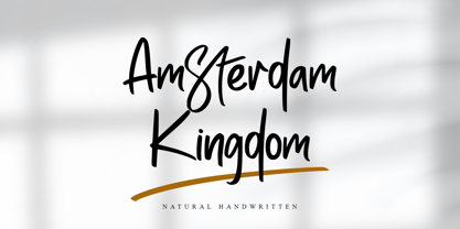 Amsterdam Kingdom is a beautiful original handwritten font with a unique feel and a stunning impact. It will add a unique spark to any design project that you wish to create! This font is PUA encoded which means you can access all of the amazing glyphs and ligatures with ease!
 - Slagless by Almarkha Type,
$29.00 Hello Introducing, Slagless - Urban Display Serif is unique font that uses 19 ligatures to smoothly link letters. inspired by the famous urban logo, perfect for the purposes of designing templates, brochures, videos, advertising branding, logos and more. Perfect for adding a unique twist to word-mark logos, monograms or pull quotes.
 - Churchward Alien by BluHead Studio,
$25.00 Churchward Alien is the latest OpenType font family released by BluHead Studio, LLC. from the exciting and unique typeface library of Joseph Churchward. The quirky chopped-top motif gives this four weight family a unique presence suitable for display work, but the lighter weights work equally well for short text runs.
 - Black Delights by Mokatype Studio,
$19.00 Hello Introducing, Black Delights - Elegant Ligatures Connected Serif is an elegant and unique font that uses ligatures to smoothly link letters. Perfect for adding a unique twist to word-mark logos Black Delights has 16 ligatures as well making it super fantastic.Ligature can be turned off if required standard writing needs.
 - ITC Tactile by ITC,
$29.99ITC Tactile is a puzzle of subtle typographic contradictions. Capitals have traditional epigraphic proportions, but the lowercase has a uniform optical width. Light weights are stately and elegant, but bold designs are almost jolly. This paradoxical alphabet even combines two distinctively different serif designs. Designer Joe Stitzlein says, “I wanted to create a modern and dynamic serif face that draws its forms from antiquity. I also wanted to have as much fun as possible with the drawing and architecture of each letter. Hopefully I've created a very legible typeface that grabs the reader's eye in a nice, 'tactile' way.” The apparent inconsistencies of the design are the result of careful consideration. Of the seemingly odd serif design, Stitzlein explains, “The transitional serif is an entry point for the eye into the letterform, and the long slab is an exit, leading to the next letter.” The result is a typeface that's easy to read at text sizes but offers surprising details when enlarged to display sizes, setting ITC Tactile apart from more traditional designs. While this is his first commercial typeface design, Stitzlein has ample experience creating custom typefaces for corporate branding, including companies such as Silicon Graphics and Sempra Energy. His graphic design business has served a wide range of clients, including Apple Computer and the 2002 Salt Lake City Olympics. The ITC Tactile family is available in three weights, with complementary italic designs and a suite of small caps for each of the roman designs. Stitzlein drew the small caps to match the height of the lowercase x-height, which enables “bi-form” or “unicase” setting in display copy. - Interboro JNL by Jeff Levine,
$29.00Interboro JNL is based on the serif lettering found on an old E-Z Letter lettering guide. - Rokach MF by Masterfont,
$59.00 Tradition and romance joined in the beautiful typeface, inspired by old hand drawn signs in Tel Aviv.
 - Tzoba MF by Masterfont,
$59.00 Inspired by old manuscript serif font, this low contrast font makes it high legible for long texts.
 - Drugstore by Coffee Bin Fonts,
$20.00This font was inspired by lettering found on old tradecards and drugstore ads from the 19th century. - TT Phobos by TypeType,
$35.00 TT Phobos useful links: Specimen | Graphic presentation | Customization options TT Phobos is a pliable display serif with a soft and gentle character. The features of the typeface are the moderate contrast between bold and thin strokes, pliable visual compensators, and the counter-clockwise bend of internal ovals. In addition to 6 weights and 6 italic, TT Phobos also includes two original decorative fonts, inline and stencil. Despite its pliability and display character, TT Phobos is dynamic enough and is well suited for text arrays even in large text blocks. The serifs of letters are completely asymmetrical and bring in dynamics when reading the text from left to right. Thanks to the harmonious contrast of black and white forms and internal negative spaces of the letters, as well as its broad letter spacing, the typeface is well read in small sizes. In this case, the character of the letters is completely preserved, partially thanks to the exaggerated elegant visual compensators. The ornamental pattern used in TT Phobos Inline varies for capital and lowercase letters. Capital letters implement a more complex double inline with a rhombic element in the middle, and in the lower case features a simplified form of the inline, made in a single movement. Thanks to the original cutting, TT Phobos Stencil stands out for its expression, and the rounded cuts add even more visual style to the font. TT Phobos consists of 14 faces: 6 weights (Light, Regular, DemiBold, Bold, ExtraBold, Black), 6 Italics, inline and stencil. There are 17 ligatures in TT Phobos, including several Cyrillic ones. The typeface has stylistic alternates, which adds an italic effect to the upright fonts, and a little solemnity of the upright version to the italics. In addition, we have not forgotten about the old-style figures and other useful OpenType features, such as ordn, sups, sinf, dnom, numr, onum, tnum, pnum, liga, dlig, salt (ss01), frac, case.
 - Sofia Pro Condensed by Mostardesign,
$25.00 A geometric sans for space saving typography Sofia Pro Condensed is the condensed version of the popular Sofia Pro font family. This typeface was completely drawn with the look of the original normal-width version. Sofia Pro Condensed contains 16 styles from Ultra Light to Black (Ultra Light, Extra Light, Light, Regular, Medium, Semi Bold, Bold and Black) with an alternative glyph set to improve its use in different graphic contexts. This typeface will be suitable for many projects such as titles, subtitles, long editorials, brand building, mobile applications, ebooks, websites or company signage. Its contemporary aspect and its condensed style will also be suitable for editorial projects who needs to save space. Sofia Pro Condensed also has many powerful OpenType features such as case sensitivite forms, old style and tabular figures, ligatures, capital spacing, fractions and alternative characters to give personality to graphic design projects. Designed also for complex editorial content, this typeface has a powerful home kerning system called “Pro Kerning”. With more than 1500 pairs of glyphs in many languages, Pro Kerning optimizes headlines, subtitles, texts as well as long paragraphs in real time. In addition to all the features of its kind, Sofia Pro Condensed is part of a very complete “type system” with style variants such as the normal-width-version (Sofia Pro), the soft version (Sofia Soft) or the rough version (Sofia Rough). With all these typefaces, you have more than 40 styles to make your own vibrant and professional graphics or web creations while maintaining consistency in your creations. The OpenType features of Sofia Pro Condensed have an extended character set to support Central and Eastern European as well as Western European languages, Cyrillic and Greek. For more info about the powerful opentype features and the complete character map of Sofia Pro Condensed, download the PDF specimen to get a detailed view of all features.
 - Rockwell by Monotype,
$40.99 Whether you call them slab serif, square serif, or Egyptian, you know them when you see them – sturdy, nearly monoweight designs with blunt, straight-edged serifs and a no-nonsense attitude. The Rockwell® Nova family is a fine example of this appealing and eminently usable type style. This is a design that is both robust and adaptable. Marked by the flat top-serifs on the cap A, unusual Q tail and high-legibility two-storied lowercase a, Rockwell has a bit of handmade charm that distinguishes it from the cool, more modern interpretations of the slab serif style. The family is excellent for branding, headlines and other display uses. The simple shapes and hearty serifs also make it a good choice for short blocks of textual content in both print and on-screen environments. The light and bold weights are perfect for setting blocks of text copy, while the extra bold and condensed designs bring authority to display copy. Throw in a little color, and you amp up Rockwell’s messaging power. The regular and italic designs perform handsomely, in the most modest of screen resolutions. With four weights of normal proportions, each with a complementary italic, and three condensed designs, two with italics, the family is a commanding and versatile graphic communicator. Rockwell’s large x-height, simple character shapes and open counters, make for an exceptionally legible design. It should not, however, be set so tight that its serifs touch, as this will erode legibility and impair readability. A benefit to Rockwell’s slab serifs, however, is that the design combines beautifully with both sans serif typefaces and a variety of serif designs. Rockwell OpenType® Pro fonts have an extended character set supporting Greek, Cyrillic, most Central European and many Eastern European languages, in addition to providing for the automatic insertion of ligatures and fractions. Looking for its perfect pairing? Look no further than ITC Berkeley Old Style, Between™, ITC Franklin Gothic®, Harmonia Sans™, Metro® Nova or Frutiger® Serif.
 - Nightmare AOE - Unknown license

- Archeologicaps - Unknown license

- Janda Scrapgirl Dots - Personal use only


