10,000 search results
(0.035 seconds)
- Dustismo - Unknown license

- Arctic - Unknown license

- Exo - 100% free

- Rational Integer - Unknown license

- CorpusCare - Unknown license

- Ptarmigan - Unknown license

- EURONEW - Unknown license

- GOST type A - Unknown license

- Thiamine - Unknown license

- Hall Fetica Wide - Unknown license

- lelim 200 - Personal use only

- MDRS-FD01 - Unknown license

- Kelan - Unknown license

- Liaisons by The Ampersand Forest,
$35.00 A Belle Époque humanist serif in two styles: crisp, high-contrast Haut-Monde and soft, low-contrast Demimonde… When you design a lot of display pieces, you’re often in need of tall, slim type. Liaisons provides that, in a distinct fin-de-siècle style inspired by the great posters of the Gilded Age from Sweden, Denmark, France, and Scotland. (The ampersand alone is a bit of a love letter to Charles Rennie Mackintosh!) Both styles use the same slim skeleton, and are named after the stratum of society where one might find… a “dancing partner.” HAUT-MONDE is a high contrast face of the sort that says “High Society.” Elegant and sleek, it speaks to the refinement of the moneyed classes of a bygone era. Great for high-end products, too! DEMIMONDE is soft and low-contrast — more reminiscent of hand-lettering on Art Nouveau/Jugendstil/Wiener Werkstätte advertisements and posters. A comfortably chic display face all around! Both typefaces feature full Western and Eastern Latin character sets, as well as full Cyrillic/Slavic ones. And, perhaps best of all, both typefaces feature capitals with high, middle, and low waists, so you can change up the look as you see fit! Part of The Ampersand Forest's Sondheim Series
 - NS Blackbooks Victorian by Novi Souldado,
$35.00 Reminiscing the old era of historical books (seriously, that old), circa 19th century. We crafted the letters by connecting the dots from the past with research for every flow, ornaments, look, and feel, to precisely aim for that perfect shape. Ephemera Blackbooks are born with a dark and robust personality. Feel the European historical mood right away, even with just typing it with your keyboard. You don't even realize when the design is done cause we make it so easy as a one-click-time-machine to your works using Ephemera Blackbooks font. It will be a perfect armory for a vintage headline, old book cover concept, sign, posters, playing cards deck design, vintage labels, beer labels, bar decoration, apparel, merchandising, you name it. OTF Features : Stylistic Set 01 to 07 and Ligature Glyph Count : 355 glyphs Language support : Afrikaans, Albanian, AsuBasque, Bemba, Bena, Breton, Catalan, Chiga, Cornish, Danish, Dutch, English, Estonian, Faroese, Filipino, Finnish, French, Friulian, Galician, German, Gusii, Indonesian, Irish, Italian, Kabuverdianu, Kalenjin, Kinyarwanda, Luo, Luxembourgish, Luyia, Machame, Makhuwa-Meetto, Makonde, Malagasy, Manx, Morisyen, North Ndebele, Norwegian, Bokmål, Norwegian Nynorsk, Nyankole, Oromo, Portuguese, Quechua, Romansh, Rombo, Rundi, Rwa, Samburu, Sango, Sangu, Scottish Gaelic, Sena, Shambala, Shona, Soga, Somali, Spanish, Swahili, Swedish, Swiss German, Taita, Teso, Uzbek (Latin), Volapük, VunjoZulu
 - Bullets by Wiescher Design,
$6.00 BulletNumbers come in very handy for all kinds of lists that don't exceed 100 categories. I have long since been using my own Bullets in positive and negative and four styles, serif, sans, engravers and script, a fitting one for every occasion. Now I added six more designs and perfected the Bullets for all of you. The following is a »must read«! Here is how to use them: (Important! Set letterspacing to '0', otherwise the two digit numbers will have gaps!!!) The numbers 1-0 reside on the standard keys. Two digit numbers 01-99 can be composed out of left and right half circles by using (lowercase) 'abcdefghij' for the first digit (left half circle) and 'lmnopqrstu' for the second digit (right half circle). The critical pairs (all combinations with 1) can be found in various places. Type '!' for 10, '#' for 11, '$' 12, '%' for 13, '&' for 14, '(' for 15, ')' for 16, '*' for 17, '+' for 18, ',' for 19, '-' for 21, '.' for 31, '/' for 41, ':' for 51, ';' for 61, '?' for 81, '_' for 91. The two arrows are on the < and > keys. '100' can be found with shift+option+1. Last but not least, the capital letter bullets A-Z can be found on the shift+letter A-Z. Your very practical Gert Wiescher
 - Rekusen by Product Type,
$15.00 Rekusen is a modern and bold sans-serif display font that stands out with its cleanness. Perfect for branding, headlines, and editorial design, this font is sure to make a statement. The unique combination of thick and thin strokes creates a dynamic and eye-catching appearance that draws attention to your message. In addition to its stylish design, Rekusen also features a wide range of alternate characters and ligatures that allow for creative customization and increased versatility. With alternates and ligatures, this font provides endless possibilities for unique and impactful designs. And with support for multiple languages, it can be used across a variety of projects with ease. Whether you’re designing a logo, creating a poster, or crafting a website, Rekusen is a powerful tool that will help you achieve your design goals with style and sophistication. Its modern, clean, and versatile design makes it a perfect fit for any project that needs a touch of boldness and professionalism. What’s Included : - All glyphs Iso Latin 1 - We highly recommend using a program that supports OpenType features and Glyphs panels like many Adobe apps and Corel Draw, so you can see and access all Glyph variations. - PUA Encoded Characters – Fully accessible without additional design software. - Fonts include Multilingual support
 - Litza by Marianna Orsho,
$35.00 Litza is a layered, condensed, all-caps cross stitch display type family. It is made up of 10 layers that show different stages of stitching and can be stacked, moved around, and coloured separately in order to create interesting effects. The ten layers come in 3 weights; Light, Medium, and Bold. The 3 weights can also be mixed with one another to create a vast range of combinations when stacking the layers. Litza has multilingual support and includes glyphs for a wide range of Latin and Cyrillic languages. The family also contains a set of ornamental borders and over 80 decorative symbols in the shape of various animals and objects. Combining the various Litza layers allows you to create eye-popping, intricate, experimental typographic compositions that are rich in detail - with ease. The condensed, geometrics sans-serif letterforms and playful nature of the Litza layering system give a contemporary feel - while at the same time retaining a nostalgic and tactile quality due to its reference to traditional needlework techniques and patterns. Ideal for use at larger point sizes where the unique, stylish effects can be best expressed - Litza will add a touch of intrigue and work best in headings and emphasised text for poster design, editorial design, packaging design, and motion design.
 - Bullet Numbers by Wiescher Design,
$9.50 This is a must read!!! BulletNumbers come in very handy for all kinds of lists that don't exceed 100 categories. I have long since been using my own BulletNumbers in positive and negative and four styles, serif, sans, engravers and script, a fitting one for every occasion. Now I perfected them for all of you. Here is how to use them: (Important! Set letterspacing to '0', otherwise the two digit numbers will overlap!!!) The numbers 1-0 reside on the standard keys. Two digit numbers 01-99 can be composed out of left and right half circles by using (lowercase) 'abcdefghij' for the first digit (left half circle) and 'lmnopqrstu' for the second digit (right half circle). The critical pairs (all combinations with 1) can be found in various places. Type '!' for 10, '#' for 11, '$' 12, '%' for 13, '&' for 14, '(' for 15, ')' for 16, '*' for 17, '+' for 18, ',' for 19, '-' for 21, '.' for 31, '/' for 41, ':' for 51, ';' for 61, '?' for 81, '_' for 91. The two arrows are on the < and > keys. '100' can be found with shift+option+1. Last but not least, the capital letter bullets A-Z can be found on the shift+letter A-Z. Yours very practical Gert Wiescher
 - Philadelphian by FontMesa,
$29.00 Philadelphian is a revival of a MacKellar, Smiths & Jordan font from 1867 by the same name. The regular version with shadow outline was the only style that was offered in 1867. We've taken the original design further by creating two additional weights of medium and bold plus plain black versions. The medium and bold weights are unique because only the horizontal strokes increase in thickness while the vertical strokes remain the same in each weight. Philadelphian Nite is the plain black version of this font family, Nite is the casual spelling of the word Night meaning dark or black. In the late 1800's Philadelphian was a very popular typeface which can be seen on many billheads and letterheads through the early 1900's. If you're looking for a western style font that doesn't look like any other then Philadelphian is the right choice. While the name doesn't remind you of the cowboy genre we've kept the original name for historical reasons because this font was so popular in its day. We plan on going forward with a weathered version of Philadelphian which will be released under a southwestern style name. With Philadelphian we've decided to set the complete family price to an amount that may be considered on sale all of the time.
 - Religan by Dora Typefoundry,
$17.00 The new Religan serif font is luxurious and elegant which will bring a unique style and trendy look to your designs. This modern serif relogan has several on-trend ligature binders and special characters to make it look more unique in all design projects and work perfectly to pair with other fonts. It's perfect for logotypes, branding, wedding monograms and invitations, blog headlines and more. Here we prepare some fasteners: ab ar an am ah ara ap ti tr st tu tt ct et ff ty ffi fu ft fj fy th tm tn in im ir it ta ri er eh em en ch cr ra ng li eb cb fr ck fb fh fk jj gi and more.. Religan also includes the full set: Uppercase and lowercase Multilingual symbol Number Punctuation This type of family has become a work of true love, making it as easy and enjoyable as possible. I really hope you enjoy it! I can't wait to see what you do with Religan! Feel free to use the #Dora Typefoundry tag and # Religan Modern Serif Font to show what you've done. If you have any questions, you can contact us by email: doratypefoundry@gmail.com Thank You!
 - Poultry Sign by Ingrimayne Type,
$5.95 While searching through microfilm of an old, 1932 newspaper, I stumbled on the word "Poultry" written with trapezoidal letters. I did not recall seeing lettering like this and it inspired me to design a typeface that could produce a similar result. Poultry Sign has two widths each with three weights giving the family six styles. It is monoline, monospaced, and all caps. The letters on the lower-case keys reverse the trapezoid of those on the upper-case keys. The designer's expectation is that the most common use for this typeface will alternate upper-case and lower-case keys, and to make this effect easy, included in the font is a contextual alternatives (calt) OpenType feature that automatically produces this result if your word processor supports this feature. To get text with all letters with big bottoms or all letters with with big tops, this feature must be turned off. The spacing of the letters is identical within each width so the styles can be layered to produce bi-colored or tri-colored letters. There is a second set of numbers that can be accessed with an OpenType stylistic alternative. Also accessible with OpenType stylistic alternatives are variations of letters T, N, L, Y, and V.
 - Sommet Slab Rounded by insigne,
$22.00 Sommet Slab Round is the latest in the Sommet series, designed as a slab serif companion to Sommet Rounded. The typeface features slightly wider counters to accommodate the serifs and this more generous whitespace allows the typeface to display well on-screen and as a webfont. Rounded serifs give the face more warmth than the original Sommet Slab, which is strong, rigid and technical. Sommet Slab Rounded’s serifs are not just blunted, but slightly obliqued, giving the face dynamic forward momentum. This geometric typeface is based on bold and clean rounded rectangles. It’s soft and friendly look lends itself to a number of applications. It would be a fine choice for tech company logotypes, magazine headlines and can be used for body copy. The typeface family also includes some alternate titling forms. These alternates can be accessed by activating OpenType features and style sets. In order to use these OpenType features, you will need a program with advanced typography capabilities such as the Adobe Suite or Quark. These alternates include a group of simplified forms that can be accessed under the swash alternates. Sommet Slab is just the latest in the versatile Sommet superfamily from insigne. Be sure to check out the rest of the design family that includes serif and sans members.
 - Gogh by Type Forward,
$32.00 Gogh is a geometric sans serif with a modern look and traditional spirit. It blends evenly without overly distracting the reader, yet still keeps a rich and distinctive character. The generous x-height, easily distinguishable glyph forms, and open terminals help the eye perceive a block of text smoothly, making it clearly legible. Gogh thrives when used both on-screen and on print media. Gogh type family consists of 10 weights from Hairline to Black and their matching Italics. Gogh is also available as a fully functional variable font, which gives unlimited opportunity to explore typography without the restrictions of predefined weights. Gogh Variable is also the best option if used on the web as it has a much-reduced size compared to the original font family. Regardless of which Gogh family you choose, the typeface covers a broad spectrum of languages, as it includes Extended Latin and Cyrillic. And it also comes with an alternative stylistic set that will completely change the overall look of a paragraph, giving it a more contemporary and display appearance. In addition to that, Gogh type family is enriched with an extensive list of OpenType features for advanced typographic layout, including standard and discretionary ligatures, tabular and small figures, fractions, language localizations, case sensitive punctuation, and more.
 - Taglio by Wilton Foundry,
$29.00 Taglio’s name is derived from intaglio, which means “incised carving” or “an impression from an engraving”. Indeed, Taglio looks like an incised engraving with a contemporary calligraphic interpretation. The down strokes start with a single horizontal line that curves into a dual vertical line and ends with the same single line at the base. The dual elongated strokes create a bold overall impression but is literally twice as sophisticated than if the two lines were solid. That was exactly the goal in creating this font. We managed to create a font that is distinctive, elegant, and crisp that is also intentionally stencilled for more flexibility. For instance, it is ideal for laser cutting signage. One of the unique features in using the capital glyphs is that they stack perfectly without losing legibility, primarily because of the slanted ends of the dual vertical lines - see the example “Miami Fashion Week” display ad. Taglio’s unusual style was carefully crafted to come to life at display sizes. It is therefore ideal for use in branding fashion, restaurants, buildings, packaging, museums, signage, etc. An ideal pairing font is our WERK family which can be seen on some of the display ads below. Taglio has a sparkling and sophisticated personality that will absolutely delight!
 - Paradise Point by Swell Type,
$20.00 Surf's up! Take an unforgettable adventure to the sparkling shores of Paradise Point. Ride our 25 majestic weights, from tranquil tall & thin to thunderous wide & heavy. Expand your horizons with the versatile Variable font to select any spot between. One-of-a-kind activities: Drop in a thrilling Inline weight for stylistic flair. Overlay with the matching Heavy for striking color effects. Discover hidden wonders! Stylistic Alternates will take you to the scenic heights of uppercase in a friendly lowercase style. Or immerse your text in interlocking Discretionary Ligatures for an authentic Tiki Type island experience. Enchanting views: Two versions of each letter and number automatically rotate for a natural, hand-drawn appearance. The Light weights have round ends to simulate a single pen stroke, which matches the center of the Inline weights for a perfect pairing. Explore! If you venture into unknown territory, each weight of Paradise Point contains 775 glyphs for stress-free support of over 200 languages. An all-inclusive getaway: Each weight of Paradise Point includes the features above, and can set readable body text as well as create striking logos and headlines. Use it for restaurant menus, surf and skate brands, or any design project where you want to convey lively, friendly, stress-free fun.
 - Waldorfschrift by Joachim Frank,
$23.00 The Waldorfschrift family was created in digital form in the years 1993-1994 by Joachim Frank, inspired by the naturally organic letters from the anthroposophical movement of the 20th century of Rudolf Steiner . In nature there are no right angles, straight lines or complete uniformity, but instead round corners, varying thicknesses and all kinds of variability. This is what the anthroposophical movement created in their buildings, their art, in their music – and also in their lettering. And this Font is like the plants in nature: it grows upwards, branches out, letters hugs to some letters, with others they keeps more distance, some letters proudly stretch their belly, others crouch in the corner - a completely natural font. Take a look at the brand of Weleda (the natural cosmetics company), Demeter (one of the biggest organic foods companies), Filderklinik (a great anthroposophical hospital in Germany) and you will see these great companies work with different but organic letter styles. More recently, Joachim revisited the Waldorf fonts with modern type design software and added extra characters such as the euro sign, and extra weights to make the fonts useable for a wide variety of design tasks. Dez 21: A big update: All fonts have been digitized again and given a complete character set, new kerning, minor bugs removed.
 - Sazone by Product Type,
$15.00 Welcome to Sazone, a font that represents the essence of the future with a stunning modern and futuristic twist. Are you looking for the perfect solution for modern, futuristic, sci-fi, and future-themed projects? Sazone is the answer. Sazone is a font specially designed to bring an extraordinary and stunning visual experience. Each letter is unique and conveys a sense of the future, showing astonishing sophistication and innovation. The main benefit of Sazone is its ability to deliver unrivaled style. With a unique and exclusive character, this font will give a modern, classy, and futuristic look to every text you use. Every detail is carefully thought out to create a standout and stunning impression. Also, multilingual support, allows you to display text in multiple languages without restrictions. This gives you the flexibility to reach a global audience and convey messages effectively in the most relevant contexts. Take your projects to the next level with Sazone. Let this font be the catalyst for your visual success in creating eye-catching future looks. It doesn’t matter whether you are designing logos, posters, or websites, Sazone will give off a distinctive feel, exude sophistication, and deliver an unforgettable experience. Explore endless possibilities and make your vision come true with Sazone. It’s time to enter a spectacular and amazing future. Choose Sazone and let this font become an indispensable part of your vibrant, modern, futuristic, sci-fi, and future projects. What’s Included : - File font - All glyphs Iso Latin 1 - We highly recommend using a program that supports OpenType features and Glyphs panels like many Adobe apps and Corel Draw, so you can see and access all Glyph variations. - PUA Encoded Characters – Fully accessible without additional design software. - Fonts include Multilingual support
 - Mutable by Paulo Goode,
$35.00 Mutable is as flamboyant and changeable as its name suggests. These characterful fonts were designed specifically for display purposes. It’s an exuberant type family that’s jam-packed with alternates and bestowed with a loud personality. This typeface is defined by its barbed serifs and elegantly curved terminals, or “foxtails” as they are sometimes known. An extremely large x-height amplifies the friendliness and buoyancy of the lowercase glyphs. These qualities give Mutable a unique aesthetic that will undoubtedly give your logotypes, headlines, and titles a distinctive appeal. Mutable has a strong Art Nouveau influence and was mainly inspired by Ed Benguiat’s Tiffany and the mysterious Pretorian typeface accredited to P.M. Shanks and Sons of London. Special OpenType features include 523 alternates that will make each word resonate beautifully when used in titling and branding situations. With so many alternates available, you may find it difficult to stop playing and settle on a selection... but that’s a good thing, right? Small Caps are also included (along with their matching diacritics and alternates) – these are designed to harmonise with regular lowercase forms making unicase-style typography a cinch. Mutable has a total glyph count of over 2,400 characters. There are 9 weights across 2 widths, ranging from a delicate and wispy Narrow Thin to a chunky and imposing Ultra. And... it’s variable! This allows you to select any width or weight in between, making Mutable even more... erm... mutable! This type family has an extensive character set that covers all Latin European languages. Finally, you can test drive Mutable immediately as the Regular weight is offered as a free download. Key features: 9 Weights 2 Widths Variable Small Caps 500+ Alternates Old Style Figures European Language Support (Latin) 2400+ Glyphs per font
 - Bex Script by The Ampersand Forest,
$35.00 Bex Script is a riff on traditional French script forms: the Bâtarde, the Ronde, and the Coulée. It has two versions: First, there’s La Belle, a straightforward, lovely interpretation of the script form, suitable for things like invitations, poetry and branding. La Belle’s evil twin is La Bête, a more whimsical (and considerably more hairy) version, great for anything that requires an elegant-but-beastly feel. Bex is surprisingly versatile! With three optional capital forms (Swash, Caps, and Small Caps) all taller than the x-height, Bex has a variety of voices. A full small cap set and a full set of Swash Caps, plus a large complement of alternates, initial forms, terminal forms, and ligatures makes it customizable and… well, FANCY! Additionally, both versions of Bex Script have a set of ten ornament glyphs. La Belle has a combination of fleurons on a culinary theme and symbols of France. La Bête has ten pseudoheraldic beasts that would feel at home at the top center of any whimsical letterhead. NOTE: A few years ago in Paris, I was lucky enough to stop at the Librairie Paul Jammes in St Germain-des-Prés, where I bought a turn-of-the-19th-century signature from a Type Specimen of the printer Joseph Gaspard Gillé. The irregularity of his script types — particularly the ones at smaller sizes, like the Cicéro — was very intriguing. They seemed to blend the Ronde with some elements of the Bâtarde and Coulée. And they, along with the work of French master penman Louis Rossignol, gave Bex Script its initial form.
 - Kalgellise by SSI.Scraps,
$8.00 Kalgellise is an elegant brush font with a bold twist. It will inspire any design projects with its authentic charm.
 - Anthemic by Epiclinez,
$18.00 Anthemic is an timeless bolded script font that is incredibly versatile and will look great on any design or craft.
 - Antika by Letterara,
$12.00 Antika is a beautiful modern script font featuring flowing letters. It will add a romantic touch to any crafting project!
 - Merry Mob by Typephases,
$5.99 A gestual drawing of little people that will produce an instant crowd, gang or any combination of folks you need.
 - Storybook Initials NF by Nick's Fonts,
$10.00 This collection of decorative initials culled from specimen books of the late 1800s will add nostalgic charm to any project.
 - DB Girly Flowers by Illustration Ink,
$3.00DB Girly Flowers is a collection of cute images and phrases perfect for any digital scrapbooking project themed towards girls. - Comic Boys by Stringlabs Creative Studio,
$25.00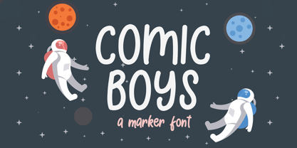 Comic Boys embodies fun, quirkiness and authenticity. This enchanting display font will turn any creative idea into a true standout.
 - Everything by PizzaDude.dk,
$20.00Everything is a simple, yet beautiful handwritten font. You will need to use OpenType supporting applications to use the autoligatures. - Book Sketch by Ziza Type,
$8.00 Book Sketch is hand written font which will deliver a friendly look to children books, label designs, posters or banners.
 - Brutto MF by Masterfont,
$59.00 This clean and geometric font family will suit you as a great companion fo signage, headline, website and much more.


