10,000 search results
(0.09 seconds)
- LT Saeada - 100% free

- BOOKER ITALIC PERSONAL USE - Personal use only

- BARBEDWIRE PERSONAL USE - Personal use only

- BAHAMAS TWO PERSONAL USE - Personal use only

- THE BOLD FONT (FREE VERSION) - Personal use only

- Chocolates Italic - Personal use only

- LT Asus Pro - 100% free

- Husk by Stiggy & Sands,
$24.00 A Flare Serif Family to Rule Them All The Husk Family began as a digitization of a film typeface called Maile by LetterGraphics. From there, it has evolved to a much more robust character set than its original reference. With multiple numerals sets, creative discretionary ligatures, as well as Swash Capitals and a few final forms, this gladiator of the type arena cuts through to let your designs shine. See the 5th graphic for a comprehensive character map preview. The Husk Family is loaded with features to give you plenty of customisation options: - Regular, Chiseled, and Inline styles that can be used alone or chromatically layered - A mix of specialized Capital letterforms for Caps & Lowercase standard - A Swash feature for Swash Capitals as E & R final forms. - Stylistic Alternates feature for Lining Numerals, an alternate & and M. - Discretionary Ligatures for a collection of unique ligature arrangements. - A Full set of Inferiors and Superiors for Limitless Fractions - An Oldstyle (default), Tabular, Proportional, and Lining figure sets Approx. 482 Character Glyph Set per font: The Husk Family comes with a glyphset that includes standard & punctuation, international language support, discretionary ligatures, alternate numeral styles, subscript and superscript.
 - Grufy by Stefani Letter,
$12.00 Grufy is an awesome bold and fun display font that will look stunning on any poster flyer or print. It will put a modern twist on any design project with its urban charm. Use this font for your designs and explore its endless possibilities.
 - Cat Paw by Beary,
$14.00 Cat Paw embodies fun, quirkiness and authenticity. It features gorgeous and fun characters that will brighten up your crafting projects. It will elevate a wide range of design projects to the highest level, be it branding, headings, invitations, signatures, logos, labels, and much more!
 - Alamanda by Goodigital13,
$20.00 Alamanda will be great for any projects including : branding, logo, stationery, business card, signage, flyer, brochure, and more. Almost all industries will be fall for this typeface: wedding, events, real estate, architect, law firm, florist, gardening, makeup artist, travel, hotel, musician, and many more .
 - Jarkids by Raditya Type,
$12.00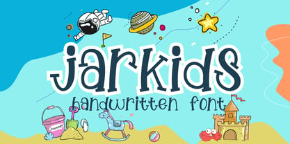 Jarkids is a picture of fun, uniqueness, and authenticity. This eye-catching handwritten font will turn your creative ideas into a standout. It will take your various design projects to the highest level, be it branding, headings, wedding designs, invitations, signatures, logos, labels, and more!
 - Tahta by JprintStudio,
$28.00 The Tatha font is a very welcoming and stunning modern script font that will elevate any design project to the highest level and will add luxury to any design project you want to create, be it branding, wedding designs, invitations, signatures, logos, labels and more!
 - Designors by Sarid Ezra,
$15.00 Designors is a freestyle font that will make your project more stylish and free! You can use this font for any project. Suitable for quotes and your tees design. This font also support multilingual. With different lowercase and uppercase will make your design more natural!
 - Beautifull Weakness by Sarid Ezra,
$15.00 Beautiful Weakness is a free-styled handwritten font that will make all your project more unique. With brush touch, this font will make your artwork feels more natural. Comes with ligatures and underline that you can access it from opentype feature. Also support multi language!
 - Explore Wonders by Sarid Ezra,
$15.00 Explore Wonders is a bold handwritten font that will make all your project more unique and handy. With bold touch, this font will make your artwork feels more natural. This font is suitable for quotes & instagram post. Comes with number & symbol! Also support multi language!
 - Begadul by Differentialtype,
$10.00 Begadul is an elegant serif font with a contrasting thickness, very suitable for displays such as titles, greeting cards, magazine covers, and many more. This font will be a great addition to your library, as it will make every design a true piece of art.
 - Hermine by Raditya Type,
$12.00 Hermine is a picture of fun, uniqueness, and authenticity. This eye-catching handwritten font will turn your creative ideas into a standout. It will take your various design projects to the highest level, be it branding, headings, wedding designs, invitations, signatures, logos, labels, and more!
 - Akazan by Typodermic,
$11.95 Are you searching for a typeface that’s out of this world? Look no further than Akazan. This compact sans-serif font has a voice that’s unlike anything you’ve ever seen before. Drawing inspiration from early twentieth-century grotesque, mid-century technical, and 1990s reductionist styles, Akazan combines the best of the past and present to create a truly unique typeface. When you use Akazan, you’ll be able to convey a ghostly sense of another time without being stuck in the past. This font is perfect for anyone who wants to add a touch of intrigue and mystery to their design projects. With styles ranging from Light to Bold, and including italics, you’ll have everything you need to make your designs stand out from the crowd. So why settle for a boring, run-of-the-mill font when you can have Akazan? Try it out today and see for yourself just how much of an impact it can make on your designs. With its otherworldly voice, Akazan is sure to become a go-to font in your design arsenal. Most Latin-based European, Greek, and some Cyrillic-based writing systems are supported, including the following languages. Afaan Oromo, Afar, Afrikaans, Albanian, Alsatian, Aromanian, Aymara, Bashkir (Latin), Basque, Belarusian (Latin), Bemba, Bikol, Bosnian, Breton, Bulgarian, Cape Verdean, Creole, Catalan, Cebuano, Chamorro, Chavacano, Chichewa, Crimean Tatar (Latin), Croatian, Czech, Danish, Dawan, Dholuo, Dutch, English, Estonian, Faroese, Fijian, Filipino, Finnish, French, Frisian, Friulian, Gagauz (Latin), Galician, Ganda, Genoese, German, Greek, Greenlandic, Guadeloupean Creole, Haitian Creole, Hawaiian, Hiligaynon, Hungarian, Icelandic, Ilocano, Indonesian, Irish, Italian, Jamaican, Kaqchikel, Karakalpak (Latin), Kashubian, Kikongo, Kinyarwanda, Kirundi, Komi-Permyak, Kurdish (Latin), Latvian, Lithuanian, Lombard, Low Saxon, Luxembourgish, Maasai, Macedonian, Makhuwa, Malay, Maltese, Māori, Moldovan, Montenegrin, Ndebele, Neapolitan, Norwegian, Novial, Occitan, Ossetian, Ossetian (Latin), Papiamento, Piedmontese, Polish, Portuguese, Quechua, Rarotongan, Romanian, Romansh, Russian, Sami, Sango, Saramaccan, Sardinian, Scottish Gaelic, Serbian, Serbian (Latin), Shona, Sicilian, Silesian, Slovak, Slovenian, Somali, Sorbian, Sotho, Spanish, Swahili, Swazi, Swedish, Tagalog, Tahitian, Tetum, Tongan, Tshiluba, Tsonga, Tswana, Tumbuka, Turkish, Turkmen (Latin), Tuvaluan, Uzbek (Latin), Ukrainian, Venetian, Vepsian, Võro, Walloon, Waray-Waray, Wayuu, Welsh, Wolof, Xhosa, Yapese, Zapotec Zulu and Zuni.
 - Dupla by Tipo Pèpel,
$22.00 When Dupla was designed, its DNA shown the best of the typographic heritage from the XIX century types, the oldest san serif known, also named as “Grotesk”, a soft synonym for bizarre, unnatural weird. XIX century Germans' eyes were surprised, astonished by the formal strangeness that provoked the mutilation of the well known serifed types. But the skeleton and DNA are barely perceptible, an invisible part of the nature of objects. We are interested in the epidermis, the outer, the visible, which directly speak to the eyes, and Dupla tells us with overwhelming presence, that is a formal, traditional type, covered with a childlike sweetness, with slight curves, epidermic, sweetening even ink’s traps up. Frutiger said that Latin alphabet letter’s minimum skeleton is like a lock where you should fit all the letters you see, but that skeleton allows many skins. We use a different skin for every specific use. And Dupla’s skin points to how generous, how friendly it is; the sweetness of the big and good-natured. They do not feel very comfortable in low-cost airplanes company’s seats, but in the proper location with enough room, they'll fill the atmosphere with kindness. Do not ask for narrow columns, or terse captions in squalid sizes; do not ask for ridiculous “small print” in dark contracts where «The party of the first part shall be known in this contract as the party of the first part …» That’s not for Dupla. Large headlines, generous width columns to cover, rude pullquotes half-breaking columns, loud exclamations, great sizes, with black weights. It’s in the insultingly generous, almost obscene use where Dupla is felt. And if you consider this a obscene, gargantuan, typographical feast, Dupla brings you everything to demonstrate that quantity does not mean less quality. Multi-language support, Latin plus full coverage, complete sets of small caps, fractions, old numerals, modern, tabular, bonds and all the “gourmet” paraphernalia that Patau has accustomed us, after many years of work. If you want to be obscene and pass the censorship, use Dupla. Hedonism is just a venial sin.
 - Nautilus Text by Linotype,
$29.99Hellmut G. Bomm first released his Linotype Nautilus typeface in 1999. Ten years later, he updated and expanded the design. Now users have two additional families at their disposal: Nautilus Text and Nautilus Monoline. Nautilus Text bears more similarities to the original Linotype Nautilus. The letters shows a high degree of contrast in their stroke modulation. Bomm's intention was to create a clear, highly legible face. While the even strokes of most sans serif types eventually tire the eyes in long texts, the marked stroke contrast of Nautilus Text lends the face its legibility. The characters were drawn with a broad tipped pen. Like serif typefaces, the forms of Nautilus Text display a variety of elements. Its characters are narrow, with relatively large spaces between them. This helps create an overall open appearance, and allows a large quantity of text to fit into a small space. Nautilus Monoline's letters share the same overall proportions as Nautilus Text's. But as their name implies, they are monolinear. Their strokes do not have the calligraphic modulation that Nautilus Text features. This allows them to set another sort of headline, making Nautilus Monoline a refreshing display type choice to pair with body text set in Nautilus Text. - Gianduja by Resistenza,
$39.00 This delicious font family takes its name from the tastiest of Piemonte’s specialities. It has been designed in collaboration with Turin-based calligrapher and artisan Andrea Tardivo. Piemonte soil provides the most delectable hazelnuts, which are the key to creating a mouth-watering chocolate spread called Gianduja. This popular delicacy has a rich graphic history, with lavishly designed packaging. We sought to infuse the sweetness and tradition of Turin’s confectionary into a new font family, reinterpreting Italian models from the first quarter of the last century. All fonts were crafted by hand on paper first and then digitised in a way that retains the handmade quality and aesthetic. This family blends the Turinese touch from the old chocolatiers and the beautifully printed foils they use to wrap each exquisite creation. The extensive display family contains; Gianduja Sans a geometric font based on examples found in Italian art deco era artworks. Gianduja Script has been handwritten with a speedball pen following the standards of “Bella Scrittura” and Gianduja Capitals is a decorative font inspired by the “liberty” lettering signs from Piemonte. To complete the suite we developed an inline Capitals version, a set of icons and decorative elements all with the same handmade characters to perfect partner with each character set.
 - Nautilus Monoline by Linotype,
$29.99Hellmut G. Bomm first released his Linotype Nautilus typeface in 1999. Ten years later, he updated and expanded the design. Now users have two additional families at their disposal: Nautilus Text and Nautilus Monoline. Nautilus Text bears more similarities to the original Linotype Nautilus. The letters shows a high degree of contrast in their stroke modulation. Bomm's intention was to create a clear, highly legible face. While the even strokes of most sans serif types eventually tire the eyes in long texts, the marked stroke contrast of Nautilus Text lends the face its legibility. The characters were drawn with a broad tipped pen. Like serif typefaces, the forms of Nautilus Text display a variety of elements. Its characters are narrow, with relatively large spaces between them. This helps create an overall open appearance, and allows a large quantity of text to fit into a small space. Nautilus Monoline's letters share the same overall proportions as Nautilus Text's. But as their name implies, they are monolinear. Their strokes do not have the calligraphic modulation that Nautilus Text features. This allows them to set another sort of headline, making Nautilus Monoline a refreshing display type choice to pair with body text set in Nautilus Text. - Samuri by Twinletter,
$15.00 SAMURI is our newest font with Japanese style features, developed with an exotic and relaxed shape, this font is extremely attractive to match your extraordinary project, using this font will instantly make your project look exquisite, charming, and everyone will be glad to view the look. Unlike the rest, your project will be one-of-a-kind. Logotypes, food banners, branding, brochure, posters, movie titles, book titles, quotes, and more may all benefit from this font. Of course, using this font in your various design projects will make them excellent and outstanding; many viewers are drawn to the striking and unusual graphic display. Start utilizing this typeface in your projects to make them stand out.
 - Estefania Bold Script by Shaltype Co,
$12.00 Estefania is based on Retro Bold Script Typeface that could fit any Graphic Project. Using bold and contrast strokes to get eye-catchy and smooth looking, this project is just born and will come with other styles and more glyphs in the future. Drawn manually by hands, and reform into a clean Typeface. Natural stroke from original lettering. It can be used for Titles or even for writing. In this font, you will get : - TTF & OTF files - WOFF & WOFF2 - Over 299 Glyphs - 11 OpenType features - Support Multilingual languages Get Estefania now! It will be best used for any design requirement, many fonts will come with a unique concept. Thank you! Best Regards, FM-STCO.
 - Patched by Mans Greback,
$39.00 Patches is a multi-faceted, victorian-era serif typeface for when you need something more than plain text. Get that extra attention while adding a genuine, original appearance to your message. Patches was designed from scratch to give a sense quality and depth. Its designer Mans Greback has created a typeface with a complex structure, yet one that will be easy to master. This work will suit every style, taste and skill level. It is a decorative and completely hand-drawn design in vintage lettering, with the perks and flexibility of present-day technology, which is exactly what you'd expect from a modern typeface. Whether you are making a decorative floral headline, drawing a cowboy logo, or creating a unique design based on this ornamental font, the hopes are that Patches can give you a set of tools and inspiration to bring out the best of your artistry. Standing on the shoulders of giants, it was inspired by a wide range of works, and will hopefully be able to continue to teach and inspire future artists. Or at least help you become a better designer when you're designing an elegant and classic headline. Set the coloring of Patches to light gold and cream tones to apply a luxurious look, or in dark tones for a more rugged impression. Bold, bright colors will make it appear In the mid-1800s, decorative design flourished in the Western major cities. Victorian style thrived and encouraged techniques such as enamelling, embroidery and calligraphy. From the 1880s onwards, there were a series of reactions to higher Victorian tastes, with Art Deco reaching the heights of the 20th century. However, the Victorian art persisted popularity, as it changed to more sophisticated designs which made it more attractive to specific professions and groups. The evolution of the Victorian style in the mid-20th century was a key factor in the succession of the movement. Classic shops and salons, sport designs and traditional festivals, and later Rock'n'Roll and Harley Davidson-themed graphics inspired the continued development of the art. Aspiring to carry on this tradition, this typeface family consists twelve different high-quality variations. The main ones are Patched and Patched In – an outlined variation – and each one provided in five weights: Thin, Light, Medium, Bold and Black. Additionally, the two rough fonts Hangaround and Prospects, that tries to grasp the rough, earthy atmosphere of a shady motorcycle club. The font is built with advanced OpenType functionality and has a guaranteed top-notch quality, containing stylistic and contextual alternates, ligatures and more features; all to give you full control and customizability. It has extensive lingual support, covering all Latin-based languages, from North Europa to South Africa, from America to South-East Asia. It contains all characters and symbols you'll ever need, including all punctuation and numbers.
 - Flece Display by Putracetol,
$26.00 Flece Display - Modern Sans Font is a versatile font that offers the perfect blend of modern style and elegance. It features two distinct styles: calligraphy and sans serif, providing a unique combination that is both luxurious and contemporary. This font is well-suited for various design projects, including logos, titles, book covers, headlines, magazines, products, invitations, and weddings, where a touch of sophistication and visual impact is desired. In addition to its stunning aesthetic, Flece Display also offers a range of features and a comprehensive font package. The font includes both calligraphy and sans serif styles, allowing you to switch seamlessly between the two to achieve the desired look for your design. It provides an extensive collection of characters and glyphs, ensuring versatility and creative possibilities. With its modern and elegant style, Flece Display - Modern Sans Font is the ideal choice for creating impactful and visually stunning designs. Whether you're designing a logo for a high-end brand, crafting attention-grabbing titles, or creating sophisticated invitations, this font will elevate your design projects with its luxurious and contemporary aesthetic. With its versatile features and comprehensive font package, Flece Display offers both convenience and creative flexibility, making it a valuable asset for designers.
 - Pocketknife by Blank Is The New Black,
$13.00 Pocketknife is a simple grid-based titling font on it’s surface, but it has a surprisingly prolific set of features under the surface. The most notable of these features is an abundant set of ligatures that give Pocketknife it’s unique look. There are very few kerning pairs contained within Pocketwatch, and these ligatures fill in most gaps that could be created by letters with more empty space, such as L and T, and also give a more playful look to an otherwise sharp-edged typeface. Pocketknife also contains with 2 full sets of alternate characters, one pairing with the uppercase set and one pairing with the lowercase—available as OpenType stylistic alternates or individually in the Glyphs panel. Pocketknife Regular is designed to be used on it’s own, while the Inline and Base fonts are designed to be used as a simple layered combination. The Base font is nearly identical to Regular, but contains a few specially adjusted characters that better accommodate the Inline style. Pocketknife Outline is a combination of the Inline/Base styles, to be used individually. Pocketknife is sharp, but playful. Simple, but sophisticated. Sporty, technical, and aggressive, yet elegant and fun. Pocketknife, while simple at first glance, is a deceivingly versatile typeface.
 - Rival Slab by Mostardesign,
$25.00 A touch of modernism for all kinds of projects Like the rest of the family (Rival Sans and Rival Serif), Rival slab has round shapes with bevelled endings on certain letters such as G, Q or Z. These are the characteristics that make Rival Slab a contemporary cast iron for all kinds of projects. It provides advanced typographical support with features such as case sensitive forms, small caps, ligatures, alternate characters, fractions, slashed zero, circled, pro kerning…It comes also with a complete range of figure set options It comes in 16 weights with corresponding italics and it’s suited for multiple purposes including editorial use, web font, apps, digital ads, ebook, and also for advertising, long text, packaging and branding. As a modern sans serif font family, Rival Sans has true italics to give more style in long texts.
 - Huerto by Stiggy & Sands,
$24.00 A Geometric Angular Sans & Italic with Pizazz The Huerto Family began as a digitization of a film typeface from LetterGraphics known simply as "Horino Bold". The original specimen included standard Capitals and Lowercase, Numerals and limited punctuation. We've fleshed out the original style and added a true italic with swash alternates to the family. Where the original had a feeling of rugged permanence to it, the italic with swashes adds a fleeting dynamic appeal. Opentype features include: - Full set of Inferiors and Superiors for limitless fractions. - A small collection of Standard Ligatures. - A small set of Stylistic Alternates - Swash Capitals for the Italic style only. Approx. 423 Character Glyph Set: Each style of Huerto comes with a glyphset that includes standard & punctuation, international language support, and additional features. Huerto Italic has a 565 character glyphset due to additional swash and alternates.
 - Avishag MF by Masterfont,
$59.00 So free so fresh, this personal handwriting will always look unique.
 - Prat Pinochio MF by Masterfont,
$59.00 Happy doodle font will make your next children book stand out.
 - A Year Without Rain by Kimberly Geswein,
$5.00 The handwriting of a teen girl- bubbly, round, legible, and cute.
 - LDJ Elf Writing by Illustration Ink,
$3.00This whimsical font will look like an elf wrote for you. - ITC Tabula by ITC,
$29.99 ITC Tabula is meant to be read. The design grew out of a study to create a font to set film subtitles. According to Julien Janiszewski, the face's Paris-based designer, “I set parameters for the design whereby the letters had to be able to hold up at very small sizes when set on film and yet must be able to be enlarged 2000 times to be read on a theatre screen.” The subtitle font was not completed, but several months later Janiszewski revisited the design and made a discovery. “I realized that the constraints I had established for the subtitling font was not that far from those people could have in creating typographic signage. Many time this calls for a font that can be used easily in very large sizes for headlines on highway billboards and quite small for text copy.” Work proceeded for two more years before Janiszewski was satisfied with the results. The final design is a somewhat squared sans serif family of four weighs with corresponding italics. Janiszewski also wanted to create what he calls a “sensitive sans-one that is not restricted to geometric shapes but has a subtle calligraphic, foundation.” ITC Tabula is not only easy to read, it is also a distinctive and handsome design.
 - Jantar Sharp by CAST,
$45.00 Jantar Sharp is a text family with flared terminals that eludes the categories of serif or sans. Its most recognisable features are taken from both styles to achieve proper design and high legibility standards. Jantar Sharp performs especially well when used for continuous reading including texts on web platforms. Its personality lies in the flared stroke endings and certain details which make its shapes neither sans nor serifs. Rather than following any particular historical model, it picks up elements from various periods to achieve an organically dynamic look which is entirely compatible with the reading process. Jantar Sharp Italic makes a nice contrast, though the pace and proportions are not drastically different from the upright. This allows for effortless reading of longer passages of italicised text. Jantar Sharp – as well as its teammate Jantar Flow – has been designed in seven weights from ExtraLight to Heavy, all with accompanying italics; it has a tabular and proportional set of figures in both old style and lining options are included together with a special set of hybrid figures sitting between x-height and capitals. Superscripts and subscripts are provided together with a vast collection of diacritics covering all European language and a set of case-sensitive characters.
 - Sofia Pro Condensed by Mostardesign,
$25.00 A geometric sans for space saving typography Sofia Pro Condensed is the condensed version of the popular Sofia Pro font family. This typeface was completely drawn with the look of the original normal-width version. Sofia Pro Condensed contains 16 styles from Ultra Light to Black (Ultra Light, Extra Light, Light, Regular, Medium, Semi Bold, Bold and Black) with an alternative glyph set to improve its use in different graphic contexts. This typeface will be suitable for many projects such as titles, subtitles, long editorials, brand building, mobile applications, ebooks, websites or company signage. Its contemporary aspect and its condensed style will also be suitable for editorial projects who needs to save space. Sofia Pro Condensed also has many powerful OpenType features such as case sensitivite forms, old style and tabular figures, ligatures, capital spacing, fractions and alternative characters to give personality to graphic design projects. Designed also for complex editorial content, this typeface has a powerful home kerning system called “Pro Kerning”. With more than 1500 pairs of glyphs in many languages, Pro Kerning optimizes headlines, subtitles, texts as well as long paragraphs in real time. In addition to all the features of its kind, Sofia Pro Condensed is part of a very complete “type system” with style variants such as the normal-width-version (Sofia Pro), the soft version (Sofia Soft) or the rough version (Sofia Rough). With all these typefaces, you have more than 40 styles to make your own vibrant and professional graphics or web creations while maintaining consistency in your creations. The OpenType features of Sofia Pro Condensed have an extended character set to support Central and Eastern European as well as Western European languages, Cyrillic and Greek. For more info about the powerful opentype features and the complete character map of Sofia Pro Condensed, download the PDF specimen to get a detailed view of all features.
 - KG Shadow of the Night - Personal use only

- OkayPaint by Okaycat,
$24.50The design process of OkayPaint began as hand-painted letters on paper. Thus, a variety of distressed paint effects can still be seen in the details, from splatters to dry-brush. This makes for a textured, artistic look. Use OkayPaint to create eye catching designs - perfect for grunge, surf, any casual cool setting. OkayPaint is extended, containing the West European diacritics & ligatures, making it also suitable for multilingual environments & publications. - Kunst by Matt Grey Design,
$24.00Inspired by European brutalist design aesthetic, Kunst strives for form dominated by pure geometric precision, utilising 45° angles based on a strict grid. See the PDF specimen | Also available in Rounded and Imprint styles. Covers Western and Cyrillic character sets with a full range of Smallcaps. Includes Tabular Figures, Standard and Discretionary Ligatures, and Contextual Alternates such as arrows, Smart Quotes, and German Capital Eszett/scharfes (Sharp s).


