10,000 search results
(0.075 seconds)
- Triat by Cuda Wianki,
$20.00 Triat is modern font suitable for sport and game related themes. It is perfect for headliners, titles etc. Thanks to its variations - full, fill and shadow you can create many color combinations. Triat fill and Triat shadow contains the same metrics so using them is so simple – just copy and paste in place in different layers and then play with colors, gradients, outlines as You like :) Triat full is combination of fill and outline in one color.
 - Capella by Larin Type Co,
$15.00 Capella is a beautiful and charismatic hand drawn font, it will emit your individuality in any project. It will draw attention to itself and highlight the main thing in your design. Ligatures and alternates will help create an impression of integrity. You can also use Capella to create a logo or templates, invitations, blog, branding, marketing, book covers, magazines, advertising, stationery, logo design and much more. This font is easy to use and has OpenType features.
 - Storyteller by My Creative Land,
$18.00 A lovingly handwritten, hand-traced and developed font family that you can use in all sort of design projects - branding, invitations, quotes design etc. The family contains 33 fonts in total. Script fonts all have initial and end swashes as well as ligatures and contextual alternates. Serif and Sans serif fonts are all capitals fonts and all of them have stylistic alternates and catchwords ligatures. The fonts are fully unicode mapped so you can use them basically in any software. If the software you are working in is not OpenType-aware one, you'll need an additional software to help you to find the glyphs you want - PopChar (MAC & Windows) or Ultra Character Map (MAC) will do the job. Take a look at the How-to PDF in the Gallery Section showing how to use OpenType features within the font.
 - Einer Grotesk by Designova,
$15.00 Einer Grotesk is a timeless sans-serif typeface family of 16 fonts, made with perfection in every aspect of design. Created with a special focus on readability and visual aesthetics, this typeface can transform your design projects to another level of craftsmanship. Handcrafted and designed with powerful OpenType features in mind, each weight includes extended language support, including Western European & Central European sets. A total of 294 glyphs are included. Einer Grotesk is a perfect choice for graphic design, text presentation, web design, print, and display use. The typeface can be an amazing option for beautiful branding, logo/logotype design projects, marketing graphics, banners, posters, signage, corporate identities as well as editorial design. Adding extra letter-spacing for the Caps will make this font perfect for minimal headlines and logotypes as shown in promo images here.
 - Mohria by Angele Kamp,
$24.00 Mohria is a font family with a modern boho style. This beautiful collection will instantly add flair & style to all of your design projects. This handwritten font family is timeless and can not be missed in your font collection. It will help you to easily create logos, branding, invites, and any other client projects you are working on.
 - Ahuta by Twinletter,
$15.00 Ahuta Arabic style font. This particular font is designed to look like a true vintage Arabic font, but in a simple and elegant form, so you can use it in all your designs which will surely make your projects beautiful. This font has been created by our dedicated team to create the best quality typeface you will ever find.
 - World Peace by Letterara,
$14.00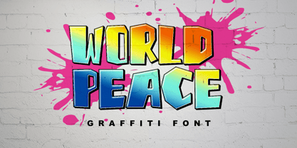 World Peace is a wildstyle outstanding graffiti display font. Urban and incredibly bold, this font will most certainly make your designs stand out. It will add a unique spark to any design project that you wish to create! This font is PUA encoded which means you can access all of the amazing glyphs and ligatures with ease!
 - Purenotes by Holis.Mjd,
$14.00 Purenotes is a cool and funny handwritten font, made as natural as possible in human handwriting which is suitable for use for quotes on Instagram, Pinterest, Tik Tok and other social media, you can also use it as a lyric video that you will upload on YouTube. You will get a natural feel in your design.
 - Mongolia by Goodigital13,
$20.00 It can be used in different purposes: lettering and logotype, labels, t-shirts, product packaging, invitations, advertising, and any classic / vintage typography design projects. will be great for any projects including : branding, logo, stationery, business card, signage, flyer, brochure etc. Almost all industries will be match for this typeface: events, music video, makeup artist, travel, promotions, musician, magician etc
 - Lothie by RagamKata,
$14.00 Lothie, a quirky font that will make your design looks outstanding! With Lothie, you can you’re your project even more fun. A playful font with it’s bold and unique shaped font, will make your design catches their eyes. This typeface is a perfect for an invitation, posters, logo, and many more! Get Lothie to make your design looks lit!
 - ITC Migrate by ITC,
$29.99George Ryan's ITC Migrate is a highly condensed sans serif display face that effectively complements ITC Adderville. Migrate represents what Ryan calls a “more highly evolved version” of a typeface he designed for Bitstream in 1991 called Oz Handicraft. “Both faces,“ says Ryan, “are based on designs of the popular early 20th-century type designer Oswald Cooper.” His inspiration came from drawing samples found in the Book of Oz Cooper, published in 1949 by the Society of Typographic Arts in Chicago. “Oz worked extensively with the sans serif form long before it became popular in the States, eschewing a popular belief of the time that sans serifs were only skeletons of letters.” Where Oz Handicraft was informal and quirky, ITC Migrate has a more restrained feel. “The uppercase characters and figures, in particular, have been reworked,” says Ryan, ”resulting in a more formal and traditional, compressed sans serif typeface.” - Samaritan Tall Lower by Comicraft,
$49.00 Fifteen hundred years from now, a man will be selected to go back in time to prevent a catastrophic event which turned his world into a dystopia. Sent back in time, he was enveloped in empyrean fire, the strands of energy that make up time itself. Crash-landing near Astro City in late 1985, he learned how to master and channel the empyrean forces that had suffused his body -- finally learning to control his powers in time to prevent the destruction of the Space Shuttle Challenger, the event he had been sent to avert. He described himself to journalists as nothing more than "a Good Samaritan", and has continued to help his fellow man in Astro City ever since. John JG Roshell has also been struggling with the empyrean challenge of fitting all of Kurt Busiek's ASTRO CITY dialogue into balloons with the regular Samaritan font, so he created the Samaritan Tall font to help his fellow comic book letterers! It's kinda the same thing, really.
 - Lust Text by Positype,
$29.00 Yes, finally. This one took the most time and the most restarting. Years went into imagining what Lust Text should look like and how it should structurally behave in order to truly improve upon a setting that includes any of the Lust typefaces. I approached it as much from the side of the type designer, as I did a potential user. The flow, the warmth, the personality needed to be there, but all of the excess had to be removed responsibly. In the process, and in need of inspiration, I looked backward to historical artifacts and precedent. In each early Lust Text approach, the solution was lackluster and/or vanilla and not actually a ‘Lust’ typeface. The exercise was not in vain though. By exploring past examples, I found my footing drawing for media now and how it might be used later—all the while, producing seamless, elegant curves and restrained indulgence (that sounds almost silly to say, but I like it). The Lust Collection is the culmination of 5 years of exploration and development, and I am very excited to share it with everyone. When the original Lust was first conceived in 2010 and released a year and half later, I had planned for a Script and a Sans to accompany it. The Script was released about a year later, but I paused the Sans. The primary reason was the amount of feedback and requests I was receiving for alternate versions, expansions, and ‘hey, have you considered making?’ and so on. I listen to my customers and what they are needing… and besides, I was stalling with the Sans. Like Optima and other earlier high-contrast sans, they are difficult to deliver responsibly without suffering from ill-conceived excess or timidity. The new Lust Collection aggregates all of that past customer feedback and distills it into 6 separate families, each adhering to the original Lust precept of exercises in indulgence and each based in large part on the original 2010 exemplars produced for Lust. I just hate that it took so long to deliver, but better right, than rushed, I imagine.
 - Love Twins Solid by Sipanji21,
$10.00 Say hello to Love Twins font. Made with love and joy. Comic look, so it will make your design more beautiful, cute, fun, and colorful. outline and solid style inside.
 - Rumpled by Ingrimayne Type,
$9.00 TapedUp, Tinkerer, and Rumpled are based on the template I used for several letterbat fonts—fonts made of wrenches and bolts, hammers, or paper clips. TapedUp can be thought of as a font made from masking tape, and Rumpled is the same design but the tape pieces are wavy. Tinkerer is the same design but with elements that resemble what might happen if one constructed letters from Tinker Toys. All are caps only, but some of the shapes on the lower-case keys differ from the corresponding shapes on the upper-case keys. The Rumpled family has four members, the regular, an oblique, a shadowed, and an oblique shadowed.
 - Gothiks Round by Blackletra,
$50.00 Gothiks Round is the rounded version of Gothiks. It is a narrow 6-weight display sans-serif influenced by Texturas. The rhythm and verticality of Texturas can be easily identified on the letters with diagonal strokes like A N M K k V v W w X x Y y Z z: here they are all vertical. This kind of morphology was chosen because it accepts condensation in a very natural way, giving to this sans-serif a very unique personality. The intermediate weights can be used for short texts while extreme weights are excellent for big sizes. It has an extensive character set—with extensive language support—and many OpenType features like fractions, small capitals and different figure sets. Default figures align with lowercase. The typeface’s name refers to the plural of the word Gothic, which in turn can refer to both sans-serifs or Blackletter, depending on geographic location.
 - Goddess by Device,
$39.00 Decadent, baroque and refined. Sinuous curves, ornate swashes and alternates that can be customized to suit your burlesque ball, bodice-ripping romance novel or high-fashion label. The “Swash” version includes swash capitals that can be toggled on or off using the ‘swash’ option in Adobe apps. The “Title” version includes drop-caps that connect with an underline that runs under the regular characters. These again can be toggled on and off using the ‘swash’ option. Also includes optional stylistic alternates and ligatures.
 - Syakaila Script by Bejeletter,
$10.00 This is our newest product called Syakaila Script. The alternative characters were divided into several OpenType features such as Title and Swash. Syakaila can be used for wide ranges of application, such as wedding design, logo, invitations, social media posts, clothing, invitation, poster, cafe/resto sign, and many others. Features: Syakaila Script Regular Syakaila Script Italic OpenType features (Titling and Swash) Ligatures Multilingual glyphs - spread your message globally AÀÁÂÃÄÅCÇDÐEÈÉÊËIÌÍÎÏNÑOØÒÓÔÕÖUÙÜÚÛWYÝŸÆßÞþ Fonts: You can use any software that fonts can be used on it
 - Vangba by Alit Design,
$12.00 Introducing Vangba Typeface The Vangba font is designed with a serif font concept that has a elegant stencil style. Irregular dynamic shapes but impressively regular and unique make the font "Vangba" different and steal attention. Serif typefaces such as "Vangba" are very easy to apply to any design, especially those with an retro, elegant and classic, besides that this font is very easy to use both in design and non-design programs because everything changes and glyphs are supported by Unicode (PUA). The "Vangba"contains 656 glyphs with many unique and interesting alternative options. In addition to the regular font, there is also an italic version of the Vangba font.
 - Cast Iron - Unknown license

- Pure evil 2 - Personal use only

- Major Snafu - Unknown license

- Skeksis - Unknown license

- Transylvanian by Comicraft,
$19.00 At the end of every road in Transylvania stands a dark, foreboding castle, seemingly clouded by impossibly dark shadows. Bat-like creatures scurry across its gargoyle-festooned towers, and slimy green patches of moss climb inexorably up its cold walls. Blood has been spilt in the tombs of this chilling location, and there, etched in stone above the arched entranceway, is inscribed -- in Comicraft’s TRANSYLVANIAN typeface -- a simple legend: ABANDON ALL HOPE YE WHO ENTER HERE. TRANSYLVANIAN is a small-caps font that includes Comicraft's revolutionary Crossbar I Technology™, to locate that mysterious character in exactly the right places. Artwork from ASK FOR MERCY by Richard Starkings & Abigail Jill Harding, available on Comixology.com Features Four weights (Regular, Italic, Bold & Bold Italic) with upper and lowercase characters. Includes Western European international characters.
 - Bellerin by Mevstory Studio,
$15.00 Bellerin is one of my fonts based on a hand lettering project in 2020. I was very inspired by the famous retro typography designs form the late 60's till the 70's. So you won't need extra efforts for create an extrude effect for this font. This mean it will saves your time.
 - Lajoya by Keristyper Studio,
$12.00 Lajoya is a unique and natural handwritten script. The appearance of the strokes is in the form of light, free-flowing brush strokes. This font is good for logo design, Social media, Movie Titles, Books Titles, short text even long text letters, and good for your secondary text font with sans or serif. Featured: Standard Uppercase & Lowercase Numeral & Punctuation Multilingual : ä ö ü Ä Ö Ü ß ¿ ¡ Alternate & Ligature PUA encoded We recommend programs that support the OpenType feature and the Glyphs panel such as Adobe applications or Corel Draw. so you can use all the variations of the glyphs. Hope you enjoy our fonts!
 - Poespa Indah by IKIIKOWRK,
$17.00 Introducing Poespa Indah - Old Type, created by ikiiko. Poespa Indah was inspired by vintage store signs in the classic era of indonesia around the 60s. In particular, this typeface is designed to give a formal yet old style look. Poespa Indah has a sans serif typeface with bold to light contrast. This typeface is perfect for an formal layout, newspaper, magazine cover, and also good for vintage product, quotes, or simply as a stylish text overlay to any background image. What's included? Uppercase & Lowercase Number & Punctuation Multilingual Support Works on PC & Mac Enjoy our font and if you have any questions, you can contact us by email : ikiikowrk@gmail.com
 - Enigmatica by Artisticandunique,
$10.00 Enigmatica - Serif font family - 18 Styles - Multilingual supports Enigmatica is a stylistic and powerful serif font family with different alternative type designs. You will have the opportunity to enrich the content of your projects with alternative characters. This font comes with multilingual support and 18 styles. It has an elegant structure that can be effective in the development of your projects. Especially for editorials, magazines, books, branding, logo design, web design, headlines, movie titles etc. If you are looking for a font with stylistic alternatives, Enigmatica serif font might meet your needs. With this font you can create your unique designs. If you have a question, please contact me. Have a good time.
 - Aclonica Pro by Stiggy & Sands,
$29.00 Our Aclonica Pro is a strong and modern sans serif typeface with a slight deco/techno essence to it. Clean letterforms and a generous x-height lend to a friendlier feel and easily legible typestyle, while signature swoops and angular tapering stems exude a subtle sensual nature. The SmallCaps and extensive figure sets not only expand the usefulness of the typeface across a wider gamut, but also convey a more serious tone when needed. Opentype features include: - SmallCaps. - Full set of Inferiors and Superiors for limitless fractions. - Tabular, Proportional, and Oldstyle figure sets (along with SmallCaps versions of the figures). - Stylistic Alternates for Caps to SmallCaps conversion.
 - Parisine Std by Typofonderie,
$59.00 Ultra legible forceful sanserif in 32 fonts Parisine was born as official parisian métro signage typeface. This family of typefaces has become over years one of the symbols of Paris the Johnston for the London Underground or the Helvetica for the New York Subway. The Parisine was created to accompany travelers in their daily use: ultra-readable, friendly, human while the context is a priori hostile. Meanwhile, Parisine is now a workhorse and economical sanserif font family, highly legible, who can be considered as a more human alternative to the industrial-mechanical Din typeface family. More human, but not fancy: No strange “swashy” f, or cursive v, w etc. on the italics, to keep certain expected regularity, important for information design, signages, and any subjects where legibility, sobriety came first. Born as signage typeface family, the various widths and weights permit a wider range of applications. In editorial projects, the Compress version will enhances your headlines, banners, allowing ultra large settings on pages. The Narrow version will be useful as direct compagnon mixed to standard width version when the space is limited. The various Parisine typeface subfamilies Parisine is organised in various widths and subsets, from the original family Parisine, Parisine Gris featuring lighter versions of the usual weights and italics, Parisine Clair featuring extra light styles, to Parisine Sombre with his darker and extremly black weights as we can seen in Frutiger Black or Antique Olive Nord. Many years of adjustments were necessary to refine this complex family. Initially, Parisine was designed by Jean François Porchez in 1996 for Ratp to solely fulfil the unique needs of signage legibility. Parisine remain the official corporate typeface of the public transport in Paris, the worldwide capital for tourism, and now integral part of the French touch. Directly related, Parisine Office was initially created for Ratp’s internal and external communication, Parisine Office is available at Typofonderie too. Not connected with Ratp and public transports, Parisine Plus was created as an informal version of Parisine. Parisine: Introducing narrow and compressed families About Parisine Parisine helps Parisians catch the right bus Observateur du design star of 2007
 - Yoghurt - Personal use only

- Buket by Ahmet Altun,
$19.00 Bouquet or in Turkish, Buket Font Collection includes 18 styles and textures which are different but compatible with each other. Decorative and script sans fonts include several useful ornaments. It can be created elegant and decorative typographic designs and additionally, eye-pleasing designs can be made even in miniscule texts.
 - Minomu by Owl king project,
$37.00 Minomu consists of twenty sans serif font families, With a thicker weight, Minomu can be applied as an attractive and bold appearance for title letters, not only that, but Minomu's family with lowercase letters can also be used in designs with use as body text, to create more detailed descriptions.
 - LT Novelty - 100% free

- LT Diploma - 100% free

- Dastafarin - Unknown license

- Arwen - Unknown license

- HV Frankfurt by Harmonais Visual,
$12.00 Frankfurt - a clean, display sans serif with great versatility. With multiple weights, this typeface can be used to create a wide range of designs looking to achieve a fun, modern, and youthful look.
 - Knappolog by Cercurius,
$19.95 Negative sans-serif capitals in squares with rounded corners, looking like tiles, pushbuttons or computer keys. The font can be used for logos, signs and labels, and for markings on maps and charts.
 - Tescellations by Ingrimayne Type,
$9.95 Though there are many thousands of digital typefaces available, none seem to be made exclusively of letters that tessellate, a complete tessellating alphabet. This void is now filled with not one typeface, but a group of typefaces, the Tescellations kinship group. Even though I am aware of only one use for this typeface--writing about tessellations--that does not mean there are not hundreds or perhaps thousands of other uses. These typefaces are a byproduct of two maze books I designed, Puzzling Typography and Puzzling Typography A Sequel. I found the challenge of making mazes from tessellations, including letter tessellations, intriguing and these typefaces are a byproduct that endeavor. There are seven members of this typeface kinship group. I tried to select the the glyphs that fit together best to form Tescellations; it is the most readable of the lot. The reason for an Italics version is that I needed one for the maze project. In constructing it, I tried to include as many different lower-case glyphs as I could rather than just skew the regular version. A purist might insist that the tessellation deal with the counters. My approach was to worry only about the exterior of any letter that has an interior, but for anyone who who might object to the counters, versions with filled counters are included. What did not fit into Tescellations was dumped into Tescellations Two, which is somewhat of a ransom-note type of face. It comes in two styles, a regular version and a version in which the counters are removed. TescellationPatterns shows how many of the characters in these typefaces tessellate. It has over 100 tessellation patterns, each on only one character. Simply type several lines with any character and make sure the leading is the same as the font size, and you have an instant tessellation pattern of a letter.


