10,000 search results
(0.076 seconds)
- Bilcase by Ilham Herry,
$20.00 The Bilcase font family is a layered condensed font family that comes from vintage logos, labels, packages, and signage. This collection of styles has 5 type layers and vintage scrolls, panels, and ornaments. Combine these to create label designs, headlines, logotypes, signage, posters, greeting cards, letterheads, T-shirts... the applications are endless. This font family is available in 2 styles. Bilcase has font layers with contextual, stylistic alternates and ligatures. You will get special capital letters when you activate the contextual alternate feature. Bilcase Extras is the expanded version of the main font with panels, ribbons, and ornaments. You can access the ornaments by activating the ligature feature. Type the letter “p” for the panel, “r” for ribbon and “o” for ornament and add numbers to each code, e.g. “p1, p2, p11, r2, o2”. Complete information is in the pdf file. http://bit.ly/2OClGjY. You can also try it in the font tester below.
 - Espesor Olas Lines - Personal use only

- Starkido by Forberas Club,
$16.00 Introducing Starkido by Forberas Club Starkido is a handwritten script font that will make your designs look classic, Farmhouse, and Boho. It is a great font for events, wedding invitations, fashion, apparel, signature, album covers, logos, branding, magazines, social media posts, advertisements, but will also work great with any other project. Add it to your fonts’ library to enhance your creativity! Starkido is best for: - logos, branding & signatures - Flyers, album cover, magazine & advertisement - Website design, design blogs & fashion - Quote graphics for social media - Also works great with any other project Whats included : - Font provided in OTF format - Numerals and Punctuation - Accents (Multilingual characters) If you have any questions, before or after purchase, please feel free to get in touch.
 - Leakpaint by Andrew Tomson,
$10.00 Hello friends! Drawing is a great way to pass the time. Sometimes, clumsy people can spill paint on paper or on an already completed drawing. What do we end up with? A ruined drawing or a new work of art? I think the latter. After all, every drawing is unique and a unique thing. Even if you are drawing a stick man! This font presents the opportunity to see what happens if invisible ink is spilled on it. This font is great for your new and unique projects for social media, lettering and just for home use! A little sloppy, a little bouncy, so it's so lively and magical! I wish you good luck and love!
 - Tenez by Plau,
$30.00 Big News! Tenez has been selected for the Tipos Latinos Biennial 2016 and Typographica’s Favorite Typefaces of 2015! Tenez is a Grand Slam display didone typeface from Plau. We designed it for a branding project, further developing the resulting logotype into a typeface we felt could solve many designers’ needs. Its origins are rooted in pointed nib calligraphy which can be seen in contemporary Didot and Bodoni inspired typefaces. But Tenez’s shapes are organic (these modern typefaces were originally cut by hand after all) – in fact that was the challenge we set from the start: to make a typeface as organic in construction as possible. This echoes some of late 19th century typefaces and advertising, yet we thought of it for contemporary uses. One of the several unique features of Tenez is its unusual Thin weight, in which the contrast between thin strokes and the black area left by the serifs makes for a typewriter-like personality. The italics provide a perfect counterpoint to the roman weights. Tenez was unapologetically conceived as a display typeface meant to be used large as in magazine openings, drop caps or everywhere there’s a need for elegant impact. The family includes support for almost all Latin languages available, figure sets for almost every conceivable occasion (tables, text, you name it), alternates for the quirky beautiful R (sometimes simpler is better, but not always!) and Q (with a nice big tail for that article opener). Tenez pairs really well with our no-frills sans-serif Motiva Sans and our cute vertical connected script Primot.
 - Boston Skyline by Set Sail Studios,
$16.00 Boston Skyline is a carefully hand-crafted duo of premium Sans & Script fonts, designed to create a bold, authentic, and timeless lettering combination. The contrasting yet complimentary strong sans and free-flowing script lend themselves perfectly as primary and secondary fonts for logo designs, product packaging, eye catching quotes and display text. Here’s what’s included in this product: Boston Skyline Rough • A hand drawn script font with authentic textures built-in. Contains upper & lowercase characters, all punctuation and numerals. Boston Skyline Rough Alt • This is a second version of Boston Skyline Rough, with a completely new set of upper & lowercase characters. If you wanted to avoid letters looking the same each time to recreate a custom-made style, or try a different word shape, simply switch to this font for an additional layout option. Boston Skyline Sans Rough • A bold Sans font with a built-in rough 'letterpress' texture. Contains uppercase characters, all punctuation and numerals. Boston Skyline Swashes • This font contains 26 swashes, perfect for underlining your script text and adding some extra custom flair. Simply install this font separately and type any a-z character when using this font to generate a swash. Clean Versions • Are included for all fonts with textures completely removed and edges smoothed. Language Support; All fonts support English, French, Italian, Spanish, Portuguese, German, Swedish, Norwegian, Danish, Dutch, Finnish, Indonesian, Malay, Hungarian, Polish, Turkish, Slovenian
 - Britonix by Owl king project,
$47.00 Inspired by monospaced letters, Britonix is designed with normal spacing but seems mono. Uppercase Britonix can be used for headlines or displays giving it a minimalist, professional yet modern look. Britonix also carries 20 weights including italic style, minimalistic lowercase letters can also work well for long sentences or paragraphs. happy exploring with Britonix.
 - Ruthless Drippin ONE - Personal use only

- Ruthless Drippin TWO - Personal use only

- Some Weatz Symbols - Personal use only

- Ruthless Wreckin TWO - Personal use only

- Let Me Ride - Personal use only

- Rider Wide - Personal use only

- Ruthless Wreckin ONE - Personal use only

- First Lyrics - Personal use only

- Barkants - Personal use only

- Second Lyrics - Personal use only

- R-2014 Eroded - Personal use only

- Eckhardt Signwork JNL by Jeff Levine,
$29.00Eckhardt Signwork JNL was inspired by visual images collected by two great nostalgia sites: www.forgotten-ny.com and www.norelevance.com. The vintage signage photographed and saved for posterity on both sites reflect an age when hand-crafted work was the rule, rather than the exception [as is today]. Although somewhat limited in scope, this font can best be used for retro or nostalgic embellishments in ads or design work. There's also a generous amount of blank panels to insert your own copy for special projects. As with previous typefaces in this series, the font is named in honor of the late Al Eckhardt, owner of Allied Signs in Miami, Florida - a talented sign man and Jeff Levine's good friend for 18 years. - Doovy Groovy Party by Mofr24,
$11.00 Introducing the Doovy Groovy Party font! This stylized, psychedelic, and round Groove Display Font takes you back to the 90's and 00's era. With its multilingual support, it's perfect for creating a pop, funky, and bold vibe. What sets the Doovy Groovy Party font apart is its unique ability to capture the essence of the vibrant and energetic 90's and 00's era. Its stylized, psychedelic design evokes a sense of nostalgia while still offering a fresh and contemporary look. This font is a true standout, allowing your designs to stand out as well. For designers looking to create harmonious compositions, the Doovy Groovy Party font has a few relatives and typefaces that complement it beautifully. Consider pairing it with "Retro Sans Serif" for a bold and cohesive look, or experiment with "Funky Display" to amplify the funky vibes. These combinations will add an extra layer of creativity and versatility to your design projects. The Doovy Groovy Party font comes in three variations - Regular, Outline, and Shadow - making it a versatile tool for various design needs. The Regular version provides a solid foundation, ideal for headlines and titles that demand attention. The Outline variation adds an element of sophistication and can be used for modern designs, while the Shadow option creates depth and dimension for a more dynamic appearance. Additionally, this font boasts extensive multilingual support, ensuring that it can be used effectively across different languages and cultures. The Doovy Groovy Party font draws inspiration from the bold and expressive typography prevalent in the 90's and 00's. It captures the vibrant and carefree spirit of that era, where music, art, and pop culture collided to create an explosion of creativity. The psychedelic elements incorporated into the font pay homage to the colorful and trippy visuals that defined the time. This font encapsulates the nostalgia and excitement of those years, allowing designers to infuse their projects with a sense of fun and playfulness. We created the Doovy Groovy Party font with a passion for celebrating the bold and expressive designs of the past. We wanted to provide designers with a versatile tool that brings the nostalgic charm of the 90's and 00's to their modern projects. By using this font, you can effortlessly transport your audience to a time when colors were brighter, music was groovier, and creativity knew no bounds. Let your imagination run wild with the Doovy Groovy Party font and infuse your designs with a vibrant touch that will captivate and inspire! Unlock the power of nostalgia and creativity with the Doovy Groovy Party font. Its unique design, versatile variations, and multilingual support make it the perfect choice for posters, marketing materials, T-shirt designs, headlines, and much more. Get ready to groove and let this font elevate your creative projects to a whole new level!
 - Tablet Gothic by TypeTogether,
$35.00 Graphic designers of any nationality and background know very well that the art of composing titles correctly is not easy, Especially when it comes to periodical publications where there is need for both flexibility and graphic coherence. Tablet Gothic was originally engineered as a titling type family, meant to help designers working on publications that require output as hard copies and a variety of digital platforms at the same time. As such, it is a grotesque sans serif that looks to the future of publishing with a clear understanding of its history, and reminiscences that go back to nineteenth century Britain and Germany. Tablet Gothic delivers the sturdy, straightforward and clean appearance expected from a grotesque, but it allows itself a good measure of personality to make it stand out on the page. Its 84 styles –six series of condensation and seven weights in each series plus obliques– guarantee that, whatever the publication format is, there's a Tablet Gothic font that will do the job and perform well both technically and aesthetically. Furthermore, the rounder styles, Tablet Gothic Wide, Normal and Narrow achieved amazing results at very small sizes, producing a beautiful texture and highly readable text blocks. Tablet Gothic fonts can be purchased individually, by series or as a complete bundle (best value!)
 - Primot by Plau,
$49.00 Primot is an upright script heavily influenced by italian gelaterias . After releasing 3 sans serifs , we were looking for an opportunity to design a display type with less constraints for legibility and expression. We started playing with brush lettering and looking into vintage scripts from different eras. Some cool things that made it into Primot were some unusual vertical connections and the sweet brush flairs in the letter endings. From that point on, we set out to create a beautiful looking vertical script – something we don’t see that often – in which each word set could would make a nice piece of graphic design (think logos, video game titles, shop windows etc.). We also made it smart by including hand-lettering inspired features such as initial and final forms for letters, contextual alternates and swashes. The result is a versatile 900+ glyphs display typeface, suitable for a wide range of applications. We hope you have as much fun with it as we had designing it! And while we’re here, you may like that it also pairs beautifully with our sturdy sans-serif family Motiva Sans .
 - Open Serif by Matteson Typographics,
$19.95 OPEN SERIF - answering the question “what font pairs well with Open Sans?”. Designed by Steve Matteson for extraordinary legibility and comfortable reading on screen and in print. Open Interpretation: Not quite Veronese – not quite Egyptian. A dash of panache in an otherwise sturdy serif typeface. Open Serif is an elegant text and display typeface family. Open Interiors: Visually open and legible at text sizes just like its cousin Open Sans. Open Serif reads smoothly but has an energetic texture. The chancery style italic contrasts nicely to the roman in a full bodied nod to Italian Renaissance forms. Open Type: Open Serif is full of OpenType features including Small Capitals for the Roman, Italic Swash Capitals and Old Style Figures for both. Open Translation: Supporting all the languages available in Open Sans, Open Serif completes the translation capabilities of international companies. Extended text is more pleasant to read in a serif typeface so go global with a unified typeface family! Open Face: Open Serif Titling is an elegant companion to round out the family. These ‘open-face' capital letters are ideal for initial letters, mastheads, titles and decoration.
 - Firwaen by Twinletter,
$15.00 Introducing our newest display font FIRWAEN. This font is perfect for any Halloween, horror project, especially signs and decorations. Choose this font for your special project. This font is perfect for party projects, invitations, cards, posters, or anything else you want. Of course with this font your various design projects will be perfect and amazing, get a beautiful title and start using our font for your special project.
 - Darksame by Alit Design,
$23.00 "DARK SAME" is a unique and versatile font that combines the striking and bold elements of blackletter with the elegant and refined features of a serif font. This font is perfect for anyone looking to add a touch of sophistication and style to their design projects. With over 701 characters, "DARK SAME" offers support for PUA Unicode and multilingual use. Its extensive range of alternate glyphs, ligatures, and swashes allow for endless creative possibilities and customization. The font's classic modern and beauty dark style makes it an excellent choice for various design projects, including branding, logos, invitations, book covers, posters, and more. "DARK SAME" will add a touch of timeless elegance to any project and will make your designs stand out from the crowd. Overall, "DARK SAME" is a must-have font for anyone looking for a versatile and sophisticated typeface that combines the best of both worlds: the boldness of blackletter and the elegance of a serif font. Language Support : Latin, Basic, Western European, Central European, South European,Vietnamese. In order to use the beautiful swashes, you need a program that supports OpenType features such as Adobe Illustrator CS, Adobe Photoshop CC, Adobe Indesign and Corel Draw. but if your software doesn't have Glyphs panel, you can install additional swashes font files.
 - Boilerplate by Wundes,
$18.00Gritty heat-forge stamped metally goodness. Can withstand up to 255 pounds of pressure psi, it even says so right on the graphic. This is a fun display font inspired by the stamped text on barbells, sewer drains, and of course boiler-plates, not that we see many of those anymore, but I digress... This font contains all the standard sub-255 unicode characters, plus a few extras for flavor. Apply this font with liberal amounts of axle grease and she should last ya a lifetime. - Panamericana by Andinistas,
$19.95 @andinistas presents an update of Panamericana in 2019, a typographic family worn out and expressive with 10 fonts perfect for short writings with cursive and stained calligraphic look. Panamericana works perfectly in headlines or logos of a film because its different thicknesses of corrosion and textures guarantee striking messages on t-shirts, stickers, skateboards, magazines, printed quotes, packaging, headings and all the designs you can imagine. Panamericana works best by exchanging and mixing letter by letter among its 10 fonts. In this way, you will take advantage of its corrosion levels by mixing the 3 uppercase, lowercase and ideal calipers for the beginning, middle or end of words, phrases or short paragraphs. Each empty and full Panamerican area was designed with care, care and attention and that is why its more than 2000 glyphs were carefully planned in 10 fonts designed for maximum performance in compositions that need scruffy and creative visual properties.
 - MFC Semicirculus Monogram by Monogram Fonts Co.,
$19.95 The inspiration source for Semicirculus Monogram is a stylish sans serif letterset from a vintage embroidery publication which combines to create a semi-circular form monogram. Originally intended to adorn handkerchiefs, it has so many other possibilities. Ornaments from numerous antique specimen books were combined with the letter set to accent and complete its form. This is one of many monogram designs for the early 1900s which fall into a two letter format that is either adorned or interwoven with ornamentation. Download and view the MFC Semicirculus Monogram Guidebook if you would like to learn a little more.
 - Talonica by Nantia.co,
$24.00 Greek Signature Font Talonica The Greek Signature Font Talonica is a signature decorative font with which you can achieve a hand-lettering style. Talonica is a multilingual lettering font with Greek (of course), Latin characters, and diacritics. Supports all European languages. This signature style is perfect if you want to achieve a modern-looking graphic design project. In addition, this font has a really nice flow so you can also use it in a larger body of text. It can also be used on social media content, for branding or packaging applications. Also, this is the ideal typeface for organic product wine branding and packaging. You can use it to create logotypes with character and natural flow. Additionally, you can use its romantic vibes for wedding invitation designs. Especially if you are looking for a handwritten font for Instagram quote posts or any other social media content, this signature typeface is for you!
 - Callimba by Letterena Studios,
$10.00 Are you trying to make an elegant, modern, and stylish statement with your invitations, social media, website, or printed materials? Ready to enchant your audience and enhance your branding? Introducing Callimba - A Serif Font Callimba is a gorgeous serif font that will whisk you away to a place of style! We are hoping that through this elegance and passion edged font, you can maximize your designs, reign in sales or make lasting impressions. The ideal font for social media banners; posts, and ads, printed quotes, t-shirt designs, packaging, or even as a modern text overlay to any background image. Callimba includes Multilingual Options to make your branding globally acceptable. Features: Ligatures Alternates Multilingual Support PUA Encoded Numerals and Punctuation
 - Rumini Namamu by Allouse Studio,
$16.00 Proudly Presenting, Rumini Namamu a Handwritten Sans Textured Rumini Namamu is perfect for any titles, logo, product packaging, branding project, megazine, social media, wedding, or just used to express words above the background. Rumini Namamu also come with Multi-Lingual Support. Enjoy the font, feel free to comment or feedback, send me PM or email. Thank You!
 - Smelly Peach by Allouse Studio,
$16.00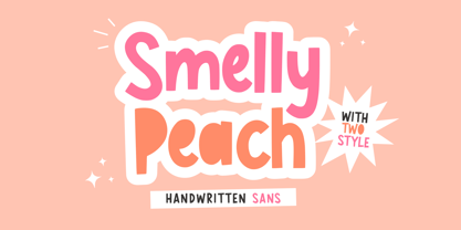 Proudly Presenting, Smelly Peach a Handwritten Friendly Sans. Smelly Peach is perfect for any titles, logo, product packaging, branding project, megazine, social media, wedding, or just used to express words above the background. Smelly Peach also come with Multi-Lingual Support. Enjoy the font, feel free to comment or feedback, send me PM or email. Thank You!
 - Roller Poster by HiH,
$12.00 Roller Poster is named after Alfred Roller. In 1902, Roller created a poster to advertise the 16th exhibit of Austrian Artists and Sculptures Association, representing the Vienna Secession movement. The exhibit was to take place in Vienna during January & February 1903. The location is not mentioned because everyone in Vienna knew it would be held at the exhibit hall in the Secession Building at Friedrichstraþe 12, a few blocks south of the Opernring, near the Naschmarkt. Designed by Joseph Maria Olbrich in 1897, the buiilding has been restored and stands today as one finest of the many fine examples of Art Nouveau architecture in Vienna (see vienna_secession_bldg.jpg). Because of its dome, it is called “the golden cabbage.” The poster itself is unique. The word “secession” is in one type style and takes up two-thirds of the elongated poster. At the bottom of the poster are the details in a different lettering style. It is this second style at the bottom that is the basis for the font Roller Poster. In keeping with our regular naming conventions, we were going to call it Roller Gezeichnete (hand-drawn), but the wonderful play on both words and the shape of the three S’s in secession was too compelling. In November 1965 there was an exhibit of Jugendstil and Expressionist art at the University of California. Alfred Roller’s Secession Poster was part of that exhibit. Wes Wilson was designing promotional material at Contact Printing in San Francisco. Among their clients was a rock promoter named Bill Graham, staging dance-concerts at Fillmore Auditorium. Wilson saw the catalog from the UC exhibit and Roller’s lettering. Wilson adapted Roller’s letter forms to his own fluid style. The result was the poster for the August 12-13, 1966 Jefferson Airplane/Grateful Dead concert at Fillmore put on by Graham (BG23-1). Wilson continued to use Roller’s letter forms on most of the posters he did for Graham through May 1967, when he stopped working for Graham. The posters were extremely successful and the lettering style along with Roller’s letter forms were picked up by other artists, including Bonnie MacLean, Clifford Charles Seeley, James Gardner, and others. The Secession poster and the Fillmore posters have inspired a number of fonts in addition to ours. Among them are JONAH BLACK (& WHITE) by Rececca Alaccari, LOVE SOLID by Leslie Carbarga and MOJO by Jim Parkinson. Each is different and yet each clearly shows its bloodlines. Our font differs in two ways: 1) the general differences in the interpretation of the letter forms and 2) the modification of the basic letter form to incorporate the diacriticals within the implied frame of the letter, after the manner of the original design by Roller. We borrowed Carbarga’s solution to the slashed O and used it, in a modified form, for other characters as well to accomplish the same purpose. We recommend that you buy ours and at least one of the other three. According to Alaccari, a version called URBAN was released by Franklin Lettering in the 70’s (and is shown on page 51 of The Solotype Catalog). For comparison of our font to original design, see image files roller_poster_2s.jpg of original poster and roller_poster_2sx.jpg showing reconstruction using our font for the lower portion (recontructed area indicated by blue bar). Please note the consistency of character width. In the lower case, 23 of the basic 26 letters are 1/2 EM Square wide. The ‘i’ is an eighth narrower, while the ‘m’& ‘w’ are one quarter wider. All the Upper Case letters are 1/8 EM wider than the lower case. This is to make it easier to fill a geometrical shape like a rectangle, allowing you to capture a little of the flavor of Wes Wilson’s Fillmore West poster using only a word processor. We have also included a number of shapes for use as spacers and endcaps. If you have a drawing program that allows you to edit an ‘envelope’ around the letters to distort their shape, you can really get creative. I used Corel Draw for the gallary images, but there are other programs that can accomplish the same thing. The image file “roller_poster_keys.jpg” shows the complete character set with the keystrokes required for each character (see “HiH_Font_readme.txt” for instruction on inserting the non-keyboard characters). The file “roller_poster_widths.jpg” shows the exact width of each character in EM units (based on 1000 units per EM square). You will notice that the font is set wide for readability. However, most programs will allow you to tighten up on the character spacing after the manner of Roller & Wilson. In MS Word, for example, go to the FORMAT menu > FONT > CHARACTER SPACING. Go to the second Drop-Down Menu, labeled ‘Spacing’ and select "condensed' and then set the amount that you want to condense ‘by’ (key on the little arrows); two points (2.0) is a godd place to start. Let your motto be EXPLORE & EXPERIMENT. Art Nouveau has always been one of my favorite movements in art -- I grew up in a home with a couple of Mucha prints hanging on the living room wall. Perhaps because of that and because I lived through the sixties, I have enjoyed researching and designing this font more than any other I have worked on. Let’s face it (pardon the pun), Roller Poster is a FUN font. You owe it to yourself to have fun using it.
 - AS Nerd by Ten Waffle Studio,
$6.00 AS Nerd is a contemporary brush script. AS Nerd is a beautiful typeface that mimics true handwriting closely. Use AS Nerd, and your documents will look stunningly beautiful from now on. Perfect for printing your personal thoughts be they silly, pensive or absolutely nonsense!
 - Balibong by Scratch Design,
$8.00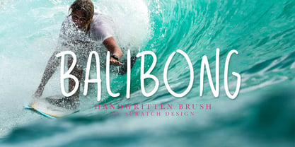 Balibong is a handwritten font with a casual look and vintage style. Balibong will be useful in your designs such as quotes, invitations, menu designs, logos, branding, clothing and some design for in a casual or vintage concept. Balibong also has Multi-Lingual support characters.
 - Dichigan by Motokiwo,
$15.00 Dichigan is a modern, beauty calligraphy font, and will work perfectly for weddings, food, e-commerce brands, trend blogs, boutiques or any business that wants to appear upscale and sweet. Features: Uppercase & Lowercase Standard Ligatures Contextual Alternates Numerals & Punctuations (OpenType Standard) Multilingual characters PUA Encoded
 - Hi TV by Yebhu,
$15.00 Hi TV is an good-humored and energetic display font. Although being an all caps alphabet, it counts two versions for a letter, easily accessed choose uppercase or lowercase. These slightly different letterforms will bring spontaneity and vitality to your designs. Crunching noises guaranteed!
 - Hex by Hanoded,
$15.00 Hex is an uneven, spiky font with an evil twist. The glyphs look like they have been scratched onto paper (which is indeed the case), so it will be perfect for your scary halloween postcards or posters. Hex font comes with extensive language support.
 - Assemblage by Latinotype,
$36.00 Assemblage Designed by Daniel Hernández, Alfonso García, Bruno Jara Ahumada and Luciano Vergara. Thanks to Pedro González for his contribution in the initial stage of the design process. Assemblage is a typeface-inspired by Roman square capitals-that comes in 6 different weights and ranging from Thin to Black. The background of the typeface makes it well-suited for branding, short text, titles and complex compositions, thanks to its italic version. Contrary to some conservative fonts, Assemblage includes an italic version with a look based on Elzeverian and Dutch Barroque typefaces, what gives the font an extra dash of elegance, resulting in a very enjoyable design. The family was specially created for labelling wine bottles and general packaging. Assemblage is a font collection consisting of a Sans Serif plus an Italic version of classic features. The family comes in 6 weights and includes ligatures, caps and small caps plus 3 sets of smaller small caps for different kinds of composition. The Italic version-with strong decorative features-comes with swashes. Assemblage also includes a set of dingbats, especially designed for packaging as well as for publishing or branding. The Sans contains 979 characters and the Italic version 620 characters. Assemblage supports 212 different languages and its OpenType features include ligatures, semi oldstyle figures, 3 sets of ornamental small caps (in the Sans version), swashes, ending forms and alternates in the Italic version.
 - Rockwell by Monotype,
$40.99 Whether you call them slab serif, square serif, or Egyptian, you know them when you see them – sturdy, nearly monoweight designs with blunt, straight-edged serifs and a no-nonsense attitude. The Rockwell® Nova family is a fine example of this appealing and eminently usable type style. This is a design that is both robust and adaptable. Marked by the flat top-serifs on the cap A, unusual Q tail and high-legibility two-storied lowercase a, Rockwell has a bit of handmade charm that distinguishes it from the cool, more modern interpretations of the slab serif style. The family is excellent for branding, headlines and other display uses. The simple shapes and hearty serifs also make it a good choice for short blocks of textual content in both print and on-screen environments. The light and bold weights are perfect for setting blocks of text copy, while the extra bold and condensed designs bring authority to display copy. Throw in a little color, and you amp up Rockwell’s messaging power. The regular and italic designs perform handsomely, in the most modest of screen resolutions. With four weights of normal proportions, each with a complementary italic, and three condensed designs, two with italics, the family is a commanding and versatile graphic communicator. Rockwell’s large x-height, simple character shapes and open counters, make for an exceptionally legible design. It should not, however, be set so tight that its serifs touch, as this will erode legibility and impair readability. A benefit to Rockwell’s slab serifs, however, is that the design combines beautifully with both sans serif typefaces and a variety of serif designs. Rockwell OpenType® Pro fonts have an extended character set supporting Greek, Cyrillic, most Central European and many Eastern European languages, in addition to providing for the automatic insertion of ligatures and fractions. Looking for its perfect pairing? Look no further than ITC Berkeley Old Style, Between™, ITC Franklin Gothic®, Harmonia Sans™, Metro® Nova or Frutiger® Serif.


