10,000 search results
(0.024 seconds)
- Passport48 by Coniglio Type,
$19.95 Passport48 exclusively in otf. opentype format, originally debuted in 1997 as Passport, close to the beginning of the indie typographer boom. Almost 25 years have passed since it was introduced at MyFonts as PS1 and later in 2003 in TT TrueType.** It was designed by Joseph Coniglio of Coniglio Type as a revival. Historically, Passport was digitized from a shiny black enamel 1948 Royal Silent Deluxe portable. Kept on the ship of merchant marine, Captain John O’Learn, it was a salty manual typewriter with no intrinsic value as a collectable, even though it is awash as a work horse and a fine communicator of it’s time.. **NOTE: Little Passport family leaves the nest: The old weight variations, styles and formats have been eliminated to allow the original face to be stand alone, on its own attributes. For those purchasing their first typewriter fonts and to our diehard collectors as well, Passport presents a friendly new port-of-entry. A simple set, that is freed of many of the normal distressed points and paths that had made most “typewriters” authentic looking, but difficult to print and manipulate in layouts back in the day. It’s smooth nature comes from its impressions struck directly onto a piece of carbon paper bypassing the silk ink ribbon and going directly from metal to carbon paper transferring to a piece paper with very little tooth. Examine the glyphs to be certain you have what you need from this minimalist set, Passport48 is intended for ease of use and affordability. This is a warm font in a cold cruel world and a real port in the storm! It is versatile in today’s layouts with 24 years of worldwide sales. …Please enjoy the fruits of its travels, hoping your destinations and explorations into graphic design and letter composition are happy ones. -Joe Coniglio, the Pacific Northwest (2021).
 - Sangli by insigne,
$- It started in 2007 with Chennai, the first of a three-part series of sans that I envisioned with slab serif counterparts. Each font would differ from the others in how the stem terminals were expressed. The initial font was extremely well received, and a revitalized and remastered Chennai made its appearance two years later, complete with new weights and new, novel OpenType features. Then came Madurai, a variation of Chennai based on the same core, only without the rounded stems. Chennai’s rounded stems made it distinctive and great for headlines but left it lacking appeal as copy--a problem that Madurai easily solved. And now comes Sangli, the final iteration of my original 2007 vision. Sangli is a happy medium. Like Chennai, it’s great for headlines--but not too distinct for copy. Sangli keeps the same core structure as the other two, but new less sharp forms give this latest font a friendlier look that’s more versatile than the original Chennai and less formal than Madurai. The font includes a whole range of six weights from light to black, along with condensed and extended options as well for a total of 54 fonts. There are plenty of OpenType features, including small caps. Alternates include normalized capitals and lowercase letters that include stems for when you want a more traditional look or when you’re writing copy. Sangli also supports over 70 languages that use the extended Latin script. Use Chennai, Madurai, and their slab serif variants interchangeably with Sangli, too, for even more options in your work. All three complement one another well. So when you need a balanced font that stands boldly on the page and commands your reader’s attention, look within and find your Sangli.
 - Imagine a font that strides into the room with the confidence of a heavyweight champion, yet possesses the gentle touch of a calligrapher. That's Tabarra Black by deFharo for you. Crafted by the tale...
- Rockabye - Personal use only

- Complete - Unknown license

- Verdaguera by Type-Ø-Tones,
$40.00 Another rebirth: Verdaguera. The all time Catalan people's choice. Now with a complete set of characters that covers a wide range of latin alphabet languages. Catalan included, of course.
 - The Good Feeling by Alfareaniy,
$100.00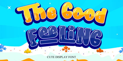 The Good Feeling is a fun, jolly, and incredibly charming display font. It embodies playfulness and authenticity and is the perfect choice for any children’s activity or school project.
 - Kris Kringle by Sealoung,
$15.00 Kris Kringle is a bold and chunky lettered display font. Add this font to your creative ideas and notice how it will make them stand out! All caps fonts.
 - Zombielicious by Zombie Font Group,
$- A meticulously-designed font that captures the spirit of the undead in a modern world. One will notice ample graveyard influence crossed with the newer, emerging trends in typography.
 - Elgista by Zealab Fonts Division,
$10.00 Elgista is modern serif display font with design choices and a combination between high contrast, experimental, and brutalism style. Elgista comes with stylistic, alternates, ligatures and supports multilingual languages.
 - Vasavine by Rvandtype,
$9.00 Vasavine is a Blackletter font. Its elegant and cool look makes it the perfect choice for logos, branding, invitations, stationery, wedding designs, social media posts, and so much more.
 - Tokyotrail by Dharma Type,
$9.99 Tokyotrail is inspired by the capital of Japan. Over 2,000 square kilometers to explore. Lines run vertically horizontal and aslant. Square and geometric form attracts notice in various scenes.
 - Sillyheads by PizzaDude.dk,
$10.00 Need something VERY silly for your headlines and still keep the legibility?! Then Sillyheads could be your no. 1 choice! Sillyheads has got that funny, weird, cute, crazy look!
 - ALS Direct by Art. Lebedev Studio,
$63.00 ALS Direct is an open and dynamic typeface with clear-cut letterforms that make it instantly readable. It lends text a neutral, yet agreeable and modern feel. Direct has nine font styles convenient for the purposes of navigation signage. Regular-style letterforms are rather wide, because direction signs are likely to appear before readers at an angle, so the type needs to withstand perspective distortions. And as signs and boards may vary in size, Direct was developed to include several width variations. Condensed fonts can be used where horizontal space is limited, allowing you to keep proper height and readability of the characters. A signage typeface must be easily readable from some distance away and have simple letterfoms with clear-cut features to quickly identify characters. Designing a type for a potentially wide range of purposes calls for a universal approach. If not destined to be used for navigation in a particular building, it shouldn’t incorporate any peculiar elements to agree with certain design or architecture. All of the above determined our choice of a sans serif with large apertures and definite features allowing readers to instantly recognize letters. Descenders are made compact not to interfere with the line below. And the low contrast between thick and thin strokes renders all elements equally perceptible. The x-height is significant, close to the cap height, which inhances readability of the lowercase type. There are two reasons why directions must not be set in all caps. Firstly, lowercase letters are more diverse and include ascenders and descenders identifying some of the letters in the line. And secondly, having learned to read, people recognize word shapes rather than individual letters, which makes lowercase text more readable. With Direct being a signage typeface, first to be developed were its width variations, and different weight styles and italics were added later. Another thing to be kept in mind was that signs often use dark background colors, and black type on a white background appears smaller than white type on a black background. Direct is the first Cyrillic typeface created for navigation purposes. Before that, designers could use the Cyrillic version of Frutiger (Freeset) developed by Adrian Frutiger for the Paris Charles de Gaulle International Airport, and a number of other, mostly body copy, neutral sans serif types. However, signs and boards were dominated by Arial, which Direct would be glad to replace offering elegance and lucidity of form instead of type bluntess. Direct was designed as a signage typeface, but its neutral style and clear-cut letterforms suggest various other ways of application.
 - Decima Mono by TipografiaRamis,
$39.00 Decima Mono – condensed geometric monospaced Sans Serif typeface, released back in 2009 and quite successful ever since (MyFonts Rising Star, February 2009). This new edition is an upgraded version of Decima Mono and Decima Mono X, combining both into one edition. New version supports more Latin languages with an extension to glyph amounts. Also, six more alternate styles have been added to the original six styles.
 - Vintage Galore by Letterhend,
$12.00 Vintage Galore is a handmade blackletter font font with casual & classic feels. This font will bring you back to 90s feel.This font perfectly made to be applied especially in logo, and the other various formal forms such as invitations, labels, logos, magazines, make up, stationery, novels, labels or any type of advertising purpose. Features : Uppercase & lowercase, Numbers and punctuation, Alternates & Ligatures, Multilingual & PUA encoded
 - Fagetone by Prioritype,
$15.00 Dating back to the 60s 70s, this retro script font comes in bold bold and thin, perfect for your projects and supports multilingualism and other character additions. Can be applied to various print and digital media such as food packaging, clothing stores, accessories, clothing, creative goods, antique workshops, sports, entertainment and even logos. For reference, see preview. Features: -Uppercase -Lowercase -Numeral -Punctuation -Ligature -Multilingual
 - Syom by Luxfont,
$38.00 Take a trip back in time with our unique color font family Syom! The rounded and inflated shapes of the letters embody the atmosphere of decades of the last century, while remaining relevant in modern design. Features: - Real 3D effect - Extras - Multilingual - Ability to adapt 3D letters to other languages - Kerning IMPORTANT: - Check the glyphs in the font before buying! - SVG fonts contain raster letters.
 - Poster Casual JNL by Jeff Levine,
$29.00 Poster Casual JNL is based on the hand lettered title on the cover of the 1929 sheet music for the song "Give Yourself a Pat on the Back"; touted at the time as being "the cheer-up song of England". Available in both regular and oblique versions, the font is perfect for applications where a less-formal look is desired in headlines or brief text.
 - Sixties Flashback by Mysterylab,
$15.00 Here's a lettering style that just might be exactly on your wavelength. Add just the right dose of vintage freak-a-delia to your retro graphics with this original psychedelic-style design. Great for music posters, album graphics, book titles, etc. Evoke a warpy, wavy, whimsical vibe that harks back to the carefree 1960s or early 1970s era with Sixties Flashback; it's pure hippie, trippy fun!
 - Deco Redux JNL by Jeff Levine,
$29.00 A long-set aside Art Deco typeface design begun (but not completed) may or not have been from a vintage source, but its roots go well back into Art Deco lettering. Taking the existing letters and thickening their weights, removing the counters and ending up with a completely new, solid alphabet design resulted in Deco Redux JNL, which is available in both regular and oblique versions.
 - Nouveau Handlettered JNL by Jeff Levine,
$29.00 The roots of Nouveau Handlettered JNL go back to the sheet music cover for the 1917 song "(Someday) Somebody's Gonna Get You". This simple style of sans serif titling has the casual, imperfect charm of the pen and ink lettering so prevalent in the decades before metal type and other technical advancements made the craft almost obsolete. The typeface is available in both regular and oblique versions.
 - Perigord by Scriptorium,
$18.00Perigord has mixed origins. It was inspired by Gutenberg’s capitals and by lettering developed by German designer Ernst Bentele, but its calligraphic antecedents go back to French initials of the Carolingian period. The result of this is a formal, attractive and antique look which we hope you'll like. The full version includes alternate forms for many of the letters, as well as numbers and punctuation. - Driven Unicase Extended by Typekirk,
$12.00 Driven Unicase Extended is sleek and modern, yet hearkens back to the first advertising to catch my eye as a kid in the glorious 1970s – automobile ads that captured the thrill of speed, for sports cars I dreamed of experiencing. Driven is available in 6 individual weights or as a family of 6 fonts, plus ornaments. Includes accented characters supporting for many European languages.
 - Hackbot by Typefactory,
$14.00 Hackbot is a font which is both retro-inspired and amusing to the eye. The gaps between the letterings allows you to feel vintage and travel back to the old times. It’s a font which uses a sans serif style of writing, but uses a retro design to make an overall unique font. It’s flawlessly suitable for promoting games, creating quotes, retro designs and much more.
 - MFC Arteaga Borders Three by Monogram Fonts Co.,
$19.95 The inspiration source for Arteaga Borders Three is a collection of the embroidery and beading patterns from a vintage embroidery patterns catalog dating back to 1865. The original collection of patterned sides has been expounded upon to create matching corners that continue the fluidity of the ornate forms. Download and view the “MFC Arteaga Borders Three Guidebook” if you would like to learn a little more.
 - Brighton vintage by Dealita Studio,
$18.00 Brighton Vintage is a stylish font that is both retro and bold font. Its thick curves give a 70s groovy vibe with the serifs bringing it slightly back to traditional. This font is perfectly made to be applied especially in logos, and other various formal forms such as invitations, labels, logos, magazines, books, greeting/wedding cards, packaging, fashion, makeup, stationery, novels, labels, or any advertising purpose.
 - Staluco by Konstantine Studio,
$17.00 Jump back to the classics with Staluco - A bold sans-serif font inspired by vintage greeting cards and town signs in the 70s 80s era. This font captures the vibes and sense of going-home and childhood-like spirits from your grandparent's house. Perfectly fit for logo, a town sign, branding, poster, clothing, merchandise, music project, books, greeting cards, street, and urban culture concepts, you name it.
 - PiS Creatinin Pro by PiS,
$38.00 PiS Creatinin pro is based on a vintage ABC learning game for kids found in my grandparents attic. The narrow and high hand-drawn letters combine delicacy and chunkyness in a wonderful way, so it can be used both in huge display sizes and in small text sizes. PiS Creatinin pro - Makes you want to go back to school and learn the alphabet all over again!
 - NS Gibswing by Novi Souldado,
$35.00 Gibswing born based on the reference of old fancy lettering, vintage illustration, and victorian calligraphy. The Gibswing decorative style make it as an instant time machine to the era from 1800-1900 victorian visual style of the products, printed advertising, and signs back in the day. It will be a perfect companion of your classic visual direction for decorative sign, labels, branding, logotype, you name it.
 - Skyline Hotel by Open Window,
$19.95 Skyline Hotel is a brand new hand painted font from Dathan Boardman of Open Window. It utilizes Art Deco structures but is greatly amplified by organic paint brush strokes. The font would be best used in designs that require an organic degraded look and feel. Skyline Hotel… optimal for back alley graffiti mural or a poster to begin a political revolution. Geometric essentials betrayed by fluid expression.
 - RM Almanack by Ray Meadows,
$19.00 Based on William Caslon’s design (c1720) which was itself based on Dutch Baroque typefaces. The old saying “when in doubt, use Caslon.” can now be updated ... “use RM Almanack instead!” Includes: Western European, Central European, Baltic & Turkish sets Due to the modular nature of this design there may be a slight lack of smoothness to the curves at very large point sizes (around 100 pt and above).
 - Song Publisher JNL by Jeff Levine,
$29.00 Song Publisher JNL features a design based on the 1945 Art Deco-era hand lettered sheet music title "When the Old Gang's back on the Corner (Singin' Sweet Adeline Again)". It's a good thing sheet music wasn't sold by the word count found in song titles, because this twelve word example would have been more costly than titles such as "Nola", "Tenderly" or "Ciribiribin".
 - Nuevo Litho by Hackberry Font Foundry,
$24.95 NuevoLitho is my first successful font design. It was designed for use in the heads and subheads of my first book, “Printing in a Digital World” back in 1994. It’s a very loosened play on Lithos, Carol Twombly’s fashionable font of the period. However, I added a complete lowercase set, several special characters, and all the other fun stuff I do with my fonts.
 - Matao Serif by Identitype Co,
$15.00 Mataö is a bold and gorgeous and is great for headlines and elegant designs with a vintage and classic flair. Mataö's contrasting lines and curved terminals give a sleek, elegant look to logos, holiday cards, wedding invitations, quotes, advertisements, and more. Mataö is a versatile typeface that's full of character and one you'll come back to time and again. Make your awesome design layout with Mataö.
 - Sheldrake JNL by Jeff Levine,
$29.00 Sheldrake JNL is the second in a series of display fonts modeled from actual water-applied decals that were manufactured by the Duro Decal Company of Chicago (now Duro Art Industries). The font's name derives from the actual phone exchange for Duro, back in the days when a telephone listing had a name-number assignment for recognition. In this case, their number began as "SH(eldrake)-3".
 - Bugleboy by Stiggy & Sands,
$29.00 Bugleboy started as a digitized version of "Wood Grotesk," a 1970s film typeface by LetterGraphics. It started with a bare bones character set which we added swash alternates for Capitals, Stylistic Alternates for a Unicase look, and crafted a Sans version without serifs. The Sans style lacks swashes but keeps Stylistic Alternate Unicase forms. See the last graphic for a comprehensive character map preview.
 - Bedford by Stereo Type Haus,
$25.00 Inspired by mosaic lettering by Heins & LaFarge, architects of the IRT (Interborough Rapid Transit) in New York City. Bedford hints at the station names on platform walls which date back to 1904 but modernize it through a rigid grid system and rounded corners. The family consists of two styles, Bitmap for web usage with a perfect pixel snap, and Rounded for a softer and bolder look.
 - MFC Arteaga Borders One by Monogram Fonts Co.,
$19.95 The inspiration source for Arteaga Borders One is a collection of the embroidery and beading patterns from a vintage embroidery patterns catalog dating back to 1865. The original collection of patterned sides has been expounded upon to create matching corners that continue the fluidity of the ornate forms. Download and view the “MFC Arteaga Borders One Guidebook” if you would like to learn a little more.
 - Augustea Open by ITC,
$29.00Augustea was designed by Alessandro Butti and Aldo Novarese and is one of the most popular classical, monumental letterforms featureing a stone cut effect. This font is based on the classic proportions of Capitalis, which dates back to the first century AD during the reign of Augustus. It should be set with a widely spaced bias. Augustea is distinguished by its balanced, classic and majestic image.

