10,000 search results (0.014 seconds)
  1. Tagged Two by j.dsky, $-
    This family is intended to be a universal font generator for languages of unknown civilizations or simply a tool for creating graffiti-like ornaments. Inspired by both my own paintings and drawings and graffiti. Set of 107 glyphs, available in 3 styles - thin, regular and black rounded. Picture font recommended for use as a decorative element and for creating new alphabets.
  2. Tag Two by Nice Designz, $23.00
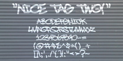
  3. Fontoonies Two by Galapagos, $39.00
  4. Schism Two by Alias, $55.00
    Schism is a modulated sans-serif, originally developed from our Alias Didot typeface, as a serif-less version of the same design. It was expanded to three sub-families, with the thin stroke getting progressively heavier from Schism One to Schism Three. The different versions explore how this change in contrast between thick and thin strokes changes the character of the letterforms. The shape is maintained, but the emphasis shifts from rounded to angular, elegant to incised. Schism One has high contrast, and the same weight of thin stroke from Light to Black. Letter endings are at horizontal or vertical, giving a pinched, constricted shape for characters such as a, c, e and s. The h, m, n and u have a sharp connection between curve and vertical, and are high shouldered, giving a slightly square shape. The r and y have a thick stress at their horizontal endings, which makes them impactful and striking at bolder weights. Though derived from an elegant, classic form, Schism feels austere rather than flowery. It doesn’t have the flourishes of other modulated sans typefaces, its aesthetic more a kind of graphic-tinged utility. While in Schism Two and Three the thin stroke gets progressively heavier, the connections between vertical and curves — in a, b, n etc — remain cut to an incised point throughout. The effect is that Schism looks chiselled and textural across all weights. Forms maintain a clear, defined shape even in Bold and Black, and don’t have the bloated, wide and heavy appearance heavy weights can have. The change in the thickness of the thin stroke in different versions of the same weight of a typeface is called grading. This is often used when the types are to used in problematic print surfaces such as newsprint, or at small sizes — where thin strokes might bleed, and counters fill in and lose clarity, or detail might be lost or be too thin to register. The different gradings are incremental and can be quite subtle. In Schism it is extreme, and used as a design device, giving three connected but separate styles, from Sans-Didot to almost-Grotesk. The name Schism suggests the differences in shape and style in Schism One, Two and Three. Three styles with distinct differences, from the same start point.
  5. Breda Two by Eurotypo, $24.00
    Breda Two is the condensed version of the Breda family, but it is presented as an independent family of fonts because they can work as a single face in your design. As a Breda font, this style is austere, functional and clear, emerged from straight lines and primary shapes. Breda Two is released in four weights with two italics.
  6. Progress Two by Alias, $60.00
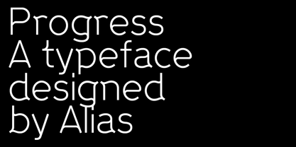
  7. Swirlies Two by Intellecta Design, $24.90
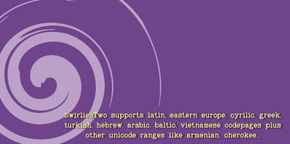
  8. Tight - Unknown license
  9. Slight by Up Up Creative, $29.00
    Introducing Slight, an elegant, full-featured script font with tons of alternate characters and OpenType features. Hand-lettered with a heavy right slant, Slight is particularly well-suited for invitations, branding, and editorial design. Slight comes with more than 1000 glyphs! Specific OpenType features include contextual alternates, stylistic alternates, initial and final forms, multiple alternate glyphs for many letters (accessed through the glyphs panel), multilingual support (including multiple currency symbols), ligatures, standard numbers, and six ampersand styles. Perhaps the most fun thing about Slight is that it includes multiple versions of all ascending and descending letters, making it lots of fun to play with in your layouts and compositions. The OpenType features can be very easily accessed by using OpenType-savvy programs such as Adobe Illustrator and Adobe InDesign. (To access these awesome features in Microsoft Word, you'll need to get comfortable with the advanced tab of Word's font menu. If you need help with this, ask me!) Files included: Slight-Regular.otf Mail support : julie@upupcreative.com --- Find inspiration (and sneak peeks at my next font-in-progress) on - Instagram: http://instagram.com/julieatupupcreative - Facebook : https://www.facebook.com/upupcreative - Pinterest: https://www.pinterest.com/upupcreative - My website: http://upupcreative.com --- PLEASE ENJOY! I can't wait to see what you make with Slight! Feel free to use the #upupcreative and #slightscriptfont tags to show me what you've been up to!
  10. Flight by ITC, $29.99
    Flight is the work of British calligraphic artist Timothy Donaldson, whose specialty is the experimentation with different design tools. Flight is named for the free-flowing lines of its forms which bring to mind a freedom of movement. It was first rendered in pencil using a quick sketching technique. The stem junctions were then carefully thickened to produce a futuristic style without losing its calligraphic origins. The capitals are intended for initialling purposes only. Flight is a lighthearted font with elegant letterforms.
  11. Eight by Zang-O-Fonts, $25.00
    Eight was desinged to be heavily geometric. The main lines were intended to be entirely comprised of lines of eight different but set angles.
  12. Tight by Typodermic, $11.95
    Get ready to boogie down with Tight, the typeface that channels the groovy vibes of vintage tee shirt lettering. Inspired by the iconic disco era of the mid to late 1970s, Tight is the perfect way to celebrate those dancing days. Our retro disco t-shirt typeface is based on old, worn-out samples of Dean Morris’ Quicksilver, the Helvetica of disco. With its misaligned characters and distressed texture, Tight captures the spirit of the era in all its glory. To achieve an even more authentic look, Tight features custom letter pairs that mimic the way real vintage tees looked. And with OpenType-savvy programs, you can swap out certain letter combinations to achieve the perfect look. Just be sure to turn off the “standard ligatures” function to disable the effect and get that true vintage feel. So whether you’re designing a poster for a disco-themed party, creating a retro-inspired logo, or just looking to add some funk to your designs, Tight is the typeface for you. Most Latin-based European writing systems are supported, including the following languages. Afaan Oromo, Afar, Afrikaans, Albanian, Alsatian, Aromanian, Aymara, Bashkir (Latin), Basque, Belarusian (Latin), Bemba, Bikol, Bosnian, Breton, Cape Verdean, Creole, Catalan, Cebuano, Chamorro, Chavacano, Chichewa, Crimean Tatar (Latin), Croatian, Czech, Danish, Dawan, Dholuo, Dutch, English, Estonian, Faroese, Fijian, Filipino, Finnish, French, Frisian, Friulian, Gagauz (Latin), Galician, Ganda, Genoese, German, Greenlandic, Guadeloupean Creole, Haitian Creole, Hawaiian, Hiligaynon, Hungarian, Icelandic, Ilocano, Indonesian, Irish, Italian, Jamaican, Kaqchikel, Karakalpak (Latin), Kashubian, Kikongo, Kinyarwanda, Kirundi, Kurdish (Latin), Latvian, Lithuanian, Lombard, Low Saxon, Luxembourgish, Maasai, Makhuwa, Malay, Maltese, Māori, Moldovan, Montenegrin, Ndebele, Neapolitan, Norwegian, Novial, Occitan, Ossetian (Latin), Papiamento, Piedmontese, Polish, Portuguese, Quechua, Rarotongan, Romanian, Romansh, Sami, Sango, Saramaccan, Sardinian, Scottish Gaelic, Serbian (Latin), Shona, Sicilian, Silesian, Slovak, Slovenian, Somali, Sorbian, Sotho, Spanish, Swahili, Swazi, Swedish, Tagalog, Tahitian, Tetum, Tongan, Tshiluba, Tsonga, Tswana, Tumbuka, Turkish, Turkmen (Latin), Tuvaluan, Uzbek (Latin), Venetian, Vepsian, Võro, Walloon, Waray-Waray, Wayuu, Welsh, Wolof, Xhosa, Yapese, Zapotec Zulu and Zuni.
  13. eurofurence light - 100% free
  14. Brie Light - Unknown license
  15. Existence Light - 100% free
  16. AdamGorry-Lights - Personal use only
  17. Hard Light - 100% free
  18. Bright Lights - 100% free
  19. Angel Light - Personal use only
  20. Quad Light - 100% free
  21. Continuum Light - Unknown license
  22. BradburySans-Light - 100% free
  23. Heidelbe-Light - Unknown license
  24. Iglesia-Light - Unknown license
  25. Teen Light - Unknown license
  26. Ashby Light - Unknown license
  27. Paganini-Light - Unknown license
  28. Teen Light - Unknown license
  29. Discognate Light - Unknown license
  30. JoaoCond-Light - 100% free
  31. Bedrock-Light - Unknown license
  32. Roughie-Light - Unknown license
  33. XPED Light - Unknown license
  34. Uberhölme Light - Personal use only
  35. U.S.A. Light - Unknown license
  36. Odinson Light - Unknown license
  37. Neon Lights - 100% free
  38. Bread Light by Great Studio, $23.00
    Bread Light is a serif display font featuring classic glyphs developed in a modern and classy style. This font idea has various references, from classic to modern, making it the perfect typeface with a distinct and contemporary look. This font offers a broad set of options for creating headlines, logos and headlines. It's perfect for books, magazines, advertising, editorial, packaging, quotes, branding and more. Bread Light completes your access to OpenType features to access a large selection of alternative letters and ligatures, a choice of letters you like from various upper and lowercase letters for a luxurious and distinctive look. If you still have questions, just send me a message and I'm happy to help ;) Thanks, Great Studio
Looking for more fonts? Check out our New, Sans, Script, Handwriting fonts or Categories
abstract fontscontact usprivacy policyweb font generator
Processing