10,000 search results
(0.028 seconds)
- Dynatype by Alphabet Soup,
$60.00 Suddenly...it’s the World of Tomorrow! With the push of a button Dynatype automates your typesetting experience. Dynatype is actually Two fonts in One–without switching fonts you can instantly change from Dynatype’s “regular” style to its alternate connecting version with the simple push of a button. For more details download “The Dynatype Manual” from the Gallery Section. What is Dynatype? Dynatype is the upright, slightly more formal cousin of Dynascript. It shares many of the characteristics of it’s slightly older relation, but is drawn entirely from scratch and has it’s own unique character. Dynatype may be reminiscent of various mid-century neon signage, and of sign writing, Speedball alphabets and even baseball scripts. Its design also takes some cues from a historical typographic curiosity that began in Germany in the ‘20s and which lasted into the ‘60s—when Photo-Lettering gave it the name "Zip-Top". Basically it was believed to be the wave of the future—that by weighting an alphabet heavier in its top half, one could increase legibility and reading speed. The jury’s still out on whether or not there’s any validity to this notion, but I think you’ll agree that in the context of this design, the heavier weighting at the top of the letters helps to create some uniquely pleasing forms, and a font unlike any other. Typesetters across the planet will also be able to set copy in their language of choice. Dynatype’s 677 glyphs can be used to set copy in: Albanian, Basque, Catalan, Cornish, Croatian, Czech, Danish, Dutch, Esperanto, Estonian, Faroese, Finnish, French, Galician, German, Hungarian, Icelandic, Indonesian, Irish, Italian, Kalaallisut, Latvian, Lithuanian, Malay, Maltese, Manx, Norwegian Bokmål, Norwegian Nynorsk, Oromo, Polish, Portuguese, Slovak, Slovenian, Somali, Spanish, Swahili, Swedish, Turkish, and Welsh—and of course English. Sorry! Off-world languages not yet supported. PLEASE NOTE: When setting Dynatype one should ALWAYS select the “Standard Ligatures” and “Contextual Alternates” buttons in your OpenType palette. See the “Read Me First!” file in the Gallery section.
 - Smallstep Pro by Evolutionfonts,
$- Smallstep - One geometric sans serif with a free spirit. If we presume that geometric typefaces play with the idea of what typography would look like in the future when all unnecessary elements would disappear, than most of their designers seem to envision the future in a rather metropolisque kind of way. We love geometric faces, but the cold and heartless feelings that most of them leave is just not our cup of tea. That is why we are happy to bring some optimism in that genre with our new typeface. We called it Smallstep. Smallstep is a typeface that follows the traditions of classic geometric sans serifs like “Futura”, but is at the same time friendly and whimsical. We took the liberty to deviate from the standard sans serif glyphs while drawing some characters (such as ”a” and ”r” ), others (“w” “k”) are completely redesigned. Probably the biggest trademark of this typeface is the way vertical lines in most lower case characters are “cut” so they end in a 60 degree angle. Smallstep is over all a expressive face, which means it brings some emotions to your design and feelings in itself, and should be used accordingly. Other than that, it is suitable for both headline and body text, print and web. So what kind of name is “Smallstep”? We view the type design process as a form of evolution: There can be no typeface that differs drastically from the current standards, since its characters would be unrecognizable and thus unreadable. But at the same time there are hundreds of faces that differ a little, and still manage to make a difference by moving with small steps towards better and more refined looks. Smallstep consist of 4 weights, that cover all the features, that are expected of a modern Opentype face: kerning pairs, ligatures, true italics and alternative characters, plus a set of symbols, that will help you start off your designs more easily.
 - FS Shepton by Fontsmith,
$80.00 Handy Andy Andy Lethbridge had only just completed his graphic design BA at the University of Portsmouth when he was spotted by Jason, who’d seen Andy’s exquisite hand lettering at his degree show and on Instagram. Keen to push the handwritten theme further, having recently launched a digitally-created, chalky script font (FS Sammy), Jason offered Andy a job and the chance to develop a suite of more stylised, truly hand-drawn fonts. Andy duly got out his pads, pencils and pens, and started experimenting with styles and textures. Magic followed. Imperfection perfected Most ‘handwritten’ typefaces are created entirely digitally. Not FS Shepton. From the start, the intention was to create a collection of alphabets of similar character but different texture and style – 100% hand-drawn and purposely imperfect, with the kind of inconsistent, organic shapes and textures of market stall signs, dashed off in chalk or paint. FS Shepton Regular, drawn with a wet brush pen, is solid with a rough outer edge and a casual but controlled feel. The dry brush used to create FS Shepton Light gives it more inner texture and a more formal, slanted, calligraphic style. FS Shepton Bold, drawn using a wider, looser dry brush pen, has a woody grain in the middle of its broad strokes and greater solidity where the brush moves more slowly. Fresh as a daisy Think of FS Shepton not as a family of three weights of the same font so much as a collection of three fonts penned by the same author. All of them – the light, regular and bold – were created independently as display fonts that offer something different to labelling, packaging, point-of-sale and advertising. Lovingly crafted by hand, they’re a good match for products and settings that share the same artisinal qualities: organic foods, drinks and healthcare products, as well as premium chocolate, coffee and condiments.
 - Helvetica Now by Monotype,
$42.99 Every single glyph of Helvetica has been redrawn and redesigned for this expansive new edition – which preserves the typeface's Swiss mantra of clarity, simplicity and neutrality, while updating it for the demands of contemporary design and branding. Helvetica Now comprises 96 fonts, consisting of three distinct optical sizes: Micro, Text and Display, all in two widths. Each one has been carefully tailored to the demands of its size. The larger Display versions are drawn to show off the subtlety of Helvetica and spaced with headlines in mind, while the Text sizes focus on legibility, using robust strokes and comfortably loose spaces. The Micro sizes address an issue Helvetica has long faced – that of being 'micro type challenged'. In the past, the typeface struggled to be legible at tiny sizes because of its compactness and closed apertures. Helvetica Now's Micro designs are simplified and exaggerated to maintain the impression of Helvetica in tiny type, and their spacing is loose, providing remarkable legibility at microscopic sizes and in low-res environments. There's also an extensive set of alternates, which allow designers the opportunity to experiment with and adapt Helvetica's tone of voice. This includes a hooked version of the lowercase l (addressing a common complaint that the capital I and lowercase l are indistinguishable) as well as a rounded G, and a straight-legged R, a single storey a and a lowercase u without a trailing serif. In the past, designers had to nudge, trim and contort the design to create stylish display-type lockups with Helvetica. Helvetica Now Display was designed and spaced with those modifications in mind—saving effort and providing more consistent (and more stylish) results. “Helvetica is the gold standard,' says Monotype Type Director Charles Nix. “To use it is to claim that you are the ultimate expression of whatever your brand aspires to be. Its blankness is its power.” Helvetica Now User Guide PDF. Featured in: Best Fonts for Resumes, Best Fonts for Websites, Best Fonts for PowerPoints
 - Dynascript by Alphabet Soup,
$60.00 Typography enters the Space Age! Dynascript brings the ease of “Pushbutton Automatic” to your typesetting experience. Dynascript is actually Two fonts in One–without switching fonts you can instantly change from Dynascript’s connecting font to the non-connecting italic with the simple push of a button. For more details download “The Dynascript Manual” from the Gallery Section. What is Dynascript? Dynascript is the slanted script cousin of Dynatype. It shares many of the characteristics of it’s sibling, but is drawn entirely from scratch and has it’s own unique character. To some it may be reminiscent of various mid-century neon signage, and of sign writing, Speedball alphabets and even baseball scripts. The design of Dynascript also takes some cues from a historical typographic curiosity that began in Germany in the ‘20s and which lasted into the ‘60s—when Photo-Lettering gave it the name "Zip-Top". Basically it was believed to be the wave of the future—that by weighting an alphabet heavier in its top half, one could increase legibility and reading speed. The jury’s still out on whether or not there’s any validity to this claim, but I think you’ll agree that in the context of this design, the heavier weighting at the top of the letters helps to create some uniquely pleasing forms, and a script unlike any other. Typesetters across the planet will also be able to set copy in their language of choice. Dynascript’s 694 glyphs can be used to set copy in: Albanian, Basque, Catalan, Cornish, Croatian, Czech, Danish, Dutch, Esperanto, Estonian, Faroese, Finnish, French, Galician, German, Hungarian, Icelandic, Indonesian, Irish, Italian, Kalaallisut, Latvian, Lithuanian, Malay, Maltese, Manx, Norwegian Bokmål, Norwegian Nynorsk, Oromo, Polish, Portuguese, Slovak, Slovenian, Somali, Spanish, Swahili, Swedish, Turkish, and Welsh—and of course English. Sorry! Off-world languages not yet supported. PLEASE NOTE: When setting Dynascript one should ALWAYS select the “Standard Ligatures" and “Contextual Alternates” buttons in your OpenType palette. See the “Read Me First!” file in the Gallery section.
 - Solaris by Ultramarin,
$40.00 Solaris is a sans serif or a grotesque as we still call it where I come from. (it is an old term which means strange compared with Roman which was the normal font) The face is an open sans, which means that the round signs take the air into the form, minuscule d is drawn kind of backwards like in Gill Sans, which sets off on minuskel a. Here is the Regular version, with a slightly difference between stems and hairlines.
 - Gilmore Sans by Red Rooster Collection,
$45.00 Gilmore Sans Extra Bold Extra Condensed Titling is a sans serif typeface that was inspired from early designs by the renowned English typographer Eric Gill. It was designed in 1992 by A. Pat Hickson (P&P Hickson) and Steve Jackaman (ITF) exclusively for the Red Rooster Collection. It has a clean, fresh, sturdy feel that is exceptionally powerful at display size. The typeface lends itself well to a variety of projects, including everything from packaging to signage to high-profile advertising campaigns.
 - Lucky Goldfish by Hanoded,
$15.00 I am not really sure if goldfish in general are lucky. They tend to swim in circles in a bowl, but maybe, years from now, scientists discover that these goldfish count themselves lucky to be in a bowl, rather than in a stream in Asia. Personally, I think they’d be better off in a stream. Lucky Goldfish font is a cute and happy font, ideally suited for book covers, posters and toy packaging. Comes with a school of diacritics too.
 - Fingerfood by Hanoded,
$15.00 I made this font using my index finger and Chinese ink. I thought the ink would come off easily, but I can tell you: it doesn’t. I have been walking around with a black stained finger for a week now and I do get strange looks from people every so often… Fingerfood, of course, is hand made. It is a rather playful font - all caps, but lower and upper case differ and like to mingle. Comes with a full diacritics palette.
 - Brushzilla by Hanoded,
$15.00 Brushzilla is a handmade brush font with a bite: it feeds off the creative energy from the depths of your mind and transforms it into something outstanding. Work with it, not against it. Ride the wave and let it take you by the hand. You may fear it at first sight, but once you get to know it, you’ll find that this beast will refresh your creative senses. Comes with some gorgeous alternate glyphs, double letter ligatures and a whole lotta diacritics.
 - LTC Holiday Ornaments by Lanston Type Co.,
$24.95 Assembled for those less commercialized holidays, LTC Holiday Ornaments features over 80 printers' ornaments from Lanston Monotype and other historical foundries such as BBS and ATF. Holidays include Easter, Valentine's Day, St. Patrick's Day, April Fool's Day, Thanksgiving and 4th of July. There¹s even a pirate to represent international "Talk Like a Pirate" day. LTC Holiday Ornaments joins the Lanston Collection alongside the popular LTC Halloween and Christmas Ornaments. LTC Holiday Ornaments contains additional Halloween and Christmas ornaments as well.
 - TT Severs by TypeType,
$29.00 TT Severs useful links: Specimen | Graphic presentation | Customization options TT Severs is a geometric grotesque with emphasized elements of internal brackets. A distinctive feature of TT Severs is the unusual form of internal ovals, which refers us to the style of traditional Arabic writing. TT Severs has a strong character and is great for use in high tech (IT), the web, in robotics, computer games, and sports. TT Severs is a 2-in-1 font family. In a large body size, it works great as a display font, creating a distinctive character for logos and headings. At the same time, when TT Severs is used in a small body size or in large text arrays, the font’s peculiarities of bracket construction fade, and it perfectly functions as a text font, thanks to both the low contrast between vertical and horizontal strokes and the detailed logic of interaction of black and white letter elements. The font family TT Severs includes 18 fonts, each of which consists of 558 glyphs. The family has standard and discrete ligatures, which include experimental ligatures for the Cyrillic alphabet. In addition, TT Severs can be made a little more humanist—it is enough to turn on stylistic alternates, and due to them the font takes the form of a humanist grotesque, which refers us to traditional broad nib writing. As part of the font family, you will also find old-style figures and a large number of OT features such as case, ordn, sups, sinf, dnom, numr, onum, tnum, pnum, liga, dlig, salt (ss01), frac.
 - The Subway Types by HVD Fonts,
$30.00 The idea was to create a package containing prominent tag styles of graffiti strongholds like New York, Berlin and Paris. Shik (New York), Deon (Paris) and Etan (Berlin) came together to show the typical tag styles of their respective metropolitan areas. The fonts were digitized, spaced, kerned and programmed by Hannes von Döhren. The Subway Types are highly equipped. Each one consists of 4 alphabets (Uppercase, Lowercase, Small Caps & Swash). They also include ligatures and some specials like underlines and a huge range of accents for a wide language support. With the OpenType technology these features can be applied easily. For those who never used the OpenType features, we created the Std (Standard) and the SC (Small Caps) versions of the fonts. They contain the same basic characters like the OT versions but are split in two fonts. Hence you don’t need any OpenType knowledge to use the Std and SC fonts.
 - Karmina by TypeTogether,
$49.00 Karmina is a text typeface developed mainly for pocket books and budget editions. It was built to withstand the worst printing conditions: low quality papers, high printing speed with web presses and variations in the ink level of the printing press. Some of Karmina's most representative features are the rather large serifs, intended to work perfectly in small reproduction sizes, the sharpness of the shapes, including some calligraphic reminiscences, and the large and yet graceful ink traps in the acute connections. Structurally, Karmina combines a significantly large x-height with relatively compressed letterforms. The result of these features grants Karmina outstanding legibility and economy. Karmina features four weights and 800 characters per weight, including small caps, discretionary ligatures, fractions and a complete range of numerals for every use. It also supports over 40 languages that use the latin extended alphabet. Karmina was selected in the text typography category at the Letras Latinas exhibition 2006 and won a merit in the European-wide ED-Awards competition 2007. Karmina Basic is a reduced version of Karmina. It is still an OT-font but without any particular features except of a set of ligatures, class-kerning and language support including CE and Baltic.
 - Idiom by Reserves,
$39.99 Idiom is an extra-condensed, tightly spaced display face with congruent forms exuding a strong sense of rhythm and elevation. The basic stenciled geometric shapes are reminiscent of the decorative style found with P22 Albers and Futura Black. Careful consideration of each letter's construction, relative to all characters, lends Idiom a decided sense of cohesion and sophistication. The included non-traditional 'weights' (Medium and Bold) are completely blacked out, creating entirely new letterforms that exhibit a very stark, contemporary sense. Increasing the versatility of the Idiom family, a selection of OpenType features allow access to a set of contrasting linear punctuation forms, unconventional ligatures, case-sensitive punctuation and more. Features include: Basic Ligature set including 'f' ligatures (ae, oe, fi, fl, ff, fh, fj, ft, fa, ct, st, rt, ot, ta, sa, mi, si, vi, su, oc, oo, ru, ib) Alternate characters (M, W, T, ß, _, $, @, (), {}, [], /, \, |, -, –, —, +, -, ±, ≤, ≥, , «, », and more) Case forms (shifts various punctuation marks vertically to a position that works better with all-capital sequences, in this case the numerals or letters with ascenders) Slashed zero Full set of numerators/denominators and superscript/subscript Automatic fraction feature (supports any fraction combination) Extended language support (Latin-1 and Latin Extended-A) *Requires an application with OpenType and/or Unicode support.
 - EB Base Mono by Fenotype,
$19.95 Not your average monospaced typeface, Base Mono flourishes with several handsome OT features mostly found exclusively in text fonts. Despite the geometric and techno feel of the initial roman version, the cursive version is heavily influenced by traditional Finnish weaving and folk art! The contradiction is taken further by inclusion of such classical features as small capitals and lower case figures, usually found in slightly more traditional fonts. Base Mono family suits many editorial, corporate identity and logotype tasks. It can even be used for setting text such as captions and headlines.
 - RMU Gilgengart by RMU,
$30.00 RMU Gilgengart is a revival of Hermann Zapf’s beautiful calligraphic blackletter font which was cut and first released by Stempel in 1952. This font comes with fine ligatures and swash letters. Before working with this font it is recommended to activate both OT features Standard and Discretionary Ligatures in order to get access to all ligatures. RMU Gilgengart contains the following swash letters: D, L, h, f, g, k, round s, and t, whereby you should use the small letters at the end of a word or slogan only.
 - Briller by Kostic,
$40.00 Briller is a super-wide display sans that covers 6 weights, from delicate Thin on one side to chunky Ultra on the other end. Briller tabular figures (via the OT feature) and most of figure related glyphs (such as monetary symbols) are the same width throughout the weights, leaving fun possibilities in pairing them up in contrast while retaining that sense of tabular order. Briller has a character set to support Western and Central European languages. Each weight includes ligatures, proportional lining and tabular figures, fractions and scientific superior/inferior figures.
 - Gamundia Pro by RMU,
$50.00 In 2012 the city of Schwäbisch Gmünd will celebrated its 850th anniversary, and in 2014 it was host town to the State Garden Show of Baden-Württemberg. These both celebrations were the background to create a special font for my home town and give it the town’s ancient name. Inspired by Excoffon’s Diane, I drew and digitized a new, multilingual script font which covers the main European languages written in Latin or Cyrillic letters. For users typing in the Serbian language, I recommend to activate the OT feature Stylistic Alternatives.
 - Concertina by Hanoded,
$15.00 A concertina is a kind of musical instrument, not unlike an accordeon. I just liked the name; I have to admit I’m not a particular fan of accordeon music… Concertina is a beautiful handmade script font. A little rough, but elegant as well. It was made with a small Japanese brush pen on coarse paper. Concertina comes with double letter ligatures and end-letter alternates. To access the end-letter alternates, type the letter you want + space (and make sure to tick the ‘ligatures’ box in your OT environment).
 - Gutenberg Gotisch by RMU,
$30.00 Gutenberg Gotisch is a redesign of an inhouse font released by Bauer in 1885, and it is a predecessor of Princess Engraved. So both fonts make a perfect match. The long s can be reached by typing the integral sign or turning the round s into the long s by using the historical OT feature. In this font, you have the possibility to turn I, V, X, L, C, D, and M into Roman numerals by activating the salt feature. Finally I recommend to use both ligature features.
 - Mariage by Linotype,
$40.99Morris Fuller Benton, the principal designer of the American Type Founders, designed Mariage in 1901. Mariage, which has been sold under a plethora of different names during the last century, is a blackletter typeface belonging to the Old English category. The term blackletter refers to typefaces that stem out of the historical printing traditions of northern Europe. These letters, called gebrochene Schriften, or "broken type" in German, are normally elaborately bent and distorted. Their forms often print large amounts of ink upon the page, creating text that leaves a heavy, black impression. The Old English style is a subset of blackletter type that dates back to 1498, when Wynken de Worde introduced textura style printing to England. Continental printers had been printing with textura style letters since Gutenberg's invention of the printing press fifty years earlier. Italian printers stopped using them around 1470. For northern Europeans, texturas remained the most popular form of typeface design until the invention of the fraktur style in Nuremberg. Mariage is heavily classicized sort of Old English type. During the Victorian era, designers admired the Middle Ages for its chivalric, community-based values and its pre-industrial lifestyle. Yet they also found the basic medieval textura letterform too difficult to read by present standards. They desired to modernize this old style. Today, this sort of update is often referred to not as "modernization" but as classicism. Benton's design for ATF builds upon earlier Victorian classicist interpretations of Old English/textura letters. For an example of what these Victorian designs looked like, check out the popular 1990 revival of the genre, Old English . Old English style types often appear drastically different from other blackletters. For contrast, compare Mariage to a classical German fraktur design, Fette Fraktur , a schwabacher style face, or the popular early 20th Century calligraphic gothic from Linotype, Wilhelm Klingspor Gotisch . Especially in the United States, classicist Old English typefaces are thought to espouse tradition and journalistic integrity. These features, together with the inherent, complex beauty of Mariage's forms, make this typeface a perfect choice for certificates, awards, and newsletter mastheads. - Helvetica Now Variable by Monotype,
$328.99 Helvetica Now Variable Helvetica Now 2.0 builds on the groundbreaking work of 2019’s Helvetica Now release—all of the clarity, simplicity, and neutrality of classic Helvetica with everything 21st-century designers need. In this 2021 release, we introduce Helvetica Now Variable and add condensed weights to the Helvetica Now static fonts. Helvetica Now 2.0 includes 96 fonts in three distinct optical sizes (Micro, Text, and Display), now with 48 new condensed weights. The Helvetica Now Variable fonts include even more: 144 instances—48 normal, 48 condensed, and 48 compressed. Helvetica Now Variable gives you over a million new Helvetica styles in one state-of-the-art font file (over two-and-a-half million with italics!). Use it as an extension of the Helvetica Now family or make custom-blends from its weights (Hairline to ExtraBlack), optical sizes (four point to infinity), and new Compressed and Condensed widths. Create infinite shades of expression, incredible typographic animations, and ultra-refined typography. Its single font file makes it easier to use and wickedly fast. Load one file and access a million fonts—in a fraction of the size of a traditional font family. More freedom. More expression. More power. More. Helvetica. Now. Each one of the Helvetica Now static fonts has been carefully tailored to the demands of its size. The larger Display versions are drawn to show off the subtlety of Helvetica and spaced with headlines in mind, while the Text sizes focus on legibility, using robust strokes and comfortably loose spaces. Helvetica Now's Micro designs are simplified and exaggerated to maintain the impression of Helvetica in tiny type. There's also an extensive set of alternates, which allow designers the opportunity to experiment with and adapt Helvetica's tone of voice. The new Condensed weights put more type into smaller spaces—for intense emphasis, sophisticated contrast, or just everyday space-fitting. Helvetica Now 2.0 is, quite simply, more: more versatility; more power; and more creative possibilities. “For more than six decades, Helvetica has been the essential typeface,” says Monotype Type Director Charles Nix. “The release of Helvetica Now insures that it will be a typographic force for decades to come.”
 - Regave by Wahyu and Sani Co.,
$25.00 Introducing Regave, a typeface inspired by Danish style lettering based off the work of Knud Valdemar Engelhardt (1882–1931) who designed the street signs for the Copenhagen suburb of Gentofte. The Engelhardt's design was loosely based on the lettering of two Danish architects of the time: Thorvald Bindesbøll (designer of the Carlsberg logo) and Anton Rosen. The signs were so successful that they’re still in use today. The most noticeable characteristic of Danish style are: a flat apex of the A the widening of diagonal terminals a double-storey g with its loop terminating before it forms the bottom most stroke (Erik Spiekermann coined this a Danish g) a single-story g with a stumpy tail a K with an almost laterally moved crotch, connected to the stem by an extra horizontal stroke widened diagonal connecting strokes forming flat apex or baseline strokes Regave comes in 11 weights from Thin to ExtraBlack with matching italics and also available in Variable Font format for more flexibility in weight selection. This family also equipped with useful OpenType features such as Ordinals, Superscripts, Subscripts, Stylistic Alternates, Stylistic Sets, Proportional Lining, Standard Ligatures, Fractions, Numerators & Denominators. Each font has 490+ glyphs which covers Western & Eastern Europe, and other Latin based languages – over 200 languages supported! Regave will be suitable for many creative projects. This masculine, strong and unique typeface will be suitable for logos, posters, presentations, headlines, lettering, branding, quotes, titles, magazines, headings, web banners, mobile applications, art quotes, advertising, packaging design, book title, and more!
 - Swiss 721 WGL by Bitstream,
$49.00 Swiss 721™ is a sans serif family that ranges in style from thin to black while mixing in a few unexpected, but beautifully made and ironically flattering, outline weights that spice up the grotesque design. Couple these upstanding letterforms with matching italic styles and you have yourself a beautiful tool that is as legible on screen as it is off, has the technical prowess to conquer even the trickiest of design riddles and will work in a myriad of projects. Swiss 721 is a staple sans serif that you’ll never be sorry you have in your library. It’s been said that a simple sans serif is one of the most difficult typefaces to design. This is because when letters are reduced to their most basic details, irregularities and inconsistencies in design become immediately visible. The Swiss 721 typeface family is a quintessential example of letterforms distilled to their essence while still possessing warmth and verve. Based on mid-century sans serif typefaces, Swiss 721 is a versatile family of weights and proportions ideally suited to a wide variety of print and interactive design projects and is equally at home as headlines on billboards as it is navigation content on small screens. Swiss 721 takes the essence of mid 20th century sans serif typefaces and melds it with modern design consistency and a systematic weight range. OpenType® fonts of Swiss 721 also benefit from a rich character set and a range glyphs supporting most Western European and many Eastern European languages.
 - Madera Variable by Monotype,
$229.99Malou Verlomme’s Madera is a typeface made strictly for graphic designers, created as an indispensable type toolbox that can meet the needs of both print and digital environments. Verlomme has drawn on his extensive experience creating bespoke type for major brands, and Madera is a “typographic synthesis” of this work. Although designed as a restrained sans serif, the typeface has some punchy personality – with sharpened apexes that inject flavour into the design, particularly in the darker weights and when set at all caps. Madera sits alongside fellow geometric designs such as Proxima Nova, Gotham or Avenir, offering a straight-talking tone of voice but with some extra bite. If you’re a large corporation, with a typeface being used in many different environments you want something that's just the right balance of visibility and legibility to sustain an extensive amount of communication.” “The design is very solid but it doesn’t go out of its way to attract attention,” explains Verlomme. “It still has a fair amount of warmth and personality, in a very understated manner. The Madera typeface family has 32 fonts: Upright, Condensed and Italics. It is available in OpenType CFF and TTF fonts formats. Each typeface contains over 650 glyphs with extensive Western, Central and Eastern European language support. It also supports OpenType typographic features like alternatives, ligatures and fractions. Madera Variables are font files which are featuring two axis and have a preset instance from Hairline to Extra Black. - Mifelin by Nathatype,
$29.00 Mifelin is a well-defined serif font. Serifs are small ornaments that appear at the ends of the lines of letters, giving them a neater, more structured appearance. The well-defined serifs in this font create an elegant and professional impression. This serif font has a balanced and harmonious proportion of height and width. The proportions ensure that each letter looks proportional and easy to read. The line of letters in this font has a smoothness and clarity that distinguishes each character. Sharp, clear lines give off a professional and organized impression. This clarity also helps strengthen the legibility of the font in a variety of design settings. This serif font with an elegant look has a classic style that remains relevant in modern designs. Despite having strong roots in traditional typographic design, this font is able to adapt to more contemporary design contexts and give it a touch of elegance and class. Even though it has a touch of elegance, this serif font still prioritizes good readability. Each letter is carefully designed to ensure that the text remains easy to read and understand for the reader. Prominent readability is the hallmark of this font. Enjoy the various features available in this font. Features: Stylistic Sets Ligatures Multilingual Supports PUA Encoded Numerals and Punctuations Mifelin is suitable for any designs that require a formal and official impression. This font is can be used in the design of books, magazines, reports, formal invitations, brand identities, and other design projects that require elegance and professionalism. Find out more ways to use this font by taking a look at the font preview. Thanks for purchasing our fonts. Hopefully, you have a great time using our font. Feel free to contact us anytime for further information or when you have trouble with the font. Thanks a lot and happy designing.
 - San Remo - Personal use only

- Koch-Antiqua Zier - Personal use only

- Rankfine by Din Studio,
$29.00 Rankfine is a elegant calligraphy with natural and handwritten style. It brings a modern and attractive typeface. Made for any professional project branding. It is the best for logos, branding, wedding and quotes. Includes: Rankfine (OTF) Features: Stylistic Set Beautiful Ligatures Multilingual Support PUA Encoded Numerals and Punctuation Thank you for downloading premium fonts from Din Studio
 - Staufer Gotisch by RMU,
$35.00 Thannhaeuser’s mid-1930s display blacklettr font as a fresh and extended redesign called Staufer Gotisch. This font contains a bunch of useful ligatures, and it is recommended to activate both Standard and Discretionary Ligatures. To reach the numero sign, type the combination N-o-period und activate the OT feature Ordinals. The # key is occupied by the round s.
 - Piepie by Dharma Type,
$24.99 Piepie is very heavy typeface for titlings and captions. OpenType Format (.otf) with 461 glyphs! Super mini ascenders and descenders! Ultra big x-height! Fatty weight yet Sharpy sharp detail! Bring it on Retina display! OpenType alternates for K, R and Y! Mac Roman ✓ Windows 1252 ✓ Adobe Latin 1 ✓ Adobe Latin 2 Almost all Adobe Latin 3 Almost all
 - Hawken by Din Studio,
$29.00 Hawken is a powerful sans serif display typeface come with sporty themes. Perfect for quotes, posters, logo, logotype, branding, business card, crafting needs, print, t-shirt, mug, merchandise, packaging, and many more. Includes: Hawken (OTF) Features: Alternates Stylistic Set Swashes Multilingual Support PUA Encoded Numerals and Punctuation Thank you for downloading premium fonts from Din Studio
 - Cat Fight by Tour De Force,
$25.00 Cat Fight is small decorative font family containing two "weights". They are not weights in actual meaning, as they differ by style but to secure safe OTF usage in all OS, they are named as Regular and Bold. Cat Fight is ideal for lively and cheerful usages on posters, packages, labels, website titles, book covers and other similar situations.
 - Fiosthic by Din Studio,
$29.00 Fiosthic is a modern signature font with natural and handwritten style. It brings a elegant and attractive typeface. Made for any professional project branding. It is the best for logos, branding, wedding and quotes. Includes: Fiosthic (OTF) Features: Stylistic Set Beautiful Ligatures Multilingual Support PUA Encoded Numerals and Punctuation Thank you for downloading premium fonts from Din Studio
 - White Risolles by pentagonistudio,
$19.00 White Risolles Is Clean Script Font Inspired By Handwritting Characters. Font Features : White Risolles OTF ( Open Type ) White Risolles WOFF ( Web Font ) SOFTWARE REQUIREMENTS : Fonts and alternate : No special software required they may be used in any basic program /website apps that allows standard fonts That's it folks! You can go ahead and get cracking :) Have a Good Day !
 - Ferpa by Typeóca,
$30.00 Ferpa is Typeóca's Fierciest Font Family. Drawn using only straight lines, Ferpa uses every kink, every kink and every serif as an opportunity for expressivity. From Thin to Black in both Roman and Italic constructions, Ferpa is available as 18 otf static font files, with a character set that goes a little beyond Latin Extended A.
 - Feel Better by Din Studio,
$29.00 Feel Better is a elegant handwritten font. The handwritten combined with brush font will make your design project more beautiful. Made for any professional project branding. It is the best for logos, branding and quotes. Includes: Feel Better (OTF) Features: Beautiful Ligatures Multilingual Support PUA Encoded Numerals and Punctuation Thank you for downloading from Din Studio.
 - Always Believe by Olivetype,
$18.00 Always Believe is a simple, fun, and relaxed handwritten font. Whether you’re using it for crafting, digital designing, presentations, or greeting card making, it’s perfect! This font is supporting Multi-Languages, which includes: Afrikaans Albanian Catalan Danish Dutch English Estonian Finnish French German Italian Norwegian Portuguese Spanish Swedish Zulu. You will get : Always Believe OTF Thank You
 - Qistilla by Ditatype,
$29.00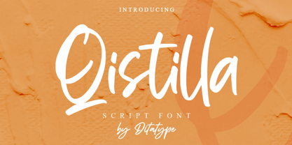 Qistilla is a casual handwritten font. Made for any professional project branding that need a modern and attractive typeface. It is the best for logos, branding and quotes. Every letter has a unique and beautiful touch. Includes: Qistilla (OTF) Features: Standart Ligatures Multilingual Support PUA Encoded Numerals and Punctuation Thank you for downloading premium fonts from Dita Type

